Most people can name the primary and secondary colors without thinking. Tertiary colors are where things get interesting.
Understanding what tertiary colors are fills a real gap in color knowledge. These six hues sit between primary and secondary colors on the color wheel, and they show up constantly in painting, branding, and digital design.
Knowing them changes how you mix paint, build palettes, and read color relationships across the RYB, RGB, and CMYK color models.
This guide covers the full picture: definitions, the six tertiary hues by name, how color mixing works in practice, and how standardized systems like Munsell and Pantone handle tertiary color notation.
What Are Tertiary Colors
Tertiary colors are the six hues produced by mixing one primary color with one adjacent secondary color on the color wheel. They sit between their two parent colors, both visually and in terms of pigment composition.
That last part matters. “Adjacent” is not optional. You can’t grab any primary and any secondary at random. The secondary has to neighbor the primary on the wheel.
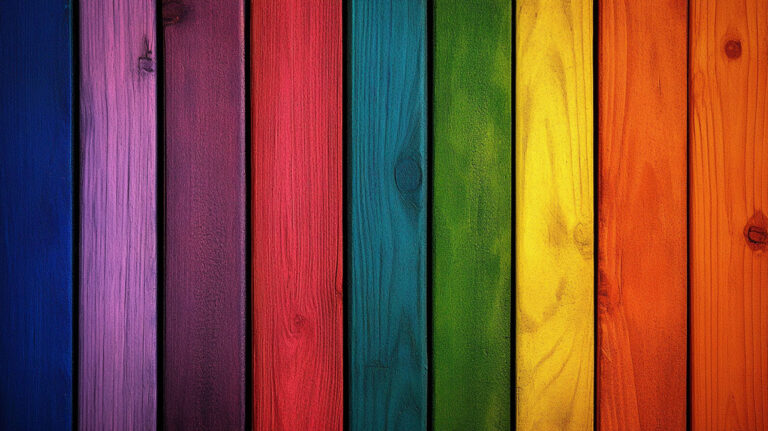
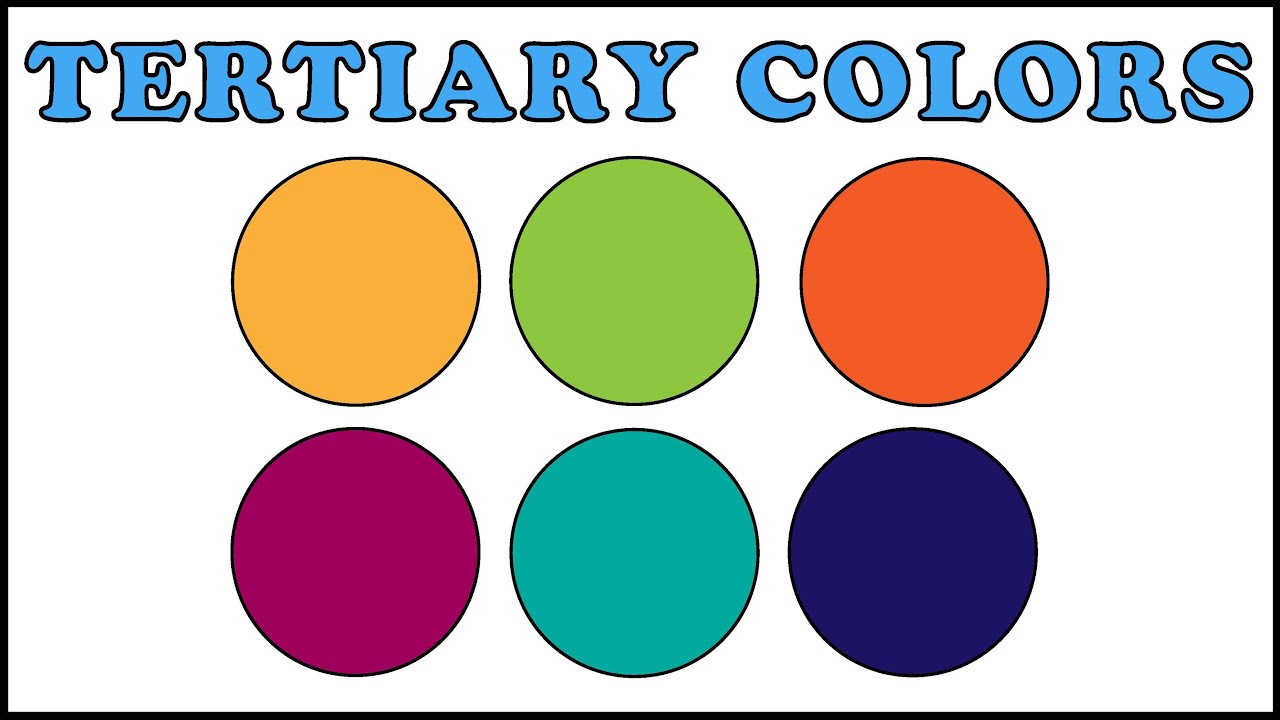
The six tertiary colors in the traditional RYB model are: red-orange, yellow-orange, yellow-green, blue-green, blue-violet, and red-violet.
Naming convention always puts the primary color first. Red-orange, not orange-red. This is standard across art education and design practice, and breaking it tends to confuse people who work with color systems professionally.
Understanding color theory at this level, including where tertiary colors fit, has real practical weight. Research from the Institute for Color Research shows that between 62% and 90% of a person’s initial judgment of a product is based on color alone, formed within the first 90 seconds.
So yes, knowing which colors are which matters beyond art class.
The Color Wheel and Where Tertiary Colors Sit

The standard color wheel used in most art and design education has 12 positions. Six belong to primary and secondary colors. The other six are tertiary colors, each placed exactly between a primary and its neighboring secondary.
That equidistance is the point. It reflects the equal mix ratio: roughly 50% primary, 50% secondary. Shift the ratio and you move toward one parent color, producing a tint or shade rather than a true tertiary.
| Position on Wheel | Color Type | Example |
|---|---|---|
| Between primary and secondary | Tertiary | Red-Orange (between red and orange) |
| Pure primary | Primary | Red, Yellow, Blue |
| Between two primaries | Secondary | Orange (red + yellow) |
The RYB Color Wheel vs. the RGB Color Wheel
These are two different systems with different primary colors, which means their tertiary colors also differ. Mixing up the two is one of the more common mistakes designers make early on.
RYB (subtractive, paint-based): used in traditional art education, physical pigment mixing, and fine arts. Primary colors are red, yellow, and blue.
RGB (additive, light-based): used in screens, monitors, and digital interfaces. Primary colors are red, green, and blue. Mixing all three at full intensity produces white, not black.
The tertiary colors that come out of each model are different because the starting primaries are different. Teal is a tertiary in RYB. In RGB, the equivalent position on the wheel produces a different hue entirely.
Most art students learn RYB first. Most designers eventually need both.
The Six Tertiary Colors in RYB

Each of the six has a common alternate name used in design, branding, and everyday language. Knowing both versions helps when working across disciplines.
| Tertiary Color | Common Name | Mixed From |
|---|---|---|
| Red-Orange | Vermillion | Red + Orange |
| Yellow-Orange | Amber | Yellow + Orange |
| Yellow-Green | Chartreuse | Yellow + Green |
| Blue-Green | Teal | Blue + Green |
| Blue-Violet | Indigo | Blue + Violet |
| Red-Violet | Magenta | Red + Violet |
These are the only “true” tertiary colors in RYB. Any mix of non-adjacent colors produces a muted or neutralized tone, not a tertiary.
Warm vs. Cool Tertiary Colors
Warm side: red-orange, yellow-orange, yellow-green. These sit in the red-to-yellow arc of the wheel and carry visual weight and energy.
Cool side: blue-green, blue-violet, red-violet. These fall in the blue arc and tend to recede visually.
This warm/cool split within tertiary colors is useful when building color palettes. Mixing a warm tertiary with a cool one can create color contrast without going straight to complementary pairs, which can feel harsh in some contexts.
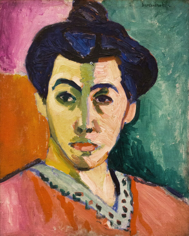
Artists like Paul Cezanne used warm/cool temperature shifts, including tertiary hues, to suggest form and depth without heavy shading.
Tertiary Colors in RGB and CMYK Color Models
Both RGB and CMYK produce their own tertiary colors. They don’t match the RYB set, and that’s not a flaw. Each model has a different purpose and a different set of primary colors to start from.
Tertiary Colors in RGB
In RGB, secondary colors are cyan, magenta, and yellow. Those are the building blocks for RGB tertiary colors.
The six RGB tertiary colors are: rose, orange, chartreuse, spring green, azure, and violet.
Some of these overlap in name with RYB tertiaries (chartreuse, violet), but the exact hue values differ. This matters in digital design. A chartreuse specified in RYB pigment and a chartreuse produced in RGB will not look identical on screen.
Adobe Photoshop and Illustrator both use RGB as their default color space for digital work, so when you are mixing or selecting colors digitally, you are working with RGB tertiary logic, not RYB.
Tertiary Colors in CMYK
CMYK is a subtractive model used in print. Its primaries are cyan, magenta, and yellow (with black added for depth and cost efficiency in printing).
Key difference from RYB: CMYK is more accurate for predicting how printed colors will actually look. RYB is intuitive for hand-mixing paint. Neither is “wrong.” They serve different outputs.
Designers working in print need to convert RGB tertiary values to CMYK equivalents before sending files to press. A teal that looks right on screen can shift noticeably once printed without proper color profile management.
This conversion issue is why tools like color harmony planning needs to happen in the correct color space from the start, not as an afterthought.
How Tertiary Colors Are Mixed

The mixing process is different depending on whether you are working with physical pigment or digital tools. Both follow the same principle (primary plus adjacent secondary), but the execution differs enough that it is worth separating them.
Mixing with Physical Pigment
Start with the primary color as your base. Add the secondary color in small amounts and mix thoroughly before adding more. Ratio matters.
A roughly equal mix gives you the truest tertiary. Going heavier on the primary pulls the result toward the primary end. Heavier on the secondary does the opposite.
One common issue: overmixing or using low-quality pigments will push the result toward brown or gray. This happens because most tube paints carry trace pigments that muddy the mix. Transparent, single-pigment paints reduce this.
Acrylic painting and oil painting both allow tertiary mixing, though oil dries slowly enough that wet-into-wet mixing is easier to control. With acrylics, colors dry slightly darker, which can shift a tertiary result unexpectedly.
Mixing Digitally
In tools like Photoshop or Illustrator, you adjust hue values using the HSB (hue, saturation, brightness) sliders rather than physically blending.
Practical approach: find the hue value of your primary, find the hue value of the adjacent secondary, then pick the midpoint on the hue slider. That midpoint is your tertiary.
For example, red sits at roughly 0 degrees on the HSB hue circle. Orange sits at around 30 degrees. Red-orange lands near 15 degrees. This is digital color mixing at its most direct.
Took me a while to stop guessing at hue sliders and just do the math. It’s faster and more consistent once you start thinking in degrees rather than eyeballing.
Tertiary Colors in Color Harmony and Design
Tertiary colors do something that pure primary and secondary colors often can’t: they give a palette room to breathe. They sit between bold anchor colors and add nuance without turning neutral.
Color influences 85% of purchasing decisions (WebAIM, 2024), and tertiary colors have become increasingly common in branding precisely because they feel less generic than primaries while still reading clearly.
Split-Complementary Schemes Using Tertiary Colors
A split-complementary scheme takes one color and pairs it with the two colors on either side of its complement. When you substitute a primary or secondary with its adjacent tertiary, the pairing becomes noticeably softer.
Red and green is a sharp complementary pair. Red-orange and blue-green is still contrasting, but the tension is lower. This is useful in UI and branding where pure complementary pairings can feel aggressive.
Why designers prefer this:
- Retains contrast without visual harshness
- Works well across light and dark backgrounds
- Gives three distinct hues instead of two
Tools like Adobe Color (formerly Kuler) let you set a split-complementary rule and drag the base hue around the wheel to explore combinations. Coolors does something similar with its locking feature. Both are worth bookmarking if you work with color regularly.
Analogous Schemes with Tertiary Hues
Analogous color schemes use colors that sit next to each other on the wheel. Tertiary colors naturally fill the gaps between primaries and secondaries, making them ideal anchors for these schemes.
A scheme built on yellow-green, green, and blue-green has a cohesive feel. All three are connected, but they’re distinct enough to create visual variety within a composition.
Claude Monet’s garden paintings consistently used analogous groupings that included tertiary greens and blue-greens alongside his secondary hues, which helped unify outdoor scenes without making them feel flat.
In UI design, analogous palettes anchored by tertiary colors tend to score better on user retention. Adobe Creative Cloud data from 10,000 design projects found that teal interfaces retained users 32% longer than average, teal being a blue-green tertiary.
Tertiary Colors in Branding
A signature color increases brand recognition by up to 80%, and many of the most recognizable brand colors are tertiary hues, not primaries.
Tiffany blue (a blue-green tertiary) is trademarked. Starbucks green leans into yellow-green territory. These are deliberate choices based on distinctiveness and psychological associations, not accident.
Tertiary colors work in branding because:
- They are less saturated than pure primaries, which can feel more sophisticated
- They are specific enough to own (no one else’s brand is exactly that shade of red-violet)
- They pair well with neutral backgrounds without competing
Understanding color psychology behind each tertiary hue helps narrow down choices. Red-orange signals energy and appetite. Blue-violet suggests calm and depth. Yellow-green reads as fresh but can tip toward unsettling if oversaturated.
Tertiary Colors vs. Intermediate Colors
These two terms get used interchangeably in classrooms, design blogs, and even some professional settings. That’s fine in casual conversation. But technically, they describe different things.
The core disagreement comes down to which definition of “tertiary” you follow, and two conflicting ones exist in color theory literature.
| Term | Traditional Definition | Modern Usage |
|---|---|---|
| Tertiary | Mix of two secondary colors (Harris, Albers) | Mix of primary + adjacent secondary |
| Intermediate | Mix of primary + adjacent secondary | Often used as synonym for tertiary |
Wikipedia’s entry on secondary color confirms this split: the traditional color theory definition, used by theorists like Moses Harris and Josef Albers, defines tertiary as a mix of two secondaries. The more recent definition (now standard in design education) defines tertiary as primary plus adjacent secondary.
Most working designers never need to resolve this debate. But if you’re reading older color theory texts, including Itten’s The Elements of Color or Albers’ Interaction of Color, knowing the distinction prevents confusion.
Why the Terminology Varies Across Sources
Art education and design education evolved separately. Art teachers in the US traditionally used “intermediate” for the six primary-plus-secondary mixes. Design and digital color courses adopted “tertiary” for the same concept.
In practice: RGB and CMYK color literature uses “tertiary” consistently for primary-plus-secondary mixes. RYB-based art education is the source of most ambiguity.
Adobe’s own color documentation uses tertiary and intermediate as synonyms, which is probably the most widely followed convention at this point.
Which Definition Applies to the 12-Color Wheel
The 12-color wheel everyone learns in school (three primaries, three secondaries, six in-between colors) uses the modern definition.
The six colors between primary and secondary positions on that wheel are called tertiary colors. Full stop. That’s the working definition used in color theory courses, design tools, and most published design guides today.
- Bauhaus curriculum: used RYB model with intermediate terminology
- Modern design schools: largely use “tertiary” for the same colors
- Digital tools (Photoshop, Illustrator, Adobe Color): tertiary throughout
The RYB model underpinned the color curriculum of the Bauhaus and institutions including the IIT Institute of Design, Yale’s Design Department, and Parsons School of Design, according to Wikipedia’s RYB color model entry. Each likely used slightly different terminology depending on era and faculty.
Tertiary Colors in the Munsell and Pantone Systems
Two standardized systems matter most when tertiary colors move from theory into professional practice: Munsell for fine art and manufacturing, Pantone for print, branding, and fashion. Neither maps perfectly to the RYB 12-color wheel, but both cover the same hue territory.
How Munsell Handles Tertiary Hues
Albert Munsell introduced his notation system in 1905 and published the Atlas of the Munsell Color Order System in 1915. His goal was a “rational way to describe color” using alphanumeric notation rather than names he considered inconsistent.
Munsell’s structure: five principal hues (Red, Yellow, Green, Blue, Purple) and five intermediate hues placed between them (Yellow-Red, Green-Yellow, Blue-Green, Purple-Blue, Red-Purple). That gives ten base hues, each subdivided into 10 steps, creating at least 100 definable hues.
The intermediate hues in Munsell (YR, GY, BG, PB, RP) correspond closely to tertiary colors in the RYB model. Yellow-Red maps to yellow-orange and red-orange territory. Blue-Green maps to teal.
Munsell notation adds value (lightness) and chroma (saturation) to the hue designation. So a specific teal in Munsell reads as something like 5BG 5/6, giving hue, lightness, and intensity in one compact code. This makes it far more precise than simply calling something “blue-green.”
The system is used internationally for specifying opaque colors of pigmented surfaces, according to Britannica. That includes paint manufacturing, textile production, and industrial color standards.
Pantone and Tertiary Color Codes
Over 10 million designers use Pantone products and colors for branding and design projects, according to Pantone’s own data. The Pantone Matching System includes 2,161 standardized colors as of 2019, covering the full tertiary range and beyond.
Pantone assigns specific codes to tertiary-range colors used in branding:
- Red-Orange range: Pantone 7417 C, Pantone 1665 C (vermillion territory)
- Yellow-Green range: Pantone 374 C, Pantone 375 C (chartreuse territory)
- Blue-Green range: Pantone 326 C, Pantone 3272 C (teal territory)
- Red-Violet range: Pantone 234 C (magenta territory)
Pantone’s 2023 Color of the Year, Viva Magenta (PANTONE 18-1750), sits squarely in the red-violet tertiary range. Its 2024 selection, Peach Fuzz (PANTONE 13-1023), lands in yellow-orange tertiary territory. Neither year’s choice was a pure primary or secondary.
Using Pantone Connect for Tertiary Color Matching
Pantone Connect is the current tool for identifying Pantone equivalents of any color, including tertiaries. It replaced the older Pantone integration that was removed from Adobe software in 2022 following a licensing dispute.
Practical workflow: identify your tertiary hue in RGB or HSB values, enter them in Pantone Connect, and get the closest Pantone match with its code. That code travels from design brief to printer to manufacturer without color shifting.
This is especially useful for watercolor painting reproductions and fine art prints, where an artist’s specific teal or amber needs to stay consistent across editions and print runs.
Color intensity in color theory, referred to as chroma in Munsell and saturation in digital tools, affects how a tertiary reads in print versus on screen. A high-chroma teal in RGB will almost always need adjustment before it translates cleanly to a Pantone CMYK equivalent. That gap between screen and print is one of the most common problems in design production, and knowing your tertiary colors well is the first step toward managing it.
FAQ on What Are Tertiary Colors
What are tertiary colors?
Tertiary colors are the six hues created by mixing one primary color with an adjacent secondary color on the color wheel. In the RYB model, they are red-orange, yellow-orange, yellow-green, blue-green, blue-violet, and red-violet.
How many tertiary colors are there?
There are six tertiary colors in both the RYB and RGB color models. Each sits between one primary and one secondary color on the 12-color wheel, filling the gaps in the standard color spectrum.
What are the 6 tertiary colors in order?
In the RYB model: red-orange, yellow-orange, yellow-green, blue-green, blue-violet, red-violet. Common alternate names include vermillion, amber, chartreuse, teal, indigo, and magenta.
How are tertiary colors made?
Mix one primary color with its neighboring secondary color in roughly equal parts. The ratio matters. Shifting it toward either parent color moves the result away from a true tertiary hue.
What is the difference between tertiary and secondary colors?
Secondary colors come from mixing two primaries (red + blue = violet). Tertiary colors come from mixing a primary with an adjacent secondary. Secondary colors sit at fixed points on the wheel; tertiary colors fill the spaces between them.
Are tertiary colors the same as intermediate colors?
In most modern usage, yes. Both terms describe the six primary-plus-secondary mixes on the 12-color wheel. Some older color theory texts, including work by Josef Albers, define tertiary differently, as a mix of two secondary colors.
What are tertiary colors in RGB?
In the RGB model, tertiary colors are rose, orange, chartreuse, spring green, azure, and violet. They differ from RYB tertiaries because RGB uses red, green, and blue as primaries rather than red, yellow, and blue.
Why are tertiary colors named with the primary color first?
Convention puts the primary color first in the name, such as red-orange rather than orange-red. This is standard across art education and design practice, making color relationships on the wheel easier to read and communicate consistently.
How are tertiary colors used in design?
They add nuance to analogous color schemes without the harshness of pure complementary pairs. Tertiary hues work well in split-complementary palettes, and many recognizable brand colors, including teal and amber, fall in the tertiary range.
What is the difference between tertiary colors in RYB and CMYK?
RYB tertiary colors are based on red, yellow, and blue primaries used in painting. CMYK uses cyan, magenta, and yellow, producing different tertiary results. Designers working in print need to convert between models to avoid color shifting on press.
Conclusion
This conclusion is for an article presenting tertiary colors as more than a basic color theory concept. They are a practical tool used across painting, digital design, branding, and standardized systems like Munsell and Pantone.
Whether you are working with pigment mixing in oils, building a monochromatic color scheme, or selecting Pantone codes for print, knowing where these six hues sit on the wheel and how they behave changes the quality of your decisions.
The split between RYB, RGB, and CMYK means there is no single universal set of tertiaries. Context determines which model applies.
Get the color mixing ratios right, understand the model you are working in, and tertiary colors become one of the more reliable parts of any color palette.