Some paintings do not show you anything recognizable. And that is exactly why they stick with you.
The most famous abstract paintings changed how we think about art itself. Works by Wassily Kandinsky, Jackson Pollock, and Mark Rothko proved that color, shape, and gesture could carry as much meaning as any portrait or landscape ever did.
But here is the thing. Most people know these paintings exist without really understanding what makes them matter. Why did a black square on a white canvas cause a revolution? How did a 23-year-old woman create a painting that redirected an entire art movement?
This guide breaks down 10 iconic abstract artworks, covering everything from the techniques behind them to where you can see them today, and what they actually sold for. No fluff, just the facts and context you need to appreciate modern abstract art on a deeper level.
Famous Abstract Paintings
Composition VIII by Wassily Kandinsky, 1923

Why This Painting Matters
This is the painting where Kandinsky finally put his theories into practice. After years of writing about how color and shape could carry emotional weight on their own, Composition VIII became the proof.
It marked a hard turn from the wild, emotional canvases of his earlier Compositions toward something more calculated. More geometric. The shift shocked audiences who expected the same apocalyptic energy from Composition VII.
Kandinsky considered it the high point of his postwar career. And Solomon R. Guggenheim agreed, buying it in 1930 during a visit to the Bauhaus. That single purchase helped start one of the world’s most famous art collections.
Visual Breakdown
Circles, triangles, and sharp lines scatter across a cool cream background. A large black circle dominates the upper left corner, serving as a kind of anchor for everything else happening on the canvas.
The geometric elements interact with each other. Triangles cut through circles. Lines create tension against curves. Nothing sits still.
Kandinsky treated composition like musical arrangement. He wanted every shape to function like a note, every color like a key signature. The result feels more like a visual symphony than a static image.
Artist Background
Wassily Kandinsky was born in Moscow in 1866 and trained as a lawyer before abandoning that career for painting at age 30. He co-founded the Blue Rider group in 1911, taught at the Bauhaus from 1922 to 1933, and spent his final years in Paris.
He is widely credited as one of the founders of purely abstract art.
Technique and Medium
Oil on canvas, measuring 140 x 201 cm. Painted during his Bauhaus teaching years, the work reflects the influence of both Suprematism and Constructivism that Kandinsky absorbed in Russia.
Unlike his earlier, more intuitive canvases, this one was methodically planned. Each shape was placed with purpose based on his own written theories about the spiritual properties of geometric forms.
Where to See It
Solomon R. Guggenheim Museum, New York. It was among the very first works Guggenheim purchased for his collection.
Fun Fact
Kandinsky’s obsession with circles started here. After Composition VIII, circles became the dominant motif in his work for years. He once said the circle was “the most modest form, but asserts itself unconditionally.”
Black Square by Kazimir Malevich, 1915

Why This Painting Matters
It is, quite literally, a black square on a white background. And it changed everything.
Malevich called it “the zero point of painting.” He meant it as a total reset. A declaration that art did not need to represent anything from the visible world to be meaningful. That was a radical idea in 1915, and honestly, it still makes people uncomfortable today.
The painting launched the Suprematist movement, which focused entirely on pure geometric form and feeling.
Visual Breakdown
A black square, slightly imperfect, sits centered on a white ground. That is it.
But look closer. The black paint has cracked over time, revealing hints of color underneath. X-ray analysis showed a multi-colored Suprematist composition hidden beneath the black surface. The square is not even perfectly geometric. Its edges are slightly uneven.
These imperfections make it more human than it first appears.
Artist Background
Kazimir Malevich (1879-1935) was born near Kyiv and studied in Moscow. His early work drew from Impressionism, Fauvism, and Cubism before he abandoned representational art entirely.
The Soviet government eventually banned him from making art. He died of cancer in 1935 at age 56, with Black Square displayed at the head of his coffin.
Technique and Medium
Oil on linen canvas, 79.5 x 79.5 cm. Malevich used thick, broad strokes of black oil paint over a previous composition that had not fully dried. He painted four versions total across his lifetime, each slightly different in size and texture.
Where to See It
The 1915 original is at the State Tretyakov Gallery in Moscow. Other versions live at the Russian Museum in St. Petersburg and the State Hermitage Museum.
Current Valuation
The Black Square has never been sold at auction. Experts estimate its value at around $450 million. It remains in Russian state collections and is unlikely to ever hit the market.
Fun Fact
At its first exhibition in December 1915, Malevich hung the painting high across the corner of the room. This was the same position where Russian Orthodox icons would hang in a traditional home. The audience got the message immediately.
Composition with Red, Blue, and Yellow by Piet Mondrian, 1930

Why This Painting Matters
This is probably the painting most people picture when they think of abstract art. Black grid lines. Blocks of primary colors. White space. That is the whole formula.
And yet Piet Mondrian spent decades refining this approach. He called it Neo-Plasticism, and he believed it could express the fundamental structure of reality itself. Not a bad ambition for a 45 x 45 cm canvas.
Visual Breakdown
A grid of thick black lines divides the square canvas into rectangles of different sizes. A large red block fills almost half the painting. A small blue square sits in the lower left corner. An even smaller yellow block occupies the bottom right.
The rest is white. But the white is not empty. It creates tension against the colored areas, making the whole thing feel carefully balanced without being symmetrical. Mondrian was obsessed with asymmetrical balance, and this painting is his clearest statement of it.
Artist Background
Mondrian (1872-1944) started out painting Dutch landscapes. He passed through Cubism and gradually stripped everything down to horizontal lines, vertical lines, and primary colors. He co-founded the De Stijl movement and spent his final years in New York.
Technique and Medium
Oil on canvas, approximately 45 x 45 cm. Mondrian’s technique looks mechanical at first, but up close you can see visible brushstrokes within the white areas. The black lines vary in thickness. Nothing is quite as perfect as it seems, which is actually what makes it feel alive.
Where to See It
Kunsthaus Zurich, Switzerland. It was donated by architect Alfred Roth, who received the painting directly from Mondrian. A personal dedication in French is written on the back.
Fun Fact
Mondrian’s image has been reproduced on everything from dresses to buildings to coffee mugs. The design is so recognizable that a version of it appeared on Yves Saint Laurent’s famous 1965 “Mondrian dress,” which helped turn the painter’s work into a pop culture icon decades after his death.
Convergence by Jackson Pollock, 1952
Why This Painting Matters
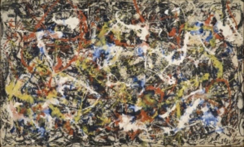
Convergence was supposed to be a black painting. Jackson Pollock had been working almost exclusively in black during 1951-1953, moving away from the colorful drip paintings that made him famous. But this one was not working.
So he started layering color on top. Oranges, yellows, blues, whites, all poured and splattered over the black underpainting. The result was a collision of old and new, like watching an artist argue with himself on canvas.
It became one of the most recognized works of the Abstract Expressionism movement.
Visual Breakdown
The painting is massive. 237.5 x 393.7 cm. You cannot take it in from a single viewpoint.
Skeins of black, white, orange, red, yellow, and blue paint tangle and overlap across the entire surface. There is no focal point. Your eye just keeps moving. If you look carefully, you will find everyday objects embedded in the paint. A match sits near the center. Nails and coins are stuck into the surface.
Artist Background
Pollock (1912-1956) grew up in the American West and studied under Thomas Hart Benton in New York. He developed his drip technique in the late 1940s, placing canvases on the floor and working from all four sides. A 1949 Life Magazine spread made him a household name.
He died in a car crash at age 44.
Technique and Medium
Oil on canvas. Pollock used house paint alongside traditional oils, applying them by dripping, pouring, and splattering from above. He used sticks, hardened brushes, and sometimes his hands. The layered approach created incredible depth and contrast.
Where to See It
Buffalo AKG Art Museum (formerly Albright-Knox Art Gallery), Buffalo, New York. It was purchased in 1956, just five months before Pollock’s death.
Fun Fact
In 1964, Springbok Editions released a 340-piece jigsaw puzzle of Convergence and marketed it as “the world’s most difficult puzzle.” Hundreds of thousands of Americans bought it, which probably did more for Pollock’s fame with the general public than any gallery show ever did.
No. 61 (Rust and Blue) by Mark Rothko, 1953
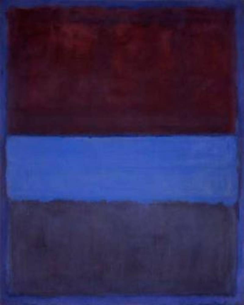
Why This Painting Matters
Mark Rothko wanted his paintings to make people cry. He was not interested in decoration or intellectual games. He wanted a direct emotional hit, the kind you feel before you can even think about what you are looking at.
No. 61 (Rust and Blue) is one of the best examples of that ambition. It represents the peak of Rothko’s color field style, where large rectangles of hue hover on the canvas and seem to pulse with their own light.
Visual Breakdown
Three horizontal bands of color stack on top of each other. A warm rust-brown dominates the top. A luminous blue occupies the middle. A deeper, darker blue-purple sits at the bottom.
The edges between colors are soft and blurred, not sharp. Rothko layered thin washes of oil paint (and possibly egg-based media) to create what he called “inner light.” If you see it in person, the colors genuinely seem to glow from within.
He sometimes inverted the canvas while working, which is why paint appears to flow upward in certain areas.
Artist Background
Born Marcus Rothkowitz in Latvia in 1903, Rothko immigrated to the United States as a child. He worked through many styles before arriving at his signature color field paintings in the late 1940s. He never called himself an abstractionist. He said he was interested only in expressing basic human emotions.
Technique and Medium
Oil on canvas, 292.74 x 233.68 cm. Rothko applied paint in multiple thin layers, building up luminosity gradually. The technique looks simple from a distance but is surprisingly varied up close, with areas of thick and thin paint creating different values and effects.
Where to See It
Museum of Contemporary Art (MOCA), Los Angeles. Part of the Panza Collection.
Current Valuation
No. 61 has not been sold at auction. But for context, Rothko’s “Orange, Red, Yellow” sold for $86.9 million in 2012. His major works consistently rank among the most expensive paintings in the world.
Fun Fact
Rothko insisted his paintings be hung in dimly lit rooms with low ceilings. He wanted viewers to feel surrounded and absorbed by the color. Bright museum lighting, in his view, destroyed the whole experience.
Interchange by Willem de Kooning, 1955

Why This Painting Matters
Interchange holds the record as the most expensive abstract painting ever sold. $300 million. In a private sale. In 2015.
But the money is almost beside the point. This painting marked the exact moment Willem de Kooning pivoted from painting women (his famous “Woman” series) to abstract urban landscapes. You can still see the ghost of a seated female figure in the fleshy pink mass at the center. The old subject matter is there, but it is dissolving into something new.
Visual Breakdown
Bold, gestural marks in pinks, yellows, greens, and whites crash across the 200.7 x 175.3 cm canvas. The brushwork is fast and aggressive, influenced by fellow artist Franz Kline, who pushed de Kooning toward quicker, more decisive marks.
There is a sense of movement and energy that feels almost physical. Standing in front of it, you can practically feel the speed of the artist’s hand.
Artist Background
De Kooning (1904-1997) was born in Rotterdam and came to the United States illegally as a stowaway in 1926. He became a central figure in the New York School alongside Pollock, Rothko, and Franz Kline. He kept painting into his eighties, even after being diagnosed with Alzheimer’s disease.
Technique and Medium
Oil on canvas. De Kooning used quick gestural marks and violent brushstrokes to build up layers of color and form. The paint is thick in some areas and scraped thin in others, creating a surface that shifts between flatness and depth.
Where to See It
Currently on loan at the Art Institute of Chicago. The painting is owned by hedge fund manager Kenneth C. Griffin, who bought it from the David Geffen Foundation.
Current Valuation
$300 million (September 2015 private sale). Griffin purchased it as part of a $500 million package that included Jackson Pollock’s Number 17A. For reference, de Kooning originally sold Interchange in 1955 for $4,000.
Fun Fact
The painting is named after the neighborhood in New York where de Kooning lived. He often named his works after local landmarks and streets, treating his titles like personal diary entries.
Mountains and Sea by Helen Frankenthaler, 1952

Why This Painting Matters
Helen Frankenthaler was 23 years old when she made this painting. It introduced the “soak-stain” technique to the art world and, in doing so, became the bridge between Abstract Expressionism and the Color Field movement that followed.
Fellow painter Morris Louis saw Mountains and Sea and reportedly said it was “a bridge between Pollock and what was possible.” That is one of the most famous quotes in modern art history, and it was about a painting made by a 23-year-old.
Visual Breakdown
Translucent pools of blue, green, pink, and red float across the 220 x 297.8 cm unprimed canvas. Charcoal lines provide loose structure. Large areas of bare canvas are left exposed.
The painting suggests a landscape. You can read the blue as water, the green as a rocky shoreline. But it is not a landscape. It is the memory of one, filtered through pure color and gesture. Frankenthaler painted it after visiting Cape Breton, Nova Scotia.
Artist Background
Frankenthaler (1928-2011) was born in Manhattan, studied at Bennington College, and became part of the New York art scene through her relationship with critic Clement Greenberg. Her career spanned six decades, and she influenced generations of painters, including Morris Louis and Kenneth Noland.
Technique and Medium
Oil and charcoal on unprimed canvas. This is the key detail. By thinning her oil paint with turpentine and pouring it onto raw, unprimed canvas laid on the floor, Frankenthaler allowed the pigment to soak directly into the cotton fibers. The paint became part of the canvas instead of sitting on top of it.
This created a luminous, almost watercolor-like quality at a massive scale.
Where to See It
National Gallery of Art, Washington, D.C. On extended loan from the Helen Frankenthaler Foundation.
Fun Fact
Frankenthaler painted Mountains and Sea on October 26, 1952, just nine days before that year’s presidential election. She signed it neatly in the lower right corner with the date, something she did not always do. She later said she was “aware I’d made something new and shouldn’t fool with it one bit further.”
Black in Deep Red by Mark Rothko, 1957
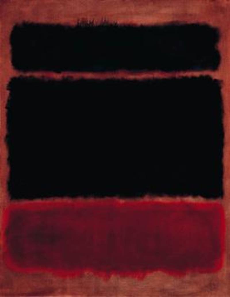
Why This Painting Matters
While No. 61 shows Rothko at his most luminous, Black in Deep Red reveals his darker side. By the late 1950s, Rothko was moving away from bright colors toward darker, more somber palettes. This painting sits right at that turning point.
It is one of the works that set the stage for his later chapel paintings and the Seagram Murals, which became some of the most emotionally intense abstract works ever made.
Visual Breakdown
Two large rectangles float against a deep red background. The upper rectangle is solid black. The lower one is a slightly lighter dark tone.
The boundaries between the rectangles and the background are soft, almost breathing. The color contrast between the black and the red creates an almost oppressive weight that a lot of viewers find deeply moving.
Technique and Medium
Oil on canvas. Same layered approach as his other works, but the palette is deliberately restricted. Rothko built up multiple thin layers to make the dark areas feel rich rather than flat.
Where to See It
Various versions of Rothko’s dark-period works are held across major museums. Rothko’s work from this period appears frequently at auction and in traveling exhibitions.
Fun Fact
Rothko famously turned down a lucrative commission for the Four Seasons restaurant in New York after eating there and deciding the space was too pretentious for his paintings. He returned the advance and kept the canvases.
Bleu II by Joan Miro, 1961
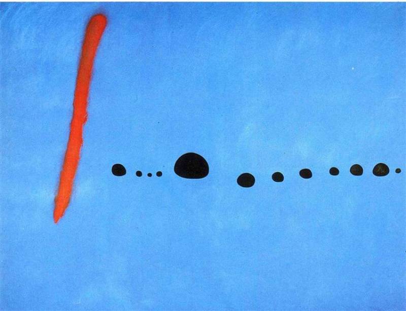
Why This Painting Matters
Bleu II is the centerpiece of a three-part triptych. Joan Miro completed all three Bleu paintings on March 8, 1961, and considered them a summary of his entire career up to that point.
The triptych sits at the crossroads between Surrealism, Minimalism, and Lyrical Abstraction. Which is a tricky thing to pull off in a single painting.
Visual Breakdown
A vast field of intense blue fills the entire canvas (each panel measures 355 x 270 cm). A vertical red slash cuts through the left side. A trail of small black dots marches horizontally across the middle.
That is all. The simplicity is the point. Miro once said the spectacle of the sky overwhelmed him, that empty spaces and bare horizons had always impressed him deeply. Bleu II is his most direct expression of that feeling.
Artist Background
Joan Miro (1893-1983) was born in Barcelona and spent decades moving between Spain and Paris. He passed through Fauvism, Cubism, and Surrealism before arriving at his own highly personal abstract vocabulary. Andre Breton called him “the most Surrealist of us all,” though Miro rejected that label.
Technique and Medium
Oil on canvas, 355 x 270 cm per panel. Miro applied the blue paint in broad, carefully layered washes, sometimes thinning it with water to create soft effects at the edges. The black dots were placed with intention but made to look spontaneous, a trick Miro had perfected over decades.
Where to See It
Musee National d’Art Moderne, Centre Pompidou, Paris. All three panels of the triptych are displayed together.
Fun Fact
Miro claimed he let his hand wander freely while painting, reaching into his subconscious rather than planning each mark. Whether that is entirely true is debatable. But the organic quality of those little black dots does feel like it came from somewhere beyond conscious decision-making.
Homage to the Square by Josef Albers, 1950-1976 Series

Why This Painting Matters
Josef Albers started this series when he was 62 years old and kept going for 25 years. Over that time, he produced more than 1,000 paintings, prints, and drawings. All of them explore the same basic idea: nested squares of color and how those colors change each other.
It sounds repetitive. And it is, on purpose. Albers believed “there is no end to color” and wanted to prove it through systematic variation. The series directly influenced Op Art, Minimalism, and hard-edge abstraction.
Visual Breakdown
Three or four squares of different colors are nested inside each other. The squares are precisely positioned at a ratio of 1:2:3 for the spacing between the bottom, sides, and top edges.
Depending on the color combinations, the inner squares may appear to push forward or recede into the background. Some versions feel warm and inviting. Others feel claustrophobic. All of this is achieved purely through color relationships.
Artist Background
Albers (1888-1976) was born in Germany and studied at the Bauhaus, eventually joining its faculty. After the Nazis closed the school in 1933, he emigrated to the United States and taught at Black Mountain College and later Yale University. His students included Robert Rauschenberg, Kenneth Noland, and Ellsworth Kelly.
Technique and Medium
Oil on Masonite board (always the rough side). Albers applied unmixed paint directly from the tube using a palette knife. He never mixed colors on a palette and always noted the exact brand and color name on the back of each panel.
He controlled his studio lighting with precise fluorescent arrangements and always started with the center square, working outward.
Where to See It
Versions of the series are held at the Whitney Museum of American Art, the Guggenheim, the Brooklyn Museum, the Metropolitan Museum of Art, and dozens of other institutions worldwide. One even appeared on a 1980 United States postage stamp.
Fun Fact
Albers published his famous book Interaction of Color in 1963, drawing heavily on lessons learned from the Homage series. The book argued that color is “the most relative medium in art” and that no color is ever seen as it physically is. It remains required reading in art and design schools today.
FAQ on Famous Abstract Paintings
What is the most famous abstract painting ever made?
Most art historians point to Wassily Kandinsky’s Composition VIII (1923) or Kazimir Malevich’s Black Square (1915) as the most recognized. Both works helped define what abstract art could be and remain iconic in museum collections worldwide.
What makes a painting abstract?
Abstract paintings do not represent recognizable objects. Instead, they use color, shape, line, and form to communicate ideas or emotions. The focus is on visual elements rather than depicting reality.
Who is considered the father of abstract art?
Wassily Kandinsky is widely credited as the founder. His 1910 untitled watercolor is often cited as the first purely abstract artwork. Though Hilma af Klint’s earlier work has challenged that timeline in recent years.
Why are abstract paintings so expensive?
Rarity, art historical significance, and collector demand drive the prices. Willem de Kooning’s Interchange sold for $300 million in 2015. Auction records for artists like Rothko and Pollock regularly reach eight figures.
What is the difference between abstract art and abstract expressionism?
Abstract art is a broad category covering any non-representational work. Abstract Expressionism is a specific mid-20th century American movement. Artists like Pollock and Rothko used spontaneous, emotional techniques on large-scale canvases.
What are the main types of abstract painting styles?
The major categories include geometric abstraction (Mondrian), color field painting (Rothko), action painting (Pollock), Suprematism (Malevich), and lyrical abstraction (Frankenthaler). Each approach handles color and form differently.
Where can I see famous abstract paintings in person?
Top destinations include the Guggenheim Museum and MoMA in New York, the Centre Pompidou in Paris, Tate Modern in London, and MOCA in Los Angeles. Most major art museums hold significant abstract collections.
What materials do abstract painters use?
Most famous abstract works use oil on canvas. Some artists experimented with house paint, enamel, charcoal, and egg-based media. Josef Albers painted on Masonite boards. Frankenthaler poured thinned oils onto unprimed canvas.
Can anyone create abstract art?
Anyone can start. But the famous abstract painters spent years studying color theory, composition, and art history before arriving at their styles. Pollock trained under Thomas Hart Benton. Albers studied at the Bauhaus. Simplicity in abstract art is usually hard-earned.
Is abstract art still relevant today?
Absolutely. Contemporary abstract artists continue to build on the foundations laid by Kandinsky, Mondrian, and Rothko. Abstract works dominate major art auctions and gallery exhibitions. The movement’s influence extends into design, architecture, and digital media.
Conclusion
These famous abstract paintings did more than hang on gallery walls. They redefined what art could be, from Malevich’s radical Black Square to Frankenthaler’s soak-stain breakthrough at just 23 years old.
Each work pushed boundaries in its own way. Mondrian stripped painting down to primary colors and grid lines. Pollock turned the canvas into a physical arena. Rothko made color feel like emotion you could walk into.
What connects them all is a refusal to play it safe. These artists abandoned representation, risked public rejection, and trusted that pure form and color could speak for themselves.
Whether you are visiting the Guggenheim Museum in New York or the Centre Pompidou in Paris, seeing these works in person changes the experience entirely. No reproduction captures what happens when you stand in front of a Rothko or a Pollock at full scale.
The abstract art movement is not a closed chapter. It is still unfolding.