

Run your eyes across a Van Gogh painting and you can almost feel the paint under your fingertips. That pull, that urge to reach out and touch the surface, is texture doing its job.
So what is texture in art? It’s one of the seven elements of art, covering everything from the physical roughness of impasto oil paint to the smooth illusion of satin in a Dutch Golden Age portrait. Texture shapes how we experience a painting, sculpture, or drawing before we even register the subject.
This guide breaks down the types of texture, how artists across different painting styles and mediums use it, why it triggers specific emotional responses, and how you can start building texture skills in your own work.
What Is Texture in Art

Texture in art is the surface quality of an artwork, either how it actually feels to the touch or how it appears to feel when you look at it.
It sits alongside line, shape, form, color, value, and space in visual art as one of the seven elements of art. Every visual arts curriculum in the world teaches these seven building blocks, and texture is the one most people forget until they stand in front of a painting and realize they want to reach out and touch it.
The NCES School Pulse Panel survey from November 2024 found that 82% of U.S. public schools offer standalone visual arts classes. Inside those classrooms, texture gets taught through hands-on exercises. Stippling, cross-hatching, collage, impasto. Kids learn it early because it bridges two things at once: what you see and what you feel.
But texture does more than check a box in art fundamentals. It carries emotional weight. A rough, gritty surface says something completely different than a smooth, polished one. And that gap between tactile reality and visual illusion is where texture gets genuinely interesting.
The Art of Education University’s 2023 survey reported that 90% of art teachers felt most comfortable with two-dimensional mediums like painting and drawing, yet they craved more content on three-dimensional work. Texture lives right at that crossover point. It pushes flat surfaces toward the physical. It makes a painting feel like a sculpture and a drawing feel like something you could run your fingers across.
At its core, texture is a decision. Every mark an artist makes, every material they choose, every tool they pick up creates a surface quality that viewers respond to. Whether that response is conscious or not.
Actual Texture vs. Visual Texture

Two categories. That’s the split. Every texture in every artwork falls into one of two groups: actual texture (the surface you can physically touch) or visual texture (the illusion of a surface on a flat plane).
Getting these two straight matters more than most people think.
Actual Texture
Physical, tactile, real. You touch an oil painting built with thick impasto strokes and you feel ridges under your fingertips. You run your hand across a woven textile and the fibers catch your skin. That’s actual texture.
It shows up most obviously in sculpture and mixed media. But even a watercolor on cold press paper has actual texture from the tooth of the paper surface.
The 2025 Art Market Report from Art Basel and UBS noted that paintings remained the most purchased medium among high-net-worth collectors. But the market also showed growing collector interest in sculpture and textile work, with experts predicting continued growth in three-dimensional art as buyers seek tactile, physically present pieces.
Invaluable’s 2025 report on artistic mediums confirmed this shift. Both contemporary artists and collectors have invested renewed attention in surface and texture, drawn to works where the artist’s hand is visible one mark at a time.
Visual Texture
Visual texture is a trick. A good one.
The artist creates the appearance of a surface on a completely flat plane. A photorealism painting of weathered wood looks rough. You could swear you’d get a splinter. But touch the canvas and it’s smooth.
Two subtypes sit inside visual texture:
- Simulated texture imitates a real surface. Painting wood grain to look like actual wood. Rendering fabric folds so convincingly you forget it’s paint on canvas.
- Invented texture creates patterns or marks that don’t copy any real material. Think decorative patterns in an illustration, or the stippled backgrounds in a graphic novel panel. They add surface interest without pretending to be anything specific.
Johannes Vermeer was a master of simulated texture. The way he painted satin, bread crusts, and pearl surfaces in 17th-century Dutch interiors is still studied today. Hyperrealism artists push this even further, rendering surfaces so precisely that photographs and paintings become nearly indistinguishable.
| Type | What It Is | Technical Strategy | Where You See It |
| Actual Texture | Physical Surface: A 3D quality you can physically feel. | Building up material (Impasto) or using physical elements. | Sculpture, thick oil painting, collage, ceramics. |
| Simulated Texture | Visual Illusion: A 2D surface that looks like a 3D material. | Precise control of Value and Specular Highlights (shines). | Photorealism, trompe-l’oeil, detailed charcoal drawing. |
| Invented Texture | Abstract Pattern: A non-representational surface created by repetition. | Using marks, dots, or lines to create a “rhythm” or “feel.” | Illustration, graphic design, abstract expressionism. |
Texture in Painting

Painting is where texture gets the most range. A single canvas can go from glassy smooth to inches-thick impasto within the same composition. The painting medium matters. The tool matters. The artist’s hand pressure, speed, and intent all leave traces on the surface.
And those traces are the texture.
How Different Mediums Create Different Textures
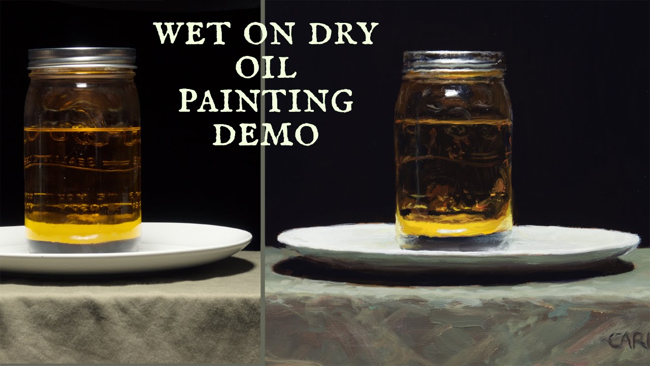
Oil paint is the traditional heavyweight for texture work. It dries slowly, holds its shape when applied thickly, and accepts both smooth glazing and heavy impasto equally well. Vincent van Gogh used oil paint’s thick consistency to build surfaces that still cast tiny shadows more than a century later.
A ScienceDirect study on Van Gogh’s white paints found he deliberately used both zinc white and lead white in the same painting because zinc white allowed higher impasto ridges at the same oil content. That’s how specific his texture decisions were.
Acrylic paint dries fast and flat on its own. But add heavy body gel medium or modeling paste, and you can build surfaces that rival oil. The tradeoff? Less working time before it sets.
Watercolor creates texture differently. The paint sinks into paper fibers, and the paper’s own tooth (rough, cold press, hot press) becomes part of the finished surface. Granulating pigments settle into the paper’s valleys, producing a speckled, organic quality you can’t really get any other way.
How Brushwork Creates Texture

Brush type, pressure, direction, and speed. Four variables that determine what the surface looks like.
A stiff hog bristle flat brush loaded with thick paint leaves ridged, parallel grooves. A soft sable round brush with thinned paint leaves almost no trace at all. Same colors, completely different textures.
Rembrandt van Rijn layered his paint strategically. Smooth, blended areas in the backgrounds. Thick, textured impasto on jewelry, facial highlights, and fabric folds where light caught the surface. Britannica notes that this use of impasto came into its own during the 17th century with Baroque painters like Rembrandt and Diego Velazquez, who used it to represent the sparkle of armor and rich fabrics.
Claude Monet took a different approach. Short, broken strokes of color placed side by side. Each stroke visible. The texture of an Impressionist painting is built from thousands of individual marks that only cohere when you step back. Up close, it’s pure texture.
The Palette Knife and Texture Additives
Sometimes brushes aren’t enough.
A palette knife spreads paint in flat planes, scrapes it back to reveal layers underneath, and creates sharp edges that no brush can match. The difference between palette knife and brush painting is mostly about texture control. Knives give you broader, flatter, more architectural surfaces.
Then there are the additives. Gel mediums, modeling paste, sand, glass beads, pumice. These get mixed directly into paint or applied to the surface before painting.
- Heavy gel medium: thickens acrylic paint while keeping transparency
- Modeling paste: builds opaque, sculptural surfaces you can carve into
- Pumice gel: adds gritty, sandpaper-like tooth for pastel or charcoal over acrylic
If you want a deeper walkthrough, see this guide on how to create texture in painting.
Texture in Sculpture and Three-Dimensional Art
Sculpture is where texture becomes fully physical. There is no illusion. What you see is what you’d feel if you could touch it. The material itself dictates the starting texture, and the artist’s decisions either preserve it or transform it completely.
Material Choice as the First Texture Decision
Marble has a crystalline grain. Bronze, when cast, picks up every fingerprint left in the wax original. Clay holds thumbprints and tool marks. Wood carries its own grain pattern before the sculptor even picks up a chisel.
Every material has a default texture. The artist either works with it or fights against it.
Auguste Rodin left visible tool marks and rough, unfinished patches on many of his bronzes. He treated texture as part of the expression, not something to polish away. The Gates of Hell is covered in surfaces that shift between smooth flesh and raw, clumpy bronze.
Louise Nevelson went the opposite direction in one sense but achieved a similar textural richness. She assembled found wooden objects (furniture legs, architectural fragments, boxes) into monumental wall sculptures, then painted everything a single color. The unity of color forced your eye to focus entirely on the texture and form of the assembled pieces.
Surface Finishing Techniques

Polishing: takes marble or metal from rough to mirror-smooth. Anish Kapoor‘s stainless steel sculptures are polished to such a high finish that the texture essentially disappears, replaced by reflections of the viewer and surroundings.
Patination: chemical treatment of metal surfaces that adds color and subtle texture changes. Green patina on bronze, dark oxide finishes, verdigris. These aren’t just decorative. They change how light interacts with the surface.
Carving and incising: removes material to create grooves, lines, and recessed patterns that catch shadow. The deeper the cut, the more dramatic the texture reads at a distance.
El Anatsui creates massive wall hangings from thousands of flattened aluminum bottle caps stitched together with copper wire. The resulting surface shimmers, ripples, and folds like fabric, but it’s entirely metal. The texture is both actual (you could touch every individual cap) and visual (the overall effect reads as flowing cloth from a distance).
Texture in Drawing and Printmaking

Drawing might seem like the flattest art form. Graphite on paper. Ink on paper. But texture in drawing comes from mark-making, and mark-making has more variety than most people realize.
Mark-Making Techniques for Texture
| Technique | How It Works | Technical Logic | Texture Effect |
| Cross-hatching | Overlapping sets of parallel lines at different angles. | Building density through layering; the more layers, the deeper the shadow. | Dense, Woven, Controlled: Feels structural and rigid. |
| Stippling | Creating an image through clusters of thousands of small dots. | Uses optical mixing; the brain blends the dots into smooth gradients. | Granular & Soft: Can achieve photographic realism and delicate transitions. |
| Scumbling | Loose, irregular, circular “scribbling” motions. | Breaks up the surface with randomness, mimicking organic chaos. | Rough & Atmospheric: Best for clouds, foliage, or weathered stone. |
| Contour Hatching | Parallel lines that follow the physical “wrap” of the object. | Uses perspective within the stroke to define the Z-axis (depth). | 3D & Sculptural: Immediately turns a 2D circle into a 3D sphere. |
Each of these creates a different visual texture on the same flat sheet of paper. And they can be combined. Cross-hatching in the shadows, stippling in the midtones, smooth blending in the highlights. A single drawing can contain five or six distinct textures.
Albrecht Durer‘s engravings are still some of the best examples of textural range in a single image. Fur, metal, skin, fabric, and stone, all rendered with different line densities and patterns using only black ink on white paper.
How Drawing Materials Affect Texture

Graphite can go from silky smooth (6B on hot press) to rough and grainy (2H on cold press). Pencil hardness and paper surface texture interact constantly.
Charcoal grabs the paper’s tooth and sits on the peaks of the grain. It naturally creates a broken, textured mark that graphite won’t produce. Vine charcoal is softer and dustier. Compressed charcoal is darker and more controllable.
Ink with a dip pen gives sharp, clean lines. Ink with a dry brush gives ragged, broken strokes. Same medium, completely different textures based on the tool.
Printmaking and Texture
Printmaking deserves its own mention because the process itself creates texture that’s impossible to get any other way.
Woodcut: the grain of the wood block transfers into the print. Knots, growth rings, and fiber direction all become part of the image. Some printmakers deliberately choose rough wood for this reason.
Etching: acid bites into a metal plate wherever the ground has been scratched away. The resulting grooves hold ink, and the printed lines have a soft, slightly fuzzy edge that’s distinct from any drawn line.
Collagraph: the artist builds a textured plate from cardboard, fabric, string, leaves, or basically anything glueable. The plate itself becomes a texture map. This technique produces prints with surfaces so varied they can look like paintings.
Texture in Digital Art and Photography

Digital art has no physical surface. Your screen is glass. The image is pixels. So how does texture work when there’s nothing to touch?
It works as visual texture. All of it. And digital artists have become extremely good at faking the real thing.
Digital Tools for Texture
Procreate ships with over 200 brushes, many of them specifically designed to simulate traditional media textures. Charcoal, oil paint, watercolor bleed, spray paint spatter. Adobe Photoshop offers custom brush engines where you can build any texture pattern from scratch.
The Art of Education University’s 2024 survey data found that only 24% of art teachers listed digital art as the medium they’re most comfortable with, even though more than half want to learn more about it. That comfort gap shows how much the conversation about texture still defaults to physical materials.
But digital texture overlay is a standard technique now in illustration, concept art, and graphic design. Artists layer noise, grain, paper textures, and brush effects onto clean digital work to give it a handmade feel.
Photographic Texture
Lighting is everything. Side lighting across a surface reveals every bump and groove. Front lighting flattens it out. Photographers who shoot textured subjects (weathered walls, bark, fabric, stone) know that the angle of light determines whether the texture reads or disappears.
Macro photography pushes texture to the extreme. Surfaces that look smooth to the naked eye become landscapes of ridges and valleys at 5x magnification.
And then there’s deliberate grain. Film photographers chose specific stocks for their grain quality. Digital photographers add noise in post-processing to get the same effect. It’s invented texture applied to photography, and it changes the mood of an image significantly.
The Tension Between Digital and Physical
Here’s where it gets interesting. The art market data tells a clear story about texture’s role in collecting decisions.
The Art Basel and UBS 2025 report showed global art sales reached $57.5 billion in 2024, with paintings remaining the most purchased medium. Online sales held steady at 18% of total sales, but the report noted a growing collector appetite for physically present work.
Wealthspire’s 2025 collecting trends analysis quoted CoCollect founder Keli Hogsett: artworks with deep texture are trending because they communicate originality and humanity in a way that screens cannot. Physical mediums are gaining appeal as a counter-response to digital saturation.
The market favors tangible mediums right now. Sculpture, heavy impasto painting, and textile art are outperforming ephemeral installations, according to ArtRewards’ 2025 market analysis. 68% of millennial collectors prefer art they can physically touch and display, per Art Basel 2024 data.
Digital art is growing (51% of high-net-worth collectors have purchased at least one digital work), but the pull toward texture, toward surfaces you can actually feel, is getting stronger, not weaker.
How Artists Use Texture to Create Mood and Meaning

Texture does more than describe a surface. It tells viewers how to feel.
Research published in Proceedings of the IEEE (2023) found that visual qualities like color, texture, and shape dominate initial perceptual responses to images, and that angular, complex textures tend to trigger negative emotional reactions while smooth, simple surfaces trigger positive ones. Artists have been using this principle for centuries, whether or not they had the science to back it up.
Rough Texture and Emotional Intensity
Heavy, rough surfaces communicate rawness, energy, and unease. Thick impasto, cracked paint, embedded materials. These surfaces feel urgent.
Anselm Kiefer is the clearest example. He builds paintings from lead, straw, ash, dried flowers, and concrete, creating surfaces with what the Thaddaeus Ropac gallery describes as “a sedimentary geological texture.” Kiefer has said lead is the only material heavy enough to carry the weight of human history. His surfaces don’t just illustrate history. They physically embody it.
Jackson Pollock‘s drip paintings are another case. The layered, tangled texture of enamel and house paint flung onto raw canvas creates a frantic, all-over energy. The surface looks like controlled chaos because it is.
Smooth Texture and Restraint

Smooth surfaces signal something different: calm, precision, control. Sometimes detachment.
Mark Rothko painted thin, layered washes of color with almost no visible brushwork. The surfaces are soft, blurred at the edges, and nearly textureless. That deliberate smoothness is part of what makes his paintings feel meditative rather than aggressive.
A 2025 study in Biological Psychology confirmed that artistic training affects how people perceive and respond emotionally to visual qualities like brightness and surface treatment. Trained artists showed different physiological responses than non-artists when evaluating visual surfaces.
Texture Contrast as a Compositional Tool
The real power is in the contrast.
Placing rough next to smooth forces the viewer’s eye to move between the two. It creates a focal point where the texture change happens. Rembrandt understood this completely. His backgrounds are smooth and dark. His highlights (jewelry, lace, skin catching the light) are built up in thick impasto. The contrast is what makes those lit areas feel alive.
| Texture Quality | Emotional Association | Technical Logic | Artist Example |
| Heavy, Rough, Layered | Intensity & Rawness: Feels tactile, visceral, and historically “burdened.” | Uses high-viscosity paint and “impasto” to create physical weight. | Anselm Kiefer, Willem de Kooning |
| Smooth, Blended, Flat | Calm & Detachment: Suggests perfection, the infinite, or a “machine-like” finish. | Eliminates brushstrokes to focus on pure color and light. | Mark Rothko, Agnes Martin |
| Broken & Fractured | Movement & Vibrancy: The eye must “mix” the marks, creating a shimmering energy. | Utilizes “optical mixing” through small, unblended touches of color. | Claude Monet, Georges Seurat |
| Mixed (Rough vs. Smooth) | Tension & Drama: Uses contrast to pull the viewer’s eye toward specific areas. | Juxtaposes thick “highlights” against smooth, thin “shadows.” | Rembrandt, Caravaggio |
Willem de Kooning‘s paintings swing between thick, violent brushwork and passages of thin, almost translucent paint. That constant textural shifting is part of what makes abstract expressionism feel so physically alive.
Texture as an Element of Design Beyond Fine Art

Texture doesn’t stay inside the gallery. It shows up everywhere people make visual decisions, from packaging to websites to the tile in your kitchen.
Texture in Graphic Design
Paper grain, noise overlays, embossed lettering. Graphic designers use texture to give flat compositions a physical presence that plain vectors can’t achieve.
The 2024 design trend reports from Figma and other sources noted that brutalism (a style built on grain and raw textural effects) became increasingly popular in web and print design. Torn paper textures, collage-style layouts, and rough hand-drawn elements are all being used to push back against the clean, sterile look of typical corporate design.
Packaging design leans on texture heavily. The paper stock, the coating (matte, glossy, soft-touch), and any embossing or debossing all communicate brand identity before anyone reads a single word.
Texture in Interior Design and Architecture
A 2024 study in the International Journal of Science and Research Archive explored how textures combined with color psychology influence people’s emotional states in interior spaces. The findings confirmed what designers already know: natural textures like wood grain and stone create feelings of warmth, while polished metal and glass communicate modernity.
- Exposed brick adds roughness and historical character
- Smooth plaster walls feel clean and minimal
- Woven textiles (rugs, upholstery, curtains) add warmth and acoustic softness
Architecture uses texture at a structural level. Concrete’s raw finish, the pattern of brickwork, the grain of timber cladding. These are all texture decisions that affect how a building feels, not just how it looks.
Texture in Web and UI Design
The history of digital interface design is basically a texture argument.
In the early 2010s, skeuomorphism ruled. Apple’s iOS interfaces mimicked real-world textures: leather-bound calendars, linen backgrounds, glossy buttons that looked like actual buttons. Nielsen Norman Group notes that this approach made digital interfaces feel familiar to first-time smartphone users.
Then flat design killed the texture. Apple’s iOS 7 stripped everything back to clean vectors and solid colors. Minimalism won.
But texture keeps creeping back. Neumorphism reintroduced soft shadows. Glassmorphism added frosted-glass effects. And with AR/VR expanding (Figma’s 2025 AI report noted 51% of designers on the platform were building AI agents), skeuomorphic textures are returning because immersive interfaces need surfaces that feel real to be usable.
Textile and Fashion Design
In fashion, texture literally is the product. The drape of silk versus the stiffness of denim. The nap of velvet versus the flat weave of cotton canvas. These are tactile texture decisions that determine how clothing looks, moves, and feels against skin.
The 2024 study published in Textile Research Journal modeled how fabric textures trigger different emotions depending on whether you see the fabric or touch it. Visual perception alone made pile fabrics that look warm trigger positive emotions. When touch was added, the sensation of skin contact shifted the emotional response entirely.
How to Practice and Study Texture

Understanding texture intellectually is one thing. Getting it into your hands takes practice. The kind where you’re not afraid to make a mess.
Hands-On Exercises for Building Texture Skills
Texture rubbings: tape paper over any surface (coins, bark, bricks, fabric) and rub graphite or crayon across it. Simple. But it trains your eye to notice surface quality everywhere.
Collage work: cut and layer different materials (sandpaper, tissue paper, foil, fabric scraps, magazine pages) onto a single surface. The point isn’t to make something pretty. It’s to feel how different textures interact side by side.
If you’re working with paint, try applying layers with unconventional tools. Sponges, credit cards, crumpled plastic wrap, old toothbrushes. Bob Ross built an entire career partly on the texture effects he could get from a fan brush and a palette knife.
Building a Texture Reference Library
Art of Education University’s 2023 survey found that 90% of art teachers are most comfortable with two-dimensional mediums. But texture understanding requires paying attention to three-dimensional surfaces constantly.
- Photograph interesting surfaces everywhere you go (peeling paint, corroded metal, tree bark, concrete walls)
- Collect physical samples in a binder or box: fabric swatches, paper types, pressed leaves
- Visit museums specifically to look at surface quality, not just subject matter
The November 2024 NCES School Pulse Panel survey found that 93% of U.S. public schools offer at least one standalone arts class. If you’re studying texture in a classroom setting, ask your instructor about tactile exercises, not just visual ones.
Common Texture Mistakes

Uniform texture across the entire surface. This is the most common one. If everything has the same level of texture, nothing stands out. Texture needs variety the same way color needs range.
Ignoring the support material is another miss. The surface you paint on has its own texture that affects everything you layer on top of it. A smooth gesso-primed panel and a rough linen canvas will produce completely different results with the same paint and the same brush.
And then there’s over-blending. Took me years to stop smoothing everything out. Sometimes the most interesting texture comes from leaving a mark alone. Not every stroke needs to be polished. Paul Cezanne left patches of bare canvas showing between his color blocks, and those gaps became part of his signature texture.
Look, texture isn’t complicated. But it does ask you to pay attention to something most people walk past every day: the surface of things. Start touching, start noticing, and your work changes fast.
FAQ on What Is Texture In Art
What is texture in art?
Texture in art refers to the surface quality of an artwork, either how it physically feels or how it appears to feel visually. It is one of the seven elements of art, alongside line, shape, form, color, value, and space.
What are the main types of texture in art?
The main types are actual texture (real, tactile surfaces you can touch) and visual texture (the illusion of a surface on a flat plane). Visual texture splits further into simulated texture and invented texture.
What is the difference between actual and visual texture?
Actual texture exists physically. You feel it. Visual texture is an illusion created through mark-making, shading, or rendering techniques. A thick impasto painting has actual texture. A realism painting of rough stone has visual texture.
How do artists create texture in paintings?
Through brushwork, palette knife application, and texture additives like gel medium or modeling paste. The type of paint, brush shape, application pressure, and surface all affect the final texture.
Why is texture important in art?
Texture adds depth, mood, and visual interest. It directs the viewer’s eye, creates emphasis, and triggers emotional responses. Rough surfaces feel energetic. Smooth surfaces feel calm. That contrast gives artwork its physical presence.
What is impasto texture?
Impasto is a technique where paint is applied thickly enough that brush or knife strokes remain visible. It creates raised, three-dimensional texture on the canvas surface. Vincent van Gogh and Rembrandt both used impasto extensively.
Can texture exist in digital art?
Yes, as visual texture. Digital artists use brush presets, noise filters, and texture overlays in tools like Procreate and Photoshop to simulate traditional surfaces. The texture is visual only since the screen itself remains flat.
What is simulated texture in art?
Simulated texture replicates the look of a real surface on a flat plane. A painting of weathered wood that looks rough but feels smooth is simulated texture. Trompe-l’oeil paintings rely heavily on this technique.
How does texture affect the mood of an artwork?
Heavy, rough textures communicate intensity and emotional weight. Smooth, blended surfaces suggest calm or control. Artists use texture contrast to create tension and guide emotional responses, much like tonal shifts guide the eye.
What materials can be used to add texture to art?
Gel mediums, modeling paste, sand, fabric, paper, found objects, straw, and pumice gel all add texture. Mixed media artists combine multiple materials on a single surface. Even the choice of paper type affects texture in drawing and watercolor.
Conclusion
Texture in art is one of those elements that works on you before you even notice it. Whether it’s the thick impasto ridges on a canvas or the smooth sfumato blending in a portrait, surface quality shapes how you feel about what you’re looking at.
It connects painting, sculpture, drawing, printmaking, and digital work through one shared idea: every surface tells a story.
The tools change. Gel mediums, palette knives, charcoal, Procreate brushes. But the principle stays the same. Rough or smooth, actual or implied, texture gives artwork its physical identity.
Start paying attention to surfaces. Touch different materials. Experiment with mark-making techniques and painting techniques you haven’t tried. Your understanding of composition and visual impact will grow faster than you’d expect.


