Klimt didn’t just paint. He built surfaces out of gold, pattern, and human skin, then made them look inevitable.
Learning how to paint like Klimt means understanding a very specific system: naturalistic oil glazing for figures, real gold leaf for decorative zones, and geometric pattern work that draws from Byzantine mosaics, Japanese prints, and Egyptian iconography simultaneously.
This guide covers everything, from canvas preparation and gold leaf application to skin tone glazing, ornamental pattern painting, and final varnishing across a mixed oil-and-metal surface.
No guesswork. Just the actual process.
What Is Klimt’s Painting Style?

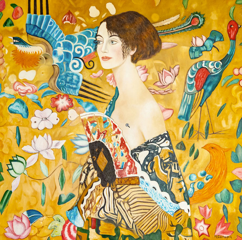
Klimt’s style is a deliberate collision between two worlds: naturalistic human figures painted in oil, and flat decorative surfaces covered in gold, geometric pattern, and symbolic ornament. The contrast is intentional. Figures breathe. Backgrounds do not.
His Golden Phase, which ran roughly from 1898 to 1910, produced the works he is most recognized for today. Art Nouveau was its closest stylistic relative, but Klimt pushed far beyond surface decoration into symbolic figurative painting that had no real precedent.
Klimt drew daily throughout his career. According to Artnet (2024), more than 4,000 of his drawings survive today, which reflects a commitment to figure study that sits underneath every finished canvas.
3 defining characteristics separate his work from every other painting style of his era:
- Figure-ornament contrast: skin and faces rendered with soft oil glazes, surrounding areas filled with flat geometric pattern
- Gold as structure: gold leaf applied not as highlight but as entire zones of the composition
- Multi-source pattern: motifs drawn from Byzantine mosaics, Japanese woodblock prints, Egyptian iconography, and Mycenaean metalwork combined in a single canvas
Works to study before picking up a brush: The Kiss (1907-08), Portrait of Adele Bloch-Bauer I (1907), Judith I (1901), and Danae (1907-08).
You can see the full range of his output through the Gustav Klimt famous paintings collection, which covers both the golden works and his earlier academic period.
How Klimt’s Influences Shaped His Visual Language

The Ravenna turning point: In 1903, Klimt traveled twice to Ravenna, Italy, where he studied the early Christian Byzantine mosaics at San Vitale. That visit directly triggered his systematic use of gold and silver leaf on canvas (Ravenna Turismo, 2023).
Before Ravenna, Klimt used gold accents. After it, gold became the primary structural material of entire paintings.
His father was a gold engraver, so working with precious metal was familiar. But the mosaics gave Klimt the compositional logic: flat gold as sacred background, figures emerging from it rather than existing in front of it.
4 cross-cultural sources fed his decorative vocabulary:
- Japanese Ukiyo-e prints: flat planes, compressed space, no horizon
- Byzantine mosaics: gold ground, hieratic figures, mosaic-like pattern units
- Egyptian iconography: eyes, triangles, repeating symbolic motifs
- Mycenaean art: spirals, geometric border patterns
The Vienna Secession, which Klimt co-founded in 1897, championed the philosophy of Gesamtkunstwerk, meaning total artwork where painting, craft, and architecture merge. That philosophy is visible in every pattern he painted. To understand the wider movement, the Symbolism art context is worth reading alongside his work.
Klimt vs. His Contemporaries
| Artist | Movement | Gold/Decoration Use | Figure Treatment |
|---|---|---|---|
| Gustav Klimt | Vienna Secession / Symbolism | Extensive structural use of gold leaf integrated into the composition as a defining visual element | Naturalistic facial features combined with highly stylized, ornamental bodies |
| Alphonse Mucha | Art Nouveau | Decorative ornamentation used mainly in borders and graphic framing, typically without real gold leaf | Idealized, flowing figures with elegant, rhythmic linework |
| Franz von Stuck | Symbolism | Minimal decorative application, generally restrained use of ornament | Dark, psychologically intense naturalism with dramatic modeling and mood |
What Materials Did Klimt Use?
Klimt used oil paint on canvas as his primary medium, but for works in his Golden Phase the oil paint covers only a fraction of the surface. The majority of the canvas in paintings like Portrait of Adele Bloch-Bauer I is gold and silver leaf, with oil used almost exclusively for skin.
Wikipedia’s documented analysis of Portrait of Adele Bloch-Bauer I confirms the painting is composed of oil paint with silver and gold leaf on a 138 x 138 cm canvas, with gesso used to build decorative motifs in bas-relief beneath the leaf.
Klimt’s Core Materials Breakdown
Gold and silver leaf: 22-24 karat real gold leaf for warm golden tones, silver leaf for cooler metallic areas. Klimt applied these in thin sheets over oil-based size adhesive, often with assistance from gilding artisans (Wonderful Museums, 2025).
Oil paint: Used for faces, hands, and areas requiring soft tonal blending. Klimt worked in thin glazes over a warm underpainting for skin, building luminosity through layered transparent color rather than thick impasto.
Gesso: Applied not just as a ground but as a textural material. Klimt built up decorative motifs in bas-relief using gesso paste, giving pattern areas a tactile three-dimensional quality even within flat gold zones.
Modern equivalents for studio work:
- Imitation gold leaf (composition leaf) from suppliers like Barnabas Gold or Blick
- Winsor and Newton or Gamblin oils for figure painting
- Liquitex Iridescent Gold acrylic for painted detail work over leaf
- Water-based or oil-based gilding size depending on your paint medium
Real gold leaf does not tarnish. Imitation leaf will oxidize over time unless sealed with varnish immediately after application. For a long-term piece, the extra cost of real leaf is worth it.
Why Klimt Used Real Gold, Not Gold Paint
Gold paint is not gold. It is metallic pigment in a binder, and it reads as paint. Real gold leaf is an actual metal surface that reflects light differently depending on viewing angle, creating the living, shifting quality in Klimt’s canvases that no gold-colored paint can replicate.
The Society of Gilders states directly: gold paints are not really gold, and the visual difference between leaf and paint is immediately apparent to any viewer standing in front of the original work. For oil painting techniques that reference Klimt’s style, the material choice is non-negotiable if you want an authentic result.
How to Set Up Your Canvas and Ground
Canvas preparation for a Klimt-inspired painting differs from standard oil painting prep. The surface needs to be smooth enough for gold leaf to adhere without tearing, and the ground color affects how the gold reads once applied.
Gold leaf is translucent when first laid down. The base color beneath it shows through, warming or cooling the final metallic surface. This matters.
Gesso and Surface Preparation
| Step | Action | Why It Matters |
|---|---|---|
| 1. Prime | Apply 2–3 coats of white gesso, sanding smoothly between layers | Creates an even, non-absorbent surface so gold leaf adheres cleanly without catching on canvas texture |
| 2. Tint ground | Lightly tone the gesso or apply a thin wash of raw sienna or yellow ochre | A warm underlayer enhances the luminosity and depth of the gold leaf once applied |
| 3. Mark zones | Gently sketch out decorative areas versus figure placement before applying size | Gold leaf is permanent once laid, so planning prevents costly placement errors |
| 4. Check surface | Sand the final dried gesso layer with fine (around 220-grit) sandpaper | Removes micro-roughness that could tear or wrinkle delicate gold leaf during application |
Canvas size matters more than most guides acknowledge. Klimt worked large. The Kiss measures 180 x 180 cm. At smaller formats, the scale relationship between figure, gold zone, and pattern detail collapses. A minimum of 60 x 60 cm gives enough room for the three compositional zones to read clearly.
Tinting the Ground
A white ground under gold leaf produces a flat, slightly cold metallic result. Klimt’s gold has warmth because his grounds were warm.
2 options that work well:
- Raw sienna tint mixed into the final gesso coat before applying
- Thin ochre wash painted over dry white gesso and allowed to dry completely before sizing
Do not paint gesso over an existing oil painting and immediately gold leaf. Oil paint takes months to cure fully, and gilding over uncured paint causes adhesion failure (Nancy Reyner, gilding guide). For canvas preparation from scratch, standard oil painting prep applies for the figure zones, but the gold zones need the extra smoothing steps.
How to Sketch and Compose a Klimt-Style Composition
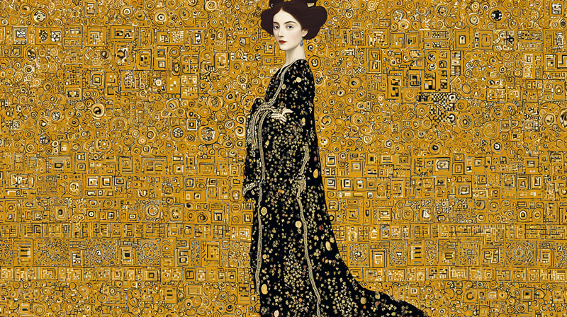
Klimt’s compositions follow a clear logic. The figure occupies the center, often close-cropped with limbs cut at the canvas edge. The space around the figure divides into 2 zones: a garment/immediate surround filled with small-scale pattern, and a background filled with large-scale or flat gold. These zones do not blend. They have hard edges.
Key compositional rule: Klimt’s backgrounds have no spatial depth. No horizon line, no receding floor, no cast shadows. The figure floats on a flat decorative field, as in Byzantine icon painting.
Dividing the Canvas into Three Zones
Before sketching a single figure line, divide the canvas into 3 functional areas:
- Figure zone: the body, face, hands rendered naturalistically in oil
- Garment/transition zone: clothing and immediate drapery, treated as flat pattern-filled shapes, not fabric
- Background zone: flat gold field or dark neutral, either empty or covered in uniform repeating pattern
The garment zone is where most beginners go wrong. They try to paint it as fabric with folds and shading. Klimt does not. The dress in Portrait of Adele Bloch-Bauer I is a flat triangular shape packed with geometric motifs, barely distinguishable from the background in places. That merging is intentional.
Figure Drawing for Klimt-Style Work
Klimt’s figures are stylized but grounded in real anatomy. He produced thousands of preparatory life drawings before composing a final canvas. The faces and hands in his portraits are among the most carefully observed elements in the entire painting.
Work from photo reference or life for the face and hands. Keep the body sketch loose. Klimt’s figures are elongated, with heads slightly larger in proportion than strict realism allows, giving them an iconic quality. The portrait painting techniques that apply here involve careful observation of the face rather than stylization of it.
Once the figure sketch is complete, don’t draw the pattern. Mark the pattern zones as filled areas only. Individual motifs are painted directly, not planned in pencil.
How to Paint Skin Tones in Klimt’s Style
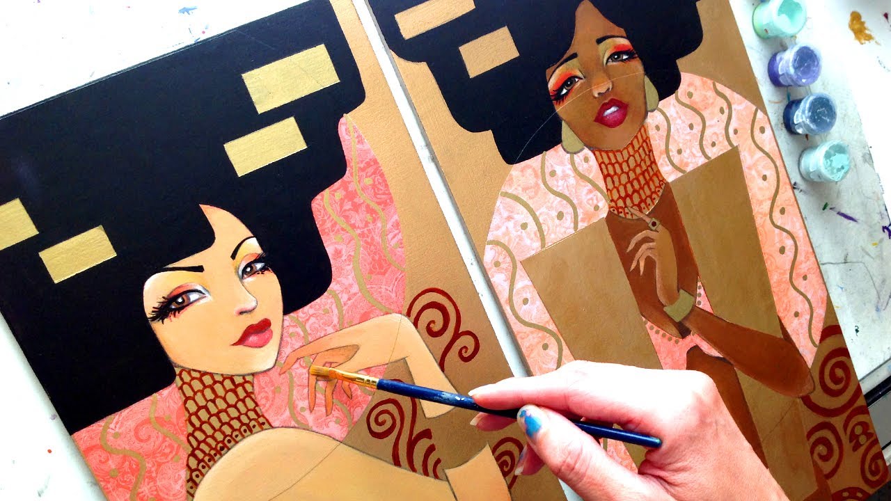
Skin is the most naturalistic element in any Klimt painting. Faces and hands are painted with soft oil glazes, minimal visible brushwork, and a warm limited palette. They stand out against the gold not because of contrast in value but because of contrast in surface quality. Skin is soft and matte. Gold is reflective.
Klimt’s faces are idealized. Eyes heavy-lidded, often cast downward or half-closed. Mouths small, slightly parted. He avoids strong shadow contrast on faces. The lighting reads as diffuse.
Building the Underpainting for Skin
Base palette for skin underpainting: yellow ochre mixed with titanium white, thinned to a semi-transparent glaze with linseed oil or Liquin. Paint the entire skin zone in this warm tone first and let it dry completely.
The underpainting does 2 things: it tones the white gesso so subsequent glazes appear warm, and it establishes the lightest value in the skin before any modeling begins. Underpainting in this context functions as the luminous base that glazes later build on.
Layering Glazes for Luminosity
Klimt’s skin tone palette uses 5 pigments: titanium white, yellow ochre, cadmium red light, burnt sienna, raw umber.
Work in thin glazed layers, allowing each to dry before the next:
- Layer 1 (underpainting): yellow ochre + titanium white, very thin
- Layer 2 (mid-tone): yellow ochre + cadmium red light + small amount of burnt sienna
- Layer 3 (shadow): raw umber + burnt sienna, applied only to shadow zones, blended while wet
- Final: thin titanium white glaze on highest light areas only
Avoid cool colors in the skin entirely. No viridian, no ultramarine blue in shadow zones. Klimt’s shadows stay warm throughout. For detailed guidance on painting skin tones in oil, the glazing sequence described here matches the classical approach Klimt used. Also see the guide on how to mix skin tones for palette specifics.
The oil painting glazing techniques used for skin are the same transparent layering method used in classical portraiture since the Renaissance. Klimt did not invent them. He just applied them only to the face while treating everything else completely differently.
How to Apply Gold Leaf and Gold Paint
This is the section most people want to skip to. Don’t. Gold leaf applied to an unprepared surface will tear, bubble, and fail. The prep work in earlier sections exists specifically so this step works.
Klimt used real 22-24 karat gold and silver leaf, applied over oil-based size with assistance from trained gilding artisans (Wonderful Museums, 2025). For studio work, the same process applies whether you use real or imitation leaf.
Using Real Gold Leaf
Materials needed: 22-24 karat loose gold leaf, oil-based gilding size (for oil paint grounds), gilder’s tip brush, soft squirrel-hair brush for burnishing, cotton gloves.
Process in order:
- Apply oil-based size thinly over the gold zone with a soft brush
- Wait for tack: oil size reaches working tack in 3-12 hours depending on the brand and temperature
- Test tack by touching lightly with a knuckle. It should feel like the back of a piece of tape
- Wearing cotton gloves, pick up a sheet of leaf with the gilder’s tip brush (static from rubbing the brush on your hair charges it)
- Lay the leaf gently over the sized area, tissue paper up, and tamp lightly
- Allow to dry for at least 3 days before burnishing (Reyner, gilding guide)
- Remove excess with a soft brush using light strokes
Gaps and holes in the leaf are normal on the first application. Apply a second layer over gaps using the same size-and-wait process.
Using Imitation Gold Leaf and Gold Paint
Imitation (composition) leaf uses water-based size and dries to tack in approximately 25 minutes, making it far more forgiving for studio work (Mont Marte, 2023). The process matches real leaf application but with a shorter wait time.
Critical difference: Imitation leaf will tarnish and oxidize within months if left unsealed. Apply Gamvar or a dedicated leaf sealer within 24 hours of completing the gold zone.
Liquitex Iridescent Gold acrylic paint works well for small painted details over leaf areas, including fine pattern lines and border work, where a brush is more controlled than leaf sheets. It does not replace leaf for large gold zones. The reflective quality is noticeably different.
For glazing over gold with transparent paint layers to add pattern variation or tonal depth, acrylic glazes work over sealed leaf. Oil glazes can also be applied but require the leaf to be fully sealed first.
How to Paint Klimt’s Decorative Patterns

Pattern is where Klimt-style paintings succeed or fail. The gold gets attention, but the pattern is what gives the gold its structure. Without it, a gilded canvas is just a gilded canvas.
Klimt’s patterns come from 5 distinct visual sources, each carrying its own geometry. He mixed them within a single painting without ever making them look random. The rule is density, not variety. Each zone repeats its motif at consistent scale and spacing.
Geometric Patterns (Rectangles, Triangles, Squares)
Primary reference works: Portrait of Adele Bloch-Bauer I background, The Kiss male figure’s robe.
Klimt’s geometric motifs are hard-edged and precise. He used a size 0 or 00 round brush loaded with paint thinned to a flowing consistency, not so thin it bleeds but not so thick it drags.
Color palette for geometric pattern over gold:
- Ivory black for outlines and solid filled shapes
- Titanium white for highlight units
- Muted turquoise (viridian + titanium white) for color accent blocks
- Deep red (cadmium red + burnt sienna) for occasional warm accents
Work from a printed reference of Klimt’s actual patterns alongside your canvas. The proportions of his rectangles and the spacing between units are specific. Eyeballing it produces patterns that read as generic rather than Klimt. The concept of repetition in art is central here. Klimt’s patterns work because the repetition is exact, not approximate.
Organic Patterns (Spirals, Florals, Eye Motifs)
Klimt’s spirals come from Mycenaean metalwork. His eye motifs reference Egyptian iconography. His floral units appear most densely in the female figure zones of The Kiss and in works like Danaë.
These organic motifs require a different brush approach: a liner brush (size 1 or 2) for spirals and curves, loaded with paint at a flowing consistency.
2 things separate authentic-looking Klimt spirals from generic decorative curves:
- They terminate in a tight closed coil, not an open swirl
- They are paired or grouped, never isolated as single units
The role of pattern in painting functions differently in Klimt than in most Western art. Pattern here is not background texture. It carries equal visual weight to the figure. Understanding rhythm in art helps clarify why Klimt’s patterns feel controlled rather than busy. The repetition creates visual rhythm that guides the eye across the entire surface.
How to Create Klimt’s Background Treatment
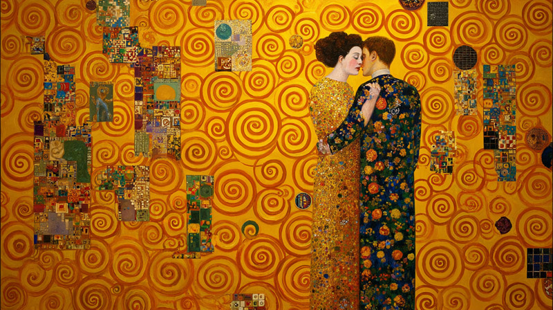
Klimt’s backgrounds are not environments. They have no depth, no light source, no cast shadows. The figure does not stand in front of the background. The figure emerges from it. That distinction is what makes a Klimt-style painting read correctly.
Art File Magazine (2023) notes that the flatness of The Kiss composition directly reflects the influence of the flat mosaic tiles at the Church of San Vitale in Ravenna. There is zero attempt at spatial recession anywhere in the background.
Gold Field Backgrounds
Primary reference: The Kiss (1907-08), Portrait of Adele Bloch-Bauer I (1907).
A gold field background is the most recognizable Klimt treatment. The entire background zone is covered in gold leaf, either left plain or overlaid with a sparse, evenly distributed pattern of small geometric units.
3 things that distinguish Klimt’s gold backgrounds from generic gilded surfaces:
- No tonal variation across the gold field. No lighter or darker areas suggesting light direction
- Pattern units applied over the gold, not built into it, keeping the metallic reflectiveness intact
- The garment gold and the background gold read as the same continuous surface in some zones, intentionally merging figure and ground
The Collector (2024) notes that Klimt arranged color and pattern elements to create visual balance across the composition, distributing repeating shapes on both sides of the canvas to create equilibrium without any spatial depth.
Dark Neutral Backgrounds
Characteristic of: Judith I (1901), earlier Golden Phase works before gold leaf dominated the entire surface.
Color: Deep teal or near-black, mixed from ivory black + viridian or ivory black alone.
Application: Flat paint, no visible brushwork, no texture. The goal is a surface that reads as a void rather than a space.
Edge handling: Where the figure meets a dark background, Klimt uses a thin dark outline on the figure’s skin side to create clean separation. Where the garment meets the background, the edges are often allowed to merge, making the decorative zone and background indistinguishable.
Choosing between gold and dark: gold fields suit compositions where the figure is close-cropped and the decorative zone is dense. Dark backgrounds work better when the skin areas are larger and the contrast between flesh and void is the primary visual tension. For pictorial space in Klimt’s work, the background is deliberately anti-spatial. That is the point.
| Background Type | Key Works | Pattern Over It | Figure Edge Treatment |
|---|---|---|---|
| Gold leaf field | The Kiss, Adele I | Sparse geometric units | Garment visually merges into gold field with minimal separation |
| Dark neutral | Judith I | Minimal or no patterning | Thin, controlled outlines defining skin and form |
| Mixed (gold + dark) | Danae, Hygieia | Pattern varies by zone, shifting density across composition | Combination of hard edges on skin areas and softer transitions on garments |
How to Handle the Figure-to-Pattern Transition

This is the single hardest part of painting in Klimt’s style. Most attempts fail here. The figure looks naturalistic, the background looks decorative, and the two zones look like they were painted by different people and then combined.
Klimt solves this with the garment as a deliberate translation zone. The clothing is neither naturalistic fabric nor pure abstract pattern. It is a flat shape, treated graphically, packed with ornament, and allowed to merge into the background at its outer edges.
Using the Garment as a Bridge
The garment does not describe cloth. It describes a zone of decoration that happens to occupy the same space as the figure’s body.
Research from WetCanvas forum analysis of Klimt’s skin technique confirms he used deliberate underpainting with low-chroma tones in the figure zones, then transitioned abruptly to flat painted pattern at the garment boundary, without any blending between the 2 areas.
4 rules for the garment zone:
- No folds, no shadows, no highlights that suggest three-dimensional fabric
- Pattern scale on the garment differs from background pattern. Garment patterns are smaller and denser
- The garment silhouette is a flat geometric shape. Portrait of Adele Bloch-Bauer I‘s dress is a triangle. The Kiss female robe is a trapezoid with organic curves at the hem
- Color in the garment patterns can include the same colors as the background or introduce new accents. The two do not need to be identical, but they should share at least one color unit
Edge Control Between Zones
Skin-to-garment edge: Hard. The transition from naturalistic face or hand to flat garment pattern is abrupt. No blending.
Garment-to-background edge: Variable. Sometimes hard (dark outline separating garment from gold field), sometimes dissolved (garment gold merging with background gold in The Kiss, where the figures become indistinguishable from the setting).
The dissolving edge between garment and background in The Kiss is a deliberate compositional choice that binds the 2 figures together as a single mass, as noted in analysis by IvyPanda (2023). The role of contour in Klimt’s work is selective: strong where skin meets ornament, absent where ornament meets background. Knowing when to draw the line and when to erase it is the core skill of this section.
For understanding negative shape in this context, the background zone is not empty space. It is an active shape with its own visual weight. In Klimt’s compositions, the gold field occupies roughly the same visual area as the figure and garment combined, creating a spatial balance between decorated and undecorated zones.
What Color Palette Does Klimt Use?
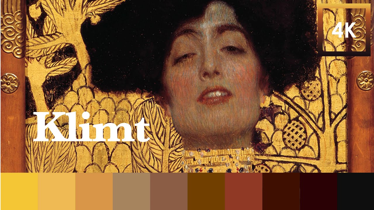
Klimt’s mature Golden Phase palette is warm, limited, and structured around gold as the dominant hue. His skin tones stay in a narrow warm range. His pattern colors are high contrast against the gold, not against each other.
Google Arts and Culture Lab data (2023), working with art historian Dr. Franz Smola’s research, confirmed through statistical analysis of Klimt’s existing works that his colorization style is consistent and learnable. The warm-dominant palette is not incidental. It is systematic.
The Core Palette
Suggested tube colors to match Klimt’s mature works:
- Yellow ochre (skin base, warm ground tint)
- Raw sienna (skin shadow warm, ground toning)
- Burnt sienna (skin mid-shadow, warm darks)
- Cadmium red light (skin flush, pattern accents)
- Ivory black (pattern outlines, geometric fills, darkest skin shadows)
- Titanium white (skin highlights, white pattern units)
- Viridian (muted teal pattern accents, only in small quantities)
What Klimt avoids in the mature works: cool blues, purples, or any cool shadow in skin zones. His pre-1900 work has a very different palette. The warm-dominant structure consolidates in 1903 and holds through 1910.
Color Distribution Across Zones
Skin palette: 5 pigments maximum (yellow ochre, raw sienna, burnt sienna, cadmium red light, titanium white, raw umber for deepest shadow areas).
Pattern palette over gold: black and white carry 70% of the visual work. Color accents (deep red, muted teal) appear in small, distributed units at consistent intervals across the surface.
Background palette: gold leaf or ivory black. No mixed neutrals, no gray backgrounds. Klimt uses only absolute values in the background zone: maximum reflectivity (gold) or near-maximum absorption (near-black).
For a detailed breakdown of color in painting terms, the relevant concepts here are value (the gold and dark backgrounds operate at opposite ends of the value scale) and warm versus cool color organization (skin zones stay warm, never cool). The intensity of Klimt’s pattern colors is deliberately controlled. Pure, fully saturated colors rarely appear. Most pattern colors are slightly muted, which prevents them from competing with the gold.
How to Add Final Details and Glazes
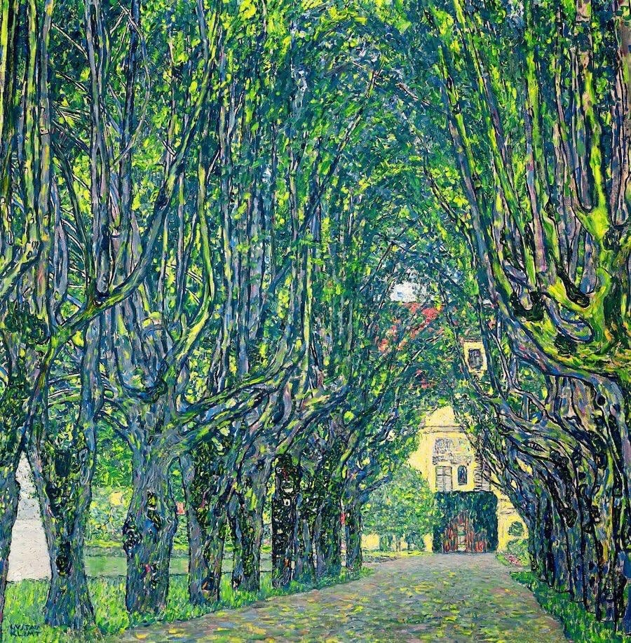
The finishing stage in a Klimt-inspired oil painting involves 3 distinct types of work: pattern refinement, skin surface unification, and varnishing a surface that contains both oil paint and metal leaf.
This last point is the part most guides skip. Varnishing a mixed surface of oil paint and gold leaf requires specific decisions about product and sequence.
Pattern and Detail Refinement
Final pattern work happens after the gold leaf is fully adhered and the skin glazes are dry. Not before.
Working sequence for the final detail pass:
- Reinforce pattern outlines where gold leaf application has blurred edges
- Add the finest detail units (small circles, interior spiral fills, dot clusters) using a size 00 round brush
- Check pattern distribution from a distance. Klimt’s patterns read evenly at arm’s length. If any zone looks heavier or lighter in pattern density, redistribute
- Sharpen the skin-to-garment edge where needed. This is the one area where a thin dark line applied with a liner brush makes a significant difference
- Final skin check: look for any areas where the glaze sequence has created uneven sheen. Address with a thin retouching layer before varnishing
The focal point in Klimt’s compositions is always the face. If the pattern detail is drawing the eye before the face does, reduce the contrast in the pattern surrounding the head zone. Visual hierarchy in his work keeps skin always dominant over ornament, even though the ornament occupies more canvas area.
Varnishing a Mixed Surface
Standard oil painting varnish rules apply to the oil paint zones. The gold leaf zones are different.
Imitation gold leaf must be sealed within 24 hours of application to prevent oxidation. Use a dedicated leaf sealer or isolation coat before any final varnish is applied across the full surface.
Real gold leaf does not oxidize and does not strictly require sealing. A varnish coat unifies the surface sheen between the matte oil paint areas and the reflective gold zones.
Gamblin (2023) states that Gamvar Picture Varnish can be applied as soon as the oil paint is dry to the touch and firm. A thinly applied oil painting may be ready in as little as 2-3 weeks. This is the fastest safe option for unifying the surface.
One practical note: Klimt’s originals have areas of dramatically different surface quality. The gold reflects. The oil paint absorbs. The gesso-built bas-relief patterns have their own texture. Unifying these surfaces completely is not the goal. A satin varnish applied only to the oil paint zones, leaving the gold reflective, produces a surface closer to his originals than a uniform gloss coat over everything.
For full varnishing instructions for oil paintings, the Gamvar application process covers the oil zones. The gold zones only need the imitation leaf sealer step if you used composition leaf rather than real gold. For more on the complete oil painting process from ground to finish, the sequence here follows the same fat-over-lean and seal-before-varnish principles that apply to any layered oil work.
Common Finishing Mistakes to Avoid
Over-working the skin after glazing is the most common error. Every additional pass on the skin zone risks lifting earlier glazes and muddying the warm translucency that makes Klimt’s figures glow.
3 mistakes that show up consistently in Klimt-style attempts:
- Adding cool shadows to the face during the final pass (kills the warm, idealized quality immediately)
- Outlining the entire figure with a continuous dark line (Klimt uses outlines selectively, not as a border around everything)
- Varnishing before the gold leaf is fully cured and adhered, which can lift loose leaf fragments and spread them across oil paint zones
The glazing process that built the skin’s luminosity is also the glazing process that the final varnish will affect. Test your varnish on a dry paint sample before applying to the finished canvas. Some varnishes shift warm tones cooler as they cure. Gamvar does not yellow, which makes it the safer choice over traditional dammar for any painting where warm skin tones are central to the work.
FAQ on How To Paint Like Klimt
What medium did Klimt use in his paintings?
Klimt used oil paint on canvas for figure areas, combined with real gold and silver leaf for decorative zones. His Golden Phase works are mixed media, not pure oil paintings. The leaf was applied over oil-based size adhesive, often with help from trained gilding artisans.
Do I need real gold leaf to paint like Klimt?
No, but the visual difference is significant. Imitation gold leaf works for practice and costs far less. It must be sealed within 24 hours to prevent tarnishing. Real 22-24 karat leaf produces the shifting, reflective quality that defines his Golden Phase surfaces.
What is Klimt’s Golden Phase?
His Golden Phase ran roughly from 1898 to 1910. It began with Pallas Athene and peaked with Portrait of Adele Bloch-Bauer I in 1907. A 1903 trip to Ravenna, where he studied Byzantine mosaics, directly triggered his systematic use of gold leaf on canvas.
How did Klimt paint skin tones?
He built skin in thin oil glazing layers over a warm yellow ochre underpainting. His palette for skin used 5 pigments: titanium white, yellow ochre, cadmium red light, burnt sienna, and raw umber. He avoided cool colors in shadow zones entirely.
What patterns did Klimt use in his paintings?
Klimt drew from 5 sources: Byzantine mosaics, Japanese woodblock prints, Egyptian iconography, Mycenaean metalwork, and Islamic tile art. His recurring motifs include spirals, rectangles, circles, triangles, and floral units. Pattern density varies between garment zones and background zones within the same canvas.
How do I prepare a canvas for gold leaf painting?
Apply 2-3 coats of gesso, sanding smooth between each coat. Tint the final coat with raw sienna or yellow ochre for a warm base. A smooth surface prevents gold leaf from tearing. Mark your decorative zones before applying any size adhesive.
What is the figure-to-pattern transition in Klimt’s style?
Klimt uses the garment as a translation zone between naturalistic skin and flat decoration. Clothing is never painted as fabric with folds or shadows. It becomes a flat geometric shape packed with ornamental pattern, often merging into the gold background at its outer edges.
What colors did Klimt use most in his paintings?
His mature Golden Phase palette is warm and limited: yellow ochre, raw sienna, burnt sienna, cadmium red, ivory black, titanium white, and viridian for small accents. Cool blues and purples are absent from most works after 1903. Gold dominates the overall surface temperature.
How do I varnish a painting that has both oil paint and gold leaf?
Seal imitation leaf within 24 hours of application using a dedicated leaf sealer. For oil paint zones, Gamvar Picture Varnish can be applied once the paint is firm to touch, as little as 2-3 weeks after completion (Gamblin, 2023). Apply satin varnish only to oil zones to preserve gold reflectivity.
What paintings should I study before attempting Klimt’s style?
Start with The Kiss (1907-08) for gold field backgrounds and garment-to-background merging. Study Portrait of Adele Bloch-Bauer I for geometric pattern layering over gold. Judith I (1901) shows the dark neutral background approach and the early ornamental figure painting technique.
Conclusion
This conclusion is for an article on how to paint like Klimt, and the core takeaway is this: the style is a system, not an aesthetic accident.
Every element connects. The warm gesso ground supports the gold leaf. The gilded surface needs the flat decorative background to read correctly. The ornamental figure painting only works because the skin glazing stays naturalistic.
Get the figure-to-pattern transition right, and the rest follows.
Study The Kiss and Judith I before committing paint to canvas. Work from Klimt’s actual mosaic-inspired motifs, not generic spirals. Use a warm underpainting in every skin zone without exception.
The Vienna Secession style rewards patience. Give it that, and the results are unlike anything else in oil painting.