That muddy, lifeless flesh tone staring back from your canvas isn’t what you imagined when you started your portrait. Learning how to mix skin tones transforms flat, unrealistic paintings into vibrant, living artwork that captures the true essence of your subject.
Most artists struggle with skin color because they rely on pre-mixed “flesh” tones or use oversimplified formulas.
Real skin contains complex undertones, temperature shifts, and subtle color variations that require understanding color theory fundamentals.
This guide reveals professional techniques for mixing natural-looking skin tones across all complexions and lighting conditions. You’ll master essential pigment blending methods, undertone identification, and troubleshooting common mixing problems.
By the end, you’ll confidently create realistic flesh tones for portrait painting, figure work, and any subject requiring human skin representation.
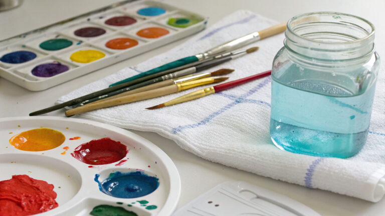
Essential Colors for Your Palette
Primary Base Colors
Titanium White forms the foundation of nearly every skin tone mix. This pigment provides the clean, bright base you need without the yellow cast of zinc white.
Raw umber gives you the deep, earthy foundation for darker complexions. It’s cooler than burnt umber and won’t push your mixes toward orange.
Burnt sienna adds natural warmth that mimics the golden undertones found in many skin types. A little goes a long way with this intense pigment.
Yellow ochre brings subtle golden tones without the harshness of cadmium yellow. This earth tone appears in almost every realistic flesh mixture.
Secondary Mixing Colors
Cadmium red light provides the life and warmth that makes skin look alive. Use tiny amounts to avoid overpowering your mix.
Ultramarine blue cools down overly warm mixtures and helps create realistic shadow areas. This primary color balances the warm tones perfectly.
Alizarin crimson creates those subtle pink undertones you see in fair complexions. It’s more transparent than cadmium red, making it perfect for delicate adjustments.
Naples yellow offers gentle warmth for highlight areas. It’s pre-mixed with white, so it won’t muddy your lighter tones.
Advanced Palette Additions
Raw sienna bridges the gap between yellow ochre and burnt sienna. This versatile earth tone works in both warm and cool skin mixtures.
Payne’s gray replaces black for creating natural-looking shadows. Black kills the luminosity in skin tones, but Payne’s gray maintains that living quality.
Quinacridone violet adds those hard-to-achieve purple undertones that appear in certain lighting conditions. Most people miss this subtle but important color note.
Basic Mixing Techniques

The Foundation Formula
Start every skin tone with titanium white as your base. This gives you the cleanest starting point and prevents muddy results.
Add warmth gradually using tiny amounts of yellow ochre or burnt sienna. You can always add more, but removing excess pigment becomes nearly impossible.
Cool down overly warm mixtures with microscopic amounts of ultramarine blue. One brushstroke too much will turn your skin tone gray.
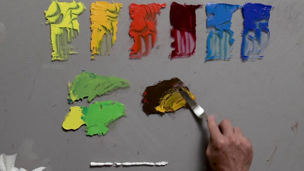
Color Ratios That Work
The 70-20-10 rule works for most skin tone mixing. Use 70% white, 20% warm tones (yellow ochre, burnt sienna), and 10% adjusting colors (reds, blues, purples).
Make micro-adjustments by touching your brush to the pigment, then to your palette. This prevents accidentally adding too much color.
Test your mixtures on a neutral gray background. Colors look completely different against white canvas versus gray or brown surfaces.
Avoiding Common Mixing Mistakes
Never add colors straight from the tube into your mixture. Always pick up tiny amounts on your brush tip first.
Don’t overmix your paint on the palette. Some color variation actually makes skin look more natural and alive.
Watch how surrounding colors affect your skin tones. A perfect mixture might look wrong next to certain background colors.
Mixing Light Skin Tones

Fair Complexions
Begin with a titanium white base and add the smallest touch of yellow ochre. Fair skin often has more yellow than people realize.
Incorporate subtle pink undertones using alizarin crimson mixed with white. Think of the pink you see on the inside of your wrist.
Cool areas like temples and under-eye regions need a hint of ultramarine blue. This mimics how blood shows through thin skin.
Medium Light Tones
Raw sienna becomes your primary mixing color for medium light complexions. It provides warmth without the intensity of burnt sienna.
Balance the warmth with cool undertones using small amounts of ultramarine blue or Payne’s gray. This prevents your mixture from looking too orange.
Create natural variations by mixing several related tones. Skin isn’t one flat color, so prepare highlight, midtone, and shadow versions.
Adjusting for Different Lighting
Indoor lighting tends to be warmer, so add more yellow ochre to your basic mixture. Fluorescent lights push skin tones toward green, requiring tiny amounts of alizarin crimson to compensate.
Outdoor lighting varies dramatically throughout the day. Morning light appears cooler, while afternoon sun creates golden, warm effects on skin.
Artificial lighting can completely change how your carefully mixed color appears. Always check your mixtures under the lighting conditions where the painting will be displayed.
The key to natural-looking skin tones lies in understanding that skin reflects its environment. A person near a red wall will have subtle red reflections in their skin tone.
Remember that color theory applies to skin mixing just like any other subject. Warm and cool colors work together to create believable flesh tones.
Practice mixing skin tones from observation rather than memory. Take time to really see the colors in front of you instead of painting what you think skin should look like.
Creating Medium Skin Tones

Golden Medium Tones
Burnt sienna becomes your foundation for most golden medium complexions. This rich, warm pigment provides the perfect starting point.
Add yellow ochre to increase the golden quality without making the mixture too orange. Think honey rather than pumpkin.
Balance with small touches of ultramarine blue to prevent the mixture from becoming too saturated. The goal is natural warmth, not artificial glow.
Olive Complexions
Mediterranean skin often has subtle green undertones that many artists miss completely. Raw umber mixed with tiny amounts of yellow ochre creates this base.
Add microscopic amounts of Payne’s gray to achieve that distinctive olive quality. Too much will make the skin look sickly.
Warm up the mixture with burnt sienna to prevent an ashy appearance. Olive skin still needs life and warmth.
Rosy Medium Tones
Some medium skin tones lean toward pink rather than yellow or olive. Start with your standard medium base and add alizarin crimson.
Use Naples yellow to maintain luminosity while building the pink undertones. This prevents the mixture from becoming too cool or gray.
Create depth by mixing a slightly cooler version for shadow areas. Add a touch more ultramarine blue to your base mixture.
Mastering Dark Skin Tones

Rich Brown Complexions
Burnt umber creates the foundation for most rich brown skin tones. This pigment has natural warmth without being too red or orange.
Add warmth carefully with raw sienna or yellow ochre. Dark skin often has beautiful golden undertones that need subtle enhancement.
Create depth using raw umber for the deepest shadow areas. Never use black, which kills the natural luminosity of dark skin.
Deep Golden Tones
Many dark skin tones have gorgeous golden qualities that require careful observation to capture accurately. Start with burnt umber and add yellow ochre gradually.
Balance these warm tones with Payne’s gray to prevent oversaturation. The mixture should feel rich, not artificial.
Vary your mixture by creating several related tones. Dark skin has incredible color variation that flat, single-tone approaches miss entirely.
Very Dark Skin Tones
The deepest skin tones require a different approach from typical mixing methods. Payne’s gray mixed with burnt umber creates a sophisticated foundation.
Add subtle warm undertones using tiny amounts of burnt sienna or raw sienna. Even the darkest skin has warm notes that bring it to life.
Create natural highlights by adding Naples yellow to your base rather than white. This maintains the integrity of the skin tone while providing luminosity.
Understanding Undertones in Practice
Identifying Undertones in Real Subjects
Look at pulse points where blood shows through the skin most clearly. Wrists, temples, and inner elbows reveal true undertone colors.
Check the jawline where skin meets the neck. This area often shows undertones more clearly than the face, which reflects surrounding colors.
Observe ear lobes in natural light. These thin skin areas reveal undertones without the interference of facial coloring or makeup.
Matching Undertones to Mixed Colors
Test your mixtures against actual skin rather than relying on memory or guesswork. Colors that look right on the palette often appear wrong against real skin.
Adjust for photographic references, which can distort color relationships. Photos often push skin tones toward one extreme or another.
Compensate for artificial lighting when working from life. Indoor lights add their own color cast to both your subject and your paint mixtures.
Regional and Ethnic Considerations
Mediterranean Characteristics
Mediterranean skin typically shows warm golden undertones with hints of olive. Raw sienna mixed with yellow ochre captures this beautifully.
These complexions often have subtle green notes that prevent them from appearing purely golden. Add tiny amounts of Payne’s gray to achieve this effect.
Northern European Features
Fair Northern European skin leans heavily toward pink and cool undertones. Alizarin crimson mixed with white creates this delicate coloring.
Blue undertones appear in shadow areas and where skin is thinnest. Use microscopic amounts of ultramarine blue for these effects.
Asian Skin Characteristics
Many Asian complexions have yellow-based undertones that require careful observation to capture accurately. Yellow ochre provides the foundation.
Avoid stereotypical “yellow” skin tones by balancing with subtle amounts of burnt sienna or raw sienna for natural warmth.
African Heritage Undertones
African skin shows incredible diversity in undertones, from warm golden to cool purple notes. Each individual requires careful color observation.
Purple and red undertones often appear in darker skin tones. Quinacridone violet mixed sparingly into your base creates these subtle effects.
Some very dark skin tones have blue undertones that standard mixing approaches miss. Ultramarine blue used carefully prevents ashy, lifeless results.
The key to accurate ethnic representation lies in observing each individual rather than relying on generalized color formulas. Every person’s skin reflects their unique heritage and environmental factors.
Understanding color psychology helps you see how different undertones affect the emotional impact of your portrait work. Warm undertones feel approachable while cool undertones can appear more formal or distant.
Practice mixing undertones separately before incorporating them into your full skin tone mixtures. This builds your understanding of how each color affects the final result.
Advanced Mixing Strategies

Creating Skin Tone Families
Mix multiple related tones at once to maintain color harmony throughout your painting. This prevents jarring shifts between different areas of the face.
Start with your base mixture and create lighter and darker variations. Add white for highlights, burnt umber for shadows, keeping the color relationships consistent.
Prepare at least five variations: deepest shadow, form shadow, halftone, light, and brightest highlight. This range gives you everything needed for realistic form modeling.
Seasonal Skin Variations
Summer skin shows warmer, more golden tones from sun exposure. Add extra yellow ochre and burnt sienna to your winter skin mixture.
Winter complexions appear cooler and often paler. Increase the titanium white and add subtle amounts of ultramarine blue or alizarin crimson.
Create sun-kissed variations by warming your base skin tone with Naples yellow rather than harsh cadmium colors. This maintains natural luminosity.
Age-Related Color Changes
Youthful skin requires more transparent, luminous mixtures. Use less paint and allow some canvas texture to show through.
Mature skin needs slightly grayer, less saturated colors. Add tiny amounts of Payne’s gray to your standard mixture without making it flat or lifeless.
Avoid caricature by making subtle adjustments rather than dramatic color shifts. Age shows in value relationships more than color changes.
Highlight and Shadow Mixing

Natural Highlight Colors
Never use pure white for skin highlights. It creates artificial-looking results that destroy believability.
Warm your whites with Naples yellow or a touch of yellow ochre. This maintains the natural quality of illuminated skin.
Create luminous effects by keeping highlight mixtures relatively clean. Don’t overmix or you’ll lose that essential glow.
Shadow Color Theory
Shadow areas need complementary colors to feel natural. If your skin leans warm, shadows should contain subtle cool notes.
Use purple or blue undertones in shadows rather than simply darkening your base mixture. This creates more convincing depth.
Maintain color temperature consistency within shadow areas. Don’t let cool shadows suddenly become warm without a clear light source reason.
Form Shadows vs Cast Shadows
Form Shadows
Form shadows occur where the surface turns away from light. These should contain the same basic color as your skin tone, just darker and cooler.
Add burnt umber or raw umber to your base skin mixture. Avoid black, which kills natural color relationships.
Cast Shadows
Cast shadows happen when objects block light from reaching the skin. These often pick up reflected colors from surrounding surfaces.
Include environmental colors in cast shadows. A person near a blue wall will show blue notes in their cast shadows.
Reflected Light Considerations
Shadow areas rarely appear completely dark in natural lighting. Reflected light bounces back into shadow areas, creating subtle illumination.
Add tiny amounts of your highlight color to deep shadow mixtures. This mimics how light behaves in real environments.
Look for warm reflected light in cool shadow areas and vice versa. These subtle color notes make shadows feel three-dimensional.
Color Temperature and Lighting Effects
Warm Light Situations

Golden Hour Effects
Golden hour creates some of the most beautiful warm lighting for portrait work. Everything becomes more golden and luminous.
Increase yellow ochre and Naples yellow in all your skin mixtures. Even shadow areas become warmer in this magical light.
Shadows during golden hour often show purple or blue undertones that contrast beautifully with the warm illuminated areas.
Incandescent Lighting
Indoor tungsten lights push all colors toward orange and yellow. Compensate by adding extra yellow ochre to your standard mixtures.
Highlights become very warm while shadows can appear almost purple by comparison. Use this color contrast intentionally for dramatic effects.
Firelight Variations
Firelight creates extremely warm, flickering illumination that requires special mixing approaches. Everything becomes more orange and red.
Add cadmium red light to your usual warm mixtures. The light source itself affects skin color dramatically.
Create variations in warmth to suggest the dancing, changing quality of firelight. Multiple mixtures help capture this movement.
Cool Light Adaptations
Overcast Conditions
Cloudy days create soft, diffused lighting with cool undertones throughout. All colors become more muted and blue-tinted.
Add subtle amounts of ultramarine blue to every mixture, including highlights. Cool lighting affects everything uniformly.
Eliminate harsh contrast in overcast conditions. The soft light reduces the difference between highlight and shadow values.
Blue Hour Effects
The period just after sunset creates beautiful blue light that transforms skin tones completely. Everything becomes cooler and more mysterious.
Increase ultramarine blue in all mixtures while maintaining enough warmth to keep skin believable. Balance becomes critical here.
Fluorescent Adjustments
Fluorescent lights add green casts that make skin look sickly. Compensate with tiny amounts of alizarin crimson in all your mixtures.
Test your mixtures under the actual lighting where the painting will hang. Fluorescent distortion disappears under different lights.
Mixed Lighting Scenarios
Indoor-Outdoor Transitions
Areas near windows show both warm interior light and cool exterior light. Create separate mixtures for each lighting condition.
Blend lighting areas gradually rather than creating harsh transitions. Real lighting rarely creates sharp edges.
Multiple Light Sources
When several light sources illuminate your subject, each creates its own highlight and shadow pattern. Map out the lighting before mixing colors.
Avoid muddy results by identifying the primary light source first. Secondary lights create subtle color notes rather than major changes.
Maintaining Believability
The key to successful lighting effects lies in consistent color temperature relationships. If highlights are warm, shadows should feel cooler.
Study how master painters like Rembrandt van Rijn and Johannes Vermeer handled complex lighting situations. Their chiaroscuro techniques remain relevant today.
Practice observing real lighting effects before attempting to paint them. Your eye needs training to see these subtle color relationships accurately.
Testing and Adjusting Your Mixes

Proper Testing Techniques
Test every mixture on a neutral gray background before applying to your painting. Colors behave differently against various surfaces.
Use a piece of gray cardboard or canvas primed with gray gesso. This reveals the true color without interference from white or colored backgrounds.
Compare your mixture directly against your reference photo or live model. Hold the test swatch next to the actual skin area you’re trying to match.
Viewing Under Different Lights
Natural daylight provides the most accurate color assessment. Position your work near a north-facing window if possible.
Check your mixtures under the lighting where the finished painting will hang. Gallery lighting differs dramatically from studio conditions.
Artificial lights distort color relationships. What looks perfect under warm incandescent bulbs might appear wrong under cool fluorescent lighting.
Fine-Tuning Methods
Making Micro-Adjustments
Use the tip of a clean brush to pick up tiny amounts of adjusting pigments. A little raw umber or ultramarine blue goes incredibly far.
Test each adjustment on your gray swatch before adding to the main mixture. You can’t remove color once it’s mixed in.
Work with paint consistency that matches your application method. Thick paint for palette knife work, thinner for brush application.
Testing Opacity Variations
Mix transparent and opaque versions of your skin tones. Watercolor painting requires different opacity than oil painting techniques.
Layer transparent colors over opaque bases to create depth and luminosity. This mimics how real skin allows light to penetrate and reflect back.
Test glazing effects by applying thin layers over dried base colors. This technique adds complexity without muddying the mixture.
Checking Color Relationships
Compare your skin mixture against other colors in your painting. Skin tones that look perfect in isolation might clash with surrounding elements.
Adjust for color interaction by slightly shifting your mixture toward or away from nearby colors. A red shirt will make skin appear more green by comparison.
Create color swatches showing your skin tone next to key colors from your painting. This prevents unpleasant surprises later.
Documentation and Consistency
Recording Successful Formulas
Write down the exact pigment blending ratios for mixtures that work well. Memory fails when you need to recreate a perfect skin tone.
Document your process including brush types, paint consistency, and application methods. These factors affect the final appearance significantly.
Create physical color swatches on paper or canvas board. Digital photos distort colors, but physical samples remain accurate references.
Building Personal Reference Charts
Organize your successful mixtures by skin type, lighting condition, and painting medium. This becomes invaluable reference material.
Label everything clearly with specific pigment names and brands. “Red” doesn’t help when you need to know whether you used cadmium or alizarin.
Update your charts regularly as your mixing skills improve. What seemed perfect six months ago might not meet your current standards.
Troubleshooting Common Problems

Muddy or Gray Skin Tones
Identifying the Cause
Muddy mixtures usually result from using too many colors or mixing complementary colors incorrectly. Check if you’ve added opposing hues accidentally.
Overmixing also creates muddy results. Stop mixing while some color variation remains visible on your palette.
Using black instead of Payne’s gray for shadows kills luminosity. Black absorbs light while gray allows natural color relationships to continue.
Revival Techniques
Add clean, pure color to revive muddy mixtures. A tiny amount of yellow ochre or burnt sienna often brings life back to gray skin tones.
Start fresh when revival attempts fail. Sometimes fighting a muddy mixture wastes more time than beginning again with proper technique.
Mix cleaner base colors by using fewer pigments. Three to four colors usually create more natural results than complex mixtures.
Overly Saturated Results
Neutralizing Techniques
Add complementary colors in minute quantities to reduce saturation. If your mixture is too orange, add a tiny touch of ultramarine blue.
Payne’s gray neutralizes oversaturated mixtures without killing them completely. It maintains color relationships while reducing intensity.
Mix in some of your base white to dilute strong colors. This often fixes saturation problems while lightening the value appropriately.
Balancing Intensity Levels
Compare your skin mixture to the most saturated color in your painting. Skin should usually be less intense than clothing or background elements.
Reduce saturation gradually rather than adding large amounts of neutralizing color at once. Small adjustments prevent overcorrection.
Consider the overall color saturation scheme of your painting. Highly saturated backgrounds require more saturated skin tones to maintain visual balance.
Unnatural Appearances
Temperature Consistency Issues
Check that your highlight and shadow temperatures work together logically. Warm highlights need cool shadows and vice versa.
Lighting source determines the overall temperature bias of your skin tones. Don’t mix cool and warm lighting effects randomly.
Study how atmospheric perspective affects color temperature in outdoor portrait work. Distant skin appears cooler and less saturated.
Value Relationship Problems
Skin tones with incorrect value relationships look flat regardless of accurate color. Check your lights and darks.
Compare values by squinting at your painting. This eliminates color distraction and reveals value problems clearly.
Use a value scale to check that your skin tones fall within realistic ranges. Most skin occupies the middle values, not the extremes.
Environmental Color Influence
Consider how surrounding colors affect skin appearance. Green foliage creates subtle green reflections in outdoor portraits.
Adjust for reflected light by adding tiny amounts of environmental colors to appropriate skin areas. This creates convincing spatial relationships.
Study master paintings to see how artists like Pierre-Auguste Renoir handled environmental color influence in their impressionism works.
Quick Fixes for Common Mistakes
- Too orange: Add ultramarine blue or Payne’s gray
- Too pink: Add yellow ochre or raw sienna
- Too yellow: Add alizarin crimson or burnt sienna
- Too gray: Add clean yellow ochre or Naples yellow
- Too dark: Mix lighter version rather than adding white directly
The most important troubleshooting skill involves recognizing problems early. Step back from your work frequently to assess color relationships objectively.
Practice these techniques with small color studies before attempting large portrait work. Build confidence through successful small experiments.
FAQ on How To Mix Skin Tones
What colors do I need to mix basic skin tones?
Titanium white, yellow ochre, burnt sienna, and raw umber form the foundation for most skin mixtures. Add cadmium red light, ultramarine blue, and alizarin crimson for fine-tuning undertones and creating realistic color theory relationships.
How do I avoid muddy skin tones?
Use fewer colors and mix gradually. Never add complementary colors directly without testing first. Replace black with Payne’s gray for shadows, and avoid overmixing your paint on the palette to maintain color luminosity.
What’s the difference between warm and cool undertones?
Warm undertones contain yellow, golden, or peachy notes, while cool undertones show pink, red, or blue qualities. Check pulse points like wrists to identify undertones, then adjust your mixture with appropriate primary colors.
How do I mix dark skin tones naturally?
Start with burnt umber instead of adding black to lighter mixtures. Add warmth with yellow ochre or raw sienna, then use Payne’s gray for depth. Quinacridone violet creates realistic purple undertones in deeper complexions.
Can I use pre-mixed flesh tones?
Pre-mixed colors rarely match real skin accurately. They lack the subtle variations and undertones that make skin look alive. Learning to mix your own colors gives you complete control over temperature and saturation.
How does lighting affect skin color mixing?
Different light sources change skin appearance dramatically. Golden hour creates warm, yellow-tinted skin, while overcast conditions push everything cooler. Test your mixtures under the actual lighting where your painting will be displayed.
What’s the biggest mistake beginners make?
Adding too much color too quickly ruins most mixtures. Start with white as your base, then add tiny amounts of pigment gradually. You can always add more color, but removing excess becomes nearly impossible.
How do I create realistic highlights on skin?
Never use pure white for skin highlights. Warm your whites with Naples yellow or yellow ochre to maintain natural luminosity. Test highlight mixtures against your base skin tone to ensure proper color harmony.
Should I mix different skin tones for one portrait?
Yes, skin contains multiple related tones throughout one face. Create variations for highlights, midtones, and shadows using your base mixture as the starting point. This adds dimension and realism to portrait work.
How do I fix skin tones that look too orange?
Add microscopic amounts of ultramarine blue to neutralize orange casts. Alternatively, use Payne’s gray to reduce saturation while maintaining natural color relationships. Test adjustments on a separate palette first.
Conclusion
Mastering how to mix skin tones requires patience, observation, and consistent practice with proper techniques. The journey from muddy, lifeless flesh colors to luminous, natural-looking skin transforms your entire approach to figure painting and portrait work.
Remember that real skin contains complex undertone variations that change with lighting conditions. Whether you’re working with watercolor painting or acrylic painting techniques, the fundamental principles remain consistent across all mediums.
Start with quality pigments like titanium white, burnt sienna, and yellow ochre. Build your mixtures gradually and test everything on neutral backgrounds before applying to your canvas.
Document successful formulas and create reference swatches for future projects. Study how masters like Diego Velázquez and John Singer Sargent achieved their remarkable flesh tones through careful observation and methodical mixing approaches.
Practice mixing different ethnicities and age groups to expand your skills. Each subject teaches new lessons about color temperature, saturation levels, and environmental color influences.