Every color decision you make is either working for you or against you.
Color theory is the framework that explains why. It covers how hues relate to each other, how the human eye perceives them, and how color combinations create specific visual and emotional effects.
Artists, designers, and brands all rely on the same core principles, from the color wheel and harmony rules to color psychology and contrast ratios.
This guide covers the full picture: what color theory actually is, how color properties like hue, saturation, and value work, and how to apply color harmonies, color models, and palette-building techniques in practice.
What is Color Theory
Color theory is the study of how colors interact, how humans perceive them, and how they can be combined purposefully. It covers everything from the physics of light to the practical decisions a designer makes when building a palette.
It sits at the intersection of science, perception, and visual communication. Not just one discipline.
The field draws from physics (how light behaves), physiology (how the eye processes wavelengths), and psychology (how the brain assigns meaning to what it sees). All three matter. Ignoring any one of them leads to color decisions that look good in theory but fall flat in practice.
In applied fields like painting, UI design, and branding, color harmony principles and perceptual science are used together. That combination is what color theory actually is in the real world.
Where it came from
Isaac Newton’s prism experiments in 1666 produced the first circular color diagram, mapping the spectrum into a loop. That basic structure underpins the color wheel still used today.
Johann Wolfgang von Goethe pushed back against Newton in his 1810 “Theory of Colors,” arguing that human perception and emotional response mattered as much as the physics. His work was controversial among scientists but had a lasting influence on artists.
Josef Albers and Johannes Itten later formalized color theory for design education at the Bauhaus in the 20th century. Their frameworks are still taught in virtually every art and design program.
| Figure | Contribution | Year |
|---|---|---|
| Isaac Newton | First circular color spectrum diagram | 1666 |
| Johann Wolfgang von Goethe | Color perception and emotional response | 1810 |
| Albert Munsell | Systematic hue, value, chroma notation | 1905 |
| Josef Albers | Interaction of color, simultaneous contrast | 1963 |
Wassily Kandinsky also explored color systematically, specifically its connection to emotion and sound. His writing remains one of the more unusual but genuinely interesting corners of color theory history.
The Color Wheel

The color wheel maps relationships between hues. That single diagram is the foundation for every color decision in painting, graphic design, and UI work.
But there is more than one version. And the differences between them actually matter depending on what you are doing.
RYB, RGB, and CMYK
These three models represent the same visible spectrum in completely different ways, built for completely different purposes.
RYB (Red, Yellow, Blue) is the traditional artists’ model. Primary colors in this system are red, yellow, and blue. Mix them to get the secondary colors: orange, green, and violet. It works well for paint mixing, which is why it survived centuries before modern color science.
RGB (Red, Green, Blue) is how screens produce color. It uses additive mixing: combining red, green, and blue light at full intensity produces white. This is the model used in Figma, Photoshop, and every digital display.
CMYK (Cyan, Magenta, Yellow, Black) is for print. It uses subtractive mixing, where inks absorb light wavelengths. Combining all four at full saturation theoretically produces black, though in practice printers add a dedicated black ink (the K) for cleaner results.
Designing in RGB and printing in CMYK without color management is one of the most common causes of color shifts between what you see on screen and what lands in your hands from a printer.
Primary, Secondary, and Tertiary Colors
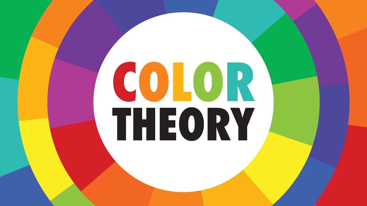
The structure of the wheel follows a consistent logic across all three models.
- Primary colors: cannot be mixed from other colors
- <strong>Secondary colors</strong>: mixed from two primaries
- <strong>Tertiary colors</strong>: mixed from a primary and an adjacent secondary
In RYB, the six tertiary colors fill the gaps: red-orange, yellow-orange, yellow-green, blue-green, blue-violet, and red-violet. The wheel gives each one a position, which then determines how it relates to every other color on the diagram.
The Munsell Color System takes this further, replacing the wheel with a three-dimensional sphere that maps hue, value, and chroma independently. Useful for precise color specification, less useful for quick design decisions.
Color Properties
Every color can be broken down into three core attributes. Miss one and you lose control over what the color actually does in a composition.
| Property | What it describes | Example range |
|---|---|---|
| Hue | The color itself | Red, blue, yellow, green |
| Saturation | Intensity or purity | Vivid crimson vs. dusty rose |
| Value | Lightness or darkness | Pale sky blue vs. navy |
Hue
Hue is what most people mean when they say “color.” Red is a hue. Teal is a hue. It is the pure color identity, without any judgment about how bright or dark or washed-out it appears.
On the color wheel, hue is expressed as a degree value from 0 to 360. In digital tools like Photoshop and Figma, the HSB (Hue, Saturation, Brightness) and HSL (Hue, Saturation, Lightness) models represent it this way.
Saturation (Chroma)
Saturation measures how pure or intense a color is. A fully saturated red is the most vivid version of that red. Reduce the saturation and it moves toward gray.
Chroma and saturation are often used interchangeably, but they are technically different. In the Munsell system, chroma measures colorfulness relative to a neutral gray of the same value. Saturation in HSB measures colorfulness relative to brightness. The distinction rarely matters in everyday design work, but it comes up in professional color management workflows.
According to the Journal of Consumer Research (2025), consumers associate lower color saturation with higher luxury status, which is why muted, desaturated palettes dominate premium branding. High saturation reads as energetic or affordable. Low saturation reads as refined.
Value (Lightness/Brightness)
Value is how light or dark a color appears. It is independent of hue. A light blue and a light orange can share the same value even though they are completely different hues.
This matters more than most people realize. Value differences are what create contrast, depth, and readability. Tone and value are closely related: tone generally refers to the perceived lightness of a color as seen by the human eye, accounting for how the eye weights different hues differently.
A composition that looks fine in full color can completely fall apart when viewed in grayscale. If the values are not working, the colors are not working.
Color Harmonies
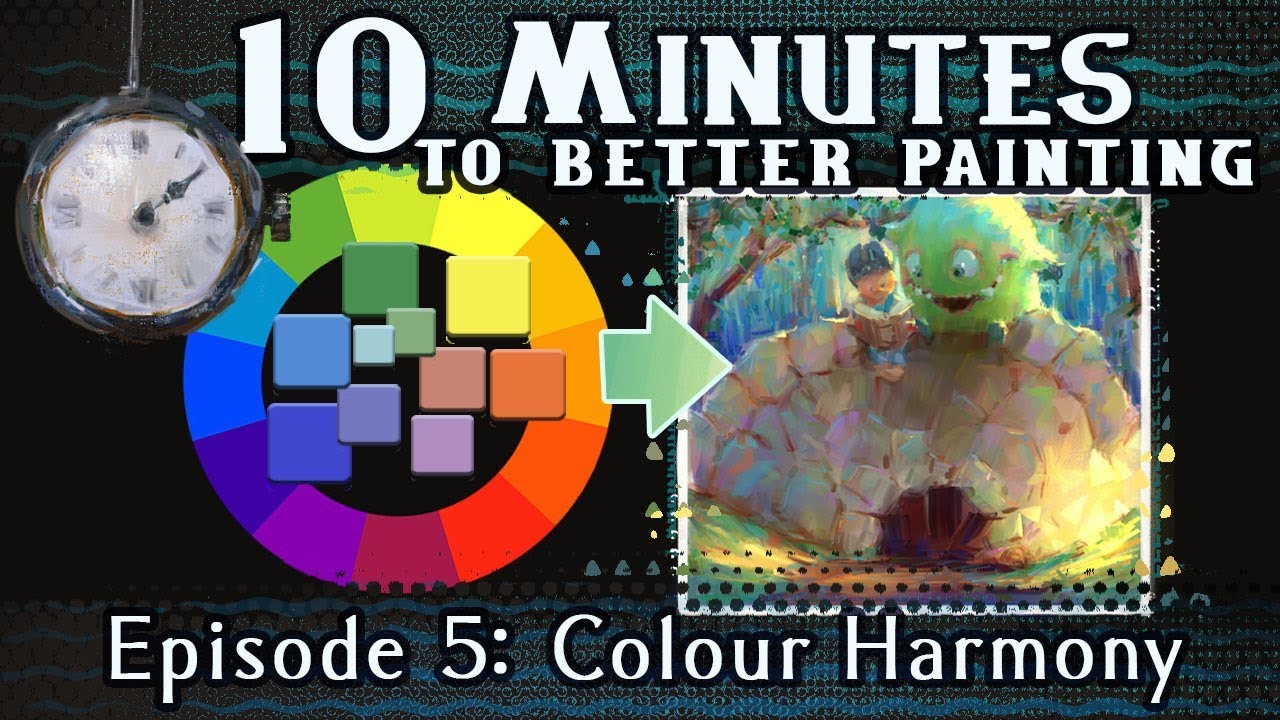
Color harmony describes combinations of colors that work together in a predictable, visually coherent way. The rules come from the geometry of the color wheel: specific angular relationships between hues produce specific effects.
None of these are absolute rules. They are starting points, not formulas. Harmony in art has always involved breaking the rules at the right moment.
Complementary and Split-Complementary

<strong>Complementary colors</strong> sit directly opposite each other on the color wheel. Blue and orange. Red and green. Yellow and violet. The contrast between them is about as high as it gets.
Used together at full saturation, complementary pairs vibrate visually. This is called simultaneous contrast, first described systematically by Michel Chevreul in the 1830s: colors placed next to their complements appear more saturated and vibrant than they would in isolation.
Split-complementary takes one hue and pairs it with the two colors adjacent to its complement rather than the complement itself. The result is still high contrast, but with more flexibility and less visual tension.
Henri Matisse built most of his signature palette around complementary pairs, particularly red-green and orange-blue. The visual energy in his work comes directly from that.
Analogous Colors
Analogous schemes use three to five hues that sit next to each other on the wheel. Think red, red-orange, orange. Or blue-green, blue, blue-violet.
The result is naturally cohesive and low-conflict. It reads as calm, unified, sometimes a little quiet.
- Works well for backgrounds, ambient environments, and contexts where harmony matters more than contrast
- Common in landscape painting and interior design
- The risk is monotony: analogous palettes can feel flat without a value contrast working alongside them
Claude Monet‘s water lily series leans heavily on analogous greens and blues, with just enough warm accents to keep the paintings from going flat.
Triadic and Tetradic Schemes
Triadic schemes use three hues evenly spaced around the wheel (120 degrees apart). Red, yellow, and blue. Orange, green, and violet.
The balance is mathematically satisfying, but these palettes are genuinely hard to use well. All three hues compete for attention. In practice, most successful triadic palettes subordinate two of the three colors, using one as dominant and the others as accents.
Tetradic (or square) schemes use four hues spaced at 90-degree intervals. Even more options, even more complexity. Variety is built in. Balance is not.
Piet Mondrian‘s primary color compositions are a reduced version of triadic logic: red, yellow, and blue held in tension through deliberate proportion and black structure.
Monochromatic Schemes
A monochromatic color scheme uses a single hue across a range of tints, shades, and tones.
Tint: hue mixed with white. Shade: hue mixed with black. Tone: hue mixed with gray.
The result is highly unified, elegant, and easier to control than multi-hue schemes. The limitation is obvious: without hue contrast, everything depends on value contrast to create visual interest. Get the values wrong and the whole thing collapses.
Color Models and Color Spaces
Color models are mathematical systems for defining and reproducing color. Color spaces define the specific range of colors a system can represent. They are related but not the same thing.
This distinction matters the moment you move color between devices or between screen and print.
RGB and Its Variants
RGB is additive: it defines color by mixing red, green, and blue light. All digital screens use it. The specific version of RGB makes a big difference though.
sRGB is the standard for the web and most consumer devices. It covers a relatively small portion of visible color. Adobe RGB covers a wider gamut, useful for print-targeted work where the printer can reproduce colors outside sRGB’s range. Display P3, used on Apple displays since 2016 or so, covers about 25% more colors than sRGB. It is increasingly the baseline for high-quality digital design.
Designing in sRGB on a Display P3 screen is tricky because the screen can show colors your file cannot actually represent. What looks vibrant in Figma may look duller on a standard monitor or older phone.
CMYK and Print Reproduction
CMYK is subtractive. Ink absorbs light rather than emitting it. The gamut, meaning the range of reproducible colors, is smaller than sRGB in some areas and larger in others.
Key practical issue: some RGB colors simply cannot be printed. Bright electric blues and vivid oranges are the usual casualties. ICC profiles map the relationship between color spaces and tell applications how to shift colors when converting between them. Without proper ICC profile management, color shifts between screen and print are unpredictable.
Most commercial printers request files in CMYK with embedded ICC profiles. Sending RGB files is technically fine with many modern printers, but it hands the conversion to them rather than you.
LAB Color Space
LAB (or CIELAB) is device-independent. It maps color based on human visual perception rather than on how any specific device works. L represents lightness, A represents the green-red axis, and B represents the blue-yellow axis.
LAB is the color space used internally by Photoshop for color conversions because it is the most perceptually uniform system available. When you convert RGB to CMYK in Photoshop, it goes through LAB as an intermediate step.
It is also used in color difference calculations, measuring how far apart two colors appear to a human observer. That has direct applications in quality control for print, manufacturing, and product design.
Color Temperature
Color temperature describes the perceived warmth or coolness of a color. It is one of the more intuitive concepts in color theory, but it operates on two different levels: the physics of light sources and the perceptual associations of hues.
Warm and Cool Colors
In the RYB color wheel, warm colors sit on one side (reds, oranges, yellows) and cool colors on the other (blues, greens, purples). This warm/cool split is the most basic form of temperature contrast.
Warm colors tend to advance visually, appearing closer to the viewer. Cool colors tend to recede.
This perceptual effect is not absolute. It depends on context. A warm orange next to a cooler red-orange appears warm. The same orange next to a hot yellow can read as relatively cool. Temperature is always relative to its surroundings.
Vincent van Gogh pushed warm-cool contrast aggressively, placing complementary temperature pairs directly against each other to create visual vibration. His use of yellow-orange against blue-violet in “The Starry Night” is a direct application of simultaneous contrast through temperature difference.
Color Temperature in Light Sources
In lighting, color temperature is measured in Kelvin. This is a different use of the term, rooted in physics rather than perception.
- 2700-3000K: warm white, incandescent light, amber-yellow cast
- 4000-4500K: neutral white, common in office lighting
- 5500-6500K: daylight, cool blue-white cast
- 8000K+: overcast sky, very blue
This matters directly for painters and photographers. Painting a subject under warm incandescent light and then photographing it under daylight will produce noticeably different color readings. En plein air painting deals with this constantly: the light temperature shifts throughout the day and the shadows change color accordingly.
Temperature in Composition
Warm and cool contrast is one of the most reliable tools for creating depth in a painting or illustration. Warm foregrounds and cool backgrounds mimic the way atmospheric haze desaturates and cools distant objects.
This is the basis of atmospheric perspective: objects in the distance not only appear smaller and less distinct, they also appear cooler and more blue-gray. Leonardo da Vinci wrote about this explicitly and used it consistently in his landscape backgrounds.
The principle works in reverse too. Placing a cool element in a warm environment, or vice versa, immediately draws the eye. Temperature contrast is one of the fastest ways to establish a focal point without using value contrast or edge sharpness.
Color Psychology
Color psychology studies how colors influence emotion, perception, and behavior. It is not a hard science with universal laws. Context, culture, saturation level, and personal history all change how a color lands.
That said, certain patterns hold up consistently across research. Warm colors (reds, oranges, yellows) tend to raise arousal. Cool colors (blues, greens) tend to lower it. These findings show up repeatedly across studies in neuroscience, marketing, and environmental design.
How Specific Colors Affect Perception
Red raises heart rate and increases perceived urgency. It is associated with appetite stimulation, which is why it appears in so many food brand identities. Red also correlates with higher arousal states and increased saturation amplifies this effect, according to research published in Frontiers in Psychology (2025).
Blue is the most universally preferred hue across cultures. Research on color-emotion associations links it to trust, calm, and reduced blood pressure. A 2024 Yale Behavioral Science lab study found navy increased trust perception by 41%.
Yellow is associated with optimism and energy at moderate saturation. At very high saturation, it can become visually fatiguing. A 2023 Oxford Psychology experiment found yellow correlated with 32% higher optimism scores among participants.
Green activates relaxation centers in the brain. A 2023 Radboud University fMRI study of 800 participants found green activated relaxation-related brain areas in 38% more instances than neutral stimuli.
Where Context Overrides the Rules
Color psychology has real limits. A red background reads very differently in a Chinese New Year banner versus a warning label.
Frank Mahnke’s research in “Color and Human Response” documents how the same hue can produce opposite emotional readings depending on the surrounding colors, the brightness of the environment, and the cultural background of the viewer. Relying on generic color-emotion rules without testing them in context is one of the more common mistakes in applied design.
Color saturation level also modifies emotional response significantly. The same blue at 20% saturation reads as calm and professional. At 100% saturation it reads as loud or even aggressive. Most color psychology studies are conducted at a fixed saturation, which limits how directly their findings apply to real design decisions.
Color Psychology in Marketing
Color influences 85% of consumer purchase decisions, according to research cited across multiple marketing studies (Illuminz, 2024; Webtribunal, 2023).
That number is often quoted without context, so here is some: it reflects how large a role visual appearance plays at the point of sale, not that any single color guarantees a specific outcome.
- Blue dominates finance and tech branding (trust, stability)
- Red is standard in food, retail sales, and CTAs (urgency, appetite)
- Green anchors sustainability, health, and organic branding
- Black and desaturated palettes signal luxury and exclusivity
According to Straits Research (2024), 33% of top global brands use blue, 28% use black or grayscale, and 23.4% use red as their primary brand color.
Color meanings vary significantly across cultures, which matters for any brand operating internationally. Euro Disney learned this directly when its use of purple in European marketing materials carried unintended associations with death and the crucifixion in Catholic European markets.
Color Contrast and Accessibility

Color contrast is the measurable difference in lightness between a foreground element and its background. It determines whether text, icons, and UI components are readable for people across different vision abilities.
WebAIM’s 2024 Million report found low-contrast text on 81% of homepages tested. It has consistently ranked as the most common accessibility failure since WebAIM began its annual analysis.
WCAG Contrast Requirements
WCAG 2.1 sets specific minimum contrast ratios. These are not suggestions.
| Content Type | WCAG AA Minimum | WCAG AAA |
|---|---|---|
| Normal text (under 18px) | 4.5:1 | 7:1 |
| Large text (18px+ or 14px bold) | 3:1 | 4.5:1 |
| UI components and icons | 3:1 | 3:1 |
In April 2024, the US Department of Justice updated Title II of the ADA, mandating WCAG 2.1 AA compliance for state and local government websites. Deadlines run through 2026 and 2027 depending on entity size.
Tools for checking contrast: WebAIM Contrast Checker, Figma’s Stark plugin, and Color Oracle for simulating color blindness conditions during design review.
Designing for Color Blindness
Color vision deficiency affects roughly 8% of men and 0.5% of women worldwide, totaling an estimated 300 million people globally (Colour Blind Awareness).
Red-green color blindness (deuteranopia and protanopia combined) accounts for 98% of all cases. This makes red-green-only signaling systems genuinely problematic at scale.
Key design rule: never use color as the only means of conveying information.
Pair color with labels, icons, or patterns. A chart that uses only red and green to distinguish data categories will be unreadable for a significant portion of your audience. Adding a pattern fill or a direct label costs nothing and solves the problem.
Color contrast decisions in art and design are not purely aesthetic. Contrast is function.
Color in Branding and UI Design
Color is one of the fastest ways a brand communicates before anyone reads a word. It is also one of the easiest things to get inconsistent at scale.
Maintaining consistent brand colors across all touchpoints drives up to 20% more revenue for over 60% of companies, according to Lucidpress brand consistency research.
Brand Color Strategy
Most effective brand color systems use three roles, not three random colors.
- Primary: the dominant brand color, used most frequently
- Secondary: supports the primary, adds range without competing
- Accent: used sparingly for CTAs, highlights, and interactive states
The relationship between these three should follow a rough 60-30-10 proportion rule. Sixty percent primary, thirty percent secondary, ten percent accent. It is a rough guide, not a formula, but it prevents palettes from feeling chaotic.
Choosing the right hue for a brand starts with understanding the emotional and cultural associations it carries, then verifying those associations hold in the specific markets and demographics the brand operates in.
Color Tokens in Design Systems
Design tokens replace hard-coded hex values with named variables. Instead of #1F6AE3 appearing 300 times in a codebase, you have one token called color-primary-blue that references it everywhere.
IBM’s Carbon Design System uses semantic color tokens like interactive-01 for primary actions and danger-01 for error states. These tokens adapt dynamically across brand themes and accessibility settings without requiring manual updates across every component.
Token-based color systems organize into three tiers, according to Material UI and UX Collective documentation.
- Reference tokens: raw values (color.blue.500 = #0066CC)
- System tokens: semantic roles (color-primary, color-error)
- Component tokens: mapped to specific UI elements (button-background, input-border)
Shopify’s Polaris design system follows this same three-tier model. When Shopify updates a brand color, changing one reference token cascades through the entire system automatically.
Color in UI Design
UI color decisions are not the same as brand color decisions. They serve different functions.
Brand colors carry identity and emotion. Functional colors communicate system states: success, warning, error, disabled, active. Mixing these categories creates interfaces that feel inconsistent and are harder to scan.
A 2024 Nielsen Norman Group UX study found blue buttons increased click-through rates by 27% in e-commerce, and green by 22% for eco-focused products. The lesson is not “always use blue buttons.” The lesson is that color meaning in UI is partly learned through convention. Breaking convention requires a reason.
Visual hierarchy in interface design depends heavily on color weight. Darker, more saturated colors carry more visual weight. Place them on the elements you want users to notice first.
How to Build a Color Palette
Building a palette from scratch is one part color theory and one part testing. The theory gives you a starting structure. Testing tells you whether it actually works.
Starting from a Base Hue
Pick one anchor hue. Everything else is built around it.
The anchor should reflect the primary purpose of the palette: the emotional quality you want to lead with, the brand context, or the visual environment it will live in. Getting this decision right matters more than any subsequent step.
From the anchor, build a tint-to-shade scale: typically 9-10 stops ranging from near-white to near-black. Tools like Coolors, Adobe Color, and Huemint automate the initial generation. The result still needs manual adjustment because algorithms do not account for perceptual uniformity across the scale.
Expanding the Palette Using Harmony Rules
Once the base hue is set, the remaining palette colors are derived from color wheel relationships.
| Palette Type | How It’s Built | Best For |
|---|---|---|
| Analogous | Adjacent hues on the wheel | Cohesive, calm environments |
| Complementary | Opposite hue for accent | High contrast, bold identity |
| Triadic | Three hues at 120-degree intervals | Energetic, diverse palettes |
| Monochromatic | Single hue, varied value and saturation | Minimal, sophisticated work |
Most practical palettes combine approaches. A brand might use an analogous pair for its primary and secondary colors, then bring in the complement of the primary as the accent.
Neutrals and Functional Colors
Neutrals are not optional. They are the majority of most palette surface area.
A neutral scale (from near-white to near-black) should be built separately from the brand color scale. Warm neutrals (with a slight red or yellow undertone) pair better with warm brand palettes. Cool neutrals (with blue or green undertones) pair better with cool ones. Mixing a warm brand color against a cool neutral creates a subtle tension that most people cannot identify but will feel.
Functional colors (success green, warning yellow, error red) need to be selected for contrast first and palette harmony second. A “success green” that perfectly matches the brand palette but fails a 4.5:1 contrast check is not a usable success green.
Testing Before Finalizing
Three tests before any palette is final:
- Grayscale test: convert to grayscale and check that value differences still create clear contrast
- Color blindness simulation: run through deuteranopia and protanopia filters using Color Oracle or Stark
- Context test: view the palette in actual use cases, not just as swatches on a white background
A palette that looks balanced as a swatch grid can fall apart when applied to real interfaces or paintings. The grayscale test alone catches a surprisingly large number of problems early.
For painters, the equivalent of a palette test is a value study: working through the composition in a single color or in grayscale before committing to the full color palette. Paul Cezanne was known for working through the structural value relationships in his compositions before pushing into color, and the stability of his paintings reflects that discipline.
FAQ on Color Theory
What is color theory?
Color theory is the study of how colors interact, how humans perceive them, and how they can be combined effectively. It draws from physics, perception science, and psychology to guide decisions in art, design, and branding.
What are the primary colors?
In the traditional RYB model, the primary colors are red, yellow, and blue. In digital design, the primaries shift to red, green, and blue (RGB). In print, they are cyan, magenta, yellow, and black (CMYK).
What is a color wheel?
A color wheel is a circular diagram mapping relationships between hues. It shows primary, secondary, and tertiary colors in sequence, making it easy to identify complementary pairs, analogous groups, and other harmonic combinations used in design and painting.
What is color harmony?
Color harmony describes combinations of colors that create a visually balanced or intentionally contrasted result. Common harmony types include complementary, analogous, triadic, and monochromatic schemes, each producing a different visual effect and emotional tone.
What is the difference between hue, saturation, and value?
Hue is the color itself (red, blue, yellow). Saturation measures its intensity or purity. Value describes how light or dark it appears. All three work together; changing any one of them produces a noticeably different color experience.
What are complementary colors?
Complementary colors sit directly opposite each other on the color wheel. Pairing them creates maximum contrast. Common pairs include blue and orange, red and green, and yellow and violet. Used together at full saturation, they produce strong visual vibration.
What is color psychology?
Color psychology studies how colors influence emotion and behavior. Red raises arousal and urgency. Blue signals trust and calm. Responses vary by culture, saturation level, and context. No single color produces the same effect in every situation.
What is the difference between RGB and CMYK?
RGB is an additive model used for screens, mixing red, green, and blue light. CMYK is subtractive, used for print. Colors created in RGB sometimes cannot be reproduced accurately in CMYK, which is why color shifts between screen and print occur.
What are tints, shades, and tones?
A tint is a hue mixed with white. A shade is a hue mixed with black. A tone is a hue mixed with gray. All three adjust the value and saturation of a color without changing its underlying hue.
How does color contrast affect accessibility?
Poor color contrast makes text and UI elements unreadable for people with low vision or color blindness. WCAG 2.1 requires a minimum 4.5:1 contrast ratio for normal text. WebAIM’s 2024 report found low-contrast text on 81% of tested homepages.
Conclusion
This conclusion is for an article presenting color theory as both a practical tool and a perceptual science, not just a set of rules to memorize.
Understanding the color wheel, color harmonies, and the differences between RGB, CMYK, and LAB gives you real control over color decisions, whether you are mixing paint or building a design system.
Color contrast, accessibility standards, and color psychology are not separate topics. They all connect back to how humans see and respond to color.
The painters who used these principles most effectively, from Georges Seurat‘s optical color mixing to Mark Rothko‘s use of color saturation and value, understood that color is never just decoration.
It is structure. Use it deliberately.