

Strip the color from any great painting and it still works. That’s value doing its job.
So what is value in painting? It’s the lightness or darkness of a color, and it controls everything from depth to mood to where your eye lands first. Get the values right and even a limited palette produces convincing light. Get them wrong and no amount of brilliant color harmony will fix it.
This guide covers how the value scale works, why it matters more than hue, how different mediums handle value shifts, and what master painters like Rembrandt and John Singer Sargent understood about tonal structure that most beginners miss.
What Is Value in Painting
Value is the lightness or darkness of a color in painting. That’s it. Not how bright a color is, not what hue it is, just how light or dark it reads on a scale from white to black.
It sits alongside line, shape, form, texture, and space as one of the classical elements of art. But ask any painting instructor which element they’d save if they could only keep one, and most will pick value without hesitating.
The confusion usually starts because value gets tangled up with other color properties. Color saturation describes how intense or muted a color is. Hue tells you whether something is red or blue. Value does neither of those things. It only measures where a color falls between pure white and pure black.
The Munsell Color System, developed by Albert Munsell in 1905, formalized this idea by placing value on a scale from 0 (black) to 10 (white). Every color, regardless of hue or saturation, occupies a specific position on that scale. A bright cadmium yellow might sit around value 8. A deep ultramarine blue might land closer to value 3.
That distinction matters. Two colors can look completely different in terms of hue but read as identical when converted to grayscale. If you can’t tell them apart in a black-and-white photo, they share the same value.
Value vs. Tone vs. Shade
People mix these terms up constantly, even in art schools. Here’s the quick breakdown:
- Value: the full range of lightness to darkness in any color
- Tone: a color mixed with gray, reducing its intensity while adjusting its value
- Tint: a color mixed with white, raising its value
- Shade: a color mixed with black, lowering its value
Value is the umbrella concept. Tint, shade, and tone are the specific ways you move up or down the value scale when mixing paint.
Why Value Matters More Than Color

A painting can survive wrong colors. It cannot survive wrong values.
That sounds extreme, and maybe it is, but it’s the one thing that nearly every classically trained painter agrees on. You can shift every hue in a painting toward purple and it will still read correctly if the value relationships hold. Mess up the values, though, and no amount of beautiful color will save it.
According to the Art Basel and UBS Global Art Market Report 2025, paintings remained the most purchased medium and the largest segment by value in the global art market. Collectors respond to what reads well visually, and strong tonal structure is a big part of that.
The classic test is simple. Squint at a painting. When you narrow your eyes, color information drops away and you mostly see light and dark patterns. If the painting still reads clearly (you can identify the subject, see where the focal point is, understand the spatial depth), the value structure is working.
John Carlson, who wrote what is probably the most referenced book on landscape painting composition, organized his entire approach around grouping values into four major categories: sky, ground plane, slanted planes, and upright planes. Each one occupies a specific value range. Get those ranges right and the landscape holds together. Get them wrong and it falls apart, no matter how accurately you match the colors.
The Grayscale Test
Painters have been checking their value structures for centuries by squinting at their work. These days, you can do it faster.
Snap a photo of your painting. Convert it to grayscale on your phone. What you see is the value map, stripped of all color distraction.
If the grayscale version looks flat or muddy, you have a value problem. If everything blends into a similar gray, there isn’t enough contrast. If your focal point disappears, you need stronger value differentiation at that spot.
Took me a while to actually trust this method over my own eyes. But the camera doesn’t lie about value the way our color-biased perception does.
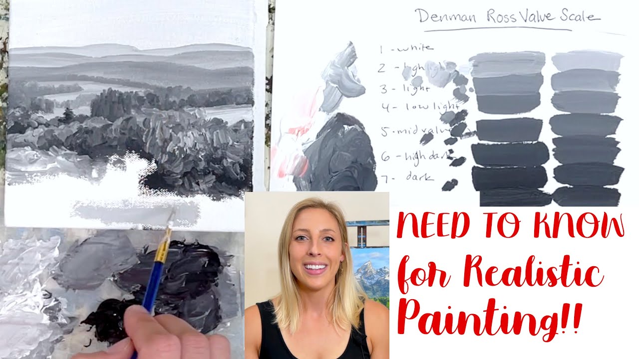
The Value Scale and How Painters Use It

A value scale is a visual chart showing steps from pure white to pure black. Most painters work with a 9-step or 10-step scale, though the Munsell system technically defines 11 positions (0 through 10).
Here’s the practical version most painters reference:
| Value Range | Category | Description | Primary Artistic Function |
| 1–3 | Low Key | Deep blacks to dark greys. | Establishes deep shadows, night scenes, and heavy silhouettes. |
| 4–6 | Mid Key | Neutral greys. | Defines the local color of objects and smooth transitions. |
| 7–9 | High Key | Light greys to pure white. | Represents highlights, sky, and surfaces in direct light. |
Most beginners paint everything in the 4-6 range. That’s why their work looks flat. They avoid committing to real darks or pushing highlights far enough.
The range of values you choose for a painting determines its overall mood before a single brushstroke of color goes down. A compressed value range creates a quiet, atmospheric feel. A full range with strong darks and bright lights produces drama.
High-Key and Low-Key Paintings
High-key paintings use mostly light values, typically in the 5-9 range. Think of Claude Monet‘s sun-drenched garden scenes or a bright beach landscape. The mood is airy and open.
Low-key paintings concentrate in the 1-5 range. Rembrandt van Rijn‘s portraits sit heavily in this territory. Most of the canvas lives in shadow, with just a few areas of light pulling your attention.
James McNeill Whistler pushed this idea further with his Nocturnes. Some of those paintings operate in a value range of maybe three steps. Everything is dark, moody, and atmospheric. The limited tonal range is the whole point.
When the Tonalist movement picked up steam in the late 1800s, painters deliberately compressed their value scales to create quiet, meditative work. They weren’t painting dark because they couldn’t see. They were making a compositional choice about how much of the value scale to use.
Value Structure in Composition

Value organizes a painting. It tells the viewer where to look, what’s in front, and what’s behind. Without a clear value structure, even a painting with beautiful color theory and correct drawing will feel disorganized.
The fastest way to see this in action is through notan, a Japanese design concept that maps a composition into just two values: light and dark.
How Notan Reveals Your Composition
A notan study strips away all detail and reduces your image to black and white shapes. If the subject is still recognizable and the design looks interesting at this extreme level of simplification, the underlying value structure is strong.
Arthur Wesley Dow referenced notan as one of three core composition elements (alongside line and color) in his 1899 book on composition design. The idea has been around in Japanese art for centuries, but Dow brought it into Western art education.
Painters often do two-value and three-value notan studies as thumbnails before starting a full painting. Basically a couple of minutes with a brush pen and a sketchbook. If the design doesn’t work in two values, it won’t work in twenty.
Value Grouping and Focal Points
Highest contrast draws the eye. Place your lightest light next to your darkest dark, and that’s where the viewer looks first. This is how value creates a visual hierarchy without any help from color.
Edgar Payne’s compositional frameworks for landscape painting are built almost entirely on how value masses are arranged. He categorized compositions by how the large dark and light shapes interact: radiating lines, steelyard balance, S-curves, and so on.
The grouping principle is simple. Shadows that are close in value should be connected into one mass. Lights that are close in value get grouped together too. This separation between light family and dark family creates readable structure.
When painters talk about “breaking up the value grouping,” they mean losing that clarity. Too much detail in the shadows, or midtones that drift into neither camp, and suddenly the painting loses its punch.
Value and Color Temperature

Here’s where it gets tricky. Every hue has an inherent value that most people don’t think about.
Yellow is naturally a high-value color. Even at full saturation, cadmium yellow sits around value 7 or 8 on the Munsell scale. Violet, on the other hand, is naturally low-value. At full saturation, it barely reaches value 3.
This means that a pure yellow and a pure violet, placed side by side, already have massive value contrast built in, even though you haven’t added any white or black to either one.
Why This Causes Problems
The challenge comes when you’re painting a shadow on a yellow object. You need to darken the yellow to get it into the shadow value range, but darkening yellow changes its hue. Add black and it goes green. Add its complement and you get a muted brownish tone.
Keeping the right value while preserving color identity is one of the harder color mixing skills. It’s the reason portrait painters spend so much time figuring out how to mix skin tones that move from light to shadow without looking dirty or dead.
Anders Zorn worked with a famously limited palette of just four colors (yellow ochre, cadmium red, ivory black, and titanium white) and still achieved incredible value accuracy. His entire approach relied on getting value right first. With only four colors, he couldn’t lean on fancy hue shifts to create the illusion of depth.
The Warm Light, Cool Shadow Principle
A common guideline in painting: if the light is warm, the shadows lean cool. If the light is cool, the shadows lean warm.
But this temperature shift has to happen within the correct value range, or the whole thing falls apart. A warm, light-valued highlight next to a cool, dark-valued shadow only works when the value contrast is correct. If both areas sit at the same value, the temperature shift alone won’t create convincing form.
Your mileage may vary on this one. Outdoor painting conditions, different light sources, even the time of day, all change how warm-cool relationships play out. But the value relationship stays consistent regardless.
How to See and Judge Value Accurately

Seeing value is a skill, not a talent. And it is surprisingly hard to do well because our eyes are wired to see color first. Isolating the lightness or darkness of a color from its hue and saturation takes practice.
According to the National Endowment for the Arts, students in arts education programs show improved critical thinking and problem-solving abilities. Learning to accurately perceive value is one of those skills that transfers into better observation across the board.
Squinting and Why It Works
This is the oldest trick in painting. Squint at your subject and your painting alternately.
When you squint, you reduce the amount of light entering your eyes. This collapses detail, simplifies edges, and compresses color information. What remains is the large-scale value pattern.
The problem is that most people don’t squint hard enough. You should barely be able to see. If you can still read text while squinting, you’re not squinting enough. The goal is to see blobs of light and dark, not details.
Tools for Checking Value
Red acetate filter: holding a red transparent sheet over your subject removes most color information, making value relationships easier to judge.
Phone camera in grayscale: faster than squinting. Most phones have a grayscale accessibility setting you can toggle with a shortcut.
Value finder: a gray card with small holes punched in it. Hold it up to a color in your scene, and the surrounding gray helps you match the value by comparison. You’re seeing the color in isolation against a known neutral.
Common Perception Mistakes
White objects in shadow look darker than you think. Most painters instinctively paint them too light because they “know” the object is white.
Dark objects in light look lighter than you think. Same problem in reverse. A black jacket in sunlight might actually be a mid-value gray, but your brain insists it should be dark.
The fix is to always compare values relative to each other, not in isolation. Ask: is this area lighter or darker than the area next to it? By how much? That relative comparison is more accurate than trying to assign an absolute value number to each spot.
Value in Different Painting Mediums

Not all paint behaves the same when it dries. The value you mix on your palette might not be the value you see on your canvas an hour later. Each painting medium handles value shift differently, and knowing this before you start saves a lot of frustration.
| Medium | Value Shift When Drying | Technical Strategy | Key Challenge |
| Oil | Minimal to None | Mix the exact value you see on the palette. | Can yellow over decades if excessive linseed oil is used. |
| Acrylic | Dries Darker | Mix your colors one step lighter than your target value. | The plastic binder turns from milky to clear, deepening the value. |
| Watercolor | Dries Lighter | Apply washes stronger and more saturated than needed. | Pigments settle into the paper and lose vibrance as water evaporates. |
| Gouache | Dries Lighter | Darks dry lighter; lights dry darker. | High pigment load makes value matching during layering extremely difficult. |
Oil Paint and Value Stability
Oil painting gives the most reliable value control. What you see wet on the palette is close to what you’ll get when it dries.
The slow drying time (days to weeks, depending on thickness) means you can adjust values while the paint is still workable. That’s a huge advantage for anyone doing careful tonal work like portraits or grisaille underpaintings.
The catch? Oil paint bound with linseed oil can yellow slightly over decades, which shifts light values warmer. Johannes Vermeer‘s paintings, for instance, likely looked cooler and brighter when first completed than they do today.
Acrylic Paint’s Darkening Problem
Golden Artist Colors (one of the largest acrylic paint manufacturers) confirms this directly: the acrylic binder appears milky white when wet and dries clear, causing colors to look darker once the water evaporates.
Darker colors shift more noticeably than lighter ones. A mix of ultramarine blue will darken more obviously than a pale yellow tint.
The practical fix is simple. Mix your acrylic colors about one value step lighter than your target. It feels wrong when you’re painting, but it dries to the value you actually want.
Watercolor’s Opposite Problem
Watercolor dries lighter. Sometimes significantly lighter.
Value control in watercolor depends almost entirely on the water-to-pigment ratio. More pigment, darker value. More water, lighter value. And since the white of the paper is your lightest light (there’s no white watercolor paint in traditional practice), planning your values in advance is non-negotiable.
Bruce MacEvoy’s research on handprint.com documents that drying shifts vary dramatically by pigment. Prussian Blue and Ivory Black show some of the largest shifts, while Cerulean Blue and Cadmium Lemon stay relatively stable.
Doing a Value Study Before Painting
![]()
Skipping the value study is like building a house without a floor plan. You might get lucky. Probably won’t.
A value study is a small, quick sketch (usually 2 to 4 inches) that maps out the major light and dark shapes of your composition before you commit to a full painting. It takes five minutes. It saves hours.
Plein air painters rely on these heavily. When you’re standing outside with shifting light, you don’t have time to figure out your value structure while also mixing color and fighting the wind. The value study locks in your plan. Everything else builds on top of it.
Two-Value, Three-Value, and Four-Value Studies
Two-value study: just black and white. Forces you to decide what’s in the light family and what’s in the shadow family. No in-between allowed. If you can’t read the subject at this level, the composition has a problem.
Three-value study: adds a middle gray. Gives you more information about how midtones connect the lights and darks. Better for complex subjects with a lot happening in the mid-range.
Four-value study: dark, dark-mid, light-mid, light. At this point you’re doing a proper tonal sketch. This is about as complex as you need before painting.
Going beyond four values in a thumbnail study defeats the purpose. The whole point is simplification.
Tools for Value Studies
- Graphite pencil (quick, easy to control, works anywhere)
- Tombow brush pens in gray tones (great for quick notan-style sketches)
- Procreate or Photoshop with a grayscale brush on an iPad
- Acrylic markers for blocking in large value shapes fast
Sketching before painting with any of these tools makes the actual painting session faster and more confident. You already know where everything goes.
Common Value Mistakes in Painting

Most value problems come from the same handful of errors. And honestly, experienced painters still fall into these traps. Knowing what to watch for makes them easier to catch early.
Painting Everything in the Middle
This is the number one value mistake across all skill levels. Every area of the painting lands somewhere between value 4 and 6. No real darks. No bright highlights. Just a narrow band of similar grays.
The result looks flat and lifeless. Your sense of depth disappears because there’s not enough tonal separation between foreground, middle ground, and background.
The fix: push your darks darker and your lights lighter. It almost always feels like too much while you’re painting. But step back ten feet and it reads correctly.
Ignoring the Light Source
Every object in a painting should respond to the same light source. When values don’t follow a consistent lighting logic, viewers sense something is wrong even if they can’t articulate it.
A sphere lit from the upper left should have its lightest value on the upper left, its darkest value on the lower right, and a gradation between them. If you paint a highlight on the wrong side, the form reads as broken. John Singer Sargent famously said that appreciation of value is training of the eye that everyone can learn.
Over-Rendering Shadows
Too much detail in the shadows breaks the value grouping. Shadows should generally stay connected as one cohesive dark mass. When you start putting sharp details, hard edges, and strong color shifts inside the shadows, they break apart visually.
Rembrandt‘s approach was the opposite. He kept shadows simple and unified, often painting them as one connected shape. Then he loaded the light areas with detail and texture. That separation between detailed lights and simplified darks is what gives his work so much visual impact.
Confusing Color Intensity With Value
A bright, saturated red and a dull gray-green might actually sit at exactly the same value. Your brain reads them as different because the color is different, but in a grayscale conversion, they’d look identical.
This is why the grayscale phone check is so useful. It strips away the color distraction and shows you whether you actually have value contrast, or just color contrast pretending to be value contrast.
Artists Known for Strong Value Control

Looking at how master painters used value is one of the fastest ways to train your own eye. These are the artists whose work holds up perfectly in grayscale, proof that their value structures carry the compositions.
Rembrandt and Chiaroscuro
Chiaroscuro, literally “light-dark” in Italian, defines Rembrandt’s entire approach. Most of his canvas sits in shadow. A narrow band of light falls across faces, hands, or key objects, pulling your attention exactly where he wants it.
A 2019 study published in the Journal of Cultural Heritage used digital luminosity histograms to analyze Rembrandt’s self-portraits and found that his chiaroscuro patterns create a statistically identifiable “signature.” Copies and forgeries consistently fail to match the original value distributions.
Caravaggio pushed this even further into tenebrism, where the backgrounds go completely black and the figures emerge from total darkness. Dramatic. Almost theatrical.
Anders Zorn’s Limited Palette
Zorn painted with just four colors: yellow ochre, cadmium red, ivory black, and white. That’s it. With such a restricted palette, his paintings couldn’t rely on hue variety for impact. Value did all the heavy lifting.
His nudes and landscapes painted en plein air demonstrate how a painter who truly understands tonal relationships can create convincing light and atmosphere without reaching for a bigger color selection.
John Singer Sargent’s Direct Approach
Sargent had a quote that pretty much sums up this entire article: “Color is an inborn gift, but appreciation of value is merely training of the eye, which everyone ought to be able to acquire.”
His method was built on getting values right from the first stroke. He would mix a color, judge its value against the model, and place it directly on the canvas. No blending, no fussing. Each brushstroke was a value decision.
According to accounts from his students (documented by Harrington Mann and others), Sargent would step back after almost every stroke to compare the value on the canvas with the value on the model from a distance. The carpet in his studio reportedly had worn tracks from this constant back-and-forth.
Contemporary Painters and Value-First Teaching
The value-first approach didn’t stop with the old masters. Several well-regarded contemporary painters and instructors carry the tradition forward.
- Richard Schmid: his book “Alla Prima” is built around value accuracy as the foundation of all painting
- Scott Christensen: known for landscape work where value structure drives everything
- Stapleton Kearns: regularly writes about value grouping and painting design on his blog
The Art Basel and UBS Global Art Market Report 2025 shows paintings remained the most purchased art medium globally, with 66% of high-net-worth collectors buying works by newly discovered artists in 2024. Strong tonal structure is part of what separates work that resonates from work that gets scrolled past.
FAQ on What Is Value In Painting
What does value mean in painting?
Value refers to how light or dark a color appears. It exists on a scale from pure white to pure black. Every color has an inherent value regardless of its hue or intensity.
Why is value more important than color?
A painting with accurate values but wrong colors still reads correctly. Wrong values with perfect colors looks broken. Value creates the structure that makes form, depth, and light believable to the viewer.
What is a value scale in art?
A value scale is a chart showing gradual steps from white to black, typically in 9 or 10 steps. Painters use it to train their eyes and to check whether their tonal range is wide enough.
What is the difference between value and tone?
Value covers the full range of lightness to darkness. Tone specifically refers to a color mixed with gray. Tints (mixed with white) and shades (mixed with black) also shift value.
How do you check values in a painting?
Squint at your work to collapse detail and see large light and dark patterns. Or photograph your painting and convert it to grayscale on your phone. Both methods strip away color to reveal the value map.
What is a high-key painting?
A high-key painting uses mostly light values, roughly in the 5 to 9 range. Impressionist works by Monet often fall into this category. The mood feels airy and sun-filled.
What is a low-key painting?
A low-key painting concentrates in the darker value range, typically 1 to 5. Baroque painters like Caravaggio and Rembrandt used low-key palettes to create dramatic, shadow-heavy compositions.
Do acrylic paints change value when they dry?
Yes. Acrylics dry darker because the binder appears milky when wet and turns clear as it dries. Mix your colors about one value step lighter than your target to compensate for this shift.
What is a notan study?
A notan is a simple two-value sketch (black and white only) that tests whether your composition has a strong light-dark design. If the subject reads clearly in just two values, the underlying structure works.
How did Rembrandt use value in his paintings?
Rembrandt used chiaroscuro to concentrate most of his canvas in shadow while directing light onto faces and hands. This value control created powerful focal points and emotional depth across his portraits.
Conclusion
Understanding what is value in painting comes down to one thing: learning to see light and dark before you see color. It’s the skill that separates muddy, flat work from paintings that feel alive.
Whether you’re working in oils, acrylics, or watercolors, the tonal structure carries your composition. It builds pictorial space, directs the viewer’s eye, and creates the illusion of three-dimensional form on a flat surface.
Start with value studies. Squint more. Check your work in grayscale. These habits cost nothing and change everything.
The painters who get value right, from Velazquez to Edward Hopper, didn’t treat it as a side topic. They built their entire process around it. You should too.


