Some color combinations feel right the moment you see them. Others feel wrong in ways that are hard to explain.
Color harmony is the principle behind that difference. It’s a structured approach to color relationships, rooted in color theory and the color wheel, that applies across painting, branding, UI design, and beyond.
This guide covers everything from the foundational color wheel mechanics to harmony scheme types, color psychology, and the most common mistakes designers make when building palettes.
By the end, you’ll know how to build a harmonious palette with intention, not guesswork.
What is Color Harmony
Color harmony is the arrangement of colors in a way that creates a visually balanced, pleasing result. It’s not about picking colors that “go together” by gut instinct. It’s a structured practice rooted in how the human eye and brain process visual information.
At its core, color harmony depends on relationships between hue, saturation, and value. Shift any one of those three and the whole palette changes feel.
The concept is grounded in color theory, a body of knowledge built over centuries by artists, scientists, and designers. The Bauhaus school formalized much of this thinking in the early 20th century, with Johannes Itten and Josef Albers leading the charge on color relationships and perceptual contrast.
Color harmony applies across fields. Painters use it to control mood and composition. UI designers use it to guide user attention. Brand teams use it to build recognition. The rules don’t change much between these disciplines, only the output format does.
| Discipline | Primary use of harmony | Common schemes |
|---|---|---|
| Fine art / painting | Mood, emotional tone, composition | Analogous, complementary |
| UI / web design | Hierarchy, usability, brand consistency | Monochromatic, split-complementary |
| Branding / identity | Recognition, perception, differentiation | Complementary, triadic |
| Interior design / fashion | Balance, spatial feel, style cohesion | Analogous, tetradic |
One thing worth separating early: harmony and contrast are not opposites. A well-harmonized palette can still carry strong contrast. In fact, the most effective color palettes usually have both.
According to a 2025 Journal of Marketing and Social Research study (n=285), color influences brand recognition by up to 80% and significantly shapes emotional associations. That number gets cited constantly, and while the exact figure depends on context, the direction is clear. Color decisions carry real weight.
The Color Wheel as the Foundation of Harmony

Every harmony scheme starts with the color wheel. It’s the map. Without it, color selection is mostly guesswork.
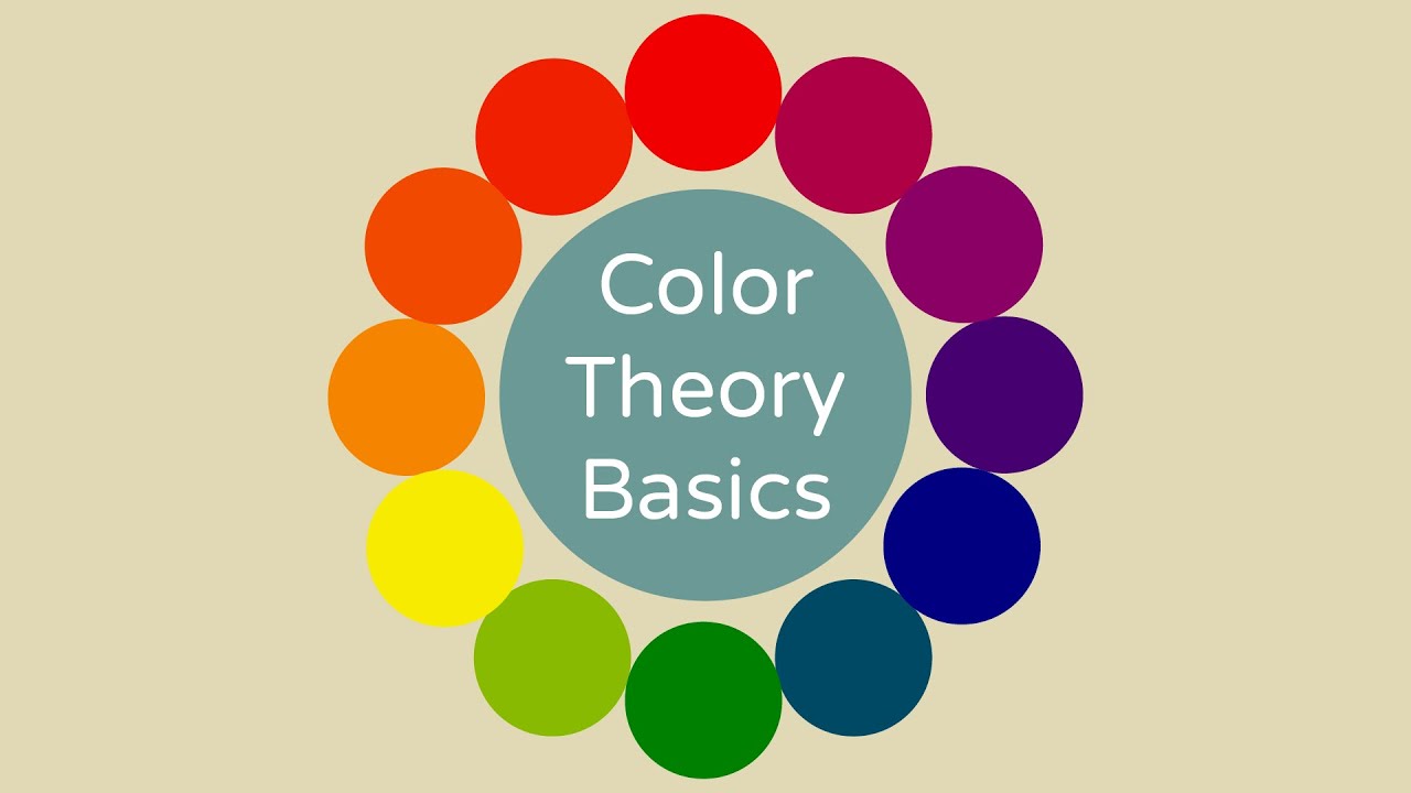
Johannes Itten’s 12-part color wheel, developed during his time at the Bauhaus school from 1919 to 1922, remains the most widely taught framework in art and design education. It organizes primary colors, secondary colors, and tertiary colors around a circle, showing how they relate by position.
The wheel also reveals temperature relationships. Warm colors (reds, oranges, yellows) sit on one side. Cool colors (blues, greens, purples) sit on the other. Most harmony decisions involve some balance between the two.
RYB, RGB, and CMYK: Which Wheel Applies
Three separate color models exist, and they don’t all share the same wheel:
- RYB (Red-Yellow-Blue): The traditional artist’s model. Used in painting, drawing, and fine art. Primary colors mix to create secondaries in pigment.
- RGB (Red-Green-Blue): The additive light model. Used in screens, digital interfaces, and photography. Colors add together toward white.
- CMYK (Cyan-Magenta-Yellow-Black): The subtractive print model. Used in commercial printing. Colors subtract toward black.
Most harmony discussions use RYB as the conceptual basis, even in digital work. But when you’re building a UI or setting up a Figma color system, you’re working in RGB. Knowing which model you’re in matters when you try to replicate a palette across print and screen.
Hue, Saturation, and Value as Harmony Variables
Hue position on the wheel determines the relationship type (complementary, analogous, etc.). But hue alone doesn’t decide whether a palette reads as harmonious.
Saturation and value do just as much work. Two colors with a solid hue relationship can still clash badly if one is fully saturated and the other is heavily muted. I’ve seen this happen constantly in student work and frankly in a lot of professional brand work too.
Tonal balance, meaning how light or dark colors are relative to each other, is what creates the visual weight distribution. A palette with identical values across all colors looks flat and undifferentiated regardless of how harmonious the hue relationships are.
Types of Color Harmony

Harmony schemes come from specific geometric relationships on the color wheel. Each one produces a different visual character and serves different design goals.
Complementary and Split-Complementary
Complementary colors sit directly across from each other on the wheel. Red and green. Blue and orange. Purple and yellow.
The result is maximum contrast. That contrast creates energy, but also tension. Full-saturation complementary pairs placed side by side can vibrate visually in a way that’s more disorienting than intentional. Simultaneous contrast, first described by Michel Eugene Chevreul in the 19th century, explains this effect. Each color makes the other look more intense.
The fix most designers use: adjust value or saturation on one of the pair so they’re not fighting at equal intensity. FedEx (purple and orange) and Firefox (blue and orange) both use complementary schemes with this kind of calibration built in.
Split-complementary replaces one of the complementary pair with its two adjacent hues. Less tension, more variety. Useful when you want visual interest without the high-contrast clash.
Analogous
Analogous schemes use three to five colors sitting side by side on the wheel. Think blue, blue-green, green. Or red, red-orange, orange.
These palettes feel unified and calm. They work well in nature-inspired work, ambient UI, wellness branding, and anything where you want a soft, cohesive feel. Impressionism leaned heavily into analogous color relationships. Claude Monet’s water lily series is a good real-world example: greens, blue-greens, and soft purples in harmony with very little contrast.
The downside is hierarchy. Analogous palettes can be hard to use in functional design because nothing stands out enough to direct attention. If you’re building a UI with analogous colors, you almost always need to pull in a contrasting accent.
Triadic and Tetradic
Triadic schemes use three evenly spaced colors on the wheel, 120 degrees apart. They’re balanced and vibrant, but harder to control than complementary pairs.
Real-world examples that work:
- Pop art used primary triadic palettes (red, yellow, blue) almost as a signature.
- Wassily Kandinsky built entire compositional theories around triadic color relationships.
Tetradic (or double-complementary) schemes use four colors forming a rectangle on the wheel. Two complementary pairs. They offer the most variety, but keeping them balanced is genuinely tricky. One color tends to dominate whether you plan for it or not.
Square and Monochromatic
Square schemes use four colors evenly spaced at 90-degree intervals. Similar to tetradic but more symmetrical.
Monochromatic schemes use a single hue and vary it through tints (adding white), shades (adding black), and tones (adding grey). They’re the easiest to keep harmonious and the hardest to make interesting. The minimalism movement made heavy use of monochromatic palettes, often treating the restraint itself as the aesthetic point.
| Scheme | Structure | Visual character | Best for |
|---|---|---|---|
| Complementary | 2 colors, 180 degrees apart | High contrast, energetic | Logos, alerts, bold campaigns |
| Split-complementary | 1 + 2 adjacent opposites | Rich, less tension | Editorial, product design |
| Analogous | 3-5 adjacent hues | Calm, unified | Nature, wellness, ambient UI |
| Triadic | 3 colors, 120 degrees apart | Vibrant, balanced | Playful branding, illustration |
| Monochromatic | 1 hue, varied tint/shade/tone | Cohesive, restrained | Minimalist design, editorial |
The Role of Hue, Saturation, and Value in Harmony

Picking the right hue relationship is only the first step. A palette’s harmony lives or dies on how hue, saturation, and value are balanced together.
Hue Relationships vs. Tonal Balance
Took me a while to internalize this one. Two colors can have a perfect complementary relationship on the wheel and still look wrong together because their values are too similar or their saturations are mismatched.
Value contrast is what separates foreground from background. Without it, even well-chosen color combinations become inaccessible and hard to read. WebAIM’s 2024 Million analysis found that color contrast is the single most common accessibility failure on the web, affecting 83.6% of all websites.
That number is worth sitting with. Most designers understand contrast as a design principle. Far fewer treat it as a functional requirement, even though WCAG 2.2 requires a minimum contrast ratio of 4.5:1 for standard text.
Saturation Differences and Harmony
High-saturation colors carry visual weight. They demand attention. Pair two fully saturated colors and they compete.
Most harmonious palettes in practice use one fully saturated anchor and reduce saturation on the surrounding colors. This creates a natural hierarchy without changing the hue relationships at all. Fauvism is the deliberate exception: Henri Matisse pushed full saturation across entire compositions, treating the resulting tension as expressive rather than problematic.
Journal of Consumer Research (Oxford Academic, 2025) research on luxury branding found that consumers associate lower saturation with higher perceived brand status, connecting “quiet luxury” aesthetics to muted, desaturated palettes. The opposite held for energy and playfulness. Saturation isn’t just a visual variable, it carries meaning.
Warm and Cool Temperature Balance
Warm colors (reds, oranges, yellows) advance visually. Cool colors (blues, greens, purples) recede.
This is why interior designers use warm tones to make a room feel smaller and cooler tones to open it up. The same principle applies in painting and UI design.
In composition: a small warm accent against a cool dominant color draws the eye immediately. That’s the logic behind why so many call-to-action buttons are orange or red even when the surrounding interface is blue or grey.
Color Harmony in UI and Web Design
Color harmony in digital interfaces is not just an aesthetic concern. It directly affects usability, legibility, and whether users complete actions or leave.
The 60-30-10 Rule in Interface Design
The 60-30-10 rule is the most practical framework for applying color harmony in UI work. It comes from interior design and translates cleanly to digital interfaces.
How it divides the palette:
- 60%: Dominant color. Backgrounds, large content areas. Usually neutral or brand primary.
- 30%: Secondary color. Sidebars, cards, headers. Supports and complements the dominant.
- 10%: Accent color. Buttons, links, interactive elements. The most vibrant or contrasting of the three.
The accent color is where the harmony scheme’s contrast lives. In a complementary scheme, the accent is typically the complement to the dominant. In an analogous scheme, the accent often steps outside the analogous range entirely to create the visual hierarchy the palette otherwise lacks.
Color Harmony in Design Systems
Real design systems treat color as a structured token system, not a loose collection of hex codes.
Material Design (Google), Apple’s Human Interface Guidelines, and Tailwind CSS all define color roles clearly: primary, secondary, surface, error, and on-color variants. These roles map directly to harmony principles, even when the documentation doesn’t use that language explicitly.
Figma’s color variables system, introduced in 2023, made this more accessible for teams not building custom design systems from scratch. You define a palette once and reference it by role throughout the entire component library.
Dark Mode and Harmony Adjustments
Dark mode doesn’t just invert colors. It shifts the entire harmony balance.
Colors that work harmoniously on white backgrounds often look harsh or oversaturated on dark backgrounds. Fully saturated primary colors on dark backgrounds cause eye strain. Most production dark mode systems, including Material You and Apple’s dark mode guidelines, use desaturated or lightened variants of the same brand colors rather than direct equivalents.
According to 2023 WebAIM accessibility data, 96.3% of the top million homepages had detectable accessibility failures. Dark mode adds another layer to that problem if harmony isn’t revalidated for the dark context specifically.
Color Harmony in Branding and Logo Design
Brand color palettes are not just aesthetic choices. They’re built on harmony principles, whether the brand team knows it or not. The ones that don’t know it usually produce palettes that feel off in ways that are hard to articulate.
Single-Color vs. Multi-Color Brand Palettes
Single-color brands (think Tiffany blue, or the specific Pantone orange of Hermes) avoid the harmony problem entirely by removing variables. The challenge becomes maintaining consistency across every application, from print to digital to packaging, where the same hue can look completely different.
Multi-color palettes require an actual harmony structure:
- Analogous palettes signal approachability, calm, and nature-adjacent values
- Complementary schemes signal energy, confidence, and differentiation
- Triadic palettes tend to read as playful, creative, or bold
Slack uses a split-complementary palette across four colors (purple, blue, green, yellow). The result is distinctive and energetic without the harshness of a straight complementary pair. That’s not accidental. Their 2019 rebrand involved substantial color harmony work to make the palette feel cohesive at scale.
When to Break Harmony Rules
Deliberately breaking harmony is a legitimate strategy. But it only works when the break is intentional and controlled.
Expressionism regularly used dissonant color combinations to generate emotional tension. Vincent van Gogh famously pushed complementary pairs to maximum saturation in works like “The Night Cafe,” specifically to create psychological unease. He wrote about this directly in letters to his brother.
In branding, a single jarring color in an otherwise harmonious palette creates memorability. The challenge is that it can also create noise if not carefully placed. The 10% accent position in the 60-30-10 framework is the safest place to introduce a controlled dissonance.
The psychology of color supports this. Unexpected color combinations generate higher recall than predictable harmonious ones, but only when the rest of the palette provides enough coherence to make the unexpected element feel deliberate rather than accidental.
Psychology of Color Harmony
Color harmony works partly because of how the brain processes visual input. Certain color combinations reduce cognitive load. Others increase it. The difference isn’t taste. It’s perception.
Frontiers in Psychology (2025) research on urban color preferences found that when individuals are presented with visual information, color plays a role in their initial perception during roughly the first 20 seconds, making up around 80% of that early impression.
Gestalt Principles and Color Grouping
Gestalt psychology explains why harmonious palettes feel unified. The brain groups similar elements automatically.
ScienceDirect (2024) EEG research found that applying Gestalt color similarity principles, where colors share saturation or brightness levels rather than just hue, measurably decreased visual cortex activity and emotional arousal while improving visual comfort. That’s the perceptual mechanism behind why tonal coherence feels restful.
The relevant Gestalt principles for color harmony:
- Similarity: Colors that share hue, saturation, or value are perceived as belonging together
- Proximity: Colors placed near each other influence each other’s perceived hue (simultaneous contrast)
- Figure-ground: Value contrast determines what reads as foreground vs. background
Warm vs. Cool Emotional Associations
Color temperature carries emotional weight that crosses most cultural lines, though not all of them.
Warm palettes (reds, oranges, yellows) consistently generate associations with energy, urgency, and appetite stimulation across Western consumer research. That’s why fast food brands cluster around red and yellow. Cool palettes generate associations with calm, trust, and reliability. Corporate and financial services default to blue for this reason specifically.
A 2022 PMC study comparing Western (Austrian/German) and East Asian (Chinese) participants on color-valence associations found meaningful differences in how red-green oppositions were perceived, with Western participants showing stronger implicit associations. Cultural context modifies but doesn’t eliminate these emotional patterns.
Cultural Variation in Color Meaning
Harmony rules transfer across cultures. Color meanings don’t always.
Orange signals warmth and harvest in Western markets. It signals mourning in parts of the Middle East. White represents purity in Western contexts and mourning in several East Asian ones. Red signals luck and prosperity in China; danger and urgency in most Western contexts. None of this changes the harmonic relationship between colors on the wheel. But it changes what a harmonious palette communicates in a specific cultural setting.
Adobe Express’s color research documentation notes that color symbolism varies significantly among cultures, which is why global brand teams often maintain regional palette variations even when the core harmony scheme stays consistent.
Color meanings in different cultures are not just academic trivia for designers working on global products. Getting this wrong in a brand palette can undermine everything the harmony structure was trying to achieve.
Palmer and Schloss: Color Preference Research
Psychologists Stephen Palmer and Karen Schloss published research in 2010 establishing the ecological valence theory of color preference. The core finding: people prefer colors associated with positive objects and environments in their experience.
Sky blue is preferred because clear skies are associated with good weather. Saturated yellow-green is often disliked because it maps to associations with illness or spoiled food. This research has practical implications for color harmony in product design. A palette can be structurally harmonious and still generate negative responses if its hues map to negative ecological associations in the target audience.
| Psychological principle | Effect on harmony perception | Design implication |
|---|---|---|
| Gestalt similarity | Shared tonal values group colors perceptually | Match value/saturation across palette |
| Simultaneous contrast | Adjacent colors shift each other’s perceived hue | Test colors in context, not isolation |
| Ecological valence | Preference follows natural environmental associations | Avoid hues with negative object associations |
| Cultural coding | Learned associations override universal responses | Localize palettes for global markets |
How to Build a Harmonious Color Palette
Most color palette failures happen in the first step. Someone picks a color they like and tries to build around it without any structure. The result is a collection of colors, not a palette.
A structured build process fixes this. It doesn’t kill creative judgment. It gives creative judgment a framework to work within.
Start with a Base Hue and Context
The first decision isn’t which color. It’s what the palette needs to communicate and where it will live.
A palette for a wellness app has different constraints than one for a sports brand. A palette that works beautifully in print may need adjustment for screens due to the shift from CMYK to RGB rendering. Figuring out context first prevents the common problem of building a palette in isolation that falls apart in the actual application.
Once context is established, choose a base hue. This is usually the brand primary or the dominant color in the 60-30-10 structure. Everything else derives from its position on the wheel.
Choose a Scheme Type Based on Goal
Scheme selection should follow communication intent, not personal preference.
| Goal | Scheme to use | Why it works |
|---|---|---|
| Maximum brand differentiation | Complementary | High contrast creates distinctiveness |
| Approachability and calm | Analogous | Low tension, unified feel |
| Energy and playfulness | Triadic | Variety without full contrast extremes |
| Restraint and sophistication | Monochromatic | Tonal variation without hue complexity |
Test Across Backgrounds and Contexts
A palette that looks harmonious on a white artboard often looks wrong on dark backgrounds, on mobile screens, or in print.
Most design systems (Material Design, Apple HIG) define separate light and dark mode palettes for exactly this reason. The harmony scheme stays consistent. The specific values, saturations, and tints get recalibrated for each context.
Three tests every palette needs before it ships:
- Render on both light and dark backgrounds
- Check contrast ratios against WCAG 2.2 (minimum 4.5:1 for text)
- View in grayscale to confirm hierarchy holds without color
Tools That Actually Help
Adobe Color handles rule-based palette generation well. You set a base color, pick a harmony rule (analogous, complementary, triadic, etc.), and the tool applies it directly to the color wheel. It integrates with Adobe Creative Cloud, which makes it the default for teams already in that ecosystem.
Coolors is better for fast exploration. Hit the spacebar, generate palettes, lock colors you want to keep. It also includes a colorblind simulator, which should be part of every palette validation process.
Figma’s color variable system, released in 2023, lets teams define palette tokens with clear role assignments (primary, surface, error, etc.). It’s not a palette generator but it’s where palette decisions get operationalized in modern product design workflows.
Khroma uses a different approach entirely. It learns your color preferences from selections you make, then generates palettes personalized to your trained taste. Useful when starting from scratch with no brief constraints.
Common Color Harmony Mistakes
Most bad palettes share the same handful of problems. Knowing what to look for makes them fixable before they ship.
Full-Saturation Complementary Pairs
The most damaging mistake in practice. Three fully saturated hues at equal intensity produce visual fatigue. MadeGoodDesigns’ 2026 design research puts it clearly: the eye has nowhere to rest and the overall effect reads as chaotic.
The fix is straightforward. Reduce saturation or shift value on one of the pair. A deep navy paired with a muted peach works. Pure blue against pure orange almost never does, outside of very specific brand contexts where the tension is intentional.
Op art deliberately exploited this kind of vibration. Victor Vasarely built entire bodies of work around pushing complementary pairs to maximum saturation to create optical movement. That’s a design choice with a specific purpose. In most UI or brand contexts, it’s just noise.
Ignoring Value Contrast
Hue harmony without value contrast is incomplete. A palette can have perfect complementary structure and still fail if the colors sit at the same value level.
When text and background colors are harmonious but similar in value, they become unreadable. WebAIM’s 2024 Million analysis found that low color contrast is the single most common accessibility failure, affecting 83.6% of websites. That failure has a direct cause: designers prioritizing hue relationships without checking value separation.
The grayscale test solves this. Remove all color from the design and check whether hierarchy, separation, and readability still hold. If they don’t, the value structure needs fixing before any other harmony work continues.
Over-Relying on Analogous Schemes
Analogous palettes are the easiest to keep harmonious. They’re also the easiest to make boring and non-functional.
Low contrast between analogous colors means nothing stands out. In a functional interface, that kills hierarchy. Buttons, alerts, links, and key information need contrast to direct attention. If every element in the palette sits within a narrow analogous band, the interface feels calm and looks like nothing is actionable.
The standard fix: pull one accent outside the analogous range entirely. Keep the analogous palette as the dominant 90%, and use the contrasting accent for the 10% where user action is needed. This preserves the calm, unified feel while restoring functional hierarchy.
Mixing Warm and Cool Without Intention
Warm and cool tones can coexist in a palette. They just need a reason to be there.
Random mixing of warm and cool creates palettes that feel unresolved. The viewer senses something is off but can’t identify what. Usually it’s an unintentional temperature split, a cool dominant with a warm secondary that wasn’t chosen for its complementary relationship, just picked because it was available.
Intentional warm-cool contrast works very differently. Impressionist painters like Claude Monet used warm-cool temperature shifts deliberately to describe light changes across a scene. The same technique in UI design shows up as warm backgrounds paired with cool interactive elements, creating a clear visual temperature hierarchy that guides the eye without relying on saturation or value contrast alone.
Treating Harmony as Absolute
Color harmony rules are starting points, not laws.
The rules describe what tends to work perceptually. They don’t account for brand positioning, cultural context, medium, competitive differentiation, or emotional intent. A palette that scores perfectly on harmony metrics can still communicate the wrong thing, or communicate nothing at all in a crowded market where every competitor uses the same reliable complementary scheme.
Abstract expressionism and movements like Fauvism built their identity by rejecting harmony conventions entirely. That doesn’t mean the conventions are wrong. It means context and intent ultimately determine whether a rule should be followed or broken. Knowing the rule is what makes breaking it productive rather than accidental.
FAQ on Color Harmony
What is color harmony?
Color harmony is the arrangement of colors that creates a visually balanced, pleasing result. It’s built on relationships between hue, saturation, and value, structured around the color wheel. Harmony applies across painting, UI design, branding, and interior design.
What are the main types of color harmony?
The core harmony schemes are complementary, analogous, triadic, split-complementary, tetradic, square, and monochromatic. Each comes from a specific geometric relationship on the color wheel and produces a different visual character and level of contrast.
How does the color wheel relate to harmony?
The color wheel maps hue relationships spatially. Harmony schemes come from the geometric distances between colors on it. Complementary pairs sit 180 degrees apart. Analogous colors sit side by side. The wheel makes color relationships visible and predictable.
What is the difference between complementary and analogous color schemes?
Complementary schemes use colors directly opposite on the wheel, creating high contrast and energy. Analogous schemes use adjacent hues, producing a calm, unified feel. Complementary palettes demand more careful saturation control to avoid visual tension.
How does color harmony affect design?
Harmonious color combinations reduce cognitive load and guide user attention. In UI design, they define visual hierarchy. In branding, they shape perception and recognition. Poor harmony creates visual noise, making designs harder to read and less trustworthy to viewers.
What is the 60-30-10 rule in color harmony?
It divides a palette into three roles: 60% dominant color, 30% secondary, 10% accent. The 60-30-10 rule creates visual hierarchy and prevents any single color from overwhelming the design. It originated in interior design and translates directly to UI and graphic work.
How does color psychology connect to harmony?
Color psychology explains the emotional responses specific hues generate. Warm colors advance and energize. Cool colors recede and calm. A harmonious palette can still fail if its hues carry negative cultural or ecological associations for the target audience.
What tools help build a harmonious color palette?
Adobe Color applies harmony rules directly to a color wheel. Coolors generates palettes fast and includes a colorblind simulator. Figma’s color variable system (released 2023) helps teams operationalize palette decisions across full design systems with clearly defined color roles.
What are the most common color harmony mistakes?
The biggest mistakes are using full-saturation complementary pairs without adjusting value, ignoring contrast ratios, over-relying on analogous palettes with no contrast hierarchy, and mixing warm and cool tones without a clear structural reason. All are fixable with basic color theory knowledge.
Does color harmony mean the same thing across cultures?
The structural rules transfer across cultures. The meanings don’t always. Red signals luck in China and danger in many Western contexts. White represents mourning in parts of East Asia and purity in Western ones. Global palettes often need cultural color adjustments alongside the core harmony structure.
Conclusion
This article on color harmony covers the full picture, from color wheel mechanics and harmony scheme types to color perception, psychology, and practical palette building.
The core takeaway is simple. Harmony is a system, not a feeling.
Whether you’re working with primary colors in a triadic scheme or calibrating color saturation across a brand palette, the same structural principles apply.
Tonal balance, color contrast, and scheme selection are not design preferences. They’re the difference between a palette that communicates clearly and one that creates noise.
Use the 60-30-10 rule, validate against accessibility standards, and always test in context. That’s where harmony becomes functional rather than decorative.