A single squeeze of cadmium red straight from the tube looks completely different from that same red mixed with gray. The hue hasn’t changed. The value might be identical. But the feeling? Totally different. That difference is saturation, and it quietly controls how every painting, photograph, and design makes you feel.
So what is color saturation in art, and why does it matter so much? This article breaks it down from the ground up: what saturation actually measures, how it works inside color theory models like HSL and Munsell, and how artists from Matisse to Vermeer have used it to direct attention and mood. You’ll also learn practical methods for controlling color intensity across both traditional and digital mediums, plus common mistakes that kill your chromatic range.
What Is Color Saturation

Color saturation is the intensity or purity of a hue. A fully saturated color contains no gray, no white, no black mixed in. It’s the color at its strongest, most vivid version.
Think of a fire-engine red straight from the tube. That’s high saturation. Now imagine that same red after you’ve mixed in some gray. It gets duller, quieter, less punchy. The hue hasn’t changed. The value might not have changed either. But the color lost its kick.
The human eye can distinguish roughly 1 million color variations under normal conditions, according to the American Academy of Ophthalmology. Under ideal lighting, that number stretches toward 10 million. A huge percentage of those variations come down to differences in saturation alone.
So when people say a painting “pops” or looks “washed out,” they’re usually reacting to saturation levels, whether they realize it or not.
Saturation vs. Hue vs. Value
These three properties describe every color you’ll ever see. They work together but do completely different jobs.
Hue is the color itself. Red, blue, yellow, green. It’s the name we give to a specific wavelength of light.
Value refers to how light or dark that color appears. Add white, the value goes up. Add black, the value drops. But the hue stays the same.
Saturation measures the chromatic strength. It tells you whether a color looks pure and vivid or muted and grayish. A cadmium red at full saturation is aggressive. Mix gray into it and the saturation drops, but the hue is still red and the value might stay the same.
Plenty of beginners confuse value shifts with saturation shifts. They’ll darken a color to “tone it down” when what they actually need is less chroma. Understanding this difference saves a lot of frustration at the easel.
The Saturation Spectrum
Saturation isn’t binary. It lives on a continuous scale from zero (completely neutral gray) to maximum (the purest version of that hue your pigment or screen can produce).
Albert Munsell built his entire color system around this idea in the early 1900s. In the Munsell system, chroma (his term for saturation) extends radially outward from a neutral gray center. Colors at the core are completely desaturated. Colors at the outer edge are at peak intensity.
| Saturation Level | Technical Logic | Visual Appearance | Common Example |
| Full (High Chroma) | The pigment is at its maximum purity; no gray added. | Vivid & Intense: Demands immediate attention. | Cadmium Yellow, Neon Signage. |
| Medium | The hue has been partially neutralized by its complement. | Natural & Balanced: Feels “earthy” or organic. | Terracotta, Sage Green. |
| Low | The hue is nearly overtaken by gray or a neutral base. | Soft & Subdued: Recedes into the background. | Fog, Overcast Sky tones. |
| Zero (Achromatic) | All color identity is removed; only value remains. | Completely Neutral: Provides no “hue” information. | Pure Gray, Black, White. |
Not all hues reach the same maximum saturation. Munsell discovered that yellows hit peak chroma at lighter values, while blues and purples reach theirs at darker values. This is just how human perception works. It’s why a bright saturated yellow looks natural but a bright saturated purple can feel almost electric.
A 2025 BMC Psychology study confirmed that colors with higher saturation consistently triggered stronger emotional responses across both art students and non-art students, reinforcing that saturation is not just a technical concept but a perceptual force.
How Saturation Works in Color Theory

Saturation doesn’t exist in isolation. It’s embedded in how we organize and classify color theory models, and understanding the mechanics behind it changes how you mix, choose, and place colors in your work.
Saturation in HSL and HSB Color Models
If you’ve ever used a digital color picker, you’ve already interacted with saturation as a slider. The two most common digital models handle it slightly differently.
HSL (Hue, Saturation, Lightness): Saturation here runs from 0% (completely gray) to 100% (fully vivid). At 50% lightness and 100% saturation, you get the purest version of any hue. Shift lightness toward 0% or 100% and the color collapses toward black or white regardless of the saturation setting.
HSB/HSV (Hue, Saturation, Brightness): This model handles things a bit differently. At maximum brightness and maximum saturation, you get the purest color. Lowering saturation moves toward white. Lowering brightness moves toward black.
The Polaris Market Research report valued the digital artwork market at $5.57 billion in 2024, growing at a 15.4% annual rate. That growth is driven partly by tools like Photoshop and Procreate that give artists precise, numerical control over saturation through these HSL/HSB models.
How Tints, Tones, and Shades Affect Saturation
This is where saturation gets practical for painters.
Adding white creates a tint. It raises the value and reduces saturation. A tinted red becomes pink, which is lighter and less intense.
Adding black creates a shade. It lowers the value and generally reduces perceived saturation as well, though the technical relationship is more complex than just “darker equals less saturated.”
Adding gray creates a tone. This is the most direct way to reduce saturation without dramatically shifting value. Tonal mixing is probably the most underused technique among beginners, and honestly among some intermediate painters too.
Knowing which of these three you’re actually doing when you mix is half the battle. Took me a while to realize that reaching for black to “mute” a color was often the wrong move. Gray was almost always the better call.
Munsell’s Chroma and Why It Matters
Albert Munsell used the word “chroma” instead of “saturation,” and there’s a real reason for that distinction.
The Commission Internationale de l’Eclairage (CIE) defines saturation as colorfulness judged relative to brightness, while chroma is colorfulness judged relative to the brightness of a white reference. In Munsell’s system, chroma is measured as the perpendicular distance from the neutral gray axis in a cylindrical color space.
That’s a mouthful. But the practical takeaway: two colors can have the same saturation but different chroma if they differ in lightness. A dark red and a light red might look equally “pure” relative to their own brightness (same saturation), but the lighter one reflects more colored light overall (higher chroma).
The Munsell system was adopted by the USDA for soil classification in the 1930s and remains one of the most referenced perceptual color models in the world. For painters, its biggest contribution is the idea that different hues peak at different chroma levels, which is why a color wheel with equal-looking swatches is actually misleading.
High Saturation vs. Low Saturation in Art

The difference between high and low saturation isn’t just a technical adjustment. It changes the entire feeling of a piece.
What High Saturation Looks Like
High saturation hits hard. It’s the visual equivalent of someone raising their voice. Pure, vivid colors demand attention, and they don’t negotiate about it.
Fauvism was basically a movement built on cranking saturation to the max. Henri Matisse and Andre Derain used colors so intense that critics named the style after wild beasts. In Matisse’s “The Joy of Life” (1906), the saturated pinks, oranges, and greens don’t try to replicate nature. They replace it with something louder.
Andy Warhol‘s pop art screen prints used heavily saturated, flat colors to turn familiar faces and products into graphic icons. The saturation was the point.
High saturation creates energy, urgency, and visual weight. But use it everywhere and the whole piece goes flat because nothing stands out when everything screams.
What Low Saturation Looks Like
Low saturation is quiet. It recedes. Colors shift toward gray, and the mood shifts with them.
James McNeill Whistler’s “Arrangement in Grey and Black No.1” (commonly known as Whistler’s Mother) is an obvious example. The palette is almost entirely desaturated. The painting’s power comes from tonal relationships and contrast, not from chromatic intensity.
A 2025 systematic review in Psychonomic Bulletin & Review, covering 128 years of color-emotion research across 42,266 participants from 64 countries, found that light, saturated colors consistently carried positive emotional associations, while desaturated and dark colors leaned negative. That doesn’t make low saturation bad. It makes it a specific tool for specific moods.
Edward Hopper understood this perfectly. His muted, desaturated interiors create loneliness and isolation without a single word of explanation.
Side-by-Side: How Saturation Changes a Single Hue
Look at the same blue across the saturation spectrum and the associations shift dramatically.
| Saturation Level | Technical Logic | Visual Quality | Emotional Association |
| Maximum | Pure pigment; no gray or complement added to the hue. | Electric & Intense: Demands focal attention. | Confidence, Authority, Digital Precision. |
| Medium | The blue is partially neutralized by a “mother gray” or orange. | Clear but Tempered: Easy on the eyes. | Calm, Professional, Approachable. |
| Low | The hue is nearly submerged in gray; low “Chroma.” | Foggy & Subdued: Recedes into the environment. | Melancholy, Distance, Nostalgia. |
| Near Zero | Only a “ghost” of the blue hue remains in a neutral base. | Quiet & Industrial: Mimics shadow or steel. | Reserved, Withdrawn, Minimalist. |
Same hue. Same value. Completely different psychological impact. That’s why saturation control is so important in composition.
Why Saturation Matters in Composition

Saturation is one of the most overlooked tools for directing a viewer’s eye. Most composition discussions focus on line, shape, and value. But saturation quietly does a lot of the heavy lifting.
Saturated Colors Advance, Desaturated Colors Recede
This is a fundamental spatial principle that even experienced painters sometimes forget. A bright, saturated object will appear closer to the viewer. A muted, desaturated version of the same color will seem to push back in space.
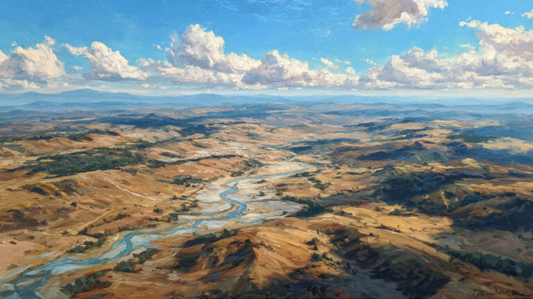
Atmospheric perspective is built on this idea. Objects far away lose saturation because of moisture and particles in the air scattering light. Claude Monet used this relentlessly in his landscape work, letting distant hills dissolve into soft, low-chroma purples and blues.
Goethe noted that warm colors advance and cool colors recede. But saturation plays an equally strong role. A desaturated warm color can actually recede behind a saturated cool one if the chroma difference is big enough.
Creating Focal Points with Saturation Contrast

You don’t always need to change hue or value to build a focal point. A single saturated element in a mostly muted painting grabs attention instantly.
Johannes Vermeer did this all the time. His interiors are often cool and subdued, but he’d drop one piece of bright, saturated ultramarine or a vivid yellow jacket into the scene. Your eye goes straight there.
This technique creates visual hierarchy without needing dramatic value shifts or size differences. It’s subtle and incredibly effective.
The Oversaturation Trap
If everything in a painting is at maximum saturation, nothing has priority. The composition becomes visually flat because there’s no contrast in chromatic intensity.
A 2023 Royal Society study measuring physiological responses to color found that dark, high-chroma environments increased heart rate and reduced heart rate variability. In art terms, oversaturation can literally exhaust a viewer’s visual system. The eye has nowhere to rest.
The fix is straightforward: pick your most saturated areas deliberately. Let the rest of the painting breathe with lower chroma. Emphasis only works when it’s earned through restraint everywhere else.
How Artists Control Saturation with Traditional Media

Digital tools give you a slider. But with painting mediums like oils, acrylics, and watercolors, controlling saturation takes real understanding of pigment behavior and mixing strategy.
Mixing Complementary Colors to Reduce Saturation
The fastest way to desaturate a color without reaching for black or gray paint? Mix in its complementary color.
Red mixed with green. Blue mixed with orange. Yellow mixed with purple. Complementary pairs neutralize each other and pull the saturation down toward gray. The exact gray you get depends on the specific pigments and their ratios.
This is how painters like Paul Cezanne and Anders Zorn created rich, complex neutrals. They didn’t use tube grays. They mixed living, colorful grays from opposites on the color wheel. The result has more depth than any premixed neutral because there’s still a trace of both colors humming underneath.
How Different Mediums Handle Saturation

Oil painting: Oils tend to produce the richest saturation levels of traditional mediums. The binder (linseed oil) has a refractive index close to that of many pigments, which keeps colors vivid even after drying. Cadmium reds and yellows straight from the tube are about as saturated as traditional paint can get.
Acrylic painting: Acrylics dry slightly darker and less saturated than they look when wet. This “color shift” catches a lot of beginners off guard. The polymer binder causes it, and it’s most noticeable with heavily saturated colors.
Watercolor painting: Saturation in watercolor depends almost entirely on the ratio of pigment to water. More water equals less saturation. But watercolor has a unique quality: the white of the paper shines through transparent washes, giving even moderately saturated passages a luminous glow that other mediums can’t easily replicate.
Glazing to Build Saturation
Glazing is a technique where you apply thin, transparent layers of paint over dried layers. Each glaze deepens the perceived saturation without making the color opaque or muddy.
Titian and the Venetian painters essentially pioneered this approach. They’d build up transparent layers of rich reds and golds over underpainting, creating a saturation depth that a single thick layer can’t match. Light passes through the transparent layers, bounces off the lighter paint underneath, and travels back through the color, making it appear more intensely saturated than the pigment itself.
It takes patience. You need to let each layer dry before applying the next. But the results are worth it, especially for skin tones, fabrics, and anything where you want that inner glow of deep color saturation.
Saturation in Digital Art and Design

The global digital artwork market was valued at $5.57 billion in 2024, according to Polaris Market Research, and the painting segment is growing fastest. A lot of that growth ties back to how digital tools give artists unprecedented control over properties like saturation.
HSL Sliders and Vibrance vs. Saturation
Every major design tool, from Photoshop to Procreate to Figma, gives you direct slider control over saturation through HSL or HSB panels. But there’s a tricky distinction that confuses even experienced digital artists.
The Saturation slider affects all colors equally. Crank it up and every pixel gets more intense. Pull it down and everything shifts toward gray. It’s a blunt instrument.
The Vibrance slider is smarter. It boosts saturation selectively, pushing muted colors harder while leaving already-saturated colors mostly alone. It also protects skin tones from turning orange or red, which is why it’s the default choice for most portrait retouching.
A 2024 Adobe survey found that 73% of creative professionals had integrated AI-assisted tools into their daily workflow. Many of those tools include automatic saturation adjustments, but understanding the manual controls still matters because automated adjustments can’t read compositional intent.
Gamut Limitations: Screen vs. Print
What you see on your monitor isn’t necessarily what you’ll get on paper. This is a gamut problem.
sRGB is the standard color space for most screens. It covers a modest range of saturation levels. Many highly saturated greens and cyans that look fine on screen fall outside what sRGB can display accurately.
Adobe RGB is wider, capturing more saturated greens and cyans. Photographers and print designers working with color contrast often prefer this space for that reason.
But here’s the catch: CMYK printing (the standard for physical prints) has an even smaller gamut than sRGB in some areas. That blazing neon orange on your screen? It physically can’t be reproduced with standard inks. The printer maps it to the closest achievable color, and the saturation drops.
If your work is heading to print, soft-proofing in CMYK before finalizing is not optional. It’s the only way to know which saturated colors will survive the translation and which will lose their intensity.
Working with Color Profiles for Consistent Saturation

Color profiles are the bridge between what you see and what others see. Without profile management, your carefully controlled saturation levels are a guess.
Embed your profile. When saving files, always embed the ICC profile (sRGB, Adobe RGB, or whatever you’re working in). Without it, the receiving device has to guess, and it often guesses wrong.
Calibrate your monitor. An uncalibrated display can show colors that are significantly more or less saturated than reality. Hardware calibrators from companies like Datacolor or X-Rite fix this, bringing your screen’s output in line with standardized color values.
The color psychology research is clear that saturation affects emotional perception. If your audience sees different saturation levels than you intended because of profile mismatches, the emotional impact of your work changes whether you want it to or not.
Color Saturation and Mood

Saturation controls emotional temperature. Two paintings with identical hues and values will feel completely different if one uses vivid, high-chroma colors and the other keeps everything muted and grayish.
A 2025 BMC Psychology study found that colors with higher brightness and saturation consistently rated more positively than low-saturation colors across both trained and untrained groups. Warm hues at high saturation scored the highest for positive emotional responses.
Psychological Associations of Saturation Levels
High saturation connects to energy, urgency, and excitement. Think of the hyper-vivid painting styles in expressionism, where artists like Wassily Kandinsky cranked chromatic intensity to trigger emotional reactions that had nothing to do with realistic representation.
Low saturation leans toward calm, melancholy, nostalgia, and restraint. The washed-out tones in somber paintings signal quietness, loss, or memory. It’s a visual shorthand that audiences pick up on instantly, even without knowing why.
Research published in Psychological Research (Wilms and Oberfeld, 2018) showed that saturation had strong and consistent effects on both arousal and pleasure, with high saturation increasing emotional arousal across hue categories.
Saturation as a Storytelling Tool in Film and Photography
Steven Spielberg desaturated nearly 70% of the color in “Saving Private Ryan” to strip away visual comfort and push the audience into the grit of the battlefield. The muted palette made the rare moments of saturated color (like the red of blood) hit even harder by contrast.
Wes Anderson does the opposite. His films are drenched in high-saturation pastels that create a world that feels deliberately artificial, storybook-like. The saturation itself becomes a character trait of the film.
A 2024 study in Humanities and Social Sciences Communications confirmed that color films consistently received higher emotional valence ratings than black-and-white versions, and that saturation variations were a primary driver of emotional perception in colored films.
Cultural Differences in Saturation Preferences
Saturation preferences aren’t universal. They shift based on geography, climate, and cultural context.
- Traditional Japanese aesthetics (wabi-sabi) favor muted, desaturated earth tones
- Latin American and South Asian visual traditions tend toward bold, high-saturation palettes
- Northern European painting historically leaned into cooler, lower-chroma palettes influenced by overcast light conditions
A 2025 systematic review in Psychonomic Bulletin & Review covering 64 countries found that while light and saturated colors were broadly positive, the specific emotional associations varied across cultures, suggesting saturation carries culturally learned meaning on top of its biological effects.
Common Saturation Mistakes

Most saturation problems come from not understanding what’s happening during the mixing process. These aren’t advanced issues. They trip up beginners and intermediate painters regularly, and honestly, I’ve made every one of them.
Uniform High Saturation Across a Piece
This is the most common mistake, and it’s the hardest to recognize when you’re in the middle of painting.
When every area of a composition runs at maximum chromatic intensity, there’s no dominance. Nothing recedes. Nothing advances. The painting feels flat, loud, and exhausting to look at.
The fix: decide which one or two areas need to be your most saturated. Let everything else drop in chroma. Harmony comes from the relationship between vivid and muted, not from cranking every color to its maximum.
Muddy Colors from Improper Mixing
Muddy colors are accidentally desaturated colors. They happen when you mix too many pigments together or accidentally combine complementary pairs without realizing it.
| Cause of Mud | Technical Logic | What’s Actually Happening | Quick Fix |
| Mixing 4+ Pigments | Subtractive Overload: Too many wavelengths are absorbed, leaving none to reflect. | All three primaries present, neutralizing each other. | Limit Mixes: Use 2–3 pigments max to maintain “Chroma.” |
| Dirty Brush | Cross-Contamination: Trace amounts of high-strength pigments (like Phthalo) tint the mix. | Residual paint contaminates fresh color. | Double Rinse: Use two water/solvent jars-one for “dirty” and one for “clean.” |
| Wrong Temperature | Thermal Clash: A cool-biased red mixed with a warm yellow creates a muted, brown-orange. | Incompatible color biases cancel out vibrancy. | Check Bias: Use a “Split-Primary” system (Warm and Cool versions of each). |
| Overworking Layers | Mechanical Agitation: The friction of the brush re-solubilizes the bottom layer. | Underlying layers lift and blend unintentionally. | Glaze / Scumble: Let the layer dry; apply the next color in a single, confident stroke. |
As painter Richard Schmid explained, muddy color often turns out to be a color at the wrong temperature for its context. A technically “correct” mix can still look like mud if its warmth or coolness clashes with the surrounding passage.
Ignoring Saturation When Adjusting Value
Here’s one that catches a lot of people. You darken a color by adding black, expecting only the value to change. But black also kills saturation.
A bright cadmium orange mixed with black doesn’t just get darker. It shifts toward a muddy, greenish brown. The saturation crashes, and the hue can wander too.
Better approach: darken colors with a darker version of the same hue family or with a complementary. Darken a red with alizarin crimson or a touch of green, not with black. You’ll keep more chromatic life in the mix. Learning to mix skin tones is where this lesson usually hits hardest, because skin requires careful value shifts without losing the subtle warmth underneath.
Over-Reliance on Digital Saturation Sliders
Digital painters have a specific version of this problem. The saturation slider is so accessible that it becomes a crutch.
Bumping global saturation in Photoshop or Procreate doesn’t give you the kind of controlled, localized intensity that good paintings have. It’s like turning up the volume on every instrument in an orchestra at once. The Vibrance tool is better (it’s more selective), but even that doesn’t replace understanding which areas of a piece need chromatic intensity and which need to stay quiet.
A 2024 Adobe survey found that 73% of creative professionals now use AI-assisted editing tools. But automated color adjustments can’t read compositional intent. The artist still needs to make the saturation decisions that serve the piece.
How to Train Your Eye for Saturation

You can’t control what you can’t see. And most people, including many painters, don’t see saturation accurately until they’ve deliberately trained for it.
A 2024 study in Biological Psychology (Song et al.) used EEG measurements to prove that artistic training directly improves top-down visual perception of color, including brightness and saturation discrimination. Trained artists showed stronger neural responses to color differences than non-artists.
The Squinting Technique
Squinting strips away detail and leaves you with the big value and chroma relationships. It’s the oldest trick in painting, and it still works better than any digital tool.
When you squint at a scene or a painting in progress, you lose the ability to see small variations. What remains are the large masses of light, dark, and chromatic intensity. If your saturation distribution looks wrong at a squint, it’s definitely wrong at full focus.
Joaquin Sorolla was famous for squinting at his subjects while painting en plein air. It let him simplify the complex light of Mediterranean beach scenes into clean blocks of saturated and desaturated color.
Desaturation Checks in Digital and Traditional Work
Convert your work to grayscale temporarily. This removes all color information and isolates value from saturation.
If your painting looks solid in grayscale, your values are working. Then, when you flip color back on, you can evaluate saturation independently. Areas that felt like they had good contrast in color but look flat in grayscale? Those are relying on chroma to do the work that value should be handling.
In Photoshop, this takes seconds (Image > Adjustments > Desaturate, then undo). For traditional painters, a phone photo converted to black-and-white accomplishes the same thing.
Color Matching Exercises with Limited Palettes
Nothing teaches saturation control faster than a restricted palette.
The Zorn palette (yellow ochre, cadmium red, ivory black, titanium white) is a classic exercise. With only one truly saturated color (the red), you’re forced to learn how saturation functions through scarcity. That single vivid note does all the heavy lifting while the rest of the painting sits in controlled, desaturated warmth.
Anders Zorn built an entire career around this idea. His portraits have a richness that comes from strategic saturation placement, not from using lots of vivid colors. The lesson: you don’t need a full spectrum to create compelling chromatic relationships. You just need to put your most saturated color exactly where it counts.
Studying Master Paintings for Saturation Strategy

Looking at how specific artists handle saturation teaches more than any theory lesson.
Vincent van Gogh: Used high saturation across broad areas, but created rhythm through temperature shifts rather than chroma variation. His blues and yellows stay vivid but alternate between warm and cool.
John Singer Sargent: Kept most of his paintings in low to mid saturation, then dropped a single vivid accent (a red sash, a bright flower, a flash of jewelry) to create a focal point. Extreme restraint with pinpoint intensity.
Pierre-Auguste Renoir: His impressionist work layers broken strokes of varied saturation levels that blend optically. Up close, you see both vivid and muted marks. At distance, they merge into luminous, breathing color.
| Artist | Saturation Approach | Technical Logic | Lesson for Painters |
| Van Gogh | Broad High Saturation | Uses Simultaneous Contrast to make pure hues “vibrate.” | Chroma alone isn’t enough; use Temperature Shifts to create depth. |
| John Singer Sargent | The Vivid Accent | Keeps 90% of the canvas in low-chroma “earth” tones. | Extreme restraint makes a single vivid focal point powerful. |
| Renoir | Optical Mixing | Places small dabs of varied chroma side-by-side. | Broken Color creates more luminosity than a flat, pre-mixed tone. |
| Sorolla | Light Logic | Ties saturation directly to the behavior of the sun. | High chroma belongs in the light; use low chroma for “open” shadows. |
Copying these paintings (or sections of them) with a focus on matching their saturation levels, not just their hues and values, is one of the fastest ways to build real color harmony instincts.
FAQ on What Is Color Saturation In Art
What does saturation mean in art?
Saturation measures how pure or intense a color appears. A fully saturated color has no gray mixed in. As saturation decreases, the color looks duller and more muted. It’s one of three core color properties alongside hue and value.
What is the difference between saturation and hue?
Hue identifies the color itself, like red, blue, or green. Saturation describes how vivid or grayish that hue appears. You can change saturation without changing the hue at all. They’re independent properties that work together.
What is an example of high saturation in a painting?
The Fauvist paintings of Henri Matisse and Andre Derain are textbook examples. Their work used extremely vivid, pure pigments applied straight or barely mixed. The result is an almost aggressive chromatic intensity that defined Fauvist art.
How do you reduce saturation when mixing paint?
Add the color’s complement. Red neutralizes with green, blue with orange, yellow with purple. You can also add gray directly. Avoid using black alone, as it darkens value and can shift the hue unexpectedly.
Is saturation the same as chroma?
They’re closely related but technically different. Chroma measures colorfulness relative to a white reference, while saturation measures it relative to brightness. In the Munsell color system, chroma is the preferred term. Most painters use them interchangeably.
Why do my paint colors look muddy?
Muddy colors happen when too many pigments mix together, accidentally combining all three primaries. This kills saturation. Limit mixes to two or three pigments, keep brushes clean, and learn which colors are primaries in your palette.
How does saturation affect mood in artwork?
High saturation creates energy, urgency, and visual excitement. Low saturation conveys calm, nostalgia, or sadness. Research confirms that saturated colors consistently trigger stronger emotional arousal than desaturated ones across different cultures.
What is the difference between vibrance and saturation in Photoshop?
The Saturation slider adjusts all colors equally. Vibrance is selective, boosting muted tones while protecting already-saturated areas and skin tones. For most digital art and photo editing, Vibrance gives more natural-looking results.
Can you increase saturation with glazing?
Yes. Glazing techniques layer thin, transparent paint over dried layers. Light passes through and bounces back, making the color appear richer and more saturated than a single thick application could achieve.
How do I train my eye to see saturation better?
Squint at your subject to simplify color relationships. Convert work to grayscale to isolate value from chroma. Practice color matching with a limited palette like the Zorn palette, which forces you to place saturation strategically.
Conclusion
Understanding what is color saturation in art changes how you see every painting, every photograph, every screen you look at. It’s not a minor technical detail. It’s the property that separates a color that feels alive from one that just sits there.
Whether you’re working with tertiary colors on a physical palette or adjusting HSL sliders in Procreate, saturation decisions shape your balance, your mood, and your focal point placement.
The painters who handle saturation well, from the Fauvist explosion of pure chroma to Sargent’s quiet restraint, all share one thing. They treat color intensity as a deliberate choice, never an accident.
Start small. Limit your palette, squint more often, and pay attention to where your most vivid colors land. Your paintings will thank you for it.