Every painting you’ve ever loved had one thing working quietly underneath the surface: balance. So what is balance in painting, and why does it matter more than most artists realize?
Balance is the distribution of visual weight across a composition. It controls how your eye moves through the work, where it rests, and whether the whole thing feels resolved or like it’s about to fall apart.
This article breaks down the types of balance (symmetrical, asymmetrical, radial, and crystallographic), explains how visual weight actually works, and covers the practical techniques painters use to get it right. You’ll also learn when breaking balance on purpose creates a stronger painting than keeping it.
What Is Balance in Painting
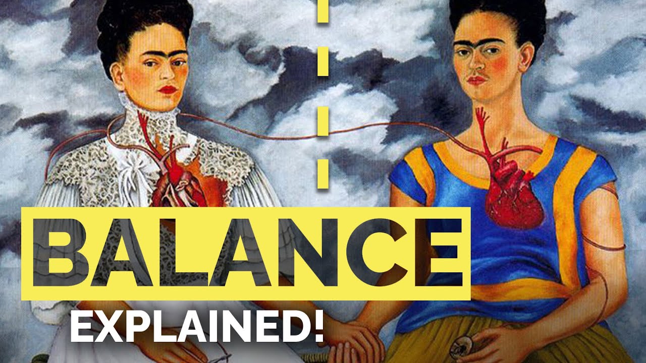
Balance in painting is the distribution of visual weight across a composition. It determines how elements like color, shape, texture, and value relate to each other within the picture plane.
Think of it like a scale. Not a literal one, but a felt one. When a painting is balanced, your eye moves through it without getting stuck or falling off the edge. When it’s not, something feels wrong, even if you can’t immediately say what.
Rudolf Arnheim dedicated the entire first chapter of Art and Visual Perception (1954) to balance, calling it the foundation of all compositional decisions. His Gestalt-based framework argued that every element in a painting exerts a kind of psychological force, pulling and pushing against other elements within the frame.
Balance doesn’t mean everything is centered or mirrored. That’s a common misunderstanding. A small, bright red dot near the corner of a canvas can balance a large muted area on the opposite side. What matters is whether the whole thing feels resolved.
It sits alongside other principles of design like harmony, rhythm, emphasis, and unity. But balance is the one that holds the composition together physically. Without it, the other principles don’t have stable ground to work from.
Research published in Frontiers in Psychology found that color accounts for roughly 80% of initial visual perception in the first 20 seconds of viewing. That number drops to about 50% after five minutes as other elements register. So the visual weight of color is the first thing a viewer’s brain processes, whether they know it or not.
Why Balance Matters for How Viewers Experience a Painting

Eye-tracking studies from the Journal of Eye Movement Research (2024) show that compositional elements directly shape where and how long viewers fixate on parts of an image. Balanced compositions guide the eye smoothly, while unbalanced ones create erratic scanning patterns.
A 2023 study by Gayen et al. at the Indian Institute of Technology found that artists can intentionally regulate gaze behavior through placement strategies. The painters in the study predicted where viewers would look first, and eye-tracking data confirmed those predictions in the majority of cases.
This matters because balance isn’t just an academic exercise. It’s the mechanic that determines whether someone stays with your painting for 30 seconds or three minutes.
Visual Weight and How It Works

Visual weight is the perceived “heaviness” of an element within a painting. Not its actual mass, obviously. It’s how much attention and presence a particular shape, color, or area commands relative to everything else on the canvas.
Arnheim described visual weight as a product of multiple interacting factors. He noted that a black area must be physically larger than a white one to maintain balance, because darker values carry more perceptual weight than lighter ones.
Several factors determine visual weight simultaneously:
- Size: Larger elements pull more attention, but a small high-contrast element can outweigh a large low-contrast one
- Color intensity: Saturated colors feel heavier than muted ones. Red almost always reads as heavy
- Value contrast: Dark against light creates weight at the point of maximum difference
- Isolation: A single element surrounded by empty space gains weight through loneliness
- Placement: Objects near the edges or corners feel heavier than objects near the center
A study on colour composition preferences in over 31,000 participants, published in Scientific Reports (2022), found that viewers show measurable preferences for specific distributions of color statistics in paintings. The research confirmed that highly saturated red tones carry disproportionate visual salience, a finding that matches what painters have known instinctively for centuries.
How Color Affects Visual Weight
Color theory and visual weight are practically inseparable. Warm colors (reds, oranges, yellows) tend to advance toward the viewer, making them feel heavier. Cool colors (blues, greens, purples) recede, making them lighter.
But hue is only part of it. A bright cerulean blue can easily outweigh a dusty pink, depending on saturation and the values surrounding it.
Research from BMC Psychology (2025) found that art-trained individuals show stronger activation in the brain’s color-selective V4 area during color processing tasks, compared to non-artists. Trained painters literally perceive color weight differently at the neurological level.
Henri Matisse understood this better than most. His cutouts from the 1940s and 1950s balanced enormous fields of flat color against each other with almost surgical precision. A sheet of bright blue paper could hold its own against a larger red form because of how complementary colors push against each other.
How Size, Placement, and Isolation Change the Equation
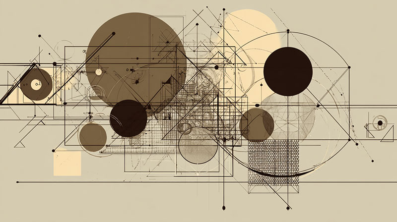
Size is the most obvious factor. A large boulder balances a small pebble, right? Usually. But not always.
Placement matters more than most beginners expect. An element placed near the edge of the canvas exerts greater visual pull than the same element placed near the center. Arnheim described this as a tension between the element and the frame boundary, a pull that increases with proximity to the edge.
Isolation amplifies weight. A single figure in an otherwise empty pictorial space becomes the heaviest thing in the painting regardless of its actual size. Edward Hopper used this constantly. His lone figures in diners and hotel rooms feel heavy precisely because there’s nothing competing for attention.
And then there’s negative space, the areas around and between subjects. It has weight too. Took me a long time to accept that empty space isn’t really empty. It pushes back.
Symmetrical Balance in Painting
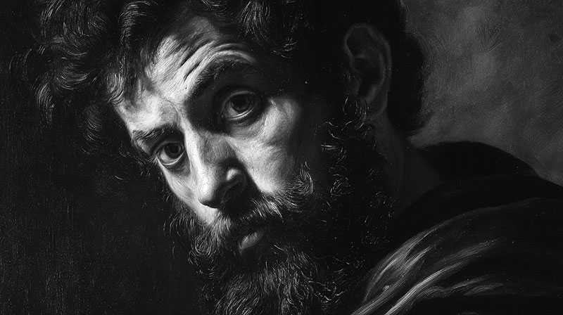
Symmetrical balance is the most straightforward type. Elements are mirrored (or nearly mirrored) along a central axis, usually vertical. Both halves carry approximately equal visual weight.
The result is stability. Formality. Calm. And sometimes, if you’re not careful, rigidity.
| Feature | Structure | Technical Logic | Effect on Viewer |
| Structure | Mirrored Axis | Elements are repeated with equal “weight” on either side of a center line. | Ordered & Stable: Provides an immediate sense of equilibrium. |
| Common In | Formal Subjects | Utilizes the “Law of Centering” to keep the eye locked in the middle. | Authority & Reverence: Conveys a sense of the eternal or ceremonial. |
| Risk | Static Nature | Lack of movement can lead to “Visual Fatigue” if over-simplified. | Low Engagement: The brain “solves” the image too quickly and moves on. |
| Best Used For | Grandeur | Creating a focal point that feels immovable and significant. | Calm & Sacred: Ideal for subjects requiring deep respect or focus. |
Leonardo da Vinci‘s The Last Supper is the textbook example. Christ sits at the center, with groups of apostles arranged in balanced clusters on either side. The symmetry reinforces the sacred weight of the moment. Nothing feels accidental.
Raphael‘s The School of Athens does something similar but with more bodies and architectural depth. The vanishing point sits between Plato and Aristotle, and the figures fan outward in roughly equal visual mass. This kind of linear perspective combined with symmetrical balance was a signature of Renaissance composition.
Cross-cultural studies in neuroaesthetics, including a 2024 review published by Palgrave Macmillan, confirm that symmetry composition has been one of the preferred strategies for generating pleasant compositions since at least the early 1900s, when psychologist Ethel Puffer first documented the pattern.
When Symmetrical Balance Works and When It Doesn’t
Symmetrical balance works best when you want authority or spiritual weight. That’s why it shows up so often in Baroque altarpieces, Gothic panel paintings, and Neoclassical compositions.
It doesn’t work well when you want tension, surprise, or the feeling of caught movement. A symmetrical landscape can feel staged. A symmetrical portrait can feel like a passport photo.
Most painters use approximate symmetry rather than perfect mirror images. Research from Scientific Reports (2018) found that while adults show aesthetic preference for symmetrical patterns, that preference isn’t innate. It develops through exposure. So the appeal of symmetry is strong but not automatic, which is why slight breaks in symmetry often make compositions more interesting.
Asymmetrical Balance in Painting
This is where things get interesting. And honestly, this is where most good paintings live.
Asymmetrical balance means the two sides of a composition aren’t mirrored, but the overall arrangement still feels stable. Different elements with different visual weights are arranged so that no single area overwhelms the rest.
It’s harder to pull off than symmetry because there’s no simple formula. You can’t just copy one side to the other. You have to feel it. Or, more accurately, you have to develop an eye for the way different kinds of visual weight offset each other.
Johannes Vermeer‘s Girl with a Pearl Earring is a classic example. The figure is positioned slightly off-center, turned at an angle. The dark background on one side holds different weight than the lighter tones near her face. The pearl earring itself, a tiny bright spot, punches far above its size because of value contrast and isolation.
Edgar Degas pushed asymmetrical balance further than almost anyone in his era. His ballet scenes regularly crop figures at the edges, leave large areas of empty floor, and place the main action off to one side. It looks spontaneous. It isn’t. Degas was ruthlessly precise about balancing those compositions, drawing from the Japanese woodblock prints he studied.
The Art Basel and UBS Global Art Market Report (2025) found that global art transactions reached 40.5 million in 2024, with lower-priced segments showing the most growth. This surge of accessible art means more people are encountering and buying paintings now, and asymmetrical balance is the compositional approach most of them are seeing, because it dominates contemporary painting and photography.
Why Asymmetrical Balance Feels More Natural
Real life isn’t symmetrical. Your living room, a forest path, a city street. None of it mirrors itself. So asymmetrical balance reads as more lifelike, more organic.
Eye-tracking research from Casteau and Smith (2024) showed that viewers spend more time exploring compositionally complex works, particularly when those works use asymmetrical layouts that distribute points of interest across the full picture plane. Symmetrical works got quicker, more predictable scan paths.
That said, asymmetrical doesn’t mean random. There’s still a logic to it. A large dark form on the left might balance against two smaller bright forms on the right. A heavy textured area near the top can offset a sharp focal point near the bottom. The tools are the same as symmetrical balance. The arrangement is just less predictable.
Radial Balance in Painting
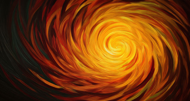
Radial balance happens when visual elements radiate outward from a central point, like spokes on a wheel. It creates a natural sense of movement and focus at the same time.
You see it in rose windows, mandalas, and ceiling frescoes. Rococo ceiling paintings used radial balance constantly, with angels and clouds swirling out from a central heavenly opening.
Hilma af Klint’s circular compositions from the early 1900s are some of the most striking examples in modern art. She organized abstract forms around central points decades before most artists were thinking in those terms.
Yayoi Kusama‘s infinity nets operate on a variation of radial logic. The repeating dot patterns emanate in all directions from every point simultaneously, creating a kind of distributed radial effect across the entire surface.
Where Radial Balance Shows Up Beyond Fine Art
Religious and spiritual art: Tibetan mandalas, Christian rose windows, Islamic geometric patterns. These traditions use radial balance to draw the viewer’s eye inward toward a spiritual center.
Ceiling frescoes: Michelangelo‘s Sistine Chapel ceiling uses radial elements within a broader grid structure. Individual panels create localized radial pulls that keep the viewer’s gaze circling.
Contemporary design: Radial balance appears in everything from app icons to album covers. It’s one of the most psychologically gripping arrangements because the central point acts as a visual anchor that resists the eye drifting away.
Crystallographic Balance

This one confuses people, mostly because the name sounds like a chemistry term. But crystallographic balance (also called mosaic balance or allover balance) is actually the simplest idea: spread similar visual elements evenly across the entire surface so that no single area dominates.
There’s no focal point. No center of interest. The whole canvas is equally weighted.
Jackson Pollock‘s drip paintings are the most famous examples. His allover technique created compositions where every square inch of canvas carries roughly the same visual density. Taylor, Micolich, and Jonas published their fractal analysis of Pollock’s drip paintings in Nature (1999), confirming that his work follows consistent fractal patterns at multiple scales, a mathematical distribution that produces the sense of even visual weight.
Andy Warhol‘s grid-based pop art works (like his Marilyn Diptych) use a different version of this idea. Repeating the same image in a grid distributes visual weight evenly, forcing the viewer to scan the whole surface rather than settling on one point. Minimalism and Op art explored similar territory.
How Allover Balance Challenges Traditional Composition

Traditional composition types assume a hierarchy. Something is the star. Something is the supporting cast. Crystallographic balance rejects that entirely.
It’s a fundamentally different relationship between painting and viewer. Instead of being guided through a composition, you’re dropped into it. Your eye wanders freely with no prescribed path. Mark Rothko‘s color field paintings sit at the border between crystallographic and radial balance. The soft-edged rectangles create a field effect, but the stacked horizontal bands also suggest a subtle vertical axis.
This type of balance works best for abstract and pattern-based work. Trying to apply it to representational painting usually just looks like a mess. Your mileage may vary, but I’ve rarely seen it work outside of abstraction.
How Painters Create Balance in Practice
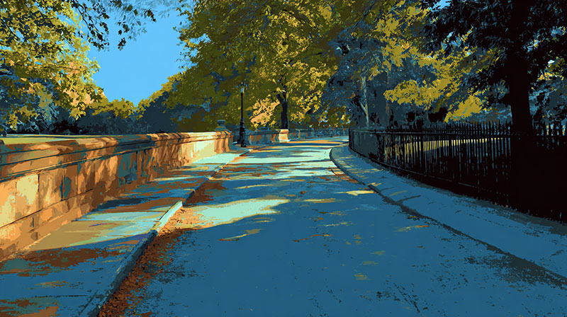
Knowing the types of balance is one thing. Actually building it into a painting while you’re working? Completely different problem.
Most painters don’t think about balance as a separate step. It gets baked into the process from the very first thumbnail sketch, long before any paint hits canvas. Edgar Payne, in his classic Composition of Outdoor Painting, showed how small preliminary studies let you solve balance problems at the planning stage rather than fighting them later.
The rule of thirds is where most people start. John Thomas Smith first wrote it down in 1797, quoting Sir Joshua Reynolds on the proportion of light and dark in a painting. The idea is simple: divide your canvas into a 3×3 grid and place key elements along the directional lines or at their intersections.
A study published in Art & Perception (Amirshahi et al., 2014) tested this by analyzing over 580 paintings across multiple genres. The researchers found that the rule of thirds played only a minor role in the aesthetic evaluation of finished paintings. Low calculated rule-of-thirds values appeared across abstract works, landscapes, and portraits alike.
So it’s a starting point. Not gospel.
Sketching for Balance Before You Paint
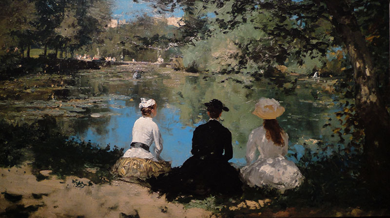
Thumbnail sketches are the cheapest insurance against bad balance. Small, fast, usually no bigger than a few inches. You’re not drawing details. You’re mapping where the major masses of dark and light fall.
Three to five thumbnails per painting is a reasonable starting point. Move the focal point around. Shift the horizon. Try different distributions of visual weight and see what feels right before committing to a full canvas.
Learning how to sketch before painting saves hours of frustration. A two-minute thumbnail can reveal a balance problem that would take an hour to fix once you’re deep into the work.
Correcting Balance During the Painting Process
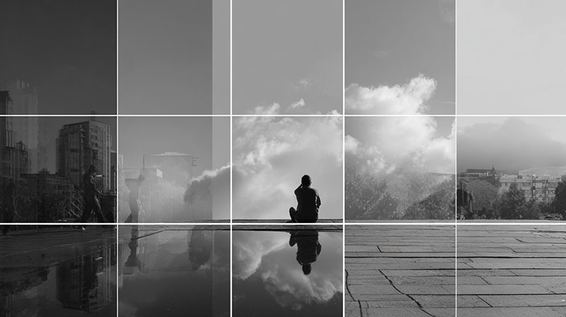
A Future Market Insights survey (2023) found that about 32% of artists worldwide now use digital tools as part of their workflow. Many use features like grayscale filters, horizontal flip, and mirror view to check compositional balance mid-process.
Procreate’s canvas flip, Photoshop’s desaturate command, and even just photographing your painting and viewing it on a phone screen. All of these reveal balance issues your eye has gone blind to after hours of staring.
| Method | Technical Logic | What It Reveals | When to Use |
| Flip Horizontally | Resets the brain’s “left-to-right” scanning bias. | Asymmetry: Structural leans or anatomical distortions you’ve adapted to. | Every 30–60 minutes (Essential for digital artists). |
| Grayscale Check | Removes the “Chroma” distraction to focus purely on Value. | Value Imbalance: Colors that look “bright” but lack sufficient light/dark contrast. | After blocking in major areas and before final rendering. |
| The 10-Foot Step | Forces the eye to see the “Big Shape” instead of the detail. | Overall Weight: Issues with composition, balance, and focal point clarity. | Frequently; at least twice per painting session. |
| The Squint | Naturally “filters” out high-frequency detail (noise). | Tonal Clusters: Major imbalances in the Ross Value Scale. | Before adding any detail or texture. |
The old-school version of all this: turn your painting upside down, or look at it in a mirror. Paul Cezanne was known for stepping far back from his canvases constantly, sometimes spending more time looking than painting.
Balance vs. Imbalance as a Deliberate Choice
Not every painting should be balanced. Some of the most powerful work in art history is powerful specifically because the composition feels unstable.
Intentional imbalance creates tension. Unease. A visual discomfort that keeps you looking because your brain wants to resolve it but can’t.
Francisco Goya‘s Black Paintings are the definitive example. Art historians note that in these works, most figures are deliberately off-center, creating an imbalance that was strikingly modern for the early 1800s. The compositions reject stability. Figures crowd one side of the canvas while darkness swallows the other. The reduced palette of ocher, earth, gray, and black eliminates the color-based visual weight that would normally help a composition find equilibrium.
Egon Schiele did something related but with the human body itself. His distorted figures stretch and twist in ways that throw the internal proportions off, making the forms feel restless within the frame. The paintings feel like they’re barely holding together, and that’s exactly the point.
The Difference Between Intentional and Accidental Imbalance
Intentional imbalance: The viewer senses tension, drama, or emotional weight. The off-balance composition serves a purpose. You feel uneasy, but you stay.
Accidental imbalance: The viewer senses that something is wrong. The painting looks unfinished or carelessly arranged. You feel confused, and you leave.
The difference comes down to control. When Willem de Kooning crammed vigorous, almost aggressive brushstrokes into one zone of a canvas, the imbalance felt deliberate because every other element (color temperature, edge quality, line direction) confirmed it was a choice.
Expressionist painters used distorted forms and non-naturalistic colors to create what art historian Sartle describes as imagery prioritizing how the world “felt” over how it optically looked. Balance gets broken on purpose when emotional truth matters more than visual comfort.
Common Balance Mistakes in Painting

These show up constantly, at every skill level. Knowing them doesn’t make you immune, but it helps you catch them faster.
Centering Everything
Putting the focal point dead center with nothing to offset it. It’s the default instinct, and it almost always produces a static, lifeless composition.
Rebecca Rath, an Australian plein air painter, puts it directly: placing the horizon line dead center “leads to visual stagnation.” The composition becomes static and the eye doesn’t know where to go. The same applies to centering a figure, a tree, or any primary subject.
The fix: Use that rule of thirds grid as a starting point, then adjust by feel. Even moving the subject a few inches off center changes the dynamic completely.
Overloading One Side
Piling detail, saturated color, or heavy values on one side of the canvas without providing anything on the other side to counterbalance. The painting starts to feel like it’s tipping over.
John Cosby, writing for OutdoorPainter, calls compositional errors one of the top ten most common mistakes painters make. Leading the eye through a painting is the painter’s job, and when one side of the canvas does all the talking, the eye gets stuck there.
It’s tricky because you can’t just add random stuff to the empty side. A subtle gradation in the sky, a well-placed shadow, or a single small element with strong color contrast can do the job without cluttering things up.
Ignoring the Weight of Empty Space
Space isn’t neutral. A large area of unbroken color or bare canvas pushes back against the elements around it. Beginners often treat background areas as “nothing,” then wonder why their composition feels off.
Claude Monet‘s water lily paintings use vast stretches of reflected sky and water as active compositional elements, not empty filler. The “empty” areas carry real visual weight that balances the clusters of floating lilies.
Treating Balance as a Rule Instead of a Relationship
Balance isn’t a formula you apply. It’s a relationship you develop with each individual painting.
Every painting medium handles visual weight differently. Watercolor paintings have a natural lightness that shifts balance calculations. Heavy oil impasto creates physical weight that affects perception. Acrylic sits somewhere between the two. What balances in oils may not balance in watercolor, even with the same arrangement.
How Balance Connects to the Overall Composition
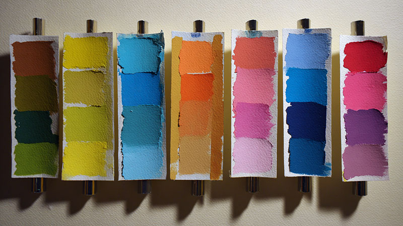
Balance doesn’t exist in isolation. It works alongside every other principle of design, and sometimes those principles pull in opposite directions.
A composition can have perfect balance but still fail because it lacks variety. Or it can be beautifully varied but feel chaotic because nothing is balanced. The tension between these forces is what makes composing a painting genuinely difficult.
Balance and Focal Point Placement

These two are interdependent. Where you place the visual hierarchy‘s primary point of interest determines how you need to balance everything else around it.
An off-center focal point (which is most focal points) creates an inherent asymmetry that the rest of the composition has to address. Vincent van Gogh‘s Starry Night places the swirling sky as the dominant focal zone, with the dark cypress tree and village providing counterweight below. Remove either, and the composition collapses.
Pablo Picasso‘s Cubist works fractured focal points across the entire picture plane, requiring a completely different approach to balance. When there’s no single place for the eye to land, balance has to come from the overall distribution of visual weight rather than the push-pull relationship between a focal point and its surroundings.
Balance as a Tool, Not a Goal
This is the part that takes years to internalize.
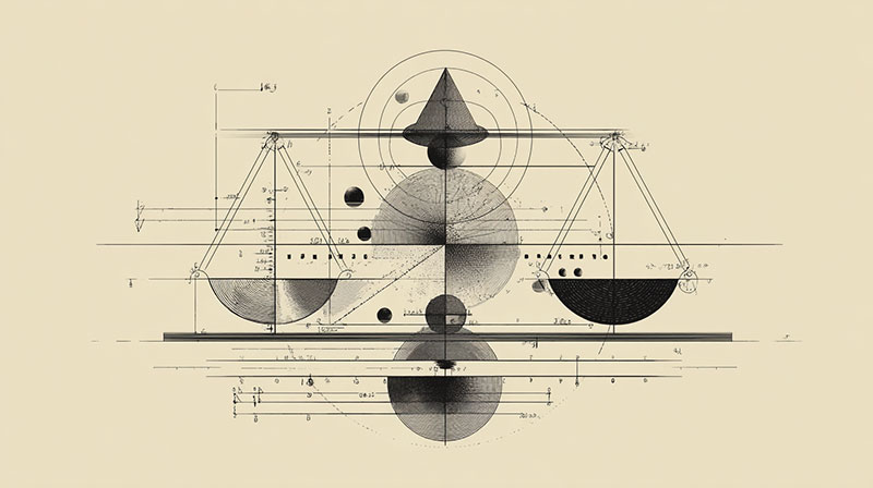
Balance is a tool. It serves the painting. The painting does not serve balance.
Sometimes a dominant element needs to overpower its surroundings. Sometimes subordinate elements need to fade almost to nothing. The question isn’t “Is this balanced?” It’s “Does this balance (or lack of it) serve what I’m trying to say?”
Piet Mondrian spent his career reducing painting to lines, rectangles, and primary colors, then obsessively adjusting the scale and placement of each element until the composition achieved a specific kind of equilibrium. For him, balance was the entire point. For Salvador Dali working in Surrealism, it was something to manipulate for dreamlike effect.
Different painting styles treat balance differently. Realism generally respects it. Impressionism loosened it. Futurism attacked it. But all of them understood it first.
You have to know where the center of gravity is before you can shift it.
FAQ on What Is Balance In Painting
What are the four types of balance in painting?
The four types are symmetrical, asymmetrical, radial, and crystallographic (allover) balance. Each distributes visual weight differently across the composition. Symmetrical mirrors elements along an axis. Asymmetrical offsets unequal elements. Radial radiates from a center point. Crystallographic spreads weight evenly everywhere.
Why is balance important in art composition?
Balance controls how a viewer’s eye moves through a painting. Without it, compositions feel unstable or confusing. Good balance creates visual harmony and keeps the viewer engaged. It works alongside principles like emphasis, rhythm, and unity to hold the whole piece together.
What is the difference between symmetrical and asymmetrical balance?
Symmetrical balance mirrors elements on both sides of a central axis, creating formality and calm. Asymmetrical balance uses different elements with different visual weights arranged so the composition still feels stable. Most paintings use asymmetrical balance because it feels more natural.
How does color affect balance in a painting?
Color carries visual weight. Warm, saturated colors like red feel heavier than cool, muted tones. A small bright area can balance a large dull one. Color intensity, hue, and value contrast all influence how weight distributes across the picture plane.
What is visual weight in art?
Visual weight is the perceived heaviness of an element within a composition. It’s determined by size, color, value contrast, texture, isolation, and placement. Darker values, saturated colors, and elements near the canvas edge all carry more visual weight.
Can a painting be intentionally unbalanced?
Yes. Artists like Francisco Goya and Egon Schiele used intentional imbalance to create tension and emotional unease. The difference between purposeful and accidental imbalance is control. Deliberate imbalance serves the painting’s meaning. Accidental imbalance just looks like a mistake.
How do you check balance in a painting?
Flip the canvas horizontally to reveal asymmetry you’ve adapted to. Squint to see major tonal distribution. Convert to grayscale to check value balance. Step back ten feet. Photograph it and view the image small on your phone screen.
What is radial balance in painting?
Radial balance arranges visual elements outward from a central point, like spokes on a wheel. It appears in religious art, mandalas, and ceiling frescoes. It creates simultaneous movement and focus, drawing the viewer’s eye inward toward the center.
Does the rule of thirds help with balance?
It’s a useful starting framework. Dividing the canvas into a 3×3 grid helps place focal points off-center, which naturally creates asymmetrical balance. But research shows it plays only a minor role in overall aesthetic evaluation. Treat it as a guide, not a rule.
How does balance relate to other principles of design?
Balance works alongside harmony, rhythm, emphasis, unity, and variety. It holds the composition together structurally while other principles handle movement, focus, and visual interest. A painting can be balanced but still fail if it lacks variety or a clear focal point.
Conclusion
Understanding what is balance in painting gives you a foundation that affects every compositional decision you’ll ever make. It’s the principle that holds everything else together, from where you place your focal point to how you distribute color and value across the picture plane.
Whether you lean toward symmetrical stability or asymmetrical tension, balance is something you feel before you analyze it. The best painters, from Vermeer to Pollock, understood this instinctively.
Start with thumbnail sketches. Check your work by flipping the canvas. Learn the rules of visual weight, then break them when the painting demands it.
Balance isn’t about perfection. It’s about making deliberate choices that serve what you’re trying to communicate. Get that right, and the rest follows.