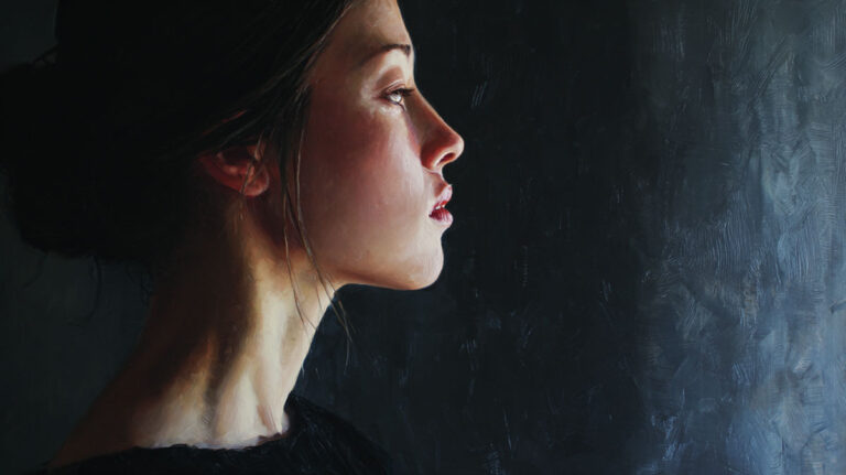
Your eye never moves randomly across a painting. It follows a path, and that path is built from directional lines in painting. Whether drawn explicitly or implied through gesture, gaze, and object placement, these lines control where the viewer looks and how long they stay.
Every major compositional decision a painter makes connects back to this idea. The diagonal that creates tension. The curve that softens a scene. The converging lines that pull you into deep space.
This article breaks down how directional lines work, the types painters use, how they shape emotional tone, and common mistakes that weaken a composition. You’ll also find practical techniques for building directional structure into your own work.
What Are Directional Lines in Painting?

Directional lines are lines, whether drawn or suggested, that guide the viewer’s eye through a composition along a specific path. They are one of the most quietly powerful tools a painter has.
Some directional lines are obvious. A road cutting through a landscape, a pointed finger, the edge of a rooftop. Others are completely invisible on the canvas surface but still do the same job.
These implied lines form through arrangements of objects, the direction someone’s gaze points, or the alignment of shapes across the picture plane. Your brain connects the dots without being asked to.
A common mistake is lumping all lines together. Directional lines are not the same as contour lines (which outline edges), decorative lines (which add pattern or ornamentation), or structural lines (which build form).
The difference is function. A contour line tells you what something looks like. A directional line tells your eye where to go next.
That distinction matters. Two painters can draw the exact same object, but if one of them tilts a figure’s arm toward the upper right corner while the other keeps it at the figure’s side, the visual path through the painting completely changes. The focal point shifts. The movement changes.
Directional lines sit at the core of compositional design. Every painting style, from tight academic realism to loose gestural abstraction, relies on them to keep a viewer engaged rather than confused.
How Directional Lines Control the Viewer’s Eye
Your eyes don’t move randomly across a painting. They follow paths, and directional lines are what build those paths.
The science behind this goes back to Gestalt psychology, specifically the principle of continuation. It states that the human eye naturally follows paths, lines, and curves in a design. When you see two points connected by even a partial line, your brain fills in the rest and keeps moving in that direction.
The Psychology of Line-Following
Gestalt continuation is the main driver. The Interaction Design Foundation describes it plainly: the eye follows paths and prefers to see continuous flow rather than separated objects, even when obstacles break the line.
That’s why a row of trees in a painting works as a line even though each tree is a separate object. Your brain groups them and reads a direction.
Closure plays a role too. When objects are arranged in a partial arc or curve, your visual system completes the shape. Painters exploit this constantly, placing figures or objects in loose circular or triangular arrangements that pull the eye along without a single drawn line.
What Eye-Tracking Research Shows

A Tobii eye-tracking study on Caravaggio’s paintings tested 40 visitors viewing Sette Opere di Misericordia in its original church setting. The Pathway Variability Index was just 0.35, meaning most people followed nearly the same visual route through the painting.
When the same researchers tested a different Caravaggio painting displayed outside its intended environment, the PVI jumped to 0.90. Almost every viewer took a different path.
That’s a striking gap. It suggests that when directional lines are calibrated to a specific setting (the lighting, the angle, the height on the wall), they lock the viewer into the compositional flow the artist planned. Remove the context, and the directional structure weakens.
Alfred Yarbus’s landmark 1967 research showed something equally useful. He recorded eye movements of a subject viewing Ilya Repin’s The Unexpected Visitor seven times, each with different instructions. The scan paths changed dramatically based on what the person was looking for. But in every case, the eyes followed the painting’s implied directional lines between figures before landing on the target area.
More recent work backs this up. A 2024 Gestalt and eye-tracking study published in the Journal of Eye Movement Research found that proximity-based visual designs received higher aesthetic ratings and demanded less viewing time, while similarity-based designs led to longer fixation durations. When the directional flow is clear, people process the image faster and enjoy it more.
Visual Weight and Attention Distribution
Directional lines also redistribute what’s called visual weight across the canvas. If a strong diagonal pulls your eye from bottom-left to upper-right, it shifts the visual hierarchy away from the geometric center.
Painters use this to create asymmetrical balance. A small, bright object at the end of a directional line can carry as much visual weight as a large, muted one sitting elsewhere. The line tells the eye that the small object matters.
Types of Directional Lines in Composition
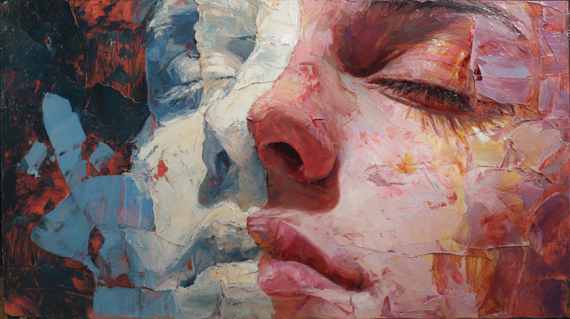
Not all directional lines do the same thing. The angle, curvature, and placement of a line directly affects how a viewer reads the painting, both physically and emotionally.
| Line Type | Technical Logic | Visual Effect | Common Use |
| Horizontal | Parallel to the earth’s gravity; no potential energy. | Calm & Stability: Mimics a body at rest or the horizon. | Landscapes, Seascapes, Earth-bound structures. |
| Vertical | Perpendicular to gravity; implies potential falling or standing. | Strength & Formality: Conveys height, dignity, and power. | Architecture, Standing figures, Skyscrapers. |
| Diagonal | Unstable; the eye perceives a state of “falling” or “climbing.” | Movement & Tension: Creates drama and high-energy vectors. | Action scenes, Sports photography, Narrative drama. |
| Curved / S-Line | Mimics organic growth and the fluidity of water. | Grace & Organic Flow: Provides a “soft” path for the eye. | Figure painting, Natural forms, Fabric drapery. |
| Converging | Mathematical vanishing points create a “3D Hole” in the 2D plane. | Depth & Recession: Forces the eye deep into the spatial field. | Linear perspective, Roadways, Hallways. |
Horizontal Lines
Horizontal lines run parallel to the ground. They suggest rest. Think of a flat horizon in a landscape painting or the still surface of water.
There’s a perceptual reason for this. Objects parallel to the earth are at rest. The Getty’s formal analysis resources note that horizontal lines also imply continuation beyond the picture plane, stretching the viewer’s sense of space to the left and right.
Claude Monet’s water lily paintings stack horizontal bands of reflected sky and vegetation. The eye drifts slowly across, never rushed. That’s the horizontal line doing its work.
Vertical Lines
Vertical lines communicate height and authority. Cathedral interiors, tall trees, standing human figures. All of them push the eye upward.
They tend to make compositions feel more formal. Gothic art leaned heavily on vertical directional force, both in architecture and in painting, to create a sense of spiritual elevation.
Diagonal Lines
Diagonals are the most dynamic. They are inherently unstable, neither at rest like horizontals nor planted like verticals. Because they suggest something about to fall or already in motion, they inject energy into any composition.
The steeper the diagonal, the more aggressive the sense of movement. A shallow diagonal glides. A steep one plunges.
Peter Paul Rubens built entire paintings around crossing diagonals. Figures tumble, rear up, and reach across the canvas on steep angles. You can feel the action partly because your eye is being pulled along those same unstable lines.
Curved and S-Lines
William Hogarth called the S-curve the “line of beauty” in his 1753 treatise The Analysis of Beauty. He wasn’t wrong.
Curved directional lines produce a sense of grace and organic rhythm. They recall the natural contours of the human body, flowing water, wind-bent branches. The eye follows them without the tension that diagonals produce.
Sandro Botticelli’s The Birth of Venus is one of the clearest examples. The figure’s pose, the wind-blown hair, the drapery held by the figure to the right, all of it traces long S-curves that keep the eye moving in a gentle, looping circuit through the painting.
Implied Lines vs. Explicit Lines
An explicit directional line is something you can physically see on the canvas. A road, a staff, a riverbank, the edge of a building.
An implied directional line is invisible but just as real to the brain. It forms through gaze direction (where a painted figure is looking), gesture (a pointed hand or extended arm), or strategic placement of objects that the eye connects into a line.
Johannes Vermeer used sightlines constantly. In Girl with a Pearl Earring, her gaze directs your eye back toward her luminous earring. The girl’s eyes and the jewelry create an implied loop. No drawn line connects them.
Leonardo da Vinci’s The Last Supper is another classic case. The apostles’ gestures and body positions create multiple implied directional lines that all converge on Christ at the center, reinforced by the architectural vanishing point directly behind his head.
Directional Lines and Diagonal Movement in Classical Painting

Renaissance painters built their compositions primarily on horizontal and vertical structures. Symmetry, central placement, stable triangular groupings of figures. Look at Raphael’s The School of Athens. It’s balanced, measured, deliberate.
Then the Baroque painters showed up and broke the whole thing open with diagonals.
The Baroque Diagonal
The so-called “baroque diagonal” was a deliberate rejection of Renaissance stability. Instead of resting the composition on a centered pyramid, Baroque painters tipped the primary directional axis to a diagonal, usually running from lower-left to upper-right or the reverse.
Why? Because they were painting drama. Martyrdoms, battles, divine interventions, emotional extremes. Horizontal calm wouldn’t cut it.
Caravaggio was one of the earliest to commit to this. In The Conversion of Saint Paul, the saint lies flat on the ground while his arms extend upward toward the horse above him. The figure-to-horse axis creates a strong diagonal that splits the picture plane. The Tobii eye-tracking study mentioned earlier confirms that Caravaggio’s compositional lines consistently directed viewers along repeating visual pathways with minimal variation.
Rubens pushed it further. His The Descent from the Cross channels Christ’s limp body along a steep diagonal from upper-left to lower-right. Every surrounding figure either supports or echoes that primary line. You can trace at least three secondary diagonals branching off the main one, each pulling the eye to a different face or hand in the scene.
How Diagonals Create Narrative Flow
Eugene Delacroix’s Liberty Leading the People is practically a textbook in diagonal composition. The central figure raises the tricolor flag on a steep diagonal while dead and wounded figures spread across the foreground on opposing angles.
The painting’s energy comes almost entirely from these competing lines. Your eye doesn’t rest anywhere for long. It moves from the flag down to the fallen bodies, back up to Liberty’s face, then along the musket barrels and reaching arms of the crowd.
That restlessness is the point. Delacroix wanted the viewer to feel the chaos and urgency of revolution. Diagonal directional lines gave him that.
Artemisia Gentileschi’s Judith Slaying Holofernes uses a similar tactic with brutal efficiency. The arms of the two women and their victim create an X-shaped diagonal intersection at the center of the violence, locking the viewer’s eye exactly where the action is most intense.
Leading Lines and Depth in Landscape Painting

In landscape painting, directional lines serve a specific additional function. They pull the eye from the foreground into deep pictorial space, creating a convincing sense of three-dimensional depth on a flat surface.
Roads, Rivers, and Natural Leading Lines
A winding road. A meandering river. A fence line. A row of trees receding toward the horizon. These are the classic leading line devices in landscape painting, and they’ve been used for centuries because they work.
Claude Lorrain, the 17th-century French painter who practically invented the classical landscape format, placed leading lines obsessively. His compositions almost always feature a path or waterway that enters at the foreground and curves into the middle distance before the eye reaches a hazy, sun-drenched horizon.
The effect isn’t accidental. Lorrain combined directional lines with atmospheric perspective (colors cooling and values lightening as distance increases) to double the depth cue. The line tells you where to go. The atmosphere tells you how far you’ve traveled.
Foreground-to-Background Line Paths
Landscape directional lines work differently from figure-based ones. In a figure painting, the lines bounce you between people, gestures, and faces. In a landscape, they pull you steadily in one direction: inward.
J.M.W. Turner used converging lines of water and light to pull the viewer deep into atmospheric space. His compositions often feel almost infinite because the directional lines never really terminate. They fade rather than stop.
The Hudson River School painters (Thomas Cole, Frederic Church, Albert Bierstadt) took a more structured approach. Their foregrounds typically feature a strongly defined leading element, such as a rocky outcrop, a fallen tree, or a stream, that points the eye toward a dramatic vista in the background.
John Constable’s English landscapes use subtler directional cues. A cart track through a field, the curve of a riverbank, the lean of wind-bent trees. The lines are gentler but still present, guiding the eye through familiar countryside with quiet insistence.
| Painter | Primary Leading Line Device | Technical Logic | Depth Strategy |
| Claude Lorrain | Meandering Waterways | Uses the “S-Curve” to slow the eye’s journey toward the sun. | Atmospheric perspective + Warm-to-cool shifts. |
| J.M.W. Turner | Light Corridors | Replaces physical lines with “Light Paths” that dissolve form. | High-contrast “glare” that obscures the horizon. |
| Thomas Cole | Diagonal Foreground | Uses fallen trees/rocks to “point” like arrows toward the vista. | Dramatic Near-Far contrast (The “Sublime”). |
| John Constable | Receding Cart Tracks | Uses linear perspective of man-made paths to ground the eye. | Subtle value shifts + Cloud-driven movement. |
How Directional Lines Shape Emotional Tone
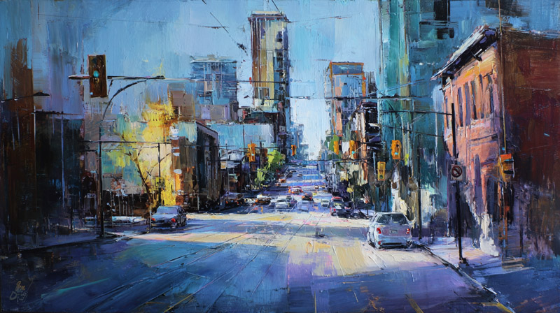
The direction and character of lines in a painting don’t just move the eye. They change how a viewer feels about what they’re seeing.
This isn’t a vague artistic claim. Research supports it. A 2024 study published in Archives of Design Research found that dynamic visual transitions and specific compositional arrangements prompted distinct emotional responses in participants, including engagement, optimism, and introspection, depending on the directional structure of the artwork.
Horizontal-Dominant Compositions
Paintings built primarily on horizontal lines tend to feel peaceful, expansive, or melancholic. The eye moves slowly, side to side, with no urgency.
Edward Hopper’s paintings are a good example. Works like Nighthawks use long horizontal bands (the diner counter, the street, the building facade) that flatten the emotional register into something between stillness and isolation. The lack of strong diagonals means there’s nowhere for the emotion to “go.” It just sits there. That’s the mood.
Diagonal-Dominant Compositions
Diagonals push emotion toward extremes. Energy, conflict, ecstasy, chaos.
Baroque religious paintings used steep diagonals to suggest divine intervention, a force breaking into ordinary reality at an angle. Francisco Goya’s The Third of May 1808 uses the firing squad’s rifles as converging diagonal lines pointing directly at the central victim, concentrating the horror into a single geometric intersection.
The Futurist painters of the early 20th century took this even further. Artists like Giacomo Balla and Umberto Boccioni filled their canvases with overlapping diagonals to represent speed, machines, and modern urban energy. The paintings feel frantic because the directional lines never settle into stability.
Curved Lines and Emotional Softening
S-curves and flowing directional lines do the opposite of diagonals. They soften. They suggest sensuality, comfort, or natural grace.
Pierre-Auguste Renoir’s figure paintings rely heavily on curved directional paths. The rounded shoulders, flowing hair, and soft fabric folds create looping lines that make the viewer’s eye travel gently, matching the warm, pleasurable tone of the subjects.
Henri Matisse pushed this concept into near-abstraction. His late cutouts and paintings use bold, sinuous curves as the primary directional force. The emotional result is joyful, almost musical. Color contributes, but the curves carry most of the feeling.
Chaotic or Multi-Directional Lines
When directional lines compete without resolution, the result is visual disorientation. That can be intentional.
Expressionist painters like Ernst Ludwig Kirchner used clashing, angular directional lines to communicate psychological distress. The viewer’s eye bounces without a stable path. That discomfort is the message.
Wassily Kandinsky wrote extensively about line and emotion in his 1926 book Point and Line to Plane. He argued that every line direction carries a specific emotional temperature. Horizontals are cold and flat. Verticals are warm and ascending. Diagonals combine both, producing tension. Kandinsky treated this framework not as opinion but as a systematic grammar of visual feeling.
EEG research has added a neurological layer to this. One study found that looking at abstract art with strong gestural directional lines activated motor areas of the cortex, as though the brain was preparing to mimic the motions shown in the painting. The directional energy of the lines literally moves through the viewer’s body.
Directional Lines in Abstract and Modern Painting

When painters stopped depicting recognizable subjects, directional lines didn’t disappear. They just became the entire point.
Piet Mondrian stripped his compositions down to horizontal and vertical lines intersecting at right angles. No curves. No diagonals. Just a grid of black lines creating rectangles filled with primary colors, white, and gray.
X-ray analysis at the Fondation Beyeler revealed that Mondrian’s Composition with Grid 1 (1918) started as a perfectly uniform grid based on the golden section. He then adjusted lines intuitively over multiple painting layers to reach what he considered the right visual balance.
The directional flow in a Mondrian painting is subtle but real. Your eye bounces between colored rectangles, following the lines that connect them. He described horizontals as representing the “natural” and verticals as the “spiritual.” Where they cross, balance occurs.
Kandinsky’s Lines as Emotional Carriers
Diagonal and curved lines became pure emotional instruments in Kandinsky’s work. Compositions like Composition VII (1913) pack the canvas with sweeping arcs, jabbing diagonals, and spiraling curves that have nothing to do with depicting objects.
The directional energy is all there is. Kandinsky theorized in Point and Line to Plane that every line angle carries a specific temperature and tension, and his paintings apply that theory directly.
A 2024 Frontiers in Psychology study on Gestalt recognition in Cubist art found that viewers experience measurable “Aha moments” when they suddenly perceive unified structure in fragmented compositions. Pupil dilation increased at the moment of recognition, confirming that the brain actively works to resolve directional cues into coherent visual paths.
Gesture as Directional Line in Abstract Expressionism
Jackson Pollock’s drip paintings look chaotic at first glance. But the directional lines are everywhere. They’re just created by the artist’s physical movement rather than drawn with a brush.
Britannica describes Abstract Expressionist paintings as replacing “conventionally structured composition” with “a single unified, undifferentiated field of force.” That’s a useful way to understand how directional lines shifted in the 1940s and 1950s.
Willem de Kooning’s slashing brushstrokes in the Women series create aggressive directional paths across the canvas. Mark Rothko took the opposite approach, using soft horizontal bands of saturated color that move the eye gently up and down with almost no linear energy at all.
From Guiding the Eye to Activating the Surface
| Approach | Technical Logic | Directional Goal | Viewer Experience |
| Renaissance / Baroque | Perspective & Gaze: Uses “Leading Lines” and eye-lines to build a hierarchy. | Lead eye through a scene to a specific focal point. | Narrative Reading: The viewer “arrives” at the story’s climax. |
| Mondrian / De Stijl | Dynamic Equilibrium: Uses opposing horizontal/vertical axes to cancel out motion. | Balance opposing forces into a locked grid. | Static Contemplation: The eye is held in a state of absolute tension. |
| Action Painting | Indices of Motion: The paint itself is a record of physical movement (drips, throws). | Energize the entire surface simultaneously. | All-over Engagement: No fixed path; the eye “dances” across the canvas. |
| Color Field (Rothko) | Edge Diffusion: Soft borders allow colors to “float” or “expand” toward the viewer. | Slow vertical drift or “breathing” sensation. | Immersion: Emotional absorption through atmospheric vibration. |
That shift from “guiding eye movement through a narrative” to “activating the entire picture plane at once” is one of the biggest changes in how directional lines function across art history.
Op Art painters like Victor Vasarely took this even further. Their directional lines create optical vibration, where the surface itself appears to move. The lines don’t guide the eye anywhere specific. They make the whole canvas pulse.
Techniques for Building Directional Lines Into a Painting

Knowing what directional lines do is one thing. Actually building them into your work is another. Most of the planning happens before paint touches canvas.
Thumbnail Sketching for Directional Paths
Small, fast sketches are the most reliable way to plan directional flow. Before committing to a full composition, experienced painters rough out the primary line paths in thumbnails (usually 2-3 inches tall) to test whether the eye moves where they want it to.
The goal at this stage isn’t detail. It’s mapping the dominant visual path. Where does the eye enter the painting? Where does it go next? Where does it rest? If sketching before painting reveals a dead end or an exit point at the canvas edge, it’s far easier to fix at thumbnail scale than after hours of painting.
Using Value Contrast to Strengthen Lines
A directional line is only as strong as its visibility. One of the best ways to make a line “read” clearly is to place a strong value shift along its path.
- Dark objects against light backgrounds create hard directional edges
- Soft gradation along a line guides the eye gently
- High-contrast areas attract fixation first, according to eye-tracking research
Rembrandt van Rijn used this constantly. His chiaroscuro lighting creates bright pools that the eye jumps between, forming an implied directional path through darkness.
Color Temperature as a Directional Tool

Warm colors advance. Cool colors recede. That’s a basic principle of color theory, and painters use it to build directional depth.
A warm red or orange placed at the foreground of a landscape, followed by progressively cooler blues and greens toward the horizon, creates a directional pull inward. The eye follows the temperature shift without needing any drawn line at all.
Paul Cezanne used hue shifts and warm-cool alternation to build directional structure in his landscapes, replacing traditional aerial perspective with a color-based system that was entirely his own invention.
Armature and Dynamic Symmetry Grids
Some painters use geometric grids as an underlying framework before placing any compositional elements. Two common systems:
Root rectangles: Proportional systems (root 2, root 3, root 4) that divide the picture plane into mathematically harmonious sections. Directional lines are placed along the grid’s diagonals.
Dynamic symmetry: A system developed by Jay Hambidge in the early 20th century, based on the proportions found in Greek art and architecture. It generates diagonal armature lines that cross the canvas at specific angles.
These aren’t magic formulas. But they give painters a structural starting point for placing directional lines in positions that feel balanced rather than random. Google Arts and Culture’s X-ray analysis confirmed that Mondrian used the golden section grid as hidden scaffolding beneath his abstract compositions.
Common Mistakes With Directional Lines
Directional lines can work against a painting just as easily as they work for it. The errors below show up in beginner and intermediate work all the time, and most are simple to fix once you see them.
Lines That Lead the Eye Out of the Painting
This is the most common mistake. A road, fence, or strong diagonal that points directly at the canvas edge will pull the viewer’s eye right out of the composition.
Draw Paint Academy notes that leading lines should direct viewers throughout a painting, not straight out of it. Lines that point toward the edges of the canvas need to be intercepted, curved, or blocked by another element before they reach the frame.
A tree, a figure, a change in value, anything that stops or redirects the eye before it exits will fix the problem.
Competing Directional Paths
Multiple strong directional lines pulling in different directions confuse the viewer. Unless disorientation is the intended effect (as with some abstract work), you generally want one dominant directional line and several secondary ones that support it.
Think of it like traffic. One main road with side streets works. Four highways crossing each other creates a mess.
Tangent Lines That Flatten Depth
A tangent in painting happens when two unrelated edges touch or align in a way that creates visual confusion. Will Kemp Art School describes tangents as “where 2 lines just touch each other in a way that causes spatial ambiguity.”
Common tangent mistakes:
- A tree top touching the bottom of a cloud, making them appear fused
- The edge of an object lining up exactly with the canvas edge
- Two objects’ edges barely touching, flattening the sense of perspective
The fix is simple. Overlap objects clearly or separate them with a visible gap. Tangents rarely survive a flipped canvas, so checking your work in a mirror catches most of them.
Static Compositions With No Directional Variation
When every directional line in a painting runs the same way, the composition feels lifeless. Outdoor Painter lists lack of compositional knowledge as one of the ten most common painting mistakes, noting that “leading the eye through a painting is the responsibility of the painter.”
A composition built entirely on horizontals needs at least one diagonal or vertical break. A painting full of verticals needs a crossing element. Variety in line direction is what creates visual energy.
Analyzing Directional Lines in Existing Paintings

Studying how other painters handle directional lines is the fastest way to improve your own compositions. The method below works for museum visits, books, or screens.
A Step-by-Step Reading Method
Step one: Identify the primary directional line. Where does your eye go first, and what path does it follow? This is usually the strongest value contrast, the biggest gesture, or the most obvious linear element.
Step two: Find the secondary lines. These are smaller directional cues that branch off the primary line or connect secondary areas of interest. Gestures, gazes, edges of objects, and color shifts all count.
Step three: Look for implied lines. Where are figures looking? Where do arms point? What objects align across the composition to form invisible connections?
Yarbus’s 1967 research demonstrated that viewers’ eye paths change dramatically based on what they’re looking for, but the underlying compositional lines remain constant. This method trains you to see those constants.
Overlay Sketching as a Study Tool
One of the most effective study techniques is tracing the directional structure of a painting with a simple line overlay.
- Print or display a reproduction of any painting
- On tracing paper (or digitally), draw only the major directional lines you see
- Reduce the painting to nothing but its linear skeleton
When you strip away color, texture, and subject matter, the directional structure becomes obvious. You’ll start seeing patterns that painters return to repeatedly.
Three Paintings Worth Analyzing
| Painting | Primary Directional Line | Technical Logic | What to Study |
| Liberty Leading the People | Pyramidal Diagonal | Uses a steep diagonal from the flag to the base to create “Explosive Stability.” | How competing diagonals create Chaos & Energy while maintaining a central anchor. |
| The Dance Class | Receding Diagonal | Uses the floorboards as a “Spatial Wedge” to push the eye into the deep background. | How Asymmetry & Implied Sightlines (where the figures look) guide the viewer’s eye. |
| The Great Wave | Logarithmic Spiral | Uses a massive, sweeping curve that funnels energy from the left into a crushing center point. | How a Single Powerful Curve can dominate a composition and dwarf secondary elements. |
Each of these paintings uses a completely different directional strategy. Delacroix stacks diagonals. Degas uses off-axis placement and cropped edges borrowed from photography. Hokusai curves the entire composition around one massive arc.
Studying all three side by side will show you just how many different ways directional lines can organize a painting, even before questions of tone, shade, or subject matter come into play.
FAQ on Directional Lines in Painting
What are directional lines in painting?
Directional lines are explicit or implied lines that guide the viewer’s eye through a composition along a specific path. They can be drawn elements like roads and edges, or invisible paths created through gesture, gaze direction, and object placement.
What are the main types of directional lines?
The five main types are horizontal (calm, rest), vertical (strength, height), diagonal (movement, tension), curved or S-lines (grace, flow), and converging lines (depth through linear perspective). Each produces a different visual and emotional effect.
How do diagonal lines create movement in a painting?
Diagonal lines are inherently unstable. They suggest something falling or already in motion, which makes the viewer’s eye follow them actively. Steeper diagonals feel faster and more aggressive. Shallow diagonals glide with less urgency.
What is the difference between implied and explicit directional lines?
Explicit lines are physically visible on the canvas, like a river or fence. Implied lines are invisible but perceived by the brain through gaze direction, pointing gestures, or aligned objects. Both control eye movement equally well.
How did Baroque painters use directional lines?
Baroque artists like Rubens and Caravaggio replaced Renaissance symmetry with strong diagonals to create dramatic tension. The “baroque diagonal” tilted the primary compositional axis, producing energy and visual instability suited to narrative scenes.
Why do leading lines matter in landscape painting?
Leading lines pull the viewer’s eye from the foreground into deep pictorial space. Roads, rivers, and fence lines act as natural depth cues. Combined with atmospheric perspective, they make flat canvases feel three-dimensional.
How do directional lines affect the emotional tone of a painting?
Line direction changes how viewers feel. Horizontals produce calm or melancholy. Diagonals create urgency and conflict. Curves suggest grace or sensuality. Chaotic multi-directional lines cause disorientation. Kandinsky wrote extensively about this line-emotion relationship.
What are common mistakes with directional lines?
The biggest errors include lines that lead the eye out of the painting, competing directional paths that confuse the viewer, tangent lines that flatten depth, and static compositions where all lines run parallel with no variation.
How do you plan directional lines before painting?
Start with thumbnail sketches to map the primary visual path. Test whether the eye enters, moves through, and rests where intended. Use value contrast and color temperature shifts to strengthen the directional flow once you begin painting.
How do directional lines work in abstract painting?
In abstract art, directional lines shift from guiding the eye through a scene to activating the entire surface. Mondrian used horizontal-vertical grids for balance. Pollock’s gestures created all-over energy with no fixed path.
Conclusion
Directional lines in painting are not a technique you add at the end. They are the compositional skeleton that everything else hangs on.
From the baroque diagonal that gave Rubens his dramatic force to the horizontal calm of a Monet waterscape, every successful painting manages eye flow with intention. The line direction you choose shapes not just where the viewer looks but how they feel while looking.
Start with thumbnails. Map the primary visual path before you commit to a full canvas. Test your value structure and color contrast to make sure the eye moves where you want it.
Study the masters. Trace the directional structure of paintings by Van Gogh, Vermeer, or Delacroix and you’ll see the same principles repeated across centuries and across every painting medium.
The tools are simple. The results are not. Get your directional lines right and your compositions will hold a viewer’s attention long after the first glance.