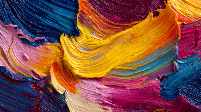
Color is the first thing people notice in a painting, and usually the last thing painters learn to control. Understanding what is color in painting goes far beyond knowing that blue and yellow make green. It means grasping how pigments behave, how light changes everything you see, and why some color choices just work while others fall flat.
This guide breaks down the core properties of color, how color theory applies to real paint mixing, and what warm and cool temperature shifts actually do on canvas. You will also find practical sections on building a working palette, avoiding the most common color mistakes, and how painters from the Renaissance to the modern era approached color in completely different ways.
What Is Color in Painting

Color in painting is the visual result of how pigments absorb and reflect light on a surface. When you squeeze cadmium yellow onto a canvas and it glows warm under studio lights, that glow is color doing its job. It is not decoration. It is the core language painters use to describe light, mood, depth, and form.
But here is where it gets tricky. Color in painting works nothing like color on a screen.
Screens use additive color mixing (the RGB model), where red, green, and blue light combine to produce white. Paint uses subtractive color mixing, where pigments absorb wavelengths and reflect what is left. Mix all your paints together and you get a muddy dark brown, not white. That single difference changes everything about how a painter thinks.
A photographer sees color as captured light. A graphic designer sees color as hex codes and RGB sliders. A painter sees color as a physical substance with weight, opacity, and chemical behavior. Phthalo blue overpowers everything it touches. Burnt sienna is gentle. Titanium white is thick and opaque. These pigment properties matter just as much as the hue itself.
The global art supplies market was valued at $15.36 billion in 2024, according to Verified Market Research, with paints accounting for a leading share of the materials segment. Oil paints alone held 38.21% of the paints category, according to Fortune Business Insights. People are buying color, in tubes and jars, at a growing rate.
And that spending reflects something deeper. Color is why most people stop in front of a painting. Research published in the European Economic Review found that abstract paintings dominated by blue hues attracted bids 18.57% higher than average at auction, while red-dominant works pulled 17.28% higher bids. Those results held across experiments in China, the Netherlands, and the United States.
Color sells. But more than that, color communicates. It is what separates a flat image from something that feels alive.
The Three Properties of Color

Every color you mix or squeeze from a tube has three measurable properties. Understanding these three is non-negotiable if you want to control what happens on your canvas. Took me forever to realize that “getting the color right” almost always means getting the value right first, not the hue.
Hue
Hue is the name of the color. Red, blue, yellow-green, violet. That is it.
When someone says “make it more blue,” they are talking about hue. It is the most obvious property and, honestly, the one beginners focus on too much. Hue gets all the attention while value and saturation quietly do the heavy lifting.
On the color wheel, hues are arranged in the familiar circle: primary colors (red, yellow, blue), secondary colors (orange, green, violet), and tertiary colors filling the gaps between them. Isaac Newton built the first version of this wheel in 1704 after splitting white light through a prism.
Value
Value refers to how light or dark a color is. A pale sky blue has a high value. A deep navy has a low value.
This is the property that most painters eventually call the most important one. A painting with accurate values will read correctly even if every hue is completely wrong. Try squinting at a painting sometime. What you see when details blur away is the value structure.
A 2025 study published in BMC Psychology found that art students with an average of 6 years of training responded more positively to high-brightness colors than non-art students, who gravitated toward high-saturation colors instead. Training literally changes how you perceive value and brightness in color.
Working with a value scale (a strip graded from white to black in even steps) is one of the fastest ways to sharpen your ability to separate value from hue.
Saturation
Saturation (also called chroma or intensity) describes how vivid or muted a color is.
Cadmium red straight from the tube is highly saturated. Mix it with a bit of its complement and you get a grayed, lower-saturation version of red. Still red. Still the same value. But calmer.
A systematic review published in Psychonomic Bulletin & Review (covering 128 years of research and over 42,000 participants from 64 countries) confirmed that saturated colors are consistently linked to positive, high-arousal emotions. Desaturated colors map to negative, low-arousal feelings. Painters have been using this instinctively for centuries.
| Property | What It Measures | Technical Logic | Example |
| Hue | The Color’s Name | The specific wavelength of light on the spectrum. | Red vs. Blue vs. Yellow |
| Value | Lightness or Darkness | The amount of light reflected; independent of the hue. | Pale pink vs. Deep maroon |
| Saturation | Vividness or Mutedness | The “purity” or intensity of the color (Chroma). | Bright orange vs. Dusty peach |
How Color Theory Applies to Painting

Color theory gives painters a framework for choosing, mixing, and combining colors. Without it, you are guessing. With it, you have a system. Not a perfect one (paint is messy, literally), but a functional starting point.
The roots go back to the 1400s. Leone Battista Alberti wrote about color relationships around 1435, and Leonardo da Vinci filled his notebooks with observations on how colors interact. But Newton’s 1704 color wheel formalized what painters had been feeling out for centuries. He mapped red, orange, yellow, green, blue, indigo, and violet into a rotating circle and even assigned musical notes to each hue.
Most painting instruction still uses the RYB color model (red, yellow, blue as primaries). Digital work uses RGB or CMYK. The RYB model is less scientifically precise, but it aligns well with how pigments actually behave when mixed on a palette. And that practical accuracy is what matters when you have a brush in your hand.
Warm and Cool Color Relationships
Warm colors (reds, oranges, yellows) tend to push forward visually. Cool colors (blues, greens, violets) tend to recede.
This is not just theory. It is how painters build the illusion of space in visual art. A warm red in the foreground against a cool blue-gray background creates depth without any drawing tricks at all.
But temperature is relative, not absolute. Ultramarine blue is warm compared to phthalo blue. Alizarin crimson is cool compared to cadmium red. This is the part that throws people off. A “warm” or “cool” label depends entirely on what is sitting next to it.
Common Color Schemes Painters Use

Complementary: Colors opposite each other on the wheel. Red and green. Blue and orange. High color contrast, lots of visual energy.
Analogous: Colors side by side on the wheel. Yellow, yellow-green, green. Produces color harmony and a unified mood.
Monochromatic: One hue in different values and saturations. Looks cohesive but can feel flat if you are not careful with value range.
Triadic: Three colors evenly spaced on the wheel. Bold and balanced, but harder to pull off without one color dominating.
Color Relationships on the Palette
Knowing color schemes is one thing. Mixing them on an actual painting palette is something else.
Many painters work with a limited palette (sometimes just 3-4 colors plus white) specifically to force color harmony. The Zorn palette (yellow ochre, ivory black, cadmium red, titanium white) can produce a surprising range. Anders Zorn built an entire career on those four pigments.
A split-primary palette takes a different approach: two versions of each primary (a warm red and a cool red, a warm blue and a cool blue, etc.) to give you cleaner mixes across the full wheel. Your mileage may vary on which system clicks, but either one beats randomly grabbing tubes.
Color Mixing with Paint

This is where theory hits reality. You can memorize the color wheel all day, but the moment you put brush to paint, you learn that pigments have opinions. Some are transparent. Some are opaque. Some stain everything they touch. And two colors that “should” make a clean green might produce mud instead.
The reason is subtractive mixing. Every pigment you add absorbs more wavelengths of light. More pigments mixed together means more light absorbed, which means darker, duller results. Painters call this “going muddy,” and it is probably the most common frustration for beginners.
Tinting, Shading, and Toning
Tinting: Adding white to a color. Makes it lighter. Titanium white is the most common choice, but be careful. It cools most colors slightly and can make mixtures feel chalky if you overdo it.
Shading: Adding black (or a dark complement) to a color. This darkens it. Many painters avoid pure black for shading because it can deaden a color. Mixing a hue with its complement creates richer, more natural darks.
Toning: Adding gray to a color. Reduces saturation without drastically shifting value. Useful for pushing a color into the background or making it feel less aggressive.
Pigment Properties That Affect Mixing
Not all paints labeled “blue” behave the same way when mixed.
Opacity vs. transparency: Cadmium yellow is opaque and covers what is underneath. Indian yellow is transparent and lets lower layers show through. This matters enormously for techniques like glazing and layering paint.
Tinting strength: Phthalo blue will overpower almost anything you mix it with. Ultramarine blue is gentler. If you are not aware of tinting strength, you will waste a lot of paint trying to bring a mixture back from phthalo domination.
Single-pigment vs. multi-pigment paints: A tube labeled “green” might contain one pigment or three blended together. Single-pigment paints mix more cleanly. Multi-pigment paints tend to go muddy faster because you are already starting with a complex mixture. Check the label for the pigment index code. It is the difference between predictable color mixing and constant guesswork.
Different painting mediums also affect mixing behavior. Oil paint mixes smoothly and stays workable for hours. Acrylic paint dries fast and shifts slightly darker when dry. Watercolor relies on water dilution rather than white paint for lighter values, which changes the entire mixing process.
The Role of Value in Color

If you only learn one thing about color in painting, learn this: value does more work than hue.
A painting with correct values and completely wrong hues will still “read” properly. A painting with beautiful hues and broken values will look flat and confusing. This is not just an opinion. It is something you can test right now by photographing any painting in black and white. If the grayscale version holds up, the value structure is solid.
Why Value Matters More Than Hue
Human vision processes contrast in lightness and darkness before it processes hue. Your brain reads a scene’s structure through value first and fills in color information after.
That is why a charcoal drawing with no color at all can feel completely convincing. The value structure alone carries form, depth, and light. Rembrandt van Rijn understood this better than most. His paintings are built on dramatic value contrasts (a technique called chiaroscuro) with color layered on top of that foundation.
Training Your Eye to See Value
Squinting is the oldest trick in the book. When you squint, you reduce the amount of light and detail your eye picks up, which strips away hue information and reveals the underlying value pattern.
Try comparing a red apple to a green leaf. They look obviously different in color. But squint, and you might discover they are almost the same value. Paint them at the same value and they will blend together, no matter how different the hues are. This is the kind of mistake that only value awareness prevents.
Some painters do full grisaille underpaintings (a monochrome layer in gray tones) before adding color. It forces you to solve the value puzzle first and add hue second. Slower, yes. But the results are usually much stronger.
Color Temperature in Painting

Color temperature is the warm-cool spectrum that runs through every hue. It is separate from the color wheel’s hue arrangement, and it might be the single most useful concept for making a painting feel like it has real light in it.
What Makes a Color Warm or Cool
The basic split is familiar enough. Reds, oranges, and yellows lean warm. Blues, greens, and violets lean cool.
But that is the simplified version. The useful version is that temperature is always relative. Ultramarine blue (which leans toward violet) is warm compared to cerulean blue (which leans toward green). Cadmium red (orangey) is warm compared to alizarin crimson (bluish). Every single pigment has a temperature bias.
Understanding these biases is what separates muddy mixes from clean ones. Want a bright, clean orange? Mix a warm red with a warm yellow. Want a bright violet? Use a cool red and a cool blue. The moment you cross temperature lines, the mix dulls.
Using Temperature to Create Depth and Light
Here is the practical payoff. Warm light produces cool shadows. Cool light produces warm shadows. This is not a rule someone invented. It is how light actually works.
Paint a sunlit outdoor scene and the light-struck surfaces will lean warm (yellows, oranges). The shadow sides will lean cool (blues, purples). Flip to a cool, overcast sky and those shadows shift warmer.
Claude Monet built his entire approach around observing these temperature shifts. His haystacks series shows the same subject under different lighting conditions, each painting dominated by a different temperature relationship. Joaquin Sorolla pushed it even further, painting en plein air beach scenes where warm sunlight and cool reflected sky light created a web of temperature contrasts across every figure and wave.
Anders Zorn, working with just four colors (the Zorn palette), managed to suggest a full temperature range by controlling the warm-cool balance between yellow ochre, cadmium red, ivory black (which leans cool and can substitute for blue), and white.
Getting temperature right is often more important than getting hue right. A face painted with slightly “wrong” hues but accurate temperature shifts will look convincing. The same face with flat temperature (all warm or all cool) will look like it was painted under a fluorescent tube, even if the hues are technically correct.
How Light Affects Color in Painting

Light is the reason color exists. Without light hitting a surface, there is no color to see, only darkness. Every single color decision a painter makes depends on what kind of light is falling on the subject.
And most beginners underestimate how much the color of light itself changes everything.
Warm Light, Cool Shadows
This is the single most useful rule for painting convincing light. When the light source is warm, the shadows shift cool. When the light is cool, the shadows lean warm.
A sunlit outdoor scene at midday throws warm yellow-orange light onto surfaces. The shadow sides of those same objects will lean toward blue, violet, or cool green. Flip to an overcast sky (cool, diffused light) and the shadows pick up warm reflected tones from the ground and surrounding surfaces.
Pierre-Auguste Renoir used this principle constantly, filling his shadows with cool violets and blues even in warm, sunny scenes. Edgar Degas applied it to indoor scenes under artificial light, where warm gas lamps created cool blue-purple shadows on dancers’ skin.
Plein Air vs. Studio Lighting
Painting outdoors and painting in a studio demand completely different color strategies.
Plein air: Natural light changes constantly. Colors shift in temperature and value every few minutes as the sun moves. Painters work fast and rely on direct observation. The collapsible paint tube, invented in 1841 by John G. Rand, made outdoor painting with oils practical for the first time.
Studio: Controlled, stable light. But studio light is also flat and uniform, which means it strips out many of the subtle color temperature shifts that make outdoor paintings feel alive. Experienced plein air painters note that photos taken on location lose color accuracy, particularly in the shadows, making direct outdoor studies a better reference than any camera.
Reflected Light and Color
Light does not just hit a surface and stop. It bounces.
A red tablecloth will bounce warm reddish light into the shadow side of a white cup sitting on top of it. A blue sky will cast faint cool light into any upward-facing shadow. These reflected color influences are subtle, but painting them is what separates a flat-looking object from one that feels like it sits in real pictorial space.
Johannes Vermeer was obsessive about reflected light. He used expensive pigments (including natural ultramarine from lapis lazuli) to capture the precise way light bounced between surfaces in his interiors.
Historical Approaches to Color in Painting

How painters use color has changed dramatically over the centuries. Not because of shifting taste alone, but because the actual pigments available kept expanding. You cannot paint with cadmium yellow if cadmium yellow has not been invented yet.
The first synthetic pigment, Prussian blue, appeared by accident in 1704 when a chemist was trying to make red. Before that, painters were limited to pigments ground from minerals, plants, and (sometimes) insects. Lapis lazuli was the only source of a deep, rich blue, and it cost more than gold by weight. Michelangelo reportedly left The Entombment unfinished because he could not afford the ultramarine he needed.
Renaissance to Baroque
Renaissance painters worked with a restricted set of earth tones (ochres, siennas, umbers) plus a few expensive mineral pigments. Color was used descriptively, to show what something “really looked like.” This is called local color, painting objects as their known hue regardless of lighting conditions.
Titian pushed beyond this, building up oil glazes in thin transparent layers to create colors that glowed from within. His reds, built from vermilion and madder lake, became famous for their depth.
Baroque painters like Caravaggio shifted the focus from broad color to extreme light-dark contrast, using tenebrism to carve figures out of near-total darkness with sharp, focused light.
Impressionism and the Color Breakthrough
Everything changed in the mid-1800s. Cadmium yellows, cobalt blues, viridian greens, and synthetic ultramarines all became commercially available within a few decades of each other.
| Pigment | Approximate Date | Technical Impact | Artistic Legacy |
| Prussian Blue | 1704 | First Modern Synthetic: An accidental discovery that provided a deep blue at a fraction of the cost of Lapis Lazuli. | Enabled the “Blue Periods” of artists like Picasso and the deep shadows of Van Gogh. |
| Cobalt Blue | 1802 | Stability: A bright, light-fast alternative to the expensive Ultramarine; extremely stable in all media. | A favorite of the Impressionists for depicting clear, sunlit skies. |
| Cadmium Yellow | 1840s | Opacity & Safety: Replaced the highly toxic and unstable Chrome Yellows with a brilliant, opaque range. | Allowed for the vibrant, heavy-impasto sunflowers and haystacks of late 19th-century art. |
| Viridian | Mid-1800s | Transparency: The first stable, transparent green that didn’t turn brown or black over time. | Vital for the “Glazing” techniques used to create realistic foliage and water. |
| Phthalo Blue | 1930s | Tinting Strength: An organic synthetic with such high intensity that a tiny drop can color an entire gallon of white. | Revolutionized modern industrial paints and high-intensity abstract expressionism. |
The Impressionists seized these new pigments. Paul Cezanne, Georges Seurat, and others moved away from local color toward observed color, painting what the eye actually sees under specific light rather than what the brain “knows” an object looks like.
Seurat took it further with pointillism, placing tiny dots of pure color side by side and letting the viewer’s eye do the mixing. This was optical color mixing applied directly to canvas.
Color as Emotion and Abstraction
Fauvism threw out accurate color entirely. Henri Matisse painted faces green and skies orange because the emotional impact of color mattered more than physical accuracy. The Fauves used color straight from the tube, at maximum saturation, pushed far beyond anything the Impressionist generation would have considered acceptable.
Expressionism followed a parallel path. Wassily Kandinsky argued that color could function independently of subject matter, triggering emotions the way music does.
By the mid-20th century, Mark Rothko had stripped painting down to pure color fields, large canvases of layered, luminous color with no subject at all. Research from the Tilburg University study found that paintings with greater color diversity attracted stronger buyer interest at auction, which partly explains why color field works from Rothko’s era continue to command some of the highest prices in the market.
Common Color Mistakes in Painting

Most color problems in painting are not about picking the “wrong” color. They are about misunderstanding value, saturation, or temperature. And almost every painter makes the same handful of errors early on.
Over-Saturating Everything
The “straight from the tube” problem. Beginners tend to use paint at full saturation across the entire canvas. The result is a painting where nothing recedes, nothing feels atmospheric, and everything competes for attention.
In reality, most colors you see in nature are muted. A “green” tree is rarely the green that comes out of a viridian tube. Learning to gray down colors, using complements or a touch of the opposite temperature, is one of the fastest ways to make your paintings feel more natural.
Industry Research data shows acrylics represent about 32% of art paint volume globally, with their fast-drying nature making over-saturation especially common since there is less time to adjust mixtures on the surface.
Ignoring Value Relationships
You can have perfect hues and still produce a flat painting if the values are wrong.
Two colors can look very different in hue but sit at the exact same value. Place them next to each other and they blend into visual mush. Squinting at your work, or checking it in a black-and-white photo, reveals value problems instantly.
The fix is straightforward: establish value structure first. Some painters do a full tonal underpainting before adding hue. Others just squint constantly. Either way, the habit of checking values separately from color is what makes a painting hold together.
Painting from Memory Instead of Observation
Your brain lies to you about color. Constantly.
You “know” the sky is blue, so you paint it blue. But look at the actual sky at 4 PM on a hazy day. It might be pale violet near the horizon, a warm gray-blue overhead, and almost white near the sun. Painting what you observe beats painting what you remember every time.
The shift from local color (what you “know”) to observed color (what you actually see) is the single biggest turning point for most painters. The Impressionists built an entire movement around this idea. Vincent van Gogh pushed it even further, painting shadows in oranges and purples that most people would never “think” to use, but that were accurate to what his eye saw under Provencal sunlight.
Using Black to Darken Colors
Reaching for ivory black every time you need a darker version of a color is a common shortcut. And it usually deadens the result.
Black does not just darken. It desaturates and cools at the same time. A warm orange mixed with black becomes a dull, lifeless brown rather than a richer, deeper orange.
Better alternatives:
- Mix a color with its complement (orange + blue, red + green) for darker, richer versions
- Use burnt umber or raw umber as a natural darkening agent that keeps warmth
- Layer transparent dark pigments over dried lighter layers using the glazing technique
Building a Working Palette for Painting

Your palette is not just a surface to hold paint. It is the decision-making center of your painting process. What you put on it determines every color you can make, and (just as importantly) every color you cannot.
How many colors do you actually need? Fewer than you think.
Full Palette vs. Limited Palette
| Approach | Colors | Technical Logic | Strengths | Trade-offs |
| Limited (Zorn) | 3–4 + White | Usually Yellow Ochre, Cadmium Red, Black, and White. | Automatic Harmony: It is almost impossible to create a “clashing” color. | Narrow Chroma: You cannot mix bright purples or vivid greens. |
| Split-Primary | 6 + White | A warm and cool version of each primary (e.g., Cadmium Red & Alizarin Crimson). | Clean Mixes: Allows for vibrant secondaries across the entire wheel. | More Mixing: Requires a strong understanding of color bias to avoid “mud.” |
| Full / Extended | 15+ Colors | Includes “convenience” colors like Turquoise, Oranges, and Earth tones. | Convenience: Immediate access to specific high-intensity hues. | Harder to Unify: The painting can look “busy” or disjointed if not carefully managed. |
A limited palette forces harmony. When every color on the canvas comes from the same 3-4 tubes, the painting naturally coheres. The Zorn palette (yellow ochre, cadmium red, ivory black, titanium white) works because ivory black, when mixed with yellow ochre, produces surprisingly convincing greens and cool tones.
A 2023 study at Stockholm University by researcher Emma Jansson scientifically analyzed Anders Zorn’s actual paintings and confirmed his consistent use of this restricted pigment set, occasionally supplemented with vermilion and small amounts of cobalt or Prussian blue.
A Practical Starter Palette
If you are just starting to paint, this five-color setup covers an enormous range:
- Titanium white (opaque, strong tinting)
- Cadmium yellow (warm, opaque, good mixing base)
- Alizarin crimson (cool red, transparent, essential for purples)
- Ultramarine blue (warm blue, mixes clean violets and grays)
- Burnt sienna (warm earth tone, natural complement to blue)
This gives you warm and cool options on both sides of the color wheel, plus an earth tone for quick neutrals. Add phthalo blue and cadmium red later if you want a split-primary setup with more range.
Palette Layout and Decision Fatigue
Where you place colors on your palette matters more than most people realize.
Most experienced painters arrange colors in the same order every session, typically warm to cool along the top edge, with white placed separately and a large open mixing area in the center. This consistency builds muscle memory. You stop thinking about where colors are and start thinking about what to mix.
Whether you use a wooden or plastic palette is less important than keeping the layout consistent. A warm-toned wooden palette does help you judge color temperature slightly more accurately than a white plastic one, since most canvas surfaces are toned rather than stark white. But the real advantage of any palette is using it the same way every single time.
Your palette shapes your paintings. A limited set of well-chosen pigments, placed consistently and mixed with intention, does more for color harmony than any number of extra tubes crammed into your paint box.
FAQ on What Is Color In Painting
What are the three properties of color in painting?
The three properties are hue (the color’s name), value (how light or dark it is), and saturation (how vivid or muted it appears). Painters control all three simultaneously to achieve accurate color mixing on canvas.
What is the difference between additive and subtractive color mixing?
Additive mixing combines light (RGB model) and produces white. Subtractive mixing combines pigments and produces darker results because each pigment absorbs more light wavelengths. Painting uses subtractive mixing exclusively.
Why is value more important than hue in painting?
Human vision reads lightness and darkness before it processes hue. A painting with correct values will look convincing even with inaccurate hues. Broken value relationships make any painting look flat regardless of color choices.
What is color temperature in painting?
Color temperature refers to how warm or cool a color appears. Reds and yellows lean warm. Blues and greens lean cool. Temperature is always relative, meaning the same blue can appear warm or cool depending on what sits next to it.
What is a limited palette in painting?
A limited palette uses just 3-4 colors plus white. The Zorn palette (yellow ochre, cadmium red, ivory black, titanium white) is a well-known example. Fewer pigments force color harmony and simplify mixing decisions.
What is the difference between local color and observed color?
Local color is painting objects as their “known” hue, like a green tree. Observed color is painting what the eye actually sees under specific lighting. The Impressionists built their entire approach around this distinction.
How does light change color in a painting?
The color of the light source shifts every surface color in a scene. Warm sunlight creates cool shadows. Cool overcast light creates warm shadows. Reflected light from nearby surfaces adds further color shifts into shadow areas.
Why do my paint mixes turn muddy?
Muddy color happens from mixing too many pigments together. Each added pigment absorbs more light, producing duller results. Use single-pigment paints and limit mixes to two or three colors for cleaner results.
What colors should a beginner start with?
A solid starter palette includes titanium white, cadmium yellow, alizarin crimson, ultramarine blue, and burnt sienna. These five cover a wide mixing range across warm and cool sides of the color wheel.
How did the Impressionists change the use of color in painting?
They moved from painting local color to painting observed color under natural light. New synthetic pigments like cadmium yellows and cobalt blues gave them a brighter, more saturated range than any previous generation of painters had available.
Conclusion
Understanding what is color in painting comes down to three things: knowing your pigment properties, seeing value and temperature accurately, and mixing with intention rather than guesswork.
Hue gets the attention, but value and saturation carry the painting. Get those two right and your color choices will hold together even when they are not technically “correct.” The Impressionists proved that. So did the Fauvists, in a completely different way.
Start with a limited palette. Learn how warm light creates cool shadows. Practice observing color instead of assuming it. These are not advanced skills. They are the foundation that every strong composition and every convincing atmospheric perspective depends on.
The rest is just practice, paint, and paying attention.