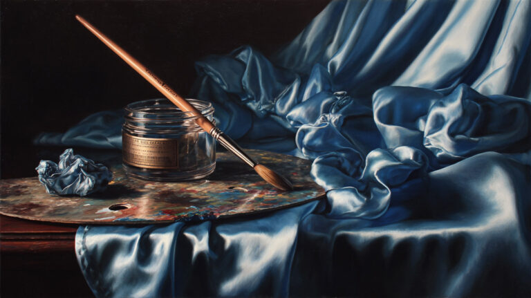
Strip away color and you are left with the hardest test in painting: pure light and shadow on a flat surface. That is grisaille.
Understanding what is grisaille in classical painting means looking at a technique that shaped how the old masters built their most celebrated works. From Jan van Eyck’s altarpiece panels to Picasso’s Guernica, this monochromatic method has carried serious weight across centuries of Western art.
This guide covers how grisaille works as both a finished artwork and an underpainting stage, the pigments and surfaces involved, the artists who defined it, and why classical atelier programs still teach it as a foundational skill today.
What Is Grisaille

Grisaille is a painting technique executed entirely in shades of grey, black, and white. The word comes from the French “gris,” meaning grey. It has been used for centuries across panel paintings, canvas works, manuscript illumination, and large-scale wall decoration.
But here’s what most people get wrong about it. Grisaille is not just one thing.
It functions as both a finished monochromatic artwork and a preparatory underpainting stage beneath layers of transparent color. The difference matters. A completed grisaille stands alone as a grey-toned picture, often designed to imitate carved stone or sculptural relief. An underpainting grisaille, on the other hand, is a foundation layer that gets covered with color glazes.
The technique reached its peak during the fifteenth and sixteenth centuries in Europe. Pigments were expensive, and grisaille gave painters a way to build convincing form using just a few tubes of paint. Over this grey base, thin washes of color could be applied to produce startlingly lifelike results.
During the restoration of the Ghent Altarpiece (started in 2012), conservators discovered that roughly 70% of the outer panels’ surface had been overpainted in the sixteenth century. Those outer panels included grisaille figures of John the Baptist and John the Evangelist, painted to simulate stone statues. The restoration, spanning over a decade with a budget of 2.2 million euros, revealed just how precise Van Eyck’s original grey tonal work actually was (KIK-IRPA).
Grisaille never fully disappeared. Pablo Picasso painted his famous Guernica in 1937 using a monochrome palette of grey, black, and white on a canvas measuring 3.49 by 7.76 meters. Britannica describes its method directly as the grisaille technique.
How Grisaille Differs from Other Monochromatic Techniques

People lump all single-color painting methods together. That’s a mistake.
Grisaille is specifically grey. Other monochromatic approaches use different hues entirely, and the visual and technical results are not interchangeable.
| Technique | Technical Logic | Primary Use | Strategic Takeaway |
| Grisaille | Achromatic Neutrality: Pure gray scale to map light/shadow without color bias. | Sculpture imitation, architectural relief, underpainting. | Volume: Best for establishing crisp, 3D form. |
| Brunaille | Earth-Tone Warmth: Uses burnt umber or sienna to create a “glowing” base. | Warm underpainting, landscape preparation. | Atmosphere: Provides a “golden” vibration through top layers. |
| Verdaille | Chromatic Complement: Specifically the “Verdaccio” method to neutralize skin reds. | Skin tone preparation, underpainting for portraits. | Naturalism: Prevents skin from looking “chalky” or overly pink. |
| En Camaïeu | Hue Uniformity: A single color (blue, red, etc.) used to explore tonal range. | Decorative painting, porcelain, “Blue-print” sketches. | Mood: Establishes a singular emotional “Key.” |
Grisaille vs. Chiaroscuro
This is the one that trips people up most often. Chiaroscuro manipulates light and dark within a full-color painting. It’s about dramatic contrast between illuminated areas and deep shadow.
Grisaille removes color altogether. There is no hue information in a pure grisaille, just a value scale running from black through middle greys to white. The two techniques solve different problems. Chiaroscuro creates mood and directs the viewer’s eye through a colored scene. Grisaille isolates value from hue so the painter (or the viewer) can focus purely on light, shadow, and three-dimensional form.
Brunaille and Verdaille
Brunaille uses brown tones, typically raw umber or burnt sienna mixed with white. The term first appeared in the seventeenth century to describe all-brown panel paintings.
Verdaille works in green. Both brunaille and verdaille trace back to twelfth-century stained glass made for Cistercian monasteries, which banned colored art in 1134 (Wikipedia).
The choice between grey, brown, or green was never random. It depended on what would go on top. A portrait painter preparing for warm skin tones might lean toward brunaille or verdaccio. A painter imitating cold stone would pick grey every time.
Grisaille as Underpainting in Oil Painting
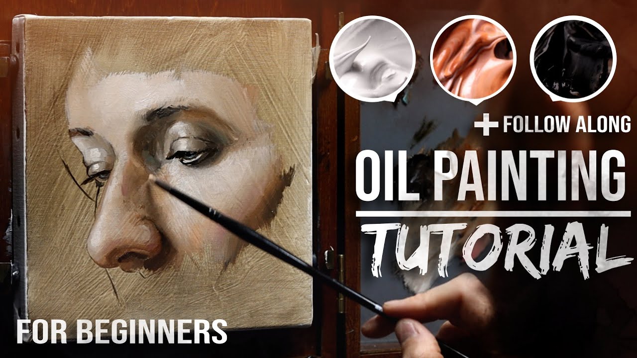
This is where grisaille does its heaviest lifting, even if nobody ever sees it in the finished work.
The old masters used a grey value structure as the first opaque layer beneath transparent color glazes. The process splits a difficult problem into two manageable steps. First, get the lights and darks right. Then, separately, get the color right. Took me a long time to understand why that matters so much, but once you try painting accurate values and accurate color simultaneously, you get it fast.
The painter Jeffrey Hayes describes grisaille underpainting as a “dress rehearsal” for the final work, noting that hours or even days spent studying the subject in grey builds familiarity that carries into the color stage.
The Flemish Method and Grisaille
The Flemish layered system depended on this approach. Jan van Eyck and Peter Paul Rubens both built paintings over careful grey foundations, though their methods differed in speed and finish.
Van Eyck’s Ghent Altarpiece (completed 1432) stands as the single most referenced example. The exterior wing panels show figures rendered entirely in grisaille to simulate stone sculpture. These grey figures were on display most of the time, since the altarpiece doors stayed closed except on feast days. Painted sculpture cost less than actual carved stone, even when the painter was a recognized master.
Rubens took a different path. He used grisaille oil sketches as preparatory models (called modelli) for larger compositions and for engravers to work from. His approach was faster, looser, more gestural.
How the Dead Layer Works
Pigments used: Typically ivory black or lamp black mixed with lead white (historically) or titanium white (today). Some painters add raw umber for a slightly warmer grey.
The glazing step: Once the grisaille dries completely, thin transparent layers of oil paint are applied over it. Light passes through these colored glazes, bounces off the white and grey underlayer, and travels back to the viewer’s eye. The result has a luminous depth that direct painting rarely matches.
One downside worth knowing. Hayes notes that pure black-and-white grisaille can dull the final colors if the top layers are applied too thinly, since neutral grey shows through and reduces vibrancy. Mixing small amounts of red or blue into the underpainting can offset this.
Grisaille in Manuscript Illumination and Decorative Arts

Grisaille did not start on canvas. Its earliest widespread use was in medieval manuscripts and stained glass, well before the Renaissance brought it into panel painting.
Illuminated Manuscripts
Jean Pucelle, a Parisian Gothic-era illuminator active around 1320 to 1350, produced some of the most refined grisaille manuscript work in existence. His Hours of Jeanne d’Evreux used grey tones with minimal color accents, creating pages that look more like tiny sculptural reliefs than flat illustrations.
Matthew Paris, an English Benedictine monk working in the thirteenth century, also produced manuscripts in this limited tonal range. The technique had been common in England since Anglo-Saxon times, which makes grisaille one of the oldest continuous painting traditions in Northern Europe.
Stained Glass and Architectural Decoration
Cistercian monasteries banned colored glass in 1134. That restriction pushed artisans toward grisaille stained glass, where grey vitreous pigment was painted directly onto clear or lightly tinted panes.
York Minster’s Five Sisters window is one of the largest surviving examples. Sections of otherwise colorful windows could also include grisaille panels as a cost-saving measure or design choice.
On walls and ceilings, grisaille served a specific purpose: imitating carved stone relief. It was a trompe-l’oeil trick. Painters could produce the look of expensive sculptural programs at a fraction of the cost.
Giotto used grisaille in the lower registers of his frescoes in the Scrovegni Chapel in Padua (around 1304), painting figures that appear to be stone statues set within niches. Portions of the Sistine Chapel ceiling were also executed in grisaille.
Notable Grisaille Works and the Artists Behind Them

A handful of paintings define what grisaille looks like at its best. These are not minor works tucked away in storage rooms. Several rank among the most studied pieces in Western art history.
Jan van Eyck and the Ghent Altarpiece
The exterior panels of the Ghent Altarpiece (1432) remain the standard reference. Van Eyck painted figures of saints in grey to mimic marble statues, and the illusion was so convincing that the grisaille sections were the default viewing experience for cathedral visitors, since the altarpiece wings stayed closed on ordinary days.
The ongoing restoration project, spanning from 2012 with a target completion in spring 2027 (CODART), has revealed Van Eyck’s original tonal precision beneath centuries of overpainting.
Andrea Mantegna’s Sculptural Illusions
Mantegna took the sculpture-imitation angle further than almost anyone. His grisaille panels deliberately fooled the eye into seeing carved stone relief on flat surfaces. His Judith with the Head of Holofernes (1495) is a textbook example of how convincingly paint can simulate three-dimensional form in two-dimensional art.
Hieronymus Bosch and The Garden of Earthly Delights
When Hieronymus Bosch‘s triptych closes, the explosive color disappears entirely. The exterior panels show a grey-toned globe representing the third day of creation. It’s a stark, quiet grisaille that gives no hint of the chaotic scenes hidden inside.
Picasso’s Guernica
Guernica (1937) measures 3.49 by 7.76 meters and uses only black, white, and grey. Britannica calls it a work painted in the grisaille technique with a neutral monochrome palette. Picasso completed the painting in roughly one month, from May to June 1937, stripping all color to focus the viewer on line, shape, and raw emotional impact.
The monochrome palette echoed the black-and-white newspaper photographs that first reported the bombing of the Basque town. It now hangs in the Museo Reina Sofia in Madrid.
Rembrandt and Rubens
Rembrandt van Rijn explored grisaille in small-scale oil studies, including his Bust of a Bearded Old Man (1633), one of his smallest paintings. Rubens used grisaille sketches to plan larger compositions and to provide engravers with tonal maps they could translate into printed reproductions.
Why Classical Painters Chose Grisaille Over Full Color

Nobody paints without color for no reason. There were specific, practical motivations behind grisaille, and understanding them changes how you look at grey-toned paintings.
Simulating Sculpture
This was the biggest driver. Carved stone and sculptural relief were expensive, physically heavy, and slow to produce. A skilled painter could create a convincing trompe-l’oeil imitation of a stone niche with figures in a fraction of the time and cost.
The National Galleries of Scotland notes that grisaille was adopted by Northern European painters specifically as “a cheaper alternative for the exterior shutters of polyptychs and large decorative schemes to imitate the effect of low-relief sculpture.”
Cost of Pigments
Ultramarine was made from lapis lazuli and cost more than gold by weight in the medieval period. Vermilion and carmine were also expensive.
Grisaille bypassed all of that. Bone black, ivory black, and lead white were cheap and widely available. For exterior altarpiece panels that would be seen most of the time (with the colored interior reserved for special occasions), spending heavily on pigments made no financial sense.
Theological and Aesthetic Restraint
Some patrons wanted visual austerity on purpose. Cistercian monasteries actively prohibited color in their decorative programs. The grey palette signaled humility, discipline, and focus on spiritual content over sensory pleasure.
Proving Mastery of Form
Color is forgiving. It can distract from weak drawing, soft edges, and sloppy value relationships. Strip it away and every structural problem becomes visible.
Painting a successful grisaille proved that the artist understood light, shadow, tone, and anatomy without relying on hue to carry the picture. In the academic tradition, this was a mark of serious training. It still is, actually, in atelier programs that teach classical painting styles today.
Art & Object notes that grisaille permits painters to pay close attention to brushwork and composition without the added complexity of color harmony.
Materials and Process for Painting in Grisaille

The palette is small. That’s the whole point.
A standard grisaille setup uses just two to three pigments. The simplicity is what makes it useful, but the specific choices affect everything from drying time to the warmth of the final grey.
| Pigment Mix | Technical Logic | Character | Strategic Application |
| Ivory Black + Titanium White | High Opacity/Cool Bias: Creates a very stable, “bluish” neutral. | Cool, clean, and modern grays. | Cast Studies: Best for sharp, high-contrast plaster studies. |
| Ivory Black + Flake (Lead) White | Translucent/Warm Bias: Flake white adds a “ropey” texture and warmth. | Warm, fast-drying, and flexible. | Flemish Underpainting: Ideal for “Fat over Lean” layering. |
| Black + Raw Umber + White | Earth-Neutral: The Umber “breaks” the black, adding a natural olive tint. | Slightly warm, organic neutral. | Portraiture: Best for mimicking the “Verdaccio” shadow base. |
| Burnt Umber + Ultramarine + White | Chromatic Neutral: A “Black” created by opposing hues rather than carbon. | Rich, vibrant, and deep darks. | Landscape: Creates “lively” shadows that feel atmospheric. |
Ivory black has a slight bluish tint when mixed with white. Adding a touch of burnt umber warms it. Painter Shelah Horvitz notes that black functions as a “low saturation blue,” and that its coolness will influence every layer painted on top.
Surface Preparation
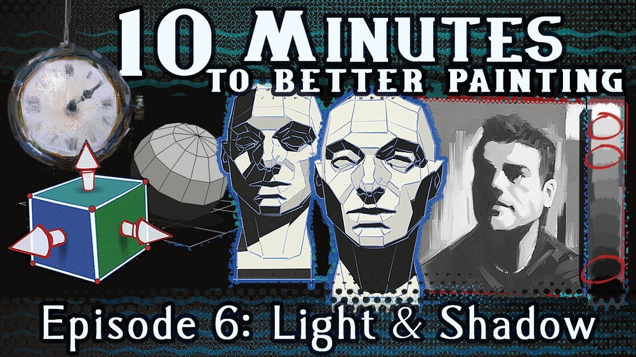
Toned ground: Most painters start on a mid-tone surface rather than pure white. A light grey or warm ochre gesso ground eliminates the glare of white canvas and makes it easier to judge middle values accurately.
White ground: Some painters prefer white for maximum luminosity in the final glazed painting, since light bounces off the bright surface beneath the paint layers. It is trickier to work on because every mark looks darker than intended.
Building Values
There are two common approaches and no single right answer.
- Dark to light: Block in shadow masses first, then gradually add lighter values. Preferred in the Flemish tradition
- Middle-out: Establish a mid-value base and push toward both darks and lights simultaneously. Common in modern atelier programs
Jeffrey Hayes recommends keeping the application thin and soft. An overly thick grisaille dries with unwanted texture and forces you to fight the underpainting rather than build on it.
Grisaille on Panel vs. Canvas vs. Wall
Wood panel has a smooth, hard surface that suits detailed grey work. The Flemish masters almost always painted grisaille on oak panels, where fine tonal transitions could be rendered without the grain interference of woven canvas.
Canvas introduces a textured weave that breaks up smooth value transitions. Fine-grained linen performs better than coarse cotton for monochromatic work.
Fresco grisaille has its own constraints. The pigment is mixed with water and applied to wet lime plaster, meaning the painter has a limited window before the surface sets. Giotto’s Scrovegni Chapel grisaille panels in Padua demonstrate what’s possible on plaster when the timing is right.
Grisaille in Art Education and Academic Training

Grisaille is not a historical curiosity. It’s still one of the first things students paint in classical atelier programs.
The logic is simple: learning to see and render accurate gradation in grey trains your eye to read light correctly, without the added confusion of mixing hue and shade at the same time.
The 19th-Century French Academy Model
Students at the Ecole des Beaux-Arts followed a strict progression. First, they copied Bargue lithograph plates in graphite. Then they drew from plaster casts of Greek and Roman sculpture in charcoal. Only after completing these exercises were they allowed to start painting, and grisaille was the first step.
Vincent van Gogh copied the complete set of 197 Bargue plates in 1880-1881, then did at least part of the course again in 1890.
Modern Atelier Programs
Atelier Melbourne lists grisaille as a required step in its curriculum. Students paint plaster casts in black, raw umber, and white before progressing to limited-palette color work.
The Academy of Realist Art Boston structures its program similarly. Their curriculum includes specific grisaille painting projects between Bargue drawing exercises and full-palette figure work.
Business Research Insights reports the global online art courses market was valued at $2.34 billion in 2024, projected to reach $6.23 billion by 2033. Many of these courses include classical grisaille exercises as foundational painting techniques.
Why Separating Value from Color Works
Trying to get drawing, value relationships, and color accuracy right all at once is like juggling too many things. The painting ends up muddy, or overworked, or both.
Grisaille splits the problem. Get the drawing and tonal structure locked down first. Add color later as a separate pass. Painter Jeffrey Hayes calls this process a “dress rehearsal” that builds deep familiarity with the subject before a single drop of color goes on the canvas.
Grisaille and Its Relationship to Photography and Print

Grisaille paintings were already grey. That made them perfect source material for reproduction.
Engravings and Lithographs
Rubens and his workshop produced monochrome grisaille panels specifically to guide engravers (Wikipedia). The engraver’s job was to translate tonal values into carved lines on a copper plate or wood block. Starting from a grey painting eliminated the guesswork of converting color to black and white.
By the nineteenth century, many book and magazine illustrations were reproduced directly from watercolor grisailles. Publishers preferred greyscale designs that translated cleanly to black ink on paper.
The Black-and-White Photography Connection
There’s an obvious visual overlap between grisaille paintings and early photographs. Both present the world stripped of color, relying entirely on tonal relationships to communicate depth and form.
Contemporary American painter Hugo Bastidas creates black-and-white paintings that, according to Wikipedia, “often resemble black-and-white photographs.” His work deliberately plays in the space between grisaille tradition and photographic imagery.
Jean-Auguste-Dominique Ingres produced a grisaille version of his Grande Odalisque. Vault Editions notes that artists often used grisaille to map tonal structure for engravers preparing prints, and Ingres’ stripped-back version served exactly that purpose.
Common Mistakes When Attempting Grisaille

Grisaille looks simple. Two colors, maybe three. But the limited palette exposes every weakness in drawing, value judgment, and paint handling.
Using Too Many Values
The instinct is to use every possible grey between black and white. That actually hurts clarity. Five to seven distinct tonal values are usually enough (art-classes.co.uk). Too many close-together greys make the painting look soft and undefined.
Your mileage may vary, but most atelier instructors will tell you the same thing: squint at your subject to simplify the value groups before you start.
Going Too Dark Too Early
The problem: Painters block in their darkest darks first, then realize they have no room left to push the shadows deeper where needed.
The fix: Hold back on the extremes. Save your lightest lights and deepest darks for last. Build the structure in middle values first.
Ignoring Temperature Within Grey
Grey is not just grey. Ivory black mixed with white leans cool and slightly blue. Raw umber with white leans warm and slightly yellow-brown.
Painting teacher Shelah Horvitz points out that the temperature of your grisaille directly affects every color layer painted on top. A cool grisaille gives you a head start on cold shadows. A warm brunaille underpainting works better when the light source is cool.
Treating Grisaille as a Sketch
A grisaille underpainting is not a rough draft. It’s a structurally complete value painting that the color stage depends on. If the tonal contrast is weak here, no amount of glazing will fix it later.
Jonathan Brier recommends keeping the application “thin and soft.” Fight the urge to pile on thick paint. The underpainting should layer smoothly beneath subsequent color passes without creating surface ridges.
Skipping Grisaille Entirely
Plenty of painters jump straight to color. That works for alla prima (direct) painting where everything is done in one session. But for layered oil painting with glazes, skipping the value foundation usually produces muddy, flat results.
Jeffrey Hayes explains that many colors are naturally transparent. Without an opaque grey understructure to bounce light off of, transparent paint layers look thin and unconvincing rather than luminous.
Strip away color and you are left with the hardest test in painting: pure light and shadow on a flat surface. That is grisaille.
Understanding what is grisaille in classical painting means looking at a technique that shaped how the old masters built their most celebrated works. From Jan van Eyck’s altarpiece panels to Picasso’s Guernica, this monochromatic method has carried serious weight across centuries of Western art.
This guide covers how grisaille works as both a finished artwork and an underpainting stage, the pigments and surfaces involved, the artists who defined it, and why classical atelier programs still teach it as a foundational skill today.
FAQ on Grisaille In Painting
What exactly is grisaille?
Grisaille is a painting technique that uses only shades of gray, white, and black. It creates a monochromatic result that mimics the look of stone sculpture or relief work. Artists have used it for centuries across European painting traditions.
Why do painters use grisaille?
Mostly as an underpainting method. Laying down tonal values first lets the artist focus on light, shadow, and form before adding color. It simplifies a complex process into manageable steps.
Is grisaille only done in oil paint?
No. It appears in fresco, tempera, and stained glass work too. The technique is defined by its neutral gray palette, not the medium. Flemish masters used it in panel painting, while Gothic craftsmen applied it to stained glass windows.
What’s the difference between grisaille and camaïeu?
Both are monochromatic painting methods, but camaïeu uses tints of a single color rather than strictly gray tones. Grisaille stays within the gray scale. Small distinction, but art historians are particular about it.
Did famous artists actually use this technique?
Yes. Jan van Eyck painted grisaille panels on the exterior wings of altarpieces. Rubens used en grisaille oil sketches as preparation studies. Even the Sistine Chapel contains grisaille figures painted by Michelangelo.
How does grisaille relate to trompe l’oeil?
Closely. Trompe l’oeil grisaille convinces viewers they’re looking at actual stone carvings or architectural elements. Decorative wall painting in historic interiors relied on this illusionistic painting style heavily, especially during the Baroque period.
Can beginners learn grisaille painting?
Yes, and it’s actually a good starting point. Working only with tonal values removes the complexity of color mixing. Many painting instructors recommend it specifically because it trains your eye for light and shadow before anything else.
What comes after the grisaille layer?
Glazing. Artists apply thin, transparent color glazes over the dry grisaille underpainting. The gray tones underneath show through, giving the final painting unusual depth. It’s a core part of old master techniques.
Is grisaille still used in modern painting?
It is. Some contemporary artists use it for value studies, others for the finished aesthetic. The gray scale painting look has seen a quiet comeback, partly because of how well it photographs and reproduces in print.
Where does the word grisaille come from?
From the French word gris, meaning gray. The term entered art history vocabulary through French and Flemish painting traditions. It’s been the standard term used across European painting and art history texts ever since.
Conclusion
Grisaille in classical painting is more than a grey-toned exercise. It is a structured method for separating the problem of value from the problem of color, and that separation is what made the Flemish layered oil technique possible in the first place.
The same limited palette of ivory black and lead white that Van Eyck used on oak panels in 1432 still shows up in atelier classrooms today. The materials changed slightly. The logic did not.
Whether used as a trompe-l’oeil imitation of carved stone relief, a preparatory dead layer beneath transparent glazes, or a complete achromatic painting in its own right, grisaille forces a painter to confront tonal rendering without any shortcuts.
That discipline carries forward into every color painting you make after it. And honestly, most painters who skip it end up circling back eventually.