Some paintings stop you cold. Not because of color or subject, but because of how the light hits.
That effect has a name. Chiaroscuro in painting is the use of strong contrast between light and dark to create the illusion of three-dimensional form on a flat surface. It is one of the most studied techniques in Western art history, from Leonardo da Vinci’s subtle tonal modeling to Caravaggio’s near-black backgrounds and theatrical spotlight effects.
This article covers what chiaroscuro actually means, how it works technically, which artists defined it, and how to identify it, along with the most common misconceptions that still circulate today.
What Is Chiaroscuro in Painting
Chiaroscuro is the use of strong contrasts between light and dark to create the illusion of three-dimensional form on a flat surface. The word comes from Italian: chiaro meaning “clear” or “bright,” and scuro meaning “dark” or “obscure.”
It is one of the four canonical Renaissance painting modes, alongside cangiante, sfumato, and unione, as defined by art historian Marcia B. Hall.
The technique is not simply “any use of shadow.” That distinction matters. Chiaroscuro requires deliberate, significant contrast, where light and dark interact to push forms toward the viewer and pull depth into the picture plane.
It is also a broader term than most people assume. It covers everything from subtle tonal modeling in a portrait to near-black backgrounds in dramatic figure paintings. The contrast does the structural work, not the outline.
What Chiaroscuro Is Not
Three common mix-ups:
- Not just dark painting. A painting can be underlit or poorly lit without using chiaroscuro at all.
- Not the same as value contrast in color theory. Chiaroscuro is specifically about light and shadow modeling, not hue relationships.
- Not synonymous with sfumato. Sfumato technique uses soft, smoky transitions. Chiaroscuro can be sharp and hard-edged.
The term also applies beyond oil painting. Drawings, prints, and even cinema use the same principles under the same name.
How Chiaroscuro Works Technically
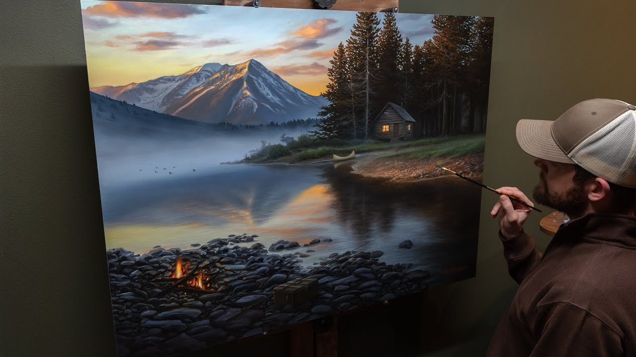
Every chiaroscuro composition starts with a light source. Its position determines everything: the direction of cast shadows, the angle of highlights, and how much of the subject falls into darkness.
A single dominant light source is standard. Multiple competing sources tend to flatten the effect.
| Light Component | What It Does | Where It Appears |
| Highlight | Marks the brightest point where the light source hits the object directly. | On the apex of curved surfaces (e.g., forehead, nose, or tip of a sphere). |
| Core Shadow | The darkest part of the shadow on the object itself, opposite the light source. | The “turning” edge where the form transitions into shadow. |
| Cast Shadow | The shadow blocked by the object and thrown onto another surface. | The ground plane or adjacent objects; usually darkest near the base. |
| Reflected Light | Light that bounces off the environment and back onto the shadow side. | Within the shadow area, typically between the core shadow and the cast shadow. |
Tonal Gradation and Mid-Tones

Mid-tones are where the technique lives or dies. The smooth transition from light into shadow, through a range of intermediate values, is what separates chiaroscuro from flat two-tone contrast.
The value scale in a chiaroscuro painting typically runs across 7 to 10 distinct tones. Painters using oil painting have an advantage here. The slow drying time allows them to blend transitions gradually, building up gradation across multiple sessions.
The contrast ratio matters too. A high contrast ratio pushes the drama. A lower ratio produces subtler tonal modeling, closer to what Leonardo da Vinci preferred in his early figure work.
How Depth Gets Built
Chiaroscuro creates pictorial space without relying on linear perspective. Forms advance toward the viewer when lit and recede when shadowed.
A 2022 quantitative analysis published in Scientific Reports found that the roughness exponent in brightness, a measurable indicator of tonal complexity, increased steadily across art history precisely as chiaroscuro and sfumato techniques advanced through the Renaissance and Baroque periods.
That is not a coincidence. The technique is structurally tied to the perception of depth.
Chiaroscuro in the Renaissance and Baroque Periods

The formal concept emerged in 15th and 16th century Italy. Early use appeared in monochrome ink drawings and grisaille work before it crossed into paint. Leonardo da Vinci brought it to full potential in European painting, most visibly in the Adoration of the Magi (1481) and the Virgin of the Rocks, according to Britannica.
Then Baroque art arrived, and the whole approach shifted.
Tenebrism vs. Chiaroscuro
Caravaggio took chiaroscuro to an extreme nobody had tried before. His version, now called tenebrism, used near-black backgrounds and a single harsh light source to produce a spotlight effect on figures. The darkness was not just a backdrop. It was a structural element.
| Feature | Chiaroscuro | Tenebrism |
| Light-to-Dark Ratio | Balanced contrast using a full range of mid-tones to model 3D form. | Extreme contrast with minimal mid-tones; a “spotlight” effect. |
| Background Treatment | Varies; the background often contains discernible depth or light. | Almost entirely black or “pitch” dark, often called “dark manner.” |
| Emotional Effect | Focuses on volume, physical depth, and soft realism. | Focuses on high drama, theatricality, and intense psychological tension. |
| Key Artists | Leonardo da Vinci, Rembrandt, Johannes Vermeer | Caravaggio, Artemisia Gentileschi, Ribera |
Tenebrism derived from the Italian tenebroso, meaning gloomy or dark. Wikipedia defines it as chiaroscuro taken to its extreme, where darkness becomes the dominant feature of the image, not just a supporting one.
How the Technique Spread

Caravaggio worked in Rome but his influence reached Spain, the Netherlands, and Flanders within a generation. Artists who followed his approach were called Caravaggisti.
[Francisco Goya] absorbed the tradition through Spanish painters like Jose de Ribera. Rembrandt van Rijn picked it up through the Utrecht School without ever visiting Italy, according to Wikipedia’s entry on Caravaggio. By the late 17th century, dramatic light and shadow contrast had become standard practice across Western European painting.
Rococo painting largely rejected the drama in favor of lightness and decoration. Then Romanticism brought it back, using chiaroscuro for emotional weight rather than religious theatre.
Key Artists Who Defined Chiaroscuro

Five painters are the standard reference points. Each used the technique differently enough that they represent distinct approaches rather than variations on one theme.
Leonardo da Vinci
Leonardo’s version was soft, gradual, and theoretical. He wrote about shadow types in his Treatise on Painting, distinguishing between primary and secondary shadows with unusual precision for his time.
His painted chiaroscuro used gentle transitions rather than sharp contrasts. Art historian Ernst Gombrich noted that Leonardo’s actual technique often differed from his own written descriptions, favoring sfumato-influenced blending over hard division. The Lady with an Ermine (c. 1490) shows this clearly: delicate tonal shift, no harsh edges.
Caravaggio
Most influential. Arguably the most copied. Caravaggio developed tenebrism from chiaroscuro principles, blackening backgrounds completely and flooding foreground figures with a single harsh light.
He worked directly on canvas without preparatory drawings, using live models, which gave his figures an unusual physical immediacy. According to Sotheby’s, his Judith Beheading Holofernes, a second version discovered in a French attic in 2014, carries an estimate of $170 million. That number says something about how the art market values his position in history.
His followers, the Caravaggisti, spread his approach across Italy, Spain, and Northern Europe within decades of his death.
Rembrandt van Rijn
Where Caravaggio used light as a spotlight, Rembrandt used it as something warmer and more diffused. His chiaroscuro paintings feel psychological rather than theatrical. The light reveals character, not drama.
A 2024 study published in npj Heritage Science, part of Operation Night Watch, analyzed The Night Watch (1642) using reflectance imaging spectroscopy and X-ray fluorescence. Researchers found Rembrandt applied pigments systematically, combining lead white, lead-tin yellow, vermilion, and arsenic-based compounds to achieve pictorial unity. He used arsenic pigments specifically to capture the warm reflected light on gold threads. That level of deliberate control shows how calculated his “natural-looking” light actually was.
Georges de La Tour
Candlelight specialist. De La Tour built his entire practice around nocturnal scenes lit by a single flame. His figures sit quietly in pools of warm light surrounded by deep shadow. The effect is contemplative rather than dramatic.
Works like The Penitent Magdalene use reflected candlelight bouncing off surfaces to create secondary light sources within the shadow zone. Technically tricky. Visually, it produces a stillness that Caravaggio never aimed for.
Artemisia Gentileschi
A direct follower of Caravaggio, Gentileschi used tenebrism in narrative scenes with unusual psychological force. Her Judith Slaying Holofernes (c. 1612-1613) is one of the most cited examples of chiaroscuro used to heighten physical tension in a scene. The light falls on the act itself, not the faces. That was a deliberate compositional choice.
Chiaroscuro in Drawing and Printmaking

The term chiaroscuro actually started in drawing and printmaking before it attached to painting. The original definition described drawings made on toned paper using dark media for shadows and white gouache for highlights.
That is not a minor historical footnote. It shaped how artists learned the technique for centuries.
Chiaroscuro Woodcuts
Invented by Ugo da Carpi in 1516. Da Carpi applied to the Venetian Senate for a patent, describing his method as a “new way of printing in chiaro et scuro.” He layered two to four woodblocks, each inked with a different tone, to reproduce the tonal range of drawings.
The patent did not hold. Printmakers across Europe adopted the technique within years, including Vicentino and Goltzius. Da Carpi used his method to reproduce works by Raphael and Parmigianino, which gave the technique wide distribution at exactly the moment Renaissance workshops were defining visual standards.
Hans Burgkmair developed the technique in Germany around the same period. His Emperor Maximilian on Horseback (1508) is an early Northern European example of chiaroscuro woodcut, using color-tone blocks to suggest depth without line shading alone.
Drawing Techniques

In pen-and-ink and charcoal work, hatching and cross-hatching replicate tonal contrast. Parallel lines spaced closely together read as shadow. Spread further apart, they represent mid-tones. This is still how drawing instruction works today.
Toned paper changes the equation. When the base is mid-gray, the artist works in both directions simultaneously, adding dark marks for shadows and white marks for highlights. The paper carries the mid-tone automatically. That efficiency is why gesture drawing on toned paper remains a standard exercise in studio training.
The difference between dry and wet media matters too. Charcoal and graphite allow blending of tonal gradations physically. Pen and ink requires building tone through mark density. Each medium produces a different quality of chiaroscuro, even when the same contrast ratio is intended.
How to Identify Chiaroscuro in a Painting

You can spot it with a few specific visual checks. This is not about feeling something dramatic. It is about reading the light structure of the composition.
Visual Criteria
Start with the light source. A chiaroscuro composition has one dominant, directional light source you can trace. Look for where the highlights sit on faces or objects and trace that angle back. If you cannot find a consistent light direction, the painting probably is not using chiaroscuro intentionally.
Check the shadow areas next. In strong chiaroscuro, shadows run close to black with little internal detail. If the shadow areas are mid-gray and show texture throughout, the contrast is not strong enough to qualify.
- Single dominant light source, traceable across multiple objects
- Near-black shadows with minimal detail visible inside them
- Form revealed through tone, not contour lines
- Visible transition from highlight through mid-tone into shadow on curved surfaces
- Background noticeably darker than the lit foreground figures
What to Compare It Against
Byzantine icons are the clearest contrast. Those paintings use flat, even light with no directional source and no cast shadow. Everything is equally illuminated. That is the visual opposite of chiaroscuro.
Atmospheric perspective is different too. It creates depth through color shift and color saturation loss in the distance, not through light and shadow contrast on surfaces. Mixing these two up is common. A landscape can use atmospheric perspective without a trace of chiaroscuro.
Impressionism mostly moved away from chiaroscuro entirely. Outdoor, diffused light conditions produce soft shadows that lack the strong contrast ratio the technique requires. Claude Monet’s work, for example, has almost no chiaroscuro by this definition. Expressionism brought dramatic contrast back, but for psychological effect rather than formal modeling.
Chiaroscuro Beyond the Old Masters

The technique did not stop with the Baroque period. It kept showing up, sometimes quietly, sometimes not, across every major movement that followed.
Well, except Impressionism. That movement largely abandoned it on purpose.
Romanticism and the Return of Drama
Chiaroscuro came back hard in the Romantic period. Artists used it for emotional weight rather than religious theatre, which was a meaningful shift in purpose.
Francisco Goya used it with psychological menace, particularly in his Black Paintings series (1819-1823), where near-total darkness surrounds figures in scenes of anxiety and horror.
Eugene Delacroix used it more theatrically, pulling dramatic light across narrative scenes to heighten the emotional stakes. According to Wikipedia, both he and Henry Fuseli relied on chiaroscuro to produce the emotive effects they saw as central to Romantic painting.
Impressionism pushed back against all of this. Outdoor, diffused light conditions produce soft, scattered shadows with no clear direction. Claude Monet and Pierre-Auguste Renoir were after something entirely different: the sensation of light, not its structural effect on form.
German Expressionism and Film Noir
Chiaroscuro moved into cinema through German Expressionism around 1910, according to Artlist. The Cabinet of Dr. Caligari (1920), Nosferatu (1922), and Metropolis (1927) all used it to visualize collective anxiety through sharp light and shadow.
German directors took the technique to Hollywood, where it became central to film noir in the 1940s and 1950s. Cinematographer Gordon Willis used chiaroscuro lighting on The Godfather (1972) so aggressively that he earned the nickname “Prince of Darkness” for keeping half his subjects in shadow throughout the film, according to Artlist and Backstage.
- The Cabinet of Dr. Caligari (1920): painted shadows on sets
- Citizen Kane (1941): deep focus + chiaroscuro via Gregg Toland
- The Godfather (1972): half-lit faces, single key light setups
Director David Fincher’s Mank (2020) deliberately recreated 1930s chiaroscuro cinematography using digital tools, according to Filmmakers Academy, demonstrating that the technique still holds aesthetic authority nearly a century after its film noir peak.
Contemporary Painters and the Ongoing Relevance
Realist painters today still use it. The technique never actually left studio practice. It just stopped being the default.
Contemporary artists working in hyperrealism and classical realism rely on chiaroscuro as a foundation for depicting form. The same principles apply whether the painting style is old master or contemporary figurative.
Photorealism uses it differently. Because photorealistic painters work from photographic reference, their chiaroscuro follows camera optics rather than idealized light logic, which produces harder, more artificial-looking shadows than the Old Masters tended to use.
| Movement | Approach to Chiaroscuro | Purpose |
| Romanticism | Dramatic, emotionally driven values with soft, atmospheric edges. | To evoke mood, sublime power, and narrative tension. |
| Impressionism | Largely Rejected: Replaced dark shadows with “colored shadows” (purples/blues). | To capture diffused outdoor light and fleeting moments. |
| German Expressionism | Extreme, distorted, and jagged light-to-dark transitions. | To visualize internal psychological unease and alienation. |
| Film Noir | Low-key, high-contrast, and highly directional lighting. | To create suspense, mystery, and a sense of moral ambiguity. |
| Contemporary Realism | Classical modeling or photo-based accuracy. | To achieve formal modeling, physical depth, and tactile realism. |
Common Misconceptions About Chiaroscuro

A lot of writing about chiaroscuro gets it wrong in the same ways. These mix-ups show up in art education, museum guides, and online resources with enough frequency that they are worth addressing directly.
Dark Paintings Are Not Automatically Chiaroscuro
This is the most common error. A painting can be consistently dark across the entire surface without using chiaroscuro at all.
The defining condition is directed contrast, not overall darkness. Chiaroscuro requires a light source that creates a gradient from bright highlight into deep shadow on the same form. A uniformly murky painting does not qualify, regardless of how dark it is overall.
Some Byzantine icons have dark backgrounds. They are not using chiaroscuro. The figures are evenly lit, without a directional light source creating shadow and form.
Sfumato Is Not the Same as Chiaroscuro
Leonardo da Vinci used both. That is part of why they get conflated.
Sfumato: Soft, smoky blending of outlines and transitions, where form dissolves into surrounding shadow.
Chiaroscuro: Strong contrast between light and dark areas to define form and create depth.
As art historian Ernst Gombrich described sfumato, it is about blurred outlines and mellowed colors that let “one form merge with another.” That is distinct from the structural purpose of chiaroscuro, which uses contrast to push forms forward and pull depth backward. They can coexist in the same painting. In the Virgin of the Rocks, Leonardo uses both simultaneously.
The Chiaroscuro-Photography Confusion
Photography uses the term too, but the principles shift when you cross media.
In painting, chiaroscuro is constructed. The artist decides where every shadow falls, independent of any actual light setup. In photography, even “Rembrandt lighting” (a portrait setup named after the painter) is constrained by the physical behavior of light on a real subject.
Key difference: Painted chiaroscuro can idealize or exaggerate shadow in ways that defy real light physics. Photography cannot, at least not without post-processing. That gap matters when comparing works across media.
Chiaroscuro Is Not Just for Oil Painting
Most of the famous examples happen to be oil paintings, which gives people the impression the technique is medium-specific. It is not.
- Watercolor painting achieves chiaroscuro through pigment transparency and careful reserve of light areas
- Acrylic painting uses layered glazes or direct blending to build tonal range
- Charcoal drawing, pen and ink, printmaking, even digital illustration all use the same underlying principles
The medium changes the tools. The logic of light source, core shadow, cast shadow, and reflected light stays the same across all of them.
Value Contrast vs. Chiaroscuro
These overlap but are not identical, and the distinction matters in practice.
Value contrast in color theory refers to the difference between light and dark tones anywhere in a composition, including color contrast between hues of different lightness. A painting with a yellow shape next to a dark purple shape has high value contrast. That is not chiaroscuro.
Chiaroscuro is specifically about the modeling of form through a directed light source. The contrast has to create the illusion of three-dimensional volume on a surface, not just visual contrast between compositional areas. A flat graphic design with high value contrast has no chiaroscuro. A portrait where shadow wraps around a cheekbone does.
Understanding this distinction matters if you are trying to apply the technique yourself, as opposed to just identifying it in finished work. The tone, the shade, and the direction all have to work together toward the same goal: making a flat surface read as a solid, lit form.
FAQ on What Is Chiaroscuro in Painting
What does chiaroscuro mean?
Chiaroscuro is an Italian term combining chiaro (light) and scuro (dark). It describes the use of strong light and shadow contrast to create the illusion of three-dimensional form on a flat painted surface.
Who invented chiaroscuro?
No single artist invented it. Leonardo da Vinci brought it to full potential in European painting during the 15th century. Earlier roots trace back to Greek shadow-painting called skiagraphia, attributed to Apollodoros in the 5th century BC.
What is the difference between chiaroscuro and tenebrism?
Tenebrism is the extreme version. It uses near-black backgrounds and a harsh single light source for dramatic spotlight effects. Chiaroscuro is broader, covering any deliberate use of light and shadow contrast to model form, including subtle tonal gradation.
Which artists are most associated with chiaroscuro?
The standard references are Caravaggio, Rembrandt van Rijn, Leonardo da Vinci, Georges de La Tour, and Artemisia Gentileschi. Each used the technique differently, from Leonardo’s soft tonal modeling to Caravaggio’s theatrical high-contrast scenes.
Is chiaroscuro only used in oil painting?
No. The technique applies across painting mediums, including watercolor and acrylic, as well as charcoal drawing, printmaking, photography, and cinema. The light-source logic stays the same regardless of medium.
What is the difference between chiaroscuro and sfumato?
Sfumato blurs outlines and softens transitions so forms dissolve into surrounding shadow. Chiaroscuro uses directed contrast to define form through light and shadow. Leonardo used both simultaneously, which is why they often get confused.
How do you identify chiaroscuro in a painting?
Look for a single traceable light source, near-black shadows with minimal internal detail, and smooth tonal gradation from highlight through mid-tone into shadow. Form is revealed through tonal contrast, not outline.
What role did chiaroscuro play in Baroque art?
It became a defining feature of Baroque painting. Caravaggio pushed it into tenebrism, using dramatic light and shadow to intensify religious narratives. His followers, the Caravaggisti, spread the approach across Italy, Spain, and Northern Europe.
Is chiaroscuro still used today?
Yes. Contemporary realist and hyperrealist painters use it as a foundation for depicting form. It also remains active in cinema and photography, where low-key lighting setups follow the same directional light principles developed by the Old Masters.
What is a chiaroscuro woodcut?
A chiaroscuro woodcut is a printmaking technique invented by Ugo da Carpi in 1516. It layers two to four woodblocks, each inked with a different tone, to reproduce the tonal range of drawings. The method spread across Europe rapidly after da Carpi’s Venetian patent failed to hold.
Conclusion
This conclusion is for an article presenting chiaroscuro in painting as one of the most technically grounded and historically significant methods in Western art.
From Ugo da Carpi’s chiaroscuro woodcuts to Rembrandt’s layered glazes and the candlelit nocturnes of Georges de La Tour, the technique has never really been a single thing. It adapts.
Understanding the value scale, cast shadow, core shadow, and reflected light gives you the actual vocabulary to read these paintings accurately, not just admire them.
The dramatic lighting in film noir, the tonal depth in famous Baroque paintings, the quiet intensity of a portrait lit by a single source. All of it traces back to the same principle: light and dark, working together to build form.