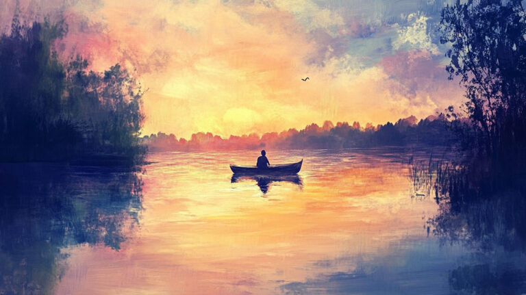
Every painting you’ve ever stopped to look at twice used contrast to hold your attention. So what is contrast in painting, and why does it matter so much?
Contrast is the placement of opposing visual elements, light against dark, warm against cool, rough against smooth, to create depth, focus, and visual tension. It’s the single most reliable tool painters have for directing where your eye goes first.
This article breaks down how contrast works across value, color, texture, and edge quality. You’ll see how artists from Caravaggio to Rothko used it differently, and how to apply it in your own work.
What Is Contrast in Painting

Contrast in painting is the placement of opposing visual elements next to each other to create tension, depth, and visual interest. Light against dark. Warm against cool. Rough against smooth.
That’s the short version. But the way contrast actually works in a painting is more layered than most people realize.
It operates across multiple properties at once. Value, color, texture, shape, edge quality, and even scale can all carry contrast. A single painting might use three or four of these simultaneously, though most viewers only consciously notice the strongest one.
There’s a difference between contrast as a principle of design and contrast as a technique. As a principle, it refers to the broader strategy of creating visual opposition anywhere in a composition. As a technique, it gets specific. A painter might push the tonal range in one area, mute it in another, and control exactly where the viewer’s eye lands first.
According to the Art Basel and UBS Global Art Market Report, paintings remained the most purchased medium in the global art market in 2025, with high-net-worth collectors allocating an average of 20% of their wealth to art. Contrast is one of the core reasons certain paintings demand attention over others. It’s what makes a work readable from across a room.
Photography and digital media handle contrast differently. Cameras capture contrast based on the light that exists. Painters build it from scratch, choosing exactly how much separation to create between the lightest light and the darkest dark. That level of control is what makes painted contrast such a specific skill.
Types of Contrast in Painting

Not all contrast is the same. Painters work with at least five distinct types, and the best ones know how to layer them.
Here’s a quick breakdown before we get into specifics:
| Type | What It Opposes | Primary Effect | Technical Impact |
| Value | Light vs. Dark | Structure & Focal Point | The most powerful tool for creating hierarchy and guiding the eye. |
| Color | Complements or Temperatures | Energy & Vibration | Opposing warm vs. cool (e.g., orange vs. blue) creates visual “heat.” |
| Texture | Smooth vs. Rough | Tactile Interest | Adds a sensory dimension; makes a surface feel “real” or “tangible.” |
| Shape | Organic vs. Geometric | Visual Tension | Contrasting fluid, natural curves with rigid, math-based lines. |
| Edge | Hard vs. Soft Transitions | Focus & Atmosphere | Controls the viewer’s “camera focus”; hard edges pull attention. |
Value Contrast
This is the foundation. Every other type of contrast is secondary to it.
Value contrast refers to the difference between light and dark areas in a painting. A high-contrast painting has deep blacks near bright whites. A low-contrast painting keeps everything within a narrow tonal band. The value scale from white to black is the tool painters use to map these decisions.
Squint at any painting and you’ll see its value structure. If the composition still reads clearly when all the color drops away, the value contrast is doing its job.
Color Contrast
Complementary colors sitting next to each other produce the strongest color contrast. Red beside green. Blue beside orange. Yellow beside purple.
But color contrast isn’t limited to complements. Warm versus cool contrast (a warm foreground against a cool background, for instance) creates the illusion of depth. And saturation contrast, where a vivid area sits against a grayed-down passage, can be just as powerful.
Johannes Itten, who taught at the Bauhaus school, identified seven distinct types of color contrast in his 1961 book The Art of Color. These included contrast of hue, light-dark, cold-warm, complements, simultaneous contrast, saturation, and extension.
Texture and Edge Contrast

Texture contrast: thick impasto brushwork next to smooth, blended passages. It doesn’t get talked about as much as value or color, but it changes how a painting feels physically.
Edge contrast: a sharp, crisp edge next to a soft or “lost” edge. Hard edges pull the eye. Soft edges let areas fall back. Most skilled painters use both in the same piece, switching between them to control where attention goes.
Rembrandt van Rijn was exceptional at this. His portraits often feature razor-sharp edges on the bridge of a nose or the rim of a collar, while the background dissolves into soft, almost formless shadow.
How Contrast Creates a Focal Point

Your eye goes to the area of highest contrast first. Every time.
That’s not a preference or a tendency. It’s how human vision works. The brain is wired to notice difference before similarity. Painters have understood this for centuries, and it’s the single most reliable way to build a focal point.
Caravaggio placed his peak value contrast directly on his subjects’ faces and hands. Everything else dropped into near-black shadow. The effect is immediate. You don’t scan the painting looking for the subject. You’re locked onto it the moment you look.
The Italian state purchased a Caravaggio painting for 30 million euros in 2025, one of the largest sums it has ever paid for an artwork. That kind of market value reflects, in part, the lasting visual power of extreme contrast in painting.
Low contrast in the surrounding areas pushes even more attention toward the focal point. Think of it as a “contrast gradient” across the composition. The further you move from the center of interest, the less difference there is between neighboring values.
Johannes Vermeer did this beautifully in his interior scenes. The strongest light-dark separation appears on the figure, usually near the head or hands. The walls, furniture, and floor occupy a much narrower tonal range.
Value Contrast and the Role of Light and Dark
Value is where it all starts. If you only master one type of contrast, this is the one.
A painting’s entire structural logic depends on how light and dark are distributed across the surface. Get this wrong and no amount of brilliant color will save it. Get it right and even a monochromatic painting can hold a viewer’s attention indefinitely.
High-Key vs. Low-Key Paintings
High-key paintings use mostly light values. The overall feeling is bright, airy, sometimes ethereal. Claude Monet’s late water lily paintings sit firmly in this range.
Low-key paintings stay in the dark end of the value scale. Deep, moody, sometimes ominous. Francisco Goya’s Black Paintings are a good example. Almost everything happens below the midpoint of the tonal range.
Neither approach is “better.” They’re different tools for different jobs.
Chiaroscuro and Tenebrism
Chiaroscuro is the deliberate use of strong light-dark contrast to model three-dimensional form and create drama. The word comes from Italian: chiaro (light) and scuro (dark). Britannica notes the technique was first brought to its full potential by Leonardo da Vinci in the late 15th century.
Tenebrism pushes this even further. It’s the extreme version, where subjects appear spotlit against nearly pitch-black backgrounds.
Caravaggio is the name most associated with tenebrism. He darkened shadows to their absolute limit and lit his figures with a single, harsh light source. Peter Paul Rubens, Diego Velazquez, and the French painter Georges de La Tour all built on this approach.
The trick most painters miss when studying chiaroscuro? Squinting. If you squint at a Rembrandt or a Caravaggio, you see the value structure stripped of all detail. That’s the skeleton of the painting. Everything else is built on top of it.
Color Contrast and Color Theory in Practice

Color contrast works independently of value. Two colors can be identical in lightness and still create strong contrast through hue or temperature alone.
This is where color theory stops being academic and starts being practical.
Complementary and Simultaneous Contrast
Michel Eugene Chevreul published his theory of simultaneous contrast in 1839. He found that the brain exaggerates differences between adjacent colors to perceive them more clearly. Place red next to green and both appear more intense than they would in isolation.
This wasn’t just interesting science. It changed how painters worked. Eugene Delacroix studied Chevreul’s writings closely and built entire compositions around pairs of complementary color contrast. His Entry of the Crusaders in Constantinople uses three complementary pairs in its flag arrangement alone.
Vincent van Gogh took it further. In The Night Cafe, the clashing reds and greens are deliberately uncomfortable. He wasn’t trying to create color harmony. He was using color contrast to communicate psychological tension.
Warm vs. Cool and Saturation Contrast
Warm colors (reds, oranges, yellows) appear to come forward. Cool colors (blues, greens, purples) appear to recede. This simple relationship is one of the most useful tools for building atmospheric perspective and depth.
Henri Matisse used warm-cool contrast as a structural device in nearly everything he painted. His interiors push warm reds and oranges against cool blues, creating spatial depth even in flattened, decorative compositions.
Saturation contrast is the quiet one. A single vivid red in a field of muted grays and browns jumps forward immediately. It’s the same principle behind why a traffic light works. The 2024 Art Basel and UBS report found that paintings remained the highest-value medium in the global art market, with total sales reaching an estimated $57.5 billion. Color, and specifically how artists handle contrast, plays a direct role in which paintings command market attention.
High Contrast vs. Low Contrast Paintings
The amount of contrast in a painting is a choice. Not an accident. And it changes everything about how the work reads.
What High Contrast Looks Like
Bold. Dramatic. Immediate.
High contrast paintings feature strong separation between the lightest and darkest values. They tend toward clarity and emotional directness. You see the structure instantly.
- Vermeer’s Girl with a Pearl Earring uses a near-black background to push a softly lit face forward
- Franz Kline’s black-and-white abstract paintings reduce contrast to its purest form
- Baroque religious paintings used high contrast to suggest divine presence
What Low Contrast Looks Like
Quiet. Atmospheric. Ambiguous.
Low contrast paintings keep values close together. The result is softer, more atmospheric, often more emotionally complex. James McNeill Whistler’s Nocturnes are a classic example. So are Giorgio Morandi’s still life paintings, where subtle shifts in tone and shade do all the work.
The Art Basel and UBS report noted that 66% of high-net-worth collectors bought works by artists they had newly discovered in 2025, up from 43% in 2022. Both high-contrast and low-contrast work attracts buyers, but for different reasons. High contrast gets noticed first. Low contrast rewards longer looking.
| Quality | High Contrast | Low Contrast |
| Mood | Dramatic & Direct: Bold, energetic, and often creates a sense of tension or conflict. | Subtle & Reflective: Quiet, ethereal, or somber; evokes a sense of calm or mystery. |
| Focal Point | Immediate: The eye is instantly pulled to the area where the most extreme values meet. | Diffused: The eye wanders across the surface; the subject emerges more slowly. |
| Value Range | Full Spectrum: Utilizes values 1 and 9 aggressively with fewer mid-tones. | Narrow Band: Compressed into a tight range (e.g., all values 3–6 or 7–9). |
| Primary Effect | Clarity: Strong silhouettes and deep shadows create a sense of physical weight. | Atmosphere: Values “bleed” into one another, suggesting fog, light, or air. |
Look, here’s what I mean. A painting doesn’t need to scream to be effective. Some of the most compelling work ever made operates on the thinnest sliver of the value range. But it takes more skill to pull off. Low contrast forgives nothing. Every gradation has to be precise, because there’s no strong value jump to hide behind.
Contrast in Different Painting Styles and Movements

Every major art movement redefined what contrast means. Some pushed it to extremes. Others stripped it away almost entirely.
Understanding how contrast shifted across painting styles gives you a much clearer picture of why certain paintings look and feel the way they do.
| Movement | Contrast Approach | Technical Strategy | Key Artist |
| Baroque | Extreme Value Contrast (Tenebrism) | Plunging the background into deep shadow to “spotlight” the subject. | Caravaggio, Artemisia Gentileschi |
| Impressionism | Color Contrast (Temperature) | Replacing black shadows with “cool” colors (blues/purples) to show light. | Monet, Renoir |
| Abstract Expressionism | Raw Visual Energy | Using high-contrast, gestural strokes to convey emotional force. | Franz Kline, de Kooning |
| Minimalism | Deliberate Reduction | Compressing values to emphasize surface, material, and repetition. | Agnes Martin, Frank Stella |
Baroque Painting and Extreme Chiaroscuro
Baroque art made contrast a defining feature. Caravaggio’s tenebrism, with its near-black backgrounds and harshly lit figures, influenced painters across Europe for over a century.
Artemisia Gentileschi used the same approach but with even more aggressive dramatic intent. Her Judith Slaying Holofernes pushes value contrast to its absolute limit.
Velazquez and Rubens both built on Caravaggio’s methods, though each adapted the technique to their own ends. According to Britannica, the dramatic chiaroscuro of the Baroque era spread from Rome to Spain, Flanders, and the Netherlands within decades.
Impressionism and the Shift to Color
The Impressionists did something radical. They largely abandoned value contrast as their primary tool and replaced it with color contrast.
Key shift: instead of using black for shadows, they used complementary colors. Purple next to yellow. Blue near orange. The Metropolitan Museum of Art notes that Impressionist painters applied colors side by side with minimal mixing, directly using the principle of simultaneous contrast to make hues appear more vivid.
Pierre-Auguste Renoir used newly available chrome orange pigment to create striking warm-cool oppositions, as noted by Sotheby’s. Edgar Degas used contrasting red focal points against green backgrounds, drawing the viewer’s eye exactly where he wanted it.
Abstract Expressionism and Minimalism
Two movements that sit on opposite ends of the contrast spectrum, yet both emerged from the same post-war American art scene.
Abstract Expressionism treated contrast as pure visual force. Franz Kline’s massive black-and-white canvases reduced painting to its rawest value opposition. Willem de Kooning layered aggressive brushwork in clashing colors. Jackson Pollock’s drip paintings created contrast through density and texture rather than traditional light-dark relationships.
Minimalism went the other direction entirely. Mark Rothko’s soft-edged color field paintings operate on incredibly subtle tonal shifts. Agnes Martin’s grids use contrast so minimal you have to stand close to see it. The Artlex research notes that Minimalism rejected the gestural, high-contrast techniques of Abstract Expressionism in favor of reduced form and understated color.
How to Use Contrast Effectively in Your Own Paintings

Knowing what contrast is and knowing how to control it are two completely different things. Took me a while to figure that out, actually. This is where the theory becomes practical.
Planning Contrast with Value Thumbnails
Start every painting with a value thumbnail. Three to five values max. Black, white, and two or three grays in between.
- Keep them small (roughly 3 inches per side) and fast (5 minutes each)
- Make multiple versions, not just one, testing different value arrangements
- Reserve your strongest contrast for the area that should be the focal point
This is how most working painters plan their compositions. You figure out where light and dark go before you ever pick up a color. If the thumbnail doesn’t read clearly in grayscale, the finished painting won’t either.
Common Contrast Mistakes and How to Fix Them
Mistake #1: Even contrast everywhere. This is the big one. When every area of the painting has the same amount of value separation, nothing stands out. The whole thing flattens. Your eye has nowhere to land.
The fix: save your full value range for one area. Let the rest of the painting sit in a narrower band. Think of it as an 80/20 split: most of the painting is relatively calm, and the contrast peaks at the center of interest.
Mistake #2: Relying on color alone. Bright colors don’t guarantee contrast. If your red and your green are the same value, they’ll vibrate against each other, sure, but the visual hierarchy collapses. A quick way to test? Photograph your painting and convert to grayscale. If everything turns into the same shade of gray, your values need work.
According to the Art Basel and UBS report, paintings remained the most purchased medium in 2025 and the largest segment by market value. Buyers respond to work that reads strongly, and that comes down to contrast structure more than anything.
Contrast vs. Harmony in Composition

Contrast and harmony are not opposites. They’re partners.
A painting with only contrast is chaos. Your eye bounces around with no place to rest. A painting with only harmony is boring. It’s pleasant, maybe, but nothing holds your attention for more than a few seconds.
The best paintings balance both. And the ratio is almost never 50/50.
How Painters Balance Tension and Unity
Most successful compositions lean heavily toward harmony and use contrast as a strategic interruption. Think roughly 80% unity, 20% contrast, though obviously nobody measures this with a ruler.
Vermeer’s interiors are a textbook example. The overall palette is harmonious: soft blues, yellows, and grays that repeat through the room. But the strongest light-dark contrast always appears in one spot. Usually the subject’s face or hands. That single area of tension is what gives the painting its structure, while the surrounding harmony keeps the whole thing from feeling aggressive.
The 2025 Art Basel and UBS Global Art Market Report showed that global art sales rose 4% to $59.6 billion in 2025. Paintings that balance visual tension with cohesion consistently perform well across market segments. It’s not random. Collectors, whether they realize it or not, respond to well-structured contrast.
Here’s a way to think about it that clicks for a lot of people:
- Harmony creates the “stage” (the unified environment where your eye feels comfortable)
- Contrast creates the “actor” (the element that holds your attention and tells the story)
Without the stage, the actor has no context. Without the actor, the stage is just an empty room.
Variety plays a role here too. It sits somewhere between pure contrast and pure harmony, adding just enough difference to keep things interesting without creating jarring opposition. A painting of a landscape, for instance, might use variety in its greens (warm greens, cool greens, yellow-greens) to avoid monotony, then use a sharp value contrast at the horizon line to anchor the viewer’s eye.
Why Contrast Is the Foundation of Visual Impact

Without contrast, a painting has no structure a viewer can read.
That sentence sounds dramatic. But it’s accurate. Contrast is what creates hierarchy in a painting. It determines what gets noticed first, second, and last. It controls movement across the canvas and establishes the mood before the viewer even identifies the subject.
A painting with zero contrast is a blank field. Even a white canvas has some, because it sits against a wall and the edge creates a boundary. The moment you place one mark that’s darker or lighter or warmer or cooler than what surrounds it, you’ve introduced contrast. And you’ve started making decisions about what matters.
Contrast Controls Everything
Hierarchy: the highest-contrast area reads as most important.
Mood: high contrast feels dramatic, low contrast feels quiet.
Depth: strong contrast in the foreground and weak contrast in the background simulates aerial perspective.
Balance: contrast on one side of a painting creates visual weight that must be offset somewhere else.
The Art Basel and UBS 2026 report noted that high-net-worth collectors allocated 20% of their total wealth to art in 2025, up from 15% the prior year. When collectors evaluate paintings at galleries or fairs, contrast is the first thing that separates one work from the next. Color gets attention. But contrast is what gives the color its impact.
The One Thing to Remember
Every “low contrast” painting still depends on contrast to function. Whistler’s Nocturnes look like they barely use it, but pull the remaining contrast out and you have nothing. Even the quietest painting is built on the gap between its lightest light and its darkest dark, however small that gap is.
Contrast is not a feature you add. It’s the skeleton of the painting. Everything else, color, texture, subject matter, brushwork, hangs on it. The better you understand contrast, the more control you have over everything a viewer sees and feels.
That applies whether you’re working in oil, acrylic, or watercolor. Different painting mediums handle it differently, but the underlying principle never changes.
FAQ on What Is Contrast In Painting
What is the definition of contrast in painting?
Contrast is the arrangement of opposing visual elements placed near each other. Light against dark, warm against cool, smooth against rough. It creates visual tension, draws the eye, and builds structure within a composition.
What are the main types of contrast in painting?
The five main types are value contrast (light vs. dark), color contrast (complementary or temperature), texture contrast (smooth vs. rough), shape contrast (organic vs. geometric), and edge contrast (hard vs. soft transitions).
Why is value contrast the most important type?
Value contrast creates the structural foundation of every painting. If a work reads clearly in grayscale, the values are doing their job. Without correct light and dark placement, no amount of color will fix a weak composition.
What is the difference between chiaroscuro and tenebrism?
Chiaroscuro uses strong light-dark contrast to model three-dimensional form. Tenebrism is its extreme version, where subjects appear spotlit against near-black backgrounds. Caravaggio is the artist most associated with tenebrism.
How does contrast create a focal point?
The human eye goes to the area of highest contrast first. Painters place their strongest value or color opposition at the center of interest. Lower contrast in surrounding areas pushes attention toward that focal point.
What is color contrast in painting?
Color contrast happens when opposing hues sit next to each other. Complementary pairs like red-green or blue-orange create the strongest effect. Warm-cool and saturation differences also produce color contrast.
What is the difference between high contrast and low contrast paintings?
High contrast paintings use a full value range, creating bold, dramatic effects. Low contrast paintings keep values close together, producing quieter, more atmospheric results. Neither approach is better. They serve different purposes.
Which famous artists are known for using strong contrast?
Caravaggio, Rembrandt, and Artemisia Gentileschi are known for extreme chiaroscuro. Franz Kline used stark black-and-white opposition. Van Gogh and Matisse pushed color contrast specifically.
How do I improve contrast in my own paintings?
Start with value thumbnails before painting. Limit your strongest contrast to one area. Test your work by photographing it in grayscale. If everything turns the same shade of gray, your values need adjustment.
How do contrast and harmony work together in a painting?
Contrast creates tension and visual interest. Harmony creates unity and rest. Most successful paintings use roughly 80% harmony and 20% contrast, with the strongest opposition placed strategically at the focal area.
Conclusion
Understanding what is contrast in painting changes how you see every artwork, and how you make your own. It’s the skeleton that holds everything together, from tonal range and hue relationships to edge quality and color intensity.
Whether you’re studying the dramatic lighting of Baroque masters or the subtle shifts in a Morandi still life, contrast is what separates a flat image from one that pulls you in.
Start with your values. Plan your dominance in composition before reaching for color. Save your strongest opposition for the one area that matters most.
The painters who control contrast well control everything the viewer experiences. That’s true across every medium and every style. It always has been.