Every painting, photograph, and layout that holds your attention has one thing in common. Something leads. One element pulls your eye before anything else registers, and that pull is what dominance in composition actually does.
Without it, a composition falls flat. The viewer’s gaze wanders with no anchor, no starting point, no clear visual hierarchy to follow.
Understanding what is dominance in composition gives you control over where people look and in what order. It’s the difference between a design that communicates and one that confuses.
This guide breaks down how dominance works through size, color, contrast, and placement. You’ll see how it applies across fine art, photography, graphic design, and digital layouts, with practical methods you can use right away.
What Is Dominance in Composition

Dominance in composition is the principle of giving one element more visual weight than everything else in a design or artwork. It controls where the viewer looks first.
Think of it like volume control for your eyes. The dominant element is turned up loud. Everything else plays quieter, supporting the main event. Without this kind of control, a composition turns into noise, and the viewer’s eye bounces around with no clear direction.
Every successful painting, photograph, poster, and web layout uses dominance to build a visual hierarchy. It determines what gets noticed immediately, what gets noticed second, and what fades into the background.
A Google research study found that users form judgments about a website’s visual appeal within 50 milliseconds. That speed tells you something about how quickly the brain processes visual priority. If nothing dominates, the eye has no anchor, and the viewer moves on.
Dominance works through three tiers: the dominant element (highest visual weight), the sub-dominant elements (secondary points of interest), and the subordinate elements (everything else that supports the composition without competing for attention).
This three-tier structure is consistent across mediums. It applies to oil painting, digital design, photography, and print layouts. The tools change, but the principle stays the same. One thing leads, the rest follows.
How Dominance Works in Visual Hierarchy

Dominance and visual hierarchy are the same conversation. One can’t exist without the other. When you assign dominance to a single element, you’ve automatically created a hierarchy for everything else on the page or canvas.
The mechanics are pretty straightforward. Your brain is constantly scanning for differences. Anything that stands apart from its surroundings pulls attention. Size, color, placement, isolation, contrast. These are the levers that push one element above the rest.
Dominant, Sub-dominant, and Subordinate Elements
Dominant: The single element with the most visual weight. It is the entry point into the composition, the first thing seen.
Sub-dominant: Secondary areas of interest. These carry enough weight to hold attention after the dominant element has done its job, but they never compete with it directly.
Subordinate: Background material. Texture, supporting text, decorative elements. They fill out the composition and provide context, but they stay quiet.
Smashing Magazine’s design principles series puts it well: if there are two red circles of equal size in a layout, the viewer doesn’t know which one to look at first. Competition kills clarity. You need noticeable differences in visual weight to make hierarchy work.
Most people can instinctively spot three levels of dominance in a composition. Push beyond three tiers, though, and things start blurring together. The middle levels feel equal, and the hierarchy collapses.
Visual Weight and How It Shifts Dominance

Visual weight is how “heavy” an element feels to the eye. It’s not about physical mass. A small red dot on a white canvas can outweigh a large gray rectangle if the contrast is strong enough.
The factors that increase visual weight:
- Larger scale relative to surrounding elements
- High color saturation against muted backgrounds
- Placement near the top or center of the frame
- Isolation through negative space
- Sharp detail surrounded by soft or blurred areas
The CCICOLOR Institute for Color Research found that people make subconscious judgments about a visual environment within 90 seconds, and between 62% and 90% of that assessment is based on color alone. That makes color one of the most powerful tools for shifting visual weight.
Took me a while to really internalize this, but dominance isn’t only about making the main thing bigger. Sometimes a whisper in a room full of shouting gets more attention. A single, quiet element surrounded by visual chaos can dominate through contrast alone.
Dominance Through Size and Scale

Making something bigger is the most direct way to establish dominance. And honestly, it works almost every time.
When one element is significantly larger than everything around it, the eye goes there first. No thought required. It’s automatic. The brain reads “large” as “important” before any conscious analysis kicks in.
Nielsen Norman Group research showed that users spend 80% of their viewing time on the left half of a webpage and prioritize larger elements in that zone. Scale drives attention, and placement reinforces it.
Proportional Contrast Matters
Size alone isn’t enough if the difference is too subtle. A heading that’s 16px next to body text at 14px creates almost no hierarchy at all. Bump that heading to 36px or 44px and the dominance becomes unmistakable.
Design guidelines generally suggest a 3:1 ratio between headers and body text for clear visual distinction. That ratio applies beyond typography. A hero image that fills 60% of a poster will dominate supporting images at 15%. The proportional gap is what creates the hierarchy, not the absolute size.
Look at magazine covers. The main headline is always dramatically larger than secondary coverlines. There’s no ambiguity about what to read first. Same with movie posters, album art, and landing pages. The biggest thing wins.
When Size Alone Falls Short
Here’s the tricky part. A massive element in a dull color, placed in a corner, with busy elements surrounding it? Might not dominate at all.
Size works best when paired with at least one other dominance method. Large plus bright. Large plus isolated. Large plus centered. Stacking multiple factors is what makes a dominant element feel truly dominant.
Pablo Picasso understood this instinctively. In many of his cubist works, the largest fragmented plane often shares its dominance through intense color or sharp angular contrast, never relying on scale alone.
Dominance Through Color and Contrast

Color is probably the single most underestimated dominance tool. People think size first. But color can override size completely when used with intention.
Research from Straits Research indicates that 85% of shoppers cite color as the primary reason for selecting a product. That same instinct applies to how the eye reads a painting or a layout. The eye goes to color first, especially when it contrasts sharply with its surroundings.
How Saturation Creates Pull
A saturated, warm-toned element on a muted or cool background will pull focus immediately. It’s hardwired into our visual processing.
Warm colors (reds, oranges, yellows) appear to advance toward the viewer. Cool colors (blues, greens) tend to recede. Painters have used this color theory principle for centuries to push focal points forward in pictorial space.
| Dominance Method | Technical Logic | Visual Pull | Best Used When… |
| High Saturation vs. Muted | Chroma Contrast: Pure pigment “out-shouts” grayed-down tones. | Very Strong | Establishing a single, undeniable focal point. |
| Complementary Pairing | Simultaneous Contrast: Opposing hues vibrate against each other. | Strong | Creating visual tension and high energy between elements. |
| Warm on Cool Field | Atmospheric Advance: Warm wavelengths physically hit the eye faster. | Strong | Pushing an element forward in the spatial field. |
| Monochromatic + Accent | The “Pop” Effect: A single hue breaks the “Pattern” of a uniform field. | Moderate to Strong | Minimalist designs requiring one specific point of focus. |
Henri Matisse and the Fauvists pushed this idea to extremes. They used flat planes of intense, non-naturalistic color to create dominance through sheer chromatic force. The subject didn’t need to be big. It just needed to be the brightest thing in the room.
Value Contrast as a Dominance Driver

Color isn’t just about hue. Value, the lightness or darkness of a tone, often does more heavy lifting than hue alone.
A near-black element on a white ground dominates instantly. Caravaggio built his entire approach around this. His chiaroscuro technique, and its more extreme cousin tenebrism, used drastic light-to-dark transitions to force attention onto illuminated figures against pitch-dark backgrounds.
The result? You can’t look anywhere else. The lit face or hand becomes the absolute dominant element, and everything else disappears into darkness.
HubSpot found that red call-to-action buttons outperformed green ones by 21% in a conversion study. That’s value and hue contrast working together. The red stood apart from the page’s color palette just enough to pull the click.
Dominance Through Placement and Spacing

Where you put something matters as much as what it looks like. A perfectly designed element placed in the wrong spot loses its dominance entirely.
Nielsen Norman Group’s eye-tracking studies across 232 users and thousands of web pages revealed consistent scanning behavior. Users follow F-shaped patterns on text-heavy pages and Z-shaped patterns on visually structured layouts. Elements placed along these natural scanning paths receive more attention by default.
The Role of Negative Space
Isolation is one of the cleanest ways to create dominance. Put a single element in open space and the eye has nowhere else to go.
Google’s homepage is the textbook example. A logo, a search bar, and vast white space. The search bar dominates because there’s nothing else competing for your attention. Apple uses the same approach on product pages: one product, one headline, generous spacing around both.
In painting, this works the same way. A lone figure against an empty sky. A single flower in an otherwise bare still life arrangement. The emptiness around the subject amplifies its visual weight.
Center vs. Rule-of-Thirds Placement
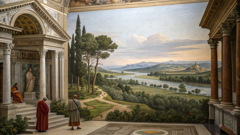
Centered placement creates formal, symmetrical dominance. It feels stable, authoritative. Think of a classical portrait where the subject sits dead center, or a Renaissance altar panel with the Madonna centered in the frame.
Rule-of-thirds placement creates dynamic, asymmetrical dominance. The subject sits off-center, and the surrounding negative space creates tension. This is what most photographers and painting styles lean toward because it feels more natural and energetic.
Both approaches can achieve clear dominance. The choice depends on the mood you’re after.
And here’s something that trips people up: proximity to other elements can dilute dominance. Pack too many things close together and none of them stand out. Balance between grouped and isolated elements is what keeps the hierarchy readable.
Dominance in Graphic Design and Web Design

Everything discussed so far, size, color, placement, spacing, all of it converges in graphic and web design. But there’s an added layer here: the user needs to do something. Dominance in digital contexts isn’t just about looking pretty. It’s about directing action.
According to Creativize, 94% of users form their first impression of a website based on its design. And Forbes data from 2024 shows that 94% of first impressions are specifically design-related, not content-related. Dominance controls that split-second judgment.
Dominance in Typography
Typography is where most web designers first encounter dominance in practice. The heading/body text relationship is a dominance decision, whether you think of it that way or not.
Heading (H1): Largest, boldest. The dominant text element on any page. It tells the reader what the page is about before they read a single paragraph.
Subheading (H2/H3): Smaller than the main heading, but still visually distinct from body text. These are sub-dominant markers that help the reader scan and orient.
Body text: Subordinate. The information layer. It delivers the detail, but it doesn’t compete for initial attention.
A clear typographic hierarchy means a reader can scan your page in seconds and understand its structure. Nielsen Norman Group’s eye-tracking research confirmed that 79% of users scan rather than read web content. Dominant headings are literally what keeps them on the page.
Dominance in UI and Layout Design
In user interface design, dominance is functional. The primary call-to-action button must dominate over secondary options. The main content area must dominate over sidebar navigation. Product images must dominate over metadata.
This is where designers sometimes get it wrong by trying to make everything equally prominent. Equal visual weight across elements creates competition, not clarity. The user ends up confused about what to click, what to read, what to ignore.
Alignment, consistent spacing, and clear movement through the layout all support the dominant element’s job. If a bright orange “Buy Now” button is your dominant element, everything else on the page should quietly point toward it through directional lines, whitespace flow, and color restraint.
The global graphic design market reached an estimated $52.6 billion in 2024, according to IBISWorld. Visual hierarchy skills, especially understanding dominance, sit right at the center of that industry’s value. Getting the eye to go where you want it to go is, quite literally, the job.
Dominance in Art and Photography

Dominance has been a compositional tool for painters long before anyone called it “visual hierarchy.” The techniques just had different names depending on the era and the medium.
Rembrandt van Rijn used concentrated light sources to isolate faces and hands from deep, shadowy backgrounds. The lit areas dominate instantly. Everything else recedes into dark tone. His approach to value scale made certain elements impossible to ignore.
Vincent van Gogh took a different route. In “Starry Night,” the swirling sky dominates through rhythm and movement rather than light. The bright crescent moon provides a secondary focal point while the dark cypress tree anchors the left side of the composition.
Abstract art handles dominance differently because there’s no recognizable subject. Mark Rothko‘s color field paintings create dominance through sheer area and color intensity. One rectangular band of color dominates others through saturation, not through representing anything specific.
Dominance in Photography

Shallow depth of field is a photographer’s fastest path to dominance. Sharp subject against a blurred background. The eye has no choice but to lock onto the in-focus area.
Leading lines, like roads, fences, or rivers, direct the viewer’s gaze toward the dominant subject. These compositional tools work because the brain follows continuous paths automatically.
Low camera angles make subjects appear powerful and dominant within the form of the frame. High angles do the opposite, reducing the subject’s visual authority. Every angle choice is a dominance decision.
Dominance in Abstract and Non-Representational Work
Wassily Kandinsky used shape and color to build dominance without depicting anything real. A large red circle in a field of small blue triangles creates immediate hierarchy through two methods at once: size and color temperature.
Piet Mondrian‘s grid paintings show dominance in its purest minimalist form. One color block is always slightly larger or brighter than the rest. That block becomes the entry point, even in a layout that looks perfectly balanced at first glance.
Gallery curators use dominance when arranging wall space too. The largest piece or the most saturated work in a group becomes the anchor for an entire exhibition wall.
Dominance vs. Emphasis vs. Contrast
These three terms get mixed up constantly, even among designers who should know better. They’re related, but they are not the same thing.
| Principle | Technical Logic | What It Is | Role in Composition |
| Emphasis | Strategic Stress: Creating a “Visual Accent” in a specific area. | The broader principle of making elements stand out. | The Strategy: The plan for where the eye should land. |
| Dominance | Hierarchical Peak: The highest level of emphasis in a layout. | The result of emphasis applied to create a clear leader. | The Outcome: The single element that “wins” the visual battle. |
| Contrast | Difference Ratio: The juxtaposition of opposing qualities (Light/Dark, Big/Small). | The visual difference between elements. | The Tool: The mechanical means of creating emphasis. |
Smashing Magazine frames it clearly: emphasis is the principle, dominance is the outcome. When emphasis techniques are applied successfully, a dominant element is created.
When Contrast Exists Without Dominance
You can have high contrast throughout a composition and still have no dominance at all. If every element contrasts equally with its surroundings, nothing stands out. Everything screams at the same volume.
Smashing Magazine’s design principles series puts it directly: you can’t emphasize everything. When you try, all elements compete for attention and nothing gets heard.
Two equally sized, equally bright objects placed symmetrically? That’s contrast without dominance. The viewer’s eye ping-pongs between them with no clear landing point.
How All Three Work Together
Contrast is the raw material. You need it to create any visual difference at all.
Emphasis is the decision to focus that contrast on a specific element, making it more prominent than its neighbors.
Dominance is the result. The element that carries the most visual weight in the entire composition, not just in one area.
A painting can contain many areas of emphasis (secondary focal points, accents, pattern breaks) while still having only one truly dominant element. The subordination of everything else is what makes the dominant element work.
Common Mistakes When Using Dominance in Composition

Knowing how dominance works is one thing. Actually pulling it off without creating problems is another. Most composition failures come down to a handful of repeated errors.
Competing Focal Points
The single biggest mistake. Two or more elements with equal visual weight fighting for the viewer’s attention.
Artists Network illustrated this problem with a specific painting example: a small bright blue square in a portrait that pulled attention away from the subject’s face. One minor element at the wrong value was enough to break the entire composition’s hierarchy.
The fix is always the same: reduce the visual weight of the competing element. Tone it down in shade, shift its color temperature, make it smaller, or move it further from the dominant area.
Over-Reliance on a Single Method
Making something big doesn’t guarantee dominance if the color is flat, the placement is poor, and the surrounding elements are visually loud. Size alone isn’t enough. Color alone isn’t enough.
Stack at least two dominance methods. Large plus bright. Isolated plus high-contrast. Centered plus saturated. The combination is what makes dominance unmistakable.
Visual Clutter That Flattens Hierarchy
Evenant’s analysis of common digital art mistakes makes this point directly: extreme detail everywhere in a painting overwhelms the viewer and destroys focal clarity. The painting loses direction and flow when eye-catching details are scattered across the entire surface.
The solution: give your dominant area the highest level of detail and progressively simplify everything else. Let subordinate elements stay quiet. They exist to support, not to compete.
Under-Designing Subordinate Elements
Less discussed but just as damaging. When secondary and background elements are too weak, the dominant element has nothing to push against. It floats in a void instead of commanding a structured space.
Variety and unity both need to exist alongside dominance. The subordinate elements should feel intentional, not like afterthoughts.
How to Create Strong Dominance in Your Compositions

This is the practical part. Everything above was theory. Here’s how to actually apply it when you’re staring at a blank canvas, an empty Figma frame, or a camera viewfinder.
Decide the Single Most Important Element First
Before you place anything, answer one question: what should the viewer see first?
Not second. Not “one of several things.” First. That answer determines every other decision in the composition. If you can’t answer it clearly, you don’t have a plan yet.
John Lovett’s composition guidance reinforces this: without a dominating element, the eye has a confusing path to follow. The arrangement of elements becomes aimless.
Stack Multiple Dominance Methods
One method creates subtle hierarchy. Two methods make it clear. Three methods make it impossible to miss.
| Method Combination | Technical Logic | Visual Effect | Best Used For |
| Size + Color | Scale & Chroma: Large objects in warm/saturated hues double the “retinal pull.” | Heavy & Aggressive: Commands immediate attention. | Poster design, “Hero” sections, Headlines. |
| Isolation + Contrast | Negative Space & Value: Dark/Light extremes surrounded by “Visual Silence.” | Clean & Sophisticated: Focuses attention through “framing.” | Minimalism, luxury branding, photography. |
| Placement + Detail | Focal Points & Texture: High-frequency detail placed on “Rule of Thirds” nodes. | Natural & Narrative: Aligns with the brain’s scanning patterns. | Editorial design, character painting, portraiture. |
| Size + Isolation + Color | The Trifecta: Combines scale, space, and saturation for zero competition. | Absolute Dominance: Impossible to ignore; total hierarchy control. | Advertising, album covers, “Call to Action” buttons. |
The Gestalt principle at work: your brain processes grouped visual signals faster than individual ones. Stacking methods gives the brain multiple simultaneous cues about what matters most.
Use the Squint Test and Grayscale Test
Nielsen Norman Group recommends the squint test as a quick check for visual hierarchy. Squint at your composition until the details blur. Whatever you notice first should be your intended dominant element.
If something else grabs your attention, your hierarchy has a problem.
The grayscale test removes color entirely. Convert your composition to black and white. If your dominant element still reads clearly through value contrast alone, the hierarchy is solid. If it disappears, you’ve been relying too heavily on color and need to build in more tonal variation.
Reduce Weight on Secondary Elements
Most people try to make the main element louder. That works. But sometimes it’s easier and more effective to make everything else quieter.
Lower the saturation on background elements. Reduce the detail. Soften edges. Pull secondary colors toward neutral. This creates dominance by subtraction rather than addition, and it often produces more sophisticated results.
Think of how atmospheric perspective works in landscape painting. Distant mountains fade in color and detail, pushing the foreground subject forward without making it physically larger. The background gets quieter so the foreground can lead.
FAQ on What Is Dominance in Composition
What does dominance mean in art composition?
Dominance is the principle of giving one element more visual weight than all others. It creates a focal point that the viewer sees first, establishing a clear visual hierarchy across the entire composition.
How is dominance different from emphasis?
Emphasis is the broader strategy of making elements stand out. Dominance is the result of emphasis applied successfully. A composition can have several areas of emphasis but only one truly dominant element.
What are the three levels of dominance?
The three levels are dominant (primary visual weight), sub-dominant (secondary interest), and subordinate (background support). Most viewers can instinctively distinguish these three tiers within any well-structured composition.
How do you create dominance using color?
Use a saturated or warm color against a muted or cool background. The contrast in hue, value, or color temperature pulls the eye to the dominant element immediately. Complementary color pairings amplify this effect.
Can a small element dominate a large one?
Yes. A small element can dominate through isolation, high contrast, or intense color. A tiny bright red dot on a vast gray canvas dominates because the visual difference overrides the size relationship.
Why does my composition feel flat or confusing?
Likely because multiple elements carry equal visual weight. Competing focal points cause the viewer’s eye to bounce without landing. Reduce the weight of secondary elements or increase the weight of your intended focus.
What is the squint test for checking dominance?
Squint at your composition until details blur. Whatever you notice first should be your dominant element. If something else grabs attention instead, your hierarchy needs adjusting through size, contrast, or placement changes.
How does dominance work in photography?
Photographers use shallow depth of field, leading lines, framing, and subject isolation to create dominance. A sharp subject against a blurred background forces the eye to the in-focus area automatically.
Does dominance apply to web and graphic design?
Absolutely. Headlines dominate body text through size. Call-to-action buttons dominate through color contrast. The visual hierarchy of any layout depends on clear dominance decisions at every level of the design.
How many dominance methods should you combine?
At least two. Size plus color. Isolation plus contrast. Stacking methods makes dominance unmistakable. A single method creates subtle hierarchy, but combining two or three makes the focal point impossible to miss.
Conclusion
Understanding what is dominance in composition comes down to one idea: give the viewer a clear starting point. Every design principle discussed here, from size and scale to color contrast and spatial arrangement, serves that single goal.
The dominant element leads. Sub-dominant elements support. Subordinate elements stay quiet. That three-tier structure holds whether you’re working in watercolor, digital interfaces, or perspective-driven photography.
Stack your methods. Test with a squint. Cut the visual noise around your focal area.
Dominance isn’t about making one thing louder. It’s about making everything else deliberately quieter. Get that compositional balance right, and your work communicates before the viewer even realizes they’re reading it.
Practice with simple compositions first. Build complexity once the hierarchy feels automatic.