Every painting that holds your attention is doing something specific with repetition and movement. Understanding what is rhythm in art explains why your eye flows naturally through some compositions and bounces aimlessly through others.
Rhythm is one of the core principles of design, sitting alongside balance, emphasis, and unity. But it’s the one most people struggle to see, even though it shapes everything from Renaissance altarpieces to modern web layouts.
This guide breaks down the types of visual rhythm, how artists control tempo through spacing and scale, and where rhythm shows up across painting, architecture, and graphic design. You’ll also get a practical method for identifying rhythm in any artwork you encounter.
What Is Rhythm in Art
Rhythm in art is the visual principle that creates a sense of organized movement across a composition through the repetition of elements at regular or varied intervals.
Think of it like this. When you look at a painting and your eye moves smoothly from one area to the next, following a path the artist set up for you, that’s rhythm doing its job. It’s what separates a static arrangement of marks from something that actually feels alive on the surface.
The comparison to music comes up constantly, and it sort of works. Musical rhythm happens over time. Visual rhythm happens across space. Both depend on recurring elements and the gaps between them to create a sense of flow.
But the analogy breaks down fast if you push it too far. A painting doesn’t have a tempo you can measure with a metronome. What it does have is interval, repetition, and variation working together to guide the viewer’s eye in a specific direction or pattern.
A 2024 eye-tracking study published in the Journal of Eye Movement Research found that compositional techniques like leading lines significantly influence where viewers focus their attention and how long they fixate on key elements. Rhythm functions the same way. It’s a control mechanism.
The core building blocks are simple: a visual element (a line, shape, color, or texture) gets repeated. The spaces between those repetitions create the visual beat. And the way those elements change (or don’t change) across the piece determines whether the rhythm feels steady, accelerating, chaotic, or flowing.
It’s one of the fundamental principles of design taught in every art program, but it shows up in places most people never consciously notice. Architecture. Textile design. Typography. Even the grid layout of a website.
Types of Rhythm in Art

Not all visual rhythm behaves the same way. Artists and designers generally recognize five distinct types, each producing a different effect on the viewer. Knowing which one you’re looking at (or trying to create) changes how you approach a piece.
Regular and Alternating Rhythm
Regular rhythm is the simplest form. One element repeats at equal intervals with no variation. Think of a brick wall, a row of columns, or a checkerboard floor. The visual beat is predictable, steady, and consistent.
It shows up everywhere in Islamic geometric art, where mathematical precision produces intricate tile patterns built entirely from identical, repeating units. The Alhambra in Granada is probably the most cited example, and for good reason. Hundreds of tessellating patterns, all built on regular rhythmic repetition.
Alternating rhythm adds one layer of complexity. Instead of repeating element A over and over, you alternate between A and B (or A, B, and C). The pattern is still predictable, but it has more visual interest.
A good example: Piet Mondrian‘s grid compositions. The rigid structure stays constant, but the alternation between primary colors and white spaces within that grid creates a rhythm that your eye follows from block to block. It’s structured but not monotonous.
| Rhythm Type | Repetition Pattern | Visual Effect | Common Example |
| Regular | Same element, equal spacing | Steady, calm, predictable | A brick wall, classical columns, or tile work. |
| Alternating | Two or more elements in a sequence (A-B-A-B) | Structured variety and complex movement | A checkerboard or Mondrian’s grids. |
Flowing and Progressive Rhythm
Flowing rhythm drops the rigid structure entirely. It follows organic, curving paths that mimic natural movement, like waves, rolling hills, or the growth patterns of vines.
Art Nouveau is practically defined by flowing rhythm. Look at any Hector Guimard Metro entrance in Paris or a Gustav Klimt painting and you’ll see curving lines that repeat with gentle variation, pulling the eye along winding paths. The rhythm feels natural because it mirrors how organic forms actually grow and move.
Progressive rhythm works differently. Here, the repeated element changes gradually. It gets bigger, smaller, darker, lighter, or shifts in color as it moves across the composition. The effect is acceleration or deceleration. Your eye speeds up or slows down depending on how the progression works.
Marcel Duchamp’s “Nude Descending a Staircase, No. 2” is the classic case. The figure repeats in overlapping stages, each one shifted slightly in position and angle, creating a progressive rhythm that suggests continuous motion through space. It’s closer to a film strip than a traditional painting, and that’s exactly what Duchamp was going for.
Random Rhythm
This one trips people up. How can randomness be rhythmic?
Random rhythm happens when elements repeat without a fixed pattern or predictable interval. The repetition is there. You can see it. But you can’t predict where the next occurrence will land.
Jackson Pollock‘s drip paintings are the textbook example. Paint splatters, drips, and pours repeat across the canvas, but there’s no grid, no sequence, no obvious order. The rhythm emerges from the density and distribution of marks rather than from any structured arrangement.
According to the Art Basel and UBS Art Market Report 2026, the global art market recorded $57.5 billion in sales in 2024, with transaction volume growing 3% year-on-year. Abstract works, including pieces that rely heavily on random and progressive rhythmic structures, continue to attract strong collector interest, especially at accessible price points.
What makes random rhythm work is that the human brain still finds patterns in it. We look at a Pollock and our eyes trace paths through the chaos, finding visual beats in the clusters and gaps. It’s unstructured, but it’s not nothing.
How Rhythm Differs from Pattern and Repetition
These three terms get used interchangeably all the time, and it causes real confusion. They’re related, but they’re not the same thing.
Repetition is the mechanism. You take an element and use it more than once. That’s it. Repetition alone doesn’t create rhythm or pattern. It’s just the raw material.
Pattern is what happens when repetition becomes structured and predictable. A wallpaper design is a pattern. A row of identical windows on a building facade is a pattern. But pattern is fundamentally static. It tiles. It fills space. It doesn’t necessarily move your eye anywhere.
Rhythm requires movement. It’s the sense that your eye is being pulled through the composition along a path, at a pace, with a visual tempo. Rhythm can use pattern as a tool, but it adds the dimension of directional flow that pattern alone doesn’t have.
Here’s a concrete way to think about it. A pointillist painting by Georges Seurat contains millions of repeated dots. That’s repetition. The dots form recognizable areas of consistent color and value. That’s pattern. But the way those areas of color guide your eye from the foreground figures to the background trees, through the middle ground, and back again? That’s rhythm.
| Concept | What It Does | Requires Movement? | Psychological Effect | Example |
| Repetition | Reuses an element exactly | No | Consistency & Familiarity | Identical dots on a surface |
| Pattern | Structures repetition predictably | No | Stability & Order | Wallpaper, tile grid, or textiles |
| Rhythm | Creates directional visual flow | Yes | Energy, Tempo, & Direction | Eye moving through a Seurat painting |
You can have pattern without rhythm. A perfectly uniform grid of identical squares has pattern but no rhythmic movement. Your eye doesn’t go anywhere specific.
You can also have rhythm without obvious pattern. A series of progressively larger circles scattered across a canvas has rhythm (your eye tracks the size change) but no repeating pattern in the traditional sense.
Elements That Create Rhythm in a Composition

Rhythm doesn’t appear out of thin air. It’s built from the same basic elements every artist and designer works with. The difference is in how those elements get repeated, spaced, and varied.
Line and Shape
Directional lines are probably the most direct rhythm-building tool. Repeated curves create flowing rhythm. Repeated angles create sharp, staccato rhythm. Parallel lines at even spacing create regular rhythm. Parallel lines at even spacing create regular rhythm. This is especially noticeable in a hand-drawn sketch, where the repetition of lines and subtle variations in stroke give the composition a natural, expressive rhythm.
Bridget Riley built an entire career on this. Her Op Art paintings use precisely calculated repetitions of lines and curves to create optical effects that appear to move, vibrate, and pulse. As she put it herself, rhythm and repetition create a situation where the most basic forms start to become visually active.
Shape works similarly but adds mass. Repeated circles feel different from repeated triangles. Organic shapes (leaves, petals, clouds) produce flowing rhythm naturally, while geometric shapes (squares, hexagons) tend toward regular or alternating rhythm.
Color and Value
A recurring hue placed at intervals across a painting creates rhythm just as effectively as a repeated shape. Your eye picks up the color and jumps from one occurrence to the next, following a path the artist laid down.
Henri Matisse used this constantly. In his Fauvist paintings, bold patches of color repeat across the canvas, and your eye bounces between them like a ball in a pinball machine. The rhythm comes from the color relationships, not from any structural grid.
Value shifts (light to dark transitions) create rhythm too. A gradation from light to dark across a surface produces progressive rhythm. Alternating light and dark bands produce regular or alternating rhythm.
Space and Texture
The intervals between repeated elements control the visual tempo just as much as the elements themselves. Tight spacing feels fast. Wide spacing feels slow. Irregular spacing feels unpredictable or jazzy.
This is something minimalist artists understood well. Frank Stella‘s stripe paintings, for instance, use evenly spaced bands of color where the gap between each stripe is as carefully considered as the stripe itself. The rhythm lives in the relationship between mark and space.
Texture adds another layer. Repeated rough patches against smooth areas create a tactile rhythm you can almost feel. Impressionist painters like Claude Monet used thick, repeated brushstrokes that create rhythmic surface texture visible from across a room, especially in his late water lily paintings where the physical texture of the paint becomes the primary rhythmic structure.
Rhythm in Art Examples Across Movements and Periods

Rhythm shows up differently depending on the era, the style, and what the artist was trying to accomplish. Looking at specific examples across art history makes the concept concrete instead of abstract (no pun intended).
Rhythm in Painting and Drawing
Hokusai’s “The Great Wave off Kanagawa” is flowing rhythm at its most dramatic. The curling wave repeats in diminishing sizes from foreground to background, with smaller waves echoing the main form. Your eye follows the arc of water naturally, pulled along by the progressive curves. It’s been reproduced billions of times and the rhythmic structure is a big part of why it works so well.
Vincent van Gogh‘s “Starry Night” layers multiple rhythms on top of each other. The swirling sky uses flowing rhythm in the cloud patterns. The cypress tree creates a vertical interruption. The village rooftops produce a regular rhythm along the horizon line. It’s rhythmically dense in a way that matches the emotional intensity of the painting.
Pablo Picasso‘s Cubist works broke objects into fragmented planes and then reassembled them with an angular, syncopated rhythm. “Les Demoiselles d’Avignon” has a jarring, percussive quality because of how the geometric shapes interlock and repeat at unexpected angles.
Wassily Kandinsky treated rhythm in painting the way a composer treats rhythm in music, and he was explicit about the connection. His abstract compositions from the 1920s and 1930s scatter geometric forms across the canvas with carefully controlled spacing, producing rhythmic relationships between circles, triangles, and lines that feel almost musical.
Rhythm in Architecture and Decorative Art
Gothic cathedrals are rhythm machines. The repeated pointed arches, ribbed vaults, and clustered columns create a regular rhythm that pulls your eye upward. Notre-Dame de Paris, Chartres, Cologne. The vertical repetition in all of them serves both structural and visual purposes.
Baroque architecture took a different approach. Instead of strict regularity, Baroque facades use alternating and progressive rhythms. Columns vary in size. Pediments alternate between triangular and curved. The effect is more dynamic and theatrical, which was the whole point.
In decorative arts, William Morris’s textile and wallpaper designs from the Arts and Crafts movement are textbook examples of flowing rhythm applied to functional objects. Repeating plant forms wind across the surface in continuous, organic patterns that maintain visual harmony while keeping the eye moving.
The 2024 NCES School Pulse Panel survey found that 73% of U.S. public schools require students to take at least one arts course, with visual arts being among the most consistently offered and staffed disciplines. Understanding concepts like rhythm remains a core part of that foundational arts curriculum.
How Artists Control Visual Tempo
Rhythm gives a composition movement. Tempo determines whether that movement feels fast, slow, frantic, or calm. Artists control tempo through a handful of specific decisions.
Spacing and Scale as Speed Controls
Tight intervals speed things up. When repeated elements sit close together, the eye moves between them quickly. The visual tempo accelerates.
Wide intervals slow things down. More space between repetitions gives the eye room to pause, creating a slower, more contemplative rhythm.
This is straightforward, but the effect is powerful. Victor Vasarely‘s Op Art pieces manipulate this constantly. In many of his compositions, geometric forms are tightly packed at the center and gradually spaced further apart toward the edges. The tempo shifts from fast to slow as your eye moves outward.
Scale variation does something similar. A series of progressively larger shapes feels like acceleration because the visual “weight” of each element increases. Shrinking shapes feel like deceleration.
Breaking Rhythm to Create Focus
Here’s where it gets interesting. Sometimes the most powerful use of rhythm is breaking it.
When an artist establishes a consistent rhythmic pattern and then disrupts it with an unexpected element, that disruption becomes the focal point. The eye snaps to the break because the brain was predicting the next beat and got surprised.
Emphasis through rhythmic disruption is one of the oldest compositional tricks in the book. Caravaggio did it with light. In paintings like “The Calling of Saint Matthew,” the regular rhythm of figures seated at a table is shattered by a single beam of light cutting across the scene. That break in the visual pattern is where all the drama lives.
According to Figma’s 2025 design statistics report, about 92.6% of people say the visual dimension is the top factor influencing their choices. Controlling visual tempo, including knowing when to break it, directly affects how audiences engage with any visual work.
This connects to visual hierarchy. Rhythm establishes order. Breaking rhythm establishes priority. The two work together to tell the viewer exactly where to look and in what sequence.
Rhythm and Emotional Response
Fast, regular rhythms tend to feel energetic or mechanical. Think of Futurist paintings with their overlapping angular forms suggesting speed and machine power.
Slow, flowing rhythms feel calm or meditative. Mark Rothko‘s color field paintings use very slow rhythmic gradations between color bands. Took me a while to see rhythm in Rothko’s work, honestly. But it’s there. The subtle shift from one hue zone to the next creates a barely perceptible pulse that encourages long, contemplative viewing.
Irregular or broken rhythms create tension or unease. Expressionist works often use this deliberately. The distorted, unpredictable repetitions in paintings by artists like Ernst Ludwig Kirchner produce a visual anxiety that matches their emotional content.
A 2024 study in Scientific Reports examining how social factors affect visual judgments of paintings found that both bottom-up visual features (like rhythm and color) and top-down cognitive processes jointly influence how viewers perceive and emotionally respond to artwork. Rhythm isn’t just decoration. It’s a direct channel to emotional response.
Rhythm in Graphic Design and Digital Art
Rhythm isn’t just a fine art concept. It drives most of the visual decisions in graphic design, web layout, motion graphics, and brand identity systems. If anything, designers use rhythm more consciously than painters do, because the stakes are different. A painting can afford to be contemplated. A website has about 50 milliseconds before a visitor forms an opinion, according to Hostinger’s 2026 web design report.
Grid Systems as Rhythm Structures
Every modern layout tool, from Figma to Adobe Illustrator, is built around grids. And grids are, at their core, rhythm frameworks.
The standard 12-column grid used in web design divides the page into equal vertical intervals. Content snaps to these intervals, creating a regular rhythm that the eye follows without conscious effort. The spacing between columns (gutters) controls the visual tempo, the same way intervals between repeated shapes control tempo in a painting.
Baseline grids handle vertical rhythm specifically. They align text across the page to consistent horizontal intervals, so lines of type sit at the same height across multiple columns. This produces the kind of smooth, flowing visual rhythm you see in well-designed magazines and editorial layouts.
MindInventory’s 2026 UX report found that 84.6% of users prefer clean, organized layouts over cluttered designs. Grid-based rhythm is a big part of what makes that “clean” feeling possible.
Typography and Visual Rhythm
Vertical rhythm in type: the consistent spacing between lines of text, between headings and body copy, and between paragraphs. Designers typically build this from a base unit (4px or 8px) and multiply it throughout the layout.
Heading hierarchy: alternating between large headings, smaller subheadings, and body text creates an alternating rhythm that guides the reader through content in order of priority.
Font weight repetition: bold labels recurring at regular intervals (like at the start of each list item in a design system) produce a visual beat that helps readers scan.
The relationship between type rhythm and contrast is tight. Without contrast between heading sizes, the rhythm flattens and the reader loses their place. Too much contrast and the rhythm becomes jarring.
Motion Graphics and Brand Systems
Motion design adds a literal time dimension to visual rhythm. Animated transitions, loading sequences, and micro-interactions all follow rhythmic patterns that affect how a product feels to use.
Apple’s iOS interface is a good real-world case. The consistent bounce animations, swipe transitions, and scroll behaviors all follow a regular rhythm that makes the system feel cohesive. Break that rhythm (laggy animation, inconsistent timing) and users notice instantly.
Brand identity systems use rhythm across a different axis. When Yayoi Kusama‘s polka dots appeared on Louis Vuitton products in their 2023 collaboration, the rhythmic repetition of dots across storefronts, bags, and clothing created visual recognition through pattern consistency. The rhythm was the brand signal.
Figma’s 2025 data shows the specialized design services market grew from $147 billion in 2023 to $157 billion in 2024. That growth reflects how seriously businesses now take visual design decisions, including the kind of rhythmic consistency that builds user trust.
Why Rhythm Matters in Composition
Strip away all the terminology and rhythm does three practical things for any visual work. It guides the eye, creates unity, and generates interest without chaos.
Guiding the Viewer’s Eye
A composition without rhythm is a composition without direction. The viewer’s eye lands somewhere, looks around randomly, and leaves. Rhythm provides the invisible track that moves the eye deliberately from one area to the next.
This is measurable. Eye-tracking research from the Journal of Eye Movement Research (2024) confirmed that compositional structures like leading lines and repeated forms directly influence both where viewers look and how long they stay focused on key areas.
David Hockney‘s photo collages are a clear example. He arranges dozens of individual photographs into a single image, and the repeated rectangular shapes, overlapping at slight angles, create a progressive rhythm that pulls the eye across the entire composition. Without that rhythmic structure, the collages would just look like a pile of snapshots.
Creating Unity Across Complex Works
Large-scale works need something to hold them together. Rhythm does this by connecting distant parts of a composition through shared visual beats.
| What Rhythm Achieves | How It Works | What Happens Without It |
| Visual Unity | Repeated elements link separate areas | The composition feels fragmented or disconnected. |
| Directional Flow | Intervals and “accents” guide the eye | The viewer’s gaze wanders randomly or exits the frame. |
| Sustained Interest | Variation within the repetition keeps attention | The viewer loses engagement and stops “reading” the work. |
Renaissance painters understood this intuitively. In large altarpieces spanning multiple panels, artists like Raphael used repeating arches, gestures, and color intervals to unify compositions that might otherwise feel like separate paintings placed next to each other.
Generating Interest Without Chaos
Pure repetition is boring. Pure randomness is disorienting. Rhythm sits between those extremes.
The best compositions use rhythm to set up expectations and then introduce just enough variety to keep the eye engaged. This is the same principle that makes music listenable. A song with only one note repeated is unbearable. A song with no repeating structure is noise. The sweet spot is structured variation.
Keith Haring‘s street murals are a great example of this balance. His repeated figures and bold outlines create strong regular rhythm, but each figure varies slightly in pose and gesture. The result is visually energetic without being confusing. Your eye moves quickly across the surface, pulled along by the rhythm, but never feels lost.
How to Identify Rhythm in Any Artwork
Looking at art without understanding rhythm is like listening to music without hearing the beat. Once you know what to look for, you start seeing rhythmic structures everywhere.
A Practical Step-by-Step Approach
Step one: find the repeated element. It could be a form, a color, a line direction, or a textural quality. Something in the work appears more than once.
Step two: trace the intervals. How far apart are the repetitions? Are they evenly spaced (regular rhythm)? Do they alternate? Do they change progressively?
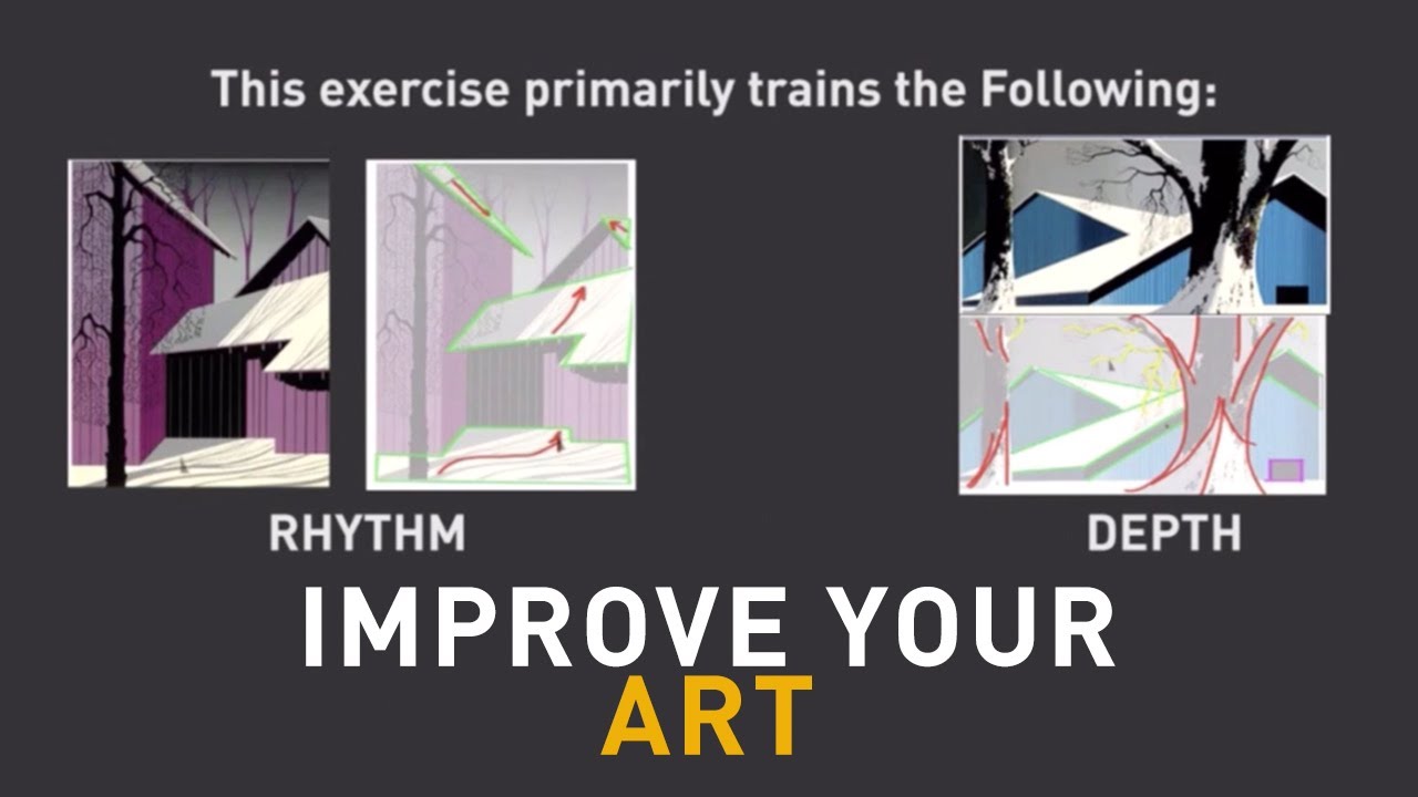
Step three: follow your eye. Where does it go first? Where does it move next? The path your eye takes is the rhythm in action. If your gaze moves smoothly, the rhythm is flowing. If it hops from point to point, the rhythm is more staccato.
Step four: find the break. Most strong compositions include at least one disruption in the rhythmic pattern. That’s usually the dominant element or focal point.
Questions to Ask When Analyzing Rhythm
Instead of memorizing rules, try asking these when you’re standing in front of a piece:
- What element repeats most obviously?
- Does the rhythm feel fast, slow, steady, or unpredictable?
- Where does the rhythm break, and is that the focal point?
- Does the rhythm match the emotional tone of the work?
The National Endowment for the Arts found that students in arts education programs show higher critical thinking skills and stronger academic performance. Learning to analyze rhythm, specifically, trains the eye to see structure in visual information, which is a skill that transfers directly to fields like graphic design, architecture, and photography.
Practice Exercises for Beginners
Trace the eye path. Pick any painting (a landscape works well) and draw arrows showing where your eye moves. The arrows reveal the rhythmic flow.
Mark the repeats. Print or open an image and use colored dots to mark every occurrence of a repeated element. You’ll see the rhythmic structure emerge from the pattern of dots.
Compare two pieces side by side. Pick one with obvious regular rhythm (any Impressionist painting with repeated brushstrokes) and one with random rhythm (a Pollock or a Basquiat). Describe how each one makes your eye move differently. That difference is the difference in rhythm.
These days, tools like Canva and Figma make it easy to experiment with rhythm yourself. Lay down a row of identical circles with equal spacing. Then vary the spacing. Then vary the size. Watch how the visual tempo changes with each adjustment. You’ll understand rhythm in about five minutes of hands-on experimentation better than from any textbook explanation.
FAQ on What Is Rhythm In Art
What is rhythm in art?
Rhythm in art is the visual principle that creates organized movement across a composition through repeated elements and intervals. It guides the viewer’s eye along a path, producing a sense of flow, tempo, and visual continuity within the work.
What are the five types of rhythm in art?
The five types are regular, alternating, flowing, progressive, and random rhythm. Each produces a different visual effect, from the steady beat of repeating geometric shapes to the organic movement of curving natural forms.
How is rhythm different from pattern in art?
Pattern is static repetition that fills space. Rhythm adds directional movement. A tiled wall has pattern. A composition where repeated colors pull your eye from foreground to background has rhythm. Rhythm implies motion, pattern does not.
What elements create rhythm in a composition?
Line, shape, color, texture, and the spacing between them. Any visual element repeated at intervals can generate rhythm. The gaps between repetitions control the visual tempo, just like rests between notes control musical tempo.
Why is rhythm important in art?
Rhythm guides the eye, creates unity across complex works, and generates visual interest without chaos. Without it, compositions feel static or disjointed. It connects separate areas of a piece through shared visual beats and recurring motifs.
What is an example of rhythm in a famous painting?
Hokusai’s “The Great Wave off Kanagawa” uses flowing rhythm through repeating wave curves that diminish in size from foreground to background. Your eye follows the arc of water naturally, pulled along by progressive, organic repetition.
How do artists control visual tempo?
Through spacing and scale. Tight intervals between repeated elements speed the eye up. Wide intervals slow it down. Gradually changing the size of repeated forms creates acceleration or deceleration across the surface of the work.
Can rhythm exist in abstract art?
Yes. Abstract artists like Kandinsky and Bridget Riley built entire bodies of work around visual rhythm. Repeated geometric forms, color intervals, and alternating shapes create rhythmic movement without representing any recognizable subject matter.
How is rhythm used in graphic design?
Grid systems, typography spacing, and repeated visual elements all create rhythm in design layouts. Baseline grids align text to consistent intervals, producing vertical rhythm. Consistent heading sizes and spacing create an alternating beat that helps readers scan content.
How can beginners learn to identify rhythm in artwork?
Find the repeated element, trace the intervals between repetitions, then follow where your eye moves. The path your gaze takes reveals the rhythmic structure. Look for where the rhythm breaks. That’s usually the focal point.
Conclusion
Understanding what is rhythm in art changes how you see every visual work you encounter. It’s the principle that turns a static arrangement of elements into something your eye wants to follow.
From the regular rhythmic patterns in Islamic tile work to the progressive movement in Duchamp’s fragmented figures, rhythm operates across every era and painting medium. It connects Op Art’s optical vibrations to the flowing curves of Art Nouveau. It links Mondrian’s grids to Pollock’s drip paintings.
The practical takeaway is simple. Look for the repeated element, trace the intervals, and follow where your eye goes. That’s rhythm working on you.
Whether you’re analyzing a famous abstract painting, designing a layout, or picking up a brush yourself to start painting, visual rhythm is the structural backbone that holds a composition together. Once you learn to see it, you can’t unsee it.