Snow looks simple. It’s white, it’s flat, and it covers everything. Then you try to paint it in watercolor and realize the medium has no white pigment, no margin for error, and zero tolerance for overworking.
Learning how to paint snow in watercolor means working backwards. You protect the paper. You mix cool shadow colors. You stop before it feels finished.
This guide covers everything from paper and brush setup to color temperature, wet-on-wet shadow washes, dry brush texture on branches, and recovery techniques when snow areas go wrong.
By the end, you will know exactly how to handle reserved paper whites, transparent shadow mixes, and the light-to-dark value structure that makes winter watercolor scenes read as cold, luminous, and real.
What Makes Snow Difficult to Paint in Watercolor?

Snow is one of the hardest subjects in watercolor painting to get right. The core problem is simple: watercolor has no white pigment you can apply. Everything depends on what you don’t paint.
Snow is never actually white. It reflects the sky, absorbs surrounding color, and shifts constantly with light and shadow. Beginners flatten all of that into a chalky, lifeless surface.
The medium makes it worse. Watercolor techniques rely on transparency and layering. Overwork a snow area even slightly and the pigment transparency collapses, leaving muddy, opaque patches that kill the luminosity snow needs.
Why Watercolor Has No White Paint for Snow
The white of the paper is the only true white in watercolor. You cannot add white back once pigment covers the surface. Every snow highlight must be planned before the first wash goes down.
This is the opposite of oil or acrylic, where white is added on top. In watercolor, the process runs backwards. You protect what you want to stay white. Everything else gets painted.
Skipping this mental shift is the single reason most snow paintings fail at the planning stage.
Why Snow Color Temperature Confuses Beginners
Snow shadow colors shift based on light source direction and sky conditions. Artists at American Watercolor note that midday snow scenes produce intense cobalt-blue shadows, while overcast conditions push shadows toward neutral grey-violet.
3 common color temperature mistakes:
- Painting shadows with neutral grey instead of cool blue or violet
- Ignoring warm reflected light in foreground snow near objects
- Treating the entire snow surface as a single uniform tone
Why Transparent Watercolor Layers Break Down on Snow
Watercolor pigment transparency is what creates luminous snow. Overworking wet areas causes blooms and backwashes, pushing pigment into hard rings at drying edges. These marks destroy the soft, gradual transitions snow requires.
A 2-pass maximum rule applies to snow areas. First pass: the base shadow wash. Second pass: adjustments once fully dry. Anything more and the surface begins to degrade.
The fine art watercolor paints market was valued at $3.67 billion in 2024 (Proficient Market Insights), driven partly by growing demand among artists working in transparent, layered techniques. That growth reflects how seriously the watercolor community approaches material quality, and material quality directly affects how snow areas behave on paper.
What Paper and Brush Setup Works Best for Snow Scenes?
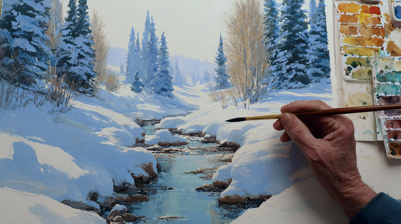
Paper choice makes or breaks a snow painting before a single brushstroke lands. The wrong surface causes buckling, pooling, and loss of edge control in snow areas.
Minimum paper weight for snow work: 300gsm (140lb). Paper below this threshold buckles badly under wet washes, creating channels where pigment pools. Pooled pigment dries into hard, unintended edges directly across snow surfaces (Bromleys Art Supplies).
Cold Press vs. Hot Press Paper for Snow Edges
The surface texture you choose determines what kind of snow edges are possible.
| Paper Surface | Snow Edge Quality | Best For |
|---|---|---|
| Cold press (textured) | Broken, natural edges with dry-brush skips across surface texture | Winter landscapes, loose snow fields, sparkle effects |
| Hot press (smooth) | Sharp, controlled edges with even pigment flow | Detailed snow close-ups, crisp shadow lines |
| Rough | Highly broken edges with aggressive dry-brush texture | Distant snow masses, atmospheric winter scenes |
Cold press is the standard choice for most snow painting. The textured surface creates the broken, irregular edges that make snow look natural rather than cut out.
Why Paper Stretching Matters for Snow Washes
Snow scenes require wet-on-wet base washes across large areas. Paper under 300gsm needs stretching or taping before any wash goes down. Unstretched paper buckles as the wet wash dries, pulling pigment into the valleys and leaving unwanted tide marks across the snow field.
Artsydee recommends taping edges with painter’s tape as a practical alternative to full stretching for 140lb paper. The tape holds the sheet flat through wet applications without the prep time full stretching requires.
For heavy snow work with multiple wet washes, 300lb (640gsm) paper is worth it. It does not buckle at all, even under aggressive repeated applications (Rileystreet Art Supply).
Which Brushes Handle Snow Work
3 brush types cover almost every snow application:
- Large flat wash brush: sky gradients and base snow ground washes
- Round brush (sizes 8-12): shadow shape placement and soft edge transitions
- Fan brush: dry brush snow clumps on branches and scattered snow texture
A mop brush works well for pre-wetting large snow areas before dropping in shadow color. The mop brush holds enough water to keep the surface workably wet across a wide area without overloading the paper.
What Color Palette Captures Realistic Snow?

A 4-pigment palette covers realistic snow in almost any light condition: Ultramarine Blue, Payne’s Grey, Quinacridone Violet, and Burnt Sienna. That’s it. More colors usually muddy the shadow mixes.
Snow is never pure white. Artists network research on winter landscape techniques confirms that snow reflects sky color directly. A blue sky produces cool blue-grey shadows. A sunset produces pink-orange tint across the surface. An overcast sky flattens snow to muted neutral grey.
How to Mix Snow Shadow Colors
Joseph Zbukvic developed 3 signature grey mixes in collaboration with Daniel Smith specifically for painting light that is cool, neutral, or warm. His core principle: tonal value carries the snow’s form. Color temperature adjusts the mood.
For standard cool shadow mixes:
- Ultramarine Blue + Payne’s Grey: neutral cool shadow for overcast conditions
- Ultramarine Blue + Quinacridone Violet: rich blue-violet shadow for clear winter light
- Burnt Sienna + Ultramarine Blue: warm grey-brown for shadow areas near buildings or warm light sources
Keep every mix transparent. Opaque shadow washes flatten snow immediately.
Warm vs. Cool Color Temperature in a Single Snow Scene
Even a single snow painting needs both warm and cool tones present. A scene that uses only cool blues reads as flat and monotonous. The interplay between warm and cool is what creates depth across the snow surface.
Standard balance: cool shadows in mid-ground and background snow, warm reflected light in foreground snow closest to the viewer. The warm foreground pulls the eye forward and creates spatial separation.
Understanding warm vs. cool colors in the context of snow is the single most useful concept for getting beyond flat white surfaces.
When to Avoid Titanium White Gouache
White gouache is a last resort, not a primary tool. Applying opaque white over watercolor creates a visible surface shift. The paint sits on top rather than glowing through the paper.
Reserve white gouache for 3 specific uses: final snowflake spattering over a dark sky, small lost highlights on branch tips, and correcting small damaged paper areas. Anything beyond these three and the result looks chalky against the transparent watercolor layers beneath it.
How Does the “White of the Paper” Technique Work for Snow?

Preserving the white of the paper for snow means deciding exactly where snow falls before any wash touches the surface. That decision drives every brush move that follows.
The process runs in one direction only. Plan white areas first. Paint everything else around them. Work light to dark across all non-snow areas. The snow stays untouched until shadow shapes are added last.
When to Use Masking Fluid vs. Leaving Paper Bare
Not all white preservation needs masking fluid. The choice depends on the complexity and size of the snow shape.
| Snow Area Type | Method | Why |
|---|---|---|
| Large open snow fields | Leave the paper bare and paint around the shape | Masking fluid over large areas often creates hard, mechanical-looking edges |
| Fine snow on branches | Apply masking fluid with a ruling pen | Intricate branch patterns are too difficult to preserve accurately by painting around them |
| Snow clumps on fence posts | Apply masking fluid with a brush | Small irregular shapes benefit from protected highlights |
| Snow sparkle / scattered flakes | Spatter masking fluid with a toothbrush | Produces a random, natural-looking snowflake pattern |
Winsor and Newton Art Masking Fluid and Pebeo Drawing Gum are the 2 most consistently recommended options among working watercolorists. Apply only to dry paper. Apply thin, flat coats, not thick globs. Thick applications are harder to remove cleanly (Ohn Mar Win).
The Common Mistake: Painting Snow Last with White Paint
This is the most frequent error in snow painting. Beginners complete the entire painting and then try to add snow on top with white gouache or white watercolor.
The result always looks wrong. White applied over dark washes reads as opaque and separate from the painting. Snow painted this way sits on top of the scene rather than being part of it.
Snow must be built into the composition from the first planning stage. The paper IS the snow. Painting over it later is repairing, not painting.
This approach connects directly to the broader principle of negative shape thinking in painting, where the unpainted areas carry as much compositional weight as the painted ones.
How to Paint a Snow-Covered Ground in Watercolor
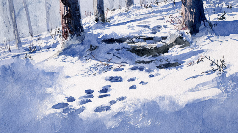
Snow-covered ground is where most winter watercolor paintings succeed or fail. Get the shadow wash right and the scene reads as cold and spatial. Get it wrong and the ground looks like white paper with grey smudges on it.
The process uses wet-on-wet for soft base transitions and wet-on-dry for hard boundary edges. Sandra Strohschein’s approach, documented at American Watercolor, lays a wash of blue across the foreground and then drops in darker pigment wet-in-wet to build footprints and surface variation without hard edges.
The Step-by-Step Process for Ground Snow
Pass 1 (wet-on-wet):
- Pre-wet the snow area with clean water, leaving a dry border around objects touching the snow
- Drop cool shadow wash (Ultramarine Blue, well diluted) into the wet area
- Let it spread naturally; do not brush it flat
- Add darker pigment wet-in-wet in foreground areas for depth
Pass 2 (wet-on-dry, after full drying):
- Define hard shadow edges where objects cast defined shadows onto snow
- Add a warm glaze in the closest foreground strip using very diluted Burnt Sienna
Two passes maximum. The wet-on-wet technique in the first pass creates the soft, gradual transitions snow surfaces show in real light. The wet-on-dry second pass adds the crisp shadow edges that give the ground plane its structure.
Avoiding Overworked Snow Ground
The most common technical failure in snow ground work is adding a third or fourth pass to “fix” the shadow wash. By that point the paper surface has been worked too much and starts to lift or pill. Pigment goes streaky.
Leave it alone. A slightly imperfect wet-on-wet wash reads as natural. A heavily reworked wash reads as mechanical.
If the first pass goes wrong, let it dry completely and assess. Sometimes what looks wrong wet reads correctly dry. Wet watercolor is always darker and less balanced than the dried result.
How to Paint Snow on Trees and Branches
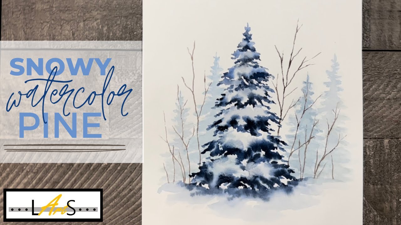
Snow on trees is a different technical problem than snow on the ground. The edges are irregular. The snow sits on top of dark branches. And the negative painting required to define branches under snow clumps is the opposite of the usual approach.
The dry brush technique is the core tool here. A fan brush loaded lightly and dragged sideways across cold press paper creates broken clumps of white because the paint catches only the raised paper texture, skipping the pits and leaving irregular broken edges.
Dry Brush Snow Clumps on Branches
Fan brush application for branch snow:
- Load brush lightly, remove excess paint on paper towel until the brush is nearly dry
- Drag sideways across cold press paper to create broken, clumped shapes
- Leave the bottom edge of each snow clump as untouched paper white
- Add a thin cool shadow wash only to the underside of each clump, wet-on-dry
The shadow goes under the snow, not through it. This is what gives snow clumps their rounded, three-dimensional form. Without the shadow underneath, clumps read as flat patches of white, not snow sitting on a surface.
Understanding dry brush technique in watercolor beyond just snow helps here. The same broken-edge logic applies to many natural textures. The difference with snow is that the broken edge IS the subject, not a background detail.
Negative Painting for Branches Under Snow
Key principle: paint the dark branch shapes, not the snow sitting on them.
The branch shows as dark against the lighter sky. The snow on the branch preserves the paper white. The way to define the branch is to paint around the snow clump, using the negative branch shape to make the white snow clump visible above it.
Winslow Homer used this approach consistently in his watercolor winter landscapes, defining snow-covered branches by painting the surrounding negative space darker, letting the paper read as snow without adding any white pigment at all.
How to Paint Falling Snow in Watercolor
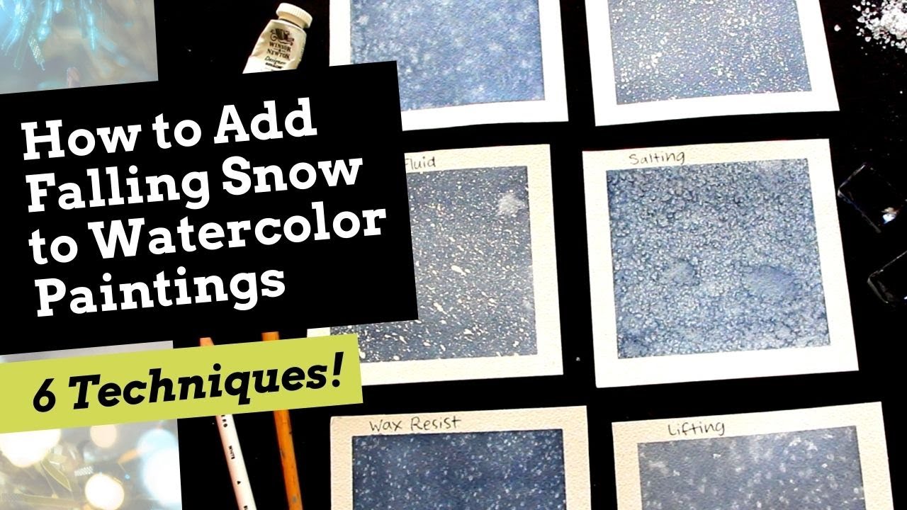
Falling snow is not painted the same way as settled snow. It is scattered, small, and suspended in atmosphere. The techniques that work for settled snow (reserved paper, careful shadow washes) do not apply here.
3 methods produce falling snow, each with a different character:
- Spatter into wet wash: soft, diffused snowflakes with blurred edges. Best for heavy snowfall in atmosphere.
- Masking fluid dots applied before painting: hard-edged white flakes that stay perfectly sharp. Best for foreground snowflakes against dark backgrounds.
- White gouache spatter over dry painting: opaque flakes with texture. Best as a final pass for visible close snowflakes.
The Salt Texture Technique for Snow
Salt applied to a wet wash creates organic, crystalline patterns that read naturally as scattered snow or frost. The salt absorbs moisture and concentrates pigment around each crystal, leaving lighter irregular shapes as it dries.
Timing is specific. Apply salt when the paper surface has lost its shine but is still damp. Too wet and the salt dissolves completely. Too dry and the salt has no effect.
Table salt gives smaller, finer patterns. Coarse rock salt produces larger, more irregular shapes. Both work for salt texture effects. The choice depends on the scale of snowfall you want to suggest.
Toothbrush Spatter: Controlling the Density
Spatter technique for falling snow is easy to overdo. A painting covered with white spatter stops looking like falling snow and starts looking like noise.
Density control:
- Heavier spatter in foreground areas (closer snow appears larger and denser)
- Lighter, finer spatter in mid-ground
- Near-zero spatter in the sky and background
Test the spatter on scrap paper first and keep a piece of plain card nearby to mask off areas that should stay clean. The spatter technique connects to broader splattering in watercolor, where control of direction and density is as important as the technique itself.
How to Paint Snow Reflections and Light
Snow acts like a mirror. It reflects the sky, nearby trees, buildings, and any warm light source in the scene.
The color of reflected light on snow shifts constantly. According to American Watercolor, snow at sunset can shift entirely to yellow ochre as it reflects the color of the horizon, while midday snow under a blue sky reads as cobalt blue in the shadows.
How Sky Color Controls Snow Color
3 lighting conditions, 3 different snow palettes:
- Clear blue sky: cool blue shadows, paper-white highlights
- Overcast: muted neutral grey, softer edges throughout
- Golden hour / sunset: warm ochre or pink wash over snow surface, violet shadows
Learning the role of color in painting becomes especially useful here. Snow does not generate its own color. It borrows from everything around it.
The sky should always read darker in value than the snow in winter scenes, per learntopaintwatercolor.com’s analysis of common composition errors. Beginners consistently paint the sky too light, which collapses the contrast that makes snow read as luminous.
Glazing Technique for Color Temperature Adjustment
Glazing is how you adjust snow color after the base wash dries without overworking the surface.
Process:
- Let the snow base wash dry completely
- Mix a thin, highly diluted wash of the sky color
- Apply one flat pass across shadow areas only
- Stop. Do not rework.
The glazing technique in watercolor creates optical color mixing. The glaze tints without covering the paper white below, keeping the snow luminous rather than opaque.
Peerless Color Labs research confirms that highly transparent pigments produce glazes with depth and luminosity that opaque or semi-opaque paints cannot replicate. For snow glazing, always use single-pigment, transparent paints.
Warm Reflected Light in Foreground Snow
The foreground strip of snow, closest to the viewer, picks up reflected warmth from objects nearby.
A very diluted wash of Raw Sienna or Yellow Ochre applied wet-on-dry to the near foreground separates the snow spatially from the mid-ground. It also creates the warm-cool contrast that gives winter scenes depth, noted by arttobasic.com’s analysis of granulating winter palettes.
Key ratio: warm notes should stay at 10-15% of the snow surface maximum. Any more and the scene stops reading as winter.
What Are the Most Common Mistakes When Painting Snow in Watercolor?
Snow mistakes cluster around 5 problems. All of them come down to the same root cause: treating snow like it needs to be painted instead of preserved.
Louise De Masi, whose work on watercolor error analysis is widely referenced in the field, identifies overworking as the single most destructive habit in watercolor, producing dull, lifeless surfaces that lose all pigment transparency. Snow is the subject where overworking shows fastest.
Using White Paint Instead of Reserved Paper
Applying white gouache or white watercolor over completed washes makes snow look chalky and separate from the rest of the painting.
White paint sits on top of the paper surface. Reserved paper glows through it. The visual difference is immediate and not fixable after the fact. Plan white areas before the first wash goes down, always.
Painting Shadows Too Dark Too Early
Shadow timing matters as much as shadow color. Dark shadows placed before the mid-tone structure is established flatten the snow immediately.
The correct sequence: pale base wash first (entire snow area, wet-on-wet), then mid-tone shadows after full drying, then deepest shadow accents last. Reversing this order compresses the value range and leaves no room for subtle light variation.
Craftsy research on common watercolor errors notes that going back into a damp wash with a watery brush creates back-runs that are nearly impossible to remove from snow areas without visible paper damage.
Ignoring Color Temperature Across the Snow Surface
Snow with no color temperature shift reads as white paper. Nothing more.
Even a single subtle temperature change separates a competent winter painting from a flat one. Watercolorpainting.com’s snow technique analysis confirms that clean water is non-negotiable when working on snow passages. Contaminated water introduces unwanted color casts that dull the lightest values beyond recovery.
Adding Too Much Detail to Snow Surfaces
Snow holds attention through value contrast and temperature, not through texture detail. Over-detailing snow pulls focus away from trees, figures, and architectural elements that are meant to read as the focal point.
Look at how Joseph Zbukvic handles snow in his winter street scenes: large, simple shadow shapes, minimal surface texture, value contrast doing all the spatial work. The snow reads as convincing precisely because it is underworked.
How Do Professional Watercolorists Approach Snow Scenes?
Professional approaches to snow painting share one consistent trait: restraint. Every working method described by established artists prioritizes simplicity over detail.
The global watercolor market was valued at $231.8 million in 2024 and is projected to reach $511.6 million by 2034 at an 8.5% CAGR, according to Global Market Insights. Professional artists drive the premium segment of that market, and their material and technique choices set the standard that filters down to serious amateurs.
Joseph Zbukvic’s Limited Palette Approach
Zbukvic developed 3 signature grey mixes in collaboration with Daniel Smith specifically for painting changing light conditions: cool grey, neutral grey, and warm grey. His reasoning: grey is expressive on its own, and light in winter is primarily tonal rather than colorful.
His documented painting process uses 2 layers maximum for snow passages. A faint sky wash first (what he calls “heaven and earth”), then major shapes placed on top after drying. He leaves the snow largely as reserved paper, working the surroundings dark to make the snow read light by contrast (American Watercolor).
Jean Haines and Atmospheric Wet-on-Wet
Jean Haines works directly onto pre-wetted paper without preliminary drawing, applying paint and letting water carry pigment into position. The Artist Magazine review of her book “Atmospheric Watercolours” describes the approach as entirely built around the wet-on-wet technique.
For winter scenes, this method produces the soft, diffused edges between sky and distant snow masses that atmospheric perspective requires. Edges in far snow are always softer than edges in near snow. Her approach achieves that automatically through timing and water control.
Key takeaway from Haines: pre-wet paper always. Do not mix color on the palette and then apply to dry paper when painting atmospheric snow sky transitions.
Ron Ranson’s Hake Brush Method
Ron Ranson built a teaching career around fast, loose watercolor landscape work using the hake brush, a wide flat brush with ultra-soft natural hair that holds large volumes of water and paint (ProArte Brushes).
| Artist | Core Snow Method | Key Tool |
|---|---|---|
| Joseph Zbukvic | Maximum of two layers, prioritizing tonal value over color complexity | Limited grey palette from Daniel Smith |
| Jean Haines | Pre-wetted paper with no preliminary drawing | Round brush with direct wet-on-wet application |
| Ron Ranson | Fast, loose washes with broad sky-to-ground coverage | ProArte hake brush |
All 3 approaches share the same value principle: the sky reads darker than the snow surface. The snow holds the lightest value in the entire composition. Everything else in the scene is darker.
How to Fix Snow Areas That Have Gone Wrong
Recovery is possible in most cases, but the method depends entirely on whether the paint is wet, damp, or fully dry. Getting the timing wrong when lifting makes the damage worse.
Watercoloraffair.com’s analysis of lifting methods confirms that hot press paper lifts more cleanly than cold press, and 100% cotton paper handles scrubbing better than cellulose without pilling or tearing (Mary Moreno Studio).
Lifting Wet Paint for Soft Corrections
Act immediately. Wet lifting gives the softest results with the least paper damage.
- Clean dry brush: blot gently, do not scrub
- Crumpled tissue: press and lift, repeat
- Clean damp brush: sweep lightly across the area to lighten
The lifting technique in watercolor works on the same logic as all watercolor corrections: faster is cleaner. Once paint begins to dry at the edges, lifting creates hard rings around the lightened area.
Scrubbing Dry Areas for Snow Recovery
Use a damp stiff synthetic brush. Work in small circles, blotting pigment away with a clean tissue after each pass.
Winsor and Newton scrubber brushes and similar short-bristle synthetic brushes are the standard recommendation. Soft hair brushes do not generate enough friction. Hard bristle brushes from oil painting damage the paper surface.
Repeat damp scrub and blot cycles until the area lightens sufficiently. Louise De Masi’s documented lifting method confirms that gentle back-and-forth motion with a damp brush, followed by immediate tissue blotting, removes significant pigment from dry areas without tearing cotton paper.
White Gouache as Last Resort
White gouache over damaged snow areas is a visible fix, not an invisible one. Use it only when other methods fail.
Appropriate uses: small branch tip highlights, lost fine edge lines, scattered snowflake details over dark backgrounds.
Avoid: large snow fields, shadow area corrections, or any area where the transparent watercolor layers below need to stay visible. Opaque white over large areas produces flat, chalky passages that break the cohesion of the surrounding transparent washes.
Knowing when to start over is also a real option. A failed snow ground that has been overworked past recovery is not worth continuing. 300gsm cotton paper is the minimum weight that survives repeated lifting attempts without surface degradation. Student-grade cellulose below 140lb begins to pill after 2-3 scrubbing passes, making any further correction impossible.
FAQ on How To Paint Snow In Watercolor
Do you use white paint to paint snow in watercolor?
No. Snow is painted by preserving the white of the paper. You work around snow areas, leaving them unpainted. White gouache is a last resort for small details only. Applying white over completed washes produces a chalky, opaque result that kills transparency.
What colors do you mix for snow shadows?
Snow shadows lean cool. Ultramarine Blue mixed with Payne’s Grey covers most conditions. Add a touch of Quinacridone Violet for deeper shadows under clear winter light. Keep every mix highly diluted and transparent. Opaque shadow washes flatten snow immediately.
What paper is best for painting snow in watercolor?
Use cold press paper at 300gsm (140lb) minimum. Lighter paper buckles under wet washes, pooling pigment across snow areas. Cold press texture creates natural broken edges that mimic real snow. Arches and Saunders Waterford are reliable choices for professional results.
How do you paint soft snow shadows?
Use the wet-on-wet technique. Pre-wet the snow area with clean water, then drop in a diluted cool wash while the surface is still damp. The pigment spreads softly without hard edges. Work quickly. Once the surface starts drying, the edges lock in place.
How do you paint snow on tree branches?
Load a fan brush lightly and drag it sideways across cold press paper. The paint catches only the raised texture, leaving irregular broken shapes. Add a thin cool shadow wash underneath each clump. The shadow gives the snow its rounded, three-dimensional form.
How do you paint falling snow in watercolor?
3 methods work: spatter masking fluid dots before painting for sharp white flakes, spatter clean water into a wet wash for soft diffused flakes, or add white gouache spatter as a final pass. Test density on scrap paper first. Overloading the scene is the most common error.
Why does my watercolor snow look flat and chalky?
Two causes. Either white paint was applied instead of reserving paper, or shadow color temperature was ignored. Snow with no cool blue or violet in the shadows reads as white paper, not snow. Add even a subtle temperature shift and the surface immediately reads as dimensional.
How do you fix overworked snow areas in watercolor?
For wet paint, blot gently with a clean dry brush or tissue. For dry areas, use a damp stiff synthetic brush in small circular motions, blotting pigment after each pass. Repeat until the area lightens. Avoid scrubbing hard. Cotton paper survives 2-3 careful passes before the surface degrades.
Should snow be the lightest value in a winter watercolor painting?
Yes. Snow holds the lightest value in the entire composition. The sky reads darker than the snow surface. This is the value structure that makes snow appear luminous. Beginners consistently paint the sky too light, which collapses the contrast and makes snow look like bare paper.
What is the best watercolor technique for painting a snow-covered landscape?
Plan white areas first. Apply a wet-on-wet base wash for soft ground shadows. Let it dry fully before adding hard shadow edges wet-on-dry. Two passes maximum. Reference Joseph Zbukvic’s approach: simple large shadow shapes, reserved paper for snow, sky darker than snow throughout.
Conclusion
This conclusion is for an article presenting the full process of painting realistic snow in watercolor, from reserved paper whites and transparent shadow washes to dry brush texture, falling snow techniques, and recovery methods.
Snow rewards restraint. Two passes of wet-on-wet shadow color, a cool blue-violet mix, and a darker sky value do more than any amount of detail work.
Study how artists like Joseph Zbukvic handle winter watercolor landscapes: simple shapes, tonal contrast, no white paint. The paper does the work.
Get the color temperature right, keep your water clean, and stop before it feels finished.
That is where watercolor snow becomes convincing.