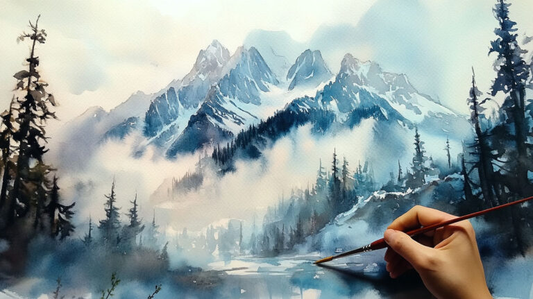
Glazing is the reason some watercolor paintings glow from the inside out, while others just look flat.
The glazing technique in watercolor painting is the process of layering thin, transparent washes of paint over fully dried washes beneath. Each layer stays separate, mixing optically rather than physically, which gives the final result its depth and luminosity.
It is one of the most useful methods in watercolor painting materials and practice, and one of the least understood by beginners.
This article covers how glazing works, which pigments suit it, how paper and drying time affect the outcome, and where working artists actually apply it.
What is Glazing in Watercolor Painting

Glazing is the process of applying thin, transparent layers of watercolor paint over a fully dried wash. Each layer sits on top of the previous one without physically mixing with it.
The result is optical color mixing, where colors blend visually rather than on a palette. Light passes through each transparent wash, bounces off the white paper, and travels back through all the layers to your eye. That process is what gives glazed paintings their depth and inner glow.
It is one of the defining watercolor painting techniques, and honestly one of the trickier ones to get right at first. Most beginners confuse it with simple layering or wet-on-wet work, but glazing is its own distinct approach.
| Technique | Surface Condition | Result |
|---|---|---|
| Glazing | Bone Dry: The bottom layer must be 100% dry to prevent the colors from mixing physically. | Optical Depth: Creates a “stained glass” effect where the eye sees a third color (e.g., Blue over Yellow = Luminous Green) while maintaining crisp edges. |
| Wet-on-Wet | Active Moisture: The paper is pre-saturated, creating a “liquid highway” for the pigment. | Soft Blooms: Paint diffuses organically into “lost edges,” perfect for misty atmosphere or soft-focus backgrounds. |
| Flat Wash | Dry/Primed: Applied to dry paper with a large, fully-loaded brush. | Uniformity: A single, even “sheet” of color with no visible brushstrokes or layering shifts; the standard for “clean” design. |
The global fine art watercolor paints market was valued at over $3.67 billion in 2024 and is projected to reach $5.48 billion by 2031, growing at a CAGR of 6.9% (Proficient Market Insights). That growth reflects a genuine resurgence of interest in watercolor methods, glazing included.
Glazing works because watercolor painting is built on transparency. The paint medium itself makes this possible in a way that oil or acrylic simply cannot replicate without additives.
How Glazing Works Optically

The white paper beneath your paint acts as the light source. This is the key physical principle behind the whole technique.
Light enters from above, travels through the first transparent wash, hits the paper surface, and reflects back upward through every layer stacked above it. Each glaze absorbs some wavelengths of light and lets others pass through. By the time that reflected light reaches your eye, it has been filtered through multiple pigment layers, each contributing to the final perceived color.
This is subtractive optical mixing, and the result looks fundamentally different from mixing the same colors together on a palette. Palette mixing combines pigments physically, which tends to neutralize and dull them. Glazing keeps each pigment working independently.
The Watercolor Academy explains it well: optical mixing produces different hues depending on which color sits on top, and the result will always differ from mechanical mixing of the same paints.
Why this matters in practice: a glazed violet built from Quinacridone Rose layered over Phthalo Blue looks noticeably more luminous than a violet mixed directly on the palette. The layered version has visual depth. The mixed version looks flat.
Understanding color theory is genuinely helpful here. Knowing how complementary colors interact across layers lets you predict whether a glaze will add depth or push a color toward neutral.
What Subtractive Mixing Looks Like Across Layers
Warm over cool: a yellow glaze over a dried blue wash tends to produce a luminous green with warmth at the surface.
Cool over warm: a blue glaze over orange creates a desaturated, shadow-like tone, useful for building atmospheric depth.
Complementary glazing: layering colors directly opposite on the color wheel neutralizes both, which is exactly what you want when building realistic shadow areas.
The order of your layers changes the outcome. That is not obvious until you have tested it a few times on scrap paper.
Transparency vs. Opacity in Glazing

Not all watercolor pigments are suitable for glazing. This is where most beginners run into trouble, and where paint brand matters more than people expect.
Transparent pigments let light pass through cleanly. Opaque or granulating pigments block or scatter light, which disrupts the optical mixing effect and often muddles the color beneath.
| Pigment | Transparency | Glazing Suitability |
|---|---|---|
| Quinacridone Rose (PV19) | Transparent | Excellent: A vibrant primary that creates glowing purples and oranges when layered. |
| Phthalo Blue (PB15) | Transparent | Excellent: Extremely high tinting strength; creates deep, luminous shadows without becoming “muddy.” |
| Quinacridone Gold (PO49) | Transparent | Excellent: The “golden hour” pigment; adds a warm, sun-drenched glow to any dry layer beneath it. |
| Cerulean Blue (PB35) | Semi-Opaque / Granulating | Poor: Because it contains heavier particles, it can look “chalky” when layered over other colors. |
| Naples Yellow (PBr24) | Opaque | Not Recommended: Acts like a “cover-up” paint; it will hide the colors underneath rather than blending with them. |
Winsor and Newton and Daniel Smith both use transparency symbols on their paint labels. A hollow square means transparent. A half-filled square means semi-transparent. A filled square means opaque. Check the label before you commit to a glazing palette.
Single-pigment paints are also worth prioritizing. Multi-pigment mixes bring more variables into the layering process and can behave unpredictably when glazed. Watercolor Academy recommends avoiding heavy pigment paints as underlayers specifically because the particles have a weaker grip on paper and can lift into the glaze above.
Using color saturation well depends on this transparency question. A glaze of the same or similar hue increases saturation and depth. A glaze of a complementary color reduces it, which is useful for shadow-building.
The Drying Requirement Between Layers
This is probably the most violated rule in glazing, especially among impatient painters.
Each layer must be completely dry before the next is applied. Not mostly dry. Completely dry. If any moisture remains in the paper fibers, a new wash applied over it will reactivate the pigment beneath, causing blooms, lifting, and muddy color bleed.
Drying Methods Compared
Air drying is the most reliable option. In a dry room at moderate temperature, a standard wash on 300gsm paper typically dries in 10 to 20 minutes. Humidity slows this significantly, sometimes doubling the wait time.
Heat gun or hair dryer speeds the process but introduces risks. Directing heat too closely can cause blooms as the drying is uneven. Hold the dryer at least 30cm away and keep it moving. Most working watercolor artists use a hair dryer regularly but test their layers by touch before committing to the next glaze.
Key signals your layer is dry:
- The paper feels cool and slightly cool to the touch but not cold or damp
- The wash looks slightly lighter than when wet
- No visible sheen under a raking light
Paper weight matters here. Most professional artists work on 300gsm (140lb) cotton paper as the standard minimum for layered work, according to multiple sources including Creative Bloq and Paul Rubens Shop. Lighter paper absorbs more water per layer and buckles more readily, which makes flat, even glazes harder to achieve.
The choice between cold press and hot press watercolor paper also affects drying time. Hot press dries faster due to its smoother, less absorbent surface. Cold press holds more water in its texture, extending drying time but also allowing the pigment to settle more fully before the next layer goes on.
Color Relationships Built Through Glazing
Glazing is not just a technical process. It is a color-building strategy.
Most painters who use it consistently are thinking in layers before they start. They know roughly what the final color relationship will look like three or four glazes in, even if the early layers look weak or disconnected on their own.
Building Shadows
Transparent shadows built through glazing have a quality that mixed shadows rarely achieve. The most common approach is to glaze a cool transparent color (Ultramarine, Phthalo Blue) over a warm base, or a warm transparent (Quinacridone Burnt Orange, Transparent Red Oxide) into cool areas. This creates color temperature contrast within the shadow, which reads as more visually convincing than a flat neutral gray.
Portrait artists, including those influenced by Joseph Zbukvic’s approach, frequently layer three to five glazes in shadow areas alone, each shift building a richer, more complex tone.
Building Greens and Earth Tones
Tube greens are notoriously difficult to control. Many experienced watercolorists build their greens through glazing instead. A yellow base wash glazed with Phthalo Blue produces a green that has visual depth and reflects the qualities of both pigments independently. It looks more natural than a pre-mixed green because it is more complex optically.
Earth tones work similarly. Glazing Quinacridone Gold over a cool gray underpainting creates a warm, textured neutral that is difficult to replicate any other way.
Understanding analogous color schemes is particularly useful when planning these kinds of glaze sequences. Staying within a narrow color family across layers maintains harmony while still adding depth.
Color theory knowledge is not optional here. It directly determines whether a glaze sequence builds toward the result you want or produces muddy, over-worked color.
Paper and Medium Considerations
The paper you choose is not a background decision. It directly determines whether glazing works at all.
Cotton fiber papers handle repeated wet applications far better than wood pulp alternatives. Cotton fibers are long and strong, which means the surface can be rewetted multiple times without pilling, tearing, or breaking down. For glazing specifically, this matters because each new layer introduces moisture that stresses the surface below.
Surface Texture and Glaze Behavior
Cold press has a textured surface that holds more pigment in its troughs. Glazes applied over cold press tend to settle unevenly in a way that can add visual interest, particularly in landscape work. The texture also slows the brush slightly, which can help control the paint application.
Hot press is smooth. Paint moves quickly and glazes lay down evenly and cleanly. It is better suited for detailed work and portrait glazing, where precise edge control matters. The Creative Bloq review notes that hot press paper is ideal for more layered approaches because color tends not to lift or change once dry.
300gsm is the practical minimum for serious glazing work. At 140gsm, paper buckles with even moderate water use and the surface degrades faster under multiple washes. Arches, Fabriano Artistico, and Saunders Waterford are among the most used cotton papers by professional artists working in layered watercolor.
Using Ox Gall
Ox gall is a traditional watercolor medium that reduces surface tension and helps paint flow more evenly. A small amount added to a glaze layer improves the spread of the wash without requiring more water, which keeps the dilution ratio stable. Most artists add just a drop or two per wash. Too much makes the paint behave unpredictably and can cause it to crawl away from certain areas of the paper.
It is particularly useful on hot press paper, where surface tension can cause glazes to bead up slightly rather than lying flat.
Glazing vs. Wet-on-Wet vs. Layering
Three techniques. All involve multiple paint applications. All produce completely different results.
Artists at every level mix these up, and the confusion costs them. Knowing which one to reach for, and when, is what separates controlled watercolor work from accidental results.
| Technique | Paper Condition | Edge Quality | Best For |
|---|---|---|---|
| Glazing | Bone Dry: Bottom layers must be 100% dry to ensure layers don’t physically mix. | Hard & Defined: Allows for overlapping shapes with sharp, translucent borders. | Building luminous color depth, creating “clean” shadows, and fine-tuning hues. |
| Wet-on-Wet | Active Moisture: Paper is pre-wetted to create a “liquid stage” for the paint. | Soft & Bloomed: “Lost edges” that blend seamlessly into the background or other colors. | Atmospheric skies, misty backgrounds, and soft-focus elements. |
| Basic Layering | Dry / Semi-Dry: Applied to a dry surface, often using thicker or more opaque paint. | Hard: Provides high contrast and clear silhouettes. | Adding final structural details, texture, and opaque “pops” of color. |
The real distinction between glazing and basic layering is transparency. Layering is just putting one coat over another. Glazing specifically requires transparent pigments, a diluted wash, and a dry surface underneath, all working together to produce optical color mixing.
Louise De Masi, watercolor artist, puts it plainly: glazing lets you adjust color and tone in an existing area without altering its underlying details, while wet-on-wet gives you spontaneous, fluid effects but almost no precision.
When Glazing Beats Wet-on-Wet
Glazing is less time-sensitive. Wet-on-wet gives you a narrow window before the surface dries, and that window shrinks in warm or dry conditions.
Glazing works better when you need:
- Precise color shifts in a specific area
- Control over where the color sits
- Shadow buildup without disturbing existing detail
Sarah Burns Studio notes that glazing is especially well-suited for beginners because it removes the time pressure that wet-on-wet creates.
When Wet-on-Wet Beats Glazing
Soft, atmospheric passages. Skies with gentle gradations. Water with subtle color shifts. These call for wet-on-wet.
Glazing will not help you when you want: fluid blending, soft edges, or the organic bloom effects that make backgrounds feel spacious and airy.
The two techniques are not rivals. Most finished watercolor paintings use both, planned deliberately for different areas of the composition.
Common Glazing Mistakes and How to Fix Them
Most glazing problems come down to three things: wrong pigment, wrong timing, wrong pressure.
Jackson’s Art Blog identifies the core issues well: applying a new layer before the previous one is fully dry, using multi-pigment colors that lose clarity, and overworking an area with too many brush passes. All three muddy the result in different ways.
Muddy Colors
Cause: opaque pigments blocking light, or glazing over a damp rather than dry layer.
The fix is usually not more paint. Stop. Let the area dry completely. Assess whether the muddiness comes from a pigment transparency issue or a timing issue, then address only that.
Multi-pigment tube colors are a frequent culprit. Winsor and Newton’s Cadmium Orange contains two pigments (PY35 and PR108), while Michael Harding’s version uses one (PO20). The single-pigment version glazes cleaner, according to Jackson’s Art Blog. Check your labels before building a glazing palette.
Lifting the Underlayer
This happens when the brush scrubs the paper surface instead of laying paint down gently.
Three rules that prevent it:
- Use a larger, softer brush than you think you need
- Load the brush fully so one pass covers the area
- Never go back over a stroke while the glaze is still wet
Staining pigments help here too. Colors like Quinacridone Red (PR209) and Dioxazine Purple (PV23) sink into the paper fibers and resist lifting when the next glaze is applied over them.
Over-Layering

Three or four glazes is usually the practical limit before colors start to darken beyond recovery.
Plan the glaze sequence before starting. Decide early which areas need the most layers and work light to dark, because you cannot reverse tonal value through glazing. More paint adds tone. Nothing removes it except lifting techniques, which carry their own risks.
Quick test before committing to a glaze: apply it on a scrap of the same paper. If the mix looks too strong, dilute it further. Going in pale is always safer because color can be added, but pulling it back is hard once it is down.
Glazing in Practice: What Painters Use It For
The technique is not an end in itself. It is a tool for specific visual problems.
Understanding what those problems are, and seeing how working artists use glazing to solve them, is more useful than a list of abstract rules.
Landscape Depth and Atmospheric Perspective
J.M.W. Turner used layering and glazing extensively to build the luminous atmospheric depth his landscapes are known for. Technical examination records from Cultural Heritage Science Open Source confirm he applied glazes in later stages of his watercolors, sometimes using his fingers, to deepen shadows and create soft transitions between sky, land, and water.
In landscape work, glazing handles atmospheric perspective effectively. Successive cool, desaturated glazes pushed over distant areas create the visual recession that makes space feel convincing. The effect is difficult to replicate with a single wash or with wet-on-wet work.
Typical glaze sequence for a landscape sky:
- Base wash of warm yellow or Naples Yellow (used sparingly, not for glazing)
- Glaze of transparent Cerulean substitute or Phthalo Blue once dry
- Final glaze of Quinacridone Violet in shadow areas only
Skin Tones in Portraiture
Realistic skin tones built through glazing have a quality that mixed flesh colors rarely match.
The standard approach: lay down a warm transparent wash (Quinacridone Gold or Transparent Red Oxide), let it dry fully, then layer cool shadows in Phthalo Blue or Ultramarine. The optical mixing across those two layers reads as a naturalistic, multi-dimensional skin tone rather than a flat color application.
Artists like Jean-Louis Morelle and Joseph Zbukvic use this kind of layered approach in portrait and figure work. The warmth and cool interact across layers rather than being physically blended, which preserves the color clarity of both pigments.
Want to push further with portraits? Understanding how to mix skin tones in different lighting conditions gives you a clearer plan for which glazes to stack and in what sequence.
Building Luminous Glow Effects
Backlit subjects. Candle light. Sunsets. These are situations where glazing earns its reputation.
The glow effect works because the white paper acts as the actual light source beneath your layers. Thin, warm transparent glazes over a preserved white area read as luminous because light is literally passing through the paint and reflecting back. No amount of opaque white mixed in will replicate that effect.
Key principle: the more layers you add, the darker and more saturated an area becomes. Plan the glowing areas first, reserve the paper white, and work outward from them. This is where understanding value scale in advance pays off directly in the glazing process.
Glazing also connects directly to how you create depth in a painting more broadly. The same optical principles that make glazed color feel three-dimensional apply across painting mediums, though watercolor glazing achieves it without any opaque paint at all.
FAQ on What Is Glazing Technique In Watercolor Painting
What is the glazing technique in watercolor painting?
Glazing is applying thin, transparent watercolor washes over completely dried layers. Each glaze mixes optically with the layers beneath rather than physically. The result is color depth and luminosity that flat, single-layer washes cannot produce.
How is glazing different from regular layering?
Regular layering can use any paint, including opaque pigments. Glazing specifically requires transparent pigments and a diluted wash so light passes through each layer and reflects off the white paper beneath. Transparency is what defines it.
Which watercolor pigments work best for glazing?
Single-pigment transparent colors like Quinacridone Rose, Phthalo Blue, and Quinacridone Gold. Check your paint label for a hollow square symbol, which indicates transparency. Avoid opaque pigments like Cerulean Blue or Naples Yellow.
How long should I wait between glazing layers?
Each layer must be completely dry before the next is applied. On 300gsm paper in a normal room, that is roughly 10 to 20 minutes. Humidity extends this significantly. Touch the paper lightly. If it feels cool or damp at all, wait longer.
Why do my glazed colors turn muddy?
Usually one of three causes: glazing over a damp layer, using opaque or multi-pigment colors, or overworking the brush. Muddy color in watercolor glazing almost always comes from a timing or pigment transparency issue, not technique.
Can I glaze with any watercolor paper?
Technically yes, but results vary. 300gsm cotton paper handles repeated wet applications without breaking down. Lighter wood pulp paper pills and buckles. For serious glazing work, cotton fiber paper is the practical minimum.
How many glaze layers can I apply?
Three to four layers is the practical limit for most pigment combinations before colors darken beyond recovery. Plan your sequence in advance. Each layer adds tone and shifts color. There is no reliable way to reverse it once it is down.
What is optical color mixing in watercolor glazing?
Light passes through each transparent layer, hits the white paper, and reflects back through all the layers to your eye. Each pigment filters different wavelengths. The color you perceive is the combined result of all layers, not a physical blend of paints mixed together.
Is glazing suitable for beginners?
Yes, actually more so than wet-on-wet work. Glazing is less time-sensitive because you work on dry paper with full control over placement. The main discipline required is patience between layers. The technique rewards slow, deliberate work rather than quick instinct.
What do artists use the glazing technique for?
Shadow building, skin tone layering in portraiture, atmospheric depth in landscapes, and luminous glow effects. J.M.W. Turner used glazing to build the atmospheric light his watercolor landscapes are known for.
Conclusion
This conclusion is for an article presenting the watercolor glazing technique as one of the most reliable methods for building color depth, tonal value, and luminosity in transparent paint layering.
The fundamentals are straightforward. Use single-pigment transparent colors, work on quality cotton paper, and respect the drying time between each wash.
Get those three things right and the optical color mixing does the rest.
Whether you are building gradation across a landscape, layering skin tones in a portrait, or pushing color contrast through complementary glazes, the process stays the same. Plan your layers, work light to dark, and trust the paper.
Glazing rewards patience. That is the whole technique, really.