The paper you choose matters more than most beginners expect. Wrong surface, and even good paint and solid technique fall flat.
The different types of watercolor paper vary by surface texture, fiber content, weight, and sizing. Each combination behaves differently the moment water hits it.
This guide covers everything you need to make a confident choice: hot press, cold press, and rough surfaces, cotton vs. wood pulp, paper weight, format options, and how sizing affects paint absorption and glazing technique.
By the end, you’ll know exactly which paper fits your painting style, your budget, and the kind of work you’re making.
What Is Watercolor Paper
Watercolor paper is a specialized paper built to absorb water without warping, tearing, or letting pigment bleed. It handles large amounts of liquid in a way regular printer or sketch paper simply cannot.
Regular paper buckles badly when wet. The fibers aren’t built for it. Watercolor paper, by contrast, is made from either cotton fibers, wood pulp, or a mix of both, with sizing added to control how fast paint soaks in.
Sizing is applied either internally (during manufacturing) or on the surface afterward. It acts as a barrier between the paper fibers and your paint. Without it, pigment would soak in immediately and be impossible to move or lift.
The global watercolor market was valued at USD 231.8 million in 2024, with watercolor papers specifically valued at around $380 million in 2023 (Business Research Insights). Interest in the medium keeps growing.
Three things define every sheet of watercolor paper: fiber content (cotton vs. wood pulp), surface texture (hot press, cold press, or rough), and weight (how much water it can hold before warping). Get those three right for your technique, and everything else becomes much easier.
Most watercolor instructors teach with watercolor painting in mind as a complete system, where paper choice is just as important as paint quality or brush selection.
Paper Weight and What It Changes
Paper weight tells you how thick a sheet is and, more practically, how much water it can absorb before it warps. It’s measured in pounds (lb) or grams per square meter (gsm).
The three standard weights are 90 lb (185 gsm), 140 lb (300 gsm), and 300 lb (640 gsm). Each one behaves differently the moment water hits it.
| Weight | Behavior When Wet | Stretching Needed? | Best For |
|---|---|---|---|
| 90 lb (185 gsm) | Buckles Quickly: Acts like standard paper; expands and ripples as soon as water hits it. | Yes, Always: Must be taped down to a board to remain even remotely flat. | Student practice, light sketches, and “dry” watercolor pencil work. |
| 140 lb (300 gsm) | Moderate Warping: The industry standard; handles washes well but will “hill” under heavy water. | Recommended: Stretching ensures a professional, flat finish for final pieces. | Everyday professional use, e-commerce product art, and standard commissions. |
| 300 lb (640 gsm) | Rigid: Feels like thick mat board; absorbs massive amounts of water without moving. | Rarely: Can be painted on directly without any preparation or taping. | “Mega-washes,” professional gallery work, and heavy mixed-media applications. |
90 lb paper is the cheapest option and dries almost instantly. It buckles the moment you apply a wet wash. You have to tape or stretch it before painting, which adds time and friction to your workflow.
140 lb is the standard most artists default to. It handles repeated wetting well and can usually take wet-on-wet technique without needing to be stretched first. Brands like Arches and Fabriano Artistico both offer strong 140 lb options.
300 lb paper behaves almost like a board. It can sit on your table and take wash after wash without moving. No stretching, no tape. The tradeoff is price. A block of 300 lb cotton paper costs noticeably more than its 140 lb equivalent.
Weight also affects drying time. Heavier paper holds more water, so layers stay workable longer. That extra open time matters a lot for wet-on-wet blending and for artists who work slowly.
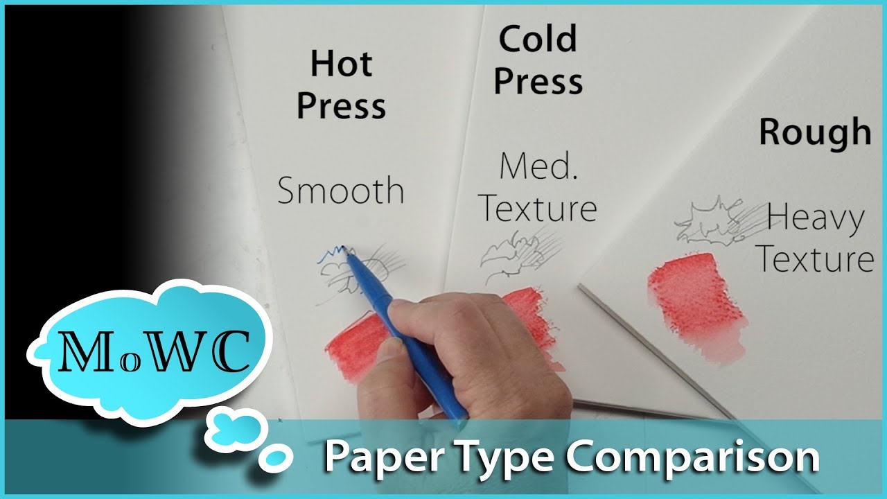
Hot Press Watercolor Paper

Hot press paper is made by pressing the sheet through heated metal rollers. The result is a very smooth, hard surface with minimal texture.
Surface behavior: Paint dries fast on hot press. Water tends to pool in low spots and move around freely rather than settling into paper texture. Brushwork stays sharp and visible.
- Best for detailed illustration, botanical art, and pen-and-wash work
- Shows every brushstroke clearly, including mistakes
- Less forgiving for wet-on-wet technique
- Hard to correct errors once paint sets
Brands worth trying: Fabriano Artistico Hot Press, Arches Hot Press, Strathmore 500 Series.
Hot press is where most botanical illustrators work. The smooth surface lets them paint fine lines and delicate details that would get lost in the texture of cold press. [Famous watercolor paintings across history show the variety of effects achievable just by changing paper surface.]
One real frustration with hot press: water blooms. The smooth surface doesn’t grip water the way cold press does, so any backwash or wet edge left unattended can create cauliflower rings. You have to stay on top of your edges.
Cold Press Watercolor Paper
Cold press is the most widely used surface in watercolor. Ask any group of artists what paper they paint on, and most will say cold press without hesitation.
According to Etchr Lab’s material testing, 50% cotton cold press paper performs closer to 100% cotton than to wood pulp paper in paint vibrancy and handling. The medium texture of cold press comes from pressing the sheet through cold felt rollers, leaving an uneven but consistent grain across the surface.
Why most instructors default to cold press:
- Holds water longer than hot press, giving more blending time
- Paper texture physically grips pigment, reducing accidental blooms
- More forgiving for corrections and lifting
- Works for wet-on-wet, glazing, loose washes, and most general techniques
- Available from every major brand at student and artist grade
Common brands: Arches Cold Press, Fabriano Artistico, Canson Montval, Winsor and Newton. The difference between a cold press sheet from Arches versus Canson Montval is real. The Montval is wood pulp, the Arches is 100% cotton. Both are cold press. Both look similar in a photo. They paint completely differently.
Cold press is also the safest default for en plein air painting, where conditions change fast and you need a surface that holds up to reworking on the spot.
Rough Watercolor Paper

Rough paper has the most pronounced surface texture of the three types. It goes through minimal pressing during manufacturing, leaving heavy, irregular peaks and valleys across the sheet.
The texture does something specific: paint catches on the raised peaks and skips the valleys. That skip creates natural granulation, broken edges, and dry brush effects without any extra technique required. For landscape painting, it’s hard to beat.
Rough press strengths vs. limitations:
| Strong For | Weak For |
|---|---|
| Landscapes & Seascapes: The pits in the paper perfectly mimic the texture of crashing waves, rocky cliffs, and distant foliage. | Fine Linework: Pens and small brushes will “stutter” over the bumps, making precision lines look shaky and inconsistent. |
| Dry Brush Technique: Essential for creating a “shimmering” light effect by only coating the peaks of the paper. | Flat, Even Washes: It is difficult to get a perfectly smooth, untextured sky; paint naturally settles in the “valleys.” |
| Natural Granulation: Amplifies the beauty of heavy pigments (like Cobalt or Ochre) as they settle into the deep tooth. | Portraiture: The heavy texture can make skin look aged or rough, making it difficult to achieve soft, “creamy” transitions. |
| Impressionistic Styles: Rewards a “loose” hand and helps the medium do half the textural work for you. | Botanical Illustration: High-detail work requiring exact leaf veins or petal textures is better suited for a smooth surface. |
Brands: Arches Rough, Saunders Waterford Rough, Langton Prestige. The texture varies between brands. Arches Rough is noticeably more aggressive than Saunders Waterford Rough. Worth testing both before committing to a large block.
[Impressionism painters would have loved rough press. The texture naturally produces the kind of broken, light-catching marks that define the style.]
One honest limitation: flat washes are tricky on rough paper. Getting a perfectly even wash across a large area is harder than on cold press because the texture causes the paint to settle unevenly. If flat color fields are part of your work, stick to cold press.
Cotton vs. Wood Pulp Paper
Cotton paper is made from long cotton fibers that are naturally almost pure cellulose with very little lignin. That makes them chemically stable and highly durable when wet.
Wood pulp paper is cheaper because wood is more available and easier to process. But wood fibers are shorter and contain lignin. Even after processing, enough remains to cause the paper to yellow and weaken over time.
Cotton paper has a lifespan of over 100 years (Faber-Castell). Wood pulp papers, even acid-free ones, are typically buffered with chalk to neutralize acidity for only 10-20 years (WetCanvas artist research).
Performance differences that actually matter in practice:
- Paint lifting: Cotton handles scrubbing without tearing. Wood pulp fiber breaks down under repeated wet-brush friction.
- Color vibrancy: Cotton gives richer, more saturated paint payoff
- Wet strength: Cotton stays strong when soaked through. Wood pulp weakens significantly.
- Archival quality: Cotton is acid-free and stable long-term. Wood pulp yellows.
100% cotton brands: Arches (founded 1492, still made in Lorraine, France), Fabriano Artistico, Hahnemuhle, Saunders Waterford.
Wood pulp brands: Canson Montval, Strathmore 300 Series, most student-grade pads.
The practical question is whether the work is archival or practice. For practice, daily sketching, or technique exploration, wood pulp is a perfectly reasonable choice. For finished work that needs to last, cotton is the only sensible option. Most professional famous watercolor artists work exclusively on 100% cotton paper for exactly this reason.
Watercolor Blocks, Pads, and Sheets

Watercolor paper comes in four physical formats: blocks, pads, individual sheets, and rolls. Each one affects your workflow differently, independent of paper quality.
Most professional artists default to blocks or full sheets. Pads are common for practice and travel work.
| Format | Binding | Stretching Needed? | Best Use |
|---|---|---|---|
| Block | All-Side Adhesive: Sheets are glued on all four edges to keep them taut. | No: The glue acts as a built-in “stretching” frame until the paint is dry. | Travel, plein air, and artists who want a professional “flat” finish without the prep. |
| Pad | Top/Spiral Bound: Sheets are easily removed for scanning or framing. | Yes: If using $140\,\text{lb}$ paper with heavy washes, the loose edges will buckle. | Daily practice, quick studies, and keeping sketches organized in a “book” format. |
| Full Sheets | Loose (Individual): Massive $22″ \times 30″$ sheets of high-quality cotton. | Yes/Tape Down: Requires a separate board and tape to manage the surface. | The most economical for professional work; can be torn to custom “odd” sizes. |
| Roll | Continuous: Typically $44″ \times 10\,\text{yards}$ of uninterrupted paper. | Depends: Mandatory for large washes; manageable for dry-brush abstracts. | Massive mural-sized pieces, panoramic landscapes, or cutting 100+ small study squares. |
Blocks are glued on all four sides, which keeps the paper flat while you paint. No tape, no stretching board needed. When you’re done, you slide a palette knife into the small gap at one edge and peel off the sheet.
Arches, Fabriano Artistico, and Saunders Waterford all offer artist-grade blocks. They cost more per sheet than pads or loose sheets, but the convenience is genuine, especially for outdoor work or travel.
Pads are bound on one side only. The paper can buckle when you apply heavy washes unless you tape the edges down to a board first. Artist-grade pads exist (Arches makes one), but the block version of the same brand typically performs better, since the binding method affects how the paper behaves under tension.
Full sheets (22″x30″) are the most cost-effective option for serious work. You buy a pack of 10 or 25 sheets and cut or tear them to whatever size you need. According to WetCanvas artist community research, full parent sheets typically work out to be the most economical format, especially for artist-grade cotton paper.
Worth knowing: preventing watercolor paper warping comes down largely to format choice and weight. A 300 lb block is almost always flat. A 90 lb pad in humid conditions is almost always not.
How Surface Sizing Affects Paint Behavior

Sizing is the part of watercolor paper that most artists never think about until something goes wrong. It controls how fast paint soaks in, how long you can work a wash, and whether lifting is even possible.
All watercolor paper has internal sizing added during manufacturing. It slows water absorption throughout the sheet and keeps the paper structurally strong when wet.
Surface sizing (also called tub sizing or external sizing) is applied after the sheet is formed and dried. The paper is dipped in a gelatin bath or coated directly. This outer layer is what you feel when you run a finger across a sheet of Arches: that slight drag is the surface gelatin.
What more surface sizing does:
- Paint stays workable on the surface longer
- Colors appear brighter and more saturated
- Lifting and glazing are easier
- Edges stay sharp, ideal for controlled technique
What less surface sizing does:
- Paint absorbs faster, creating softer, less defined edges
- Wet-on-wet effects spread more freely
- Correction and lifting become much harder
- Colors sink deeper and look slightly muted
This is why two “cold press 140 lb” papers from different brands can feel completely different to paint on. Canson Montval has less surface sizing than Arches. Both are cold press. The Arches sheet gives you noticeably more working time before paint locks in.
According to Erik Lundgren Watercolor research, a heavily sized paper produces bright colors with sharp edges, while a lightly sized paper results in softer contours. The same paint, same technique, different paper, different result entirely.
Arches has retained traditional gelatin sizing since 1826, when most other mills switched to cheaper rosin-based methods. Books sized with rosin began deteriorating quickly. Arches stayed with gelatin and became the reference for fine art paper as a direct result.
Understanding watercolor painting techniques properly means understanding sizing first. Wet-on-wet on a heavily sized sheet behaves nothing like wet-on-wet on a student-grade pad.
Student-Grade vs. Artist-Grade Paper

Student-grade paper is cheaper. Artist-grade paper performs better. The practical question is whether the difference matters for what you’re actually doing.
According to Createlet research, student-grade paper averages under $0.50 per sheet, while artist-grade cotton paper averages around $4.15 per sheet. That’s a real cost difference over time.
Student-grade paper: Wood pulp or pulp-cotton blend, less consistent sizing, not archival, tends to pill and tear under heavy scrubbing.
Artist-grade paper: 100% cotton, consistent sizing, acid-free, handles lifting, layering, and masking without surface breakdown.
Canson Montval is a commonly recommended student-grade option. It holds up reasonably well and is a good fit for daily practice or technique drills. But the surface behaves differently enough from Arches or Fabriano Artistico that habits learned on Montval don’t transfer cleanly to cotton paper.
A practical workaround: buy full 22″x30″ sheets of artist-grade cotton and tear them into smaller pieces. You get professional surface behavior at a lower cost-per-piece than buying pre-cut artist blocks. Both sides of the sheet are usable, which stretches the value further.
For finished work meant to last, cotton is the only sensible choice. For technique practice, color mixing tests, or daily sketching, student-grade is perfectly fine. The real mistake is using student-grade paper and then wondering why a specific technique isn’t working the way it should.
How to Choose the Right Watercolor Paper
The right paper comes down to three decisions: surface texture, weight, and fiber content. Get those three right and everything else follows.
According to Dick Blick’s buyer research, cold press is the default for 80% of watercolorists because its medium texture works across the widest range of techniques.
Match surface to your painting style:
- Hot press: illustration, botanical art, fine linework, pen-and-wash
- Cold press: general painting, wet-on-wet, glazing, most landscape work
- Rough: expressive landscapes, dry brush, heavy texture effects
Match weight to how you want to work:
- 90 lb: practice only, always stretch or tape down
- 140 lb: standard for most work, stretch for heavy wet techniques
- 300 lb: no stretching needed, best for heavy washes and professional finished work
Match fiber content to the purpose of the work: Cotton for archival, finished pieces. Wood pulp for practice, learning, and daily sketching.
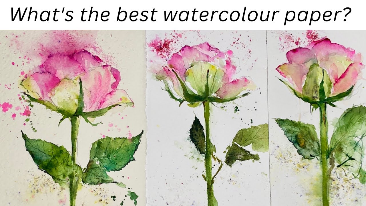
One honest suggestion: buy a few sample sheets from two or three brands before committing to a large block. Arches Cold Press and Saunders Waterford Cold Press are both 100% cotton, both cold press, and they feel noticeably different under a brush. Your preference for one over the other is legitimate, and you won’t know which it is until you try both.
Paper choice also varies by subject matter. Artists working in realism tend toward hot press for its detail capability. Painters working in looser, more expressive styles often reach for rough or heavily textured cold press instead.
Finally, the format question: blocks for travel and outdoor work, full sheets for studio work where cost matters, pads for practice. There’s no universally correct answer, just what fits how you actually paint.
FAQ on Types Of Watercolor Paper
What are the main types of watercolor paper?
The three main types are hot press, cold press, and rough. They differ by surface texture. Hot press is smooth, cold press has medium tooth, and rough has the most pronounced texture. Each suits different painting styles and techniques.
What is the difference between hot press and cold press watercolor paper?
Hot press has a smooth surface made by pressing sheets through heated rollers. Cold press uses cold felt rollers, leaving a medium texture. Cold press is more forgiving and widely used. Hot press suits fine detail and illustration work.
What watercolor paper weight should beginners use?
140 lb (300 gsm) is the standard starting point. It handles repeated wetting without heavy buckling and works for most techniques. Avoid 90 lb paper unless you plan to stretch or tape it down first.
Is cotton watercolor paper better than wood pulp?
Yes, for most serious work. Cotton paper handles scrubbing, lifting, and layering without tearing. It’s archival and stays stable when wet. Wood pulp paper is cheaper and fine for practice, but it pills under heavy technique.
Do I need to stretch watercolor paper?
Only if you’re using paper under 300 lb (640 gsm). Lighter paper buckles when wet. Watercolor blocks glued on all four sides eliminate stretching entirely. Full sheets need taping or stretching before use with heavy washes.
What is the best watercolor paper for beginners?
Cold press, 140 lb, either cotton or a quality wood pulp option like Canson Montval. It’s forgiving, widely available, and works across most basic techniques. Once your skills develop, move to 100% cotton artist-grade paper like Arches or Fabriano Artistico.
What does paper sizing mean in watercolor?
Sizing is a gelatin or synthetic coating that controls how fast paint absorbs into the paper. More sizing means longer working time and easier lifting. Less sizing means faster absorption and softer, harder-to-correct edges. It directly affects paint behavior on the surface.
What is rough watercolor paper used for?
Rough paper suits landscape painting, dry brush technique, and expressive, loose work. Its heavy texture creates natural granulation and broken edges. It’s not suited to fine detail, flat washes, or botanical illustration.
What is the difference between a watercolor block and a pad?
A watercolor block is glued on all four sides, keeping paper flat while you paint. A pad is bound on one side only. Pads need taping or stretching to prevent buckling. Blocks are more convenient, especially for outdoor and travel painting.
Which watercolor paper brands are considered artist grade?
Arches, Fabriano Artistico, Saunders Waterford, and Hahnemuhle are the most widely recognized artist-grade brands. All use 100% cotton. Arches has been produced at the same mill in France since 1492 and remains a top choice among professional watercolor artists.
Conclusion
This conclusion is for an article presenting the full picture of watercolor paper: surface texture, fiber content, paper weight, sizing, and format all work together to shape how your paint behaves.
Cold press remains the most practical starting point. But once you understand what separates cotton rag paper from wood pulp, or how internal sizing differs from surface gelatin sizing, you start making deliberate choices rather than default ones.
Rough paper for landscape. Hot press for botanical detail. Cold press vs. hot press is not just a preference, it’s a technique decision.
Buy a few sheets from different brands. Test them. Archival quality, wet strength, and paint absorption vary more between papers than most beginners expect.