Some painting mediums reward patience. Watercolor rewards decisiveness, and the artists who mastered it changed what the medium could do entirely.
From J.M.W. Turner’s atmospheric washes to John Singer Sargent’s bold, gestural brushwork, the most famous watercolor artists didn’t just paint well. They pushed the medium into territory that oil and acrylic couldn’t reach.
This guide covers the historical masters, the Asian ink wash tradition, key 20th-century figures, and the contemporary painters still working in watercolor today. It also covers where to study their work in person and what technically separates exceptional watercolor painting from merely competent work.
The Artists Who Defined Watercolor as a Fine Art Medium
For most of Western art history, watercolor was a secondary tool. Sketches, topographical drawings, preparatory studies. Not something serious painters pursued. A handful of artists changed that entirely.
Their collective output across three centuries shaped what we now consider the watercolor tradition. Each approached the medium differently, but all pushed beyond what came before them.
J.M.W. Turner

Turner left behind more than 30,000 works on paper, 300 oil paintings, and 280 sketchbooks, collectively known as the Turner Bequest, now held primarily at Tate Britain (American Watercolor, 2024).
He entered the Royal Academy at 14, making him the youngest painter ever to show there. His early training involved copying watercolors by earlier masters, which gave him a deep command of the medium’s technical range before he started breaking its conventions.
His Romanticism-era atmospheric washes of Venice and the Alps pushed toward something close to abstraction. Critics at the time weren’t always sure what to make of them. His 1840 Venice watercolors are still considered among the most technically daring works in the medium’s history.
In terms of auction value: a rediscovered Turner watercolor, “The Blue Rigi,” sold at Christie’s for nearly $11 million, setting a world record for a British work on paper at the time (Antiques and the Arts, 2006).
More than anyone else, Turner established watercolor as a legitimate fine art medium, on equal footing with oil painting. That was not a given before him.
John Singer Sargent
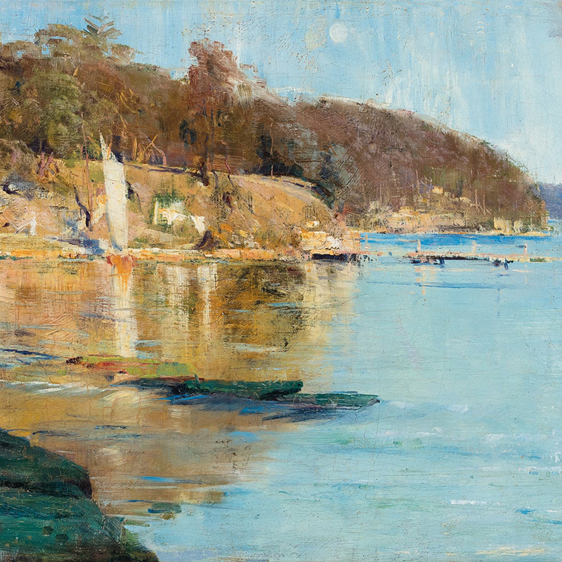
Sargent produced over 2,000 watercolors during his career, alongside roughly 900 oil paintings (Wikipedia). That output alone puts him in a category few artists reach in any single medium.
His watercolor approach was deliberately loose. Bold, dense strokes. Forms that are only approximately defined. When he showed watercolors in London, one critic called them “swagger” works. That’s actually a fair description.
His 1909 New York show consisted of 86 watercolors. The Brooklyn Museum bought 83 of them outright. The Museum of Fine Arts in Boston did the same with his 1912 exhibition. Both collections still form the two largest holdings of his watercolor work in the world.
Where Turner chased atmosphere, Sargent chased speed and spontaneity. You can see the decision-making in the marks. Nothing is overworked. He trusted his first read of a scene, and it mostly held up.
Winslow Homer

Homer didn’t start working seriously in watercolor until 1873, when he made his first pieces for public exhibition. Before that, he’d used it only for preparatory work and engravings (Britannica).
What followed was one of the most sustained and serious engagements with the medium in American art history. His marine and coastal subjects, especially works from the Bahamas and the Adirondacks, show a painter who understood how water behaves in paint as well as in nature.
In 1875 he quit commercial illustration entirely to survive on paintings and watercolors alone. That’s a real commitment to the medium, not a side project.
Homer’s approach contrasts sharply with Sargent’s. Where Sargent was fast and gestural, Homer was more structural. His value structures are tight. His compositions are deliberate. Both men are considered among America’s greatest watercolorists. Your preference between them probably says something about how you paint.
Albrecht Durer and Paul Cezanne
Two very different figures, but both matter to the story.
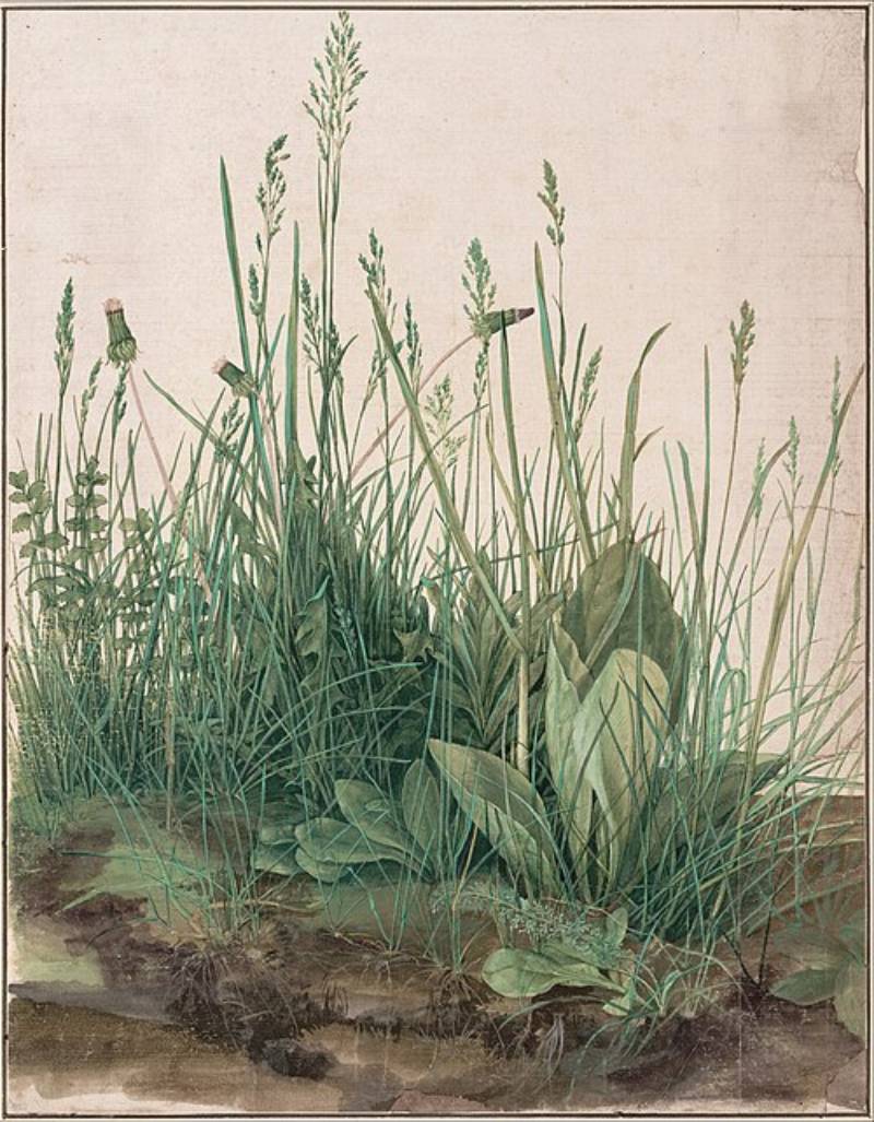
Durer (1471-1528) is considered among the earliest European artists to use watercolor as a fine art medium in its own right. His botanical and wildlife studies, including “Young Hare” and “The Great Piece of Turf,” showed a precision and commitment to the medium that was well ahead of his time. He worked three centuries before the English watercolor tradition emerged. His influence led directly to the founding of the first German watercolor school by Hans Bol.

Cezanne used watercolor differently, mostly as a structural planning tool alongside his oils. But his understanding of color theory and composition came through clearly in his watercolor output. His late Mont Sainte-Victoire watercolor studies, done while he was developing the ideas that would influence Cubism, show a painter thinking through space and structure with the medium rather than just recording what he saw.
Asian Watercolor Traditions and Their Key Figures
The Chinese and Japanese ink traditions predate the Western watercolor story by centuries. These aren’t parallel histories that happened to produce similar results. They are genuinely different approaches to water-based pigment on paper, shaped by different philosophical frameworks.
Western watercolor generally aims to describe. The ink wash tradition often aims to suggest.
Qi Baishi
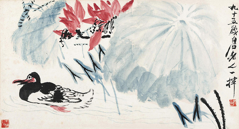
Qi Baishi (1864-1957) was born into a peasant farming family in Hunan Province, China. He became a carpenter at 14 and was largely self-taught as an artist, calligrapher, poet, and seal-carver. He is thought to have produced between 8,000 and 15,000 individual works over his career (The Collector, 2021).
His subjects are deceptively simple: shrimps, crabs, insects, fish, vegetables, flowers. The brushwork reads as casual. It isn’t. Each stroke is committed and calculated. You don’t get a second pass in ink wash painting, which is structurally similar to watercolor in that respect.
In 2017, his “Twelve Landscape Screens” (1925) sold at Poly Auction Beijing for $140.8 million, making him the first Chinese artist to break the $100 million mark at auction and placing him alongside Warhol, Picasso, and Van Gogh by market value (Artnet, 2017).
Despite working throughout the 20th century, Qi’s output shows no Western influence. He stayed entirely within the Chinese traditional painting framework, which makes his global auction standing all the more striking.
Hiroshige and Hokusai
Both are better known in the West for their woodblock prints, but their relationship to water-based pigment on paper shaped their entire visual approach.
| Artist | Period | Key Contribution | Watercolor Influence |
|---|---|---|---|
| Katsushika Hokusai | 1760–1849 | The Great Wave: Redefined the landscape as a dynamic, dramatic subject. | Graphic Precision: His use of bold outlines and flat, vibrant color blocks (especially Prussian Blue) inspired modern “clear line” illustration. |
| Utagawa Hiroshige | 1797–1858 | Edo Landscapes: Captured the poetic, quiet moments of daily Japanese life. | Bokashi (Gradients): His mastery of fading color inspired the “soft wash” and atmospheric blending techniques used in Western watercolor landscapes. |
Both artists belong to the Ukiyo-e tradition. Their influence on Western painters, particularly the French Impressionists, was substantial. Van Gogh copied Hiroshige prints directly. Monet’s garden at Giverny was partly inspired by Japanese aesthetic principles.
The connection between Japanese printmaking and Western watercolor is less direct than it looks on the surface. But the shared concern with economy of means, using the minimum marks needed to convey a scene, connects the two traditions more than the materials do.
How Eastern Traditions Shaped Western Watercolor
The influence ran in multiple directions by the late 19th century. Western artists studied Japanese prints. Japanese artists, particularly during the Meiji period, studied Western academic painting. What emerged from that exchange is visible in work from both traditions.
Key shared principles between ink wash and Western watercolor:
- Irreversibility of marks requires decisive execution
- White of the surface (paper or silk) functions as a color
- Negative space carries as much weight as painted areas
- Speed preserves freshness in both traditions
The en plein air painting movement that emerged strongly in France in the 1870s drew on some of the same ideas about immediacy and direct observation that had always been central to ink wash painting.
Famous Watercolor Artists of the 20th Century
By 1900, watercolor had shaken off its reputation as a minor medium. The 20th century brought a much wider stylistic range to the form, from tight American realism to loose European expressionism.
Artists across movements used watercolor not just as a secondary tool but as the primary means of working out their visual ideas.
Edward Hopper

Hopper is best known for large oil paintings like “Nighthawks.” His watercolors are a different experience entirely. Looser, faster, more observational. His architectural studies of New England buildings and Cape Cod landscapes show a painter genuinely enjoying the speed the medium allows.
He spent summers in Gloucester, Massachusetts, and Truro, Cape Cod, producing hundreds of watercolors over multiple decades. The Hopper watercolors at the Whitney Museum of American Art in New York represent one of the strongest collections of 20th-century American watercolor work held by any institution.
Paul Klee
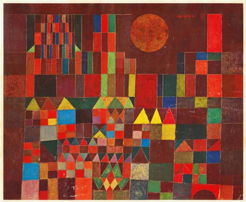
Klee used watercolor as a primary medium, not a secondary one. His connection to the Bauhaus, where he taught from 1921 to 1931, gave him a rigorous framework for thinking about color, line, and form.
His output was enormous: over 9,000 works in his career, many of them watercolor and ink on paper. He worked small, which suited the medium. His abstract color field pieces from the 1920s anticipate color field painting by several decades.
Klee’s approach to watercolor was systematic in a way that most watercolorists aren’t. He studied how colors behave in transparent layers, how warm and cool pigments interact when wet, and how the paper texture affects granulation. The paintings look playful. The thinking behind them was not.
Charles Demuth and Raoul Dufy
Two artists from the same generation with completely different approaches to the same medium.
Demuth worked in the American Precisionist tradition, using crisp edges and geometric structure in watercolor. His botanical series, particularly his studies of flowers and fruit, show a painter using the medium’s transparency as a design element rather than fighting it. His architectural industrial works, like “I Saw the Figure 5 in Gold,” show a harder edge than most watercolor allows. He worked carefully and deliberately, which is not the typical approach.
Dufy went the opposite direction. His watercolors are fast, loose, and exuberant. Coastal scenes, regattas, concert halls. He used the medium’s spontaneity fully. His calligraphic line work, often laid over loose color washes, is immediately recognizable. The Fauvist influence in his color choices is clear even when he’s working in a more descriptive mode.
Andrew Wyeth

Wyeth worked in both watercolor and egg tempera. His most famous works, including “Christina’s World” (1948), are tempera. But his watercolor output is substantial and often more emotionally direct than his finished tempera pieces.
He worked primarily in the Brandywine Valley of Pennsylvania and the Cushing, Maine area. His approach to the medium was tight by most standards, closer to Durer in precision than to Sargent in speed. The drybush technique he favored, dragging a lightly loaded brush across rough paper, produces a texture that suits his subjects: weathered barns, field grass, isolated figures.
Wyeth’s insistence on working from the same landscapes and people over decades gave his work a kind of depth that more varied subject matter usually prevents.
Contemporary Watercolor Artists Working Today
Watercolor is having a real moment right now. The fine art watercolor paints market was estimated at $3.67 billion in 2024 and is projected to reach $5.48 billion by 2031 at a CAGR of 6.9% (Proficient Market Insights, 2024). Some of that is driven by the art therapy trend. Some is social media. Either way, the medium is growing.
Contemporary practitioners are pushing the medium in directions the historical masters didn’t explore. Ultra-loose florals. Near-photographic portraits. Urban plein air work that rivals oil painting for complexity.
Alvaro Castagnet and Joseph Zbukvic
Both work in the plein air tradition, both teach internationally, and both are known for strong value structures in their urban and landscape subjects. They’re often mentioned in the same breath because their approaches share similar DNA, even though their marks look different.
Castagnet (Uruguayan-Australian) works with high contrast and intense color saturation. His street scenes, particularly his Spanish and South American work, use very dark darks and very light lights, with little middle ground. That takes confidence. Most watercolorists hedge toward the middle.
Zbukvic is slightly softer in approach but equally committed to capturing European cityscapes with minimum marks. He has said publicly that he aims to paint “not what is there, but what needs to be there.” That distinction matters in watercolor more than in most mediums.
Jean Haines
Haines is UK-based and has published several widely distributed books on loose, expressive watercolor, particularly floral subjects. She works with a very wet palette and minimal drawing, letting the paint find its own forms.
Her approach is difficult to execute but easy to describe: lots of water, minimal correction, trust the process. Sounds simple. It isn’t. The number of painters who have tried to copy her style and produced muddy results is substantial.
She has built a large audience through Instagram and YouTube, which reflects a broader shift in how contemporary watercolor artists reach collectors and students. The medium translates well to video because the process is visible and the results are fast.
Steve Hanks
Hanks (American, 1949-2015) worked in a hyper-realistic figurative style that pushed the technical limits of the medium. His figures, often women and children in natural light, are rendered with a precision that most viewers assume requires oil or acrylic.
He worked primarily on hot-press paper, which allows finer detail than cold-press. His glazing technique, building up transparent layers slowly over weeks, is closer to Flemish oil painting methods than to typical watercolor practice. The results are photographic in resolution but retain the luminosity that only watercolor produces.
Hanks is a good example of why “watercolor” as a category covers a much wider range of approaches than the term suggests.
Watercolor Illustration and Its Notable Artists
Fine art watercolor and illustration watercolor use the same materials but serve very different purposes. Illustration work is made to communicate a specific message, often within a narrative context, and is usually designed to be reproduced. Fine art watercolor is complete in itself.
That distinction shapes everything: the way marks are made, the level of detail, the relationship between image and text.
Beatrix Potter and N.C. Wyeth
Both are illustrators who produced watercolor work of a quality that sits comfortably in the fine art category regardless of its original purpose.
| Artist | Period | Style | Key Works |
|---|---|---|---|
| Beatrix Potter | 1866–1943 | Naturalist Precision: Combines rigorous scientific observation with whimsical character design. | The Tale of Peter Rabbit, extensive mycological (fungi) studies. |
| N.C. Wyeth | 1882–1945 | Cinematic Narrative: High-drama compositions with bold lighting and “larger-than-life” scale. | Treasure Island, The Last of the Mohicans, Robinson Crusoe. |
Potter’s pre-illustration work included highly detailed botanical and mycological studies submitted to the Royal Botanic Gardens, Kew. Her work on fungi was serious enough to be presented to the Linnean Society of London in 1897. The precision that went into those studies carried directly into her illustration work.
N.C. Wyeth (father of Andrew Wyeth) worked on a much larger scale. His illustration commissions for Scribner’s Illustrated Classics produced images that defined how generations of readers visualized those stories. His compositions owe a debt to Baroque drama, particularly in his use of chiaroscuro light effects.
Arthur Rackham
Rackham (1867-1939) worked in a very specific combination of precise ink line and loose watercolor wash. The line defines the structure. The wash gives atmosphere. It’s a technique that suits fairy tale and fantasy subjects because it feels simultaneously concrete and dreamlike.
His work for editions of “Peter Pan in Kensington Gardens,” “Alice’s Adventures in Wonderland,” and “A Midsummer Night’s Dream” set a visual standard for fantasy illustration that lasted for decades and still influences contemporary illustrators working in watercolor.
The collector market for original Rackham watercolors is strong. His finished book illustrations regularly appear at major auction houses and sell into the tens of thousands of pounds. That level of collector interest for illustration work, as opposed to fine art, is unusual and reflects how thoroughly his work transcends the illustration category.
How Illustration Changed the Perception of Watercolor
The commercial success of illustrated books in the late 19th and early 20th centuries brought watercolor in front of a mass audience in a way that gallery shows never could. Millions of people grew up with Rackham and Potter on their bookshelves. That familiarity shaped public understanding of what watercolor could do.
It also created a problem: watercolor became associated with children’s books, which reinforced its reputation as a minor medium relative to oil. Turner and Sargent had already elevated it. The illustration tradition temporarily pulled it back toward the decorative.
The tension between watercolor as a fine art medium and watercolor as an illustrative tool is still visible in how the medium is discussed and taught today. Most serious watercolor practitioners are aware of it, even if they don’t always address it directly.
What Separates Master Watercolor Artists from Competent Ones
Most people who struggle with watercolor don’t have a color problem. They have a value problem. Get the lights, mids, and darks wrong, and no color choice will save the painting.
The gap between someone who’s competent and someone who’s genuinely skilled comes down to a few specific technical habits. Not talent. Habits.
Value Structure Before Color
Professional watercolor painting demands purposeful brushwork that serves the composition, not tentative marks that reveal uncertainty (MOMAA, 2025).
The sequence that separates skilled from struggling:
- Plan your darks before mixing any color
- Work light to dark, never the reverse
- Reserve whites by leaving paper bare, not painting over with white
- Commit to each wash without going back in while wet
Overworking is the single most common mistake. Every return pass to a wet area lifts pigment, disrupts edges, and destroys the luminosity that makes the medium worth using at all.
Paper and Brush Knowledge
Cold-press paper grabs pigment in its texture and produces granulation. Good for landscape, loose florals, plein air work.
Hot-press paper is smooth. Paint pools and flows freely. Better for precise illustration, botanical work, and the kind of hyper-realistic figurative work Steve Hanks produced.
Brush choice affects outcome as much as technique. A mop brush holds huge volumes of water for large washes. A round brush with a fine tip handles everything from broad strokes to detail in a single tool. Most professional watercolorists work with fewer brushes than beginners assume, not more.
Speed and Decisiveness
Sargent’s loose brushwork and Zbukvic’s urban scenes share one thing: neither painter went back to fix. Both painted what needed to be there and stopped.
That isn’t carelessness. It’s the result of planning the painting mentally before touching the paper, understanding how the medium dries, and trusting that the white of the paper will do the work that other mediums require paint for.
Key distinction: Sargent used transparent washes for most of a piece, then added a few opaque dark accents near the focal point to create contrast. That restraint is what makes his watercolors read as effortless. The restraint is the technique.
Technique Comparison Across Masters
| Artist | Primary Technique | Paper Preference | Speed / Approach |
|---|---|---|---|
| J.M.W. Turner | Atmospheric “Scumbling”: Pioneered the use of heavy wet-on-wet washes to dissolve form into light. | Tinted / Textured: Often used blue or grey paper to establish a mid-tone “atmosphere” instantly. | Deliberate: Built complex “sublime” landscapes through multiple drying sessions and lifting. |
| John Singer Sargent | “Alla Prima” Gestures: Known for the “heroic” brushstroke where one mark represents a whole shadow or fold. | Rough / Heavy: Used the texture of the paper to “break” his brushstrokes for a spontaneous look. | Fast & Decisive: Painted with a “one-and-done” philosophy, avoiding overworking the surface. |
| Winslow Homer | Value Structure: Focused on the “architecture” of light and shadow to create rugged, powerful scenes. | Cold-Press: Preferred a surface that allowed for both broad washes and sharp, “stuttering” drybrush marks. | Moderate: A balanced approach that combined structural planning with energetic execution. |
| Andrew Wyeth | Precision Drybrush: Used nearly dry brushes to “knit” together thousands of tiny strokes for immense detail. | Rough: Relied on the heavy tooth of the paper to catch pigment for his signature weathered textures. | Slow & Methodical: Spent weeks on single pieces, building depth through incredibly controlled layers. |
| Albrecht Dürer | Scientific Realism: Treated watercolor like an ink drawing, using transparent glazes for botanical accuracy. | Smooth Vellum: Used ultra-fine surfaces to ensure not a single hair of texture interfered with his detail. | Highly Controlled: Every stroke was pre-planned to document the natural world with surgical precision. |
The range here is genuinely wide. “Watercolor technique” covers Durer’s botanical precision and Sargent’s gestural freedom. Both work. They just require entirely different mental approaches to the same materials.
What Overworking Actually Does
When you return to a wet or partially dry wash, you lift already-settled pigment and create muddy, uneven edges. The paper surface degrades from repeated abrasion. That roughened fiber holds subsequent washes differently than undisturbed paper, making the problem compound with each pass.
The fix isn’t better technique mid-painting. It’s better planning before the first mark. Artists like Alvaro Castagnet and Joseph Zbukvic both emphasize creating a value hierarchy before starting, identifying the biggest shapes and darkest darks first. That planning is what makes their apparent spontaneity possible.
Well, that and years of practice. The planning only works once you’ve made the mistakes enough times to know what you’re planning against.
Where to Study Famous Watercolor Works
Seeing original watercolors in person is genuinely different from seeing reproductions. The scale, the paper texture visible under raking light, the way pigment settles into cold-press tooth. Photography captures color but not surface.
These are the most significant collections for anyone serious about studying the medium’s history.
Tate Britain, London
Tate Britain holds the world’s largest collection of Turner’s work. The Turner Bequest, received by the British nation in 1856, includes tens of thousands of works on paper spanning his entire career (Fine Art Connoisseur, 2020).
The collection is described as “a museum within a museum” for its scale and depth. Beyond Turner, Tate Britain’s watercolor holdings cover the British tradition from the 18th century through the present, including work by William Blake, Thomas Girtin, and contemporary figures like Tracey Emin.
The Clore Gallery, added to Tate Britain in 1987, was built specifically to house the Turner collection in controlled light conditions that protect the works from fading.
Metropolitan Museum of Art, New York
The Met received a gift from Sargent’s sister in 1950 of 24 oils, over 300 drawings and watercolors, and four sketchbooks, forming the core of one of the finest Sargent holdings outside Boston (Metropolitan Museum of Art).
The Met’s watercolor holdings extend well beyond Sargent. Its American drawings and watercolors collection is one of the most comprehensive in the world, covering the full sweep of American watercolor painting from the 18th century forward.
For visitors specifically interested in famous watercolor paintings, the Met’s galleries covering American art and European drawings are worth separate visits. The works are not always displayed together, which makes planning useful.
National Gallery of Art, Washington D.C.
The NGA’s Winslow Homer holdings are among the most significant in the United States. A major 1995 survey drew 229 paintings, watercolors, drawings, and prints from the Gallery’s own collection, with 72 works selected specifically to illustrate Homer’s technique and working methods (National Gallery of Art).
The collection is strong across American watercolorists broadly, not just Homer. The Gallery’s drawings and prints department holds work spanning several centuries of watercolor production, accessible through the collection search online for those who can’t visit in person.
Brooklyn Museum and MFA Boston
These two hold the most important Sargent watercolor collections in the world, split between them by his own exhibition history.
The Brooklyn Museum bought 83 of Sargent’s 86 exhibited watercolors outright from his 1909 New York show. The Museum of Fine Arts in Boston did the same with his 1912 exhibition. The two collections were reunited for exhibition for the first time in 2013-2014, showing approximately 90 works together.
Practical note: Both collections are largely in storage when not on dedicated display. Check ahead if Sargent watercolors are specifically what you’re visiting for.
Google Arts and Culture and Digital Access
For works held at institutions you can’t visit physically, Google Arts and Culture provides high-resolution digital access to collections from Tate, the Met, the NGA, and dozens of other major institutions.
The limitation is the same one that affects all digital viewing of watercolor: surface texture and true color rendering are both lost. Useful for research and comparison, not for the experience of the actual work.
Recommended books for deeper study:
- “John Singer Sargent Watercolors” (MFA Boston/Brooklyn Museum, 2013) covers the joint collection with technical essays
- “Winslow Homer Watercolors” by Helen A. Cooper (National Gallery of Art, 1986) remains the most thorough catalog of Homer’s output in the medium
- “Turner’s Painting Techniques” by Joyce Townsend (Tate Gallery) draws on analysis of over 20,000 Turner watercolors in the Tate collection
At least in my experience, the catalog for a major retrospective is often better than a general survey book. The focus forces depth in a way that broad overviews rarely achieve.
Watercolor Painting Courses and Technique Resources
Beyond museum collections, learning from contemporary masters directly is more accessible now than at any point in the medium’s history. Alvaro Castagnet, Joseph Zbukvic, and Jean Haines all teach workshops internationally and have published instructional books.
If you’re working on technique specifically, understanding watercolor painting techniques in depth is worth doing alongside studying the masters. Knowing what Turner was doing with wet-on-wet or what Wyeth was doing with drybush changes how you read their finished work. The technical knowledge and the art historical knowledge feed each other.
The materials you start with also matter more in watercolor than in most mediums. Student-grade paint on the wrong paper produces results that have nothing to do with your skill level. Starting with at least mid-grade supplies gives you an honest read on where your actual technique needs work.
FAQ on Famous Watercolor Artists
Who is considered the greatest watercolor artist of all time?
J.M.W. Turner is most frequently cited. His atmospheric washes and loose brushwork redefined what the medium could do. John Singer Sargent and Winslow Homer are close rivals, depending on whether you prefer British Romanticism or American realism.
What makes watercolor harder than oil painting?
Mistakes are nearly impossible to hide. You work light to dark, you can’t paint over errors with white, and every mark is largely permanent once dry. The transparency of the medium means hesitation shows directly in the finished work.
Which famous artists used watercolor as their primary medium?
Turner, Sargent, and Winslow Homer all treated watercolor as a serious primary output, not just a sketching tool. Paul Klee produced over 9,000 works, many in watercolor. Qi Baishi worked almost entirely in ink wash painting throughout his career.
Did Picasso or Van Gogh use watercolor?
Both did, though neither is known primarily for it. Van Gogh used watercolor during his early Dutch period. Paul Cezanne used it consistently as a structural planning tool alongside his oils, particularly in his late Mont Sainte-Victoire studies.
What is the difference between watercolor and ink wash painting?
Ink wash uses black ink diluted with water, rooted in Chinese and Japanese traditions. Watercolor uses pigment in a gum arabic binder across a full color range. Both share the same core principle: the white of the paper functions as a color.
Who are the most famous contemporary watercolor artists?
Alvaro Castagnet, Joseph Zbukvic, and Jean Haines are widely recognized today. Steve Hanks pushed watercolor realism to near-photographic levels before his death in 2015. All four have taught internationally and published instructional books on their techniques.
What watercolor paintings are most famous?
Turner’s Venice series and Sargent’s travel watercolors are among the most studied. Winslow Homer’s Bahamas and Adirondack works are considered cornerstones of American watercolor painting. Albrecht Durer’s “Young Hare” remains one of the most recognized watercolor works from the Renaissance.
Where can I see original watercolor paintings by famous artists?
Tate Britain holds the world’s largest Turner collection. The Brooklyn Museum and MFA Boston split Sargent’s most important watercolor output between them. The National Gallery of Art in Washington D.C. holds a major Winslow Homer collection.
Is watercolor a respected fine art medium?
Yes, though it took time. Before Turner, watercolor was mostly used for topographical drawings and preparatory sketches. The English watercolor tradition of the 18th and 19th centuries, followed by Sargent and Homer, established it as a fully legitimate fine art painting medium.
What watercolor paper and brushes do professional artists use?
Most professionals use 300gsm cold-press paper from brands like Arches or Fabriano. Brush preferences vary widely. Sargent reportedly worked with large flat and round brushes. Many contemporary artists use a mop brush for washes and a single round brush for everything else.
Conclusion
This conclusion is for an article presenting famous watercolor artists across five centuries, from Albrecht Durer’s precise botanical studies to the loose expressive brushwork of contemporary painters like Alvaro Castagnet.
What connects them all is the same demand: commit to the mark, trust the paper, and stop before you overwork it.
The medium sits across fine art, illustration, and the Asian ink wash tradition. Each branch produced painters worth studying seriously.
Whether you’re building a watercolor painting practice or deepening your art history knowledge, the masters covered here offer a clear picture of what the medium can do at its highest level.
The best next step is seeing the original works in person.