A painting can have perfect color, flawless brushwork, and a subject that grabs you. But if the arrangement of elements on the canvas doesn’t work, none of that matters.
Understanding the types of composition in painting is what separates a picture that holds your attention from one you walk past in three seconds. Every compositional choice, from where you place the focal point to how you distribute visual weight across the picture plane, controls the viewer’s experience.
This guide breaks down each major composition type, from symmetrical and triangular arrangements to the golden ratio and radial layouts. You’ll see how painters like Vincent van Gogh, Vermeer, and Velazquez used these structures, and how to apply them to your own work.
What Is Composition in Painting?

Composition is how a painter arranges visual elements on the canvas. That includes line, shape, color, value, and texture, all organized within the picture plane to direct where the viewer looks and how they feel about the image.
A lot of people mix up composition with subject matter, and honestly, it took me a while to separate them too. Subject matter is what you paint. Composition is how you place it.
A bowl of fruit, a war scene, a portrait. The subject can be anything. But the arrangement of shapes, the distribution of visual weight across the space, the way your eye tracks from one area to the next? That’s composition doing the heavy lifting.
Leonardo da Vinci and Raphael didn’t just stumble into their picture layouts. Research from the National Gallery in London shows that Renaissance painters used ruled lines, geometric divisions, and measured axes directly on their panels before applying any paint. Raphael’s Garvagh Madonna begins with the panel divided into four equal parts, with the central vertical becoming the axis for the Virgin’s head and body.
The 2025 Art Basel and UBS Global Art Market Report found that paintings remained the most purchased medium among high-net-worth collectors, accounting for 36% of all art sales by category. Understanding how those paintings are structured matters if you’re going to make them or buy them.
Every composition type controls eye movement differently. Some lock your gaze into the center. Others pull it along a diagonal or spiral it outward. And the best painters, the ones whose work stays with you, understood how to use that control on purpose.
Symmetrical Composition

Symmetrical composition places equal visual weight on both sides of a central axis. Fold the painting in half and the two sides roughly mirror each other.
Simple idea. Hard to pull off without making everything look stiff.
Why Symmetry Works in Painting
Our brains process symmetric images faster than asymmetric ones. A 2022 study published in PsyCh Journal found a statistically significant 53% preference for golden ratio proportions, with the strongest responses triggered by images of humans and anthropomorphic sculptures. Symmetry taps into something automatic.
It creates stability, order, and a feeling of authority. That’s why religious art relies on it so heavily. Medieval altarpieces, Byzantine mosaics, and baroque ceiling paintings all use mirror balance to suggest divine order.
Symmetrical Composition in Practice
Leonardo’s The Last Supper is the textbook example. Christ sits at the exact center. The apostles are grouped in sets of three on each side. The architectural lines of the room converge behind Christ’s head, locking him into the focal point with mathematical precision.
Raphael’s The School of Athens uses flawless central perspective. Each figure balances across the composition’s middle axis, and the arched architecture frames the scene with near-perfect bilateral arrangement.
The National Gallery’s technical analysis confirms that painters like Raphael began by dividing panels into geometric sections with ruled lines and incised marks. Renaissance compositional planning was precise, not intuitive.
Limitations of Symmetrical Layouts
Symmetry can feel rigid. If every element mirrors perfectly, the painting risks looking static, almost sterile.
Sandro Botticelli recognized this problem. In The Birth of Venus, he placed Venus slightly off-center, leaning toward the right side of the canvas. Art historian Charles Bouleau identified Botticelli’s use of a musical ratio (the double diatessaron, or 9/12/16) rather than strict mirror symmetry to structure the piece.
The takeaway: symmetry gives you a strong foundation, but the best painters knew when to break it just enough.
Asymmetrical Composition
Asymmetrical composition distributes visual weight unevenly. Nothing mirrors. Instead, the painter balances the picture using differences in size, color intensity, value contrast, and placement.
A large, dark shape near the center can be offset by a small, bright object at the edge. The result feels more natural than symmetry. More like how we actually see things.
How Asymmetrical Balance Creates Tension
Edgar Degas built his reputation on asymmetrical layouts. His ballet scenes crop figures at the edges, leave large areas of empty floor space, and push subjects into unexpected corners of the canvas.
This wasn’t random. Degas studied Japanese ukiyo-e prints, which influenced how Impressionist painters handled off-center placement and cropped framing. The prints taught European painters that a composition didn’t need to be centered to feel complete.
Eye-tracking research published in the Journal of Eye Movement Research (2024) confirmed that compositional elements like leading lines and off-center placement significantly influence where viewers fixate their attention, even among people with no formal art training.
Asymmetry Across Painting Styles
| Style | Asymmetrical Approach | Key Painter |
| Impressionism | Uses cropped edges and off-center subjects to mimic a “snapshot” of life. | Edgar Degas |
| Romanticism | Relies on dramatic weight distribution and diagonal lines to create emotional tension. | Eugène Delacroix |
| Expressionism | Employs distorted proportions and uneven visual mass to convey inner psychological states. | Ernst Ludwig Kirchner |
| Traditional Chinese | Treats empty space (liubai) as an active element to balance natural flow. | Ma Yuan |
Traditional Chinese ink painting is probably the purest example of asymmetrical composition in art history. Blank areas aren’t empty. They represent the natural flow of energy, and they balance the painted elements through implied tension rather than matching visual weight.
Rule of Thirds Composition

Divide your canvas into a 3×3 grid with two vertical and two horizontal lines. Place the most interesting parts of your painting along those lines or at their intersections.
That’s the rule of thirds. And despite being one of the simplest compositional frameworks, it still works.
Origins of the Rule of Thirds
John Thomas Smith first described this approach in his 1797 text Remarks on Rural Scenery, writing about landscape painting and the distribution of light and dark masses. He wasn’t inventing something new. He was putting a name on what landscape painters had already been doing.
The idea builds on an older understanding: placing a subject dead-center makes the eye settle too quickly. Off-center placement creates a pull, a reason for the viewer’s gaze to move across the picture.
What Eye-Tracking Studies Actually Show

A study by Torabi and Teeravarunyou found that expert photographers were more sensitive to rule-of-thirds placement than novice viewers. Experts consistently preferred images composed along the grid, while novices responded to other visual cues like contrast and color.
Gaze-pattern research confirms that people don’t naturally fixate on the center of an image. Their eyes tend to track toward areas of high contrast and structural interest, which is exactly where the thirds grid positions key elements.
But here’s the thing. The rule of thirds is a starting point, not a law. Johannes Vermeer used it frequently in his interior scenes. So did many Impressionist landscape painters. But plenty of masterpieces break this rule entirely, and they work because the painter understood why the rule exists before choosing to ignore it.
Rule of Thirds vs. Golden Ratio
| Feature | Rule of Thirds | Golden Ratio (ϕ) |
| Grid Structure | Equal $3 \times 3$ divisions; simple horizontal and vertical lines. | Unequal segments based on the $1:1.618$ ratio (Golden Spiral or Phi Grid). |
| Complexity | Simple and fast to apply; standard in digital viewfinders. | Requires calculation or a trained instinct for organic proportions. |
| Focal Intersections | 4 points, evenly spaced and easy to identify. | 4 points, clustered more toward the center for natural flow. |
| Best For | Quick landscape snapshots and standard portrait layouts. | Complex multi-figure scenes and high-level architectural design. |
The two systems are close enough that some painters use them interchangeably. The golden ratio grid is a more refined version with slightly different intersection points, which we’ll get into next.
Triangular Composition

Triangular composition arranges the main subjects into a triangle shape within the picture plane. The apex usually sits near the top of the canvas. The base stretches across the bottom.
Renaissance painters used this structure more than any other. And it’s easy to see why.
Stability and Hierarchy Through Triangles
Triangles are inherently stable. A wide base and a pointed top create a sense of groundedness. In paintings with a single dominant figure, the triangle places that figure at the peak, creating visual hierarchy without needing any other tricks.
Raphael’s Sistine Madonna is a clean example. The Madonna stands at the top of the triangle, with the two saints forming the lower corners. The viewer’s eye goes to her first, then tracks down to the supporting figures.
Leonardo’s The Virgin of the Rocks follows the same structure. The Virgin’s head sits at the apex, and the children and angel form the base. Art historians from The Art Story note that High Renaissance artists were specifically concerned with presenting compositions of “symmetrical and compositional perfection,” and the triangle was their primary tool for achieving it.
Variations on the Triangle
Inverted triangles flip the structure. The widest part sits at the top, and the point drops toward the bottom of the canvas. This creates instability and tension, which is exactly the emotional effect some painters want.
Caravaggio played with inverted and tilted triangular arrangements in his dramatic biblical scenes. The subjects press against the edges of the canvas, and the triangular structure feels like it’s about to collapse, which matches the violence of his subjects.
Jackson’s Art Blog traces the evolution of triangular composition from Greek pottery through Renaissance painting, noting that Renaissance triangles “exist within and break beyond the constraints of the canvas, giving them greater narrative freedom” compared to earlier uses.
Diagonal Composition

Diagonal composition runs the dominant lines of a painting from one corner toward the opposite. Instead of the stable horizontals and verticals of symmetrical or triangular layouts, diagonals cut across the canvas at an angle.
The effect is immediate: energy, movement, and a strong sense of depth.
How Directional Lines Drive Drama
Peter Paul Rubens used diagonal arrangements in nearly every major work. His figures twist and lunge across the picture plane, and the viewer’s eye follows those lines from foreground to background without stopping.
The 2024 eye-tracking study in the Journal of Eye Movement Research found that leading lines, including diagonals, significantly influenced participants’ attention to key elements. Subjects with prominent directional lines produced longer fixation durations and fewer scattered saccades, meaning people looked where the painter wanted them to look.
Diagonal Composition in Baroque and Beyond
Eugene Delacroix, Liberty Leading the People: The flag rises at the apex, but the composition’s real power comes from the diagonal line of bodies stretching from the lower right to the upper left. The entire scene lunges forward.
Tintoretto’s biblical scenes: Figures cascade along steep diagonals, sometimes nearly vertical. The effect is theatrical and overwhelming, which was exactly the point during the Counter-Reformation when Baroque painters needed to shock viewers into emotional engagement.
Japanese ukiyo-e prints: Hokusai’s The Great Wave off Kanagawa uses a massive diagonal sweep that art historians have linked to both the golden ratio and diagonal composition principles. The wave curves across the frame at an angle that creates simultaneous tension and beauty.
When Diagonals Work Best
Action scenes. Battle paintings. Anything where the subject needs to feel like it’s in motion.
If you’re painting something that should feel calm, like a still life or a quiet interior, diagonals can work against you. They inject movement whether you want it or not. That’s a feature for Romanticism and Baroque work, but a problem for meditative or contemplative scenes.
Understanding when to use and when to avoid diagonal arrangements is part of learning to compose a painting effectively. The line itself isn’t good or bad. Context decides everything.
Radial Composition

Radial composition arranges all visual elements around a single central point. Everything either radiates outward from that center or converges inward toward it, like spokes on a wheel.
It’s the most focused composition type. There’s no ambiguity about where you should look first.
Where Radial Layouts Appear in Painting
Ceiling frescoes are the most obvious application. Andrea Pozzo’s ceiling at the Church of Sant’Ignazio in Rome uses radial composition to pull the viewer’s eye upward into a painted illusion of open sky, with figures spiraling outward from a central burst of light.
Michelangelo’s Sistine Chapel ceiling, covering 5,700 square feet, organizes its 343 figures and nine biblical scenes around a central axis that runs the length of the chapel (Britannica). The layout uses both linear and radial balance to manage an overwhelming amount of visual information.
Buddhist mandala paintings rely almost entirely on radial composition. The design radiates from a central spiritual figure, with concentric rings of pattern and color expanding outward in perfect symmetry.
Radial vs. Central Placement
Putting something in the center of a canvas isn’t the same as radial composition. That’s just centered placement.
The difference: in a radial layout, the surrounding elements actively point toward or move away from the center. The whole picture participates in the arrangement. In simple central placement, the subject sits in the middle and the rest of the canvas just fills in around it.
Raphael’s Galatea fresco uses a double radial structure. One set of figures swirls at the bottom, while three cherubs circulate independently at the top. Both radial patterns share the same compositional space without competing, because Raphael made sure the directional forces within each group remain separate.
Golden Ratio and Spiral Composition
The golden ratio is approximately 1:1.618. When you apply this ratio as a spiral, it creates a curved path that guides eye movement across the entire picture plane.
Painters have used it for centuries. Whether they always did it on purpose is another question entirely.
The Ratio in Practice
Salvador Dali deliberately built his Sacrament of the Last Supper (1955) on the golden ratio. The canvas itself measures 267 x 166.7 cm, forming a golden rectangle. A transparent dodecahedron, whose edges appear in golden ratio to one another, dominates the background.
According to mathematician Mario Livio’s analysis on Plus Maths, Dali was influenced by the works of Matila Ghyka and explicitly chose these proportions. He even stated that “the Communion must be symmetrical.”
Art historian analyses of Botticelli’s famous paintings like The Birth of Venus and Leonardo’s The Last Supper have identified golden ratio proportions throughout, though debate continues over whether this was intentional or coincidental.
Does the Golden Ratio Actually Work?
A 2022 study in PsyCh Journal tested this directly. Researchers showed 256 participants images at three different proportions: golden ratio, 1.5, and 1.8.
Result: a 53% overall preference for golden ratio proportions. The effect was strongest for images depicting humans and anthropomorphic sculptures, weaker for abstract geometric forms.
A 2007 Italian neuroscience study by Di Dio, Macaluso, and Rizzolatti found that viewing sculptures with golden ratio proportions activated the anterior insula, a brain region linked to emotional response. This activation was strongest when participants simply observed without being asked to judge.
So yes, it works. But it’s not magic. Stanford mathematician Keith Devlin ran experiments where students showed no consistent preference for golden rectangles when choosing shapes at random. Context matters more than the ratio alone.
Golden Ratio vs. Rule of Thirds: Quick Comparison
| Aspect | Golden Ratio (ϕ) | Rule of Thirds |
| Mathematical Basis | $1:1.618$ (Fibonacci-derived) | Equal division into thirds ($1:1$) |
| Focal Point Spacing | Slightly tighter toward the center (Phi Grid) | Evenly distributed across the frame |
| Learning Curve | Requires calculation, specialized grids, or practice | Immediate, intuitive, and built into most cameras |
| Historical Use | Renaissance, Baroque, and Surrealism | Photography, Impressionism, and modern landscapes |
Piet Mondrian wove golden ratio proportions into his geometric grid paintings to such a degree that art historians consider it a defining structural feature of his abstract work.
L-Shaped and U-Shaped Compositions
These are framing compositions. They use the edges and corners of the picture plane to create a structural container that draws the eye into the painting’s subject.
Less talked about than triangles or diagonals. Just as widely used.
L-Shaped Composition
Structure: A strong vertical element on one side of the canvas connects to a horizontal element along the bottom (or top). The two parts form an L-shape, creating a frame that opens into the middle of the painting.
Landscape painters lean on this one constantly. J.M.W. Turner and John Constable both used trees, cliff faces, or buildings as vertical anchors, with a river bank or path running horizontally across the lower portion of the canvas.
The L-shape works because it creates depth. The foreground framing pushes the viewer’s attention past the L and into the middle ground where the real subject sits.
U-Shaped Composition
Three sides of the picture hold visual weight. The fourth side stays open, creating a U-shaped frame that funnels the eye into a central focal area.
Pieter de Hooch’s courtyard scenes are textbook examples. Walls on three sides, an open doorway or courtyard at the center. The architecture does most of the compositional work, directing the viewer’s gaze through a carefully constructed opening into a deeper space lit by natural light.
The 2025 Art Basel and UBS Report noted that 66% of high-net-worth collectors bought works by newly discovered artists in the past year, up from 43% in 2022. Collectors are increasingly drawn to compositional techniques that feel less conventional, which gives framing compositions like L and U shapes fresh appeal among contemporary artists working in realism and representational painting.
How Painters Combine Multiple Composition Types

Most finished paintings don’t use one composition type. They stack several at once.
Layered Composition in Master Paintings
Diego Velazquez, Las Meninas: This single painting combines symmetrical framing (the room architecture), triangular arrangement (the central group of figures), diagonal eye movement (the viewer’s gaze tracking from foreground to the mirror in the back), and an L-shaped frame (the dark right-side wall meeting the floor).
It’s one of the most analyzed paintings in art history specifically because you can’t reduce it to a single compositional strategy.
Hokusai’s The Great Wave off Kanagawa layers diagonal composition (the wave’s sweep from lower left to upper right) with golden spiral structure (the curve of the wave itself) and framing composition (Mount Fuji visible through the opening beneath the crest).
Why Layered Compositions Work
Single composition: directs the eye along one path.
Layered composition: creates multiple reading levels. The viewer can scan the painting quickly and understand it, or study it slowly and keep discovering new structural relationships.
The Journal of Eye Movement Research (2024) found that images with multiple compositional cues produced longer total fixation durations than images with single compositional strategies. Viewers spent more time with complex compositions and reported higher aesthetic satisfaction.
Cubism, which Pablo Picasso and Georges Braque developed in the early 20th century, shattered the idea of a single compositional viewpoint altogether. Jackson’s Art Blog describes how Cubist painters broke subjects into fragmented planes, abandoning the linear perspective that had dominated European painting since the Renaissance. Every fragment became its own micro-composition within the larger picture.
How to Pick a Composition Type for a Painting

The composition you choose should match what you’re trying to make the viewer feel. Stability, tension, focus, calm, chaos. Each type does something different.
Matching Composition to Emotional Intent
| Emotional Goal | Best Composition Types | Why It Works |
| Stability & Authority | Symmetrical, Triangular | Even weight distribution and a solid “base” provide a sense of permanence and calm. |
| Energy & Action | Diagonal, Asymmetrical | Angled lines and unbalanced weight force the eye to move rapidly across the frame. |
| Focus & Intensity | Radial, Golden Spiral | Uses converging lines or a mathematical curve to funnel the viewer’s gaze toward a singular point. |
| Depth & Layered Space | L-shaped, U-shaped | Natural framing elements (like trees or doorways) push the gaze inward, creating a 3D window effect. |
| Complexity & Discovery | Layered (Multi-type) | By overlapping different systems, the artist rewards extended viewing with hidden details. |
If you’re painting a landscape, the rule of thirds or an L-shaped frame will usually serve you well. Portraits tend toward symmetrical or triangular arrangements. Narrative or action scenes respond best to diagonal lines.
Thumbnail Sketching to Test Compositions
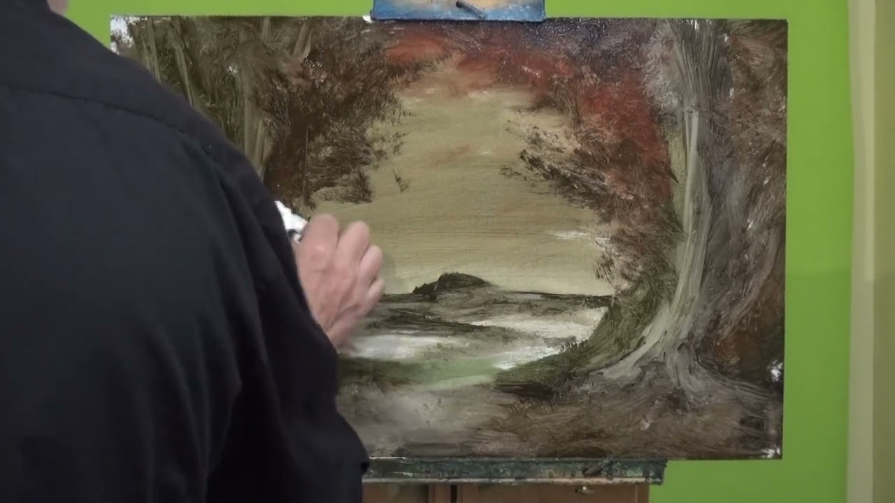
Before committing anything to canvas, sketch it small. Thumbnail sketches, roughly credit-card sized, let you test different compositional approaches in minutes instead of hours.
The RISD Museum’s guide to thumbnail sketching breaks it into three steps: map the basic shapes, note the light-dark value pattern, then add detail. Keeping them simple forces you to focus on the arrangement of masses rather than getting lost in surface details.
Artist John Lovett puts it well: “It is the strength of the composition that makes or breaks a painting, not accuracy, detail or technique.” Having a solid plan frees you up to take risks once you’re actually painting.
Composition Choices by Genre
Landscape: Rule of thirds, L-shapes, and golden spiral for panoramic views. Claude Monet favored asymmetrical layouts with off-center horizons, especially when painting his famous Impressionist works.
Portrait: Symmetry or triangular framing. Rembrandt van Rijn combined triangular composition with dramatic chiaroscuro lighting to create portraits that feel both stable and deeply emotional.
Still life: Triangular or asymmetrical placement. Paul Cezanne famously broke the rules by painting objects from slightly different viewpoints on the same canvas, which eventually led to the compositional fragmentation of Cubism.
Narrative and historical: Diagonals and layered compositions. Francisco Goya used extreme diagonal arrangements in his war paintings, creating chaotic, emotionally overwhelming scenes where composition itself becomes part of the horror.
The most common mistake? Defaulting to center placement because it feels safe. Painters at every level fall into this trap. Before you sketch before painting, try at least three different compositional layouts in thumbnail form. The best choice almost never turns out to be the first one you think of.
FAQ on Types Of Composition In Painting
What is composition in painting?
Composition is how a painter arranges visual elements like shape, color, and value within the picture plane. It controls where the viewer looks and how they experience the artwork. Subject matter is what you paint. Composition is how you place it.
What are the main types of composition in painting?
The main types include symmetrical, asymmetrical, rule of thirds, triangular, diagonal, radial, golden ratio spiral, L-shaped, and U-shaped. Most finished paintings combine two or more of these to create layered visual structure.
What is the rule of thirds in painting?
You divide the canvas into a 3×3 grid and place key elements along the lines or at their intersections. John Thomas Smith described this approach in 1797. It keeps subjects off-center, which naturally creates more visual interest than centered placement.
How does the golden ratio apply to painting composition?
The golden ratio (approximately 1:1.618) creates a spiral or grid that guides eye movement across the canvas. Salvador Dali’s famous paintings used this ratio deliberately, including building his Sacrament of the Last Supper on a golden rectangle.
What is triangular composition?
Subjects are arranged to form a triangle, usually with the apex at the top. Renaissance painters like Raphael relied on this for Madonna paintings and group portraits. The wide base creates stability, while the peak establishes clear dominance in composition.
What is the difference between symmetrical and asymmetrical composition?
Symmetrical composition mirrors elements equally across a central axis. Asymmetrical composition distributes unequal visual weight using differences in size, color, or placement. Symmetry feels formal and stable. Asymmetry feels dynamic and natural.
Which composition type works best for landscape painting?
The rule of thirds and L-shaped framing work best for most landscapes. Placing the horizon along a thirds line rather than dead center instantly improves a landscape painting. Golden spiral compositions also suit panoramic views with strong curved elements.
Can you combine multiple composition types in one painting?
Yes, and most master painters did exactly that. Velazquez’s Las Meninas layers symmetrical framing, triangular figure grouping, and diagonal eye movement simultaneously. Layered compositions create multiple reading levels that reward extended viewing.
What is radial composition in painting?
All elements radiate from or converge toward a central point, like spokes on a wheel. Ceiling frescoes and Buddhist mandala art use this structure heavily. It creates the strongest possible focal pull of any composition type.
How do I choose the right composition for my painting?
Match the composition to your emotional goal. Use symmetry for calm and authority. Use diagonals for energy. Use radial for intense focus. Always test options with thumbnail sketches before committing to canvas, trying at least three different layouts.
Conclusion
Every types of composition in painting covered here exists to solve the same problem: how to organize a flat surface so it holds a viewer’s attention. Symmetrical, diagonal, radial, golden ratio. They’re all tools, not rules.
The painters who made lasting work, from Henri Matisse to Edward Hopper, understood compositional structure deeply enough to bend it when needed. That’s the real skill.
Start with thumbnail sketches. Study how masters handled contrast, harmony, and spatial arrangement on their canvases. Test at least three different layouts before you commit.
Composition isn’t the flashy part of painting. But it’s the part that determines whether everything else you do actually lands. Get this right, and the rest follows.