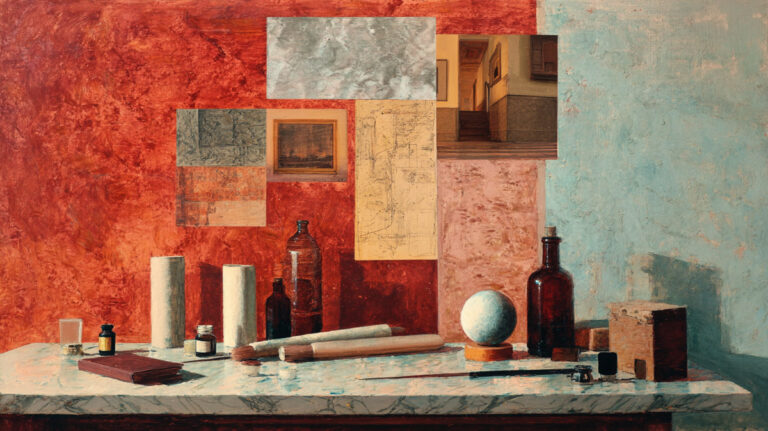
Composition in art is the difference between a painting that holds your attention and one your eyes slide right past. It is the arrangement of every visual element, from color and form to space and tonal value, into a structure that controls where the viewer looks and how they feel.
Every painting style in history, from Neoclassical masterworks to abstract canvases, relies on compositional decisions. This article breaks down how composition actually works, what principles drive it, and how to train your eye to use it better, whether you paint with oils, shoot photographs, or design on a screen.
What Is Composition in Art?

Composition is the arrangement of visual elements within a work of art. It determines where every line, shape, color, and texture sits relative to everything else in the picture plane.
That sounds simple. It is not.
Composition is the decision-making framework behind every painting, photograph, sculpture, and graphic design layout. It is not the subject matter. A portrait of a woman is the subject. Where that woman sits within the frame, how much space surrounds her, what pulls your eye first, that is the composition.
A 2024 eye-tracking study published in the Journal of Eye Movement Research confirmed that compositional techniques like leading lines directly influence where viewers focus their attention, how long they fixate, and how they process visual information cognitively. Composition is not a suggestion. It is a control mechanism.
Composition vs. Subject Matter

Subject matter is what the artwork shows. Composition is how the artwork is organized.
You can paint a bowl of fruit with terrible composition. You can arrange abstract forms with flawless structure. The two things operate independently, and confusing them is one of the most common mistakes beginners make.
Johannes Vermeer painted domestic scenes, but his compositions are among the most studied in art history. The subjects are ordinary. The arrangement of light, value, and figure placement is anything but.
Why Composition Exists Across All Visual Media
Composition is not limited to painting. It applies everywhere a visual decision gets made.
Photography relies on framing and timing. Film uses blocking and camera angles. Graphic design treats typography as a visual element. Sculpture forces you to consider how the viewer physically moves around a three-dimensional object, creating multiple compositions in one piece.
The core principle stays the same across all of them: control where the eye goes and how it feels getting there.
Research from iMotions (2024) on neuroaesthetics found that visual elements like symmetry, color, and compositional structure activate the brain’s reward circuits, including the orbitofrontal cortex. Your brain processes a well-composed image the same way it processes other pleasurable experiences.
Elements of Composition

Before you can compose anything, you need to know what you are composing with. These are the raw materials.
Every painting style, every painting medium, every photograph, uses the same fundamental building blocks. The difference between a flat amateur sketch and a compelling masterpiece often comes down to how these elements are placed, not which ones are used.
Line and Shape as Directional Tools
Directional lines do more than define edges. They push the viewer’s eye in specific directions, whether the artist intends it or not.
A 2024 eye-tracking study by Chuang, Tseng, and Chiang confirmed that leading lines significantly influence where participants focused their attention, especially when a prominent subject element was present at the line’s terminus. Horizontal lines suggest calm. Diagonal lines create tension. Vertical lines imply stability or height.
Edgar Degas used the diagonal lines of ballet stages to pull your eye across the canvas. Piet Mondrian stripped everything down to vertical and horizontal intersections. Both artists used line as their primary compositional tool. Same element. Completely different outcomes.
Color, Value, and Visual Weight

Visual weight is the concept that certain elements “pull” the eye more than others. Dark values carry more weight than light ones. Warm colors advance while cool colors recede.
Caravaggio understood this better than almost anyone. His use of chiaroscuro, the extreme contrast between light and dark, created compositions where your eye had no choice but to land exactly where he wanted it. The backgrounds dissolve into near-black, and the illuminated figures become the only possible resting place for your gaze.
Color theory plays a similar role. A small patch of red in a field of muted greens will dominate the composition regardless of its size. Henri Matisse built entire compositions around this principle during his Fauvist period, using intense, non-naturalistic color to direct visual flow.
Space: Positive, Negative, and the Tension Between Them
Most people think of negative space as “empty” space. It is not empty. It is one of the most powerful tools in composition.
The relationship between positive shapes (the subject) and negative shapes (the area around the subject) creates contrast, breathing room, and visual tension.
Look at traditional Japanese woodblock prints, or the work of Andy Warhol for that matter. Both exploit pictorial space in radically different ways, but both treat what surrounds the subject as equally important to the subject itself. Took me a long time to get that concept. A lot of artists do.
Principles That Control How Composition Works

Elements are the ingredients. Principles are the rules that tell you how to combine them.
And I should be honest here, calling them “rules” is generous. They are more like tendencies that consistently produce predictable visual results. Break them deliberately and you get interesting work. Break them accidentally and you get a mess.
Balance and Its Three Types
| Balance Type | How It Works | Psychological Effect |
| Symmetrical | Equal visual weight on both sides of a central axis | Stability, formality, calm |
| Asymmetrical | Unequal elements balanced through contrast, color, or position | Dynamic tension, visual interest |
| Radial | Elements radiate outward from a central point | Focus, energy, movement |
Balance is not about making things equal. It is about making things feel stable, or deliberately unstable.
Raphael used symmetrical and asymmetrical balance interchangeably in “The School of Athens.” The architectural setting is symmetrical. The figure groupings are not. That combination keeps the whole thing from feeling static despite its formal structure.
Contrast, Emphasis, and Focal Points
Every composition needs a focal point. Without one, the viewer’s eye wanders aimlessly. That is the compositional equivalent of a conversation with no point.
Emphasis is created through contrast. The area that differs most from its surroundings, whether in value, color, scale, or detail, automatically becomes the focal point.
Rembrandt van Rijn was a master of this. He would render faces with extraordinary detail while letting backgrounds and clothing dissolve into loose brushwork. The contrast in finish alone tells your eye exactly where to look. A 2022 study published in PsyCh Journal found that viewers showed a 53% preference for compositions using golden ratio proportions in paintings and sculptures, confirming that certain proportional relationships in emphasis and placement carry measurable psychological weight.
Rhythm, Repetition, and Movement
Rhythm in visual art works the same way rhythm works in music. Repeated elements create a beat. Variations in that beat create interest.
Islamic geometric art is one of the best examples. The pattern repeats, but the complexity builds as the eye moves across the surface. Warhol‘s grid compositions do something similar with a completely different aesthetic, using repetition and rhythm of identical images with color variations to create visual movement across the work.
Movement is the result of rhythm applied to directional flow. It is how the composition carries the viewer’s eye from one element to the next in a deliberate sequence.
Unity vs. Variety
Unity and variety are always in tension. Too much unity and the work becomes monotonous. Too much variety and it falls apart into visual chaos.
The sweet spot is somewhere in between, and honestly, every artist lands in a different place. Minimalist painters like Mark Rothko lean heavily toward unity. Jean-Michel Basquiat pushed variety to the edge and somehow held it together through raw harmony of energy and color relationships.
There is no formula. But knowing these two forces are always at work helps you diagnose why a composition feels “off.”
The Rule of Thirds and Other Compositional Frameworks
Frameworks give artists a starting point. Not an ending point.
The problem with compositional “rules” is that people treat them as laws. They are not. They are patterns that tend to work more often than not. At least in my experience, they are most useful as diagnostic tools. When something feels wrong, a framework helps you figure out why.
Rule of Thirds: Uses and Limits

Divide your canvas into a 3×3 grid. Place key elements along the lines or at their intersections. That is the rule of thirds.
It works because off-center placement creates visual tension. Centered compositions feel static (sometimes that is what you want, but usually it is not).
A Springer study by Torabi and Teeravarunyou found that expert photographers were more sensitive to rule-of-thirds placement than novices, while novice viewers gravitated toward other visual elements entirely. The rule helps trained eyes, but it does not automatically make a composition appealing to everyone.
Here is the thing about the rule of thirds: it is a starting point. Vermeer used it. Claude Monet sometimes used it. But plenty of powerful compositions break it completely. If you are centering a subject for intentional symmetry (like a lot of Renaissance altarpieces), the rule of thirds is irrelevant.
Golden Ratio in Practice
The golden ratio (approximately 1.618:1) has been attributed to everything from the Parthenon to Leonardo da Vinci‘s paintings. Some of those attributions hold up. Many do not.
A comprehensive 2024 review in Maxillofacial Plastic and Reconstructive Surgery concluded that there is no convincing evidence linking the golden ratio to idealized human proportions or facial beauty. Stanford mathematician Keith Devlin has been particularly vocal that students shown rectangles displayed no consistent preference for golden ratio proportions.
But here is where it gets tricky. A 2022 study by De Bartolo et al. did find a slight but statistically significant overall preference for golden ratio compositions (53%), particularly in stimuli showing humans, sculptures, and paintings. The effect is real, but modest.
Your mileage may vary. The golden ratio is a useful compositional guide, not a magic formula. Treat it that way.
Grid Systems and Dynamic Symmetry
Rabatment of the rectangle: A technique where you swing the short side of a rectangle along the long side to create natural division points. Classical painters used it more than most people realize. It creates a less obvious grid than the rule of thirds but produces surprisingly strong compositions.
Dynamic symmetry: Jay Hambidge developed this system in the early 20th century, analyzing the proportional systems of Greek art and architecture. It influenced painters and designers who wanted a more mathematically grounded approach to visual arrangement.
Grid systems in graphic design: Josef Muller-Brockmann formalized the grid system for modern graphic design in the mid-20th century. His work turned the compositional grid from an artistic intuition into a repeatable design methodology. These days, most people encounter grid-based composition through responsive web layouts without even realizing the history behind it.
How Composition Directs the Viewer’s Eye
This is, arguably, the whole point. If composition does not control where the eye goes and how it moves, it is not doing its job.
Leading Lines and Implied Direction
Leading lines are the most direct tool for guiding attention. A road vanishing into the distance. A pointed finger. The angle of a reclining figure. All of these create directional lines that the viewer’s eye instinctively follows.
The 2024 Chuang, Tseng, and Chiang study confirmed this with data: participants shown photographs with strong leading lines spent significantly more fixation time on the areas those lines pointed toward. Leading lines are not a theory. They produce measurable changes in viewing behavior.
Implied lines work just as well. The direction a figure is looking, the gesture of a hand, the alignment of objects that do not physically touch but visually connect. Raphael‘s “The School of Athens” is packed with implied lines. Figures point, gesture, and gaze in directions that create an invisible network of visual pathways across the painting.
Entry Point, Path, and Focal Point

A good composition works like a journey.
Entry point: where the eye enters the image, typically at the area of highest contrast or the most familiar element (faces, text, bright colors).
Path: the route the eye takes through the composition, guided by directional lines, value shifts, and visual hierarchy.
Focal point: the destination. The place where the composition resolves and the viewer’s attention rests.
Eye-tracking research by James Gurney (of “Imaginative Realism”) found that when he compiled heatmap data from 16 test subjects viewing paintings, the results showed concentrated interest on figures and high-contrast areas. The compositional columns and architectural elements that an artist might consider structural received almost no fixation time at all.
People look at faces and contrast first. Always. Build your compositions around that reality, not against it.
Dead Zones and Common Flow Problems
A dead zone is any area of a composition that the eye skips entirely. Uniform value, no contrast, nothing interesting happening. Your brain just… moves past it.
Dead zones are not always bad. Sometimes you need quiet areas to give the eye a rest between active zones. The problem arises when dead zones appear accidentally, breaking the intended flow and leaving large portions of the canvas or frame serving no compositional purpose.
Dominance and subordination help manage this. Primary elements command attention. Secondary elements support them. Subordinate areas provide context without competing. When these three levels break down, you get either chaotic compositions with no clear focus or boring ones with too much dead space.
Composition in Different Art Forms

The principles stay the same. The constraints change completely.
A painter works with total control. A photographer fights against reality. A sculptor deals with the fact that the viewer can physically walk around the work. Each medium reshapes how composition actually functions, even though the underlying logic of arrangement, balance, and visual flow carries across all of them.
Painting and Drawing
Painting offers complete compositional control. You decide where every element sits. Nothing exists in the picture unless you put it there.
This freedom is both the advantage and the challenge. Without external constraints, a painter has to impose structure entirely from within. That is why thumbnail sketching before starting a full work is so consistently recommended. In my experience, the composition usually gets figured out (or ruined) in the first five minutes of planning, not during the hours of rendering.
Different painting styles handle composition differently. Baroque painters like Peter Paul Rubens used sweeping diagonal compositions to create drama. Impressionist painters like Monet often adopted cropped, asymmetrical compositions influenced by Japanese prints and early photography. The Cubists, led by Pablo Picasso, shattered traditional composition entirely by presenting multiple perspectives simultaneously.
Photography
Photography imposes a constraint that painting does not: reality exists in front of the lens whether you want it there or not.
Composition in photography happens through framing (what you include and exclude), timing (when you press the shutter), and lens choice (wide-angle distortion versus telephoto compression). Henri Cartier-Bresson called it “the decisive moment,” that fraction of a second when all compositional elements aligned within the viewfinder.
The 2024 Zenfolio State of the Photography Industry survey collected insights from over 7,600 photographers across 100+ countries. An estimated 1.81 trillion photos were taken globally in 2023 alone. But volume has nothing to do with quality. Most of those photos have no compositional intent at all, which is exactly what separates a snapshot from a photograph.
Sculpture and Three-Dimensional Work

Sculpture breaks a fundamental assumption that painting and photography share: the viewer sees from one fixed position.
When you walk around a sculpture, you encounter a new composition at every angle. Michelangelo‘s “David” was designed with this in mind. The proportions are slightly distorted (the head and hands are oversized) because the sculpture was intended to be viewed from below, at a specific angle. The “correct” composition only exists from that viewpoint.
Installation art pushes this further. Artists like Yayoi Kusama and James Turrell create environments where the viewer’s physical movement through space is the composition. You do not look at it. You are inside it.
Film, Motion, and Time-Based Composition
Film adds a dimension that static arts do not have: time.
Composition in film is not fixed. It moves. The camera pans. Actors walk through the frame. Edits cut between compositions. A shot that starts balanced can become unbalanced through character movement alone, and that shift creates meaning.
Filmmakers also deal with visual hierarchy across cuts. Research on film composition found that filmmakers generally place the most important content, usually the center of a character’s face, slightly above screen center. In two-person conversations, speakers are typically placed on opposite sides of the midline. These conventions exist because they keep the viewer’s eye comfortable across rapid edit transitions.
Composition in film is, in a way, composition applied hundreds or thousands of times in sequence. Every frame is its own arrangement.
Famous Compositions and What Makes Them Work
Theory is useful. Seeing it applied to real paintings is better.
The works below are not famous because of their subjects. They are famous because of how those subjects are arranged. Strip away the content and you would still find compositions that control the viewer’s eye with precision.
Vermeer’s “Girl with a Pearl Earring”
Almost the entire background is dark, empty space. The figure occupies less than half the canvas. And yet your eye goes nowhere else.
Why it works: The extreme value contrast between the dark background and the illuminated face creates a single, inescapable focal point. The pearl catches light as a secondary anchor, and the girl’s turned gaze implies a directional line that pulls you back to her eyes.
The 2023 Rijksmuseum Vermeer exhibition used non-invasive imaging techniques to reveal that Vermeer made multiple compositional changes during painting, proving that even masters revised their arrangements.
Hokusai’s “The Great Wave off Kanagawa”
A 2023 exhibition at Boston’s Museum of Fine Arts featured over 90 works by Hokusai and 200 by his contemporaries, confirming his lasting influence on Western and Eastern art movements.
The wave dominates the left and top of the frame. Mount Fuji sits small in the background, centered low. The boats create diagonal tension between the massive water and the distant mountain.
Key compositional move: Asymmetrical balance at its finest. The enormous wave is “balanced” by tiny Fuji because Fuji carries cultural and symbolic weight that compensates for its small physical size.
Dorothea Lange’s “Migrant Mother”
Triangular composition. The mother’s face sits at the apex. The two children leaning into her shoulders form the base.
This is realism at its most compositionally deliberate. Lange shot six frames and progressively tightened her framing, removing distracting elements until only the essential triangular structure remained. The final image became one of the most recognizable photographs in American history.
Mondrian’s Grid Compositions
| Artist | Compositional Strategy | Primary Elements Used | Psychological Effect |
| Piet Mondrian | Pure Geometric Grid: No depth or perspective | Line, Primary Color, Shape | Extreme order, universal logic |
| Jackson Pollock | All-over Composition: No single focal point | Line, Rhythm, Texture | Infinite energy, chaotic immersion |
| Georgia O’Keeffe | Cropped Close-up: Fills the entire frame | Color, Form, Scale | Intimacy, monumental abstraction |
Mondrian’s work strips composition down to its absolute basics. No subject. No perspective. No texture. Just the arrangement of rectangles, primary colors, and black lines on white. If you want to understand compositional balance without any distractions, study Mondrian.
Common Composition Mistakes

Most compositional failures come from the same handful of problems. The good news: once you can identify them, they are surprisingly easy to fix.
Centering Without Intent
Placing the subject dead center is not inherently wrong. Renaissance altarpieces do it. Passport photos do it. Minimalist works by Rothko approach it.
The problem is centering by default rather than by choice. When you center something because you did not think about where else it could go, the composition feels flat. When you center it deliberately because symmetry serves the mood, it feels intentional.
Tangencies That Create Unintended Tension
What is a tangency? It is when two edges of objects barely touch or align in a way the artist did not plan. An arm that just grazes the edge of the frame. A tree that appears to “grow” out of someone’s head in a photograph.
These create visual confusion because the viewer’s brain cannot decide if the objects are overlapping, touching, or separate. The fix is simple: either overlap clearly or separate clearly. The in-between is where problems live.
Ignoring Negative Space
A 2023 Future Market Insights survey found that about 32% of artists worldwide now use digital tools, where cropping and rearranging are instant. Even with that flexibility, the most common composition mistake remains treating the area around the subject as leftover space.
Negative space is not a void. It shapes the subject from the outside. Squeeze it and the composition feels cramped. Expand it and the subject feels isolated (which can be powerful or accidental, depending on intent).
Overcomplicating the Arrangement
More elements do not make a better composition. They usually make a worse one.
Every object in the frame either supports the composition or fights against it. There is no neutral. If you cannot explain why something is there, remove it. Monet knew when to leave an area loose. Picasso knew when to subtract. That restraint is what separates working compositions from cluttered ones.
How to Practice and Improve Composition Skills
Reading about composition helps. But composition is a visual skill, and visual skills develop through doing, not reading.
The methods below are ranked by how quickly they produce results, based on how working artists actually train their eye.
Thumbnail Sketching Before Starting Any Work
The single most effective habit for better composition.
Thumbnails are small (palm-sized), quick sketches that test different arrangements before committing to a full piece. Concept artists typically produce 5 to 20 thumbnails per project. The goal is to work out compositional problems in minutes rather than discovering them hours into a painting.
Art Prof (a widely referenced fine arts resource) recommends keeping thumbnails focused on arrangement only, not color or technique. If you are thinking about brushwork during thumbnails, you are doing it wrong.
Master Study Through Overlay Analysis
Pick a painting you admire. Trace its major compositional lines on a separate sheet or digital layer. You will start seeing patterns you never noticed.
- Where are the diagonals?
- Where does the visual hierarchy fall?
- How does the artist handle the edges of the canvas?
This is how Andrew Loomis taught composition in “Creative Illustration” (1947), and it remains one of the most effective self-teaching methods. “Picture This” by Molly Bang takes a similar approach using cutout shapes to demonstrate how arrangement affects emotional response.
Cropping Exercises With Existing Photos
Take a photograph you have already shot. Open it in any editing tool. Crop it five different ways, each creating a completely different composition from the same source image.
This trains your eye to see compositional possibilities within existing content. It is faster than drawing from scratch and teaches you how small framing changes produce large shifts in visual impact.
Limiting Variables
Restrict your elements: Try composing with only two shapes and one tonal value. Or three values and no recognizable subject.
Constraints force compositional decisions. When you cannot rely on subject matter, color, or detail to carry the work, the arrangement itself has to do all the heavy lifting. That is how you build the skill.
Composition in Digital and Contemporary Art
The fundamentals have not changed. The containers have.
Every principle covered in this article applies to digital work. The difference is in the tools, the speed of iteration, and the formats that compositions now need to fit.
Screen Formats as Modern Compositional Constraints
A Baroque painter composed for a church wall. An Impressionist composed for a gallery frame. Today’s artists compose for screens, and screens come in an absurd range of aspect ratios.
| Format | Aspect Ratio | Compositional Challenge | Best Strategy |
| Instagram Post | 1:1 (Square) | Centered compositions dominate; limited room for wide diagonals. | Symmetry & Radial Balance |
| IG/TikTok Story | 9:16 (Vertical) | Extreme vertical space; requires “stacked” focal points. | The “Z” Pattern or Vertical Rule of Thirds |
| Desktop Wallpaper | 16:9 (Wide) | Horizontal sweep; the human eye naturally scans left to right. | Rule of Thirds & Lead-In Lines |
| Traditional Canvas | Varies (3:4 common) | The “Golden Mean” and most classical frameworks were built for this. | Fibonacci Spiral & Triadic Balance |
Roots Analysis projects the global digital art market will grow from $7.24 billion in 2025 to $30.69 billion by 2035. That growth means more artists composing for screens, not walls.
How Digital Tools Change the Compositional Workflow
Infinite undo changes everything about how artists compose.
In oil painting, a major compositional change might mean scraping off hours of work. In Procreate or Photoshop, you move a layer. That freedom allows for more experimentation, but it also means artists can defer compositional decisions instead of planning them upfront.
A 2024 Adobe survey found that 73% of creative professionals had already integrated AI into their daily workflows. Tools like Photoshop’s generative fill can now extend or rearrange compositional elements automatically. The speed is unprecedented, but the compositional judgment still has to come from the artist.
Composition for Social Media Formats
Instagram alone hosts over 50 billion images. Of the estimated 1.81 trillion photos taken globally in 2023, roughly 93% were captured on smartphones, according to multiple industry reports.
Social media has created an entirely new set of compositional problems. Vertical formats break traditional landscape-oriented frameworks. Square formats compress compositions into a format most historical painters never used. Stories and Reels add time-based composition (which overlaps with film composition principles).
Artists like Banksy and Shepard Fairey have adapted by creating work that reads clearly at small scales and on mobile screens. Strong silhouettes, high contrast, and simplified arrangements work better in a feed than subtle tonal compositions that require wall-size viewing.
Generative Art and Algorithmic Composition
Artists like Tyler Hobbs (creator of the Fidenza series) and Takashi Murakami represent opposite ends of how contemporary artists deal with compositional systems. Hobbs writes algorithms that generate compositions according to programmed rules. Murakami arranges flat, pattern-driven compositions influenced by both traditional Japanese art and pop art.
ArtSmart data shows that around 29% of digital artists currently use AI in their creative processes. Over 53% of those artists feel their contribution remains fundamental when working with AI-assisted tools.
The tools keep changing. The question every artist faces remains the same: where does this element go, and why does it go there? That is composition. It always has been.
FAQ on Composition In Art
What is composition in art?
Composition is the arrangement of visual elements within an artwork. It determines how line, shape, color, and space relate to each other inside the picture plane, guiding where the viewer’s eye travels and rests.
Why is composition important in a painting?
Without strong composition, even technically skilled work feels disorganized. Composition controls visual flow, creates focal points, and communicates mood. It is the structure that separates a compelling painting from a collection of well-rendered objects sitting in a frame.
What are the basic principles of composition?
The core principles include balance, contrast, rhythm, unity, variety, emphasis, and proportion. These principles work together to organize visual elements into a coherent arrangement that holds the viewer’s attention.
What is the rule of thirds in art?
The rule of thirds divides the canvas into a 3×3 grid. Placing key elements along these lines or at their intersections creates off-center tension that feels more dynamic than centering. It is a starting guideline, not an absolute law.
What is the difference between symmetrical and asymmetrical composition?
Symmetrical composition mirrors elements equally on both sides, creating formality and calm. Asymmetrical composition balances unequal elements through contrast, color, or placement. Most contemporary artwork uses asymmetry because it generates more visual energy.
How does the golden ratio apply to art composition?
The golden ratio (approximately 1.618:1) is a proportional relationship found in nature and classical art. Artists like Leonardo da Vinci used it to structure paintings. Research shows a modest viewer preference for these proportions, though results are mixed.
What are common composition mistakes artists make?
The most frequent errors include centering subjects by default, ignoring negative space, creating unintended tangencies where edges barely touch, and overcrowding the frame. Each weakens visual clarity and the viewer’s ability to find a clear focal point.
How do I improve my composition skills?
Start with thumbnail sketching before every piece. Study master paintings by tracing their compositional lines. Practice cropping existing photographs multiple ways. Limiting your elements to just two or three shapes forces arrangement decisions that build the skill quickly.
Does composition differ between painting and photography?
The principles are identical, but constraints differ. Painters construct every element from scratch. Photographers compose by framing, timing, and lens selection within reality’s limits. Both require deliberate placement of visual weight, tonal gradation, and directional flow.
How did famous artists use composition in their work?
Caravaggio used extreme light-dark contrast to force focal points. Raphael combined symmetrical architecture with asymmetrical figure groupings. Mondrian reduced composition to pure geometry. Each approach shows how arrangement drives meaning.
Conclusion
Composition in art is not a set of rigid rules. It is a framework for making visual decisions that hold up whether you are working on a watercolor, a digital illustration, or a film frame.
The principles of color harmony, dominance, and directional movement apply across every medium and every era. From Romantic canvases to social media feeds, the question stays the same: where does the eye go, and does it go there on purpose?
Study the masters. Do your thumbnail sketches. Pay attention to negative space and how light shapes your arrangement.
The tools change. Compositional thinking does not. Build that skill and everything else in your work gets stronger because of it.