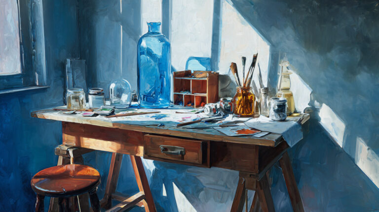
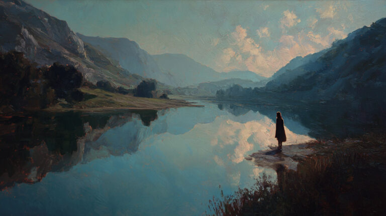
Every painting lies to you. It’s a flat surface pretending to have depth, and your brain goes along with it. Understanding what is pictorial space in painting means understanding how that trick works, why it works, and why artists across centuries have handled it so differently.
From Renaissance perspective systems to the compressed planes of Cubism, pictorial space shapes how you experience a painting before you even think about subject matter. It controls where your eye goes, how close you feel to the scene, and what emotional response the image triggers.
This guide breaks down the types of pictorial space, the techniques that create it, how different cultures approach spatial depth, and why it matters for anyone who looks at paintings seriously.
What Is Pictorial Space

Pictorial space is the illusion of three-dimensional depth created on a flat, two-dimensional surface. It’s what makes you feel like you could step into a painting, walk down that road, or reach out and touch an object sitting on a table.
Every painting has a physical surface. Canvas, wood panel, paper. But the moment an artist applies paint in a specific way, something shifts. The viewer’s eye starts reading depth where none actually exists. That gap between the real surface and the perceived depth inside the image is pictorial space.
It sounds simple, but the concept runs deeper than most people think. A famous landscape painting from the 1800s and a flat Byzantine icon both contain pictorial space. They just handle it in completely different ways.
The Art Basel and UBS Global Art Market Report found that paintings remained the most purchased medium in 2024, with global art sales reaching an estimated $57.5 billion. People are still drawn to painted images, and a big reason is the spatial experience those images create.
Pictorial space is not about trickery for its own sake. It’s a tool. Artists use it to guide the viewer’s eye, create mood, tell stories, and build emotional responses. A painting with deep, receding space feels different from one with a compressed, shallow arrangement. Your brain processes them differently.
And here’s the thing most guides skip over. Pictorial space isn’t fixed to one tradition or one set of rules. It looks completely different depending on the century, the culture, and the individual painter’s goals. A Renaissance altarpiece and a Cubist still life are both working with pictorial space, just from opposite ends.
How Pictorial Space Differs from Actual Space

Actual space has volume. You can walk through it, measure it, touch objects sitting in it. Pictorial space is entirely constructed. It exists only because your brain interprets visual cues on a flat surface as depth.
That distinction matters more than you’d expect.
Pictorial Space vs. the Picture Plane
The picture plane is the literal surface of the painting. It’s the canvas, the board, the wall. Pictorial space is what happens behind it, at least perceptually.
Think of the picture plane as a window. You look through it, and the scene appears to extend backward into depth. But there’s nothing actually behind the glass. The whole thing is a visual construction.
Some artists deliberately call attention to the picture plane. Henri Matisse flattened his compositions to remind viewers they were looking at paint on a surface, not a window into another world. Frank Stella took it further with shaped canvases that rejected any illusion of depth at all.
Pictorial Space vs. Composition
Composition refers to how elements are arranged across the surface. Where figures sit, how shapes relate to each other, how the eye moves around the image.
Pictorial space overlaps with composition, but they’re not the same concept. Composition is about the arrangement. Pictorial space is about the depth of that arrangement.
You can have a strong composition with almost no pictorial depth (a Mondrian grid, for instance). Or you can have deep pictorial space with a fairly simple composition (a single road vanishing to the horizon).
Why It’s Not Sculptural Space
Sculpture exists in real, physical space. You walk around it. Light hits it from different angles. Pictorial space is locked to one surface and depends entirely on the viewer’s position. Research published in i-Perception journal found a close positive relationship (r2 = .929) between canvas size and viewing distance in museum settings, showing that even our physical response to paintings is shaped by how we perceive the spatial illusion inside them.
A painting’s spatial illusion breaks if you look at it from the wrong angle. Sculpture doesn’t have that limitation. That fragility is actually part of what makes pictorial space interesting to study.
Types of Pictorial Space

Not all pictorial space looks the same or functions the same way. Artists across centuries have used different spatial approaches depending on their goals, their tools, and the cultural expectations they worked within.
| Type | Depth Characteristic | Technical Strategy | Common Examples |
| Deep Illusionistic | Strong Recession: Uses mathematical vanishing points to pull the eye toward a distant horizon. | Employs Linear Perspective and dramatic “tunnels” of space. | Renaissance panels, Baroque ceilings. |
| Shallow | Limited Range: Compresses the subject into a narrow “stage” just behind the glass. | Overlapping shapes without significant scale reduction. | Matisse cutouts, Manet’s late works. |
| Flat / Compressed | Surface Emphasis: Denies depth entirely to focus on pattern, color, and the 2D plane. | High-contrast silhouettes and a lack of traditional shading. | Byzantine icons, Mondrian grids. |
| Ambiguous | Contradictory Cues: Provides depth signals that don’t logically align (e.g., multiple perspectives). | Use of Isometric angles mixed with overlapping planes. | Cubist still lifes, De Chirico piazzas. |
| Atmospheric | Infinite Distance: Objects lose detail and contrast as they recede into an undefined “void.” | Sfumato and color temperature shifts (blueing of the distance). | Turner seascapes, Chinese scroll paintings. |
Shallow Space and Its Uses
Edouard Manet was one of the first Western painters to deliberately compress pictorial depth. His figures feel close to the surface. Backgrounds flatten out instead of receding. At the time, critics hated it.
Shallow space forces your attention to stay on the surface relationships. Color, shape, and texture become more prominent when depth gets taken away. That’s why it became such a common approach for modern painters who wanted to prioritize the paint itself over the illusion.
Deep Illusionistic Space

This is what most people picture when they think about pictorial space. A room that recedes, a landscape stretching to the horizon, architectural interiors where you can almost count the floor tiles going back.
Deep space relies heavily on linear perspective and atmospheric perspective working together. Raphael‘s School of Athens is probably the textbook case. Every architectural element converges toward a single vanishing point, and the figures are scaled precisely to reinforce the spatial recession.
Baroque ceiling painters like Andrea Pozzo pushed it even further. His ceiling at Sant’Ignazio in Rome creates the illusion of the architecture continuing upward into an open sky. Stand in the wrong spot, though, and the whole thing collapses. Which brings us back to that fragility point.
Ambiguous and Contradictory Space
Ambiguous space gives conflicting depth signals. Your eye can’t settle on a single reading of how deep or shallow the scene is.
Salvador Dali and Rene Magritte used spatial contradictions for psychological effect. De Chirico’s empty piazzas have perspective lines that don’t quite add up, creating a feeling of unease that’s hard to pin down.
Pablo Picasso and Georges Braque made ambiguity the whole point during their Cubist period. Objects exist in a space that’s simultaneously flat and dimensional. Your brain keeps trying to resolve the contradictions and can’t.
Techniques That Create Pictorial Space

The illusion of depth on a flat surface doesn’t happen by accident. Painters have developed specific tools over centuries to construct pictorial space. Some are mathematical, some are optical, some rely on how the human brain naturally processes visual information.
Linear Perspective
Britannica documents that linear perspective was devised around 1415 by Filippo Brunelleschi and later documented by Leon Battista Alberti in 1435. Before that, Western painters had no consistent mathematical system for depicting spatial recession.
The system works through three components: orthogonal lines that converge toward a vanishing point, a horizon line, and objects that diminish in size as they move further from the viewer.
One-point perspective uses a single vanishing point. Two-point and three-point systems add complexity. Masaccio’s Holy Trinity (c. 1425-27) was among the first paintings to apply Brunelleschi’s system with full confidence. Andrea Mantegna, Leonardo da Vinci, and Albrecht Durer are all recognized as early masters of the technique.
Atmospheric Perspective

Also called aerial perspective. Objects in the distance appear lighter, bluer, and less detailed. It mimics how the atmosphere actually affects how we see things far away.
Leonardo da Vinci was probably the most deliberate practitioner. His sfumato technique softened edges and pushed backgrounds into a hazy, indistinct distance. The mountains behind the Mona Lisa are a textbook case.
Chinese landscape painters were using atmospheric effects by roughly 1000 CE, centuries before European artists had any systematic method for depicting spatial recession. The Nelson-Atkins Museum notes that these Eastern traditions distributed subject matter across three spatial planes with gradating hue, detail, and tone.
Overlapping, Scale, and Foreshortening

Overlapping forms: When one object partially covers another, your brain automatically reads the covered one as farther away. Simplest depth cue there is.
Size diminution: Smaller objects register as more distant. This is hardwired into human visual perception.
Foreshortening: Compresses an object along the axis pointing toward the viewer. Mantegna’s Lamentation of Christ is the go-to example. The body appears to project directly toward you.
Light, Shadow, and Color
Chiaroscuro uses strong contrast between light and dark to give objects a three-dimensional form. Caravaggio turned this into a full spatial system. His figures emerge from darkness, which simultaneously defines their volume and places them in space.
Color temperature also plays a role. Warm colors (reds, oranges) tend to advance toward the viewer, while cool colors (blues, greens) recede. Painters use this to reinforce or complicate the spatial reading of a scene.
| Technique | How It Creates Depth | Technical Logic | Key Practitioner |
| Linear Perspective | Uses mathematical converging lines meeting at a vanishing point. | Based on the optical reality that objects appear smaller as they recede. | Brunelleschi, Masaccio |
| Atmospheric Perspective | Fades color, contrast, and detail as objects move into the distance. | Mimics the way particles in the air scatter light, making things look “blue and blurry.” | Leonardo da Vinci |
| Chiaroscuro | Uses strong value contrast between light and shadow to define mass. | Turns a flat “shape” into a volumetric “form” through light modeling. | Caravaggio, Rembrandt |
| Foreshortening | Compresses the scale of a form as it points directly toward the viewer. | Distorts anatomical proportions to create an aggressive sense of “coming off the page.” | Mantegna |
| Color Temperature | Utilizes the rule that Warm colors advance and Cool colors recede. | Uses the psychological and physical properties of light to push/pull the eye. | Turner, Cezanne |
Pictorial Space in Renaissance Painting
The Renaissance didn’t just use pictorial space well. It basically invented the systematic, mathematical approach to constructing it. Everything before was intuition, trial, and cultural convention.
Brunelleschi’s Perspective Demonstrations
Around 1415, Brunelleschi stood inside the Cathedral of Florence and created a painted panel of the Baptistery using mathematically precise converging lines. Smarthistory scholars describe this as the moment when linear perspective was created for the modern world.
He used a mirror to prove the accuracy. Viewers would look through a hole in the back of the panel at a mirror reflecting the painted surface. The painted image and the real building aligned almost perfectly. That demonstration changed Western art permanently.
Early Masters of Renaissance Depth
Masaccio’s Holy Trinity (c. 1427) was the first painting to fully apply Brunelleschi’s discovery. The barrel-vaulted ceiling in the fresco recedes so convincingly that viewers reportedly believed a real chapel had been carved into the church wall.
Sandro Botticelli, Raphael, and Titian each took the system further. Raphael’s School of Athens turned perspective into a storytelling device, placing ancient philosophers in a receding architectural space that reinforces the painting’s intellectual ambitions.
Oil painting made a difference too. Jan van Eyck‘s development of oil techniques in the Netherlands allowed for finer gradations of value and color, which meant more subtle spatial transitions. Suddenly painters could build depth not just through geometry but through the optical qualities of the paint itself.
Why the Renaissance Cared So Much About Space
It wasn’t just a technical exercise. Renaissance humanism placed humans at the center of a rational, measurable universe. Pictorial space reflected that worldview. The ability to map depth mathematically on a flat surface was a statement about human understanding of nature.
The Art Basel and UBS report shows paintings remain the most purchased medium by value globally, and Renaissance paintings still dominate the highest tier of auction sales. Collectors continue paying premium prices for works that demonstrate mastery of spatial construction.
Florence’s trade-based culture also played a part. As Smarthistory notes, the city prized mathematical accuracy in both economic life and artistic practice. Perspective wasn’t just art. It was proof of rational thinking.
How Pictorial Space Changed After the Renaissance
The Renaissance established the rules. Everything that followed either extended those rules, bent them, or threw them out entirely. The history of pictorial space from roughly 1600 to 1960 is basically a story of loosening control over that illusion of depth.
Baroque Expansion
Baroque painters didn’t reject Renaissance space. They amplified it. Caravaggio‘s dramatic use of tenebrism made figures explode out of dark backgrounds. Peter Paul Rubens filled massive canvases with swirling figures that push and pull through deep, dynamic space.
Ceiling paintings became a full-blown illusion industry. Andrea Pozzo, Giovanni Battista Tiepolo, and others created architectural fantasies that appeared to extend buildings upward into infinite sky. The spatial ambition was wild, honestly.
Impressionism’s Loosening Grip
Impressionism didn’t deliberately attack pictorial space, but it eroded it as a side effect. Claude Monet‘s broken brushwork made solid forms harder to read. Edgar Degas cropped his compositions like photographs, cutting off figures and spaces in ways that disrupted traditional depth reading.
The Impressionists prioritized light and color over spatial construction. When you dissolve edges and break up surfaces into individual brushstrokes, depth becomes less stable. The illusion flickers instead of holding firm.
Cezanne and the Collapse of Traditional Depth
This is the turning point. Paul Cezanne deliberately flattened his pictorial space while still trying to preserve a sense of volume. The Metropolitan Museum of Art describes how he ignored classical perspective laws, allowing each object to be independent within the picture while relationships between objects took precedence over single-point recession.
His approach was full of contradictions. Tables tilt forward at angles that don’t make physical sense. Backgrounds press up against foregrounds. Picasso famously called him the “father of us all,” and Braque said Cezanne introduced “doubt” into painting.
What Cezanne did, in practical terms, was break the link between pictorial space and optical reality. After him, depth became something artists chose rather than something they were obligated to reproduce.
Cubism and Multiple Viewpoints
Cubism took Cezanne’s instability and made it structural. Picasso and Braque collapsed foreground and background into interlocking planes. Objects appeared from multiple angles at once. The single fixed viewpoint that had governed Western painting since Brunelleschi was gone.
Wikipedia’s account of Cubism notes that the 1907 retrospective of Cezanne’s paintings at the Salon d’Automne was a direct catalyst. Both Picasso and Braque saw those late Cezanne works and recognized the spatial possibilities.
The impact went far beyond painting. Futurism, Constructivism, Suprematism, and Dadaism all responded to Cubism’s destruction of traditional pictorial space.
Abstract Expressionism and the Rejection of Depth
By mid-20th century, some painters abandoned the spatial game entirely. Jackson Pollock‘s drip paintings have no foreground, background, or middle ground. The canvas is a surface, full stop.
Mark Rothko‘s color fields hover in an undefined space. Your eye reads depth in the color layers, but it’s a different kind of depth. Not architectural, not geometric. Something closer to emotional space.
Critic Clement Greenberg argued that this was painting finally being honest about what it is: a flat object with pigment on it. Whether you agree with him or not, abstract painting changed what pictorial space could mean.
Pictorial Space in Non-Western Painting Traditions

Single-point perspective is not a universal truth. It’s a Western European convention that dates back to early 15th-century Florence. Other cultures developed entirely different systems for creating spatial depth on flat surfaces, and those systems worked perfectly well for their artistic goals.
Thinking of non-Western spatial approaches as “less advanced” is a mistake that shows up constantly in older art history texts. The Oxford Companion to Art once stated that the Chinese “never had any scientific interest in perspective or its rules,” which is flatly wrong.
Chinese and Japanese Scroll Painting
Chinese landscape painters used shifting perspective rather than a fixed viewpoint. As Britannica documents, the landscape hand scroll reached its greatest period in the 10th and 11th centuries with masters like Xu Daoning and Fan Kuan. The viewer becomes a traveler moving through space and time.
The spatial system distributed subject matter across three planes:
- Foreground: earthly objects like people, animals, buildings
- Middle ground: emptiness shown as clouds, mist, or water
- Background: mountains, hills, sky
Classic hand scrolls stretched up to ten meters long and were viewed by unrolling segments of about 50 centimeters at a time. A fixed vanishing point would have been technically impossible and expressively counterproductive for this format.
The system used what researchers call axonometric or parallel projection. Receding lines stay parallel instead of converging. David Hockney has spent years analyzing Chinese scroll paintings, arguing that their spatial approach offers a more honest representation of how we actually experience the world than fixed-point perspective.
Islamic Miniature Painting
Persian and Mughal miniatures made spatial flatness a deliberate feature, not a limitation. Figures float across layered landscapes with shifting viewpoints and no consistent vanishing point.
Wikipedia’s account of Persian miniatures notes that Safavid-era painters developed increasingly complex pictorial structures with multiple spatial planes and shifting perspectives. The effect is decorative and narrative rather than illusionistic.
When Mughal artists encountered European engravings brought by Jesuit missionaries, they adapted some Western techniques selectively. But as the EastEast analysis of Farrukh Beg’s work shows, Mughal painters deliberately chose to ignore perspective rules even when they understood them.
Aboriginal Australian Painting
Aerial perspective from above. Many Aboriginal desert paintings show terrain as if viewed from a bird’s-eye position, mapping physical landscape alongside spiritual information. Japingka Gallery describes how these works carry Dreaming stories, ceremonial sites, and travel routes overlaid on the physical geography.
There’s no foreground or background in the Western sense. Space functions as a map of meaning rather than a window into an illusionistic scene. Emily Kame Kngwarreye‘s paintings, for instance, operate in a spatial logic that has no connection to European perspectival traditions yet creates a powerful sense of place and depth through layered pattern and color saturation.
| Tradition | Spatial System | Technical Strategy | Viewing Experience |
| Chinese Scroll | Shifting / Parallel Perspective | Uses multiple “vanishing points” so the eye can travel across the landscape. | An unfolding journey through time and space. |
| Persian Miniature | Stacked / Layered Planes | Objects are placed higher on the page to indicate distance, with no scale reduction. | A dense, decorative narrative similar to reading a jewel-toned manuscript. |
| Aboriginal Australian | Aerial & Symbolic Map | Combines a bird’s-eye view with metaphysical “dreaming” tracks and symbols. | A topographic and metaphysical record of the land and spirit. |
| Western Renaissance | Fixed Single-Point Convergence | Uses mathematical grids to anchor the viewer to a single, static location. | A stationary window into illusionistic depth and realism. |
The Picture Plane and Its Relationship to Pictorial Space

The picture plane is the boundary between the viewer and the painted world. It’s the actual physical surface. Everything that happens in pictorial space takes place behind it, perceptually speaking.
How artists handle this boundary has driven some of the biggest arguments in art history.
Breaking Through the Picture Plane
Trompe-l’oeil painting deliberately fools the eye into believing painted objects occupy real space. The picture plane vanishes. Mantegna’s Camera degli Sposi ceiling in Mantua, painted around 1474, shows figures and a sky that appear to open directly above the viewer’s head.
Baroque ceiling painters turned this into a whole genre. Andrea Pozzo’s ceiling at Sant’Ignazio in Rome is so spatially convincing that a marble disc on the floor marks the exact spot where you need to stand for the illusion to work.
Acknowledging the Picture Plane

Clement Greenberg argued the opposite position. In his 1960 essay “Modernist Painting,” he wrote that flatness was the only condition painting shared with no other art, and that modern painting’s development was a progression toward acknowledging this flatness honestly.
The Art Story notes that Greenberg traced this progression from Manet through Cezanne through Cubism and into Abstract Expressionism. Each generation stripped away more of the spatial illusion.
Piet Mondrian‘s grids are a clear endpoint in this line of thinking. The intersecting black lines emphasize the flat surface and the shape of the canvas itself. There is no pictorial space behind the surface. The surface is the work.
The Tension Between Surface and Depth
Greenberg also admitted that absolute flatness was impossible. As he wrote, even the first mark on a canvas destroys its literal flatness by creating a foreground (the mark) and a background (the surface).
Hans Hofmann called this “re-created flatness”: the artist destroys the canvas’s original flatness, then has to rebuild it. That push and pull between surface and depth is where a lot of the energy in modern painting lives.
Whether you buy Greenberg’s theory or not (and plenty of artists and critics don’t), the relationship between picture plane and pictorial space remains one of the most productive tensions in painting. Pop art, minimalism, and Op art all engaged with it in different ways.
Why Pictorial Space Matters for Understanding Paintings

Knowing how to read pictorial space changes the way you look at paintings. Not in an academic, detached way. In a practical, “I suddenly understand why this painting makes me feel something” way.
Space as a Carrier of Meaning
Spatial choices are not accidental. A painting with deep, measured recession tells you something different than one with claustrophobic, compressed space. Edward Hopper‘s interiors feel lonely partly because of how he handles spatial isolation, placing figures in rooms that feel too large or too empty.
A 2025 study by the National Endowment for the Arts found that higher numbers of fine arts credits completed in high school were associated with higher first-year college GPAs. Visual literacy, including the ability to analyze spatial construction in images, builds transferable cognitive skills.
The American Alliance of Museums reports that children who visited a museum during kindergarten scored higher in reading, math, and science by third grade. Learning to look at pictorial space is part of a broader skill set that affects how people process visual information.
A Practical Viewing Strategy
Ask yourself: “Where am I standing?”
Every painting with pictorial space implies a viewer position. Are you looking down at the scene? Looking up? Standing at eye level? Once you identify that position, the painting’s spatial logic starts to make sense.
Then ask where the depth stops. Does the space recede infinitely? Does it hit a wall? Does it loop back on itself? These are choices the artist made, and they carry meaning.
A famous still life painting by Vermeer places you very close to the objects. A landscape by J.M.W. Turner dissolves you into atmospheric distance. Both are using pictorial space to control your emotional relationship to the subject.
Space as Ideology
Renaissance perspective positioned the individual viewer at the center of a rational, measurable world. That was a philosophical statement, not just a technical solution.
The Art Basel and UBS report found that 66% of high-net-worth collectors in 2024 bought works by artists they had newly discovered. A growing collector base, combined with expanded access to non-Western art traditions, means more people are encountering spatial systems that challenge the Renaissance default.
Understanding pictorial space as culturally constructed, not universal, opens up a much richer experience of looking at art from any tradition.
Common Misunderstandings About Pictorial Space

Some of the most persistent misconceptions about pictorial space come from treating one tradition’s approach as the only correct one. Others come from confusing technical skill with artistic intent.
“More Realistic Perspective Equals Better Painting”
This is the single most common misunderstanding. The idea that perspective accuracy equals quality shows up everywhere from casual gallery comments to formal art criticism.
It falls apart immediately when you consider that Gothic art, Byzantine icons, and Expressionist paintings all reject precise perspective. And they do it on purpose. A gold-background Byzantine Madonna isn’t “failing” at depth. It’s choosing to represent spiritual space instead of physical space.
Wassily Kandinsky didn’t paint abstract compositions because he couldn’t paint realistically. He was trained in traditional techniques and chose to leave them behind.
“Flat Space Is a Failure of Skill”
Flat pictorial space is a choice, not a deficiency.
Matisse‘s cut-outs are flat. Minimalist paintings are flat. Alex Katz‘s portraits compress space to an extreme. None of these artists lacked the ability to create depth. They decided it wasn’t what their work needed.
The NCES 2024 School Pulse Panel Survey found that 93% of public schools offer at least one standalone arts class. As more students gain exposure to diverse painting styles, the assumption that depth equals quality should weaken over time.
“All Paintings Aim for the Same Spatial Experience”

They don’t. And expecting them to leads to confusion.
A Surrealist painting by Magritte uses recognizable depth cues but arranges them in impossible ways. A Pointillist painting by Georges Seurat builds space through tiny dots of color rather than drawn lines. A Fauvist landscape by Matisse uses wild color to flatten and distort spatial relationships for emotional effect.
| Misunderstanding | Reality | Technical Significance |
| Better perspective = better art | Perspective is a tool, not a goal. Many masterpieces deliberately reject it to focus on other elements. | Precise perspective is a mathematical skill; art is about visual communication. |
| Flat space = lack of skill | Flatness is a deliberate aesthetic choice used to emphasize pattern, color, and the canvas surface. | Modernism (Matisse, Warhol) and Byzantine art use flatness to focus on symbols over realism. |
| Pictorial space = emotional depth | Physical depth and emotional impact are independent qualities. | A “flat” icon can be more spiritually or emotionally moving than a “deep” architectural render. |
| Universal spatial goals | There is no “perfect” system. Each movement has its own spatial logic (journey vs. window vs. map). | Western realism is just one of many ways to organize a composition. |
The best way to appreciate pictorial space is to stop judging every painting by Renaissance standards and start asking what kind of spatial experience the artist actually intended. That shift in thinking makes looking at abstract paintings, Chinese paintings, and Impressionist paintings far more rewarding.
FAQ on What Is Pictorial Space In Painting
What is pictorial space in simple terms?
Pictorial space is the illusion of three-dimensional depth on a flat painting surface. It’s what makes you perceive distance, volume, and spatial relationships in an image that physically has no depth at all.
How do artists create pictorial space?
Artists use techniques like linear perspective, atmospheric perspective, overlapping forms, size diminution, foreshortening, and chiaroscuro. Each method tricks the eye into reading depth on a two-dimensional surface.
What is the difference between pictorial space and the picture plane?
The picture plane is the physical surface of the painting. Pictorial space is the perceived depth behind that surface. One is real, the other is an illusion constructed through visual cues.
Did all cultures use the same approach to pictorial space?
No. Chinese scroll painters used shifting perspective with parallel lines. Islamic miniaturists layered flat planes. Aboriginal Australian artists mapped terrain from above. Single-point perspective is a Western European convention, not a universal standard.
Who invented linear perspective in painting?
Filippo Brunelleschi demonstrated it around 1415 in Florence. Leon Battista Alberti documented the system in 1435. Masaccio was the first painter to fully apply it in his fresco The Holy Trinity.
Why did modern artists flatten pictorial space?
Paul Cezanne began flattening depth to emphasize the painting’s surface. Picasso and Braque pushed further with Cubism. They believed illusionistic depth disguised what a painting actually is: a flat object.
Does abstract painting have pictorial space?
Sometimes. Mark Rothko‘s color fields suggest atmospheric depth. Jackson Pollock‘s drip paintings reject it entirely. Whether abstract work contains pictorial space depends on the artist’s intent and technique.
What is shallow pictorial space?
Shallow space limits the distance between foreground and background. Objects feel close to the surface. Edouard Manet and Henri Matisse both used compressed depth to shift attention toward color and surface relationships.
How does pictorial space affect the viewer’s experience?
Deep space creates a sense of distance and openness. Compressed space feels intimate or tense. Ambiguous space unsettles the viewer. Every spatial choice shapes emotional response before the subject is even consciously registered.
Can you learn to read pictorial space in paintings?
Yes. Start by asking where you’re “standing” relative to the scene. Identify the depth cues the artist used. Notice whether space recedes, compresses, or contradicts itself. It becomes intuitive with practice.
Conclusion
Understanding what is pictorial space in painting gives you a sharper eye for every artwork you encounter. It turns passive looking into active reading. Once you recognize how depth cues, spatial arrangement, and surface tension work together, paintings start revealing layers you never noticed before.
No single system owns the concept. Brunelleschi’s vanishing point, Cezanne’s fractured planes, Chinese scroll painting’s shifting viewpoint, and Rothko’s color field depth all solve the same problem differently. Each reflects a distinct way of seeing the world.
The spatial choices a painter makes carry as much meaning as the subject itself. Flat or deep, compressed or infinite, those decisions shape your emotional response to every painted image.
Pay attention to the space. That’s where the real conversation between painter and viewer happens.