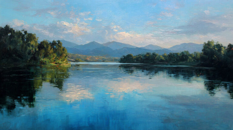
Look at any distant mountain range and you’ll notice something. The colors fade. The edges blur. Everything shifts toward blue. That visual phenomenon is exactly what painters have been replicating for over two thousand years, and understanding what aerial perspective is in painting changes how you see every landscape on canvas.
Aerial perspective is a depth technique that uses color, value, and detail changes to make flat surfaces feel three-dimensional. It’s grounded in atmospheric science, not guesswork.
This guide covers how the technique works, its origins with Leonardo da Vinci, practical methods across oil, watercolor, and acrylic, and the common mistakes that flatten even well-composed paintings.
I’ll start by researching real statistics relevant to aerial perspective in painting, then write the content.
What Is Aerial Perspective in Painting

Aerial perspective is a painting technique that creates the illusion of depth by changing color, value, and detail as objects recede into the distance. It goes by another name too: atmospheric perspective.
Both terms describe the same thing. The atmosphere between you and a distant object changes how that object looks. Colors lose their punch. Edges soften. Contrast drops.
This isn’t a stylistic choice. It’s based on how we actually see the world. Mountains far away look bluish and pale. A tree right in front of you looks sharp, saturated, full of detail. The one a mile back? Flat, muted, barely there.
The technique works differently from linear perspective, which uses geometry and vanishing points to show spatial depth. Aerial perspective handles the perceptual side. It deals with how the air between objects and viewers alters what we see.
Most convincing paintings use both systems together. But aerial perspective is the one that makes a landscape actually feel like you could walk into it.
How Aerial Perspective Works

The science behind this is straightforward. Light traveling through the atmosphere gets scattered by tiny particles, moisture, dust, and gas molecules. Blue light scatters more than red. That single fact drives everything about how we perceive distance.
According to EBSCO Research, blue light with a 400nm wavelength scatters roughly 9.4 times more than red light at 700nm. Canon’s research confirms that red light, having double the wavelength of blue, gets scattered 16 times less efficiently.
That scattering produces the visual effects painters have been replicating for centuries.
Color Shift Across Distance

The farther an object sits from the viewer, the more its colors shift toward blue and violet. Warm hues in the foreground give way to cooler tones in the background.
Color saturation drops too. A bright red barn close up looks vivid. That same barn a half-mile back appears grayish, desaturated, almost ghostly.
The color wheel gives painters a practical framework here. Objects recede toward the cool side as distance increases, and the degree of shift depends on atmospheric conditions like humidity and haze.
Value and Contrast Reduction

Dark objects lighten. Light objects may darken slightly. The overall effect is that contrast between light and dark areas compresses as distance grows.
A cliff face up close shows dramatic value shifts between sunlit rock and deep shadow. That same cliff five miles out shows barely any value difference at all.
Britannica notes that these effects are more visible at the base of a mountain than at its peak, because more atmosphere sits at lower elevations.
Leonardo da Vinci and the Codification of Aerial Perspective

Leonardo da Vinci didn’t invent this technique. But he gave it a name and wrote down why it works.
In his Trattato della Pittura (Treatise on Painting), compiled after his death by his student Francesco Melzi around 1530-1540, Leonardo used the term “aerial perspective” for the first time. His observation was direct: colors weaken in proportion to their distance from the viewer.
He wasn’t guessing. Leonardo studied optics, dissected how the eye processes form and distance, and tested his findings in paint.
Look at the Mona Lisa. Those background mountains don’t just sit there. They dissolve into a blue-gray haze, progressively losing sharpness and warmth. The landscape behind the figure in Virgin of the Rocks does the same thing.
Leonardo separated aerial perspective from linear perspective as distinct tools for creating depth. According to the Perspective Research Centre, he identified at least 15 basic types of perspective, including size, form, proportion, and atmospheric color shifts.
His sfumato technique, that smoky blending of tones without visible brushstrokes, was closely tied to his understanding of atmospheric effects. One supported the other.
Aerial Perspective Before and After the Renaissance

The technique existed long before Leonardo wrote about it. And it kept changing long after him.
Ancient Roman frescoes at Pompeii, dating as early as 30 BCE, already show rudimentary atmospheric depth. The Villa of Livia garden room fresco uses lighter, softer background foliage to push certain plants forward visually.
Britannica notes that Chinese landscape painters applied similar principles with sophistication from about the 8th century onward. Song Dynasty masters like Guo Xi used mist and tonal recession to create vast spatial depth without any reliance on vanishing points.
| Period | Technical Logic | Region | Strategic Approach |
| 1st Century BCE | Value Compression: Lightening the background values to suggest depth. | Roman Empire | Tonal Lightening: Seen in Pompeian frescoes to push walls “back.” |
| 8th–12th Century | Void & Wash: Utilizing “The Void” (mist) to separate mountain tiers. | China (Song Dynasty) | Ink Wash Recession: Mist and ink “breathing” to create infinite distance. |
| 15th Century | Chromatic Cooling: Using the “blue shift” caused by light scattering. | Flanders | Oil Glazing: Layering transparent blues to “chill” the distant horizon. |
| 15th–16th Century | Sfumato: The “smoky” blurring of edges to remove visual friction. | Italy (Renaissance) | Scientific Observation: Blending edges to mimic the limitations of the eye. |
| 19th Century | Luminous Dissolve: Allowing light and moisture to fully consume form. | Britain | Extreme Dissolve: Light becomes the subject; forms are nearly erased by air. |
After the Renaissance, the technique became standard equipment for European painters. Dutch Golden Age artists like Jacob van Ruisdael pushed it further with overcast skies and flat terrain.
Romanticism brought another leap. Hudson River School painters like Frederic Edwin Church and Albert Bierstadt used aerial perspective at massive scale to capture the American wilderness.
Eastern and Western Approaches Compared

Chinese painters used ink wash and empty space to suggest atmospheric depth. Their scroll format demanded it. A single vanishing point made no sense for a painting designed to be unrolled gradually.
Western painters combined aerial perspective with geometric systems. The two traditions converged on the same visual truth from completely different starting points.
The Eclectic Light Company notes that by the late 19th century, painters like Paul Cezanne deliberately abandoned aerial perspective. His Le Lac d’Annecy (1896) compresses 800 meters of actual distance into what looks like arm’s reach, using none of the standard atmospheric cues.
Aerial Perspective vs. Linear Perspective

These two systems solve the same problem (showing depth on a flat surface) through completely different methods. Perspective in painting almost always involves both working together.
Linear perspective is structural. It relies on converging lines, a horizon line, and one or more vanishing points to create geometric spatial order.
Aerial perspective is perceptual. It uses color theory, tonal gradation, and edge quality to simulate what the atmosphere actually does to light.
| Feature | Technical Logic | Linear Perspective | Aerial Perspective |
| Basis | Structural vs. Optical: Math for the bones; science for the skin. | Geometric: Based on Euclidean mathematics. | Physical: Based on optics and atmospheric particles. |
| Primary Tools | Vector vs. Tone: How the illusion is “measured.” | Vanishing points, horizon lines, orthogonals. | Color temperature, value compression, edge softening. |
| Affects | Spatial Mapping: What changes as distance increases. | Size & Position: Objects shrink and move toward eye level. | Quality: Objects lose contrast, detail, and “warmth.” |
| Origins | Renaissance Evolution: From rigid grids to nuanced observation. | F. Brunelleschi (1420s): The invention of the grid. | Leonardo da Vinci (1490s): The observation of air. |
| Best For | Optimal Environment: Where each system shines. | Architecture, interiors, man-made structures. | Landscapes, vistas, and extreme outdoor depth. |
Leon Battista Alberti formalized linear perspective in his 1435 text On Painting. Leonardo added aerial perspective on top of that foundation decades later, giving painters a complete toolkit for spatial illusion.
Some painting styles reject both systems entirely. Cubism deliberately collapses space. Byzantine art uses flat gold backgrounds with no depth at all. But for any painter working toward realism, both tools are necessary.
Techniques for Achieving Aerial Perspective in Paint

Knowing the theory is one thing. Getting it onto canvas with actual paint is another problem entirely. The specific approach changes depending on your painting medium.
The Art of Education reports that 90% of art teachers feel most confident in two-dimensional mediums like painting and drawing. Yet many struggle to teach spatial depth techniques effectively, which suggests that aerial perspective is one of those concepts that’s easier to understand than to execute.
Color Temperature Shifts

Foreground: Use warm, saturated colors. Reds, oranges, warm yellows. These advance visually.
Middle ground: Start mixing in cooler tones. Add blue or blue-violet to your mixtures. Reduce intensity slightly.
Background: Cool, desaturated. Mix toward blue-gray. Pull complementary colors into your mixtures to gray them down naturally.
When working in oil paint, glazing thin blue-violet layers over dried background passages is one of the most effective ways to build atmospheric recession gradually.
Edge Control and Detail Reduction
Sharp edges pull things forward. Soft edges push them back. It’s that simple in concept, tricky in practice.
Keep your most detailed brushwork in the foreground. Let things get progressively looser as they recede. A tree in the foreground shows individual leaves. The same tree in the middle ground shows clusters. In the background, it’s just a soft shape.
Watercolor painting handles this naturally because wet-into-wet passages automatically produce soft edges. Acrylic dries fast, so you have to work quickly or use retarders to blend transitions.
Aerial Perspective in Landscape Painting

Landscape painting depends on aerial perspective more than any other genre. Without it, even a well-composed scene looks flat, like a stage backdrop rather than a real place.
The classic structure uses three distinct planes to create depth.
Foreground plane: Warm colors. High contrast. Sharp edges. Maximum detail. This is where you put your strongest darks against your lightest lights.
Middle ground: Transitional. Moderate saturation. Edges start softening. Colors begin cooling.
Background plane: Cool, muted tones. Low contrast. Minimal detail. Objects begin merging with the sky.
J.M.W. Turner pushed aerial perspective harder than anyone before him. Britannica calls his work the boldest and most ambitious use of the technique among Western painters. His atmospheric seascapes dissolve solid forms into pure light and mist.
Claude Monet took a different angle. His series paintings (haystacks, Rouen Cathedral, water lilies) captured how shifting atmospheric conditions alter the same subject from hour to hour.
For anyone learning to paint a landscape, mastering the three-plane system is the fastest path to convincing spatial illusion. Plein air painting lets you observe these effects directly in natural light, which is something studio work can’t fully replicate.
Aerial Perspective in Non-Landscape Contexts

This technique isn’t locked to mountains and fields. Aerial perspective shows up anywhere depth exists, even indoors.
Johannes Vermeer used subtle atmospheric softening in his interior scenes. Look at how background walls in his rooms lose just a bit of sharpness compared to foreground figures. It’s barely noticeable, but it makes the pictorial space feel real.
Figure painting benefits too. In group scenes, background figures often lose contrast and color intensity compared to the central subjects. It’s the same atmospheric principle scaled to a smaller space.
Urban scenes offer some of the most dramatic examples. Fog, smog, rain, and industrial haze amplify atmospheric effects enormously. A city street on a foggy morning demonstrates aerial perspective within just a few hundred meters.
Digital painting and concept art apply identical principles. The global digital art market was valued at approximately $5.57 billion in 2024 (Polaris Market Research), with digital painting representing the fastest-growing segment. Game environment artists and film concept painters rely on aerial perspective daily to build convincing fantasy and sci-fi worlds.
Common Mistakes When Painting Aerial Perspective

Getting aerial perspective wrong is easy. And the mistakes tend to be the same ones, over and over.
Uniform detail across all planes. This is the big one. Painting every leaf on every tree, no matter how far away, kills the depth illusion completely. Your brain reads equal detail as equal distance.
Making distant objects darker instead of lighter. This is counterintuitive for beginners, but the atmosphere adds light to distant objects by scattering sky light into the viewing path. Distant mountains are lighter, not darker (under normal daylight conditions).
Ignoring color temperature. Some painters adjust value but forget about the warm-to-cool shift. A background painted in the right value but the wrong temperature still looks wrong. The blue shift is just as critical as the lightening.
Over-blurring backgrounds. Soft doesn’t mean blurry. There’s a difference. Selective reduction of detail is the goal, not running a Gaussian blur across everything behind the focal point.
Abrupt transitions. Real atmosphere changes things gradually, not in sudden steps. If your foreground slams into your background without a middle ground transition, the painting looks like a collage of separate pieces rather than a unified space.
How Light and Weather Conditions Change Aerial Perspective

The strength of aerial perspective isn’t constant. It changes with every shift in weather, time of day, and geographic location.
Clear, dry air produces minimal atmospheric effect. Desert environments and high-altitude locations show very little color shift or contrast reduction over distance. Objects miles away can look crisp and detailed.
High humidity, fog, and rain amplify everything. Colors desaturate faster. Contrast drops within much shorter distances. Objects can disappear entirely within a few hundred meters.
ScienceInsights explains that hot and humid weather traps more water droplets and particles in the atmosphere, creating heavier haze and faster visual falloff. This is why summer landscapes often show more pronounced aerial perspective than winter scenes in the same location.
Time of Day Effects
Golden hour adds warm haze to the atmosphere. Background objects shift toward orange-pink rather than the typical cool blue. This happens because sunlight near the horizon passes through more atmosphere, scattering blue light away and leaving warmer wavelengths.
Midday produces the most neutral or cool atmospheric shifts. Blue-violet recession is at its strongest.
Painters who paint sunsets or golden-hour scenes need to adjust their approach entirely. The standard “add blue to push things back” formula doesn’t work when the whole sky glows orange.
Seasonal Differences

Winter air tends to be clearer in many regions, with lower humidity and fewer suspended particles. This reduces aerial perspective effects.
Summer air carries more moisture and organic matter. The result is thicker atmospheric haze and more pronounced depth cues.
Painters working en plein air in different seasons will notice dramatic variation in how the same landscape reads spatially. A valley that shows strong aerial perspective in August might look almost flat in January.
FAQ on What Is Aerial Perspective In Painting
What is the difference between aerial perspective and linear perspective?
Linear perspective uses vanishing points and converging lines to create geometric depth. Aerial perspective uses color shifts, value changes, and edge softening to simulate atmospheric effects on distant objects. Most realistic paintings combine both systems together.
Who invented aerial perspective?
The technique existed in ancient Roman frescoes and Chinese landscape painting centuries earlier. But Leonardo da Vinci coined the term in his Treatise on Painting and provided the first systematic written explanation of why it works.
Why do distant objects appear blue in paintings?
Rayleigh scattering causes short-wavelength blue light to scatter more than red light as it passes through atmospheric particles. This makes distant objects shift toward blue and violet tones, which painters replicate through color temperature adjustments.
How do you create aerial perspective with oil paint?
Add blue-violet to background mixtures. Reduce color saturation progressively with distance. Use thin glazing layers over dried passages. Keep your sharpest edges and warmest colors in the foreground only.
Is aerial perspective the same as atmospheric perspective?
Yes. Both terms describe the same technique. “Aerial perspective” comes from Leonardo da Vinci’s writings. “Atmospheric perspective” is sometimes preferred because it avoids confusion with aerial viewpoints or bird’s-eye compositions.
What are the four elements of aerial perspective?
The four elements are size reduction, detail loss, tonal weakening, and color desaturation over distance. Each effect increases progressively as objects recede from the viewer, working together to create convincing spatial depth.
Can aerial perspective be used in non-landscape paintings?
Absolutely. Interior scenes, figure groups, and urban settings all benefit from subtle atmospheric softening. Vermeer applied it in room interiors. Concept artists use it daily in digital environment design for games and film.
What is the three-plane system in aerial perspective?
Painters divide a scene into foreground, middle ground, and background. Each plane uses progressively cooler colors, lower contrast, and softer edges. This layered approach creates a natural depth illusion on a flat surface.
Does weather affect aerial perspective in painting?
Significantly. Fog, humidity, and rain amplify atmospheric effects. Dry, clear air minimizes them. Painters adjust their technique based on the specific weather conditions they want to depict, since each condition produces different color and value shifts.
What are common mistakes when painting aerial perspective?
Using equal detail across all planes. Making backgrounds darker instead of lighter. Ignoring the warm-to-cool color shift. Over-blurring distant objects instead of selectively reducing detail. These errors flatten spatial depth and break the illusion.
Conclusion
Understanding what is aerial perspective in painting gives you a concrete tool for building spatial depth on any flat surface. It’s not abstract theory. It’s applied observation, rooted in how light actually behaves as it moves through the atmosphere.
From ancient Pompeian frescoes to digital concept art, the core principle hasn’t changed. Reduce contrast, cool your colors, soften your edges as things recede.
Whether you work in oils, watercolors, or pixels, the three-plane system of warm foreground, transitional middle ground, and cool background remains the most reliable framework for pictorial depth.
Practice it outdoors first. The atmosphere does half the teaching for you. Then bring that knowledge back to the studio and watch your compositions gain the kind of spatial recession that separates flat paintings from convincing ones.