
Most painters avoid city subjects. The geometry feels tricky, the figures look stiff, and the whole thing ends up looking more like a diagram than a painting.
Learning how to paint a city street scene in oil is a process with a clear sequence. Get the perspective structure right, build tonal values early, and the rest follows logically.
This guide covers everything from choosing a strong urban composition and setting up your limited palette to handling wet pavement reflections, atmospheric perspective, and knowing when the painting is actually finished.
Whether you work en plein air or from photo reference, the same principles apply.
What Is Urban Street Scene Painting in Oil?

Urban street scene painting is the practice of depicting city environments in oil paint, with a focus on man-made structures, light behavior on hard surfaces, and human activity within architectural space.
It is distinct from rural landscape painting in 3 core ways: it relies on geometric perspective rather than organic form, it deals with artificial and reflected light rather than direct sunlight on foliage, and it requires the painter to selectively simplify visual noise without losing the sense of urban density.
Paintings continue to hold the primary position in global collecting. Over three quarters of high-net-worth collectors acquired a painting in both 2023 and the first half of 2024, according to the Art Basel and UBS Survey of Global Collecting 2024.
Cityscape painting sits at the intersection of landscape painting and architectural study. The subject covers building facades, wet pavement reflections, storefront windows, artificial light at dusk, and figures moving through space.
Two working methods define the practice:
- En plein air: painting on location, which forces quick decisions about light and value
- Photo reference: working from photographs in the studio, which allows more control over composition and layering
Each method produces different technical demands. Plein air urban painting requires a streamlined kit and fast decision-making. Studio work from photo reference allows multiple paint layers, glazing, and more deliberate edge control.
Oil paint suits this subject specifically because of its slow drying time, which allows wet-on-wet blending for atmospheric haze. It also provides the tonal depth needed to render the contrast between sunlit facades and deep shadow under awnings or inside doorways.
Painters like Edward Hopper built entire careers around urban realism in oil, capturing not just the physical facts of city space but the quality of light at specific times of day. His approach to tonal value structure and selective detail remains a reference point for anyone working in this subject.
What Materials Do You Need to Paint a City Street Scene?
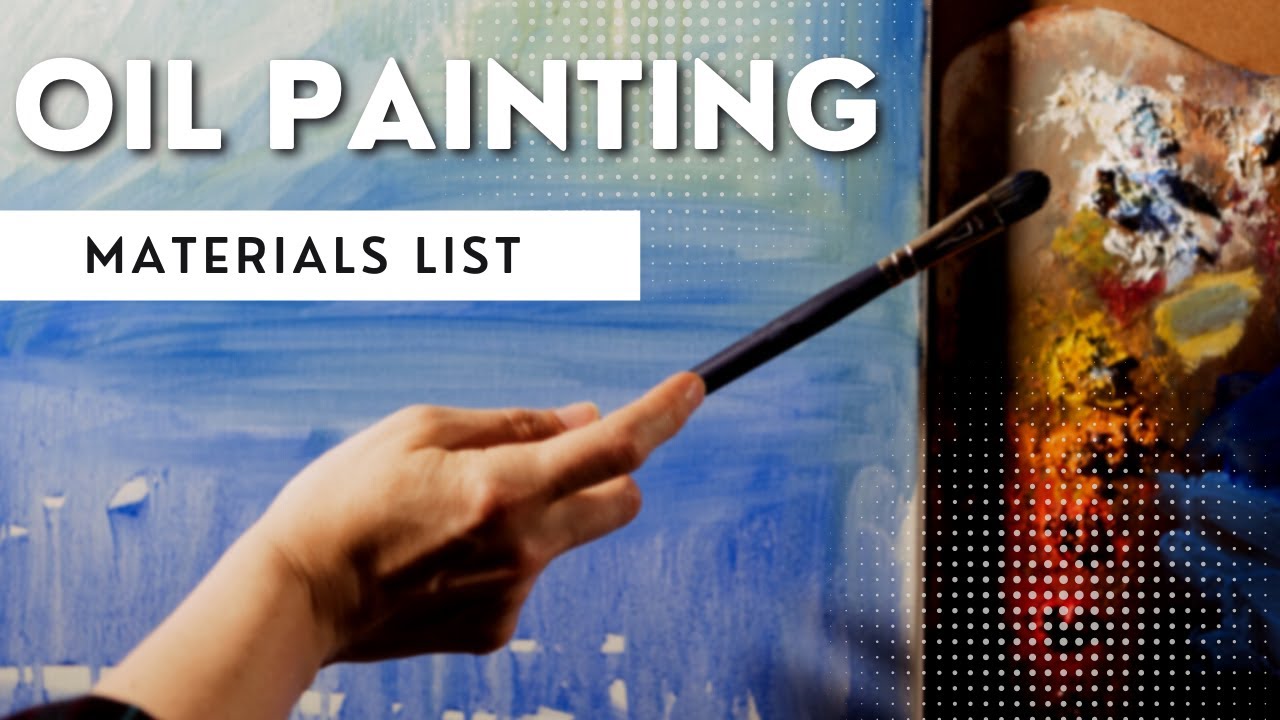
The right oil painting materials for a street scene differ from a general studio setup. Urban subjects involve hard edges, fine architectural detail, and the need to cover large mid-tone areas quickly before working into specifics.
Canvas and Surface
Panel vs. canvas: Linen or cotton canvas on a stretcher works for studio painting. A rigid panel, MDF or Masonite board, is preferable for plein air because it resists vibration and damage during transport.
Size matters practically. A 12×16 or 16×20 surface gives enough room to establish architectural perspective without becoming unmanageable on location. Larger formats are for the studio.
Paints: The Urban Palette
A limited oil palette works better for street scenes than a large one. Too many options slow decisions and increase the chance of muddy color mixing.
| Pigment | Primary Role in Urban Painting |
|---|---|
| Titanium White | Highlights on glass, wet pavement, lamp posts |
| Ivory Black | Deep doorways, shadow anchor tones |
| Yellow Ochre | Sunlit concrete and stone facades |
| Burnt Sienna | Underpainting wash, brick, warm shadow |
| Ultramarine Blue | Cool shadows, sky, shadow color mixing |
| Cadmium Red Medium | Warm accents, neon signage, mixed neutrals |
Brushes and Tools
Filbert brushes (sizes 4 to 10) handle broad architectural masses and facade coverage. Round brushes (sizes 1 to 4) handle figures, window details, and fine edge work.
A palette knife adds texture to brick, rough concrete, and impasto pavement areas. It is faster than a brush for building surface variation in early layers.
Mediums and Solvents
Odorless mineral spirits thin paint for the first wash layers and allow fast drying. Liquin or linseed oil goes into middle and final layers to maintain the fat-over-lean rule and keep the paint film flexible.
For plein air, a pochade box with an integrated palette keeps the setup compact. Winsor & Newton Liquin Original is a common choice for speeding drying between sessions without cracking.
How Do You Choose a Strong Street Scene Reference or Location?
A street scene fails at the reference stage more often than at the painting stage. A weak composition cannot be rescued by strong technique.
Paintings account for around 71 percent of the total value of global art transactions by sales value (Stronddo Art, 2025). Urban subjects within that category sell consistently, particularly when light conditions are specific and memorable rather than flat or generic.
What Makes a Street Scene Compositionally Paintable?
One dominant light direction is the minimum requirement. Overcast days with no shadow direction produce flat scenes with no value structure to anchor the composition.
Strong candidates share 3 characteristics:
- A clear focal element: a lit storefront, a figure cluster, a strong reflection in wet pavement
- A readable value contrast between shadow zones and sunlit areas
- A horizon line that creates natural depth through converging architecture
Time of day shifts everything. Golden hour light rakes across building facades and creates long, saturated shadows. Overcast conditions flatten contrast but produce unified color temperature across the whole scene, which suits a quieter, more tonal approach.
Midday light is the hardest to paint. It flattens facades and creates harsh, uninteresting shadows directly below objects rather than casting long dramatic ones across the street.
Thumbnail sketches before committing to a composition take five minutes and prevent wasted hours. A 2×3 inch graphite sketch that reads well at arm’s length will usually translate to canvas. One that looks confused at thumbnail size will not improve at larger scale.
When shooting photo reference, RAW format captures the full dynamic range of highlights and shadow detail. JPEG files compress the darks and blow out the highlights. Shoot from several positions before settling on the strongest angle.
How Do You Set Up the Composition and Perspective Drawing?
Perspective structure is the foundation of a readable street scene. Errors in perspective are immediately obvious to viewers even if they cannot name what is wrong. The eye detects converging lines that do not meet correctly at the same vanishing point.
One-Point vs. Two-Point Perspective
| Perspective Type | When to Use It | What It Controls |
|---|---|---|
| One-point | Looking straight down a street or corridor | All horizontal lines converge to a single vanishing point on the horizon |
| Two-point | Standing at a corner, buildings on both sides | Two sets of converging lines, each leading to its own vanishing point on the horizon |
Understanding linear perspective tells you where every edge in the scene must point. The horizon line is always at eye level. Everything above it tilts down toward it; everything below tilts up toward it.
The Underdrawing Process
Charcoal or a burnt sienna pencil on a toned or white ground establishes the vanishing lines and major shapes before any paint goes down.
Keep the underdrawing loose. Mark the horizon line, the primary vanishing point or points, the base and roofline of the main building, and the scale of any foreground figures. That is enough. Detailed architectural drawing at this stage gets buried under early paint layers and wastes time.
The most common error: drawing window and door detail into the underdrawing. Paint defines detail far more efficiently than line. The underdrawing only needs to record what paint cannot easily correct, which is vanishing point convergence and figure-to-building scale relationships.
Use vanishing points correctly and the painting has structural credibility before a single color decision is made.
How Do You Block In the Initial Tonal Values?

The tonal block-in is the most important stage of the painting. Get the value structure right here and the rest of the process is problem-solving at the surface level. Get it wrong and no amount of detail will fix a painting where the lights and darks are in the wrong places.
The Monochromatic Underpainting
Start with a burnt sienna or raw umber wash thinned with odorless mineral spirits. This dries in under an hour and gives a warm mid-tone ground to judge lights and darks against.
A white canvas is the worst surface to judge value on. Every color applied to it looks darker than it actually is, which leads to underpainting in tones that are too light overall.
Three zones to establish first:
- Lightest lights: sky, sunlit building tops, reflective pavement sections
- Mid-tones: shadowed walls, the bulk of the road surface, mid-distance facades
- Darkest darks: doorways, deep shadow under awnings, cast shadows on pavement
Paint Application at This Stage
Work dark to light. Establish the darkest darks first so the mid-tones can be judged against them. Adding lights last means they sit on top of dry or semi-dry mid-tone paint, which keeps them clean and prevents muddying.
Value in painting determines depth and spatial logic. A street scene with correct perspective but wrong tonal values still reads as flat. A scene with simplified perspective but strong tonal contrast reads with convincing depth.
At the block-in stage, shapes and values are the only priority. Edges, color temperature, and texture come in subsequent layers.
How Do You Paint Buildings and Architectural Elements?

Buildings in a street scene are not just backdrop. They establish depth, direct the eye through the composition, and carry the majority of the light and shadow information that makes a scene readable.
Painting Building Facades
Each facade is a flat geometric plane first. Paint it as a single value mass before introducing color variation within it.
A sunlit stone wall is not uniform cream or grey. It carries a warm ochre note in the highest light, shifting to a cooler, slightly greener tone toward the shadowed edge where reflected sky light hits it. The shadow side is never black. It receives reflected light from the pavement below and from adjacent buildings, making it a complex warm-cool mix.
Shadow color formula for urban walls: ultramarine blue + burnt sienna + a small amount of the wall’s local color. The ratio of blue to sienna shifts the shadow toward cool or warm depending on the light conditions.
Vary edge quality. The edge where two planes of a building meet at a hard corner gets a sharp, clean edge. The edge where diffused sunlight falls across a flat facade gets a softer gradation. Keeping all edges equally sharp makes a painting look like a technical drawing.
How Do You Handle Reflections in Glass and Wet Pavement?
Glass and wet surfaces are the two elements that most convincingly convey a city scene as alive and specific rather than generic.
Window glass combines 2 color notes simultaneously:
- Sky reflection: a pale, cool tone from the sky above, brighter toward the top of the pane
- Interior darkness: the deep, near-black tone of the room behind the glass
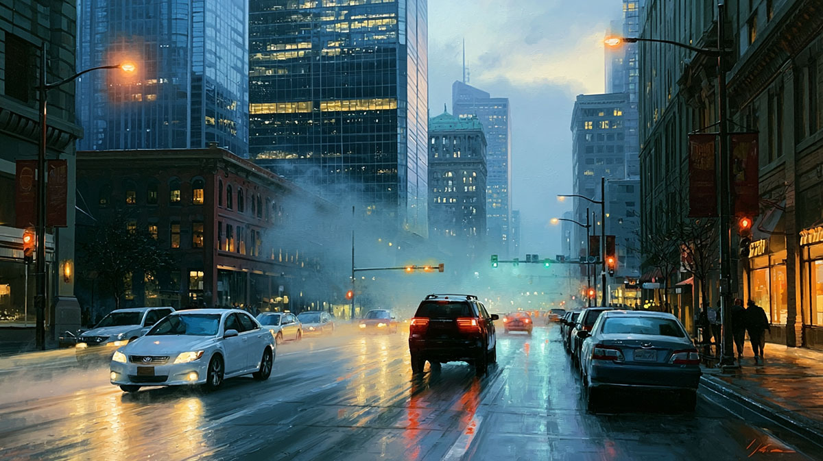
Wet pavement reflections follow one rule consistently: the reflected image is always darker and more saturated than the object above it. A red awning reflects as a deeper, richer red in wet asphalt, not a lighter pink. The reflection also distorts horizontally, spreading sideways rather than being a clean vertical copy.
Both glass and wet pavement reflections need softer edges than the hard architectural forms around them. This edge contrast is what makes them read convincingly as reflective surfaces rather than simply colored shapes.
For techniques on painting glass and reflections in general, the same principles apply across subjects: darker values, horizontal distortion, and soft edges relative to surroundings.
Texture Techniques for Brick and Concrete
Dry brush and palette knife are the 2 fastest methods for suggesting surface texture without overworking.
Dry brush: load a stiff filbert brush lightly, drag it across a dry or semi-dry layer. The paint catches the raised texture of the canvas and skips over the valleys, creating the granular quality of aged concrete or rough stone.
Palette knife: apply a thick stroke of mixed color across a brick area, then lightly drag the knife edge horizontally to suggest mortar lines. The result reads as brick from normal viewing distance without requiring individual brick rendering, which is both time-consuming and unconvincing at scale.
How Do You Paint the Sky and Atmospheric Perspective in a City Scene?
Urban skies behave differently from open landscape skies. Buildings interrupt and frame the sky, reducing it to irregular shapes between rooflines. The sky is rarely the dominant element in a city painting; in most street-level views, it occupies less than 20 percent of the picture plane.
Sky Handling in Urban Compositions
Treat the sky as a value anchor, not a focal point. Its role is to establish the lightest light in the scene and provide the correct cool tone that the shadows on the ground will reflect.
An overworked sky competes with the street-level action. 2 to 3 broad strokes of a blue-white mix, soft-edged where they meet rooflines, is usually enough. The viewer’s eye will accept a simply stated sky if the street below is resolved.
Painting clouds in oil within a city scene requires restraint. A detailed cloud formation above a complex urban streetscape overloads the composition with competing information.
Atmospheric Perspective in Urban Environments
Atmospheric perspective works the same in a city as in an open landscape, but the distances involved are shorter and the haze is warmer and denser due to urban pollution and particulate matter in the air.
A building 200 meters away in a city is noticeably lighter, cooler, and less saturated than one 20 meters away. The shift is not subtle. Missing it makes the background buildings read as being on the same plane as the foreground, collapsing the sense of depth.
Aerial perspective rule for urban backgrounds: add titanium white + a touch of raw umber to every color used in the background. This greys and lightens the tone simultaneously, pushing the building back in space. The further the distance, the more white and grey enters the mix.
This technique, sometimes called aerial perspective, was refined by Leonardo da Vinci and remains one of the most reliable tools for creating believable spatial depth in representational painting.
The roofline edge where sky meets building is where many painters lose control. A hard, over-defined roofline silhouette flattens the building against the sky. A slightly softened edge, achieved by blending the still-wet sky into the building tone at the transition, creates air between the two planes and gives the building a sense of sitting in space rather than being cut out and pasted against a backdrop.
How Do You Paint Figures and Street Activity?

Figures in a city street scene are not portrait subjects. They are scale indicators, focal anchors, and movement signals. Overworking them destroys the painting.
Saatchi Art lists over 2,600 contemporary cityscape paintings currently available, and the ones that sell consistently feature figures suggested in 5 to 10 brush strokes rather than fully rendered.
Painting Figures at Street Scale
Silhouette first, detail never. Block the figure as a single dark mass. Add one highlight stroke across the shoulder catching the light source, then one color note for clothing. Stop.
Scale must match the established perspective. A figure standing at mid-distance is roughly one-third the height of a standard ground-floor doorway. A figure near the vanishing point is correspondingly smaller. Getting this wrong collapses the spatial logic the perspective drawing established.
Understanding gesture drawing helps here. The gesture of a figure in motion reads from the overall line of the body, not from facial features or clothing detail.
Grouping and Movement
Isolated figures read as static and staged. Group figures in clusters of 2 to 3 with overlapping edges. The overlap creates a single combined silhouette that reads more naturally as a crowd fragment than individually placed figures do.
Moving vehicles follow the same logic:
- Suggest with horizontal color streaks, not outlined shapes
- Keep vehicle edges soft against the road surface
- Use the vehicle’s local color desaturated, not at full chroma
Visual hierarchy matters. Figures placed near the focal point of the composition get the most edge definition. Figures at the periphery stay as loose value masses. This is how visual hierarchy operates in practice within a complex scene.
How Do You Mix and Apply Color for Urban Light Conditions?
Urban light is not clean. It bounces off concrete, glass, wet asphalt, and painted metal simultaneously. The color mixes for a city scene are more complex than a rural landscape because every surface is reflecting every other surface.
Color temperature contrast between lit and shadow sides is the core principle. As Gamblin Artists Colors notes, adding black to create shadow color deadens it and reduces the illusion of strong sunlight. Color-active shadow mixes produce a visually livelier result.
Mixing Sunlit Urban Surfaces
Sunlit concrete and stone: yellow ochre + titanium white + a small touch of cadmium red. Not pure white. Pure white makes concrete look like a hospital wall rather than a surface absorbing warm directional light.
The global oil painting materials market reached USD 2.34 billion in 2024, with professional artists driving 50% of demand (24marketreports). That professional segment develops the kind of color sensitivity that separates technically correct mixing from visually convincing mixing.
Shadow Color Mixing for Urban Scenes

Urban shadows are never black and rarely pure grey. 3 variables shift every shadow mix:
- Reflected sky: adds cool blue-violet to upper shadow surfaces
- Reflected pavement: adds warm ochre bounce light to lower shadow zones
- Local color: the wall’s own color stays present even in deep shadow
Base shadow mix: ultramarine blue + burnt sienna. Shift toward blue for cool conditions (overcast, north-facing walls). Shift toward sienna for warm, late-afternoon shadow. Add a small amount of the surface’s local color to keep the shadow linked to the object it sits on.
Artificial Light at Dusk
Dusk scenes require 2 competing color temperatures in the same painting at the same time. This is what makes them both challenging and painterly.
| Light Source | Color Mix | Shadow Response |
|---|---|---|
| Streetlamp (sodium) | Cadmium yellow + yellow ochre + white | Cool blue-violet shadows away from lamp |
| Lit shop window | Naples yellow or warm white + cadmium orange | Cool grey-blue on surfaces outside the light spill |
| Overcast sky (ambient) | Titanium white + cerulean blue + raw umber | Warm reflected ground light underneath objects |
The rule: wherever artificial warm light hits a surface, the shadow areas adjacent to it shift cool. The eye reads this contrast as light and accepts it as real.
Understanding warm vs. cool color relationships and how they interact in the same scene is the single most important color skill for painting dusk city subjects.
How Do You Handle Edges and Detail in the Final Layers?
The final layers determine whether the painting reads as a considered work or a labored one. Most overworked city paintings fail at this stage, not earlier.
The oil painting process from underpainting to final layer follows a consistent logic: each layer increases oil content relative to the one below. This is the fat-over-lean rule in practice. Violating it causes the paint film to crack as lower layers continue curing beneath rigid upper ones (Natural Pigments).
Edge Control in the Focal Area
Not all edges receive equal treatment. The focal area of the composition gets 3 things the rest of the painting does not:
- The sharpest edge transitions in the entire work
- The highest value contrast (darkest darks directly adjacent to lightest lights)
- The most specific color temperature variation
Everything outside the focal area softens. Peripheral buildings stay as value masses. Background figures lose their edge definition entirely. This is not laziness; it is how contrast in painting directs the viewer’s eye.
Final Highlight Placement
Pure titanium white highlights go on last, applied with a small round brush in 3 specific locations:
- Lamp post tops and lamp housings where direct light hits metal
- The brightest point of wet pavement reflections
- Window glints, one per pane, placed off-center
These highlights should not be blended into the surface beneath them. Load the brush, place the stroke, leave it. Blending a specular highlight softens it into a glow rather than a point of light, which loses the sense of hard reflective surfaces that defines urban subjects.
Knowing When to Stop Adding
Overblending is the most common final-stage error in oil city paintings. British photorealist Nathan Walsh, whose urban oil paintings of New York and Chicago took months to complete, noted that the challenge is “to make it challenging” rather than defaulting to repeating safe patterns. That applies equally to knowing when a painting is resolved.
Test: step back to 6 feet. The focal point should read clearly, depth should be visible, and light direction should be obvious. If those 3 things work, the painting is finished regardless of how unresolved it looks at close range.
What Are the Most Common Mistakes in Street Scene Oil Painting?
Most errors in urban oil painting are structural, not surface-level. They happen in the early stages and get harder to correct with every subsequent layer.
Uniform Detail Across the Whole Canvas
Painting every building, figure, and surface at the same level of finish removes the hierarchy that guides the viewer’s eye. A street scene where everything competes equally for attention reads as flat and exhausting rather than deep and inviting.
The fix: decide the focal element before touching paint. Assign 3 tiers of finish: resolved (focal area), suggested (mid-ground), and implied (background). Stick to it.
Opaque, Dead Shadows
Mixing black into shadows removes their color activity and creates flat dark zones rather than transparent, luminous shadow. This is the most visually deadening mistake in representational city painting.
As Gamblin Artists Colors documents, using value contrast alone without color temperature contrast produces shadow areas that look dull even when technically correct in tone.
Shadow areas need transparency. Apply them with less paint pressure than the lit areas, and use glazing medium in the final shadow layers to keep them translucent.
Scale and Perspective Inconsistency
Two errors here, and both read immediately to any viewer:
- Figures that do not shrink proportionally as they approach the vanishing point
- Window heights that do not follow the same convergence as the roofline
Both stem from the same cause: not committing to the perspective structure in the underdrawing and then estimating by eye during painting.
Copying Photographic Lens Distortion
Wide-angle camera lenses introduce barrel distortion. Vertical lines at the edges of a photograph bow outward. Buildings lean. Copied directly into paint, this makes the architecture look structurally wrong even if the painting accurately reproduces the photograph.
Artist Brian Keeler noted this directly in his cityscape demonstrations: manipulating and correcting perspective from photo reference is necessary because “the orthogonals need to lead toward the vanishing point” regardless of what the lens recorded (Artists Network).
Correct vertical lines to true vertical. Adjust converging horizontals to meet at a single consistent vanishing point on the horizon. The painting should look like what the eye sees, not what a 16mm lens records.
How Do You Know When a Street Scene Painting Is Finished?
Finishing is a decision, not a feeling. Most painters add 20 percent too much. The last session of overworking erases the brushwork energy that oil paint accumulates through the painting process.
The 6-Foot Test
Step back to at least 6 feet and check 4 things:
- The focal point is immediately clear
- Light direction is readable in a single glance
- Depth is visible from foreground to background
- No single area is demanding attention equally to the focal zone
If all 4 pass, the painting is finished. If one fails, address only that issue.
Varnishing and Preservation
Wait a minimum of 6 months before applying a final varnish to a thinly painted oil. Thicker impasto layers require up to a full year to cure through to the lower layers (Natural Pigments).
Retouch varnish is the bridge solution. It saturates sunken areas and evens the surface sheen for photography or exhibition while the paint continues curing underneath. Apply it in a single thin coat with a wide flat brush.
Knowing how to varnish an oil painting correctly protects decades of work. Gamvar (Gamblin) dries in 18 to 24 hours and is removable with Gamsol, which is the standard recommendation for conservation-safe finishing.
Storage and Framing After Completion
A finished city scene painting needs at least 2 weeks of air drying before being placed face-to-face with another canvas for storage. The surface may be touch-dry but still soft enough to take impressions from contact.
Framing choices affect how the painting reads. A simple floater frame or a plain wood moulding with a small reveal keeps the architecture of the city scene as the visual focus. An ornate frame competes with the geometric structure of urban subjects in a way it does not with landscape or portraiture.
Guidance on how to store oil paintings correctly covers climate control, stacking, and tissue interleaving in detail, all of which matter for preserving the layered paint film of a complex urban oil painting over time.
FAQ on How To Paint A City Street Scene In Oil
What oil paints do I need for a city street scene?
A limited palette works best. Use titanium white, ivory black, yellow ochre, burnt sienna, ultramarine blue, and cadmium red medium. Six colors cover every urban mix you need, from sunlit concrete to cool shadow color.
Do I need to sketch the scene before painting?
Yes. A loose charcoal or burnt sienna underdrawing establishes your vanishing point and horizon line before any paint goes down. Skip this and perspective errors compound through every layer.
What canvas size works best for street scenes?
x16 or 16×20 inches is the practical range. Large enough to suggest architectural detail, small enough to manage tonal value blocking efficiently. Bigger formats work in the studio, not on location.
How do I paint wet pavement reflections in oil?
Reflected images in wet asphalt are always darker and more saturated than the objects above them. Keep reflection edges softer than the hard building edges around them. Apply with horizontal brush strokes, not vertical ones.
How do I handle figures in a city painting without overworking them?
Paint each figure as a dark silhouette mass first. Add one highlight stroke and one color note. Stop there. Figures in street scenes read as scale indicators, not portraits. Five to ten brush strokes per figure is enough.
What is atmospheric perspective in an urban scene?
Atmospheric perspective means background buildings appear lighter, cooler, and less saturated than foreground structures. In cities, urban haze adds a warm grey tone to distant facades. Add titanium white and raw umber to every background mix.
How do I mix shadow colors for city buildings?
Never use black for shadows. Mix ultramarine blue and burnt sienna as your shadow base, then add a small amount of the wall’s local color. Shift toward blue for cool light, toward sienna for warm afternoon conditions.
Can I paint a city scene from photo reference?
Yes, but correct for lens distortion. Wide-angle cameras bow vertical lines outward and misalign converging horizontals. Adjust all orthogonal lines to meet at a consistent vanishing point, regardless of what the photograph shows.
When should I varnish a finished city oil painting?
Wait at least six months before applying a final varnish to thin paint layers. Use retouch varnish in the meantime for photography or exhibition. Gamvar is the standard choice: it dries in 18 to 24 hours and stays removable.
How do I know when a street scene painting is finished?
Step back to six feet. The focal point should be immediately clear, light direction readable in one glance, and depth visible from foreground to background. If those three things work, the painting is done. Stop adding paint.
Conclusion
This conclusion is for an article presenting how to paint a city street scene in oil as a structured, learnable process rather than an intimidating subject.
The core skills stack on each other. Tonal value blocking creates the foundation. Correct perspective keeps architecture readable. Color temperature contrast makes light feel real.
Shadow color mixing, figure scale, wet pavement reflections, and atmospheric perspective each solve a specific visual problem. Master them individually and they work together automatically.
Urban landscape painting rewards patience at every stage. Rush the underpainting and the color layers suffer. Overwork the final details and the brushwork energy disappears.
Get the sequence right. The cityscape will follow.