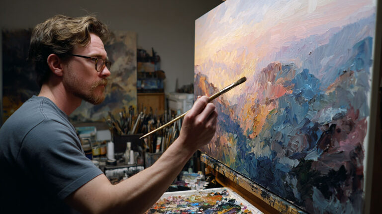
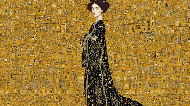
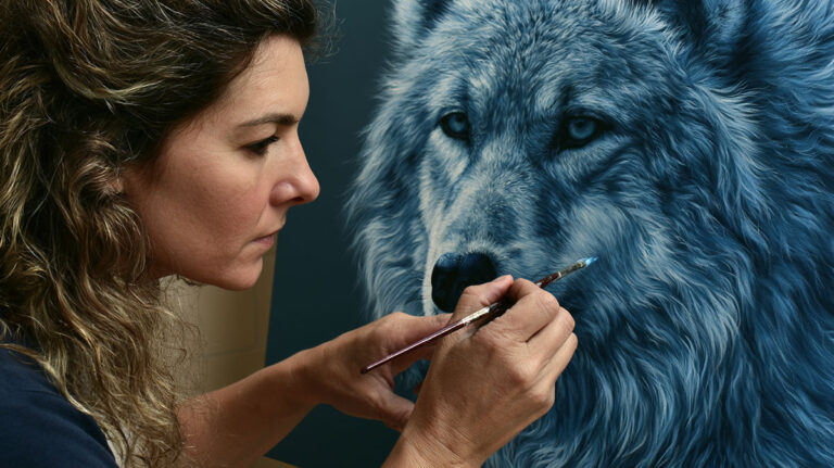
A portrait can stop someone mid-step. Not because of the subject, but because of how it was painted.
Mastering portrait painting techniques takes more than knowing how to mix skin tones or copy a reference photo. It requires understanding light, value structure, facial proportions, and the edge quality that separates a lifeless likeness from something that actually looks like a person.
This guide covers everything from oil and acrylic portrait methods to watercolor approaches, lighting setups, and the most common mistakes that undermine otherwise solid work.
Whether you are painting alla prima in a single session or building up glazed layers using the indirect method, the fundamentals covered here apply across every medium and every skill level.
What Is Portrait Painting

Portrait painting is the practice of representing a specific person’s likeness through paint on a surface. It is one of the oldest and most technically demanding genres in the history of painting, going back to ancient civilizations and codified during the Renaissance period.
The goal is not always photographic accuracy. Some portraits go after emotional truth, presence, or character. Others aim at strict likeness. Both approaches are valid, and your technique choices depend on which direction you’re heading.
Portraits consistently rank among the most commercially sought-after works. According to Artsy data, 61 of the top 100 in-demand artists in 2023 were figurative painters, and 67 of the top 100 auction results that year were for figurative works.
Understanding what painting is at a fundamental level shapes how you approach portraiture. Faces respond differently to paint handling than still life objects or landscapes. Skin shifts in color temperature across shadows and highlights. Features carry weight, and small errors in proportion read immediately to the human eye.
Portrait Painting vs. Other Painting Genres

Portraits demand a specific skill stack that other genres don’t always require.
- Likeness depends on accurate facial proportions and correct value structure
- Skin tones require understanding warm-cool color temperature shifts
- Facial features like eyes and lips have precise edge quality requirements
- The viewer notices mistakes in faces faster than in any other subject matter
Landscape painting or still life work allows more interpretive freedom. Portraits don’t. A tree that’s slightly off still reads as a tree. A nose that’s slightly off reads as wrong immediately.
Mediums Used in Portraiture

Most portrait painting happens in one of four mediums. Each has tradeoffs worth knowing before picking up a brush.
| Medium | Key Strength | Main Challenge |
|---|---|---|
| Oil | Slow drying, allows extended blending | Long drying time between layers |
| Acrylic | Fast drying, versatile | Color shift on drying, harder to blend |
| Watercolor | Luminous skin tones, transparency | No corrections, light to dark only |
| Gouache | Opaque, flat graphic quality | Rewets easily, not as forgiving |
Oil remains the dominant choice for commissioned portrait work and academic training. That said, watercolor portraiture has seen steady interest, and acrylic techniques have improved significantly as manufacturers have developed better slow-dry mediums.
Essential Materials for Portrait Painting
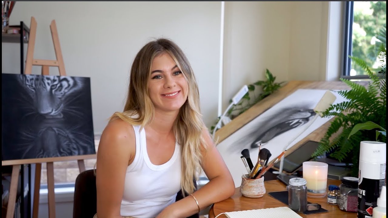
Getting the right materials before you start saves a lot of frustration. Cheap brushes in particular cause problems that beginners often blame on their technique.
Brush selection matters more in portraiture than almost any other genre. The filbert brush is the workhorse for most portrait painters. Its rounded tip blends edges naturally and allows varied stroke shapes in a single pass.
Brushes
A basic portrait brush kit doesn’t need to be large.
- Filbert brushes: sizes 4, 6, and 8 cover most of the painting
- Round brushes: sizes 1 and 2 for detail work on eyes and lips
- Flat brush: size 10 or 12 for blocking in large areas and backgrounds
Natural hog bristle brushes work well for oil portraits, especially for blocking in. For finer blending, a soft synthetic or sable-blend brush makes a noticeable difference. A fan brush occasionally comes in handy for softening hair edges, though it’s not a must-have.
Surfaces
Linen canvas is preferred by most professional portrait painters for its tooth and durability. Cotton canvas works fine for practice work and is significantly cheaper.
Wood panel is another option worth knowing. It provides a rigid, non-flexible surface that many classical painters preferred. Some artists find it easier to achieve smooth blends on panel because the surface doesn’t flex. The tradeoff is weight, especially for larger works.
For a detailed comparison, the differences between cotton canvas and linen canvas come down to texture, longevity, and cost. For a portrait that’s meant to last, linen is worth the extra expense.
Paints and Mediums
Student-grade paints are fine for practice but cause issues when mixing skin tones. Lower pigment concentration means you need more paint to hit a clean color, and the mixes often look muddy.
For oil portrait work, a lean medium like Gamblin Gamsol or Winsor & Newton Liquin keeps early layers drying faster. The fat-over-lean rule applies throughout: thin washes first, progressively oilier paint as layers build.
Gesso primer is the standard surface prep for both canvas and panel. Apply two to three coats, sanding lightly between each. A toned ground (a thin wash of burnt sienna or raw umber over the white gesso) is standard practice in portrait work. It eliminates the blinding white and gives you a mid-tone starting point that makes judging values much easier.
How to Structure a Portrait with an Underdrawing
The underdrawing is where portraits are won or lost. Most beginners skip it or rush it, then spend the rest of the painting trying to fix proportion problems with color.
Get the drawing right first. Everything after it is color and value. Facial proportions that are off at the drawing stage don’t magically fix themselves when paint goes on top.
Underdrawing Methods
Three approaches are commonly used, each with a different feel.
Charcoal underdrawing: Loose, erasable, and forgiving. Charcoal mixes easily with oil paint and doesn’t resist the first layer. Fix the drawing with a light spray of fixative before painting, or simply brush the excess charcoal dust off and paint directly over it with a thin burnt umber wash to lock in the lines.
Paint underdrawing (monochromatic): Thin burnt umber or raw umber thinned with solvent. More commitment than charcoal, but builds directly into the painting. Artists like Rembrandt van Rijn and Peter Paul Rubens both used versions of this approach.
Pencil underdrawing: Works well on panel or primed board. The graphite can show through thin paint layers over time as the painting ages, which is worth knowing for archival work.
Proportion Methods

Two methods dominate portrait training. They produce different results and suit different personalities.
| Method | How It Works | Best For |
|---|---|---|
| Grid method | Overlay a grid on reference, replicate squares individually | Photo-based portraits, beginners |
| Sight-size | Canvas placed beside subject, measured at arm’s length from a fixed point | Life painting, academic training |
| Freehand observation | Comparative measuring using pencil or brush as a plumb line | Experienced painters, expressive work |
The sight-size method is time-intensive but produces proportions that are measurably accurate because the painted image is the same size as the observed image. Most traditional portrait academies still teach it as the primary approach for life study.
Blocking In Shadow Shapes Early
After the line drawing, the next step is blocking in the major shadow shapes before any color goes in. This is where value structure gets established.
Squint at your subject. What you see when squinting is essentially the two-value version of the portrait: a light pattern and a shadow pattern. Lock those two shapes in before anything else. If that division reads correctly, the portrait will hold up even with rough color.
This early shadow block also makes the chiaroscuro relationship visible from the start. Painters who skip this step tend to overblend at the color stage, losing the sharp light-shadow boundary that gives portraits their sense of form.
Oil Portrait Painting Techniques
Oil paint gives portrait painters more flexibility than any other medium. The slow drying time allows extended blending, color adjustment, and the ability to wipe back and rethink sections while the paint is still wet.
Two fundamentally different approaches exist in oil painting. They’re not just stylistic preferences. They produce different results and require different skill sets.
Alla Prima vs. Indirect Painting

Alla prima means completing the painting wet-into-wet, usually in a single session. Indirect painting means building up layers over multiple sessions, allowing each layer to dry before the next goes on.
Alla prima suits:
- Expressive, loose brushwork
- Painterly portraits with visible texture
- Single-session studies from life
- Artists who prefer spontaneity over control
Indirect painting suits:
- Complex commissions requiring precise likeness
- Glazed skin effects with luminous depth
- Classical technique using grisaille underpainting followed by color layers
- Artists who want to separate drawing, value, and color problems
John Singer Sargent worked primarily alla prima, which explains the confident, fluid brushwork in portraits like Madame X. The Flemish masters worked indirectly, building thin transparent glazes over a detailed dead layer. Both methods produce exceptional results. The difference is in temperament and timeline.
How to Mix Skin Tones in Oil
Skin tone mixing is where most beginners spend the most time getting stuck. The problem usually isn’t the color. It’s the value.
A simple approach that works across a wide range of skin tones: start with titanium white, add yellow ochre, then push warm or cool with cadmium red light or burnt sienna. The classic Zorn palette (titanium white, yellow ochre, vermilion, and ivory black) can produce a surprisingly wide range of flesh tones using just four pigments.
Shadows on skin are not simply darker versions of the light. They shift cooler and more chromatic. A warm, peachy highlight area will have a cooler, slightly more saturated shadow. This warm-cool relationship is what gives skin its sense of translucency.
Understanding how to mix skin tones properly, including warm-to-cool temperature shifts, is one of the biggest technical steps in portrait development. Most painters get it wrong for years before it clicks.
Glazing and the Flemish Method
Glazing means applying thin, transparent layers of oil paint over a dried surface to modify color or add depth. It’s the foundation of the Flemish indirect method and produces a luminosity that direct painting can’t replicate.
The sequence in the classical Flemish approach goes: imprimatura (toned ground), then the dead layer or grisaille (full monochromatic underpainting), then transparent color glazes layer by layer. Rubens used this method extensively, completing glazes in vermilion and yellow ochre over raw umber underpaintings.
The glazing technique in oil requires patience. Each layer needs to be fully dry before the next goes on. Rushing it causes the layers to mix and muddy. But done correctly, glazed skin tones have a depth that no single-pass painting can achieve.
Scumbling works the opposite way: a semi-opaque, lighter paint layer dragged over a darker dry surface. It creates soft, broken light effects on skin and is particularly useful for suggesting the soft light falling across a forehead or cheekbone.
Acrylic Portrait Painting Techniques

Acrylic has a reputation for being tricky in portrait work. That reputation is partly deserved. The fast drying time cuts into blending windows, and the color shift when acrylic dries (slightly darker and more matte) throws off color mixing judgment.
That said, plenty of serious portrait painters work exclusively in acrylic. The medium just requires adapting your workflow.
Managing Drying Time
A wet palette is non-negotiable for acrylic portrait work. It keeps paint workable for hours instead of minutes.
The commercial options (Masterson Sta-Wet, Mijello Mission Gold) work well. A DIY version using a shallow tray, damp absorbent paper, and palette paper works just as well for a fraction of the cost.
Slow-dry mediums like Golden’s Retarder or Liquitex Slow-Dri extend open time further, especially helpful when blending skin transitions across larger areas of the face.
Layering Approach in Acrylic
Because acrylic dries fast, the layering approach actually works better in acrylic than in oil for many painters. You can build up multiple thin layers in a single sitting.
Start with a transparent wash to block in shadows. Build mid-tones in the second pass. Add highlights last. Layering in acrylic keeps colors clean because each layer has already dried and won’t lift or muddy into the next.
Glazing works in acrylic too, and the effect of acrylic glazing over dried layers produces a luminous quality similar to oil glazing, though the optical character differs slightly due to the acrylic binder.
Blending Skin in Acrylic
Wet-into-wet blending in acrylic requires speed. The window is short, and beginners often find the paint has already started to dry while they’re still trying to soften an edge.
A few approaches that actually help:
- Work in small sections, completing each blend before moving on
- Mist the canvas lightly with water to extend workability
- Use dry brushing for soft transitions instead of wet blending
- Accept harder edges as part of the style and use them intentionally
Some acrylic portrait painters lean into the harder edges and build a graphic, graphic-influenced portrait style. Artists like Alex Katz built an entire career on flat, hard-edged portrait painting in acrylic. Not every portrait needs soft, blended transitions.
Watercolor Portrait Techniques
Watercolor portrait work is unforgiving in ways that oil and acrylic are not. You can’t paint light over dark. You can’t fully erase a mistake. The medium demands planning, confidence, and a willingness to accept some unpredictability as part of the result.
That said, the luminosity watercolor produces in skin tones is something oil can only approximate. When it works, it’s spectacular.
Working Light to Dark

This is the defining constraint of watercolor technique. The white of the paper is the lightest light. Everything else is built by adding pigment, which means getting progressively darker with each layer.
Plan where the lightest areas fall before putting any paint down. In a portrait, this usually means the forehead highlight, the bridge of the nose, the upper lip highlight, and any catchlights in the eyes. Those areas stay as bare paper or receive only the palest wash.
A limited palette approach works well for watercolor portraits. Three pigments that mix cleanly (a warm red, a yellow, and a cool blue) give more color range with less risk of muddy mixes than a loaded palette does.
Wet-on-Wet for Soft Skin Transitions
Soft edges in skin, particularly across cheeks and forehead, happen naturally with the wet-on-wet technique. Apply a wash, then drop a second color into it while still wet. The two colors bleed into each other, producing transitions that no brush can replicate artificially.
The wet-on-wet approach also produces soft, blooming shadows on the shadow side of the face. The unpredictable blooms and granulation that result are part of what makes watercolor portraits feel alive and different from any digitally produced image.
Hard edges matter too. Not every edge in a portrait should be soft. The sharp edge of an eye socket or the crisp line of a lip needs a dry-brush approach or a wet brush on dry paper. Mixing hard and soft edges, knowing which features call for each, is what separates competent watercolor portraiture from truly skilled work.
Fixing Common Watercolor Portrait Mistakes
A few things go wrong regularly, especially for painters coming from opaque mediums.
Overworking wet paint: Going back into a drying wash with a brush lifts the pigment and creates streaky, uneven patches. Let it dry completely before touching it again.
Ignoring value structure early: It’s tempting to focus on color in watercolor because it’s so immediate. But portraits where the dark values are too light read as weak and washed-out. The shadow side of the face needs committed darks, even in a light-key portrait.
Paper warping: Thin watercolor paper buckles badly when wet, which makes consistent washes nearly impossible. Learning how to fix watercolor paper warping and pre-stretching paper before starting is worth doing for any serious portrait work.
How to Paint Skin Tones Accurately
Skin tone mixing is probably where portrait painters spend the most time struggling, and the fix is almost never about finding the right color.
It’s about value first, temperature second, color last. Get those two right and almost any color mix will read as convincing skin.
According to Artsy’s 2023 recap, 61 of the top 100 most-in-demand artists were figurative painters. Portraits showing convincing skin tones dominate that category. There’s a reason: getting it wrong is obvious. Getting it right is memorable.
Working from Life vs. Photo Reference
Life painting forces you to make decisions. A camera flattens color temperature, compresses value range, and shifts hues depending on the sensor. Most portrait painters who learn entirely from photos end up with skin tones that feel slightly plastic or overworked.
From life: color temperature shifts are visible, subtle, and accurate.
From photo: shadows often read as flat grey-brown, highlights lose nuance, color temperature differences are compressed.
Working from both builds better instincts. Use photos for convenience and life sessions for calibration. Painter John Singer Sargent was known for painting directly from life, which is a significant factor in why his skin tones hold such an immediate quality even in reproduction.
Color Temperature in Skin

Under traditional north-facing window light, skin follows a repeating warm-cool pattern across zones. Artists Network research shows the highlight tends to run slightly cool, the direct light zone warms, the halftone cools again, and the deep shadow picks up warmth from reflected light.
A practical breakdown for most skin under indoor lighting:
- Highlight: titanium white + a touch of cerulean blue (cool)
- Light zone: base mix warm, leaning towards yellow ochre and cadmium red light
- Halftone: base mix with a small amount of viridian or blue to cool it down
- Deep shadow: warm, transparent glazes of burnt sienna or burnt umber
This pattern applies across a wide range of skin tones. The specific pigments shift depending on the subject’s complexion, but the warm-cool alternation holds. Darker skin tones often show richer, more saturated color in the halftone zone compared to lighter complexions.
Common Skin Tone Mixing Formulas

A limited palette forces cleaner mixing and better color harmony. The Zorn palette (titanium white, yellow ochre, vermilion, ivory black) is the most widely cited limited palette for portrait work, and it genuinely covers most skin tones.
For a broader range, a five-pigment portrait palette works well across most complexions:
| Skin Zone | Starting Mix | Temperature Adjustment |
|---|---|---|
| Highlight | Titanium white + raw sienna | Add cerulean to cool |
| Mid-tone | Yellow ochre + cad red light + white | Warm or cool as needed |
| Shadow | Burnt sienna + ultramarine blue | More blue for cool, more sienna for warm |
Avoid using black to darken skin. Black mixed into skin tones typically produces a grey, deadened look that kills the sense of translucency. A mix of burnt sienna and ultramarine blue creates a natural dark that can be tilted warm or cool with small adjustments.
How to Paint Eyes, Nose, and Lips
These three features are where most portrait painters either win or lose the work. And the irony is that overworking any of them is what usually kills it.
As portrait specialist Ben Lustenhouwer put it, “the likeness does not depend on an accumulation of details.” That’s worth writing on a sticky note above your easel.
Painting Eyes That Look Alive

Eyes fail in portraits for one consistent reason: they’re painted as flat symbols rather than three-dimensional spheres with a wet, curved surface in front of them.
Key structural points:
- The eyeball is a sphere. The upper lid casts a shadow on the iris
- The iris is never a flat disc of one color. It darkens at the rim and lightens toward the pupil
- The lower lid has a thick, wet edge that catches light. Leave a small highlight on it
- The whites of the eyes are almost never white. They sit in shadow and pick up reflected color
The catchlight placement matters a lot. Keep it consistent with your light source direction. If the light is coming from the upper left, the catchlight is upper left. Moving it to the center to make it “look better” is the kind of adjustment that quietly kills likeness without the painter realizing why.
Getting the Nose Right Without Overworking It
The nose is the most outlined feature in beginner portrait work. Outlines kill it every time.
Paint the nose using value and shadow shapes, not lines. The side plane of the nose turns away from the light and gets darker. That value shift, not a dark line, is what separates the nose from the cheek beside it.
Nostrils read as dark shapes, not black holes. Use warm darks like burnt umber mixed with alizarin crimson. The base of the nose often has a soft, reflected-light highlight underneath it from light bouncing off the upper lip area.
Lips: Hard Edges and Soft Edges
Lips have a clear edge quality logic that’s worth understanding before putting any paint down.
Upper lip: usually the darker of the two, often in partial shadow. The Cupid’s bow has some sharp definition at its peaks. The corners of the mouth are soft and lost.
Lower lip: catches more light, sits slightly forward. The center highlight is often the brightest point. The shadow under the lower lip, between lip and chin, gives the lip its forward projection.
A sharp, outlined mouth is the fastest way to make a portrait look rigid. Vary the edge quality. Let the corners of the mouth soften or disappear into shadow. The sfumato approach that Leonardo da Vinci used around the mouth in portraits like the Mona Lisa works precisely because those edges are resolved into near-invisible transitions.
Light and Shadow in Portrait Painting
Light and shadow aren’t just about making things look three-dimensional. They determine mood, focus, and character. A flat portrait with even illumination reads very differently from one built on strong Rembrandt lighting.
The light source sets every other decision that follows. Decide it early and stick with it.
Classic Portrait Lighting Setups
Four setups dominate portrait painting and are directly borrowed from how painters have positioned their sitters for centuries.
| Setup | Light Position | Shadow Character | Best Use |
|---|---|---|---|
| Rembrandt | 45 degrees to side, above eye level | Triangle of light on shadowed cheek | Moody, character-driven portraits |
| Loop | 30-45 degrees to side, slightly above | Small loop shadow below nose | Versatile, natural, most faces |
| Butterfly | Directly in front, above | Small shadow below nose, even cheeks | Flattering, glamour, fashion |
| Split | 90 degrees to side | Half face lit, half in shadow | Dramatic, editorial, strong character |
Rembrandt lighting takes its name directly from the Dutch master’s habitual use of high-side window light in his portraits. The triangle of light on the shadowed cheek is the hallmark, and it’s created simply by placing the light source far enough to the side that the nose shadow connects with the cheek shadow, leaving that small lit triangle below the eye.
Core Shadow vs. Cast Shadow
This distinction matters more than most beginners realize. Mixing the two up produces portraits where the lighting reads as confused and internally inconsistent.
Core shadow: the darkest area on the form itself, where the surface turns away from the light. It sits at the shadow terminator, the line where the lit side transitions to shadow. On the face, this runs along the side of the nose, across the cheek, down the jaw.
Cast shadow: the shadow an object throws onto another surface. The shadow the nose casts onto the upper lip. The shadow the upper lip casts onto the lower lip. These tend to have harder edges than core shadows on curved forms.
Understanding value in painting and how it builds the illusion of form is the technical foundation under all of this. Every shadow relationship comes back to controlling the value structure.
Reflected Light on the Shadow Side
The shadow side of a portrait is not uniformly dark. Light bouncing off surrounding surfaces, clothing, a white shirt collar, a light-colored background, fills back in from below and from the sides.
This reflected light sits in the shadow but is always darker than any value on the light side of the face. A common mistake is painting reflected light too bright, which breaks the light-shadow logic and flattens the form.
Rembrandt handled reflected light with notable restraint. His shadow sides are genuinely dark, with just enough warm reflected light to suggest the face continuing around the form. That restraint is part of what gives his portraits their weight.
Common Portrait Painting Mistakes
Most portrait problems aren’t technical. They’re perceptual. Painters paint what they think they see instead of what’s actually there.
Renso Art research puts it clearly: likeness depends on accurate proportions and value structure, not on an accumulation of details. A portrait with rough brushwork and correct values reads better than a polished portrait with wrong proportions.
Overblending and Losing Edge Variety
Overblending is the single most common mistake in portrait painting at the intermediate level. The instinct to smooth every transition out produces skin that reads as rubbery, uniform, and lifeless.
Good portraits have a mix of hard, soft, and lost edges. Not every edge needs to be resolved. The edge where a cheek turns away from the light into shadow is soft. The edge where the upper eyelid meets the iris is sharp. The corner of the mouth can be nearly lost entirely.
Boynes Artist Award research cites artist Ben Lustenhouwer directly on this: likeness does not come from accumulated detail. Over-rendered features, overworked edges, and excessive blending all work against it.
Painting Symbols Instead of What You See
This one is tricky because it’s unconscious.
Every person who has seen a human face carries a mental template: two eyes, a nose, a mouth, in roughly these proportions. The brain wants to paint that template. The problem is the template is generic and the subject is specific.
White of the eyes painted pure white. Teeth painted bright and uniform. Nostrils painted as two identical dark holes. None of these is what the actual face looks like under real light.
The fix isn’t to paint more carefully. It’s to paint more observationally. Squint at the subject until features dissolve into value shapes. What’s left are shapes and tones, not symbols.
Ignoring Value Structure in Favor of Color
Starting with color before the value structure is solid is probably the #1 reason portraits fall apart.
Test: photograph your painting in black and white. If the light and shadow pattern doesn’t read convincingly in greyscale, no amount of color mixing will fix it.
Working from dark to light (blocking in shadow shapes first, then mid-tones, then highlights) builds a solid structural foundation before color gets involved. It also makes contrast in painting easier to control because the value relationships are already locked in.
Getting Attached Too Early to Details
Took me a while to learn this personally: the eyes you painted in the first hour almost certainly need to change once the rest of the face develops around them. Committing to detail too early means you’re reluctant to correct the big structural problems later.
Finish the big shapes before the small ones. Always. A portrait that works in big shapes at 80% completion is in a much better position than one where the eyes are museum-quality but the nose placement is wrong.
Stepping back from the canvas physically, at arm’s length or further, is the fastest way to diagnose structural problems. The eye-to-nose distance that looks fine up close will read immediately as wrong from across the room. Fixing painting mistakes is always easier when you catch them at the structural stage rather than after you’ve spent time on surface detail.
FAQ on Portrait Painting Techniques
What is the best medium for portrait painting beginners?
Acrylic is the most practical starting point. It dries fast, cleans up with water, and forgives mistakes through layering. Oil is better long-term for blending skin tones, but the slow drying time adds complexity that beginners don’t need early on.
How do you mix accurate skin tones?
Start with a warm base of yellow ochre, cadmium red light, and titanium white. Adjust temperature with small amounts of blue for shadows and burnt sienna for warmth. Value matters more than color. Get the light-to-dark relationships right first.
What is alla prima portrait painting?
Alla prima means painting wet-into-wet in a single session without waiting for layers to dry. It produces expressive, direct brushwork. John Singer Sargent used it extensively. It requires confident color mixing and decisive mark-making from the start.
What is the difference between direct and indirect portrait painting?
Direct painting completes the portrait in one session. Indirect painting builds layers over multiple sessions, typically starting with a monochromatic underpainting. Indirect methods allow more control over skin tone depth and glazed effects like those used in the Flemish method.
How do you achieve likeness in a portrait?
Likeness comes from accurate proportions and correct value structure, not detail. Check the distances between features constantly. Squint to simplify the face into value shapes. Small proportion errors in the underdrawing stage compound significantly once paint goes on.
What lighting setup is best for portrait painting?
Loop lighting works for most subjects. Rembrandt lighting adds drama through its characteristic triangle of light on the shadowed cheek. Both setups come from classical north-facing window light that painters like Rembrandt van Rijn and Vermeer used in their studios.
How do you paint realistic eyes in a portrait?
Treat the eye as a sphere, not a flat symbol. The upper lid casts shadow on the iris. The lower lid has a wet highlight edge. The whites are rarely white in shadow. Keep the catchlight consistent with your main light source direction.
What is a grisaille underpainting?
A grisaille is a monochromatic underpainting in grey or brown tones used to establish value structure before color. It separates the drawing and value problems from color mixing. Artists like Rubens used it as the foundation layer in the classical indirect painting method.
How do you paint skin tones in watercolor?
Work light to dark, preserving the white of the paper for highlights. Use wet-on-wet for soft shadow transitions across cheeks and forehead. A limited palette of three clean pigments avoids muddy mixes. Let each wash dry fully before adding the next layer.
What are the most common portrait painting mistakes?
Overblending is the most frequent issue at the intermediate level. Others include ignoring value structure in favor of color, painting symbols instead of observed shapes, and committing to facial detail before the overall proportions and light-shadow pattern are correctly established.
Conclusion
This conclusion is for an article presenting portrait painting techniques as a skill built on layered understanding, not shortcuts.
Getting the value structure right before mixing skin tones, choosing between alla prima and the indirect method based on your intent, understanding warm-cool color temperature shifts across the face, these are the decisions that separate work that reads as convincing from work that doesn’t.
The grisaille underpainting, Rembrandt lighting, accurate facial proportions, controlled edge quality. Each one compounds the others.
Study the old masters. Famous portrait paintings by Velazquez, Sargent, and Rubens are still the most useful technical references available.
Paint regularly. Likeness and brushwork both develop through repetition, not theory.