
Skin is not a color. It is a problem of light, temperature, and value that changes across every inch of a face.
Learning how to paint skin tones in oil means understanding why flesh tones look flat, chalky, or artificial, and what to fix. The answers come down to color temperature, pigment choice, and how layers interact on the canvas.
This guide covers everything from mixing a base flesh tone to glazing deep chromatic shadows across the full range of human skin.
You will learn which pigments actually work, how warm and cool contrasts build form, and why value structure matters more than getting the hue exactly right.
What Are Skin Tones in Oil Painting?
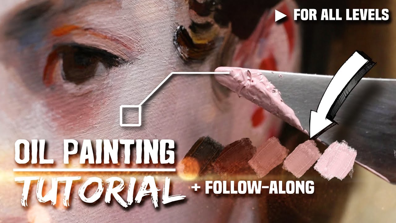
Skin tone in oil painting is not a single color. It is a relationship between hue, value, and chroma that shifts constantly across a surface depending on light, anatomy, and the viewer’s distance.
Most beginners approach skin with a fixed idea of what it “should” look like. That mental model, usually something pink or beige, is the first thing to discard.
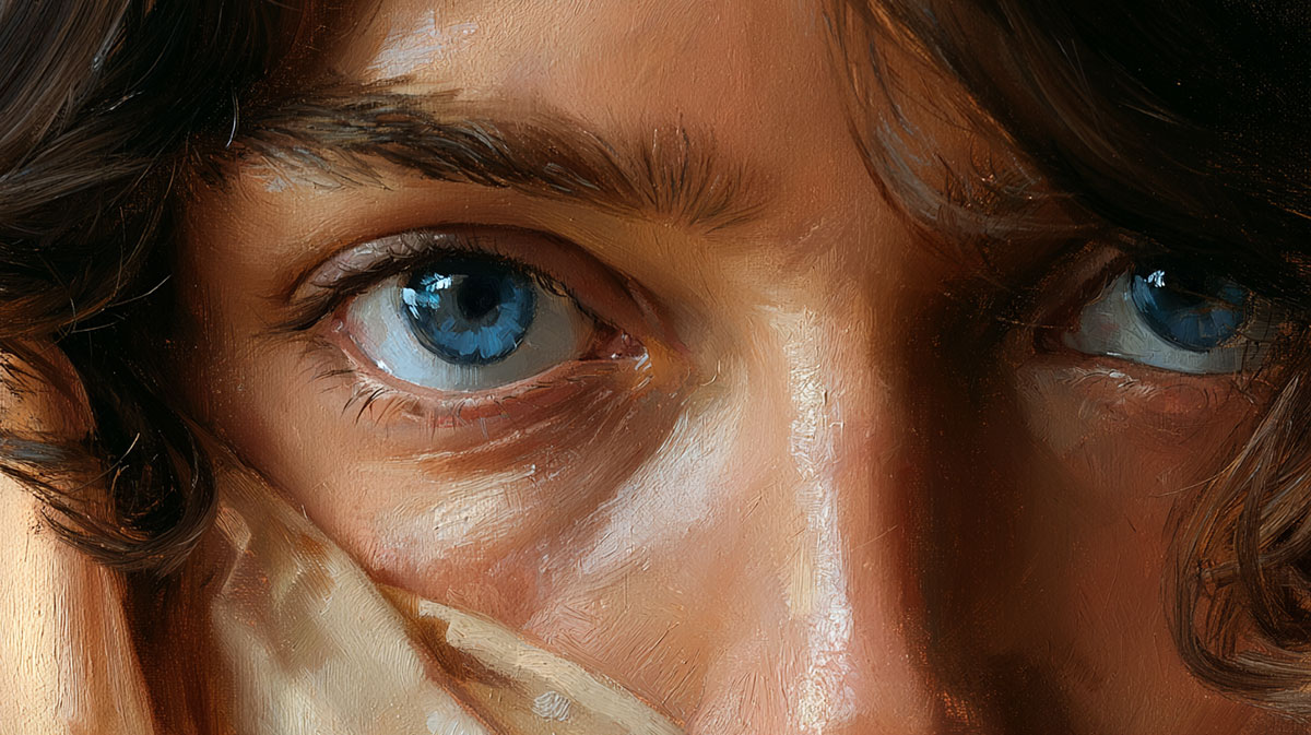
Skin is semi-translucent. Light does not just bounce off the surface. It penetrates the outer layers, scatters through blood, fat, and tissue beneath, then exits at a different point. This is called subsurface scattering, and it is why ears, nostrils, and fingertips glow with a warm orange-red in backlit conditions. The effect is most visible where skin is thin.
Painters who ignore subsurface scattering tend to produce portraits that look flat, like painted rubber rather than living flesh. Accounting for it, even subtly, is what separates a convincing portrait from a stiff one.
The 3 Variables That Define Every Skin Tone
Every mixing decision in portrait painting comes back to 3 variables:
- Hue: the underlying color direction, warm (orange, yellow) or cool (pink, blue-grey)
- Value: how light or dark the mixture is, regardless of its color
- Chroma: how saturated or muted the mixture is
Real skin is far less saturated than beginners expect. The instinct to add more red is almost always wrong. Muted, neutralized mixtures read as convincing flesh. Bright ones read as painted faces at a carnival.
Understanding value in painting is the single most useful skill for portrait work, more important than getting the exact hue right. A painting with correct values and slightly wrong colors looks better than one with perfect colors and wrong values.
Why Skin Is Not One Color
No patch of skin on a face is the same color as any other. The forehead reads differently from the jaw. The area around the mouth is cooler than the cheeks. The temples often carry a bluish-grey. Cartilage areas like the nose tip tend toward red-orange.
The color shifts are driven by 3 factors: the thickness of the skin, the density of blood vessels beneath, and the angle of the surface relative to the light source.
A portrait painter tracks all 3 simultaneously. This is why portrait painting techniques take years to internalize. The decisions happen fast, and most of them are not consciously deliberate once the eye is trained.
What Color Temperature Does to Skin in Oil Paint?

Color temperature is the single most important concept in realistic skin tone painting. Get it right and the portrait reads as lit and alive. Get it wrong and the face looks like it was painted under fluorescent lights in a basement.
The core rule: warm light sources produce cool shadows, and cool light sources produce warm shadows. This applies to every surface, including skin.
How Temperature Opposition Works on a Face
Under warm afternoon light, the lit planes of the forehead and cheekbones shift toward yellow-orange. The shadow sides of the face, the recesses under the brow, the area below the nose, the underside of the jaw, pull toward cooler blue-grey and violet.
This opposition is what creates the sense of three-dimensional form. Without it, a face looks flat even if the values are technically correct.
Key areas to watch:
- Forehead (lit plane): warmer, higher value, slightly more yellow
- Cheek (lit plane): warmest area on many faces, more red-orange presence
- Temple and jaw shadow: notably cooler, often blue-grey or neutral violet
- Under-chin: picks up reflected light from clothing or surfaces below
White Paint and Temperature Shifts
The white you choose directly affects temperature control. Titanium White is the most opaque and the most cooling. Add it to any warm mixture and it shifts the color toward a chalky, bluish-grey that reads as cold skin.
Lead white (also called Flake White) is warmer and more transparent. It integrates into flesh mixtures more naturally and was the standard choice for portraitists from the Renaissance through the 19th century.
Zinc White sits between the two in terms of opacity and temperature, leaning slightly cooler than lead white but less aggressively so than titanium. It works well for halftone passages where you need the paint to stay semi-transparent.
Most working portrait painters today use a combination when mixing oil paints, keeping titanium for light highlights and lead or zinc for mid-tone flesh mixtures where temperature sensitivity matters.
The Most Common Temperature Mistake
Painting the entire face at the same temperature. This produces skin that looks like a uniform mask, with no sense of light direction or three-dimensional form.
The fix is deliberate: paint the lit planes warmer than your base mix, and the shadow planes cooler. The transition zone between them, the halftone area, is where the most nuanced temperature work happens and where most of the face’s sense of volume lives.
What Pigments Work Best for Painting Skin Tones?
The pigments you use determine what is possible in your mixes. Some pigments are chemically incompatible with skin tone work. Others are so opaque they flatten every mixture they touch. Starting with the right palette removes most of the technical problems before they happen.
A solid core palette for skin tones uses 5-6 pigments: Yellow Ochre, Burnt Sienna, Cadmium Red Light, Titanium White, Raw Umber, and either Ivory Black or a cool dark like Paynes Grey.
Why Cadmium Red Light Over Alizarin Crimson
Alizarin Crimson is transparent, cool, and has a bluish-purple bias. It dominates mixtures and pushes skin tones toward a cold, synthetic look.
Cadmium Red Light is opaque, warm, and orange-leaning. Mixed with Yellow Ochre and white, it produces the kind of warm, muted flesh color that sits naturally in the lit areas of a portrait. It behaves predictably and does not overpower the mix.
Winsor and Newton, Gamblin, and Old Holland all produce reliable Cadmium Red Light in their professional lines.
Pigment Transparency and What It Controls
Pigment opacity affects how paint layers interact. For direct painting, opaque pigments are more predictable. For layered work and glazing, transparent pigments are the tools.
| Pigment | Opacity | Best Use in Skin |
|---|---|---|
| Yellow Ochre (PY43) | Semi-opaque | Base flesh mix, light passages |
| Burnt Sienna (PBr7) | Transparent to semi | Warm shadows, glazing, dark skin bases |
| Cadmium Red Light (PR108) | Opaque | Warm lit planes, cheek areas |
| Raw Umber (PBr7) | Semi-transparent | Neutral shadows, cooling warm mixtures |
| Transparent Oxide Red (PR101) | Transparent | Glazing warm depth into skin layers |
Limited Palette vs. Full Palette for Skin
The Zorn palette (Ivory Black, Titanium or Lead White, Yellow Ochre, Cadmium Red) is the most taught limited palette for portrait work. Swedish painter Anders Zorn (1860-1920) used a version of this 4-color system throughout much of his career, building his full range of flesh tones from those 4 pigments alone.
The Zorn palette works because Ivory Black functions as a low-chroma blue in context, creating the illusion of cool shadows and even sky when placed against warm ochre and red mixtures.
Its limitation: it cannot produce clean, chromatic blues or greens. A painting with a blue sky or green clothing will require expanding beyond the 4 colors. For pure skin tone practice, it is close to ideal.
Viridian is the one pigment worth adding when skin reads too red. A small amount mixed into a warm shadow cuts the red channel without graying it the way black does. It is worth keeping on the palette even if you use it sparingly. You can read more about how different painting mediums and pigment choices interact in classical oil work.
How Do You Mix a Base Skin Tone in Oil Paint?
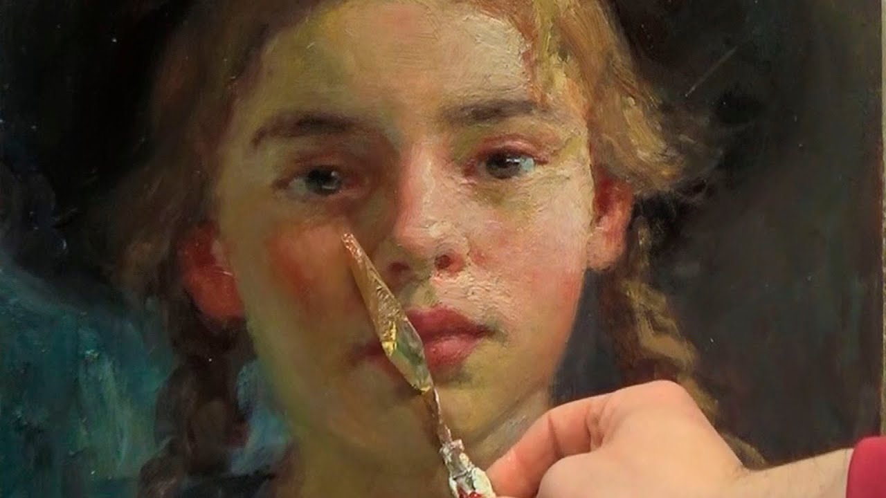
A base skin tone is a starting-point mixture that sits in the mid-tone range, neither the lightest highlight nor the deepest shadow. Everything else in the portrait gets adjusted from this foundation.
The starting proportions for a mid-tone, medium-fair skin: roughly 60% white, 25% Yellow Ochre, 10% Cadmium Red Light, 5% Raw Umber. These are not fixed ratios. They shift depending on the subject’s skin and the lighting conditions.
Adjusting the Base for Different Skin Tones
Lighter skin: increase white, reduce yellow ochre, keep the red very low. The result should look slightly too pale in isolation. Viewed against the shadow areas, it will read correctly.
Medium skin: balanced ochre and sienna with white, more red presence in the mix. Burnt Sienna begins to replace some of the Yellow Ochre role.
Darker skin: white steps back significantly. Burnt Sienna and Raw Umber form the base, with Cadmium Red adjusting warmth. The process of making convincing skin color for deep complexions is not about adding black. Black flattens the mix and removes color. Chromatic darks built from Transparent Oxide Red, Ultramarine Blue, and Burnt Umber produce shadows that retain color energy and read as rich rather than muddy.
Practical Mixing Notes
Mix more than you think you need. Running out of a matched mid-tone mid-session is the most avoidable problem in portrait painting. Mix at least twice the amount you expect to use.
Test the mixture against the reference under the same light source you are working under. Colors shift dramatically between tungsten, daylight, and LED lighting. A mix that looks correct under a warm lamp can read as too orange in natural light.
Use a palette knife for mixing rather than a brush. It produces more thorough, consistent blends and does not bury pigment in the bristles.
How Do You Paint Light and Shadow on Skin?

Value structure is what makes a portrait read from across the room. Color nuance is what holds attention up close. Get the value structure wrong and no amount of color sophistication will save the painting.
The basic structure has 4 zones: lights, halftones, form shadows, and cast shadows. Each behaves differently in terms of color temperature, edge quality, and chroma.
Mixing Lights and Shadows
Lights: start from the base mix, add more white and a slight warm shift (more Yellow Ochre or a touch more red). Do not add too much white too fast. Over-lightened skin looks chalky and dead.
Form shadows: start from the base mix, add Raw Umber and a small amount of the cool dark (Ivory Black or a touch of Ultramarine). Never add straight black directly into skin shadows. It produces a grey mud that reads as a bruise.
Halftones: the passage between light and shadow. These are the most critical areas in the painting and the most common place where portraits fall apart. Halftones should shift in temperature, slightly cooler than the lit planes, slightly warmer than the deep shadows.
Where Shadows Fall on the Face
Anatomy determines shadow placement. The light source determines their intensity and edge quality. Both matter.
| Facial Area | Shadow Type | Edge Quality |
|---|---|---|
| Under brow ridge | Form shadow | Soft, gradual |
| Underside of nose | Cast shadow | Sharper edge |
| Upper lip area | Form shadow | Soft, complex |
| Jaw and neck transition | Cast shadow (from chin) | Sharper in direct light |
Cast shadows and form shadows are not the same. Form shadows develop where the surface curves away from the light. Cast shadows are produced when one form blocks light from reaching another surface. Cast shadows have harder, more defined edges. Painting all shadows with the same edge quality is a common mistake that flattens the three-dimensional reading of a face.
John Singer Sargent’s portraits are the most studied example of this distinction in oil painting. His shadow edges are precise where anatomy and light demanded it, and dissolved into the surrounding flesh where they did not.
What Role Does Reflected Light Play in Skin Tones?
Reflected light is the color that bounces back into shadow areas from surrounding surfaces and the environment. It modifies the shadow temperature locally and, when handled correctly, makes the face look like it exists in a real, physical space.
Most beginners either ignore it completely or paint it too light. Reflected light is always darker than the direct light. This is a hard rule with no exceptions. Painting the reflected light brighter than the halftone destroys the illusion of form.
Where Reflected Light Appears on the Face
- Under the chin (reflected from the collar, chest, or a light-colored surface below)
- Side of the nose (bounced from the opposite cheek or nearby wall)
- The ear (often catches warm bounce from the neck and hair)
- Below the brow on the upper eyelid (bounced from the cheek plane)
The color of reflected light depends entirely on what is nearby. A subject photographed against a white wall will have neutral, slightly cool reflected light. Seated near a wooden surface, the reflected light picks up warm amber. Portrait painters working from life rather than photo reference have a significant advantage here because the reflected color is directly visible, not lost in a camera’s color compression.
How to Mix Reflected Light Color
Start from the shadow base mix. Add a small amount of the environmental color modifier. Keep the value darker than the halftone. Check it against the shadow rather than the light.
The most common reflected light scenario: cool north light from a window with warm bounce from a wooden floor or interior walls. The shadow side of the face gets a slightly warm, amber-tinted modifier in its lower sections while the upper shadow planes stay cooler from the skylight above. Understanding how light source affects composition helps predict where these bounces appear before you look for them.
How Do You Glaze Skin Tones in Oil Paint?

Glazing is the technique of applying a thin, transparent layer of paint mixed with medium over a dry, opaque underlayer. The underlayer shows through the glaze, and the interaction between them creates a luminosity that direct painting cannot fully replicate.
This is how Flemish and Baroque painters achieved the depth and glow in skin that still looks remarkable 400 years later. The technique works because transparent pigments filter light rather than simply reflecting it, producing a visual warmth that paint applied straight from the tube cannot match.
Best Pigments for Skin Glazes
Not all pigments glaze well. The key requirement is high transparency. Opaque pigments added to medium turn milky and muddy rather than transparent.
The 3 most reliable pigments for warm skin glazes: Transparent Oxide Red (PR101), Burnt Sienna (PBr7), and Quinacridone Red (PR122). For cool depth in shadow glazes: Ultramarine Blue thinned heavily with medium works well. Keep glaze layers thin enough to see your brushstrokes in the underlayer.
Glazing Medium Options
Liquin: speeds drying significantly, typically touch-dry in 24-48 hours. Maintains color accuracy better than pure linseed oil. Good choice for sequential glazing sessions.
Linseed oil: traditional, slower drying, can yellow slightly over decades. This yellowing affects lighter skin tones more than darker ones. Used alone, linseed oil extends drying to several days per layer.
Damar varnish mixed with solvent: very fast drying, produces a slightly resinous surface. Less flexible over time than oil-based mediums.
For layered portrait work, Liquin is the practical choice. The faster drying time allows realistic multi-session schedules without weeks of waiting between layers. You can read a detailed breakdown of all the options in this guide to oil painting mediums.
Flemish Technique vs. Direct Painting for Skin
These are the 2 main structural approaches in oil portrait painting. They are not better or worse than each other. They produce different visual results and suit different working styles.
| Aspect | Flemish Layering | Alla Prima (Direct) |
|---|---|---|
| Session count | Multiple, with drying time between layers | Single session or continuous wet |
| Skin luminosity | Higher, from glaze interaction | Lower, relies on direct color mixing |
| Color flexibility | Can correct at each layer | Correction done while wet only |
| Starting point | Grisaille underpainting | Direct color application |
| Best for | High-detail, high-finish portraits | Studies, life sessions, looser style |
The Flemish method begins with a grisaille, a monochrome underpainting in grey or brown that establishes all values before any color is introduced. Color then comes in through glazed layers over that tonal foundation. Painters like Rembrandt and Caravaggio both used multi-layered approaches in their portrait and figure work, with the underlayers doing the structural value work and the final layers handling color and surface.
Alla prima, by contrast, is all decisions made at once. John Singer Sargent and Edgar Degas worked largely in this mode, using fast, confident brushwork to resolve color and value simultaneously in a single wet session. The alla prima method rewards direct observation and a decisive hand. It is less forgiving of hesitation than the layered approach but produces a freshness and immediacy that glazed work rarely achieves. For more on how glazing works as a standalone technique in oils, see this detailed breakdown of oil painting glazing techniques.
How Do You Paint Different Skin Tones Across the Color Spectrum?
All skin tones across the full human range share one structural rule: they are built from warm orange-brown bases, not arbitrary mixes of red, yellow, and white.
The differences are in proportions and value, not in kind. Adjusting those ratios correctly is the entire job.
Lighter Skin Tones

White dominates the mix, roughly 60-70%. Yellow Ochre and Cadmium Red Light act as modifiers, kept deliberately low in proportion.
The most common mistake here is painting skin that reads as grey or lavender because Titanium White pulls every warm mix toward blue. Keep adding small amounts of Yellow Ochre until the cool cast disappears.
Shadows in lighter skin are often strongly blue-grey, sometimes with a violet quality, not dark pink or brown. Ivory Black mixed with a small touch of Cadmium Red produces a convincing cool shadow for very fair complexions.
Medium Skin Tones
Burnt Sienna steps in as a co-equal partner alongside Yellow Ochre. The red presence in the mid-tones is more pronounced and the white proportion drops below 50%.
Key shift: the lit areas carry more visible warmth, with more orange-red energy in the cheeks and brow. Shadows move toward richer, chromatic darks rather than the blue-grey of lighter skin.
A small amount of Viridian mixed into warm shadow passages neutralizes excess red without muddying the mix, which is the same technique used to pull back over-saturated cheek areas.
Darker Skin Tones
Burnt Sienna and Raw Umber form the base. White is used sparingly, mostly in highlights only.
Dark skin reflects light with high contrast and high chroma in the highlight areas. Those highlights are often closer to a warm ochre or mid-tone flesh mix than to pure white, which is what makes them appear luminous rather than chalky.
Never darken by adding black. Chromatic shadow mixes built from Transparent Oxide Red, Ultramarine Blue, and Burnt Umber produce rich, deep darks that retain color. Compare that to black-mixed shadows, which read as cold, flat, and lifeless at any value.
Contemporary portrait painter Kehinde Wiley, known for richly lit portraits of Black subjects, works with layered warm-cool contrasts to maintain luminosity across deep skin tones. His approach demonstrates how chromatic darks and reflected light interaction are more important than tube color selection for this range of complexions.
What Brushwork Technique Produces Realistic Skin Texture?

How paint is applied is as important as what color is mixed. The same flesh tone reads entirely differently depending on whether it is blended smooth, dragged dry over a texture, or laid down with a loaded filbert in a single stroke.
Brush Selection for Skin
Filbert brushes are the standard choice for skin blending. The oval tip creates soft, curving transitions without the hard corner marks that flat brushes leave.
According to research on oil painting brush types, filbert brushes combine the coverage of a flat with the softness of a round, making them particularly suited for portrait work and organic transitions in skin.
Hog bristle filberts for block-in and initial blending. Softer synthetic or sable filberts for final halftone passages. The progression from stiff to soft mirrors the progression from bold to refined in the painting itself.
Blending and Edge Control
Over-blending is the single most common technical mistake in skin painting. Every time a soft edge is introduced where a hard one should exist, some sense of form and focus is lost.
The rule: blend edges that describe gradual form transitions, leave edges hard where one form casts a shadow on another, or where you want the viewer’s eye to stop.
Wet-into-wet blending works well for smooth, young skin. Allow adjacent color passages to merge on the surface rather than pre-mixing them. The transitions feel more organic because they happened on the canvas, not the palette.
Scumbling for Skin Texture
Scumbling, dragging a semi-dry brush loaded with paint across a dry underlayer, creates the subtle broken texture that reads as aged or weathered skin.
Application areas:
- Temple and forehead in older subjects
- Areas around the eyes and mouth
- The neck and jawline where skin texture is more pronounced
The underlayer shows through the broken marks and contributes to the final reading. A warm underlayer scumbled with a cooler, lighter mix produces a textural effect no amount of smooth blending can replicate. For more on how layering and scumbling interact as techniques, there is a detailed breakdown worth reading before you start.
How Does Lighting Setup Affect Skin Tone Mixing Decisions?
The light source is not separate from the painting problem. It is the painting problem. Every color decision in a portrait is a response to the specific quality of light falling on the subject.
Change the light and you change every mixture. The same face under a tungsten lamp and under north-facing window light are two different technical exercises.
Warm vs. Cool Light Sources
| Light Source | Color Bias | Effect on Skin Mixes |
|---|---|---|
| Tungsten / incandescent | Orange-yellow warm | Lit planes shift strongly orange; shadows turn blue-violet |
| North window daylight | Cool, balanced | Lit planes lean blue-pink; shadows stay warm by contrast |
| Direct sunlight | Warm yellow-white | High contrast, warm highlights, deep cool shadows |
| Overcast / diffused | Neutral to cool | Low contrast, subtle temperature shifts, muted skin tones |
Portrait painters who have worked from life for years recommend a 5000K color-balanced daylight bulb for studio work at night. It produces a neutral light that keeps flesh mixes stable and accurate across painting sessions, avoiding the orange bias that distorts color decisions under warm household lighting.
The Photo Reference Problem
Camera sensors compress color and shift temperature in skin. Auto white balance eliminates the natural warm-cool contrast that makes a face read as three-dimensional, flattening the halftone zone in particular.
A portrait painted directly from a photo reference without color correction tends to look flatter than one painted from life, not because the painter is less skilled, but because the reference itself has already discarded the information that matters most.
A practical correction: before mixing from a photo reference, add a slight warm bias to your lit-plane mixes and a slight cool bias to your shadow mixes. This reintroduces the temperature opposition the camera removed. It takes some getting used to, but the results are noticeably more convincing.
Understanding the difference between warm and cool colors as a theoretical foundation makes these real-world adjustments much easier to apply consistently. You can also read more about how value scale interacts with temperature decisions when working from reference.
What Are the Most Common Mistakes When Painting Skin Tones?

Most skin tone problems come from 6 repeating errors. All of them are correctable once identified.
Mixing and Color Errors
Using straight tube colors. Cadmium Red alone is not skin. Cerulean Blue straight from the tube is not a shadow. Every skin tone requires a mix of at least 3-4 pigments to read as convincing flesh rather than theatrical makeup.
Adding black to darken shadows. This is the most damaging single habit in portrait painting. Ivory Black in shadows produces cold grey mud. Use chromatic darks: Raw Umber, Burnt Umber, Ultramarine Blue in small quantities, and Transparent Oxide Red.
Painting skin too saturated. Real skin, viewed at any distance, is far more muted than beginners expect. The instinct to add more red, more orange, more anything usually makes it worse. When a mix looks too grey, check the value first before adding more hue.
Technical and Process Errors
Wrong value. Getting the color direction right but the lightness or darkness wrong is the most common reason a portrait fails to read. A correct color at the wrong value looks like the wrong color. Value accuracy is the foundation. Check it separately from hue decisions.
Ignoring temperature shifts. Painting the entire face at the same temperature. The fix is deliberate warm-cool opposition across light and shadow planes, not subtle adjustments to a single mix.
Overblending. Every edge that gets softened removes information. Leave halftone transitions soft. Leave cast shadow edges hard. Leave the edges around focal points of the face (eyes, mouth) with the most care and the most deliberate edge variety.
These 6 errors account for the vast majority of portraits that look almost right but not quite convincing. Fixing them one at a time, in the order listed above, produces faster improvement than attempting to address all of them simultaneously. You can learn more about contrast in painting and how value decisions drive the overall reading of a portrait.
What Mediums and Drying Considerations Apply to Oil Skin Tone Work?

Medium choice directly affects how long skin passages stay workable, how layers interact, and whether the paint film stays stable over decades.
Fast-drying alkyd mediums like Liquin can reduce oil paint drying time by up to 50%, making them the practical choice for layered portrait work with multiple sessions (Winsor and Newton).
Medium Comparison for Portrait Work
Linseed oil: the traditional standard, extends workability by several days, allows extended wet-into-wet blending. Refines linseed oil dries in roughly 3-5 days in thin layers, longer as layers thicken. Yellows slightly over time, which affects very light, cool skin tones more than warm or darker ones.
Liquin: touch-dry in 24-48 hours in thin applications. Does not yellow. Adds a silky consistency to paint. The preferred choice for layered portrait work where sessions happen across days rather than weeks.
Solvent only (mineral spirits / Gamsol): thins paint without adding oil content. Lean layers. Used in the earliest layers of a portrait before oil-richer applications go on top.
The Fat-Over-Lean Rule for Skin Painting
Every layer must contain more oil than the one below it. Lean layers dry rigid and fast. Fat layers dry flexible and slow.
If a fat layer is applied over a lean layer and the lean layer is still drying, the two films cure at different rates and the top layer cracks. This does not show up during the painting process. It appears years later.
Practical sequence for multi-session portraits:
- Session 1: solvent-thinned Raw Umber underpainting, lean and fast-drying
- Session 2: Liquin-thinned first color layer, medium fat
- Session 3: paint with a touch of linseed oil, fatter
- Final glazes: transparent pigment thinned with stand oil or Liquin, fattest layers last
Waiting a minimum of 24-48 hours between Liquin-thinned layers is sufficient for most thin applications. Pure linseed oil layers need longer, often 3-7 days depending on thickness and pigment. Cadmium pigments dry slowly. Ochres and umbers dry fast. Mixing them in the same layer creates uneven drying across the paint film, which is worth accounting for in multi-session work.
For a full breakdown of how mediums interact with paint consistency and the oil painting process from start to finish, that guide covers everything from gesso through to varnishing. And if you are still setting up your workspace, the oil painting materials overview explains which supplies are actually worth spending on versus where to save.
FAQ on How To Paint Skin Tones In Oil
What colors do you mix to make a basic skin tone in oil paint?
Start with Titanium White as the dominant base, then add Yellow Ochre, a small amount of Cadmium Red Light, and a touch of Raw Umber to neutralize. That combination produces a convincing mid-tone flesh color for most fair to medium complexions.
Why do my painted skin tones look grey or chalky?
Titanium White cools every mixture it enters. Adding too much too fast pushes flesh tones toward a cold, lifeless grey. Correct it by working more Yellow Ochre back into the mix until the warm color temperature returns.
How do you paint dark skin tones in oil without using black?
Build chromatic darks from Burnt Sienna, Raw Umber, and Ultramarine Blue. These combinations produce rich, deep shadows that retain color energy. Straight black flattens the mix and removes the warmth that makes darker skin tones read as luminous.
What is the Zorn palette and does it work for portrait painting?
The Zorn palette uses just four pigments: Ivory Black, White, Yellow Ochre, and Cadmium Red Light. It covers a wide range of flesh tones for portrait work. Its main limitation is that it cannot produce clean blues or greens for backgrounds or clothing.
How do you mix shadow colors for skin in oil paint?
Add Raw Umber and a small amount of Ivory Black or Ultramarine Blue to your base flesh mix. Never use black alone directly in skin shadows. Cool, chromatic darks read as convincing form shadows. Warm glazes of Burnt Sienna can deepen them further.
What is color temperature and why does it matter for skin tones?
Color temperature describes whether a color leans warm (orange, yellow) or cool (blue, violet). In portrait painting, warm light produces cool shadows and vice versa. Without this opposition across the face, skin reads flat regardless of how accurate the individual colors are.
Should you paint skin tones alla prima or use a layered glazing technique?
Both approaches work. Alla prima suits loose, direct portraits completed in one session. Flemish layering with glazes produces greater luminosity and depth. The choice depends on working style, available time, and the finish you are after.
What brushes work best for blending skin tones in oil paint?
Filbert brushes are the standard choice. The oval tip creates soft transitions without hard corner marks. Use hog bristle filberts for block-in, softer synthetic or sable filberts for final halftone blending. Overblending with any brush removes value contrast and flattens form.
How does painting from a photo reference affect skin tone accuracy?
Camera auto white balance removes the natural warm-cool contrast across a face. Photos compress color saturation and flatten halftones. Compensate by adding a warm bias to lit planes and a cool bias to shadow areas beyond what the reference shows.
What oil painting medium is best for layered portrait work?
Liquin dries touch-dry in 24 to 48 hours and does not yellow over time, making it the practical choice for multi-session portrait painting. Linseed oil extends working time but yellows slightly, which affects light flesh tones more than warm or darker complexions.
Conclusion
Painting skin tones in oil comes down to a small set of repeatable decisions: pigment selection, value structure, and warm-cool temperature opposition applied consistently across every flesh tone passage.
Get those 3 things right and the portrait reads as convincing. Get them wrong and no amount of detail work rescues it.
The fat-over-lean rule keeps your paint film stable across layered sessions. Chromatic shadow mixing keeps dark complexions luminous. Subsurface scattering keeps lighter skin from looking like plastic.
None of this requires an expensive palette. Yellow Ochre, Burnt Sienna, Cadmium Red Light, and Raw Umber handle most of the work.
Study your light source, mix more than you need, and paint what you actually see.