Water is one of the hardest subjects to paint convincingly. Most artists get it wrong not because the technique is tricky, but because they paint what they think water looks like instead of what it actually does.
Learning how to paint water reflections means understanding a specific set of visual rules: value compression, color temperature shifts, edge softening, and the optical difference between still and moving surfaces.
This guide covers all of it. From the core physics that govern every reflection to step-by-step processes for watercolor, oils, and acrylics, you will find practical, direct instruction that applies whether you are painting a glassy lake, a wind-rippled river, or a backlit ocean surface.
What Are Water Reflections in Painting?
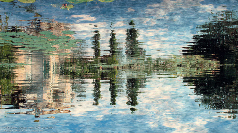
A water reflection is the distorted, value-shifted image of objects above the water surface, seen on the water plane itself. It is not a mirror copy. It is a compressed, desaturated, and edge-softened version of reality.
Understanding this distinction is the first step in landscape painting. Most beginners copy the scene above the waterline directly into the water below it. That produces a flat, unconvincing result every time.
Water reflections appear directly below their source objects. They never shift horizontally. The horizon line in the scene and the horizon line in the reflection share the same position on the picture plane.
The surface condition of the water determines everything else. Still water produces near-mirror images with softened horizontal edges. Moving water fragments those images into broken vertical streaks. This single variable, still versus moving, drives every technique decision that follows in this guide.
Artists have painted water surfaces since antiquity. Claude Monet built his entire late career around the optical complexity of his Giverny pond, producing over 250 water lily paintings between 1896 and 1926 that systematically explored how sky color, surface movement, and reflected light interact on the same picture plane.
Physics research published in the European Physical Journal (Coullet & Pomeau, 2020) confirmed that Monet’s painted light streaks in works like “Impression, Soleil Levant” accurately replicate the optical behavior of low-angle sun reflections on a disturbed water surface. The stripes he painted arise from overlapping reflection points, not artistic invention.
What Are the Core Visual Rules That Govern Water Reflections?
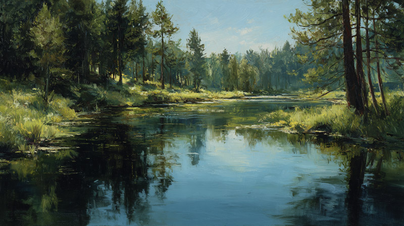
Water reflections follow consistent optical laws. Knowing these rules before picking up a brush removes most of the guesswork from the painting process.
The 4 rules that apply to every water reflection, regardless of medium or surface condition:
- Reflected lights are darker than the source light
- Reflected darks are lighter than the source dark
- All reflected colors are less saturated than their source
- The reflection sits directly below its source, never offset
This is called value compression. Both ends of the value scale shift toward the middle. A white sail reflects as a medium-light gray. A dark tree trunk reflects as a medium-dark green-gray. Neither extreme survives the transfer to water (Artists Network, 2022).
How Value Shifts Work in Still vs. Moving Water
Still water: value compression is consistent across the whole reflection. The image reads as a continuous, slightly lower-contrast version of the scene above.
Moving water: value shifts are inconsistent. Ripple crests catch highlights, producing small bright interruptions across dark reflection areas. The average value still compresses, but local contrast increases.
A useful test: squint at your reference. The reflection should read as a slightly softer, lower-contrast mass than the scene above it. If the values look identical, the reflection will appear painted-on rather than immersed in the water surface.
Why Sky Color Dominates Most Water Reflections
Sky coverage in a water reflection is almost always larger than it appears from the bank. At a viewing angle of more than 30 degrees above the horizon, the water surface reflects more sky than anything else (Landscape Atelier, 2022).
This means sky color temperature sets the overall hue of the water. A warm orange sunset turns the entire water surface toward red-orange, regardless of the local tree or building colors reflecting into it.
The practical result: add a small amount of your sky color into every reflection mixture on your palette. It keeps the color temperature consistent across the water area and prevents individual object reflections from reading as isolated, disconnected patches of color.
| Sky condition | Water color temperature | Reflection saturation |
|---|---|---|
| Clear blue sky | Cool blue-gray | Medium |
| Overcast / cloudy | Neutral gray | Low |
| Golden hour | Warm orange-amber | High near horizon |
| Storm light | Cool green-gray | Very low |
What Paints and Tools Work Best for Water Reflections?
Each painting medium handles water reflections differently. The choice of medium is also a choice of technique, since the physical properties of the paint determine how edges, blending, and surface texture behave.
Watercolor Tools and Techniques for Reflections

Watercolor suits water reflection painting particularly well because the medium’s behavior mirrors the subject.
Wet-on-wet is the primary technique for still water. A wet paper surface allows colors to bleed softly into each other, producing the soft horizontal edges that define calm-water reflections. The wet-on-wet technique requires working quickly before the paper surface dries.
The dry brush technique is the opposite approach, and it works well for moving water. A brush loaded with stiff pigment dragged across dry paper catches only the tooth of the surface, creating the broken, streaky texture of rippled water.
Brush selection for watercolor water reflections:
- Wide flat wash brush for initial reflection washes
- Round brush (size 10-14) for wet-on-wet soft blending
- Fan brush or stiff hog bristle for dry-brush ripple strokes
- Small rigger brush for thin horizontal highlight lines
Oil and Acrylic Material Choices
Oils are the most forgiving medium for water reflections. The slow drying time allows reflection edges to be blended long after initial application. Artists like J.M.W. Turner exploited this property to build up complex layered water surfaces with translucent glazes over opaque underpainting.
Glazing in oils is particularly effective for adding depth to reflection areas. A thin, transparent layer of a cooler color over a dried warm underpainting creates the sense of water depth below the surface reflection.
Acrylics dry fast, which is a problem for blending. Adding a retarder medium to fluid acrylics extends the open time enough for smooth wet-on-wet blending on reflection edges. Blending acrylic paint on a water surface usually requires working in small sections, blending each section before the paint sets.
Palette knives work in both oils and acrylics for sharp, broken highlight strokes on choppy water. The knife deposits a flat slab of color with a clean edge, which reads convincingly as a bright light reflection off a wave crest.
| Medium | Best water type | Key advantage | Main challenge |
|---|---|---|---|
| Watercolor | Still, glassy | Natural soft edges | Timing wet-on-wet |
| Oils | Any water type | Long blending time | Drying between layers |
| Acrylics | Moving, rippled | Fast layering | Quick dry time |
How Do You Paint Still Water Reflections?
Still water is the clearest starting point for learning water reflection painting. The rules are consistent, the reference is easy to read, and the technique transfers to all other water types.
Paint the scene above the waterline completely before working on the reflection. The reflection derives its values and colors from the finished scene. Painting both simultaneously leads to color inconsistencies that are hard to correct.
Step-by-Step Process for Still Water in Watercolor
Artists Network (2022) recommends keeping the total stroke count low. Overworked water loses its sense of freshness. The goal is a convincing impression, not a detailed inventory of every ripple.
Step 1: Wet the paper below the waterline with clean water. Work quickly.
Step 2: Drop in the sky color mixture first, since sky is the dominant color mass in most reflections. Let it spread naturally.
Step 3: Add object reflection colors wet-into-wet, starting with the largest shapes. Trees, banks, and dark masses go in as soft-edged vertical strokes.
Step 4: While still wet, drag a clean damp flat brush horizontally across the reflection area. This creates the soft horizontal banding that reads as a calm water surface.
Step 5: Once dry, add a light horizontal dry-brush stroke at the waterline to separate the land from the reflection cleanly.
Step-by-Step Process for Still Water in Oils or Acrylics

The logic is the same as watercolor, but executed with blending rather than wet-on-wet flow.
- Block in the large reflection color masses first with a wide flat brush
- Blend horizontal edges softly while paint is still wet
- Keep vertical edges slightly crisper than horizontal ones
- Add transparent glazes in subsequent layers to build depth
- Final highlights go on last, applied with a palette knife or small round brush
David Hockney’s pool paintings from the 1960s and 1980s are a useful reference for still water in acrylics. His approach of painting flat color planes with visible brushwork for water ripples demonstrates that a stylized treatment can read as convincingly as a photorealistic one, provided the value relationships are correct.
How Do You Paint Moving Water Reflections?
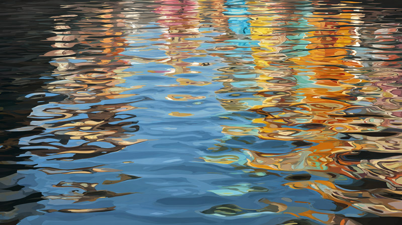
Moving water breaks up reflections. The continuous mirror image of still water becomes a series of fragmented color patches separated by light-catching wave crests.
The key visual rule: reflections in moving water stretch vertically and compress horizontally. The colors from objects above the waterline appear as elongated vertical dabs, not as recognizable shapes.
Painting River and Stream Reflections
River water moves at varying speeds across the same surface. Fast-moving sections near the center carry almost no readable reflection. Slower water near the banks holds more consistent color and shape.
Color placement in a river reflection follows the source object position. Tree reflections appear below the trees, building reflections below the buildings. But each individual color appears as a short, interrupted stroke rather than a continuous mass.
The negative space between strokes matters as much as the strokes themselves. Those gaps represent water surface catching light, which is typically close to the sky color. Filling in all the gaps destroys the sense of movement.
Winslow Homer’s river and coastal watercolors from the 1890s show this clearly. In works like “Sloop, Nassau” (1899), he left large areas of paper white between reflection strokes to represent light bouncing off choppy water, a technique that reads as movement without describing it literally.
Painting Ocean and Lake Reflections with Wind
Wind-driven lake and ocean surfaces create a specific visual pattern: small horizontal ripples that reflect the sky at the crest and the deeper water color in the trough.
The result is a striped pattern of alternating light and dark horizontal bands. The bands get smaller and flatter as they approach the horizon, consistent with standard atmospheric perspective principles.
Technique for this effect:
- Start with a base wash of the mid-value water color
- While wet, drag a dry fan brush horizontally to create texture
- Once dry, add short horizontal strokes of a lighter value for wave crests
- Final step: small white or near-white strokes for specular highlights on the nearest wave crests
Joaquin Sorolla’s Mediterranean beach paintings consistently demonstrate this approach. He used broken horizontal strokes of white and pale blue over a darker green-blue base to suggest wind-rippled water surfaces, with the stroke width and spacing decreasing toward the horizon.
How Do You Mix Colors Accurately for Water Reflections?

Color mixing for water reflections has 3 consistent adjustments: lower the value by 1-2 steps for lights, raise it for darks, and reduce saturation across everything. The sky color gets added to every mixture.
Most color errors in painted water reflections come from mixing the reflected color in isolation, without accounting for the sky color temperature that the water surface is also reflecting simultaneously.
How to Adjust Values and Saturation for Reflections
For light objects: Darken the reflected color by mixing in a small amount of the color’s complement or a neutral gray. A white boat hull reflects as a cool medium-light gray, not white.
For dark objects: Lighten the reflected color slightly and reduce its saturation. A dark green tree reflects as a lighter, grayer green, not the same dark green.
For all colors: Mix in a small portion of your sky color. This creates the sense that the water surface is reflecting the sky across its entire area, with object reflections sitting within that broader sky reflection (Lee Muir-Haman Watercolor, 2024).
How Color Temperature Changes in Different Light Conditions
Golden hour light is where most beginners go wrong. The sky turns warm orange, and that orange dominates the entire water surface. Object reflections shift toward orange-red. Shadows on the water go cool purple-blue.
Check your color temperature shifts with this reference:
- Midday sun: Neutral to slightly warm water, high contrast reflections
- Overcast: Cool gray water, low contrast, minimal specular highlights
- Sunset / sunrise: Warm orange-red water near horizon, cooler water in foreground
- Shade: Cool blue-gray water, reflected shadows appear as warm purple-gray
To check color accuracy before committing to the full painting: squint at your mixed color next to your reference. The reflection should read as a lower-contrast version of the scene above. If the values look equal, the reflection will appear to sit on top of the water rather than inside it.
How Do You Handle Light and Shadow in Water Reflections?
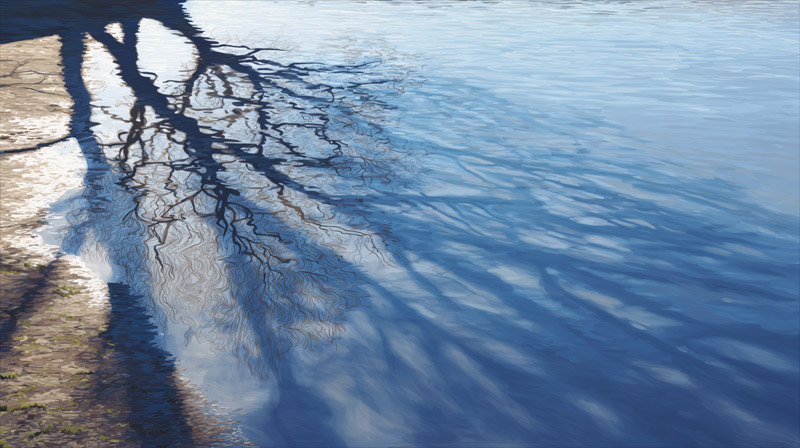
Light and shadow behave differently on a water surface than on land. Water reflects more ambient light than most solid surfaces, which fills shadow areas and reduces the overall contrast of shadows seen on water.
Shadows cast onto water appear as darker, cooler shapes that shift with ripple movement. They are never as sharp-edged on water as they are on dry land. A tree shadow cast across a river will have a soft, slightly wavy edge, not the crisp line it would produce on a road surface.
Specular Highlights on Water
Specular highlights are the direct reflections of a light source, usually the sun, seen as bright spots or streaks on the water surface. They are the brightest values in any water painting.
Specular highlights are always small horizontal strokes or dots, never large areas. On still water, they appear as a soft, elongated oval near the horizon. On moving water, they scatter into dozens of small disconnected bright marks across the wave crests.
Paint them last. Always. Adding highlights over a dry surface gives them a clean, light-catching quality. Mixing them into wet paint muddies them.
Backlit Water and Shadow Areas
Backlit water scenes, where the light source is directly opposite the viewer, produce the strongest contrast in water painting. The water surface between the viewer and the light source carries the brightest specular highlights. The water on either side of that path drops to a much darker value.
Reflected light from the sky fills shadow areas on water more than on land. This means shadow areas in water reflections are never fully dark. A dark tree shadow cast on bright water will be at most a medium-dark value, lighter than the same shadow on a path or field would be.
Sorolla’s backlit beach paintings (1904-1910) are the clearest demonstration of this principle in practice. He consistently painted the lit water surface at near-white values while keeping the shadow areas at a medium-cool blue-gray, with no hard edges between the two zones.
What Are the Most Common Mistakes When Painting Water Reflections?

Most water reflection errors come down to the same 3 problems: wrong values, wrong edges, and too many strokes. Fixing any one of them improves the result significantly.
Overworking is the most widespread issue. Artists Network (2022) notes that beginners lose the freshness of water surfaces by adding too many strokes, which creates uniform texture where there should be variety and depth.
Value and Color Errors
Matching the reflection value to the source object is the single most common mistake. The reflection of a white boat hull is never white. It is a medium-light gray, shifted toward the water’s local color (Lori McNee, 2023).
Two other color errors that appear repeatedly:
- Painting all water blue regardless of sky color temperature
- Using pure white for sunlight reflections instead of mixing in a small amount of yellow or orange
The fix for both: mix every reflection color from your sky mixture first, then adjust for the specific object being reflected.
Edge and Stroke Errors
Hard edges where there should be soft ones. That is the most visually jarring edge mistake in water painting.
Horizontal edges at the top and bottom of a reflection should always be softer than vertical edges. A tree trunk reflecting in water has relatively crisp left and right edges but a diffused, soft upper edge where it meets the waterline (Rancho Cordova Arts).
Perfectly symmetrical reflections in moving water are wrong. Moving water fragments shapes into interrupted vertical strokes. A reflection that mirrors the source object exactly reads as still water, regardless of what the brushwork on the surface suggests.
Structural and Compositional Errors
Artists Network (2022) points out that many professionals deliberately avoid perfectly still water in paintings because a full mirror image competes with the scene above the waterline for visual attention.
A lazy ripple, a slight wind disturbance: partial movement in the water is often a better compositional choice than total stillness. The reflection breaks just enough to read as water without fragmenting into meaningless texture.
| Mistake | What it looks like | Fix |
|---|---|---|
| Same value as source | Reflection looks pasted-on | Compress value 1–2 steps toward mid-tones |
| All reflections blue | Ignores sky color temperature | Mix sky color into every reflection |
| Too many strokes | Muddy, overworked surface | Stop after establishing main value shapes |
| Hard horizontal edges | Reflection floats above water | Soften top and bottom edges of each shape |
How Do You Paint Reflections of Specific Subjects in Water?
The core value and color rules apply to all subjects. What changes is the edge quality, the shape simplification, and the degree of detail carried into the reflection.
A useful general rule from Painting With Watercolors (2023): the reflection is always more solid and defined close to the object, and more broken and diffused further away from it.
Painting Sky and Cloud Reflections
Sky reflections are the largest color mass in any water painting. They set the overall color temperature of the scene.
Clear sky: paint the water with the same blue-gray wash used for the sky, then reduce the value slightly. The water is almost always darker than the sky it is mirroring (Lee Muir-Haman Watercolor, 2024).
Cloud reflections follow the same placement rule as all reflections: directly below the cloud’s position in the sky. The white of a cloud reflects as a soft medium-light gray, not white. Edges are diffused, especially in moving water.
Painting Tree and Foliage Reflections
Dark green foliage reflected in water shifts to a lighter, grayer, cooler green. The shape simplifies considerably.
Individual leaves, branches, and bark texture disappear in the reflection. What remains is the overall silhouette of the tree, rendered as broken vertical strokes in a desaturated version of the foliage color.
Artists Network (September/October 2024) recommends drawing a vertical line from the base of a tree straight down into the water area before painting the reflection. This keeps the horizontal placement accurate and prevents the reflection from drifting left or right of the source.
Painting Architecture in Water
Buildings and bridges carry the hardest edges of any reflected subject. But even architectural reflections soften slightly at horizontal edges.
Window reflections simplify to light and dark value patches. Individual window frames and mullions are too small to survive the value compression of water. Paint windows as a single value shape: lighter if the window is dark, darker if the window is light-catching glass.
One-point and two-point linear perspective rules apply to architectural reflections in calm water. A building receding to a vanishing point on the horizon will have its reflection recede to the same vanishing point.
Edward Hopper’s harbor paintings from the 1920s-1930s consistently show this: the geometric precision of building reflections in still water is maintained, but all horizontal edges are softened and values are compressed toward middle gray.
| Subject | Value shift | Edge quality | Detail level |
|---|---|---|---|
| Sky / clouds | Slightly darker overall | Very soft | None |
| Trees / foliage | Lighter, less saturated | Soft vertical strokes | Silhouette only |
| Buildings | Compressed toward mid-values | Soft horizontals, crisp verticals | Value shapes only |
| Figures | Simplified to silhouette value | Broken, diffused | None |
How Does Perspective Affect Water Reflections?
Viewpoint height changes what you see in the water. The higher you stand above the surface, the shorter each reflection appears relative to its source, and the more of the water plane itself is visible (Rancho Cordova Arts).
The horizon line in the scene and the horizon line in the reflection share the same position on the picture plane. Always. There is never a second horizon in a water scene.
How Viewer Height Changes the Reflection
Artists Network (September/October 2024) notes that a very low viewpoint, such as sitting at water level, produces a high horizon line in the painting and emphasizes foreground ripples and wave shapes over distant reflections.
High viewpoint (standing, elevated bank):
- More water plane visible
- Reflections appear shorter than source objects
- Sky covers less of the water area
Low viewpoint (sitting, ground level):
- More sky visible in water
- Reflections appear longer, closer to full height of source
- Foreground ripple shapes become the dominant visual element
Reflection Length and Leaning Objects
A vertical object, like a flagpole, reflects at its full height when viewed from directly opposite. Viewing from an angle shortens the reflection.
Key rule: if an object leans left, its reflection also leans left. If it leans right, its reflection leans right. The reflection mimics the lean exactly (Rancho Cordova Arts).
This trips up artists who assume all reflections point straight down. A mast, a leaning tree, or a tilted pier all reflect at their actual angle, not at vertical. Artists Network (2024) recommends sketching a pencil line along the object’s angle before painting the reflection, to lock in the correct lean.
How Atmospheric Perspective Applies to Water

Reflections in the far distance follow atmospheric perspective rules. Distant reflections are lighter in value, cooler in color temperature, and lower in contrast than foreground reflections (UrArtStudio, 2024).
Foreground water is typically darker and warmer than distant water. The water directly below the viewer reflects the zenith of the sky, which is the darkest part of the sky on a clear day. Water near the horizon reflects a lighter, cooler portion of the sky close to the horizon line.
What Reference and Practice Methods Improve Water Reflection Painting?
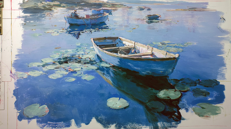
Observation is the primary skill. Technical rules accelerate learning, but there is no substitute for looking at real water in different light conditions and painting from direct observation.
Studying master works alongside direct observation gives the fastest skill gains. Sorolla’s beach paintings, Monet’s Giverny pond series, and Winslow Homer’s coastal watercolors each demonstrate different approaches to water surface texture, color temperature, and reflection handling.
How to Use Photo Reference Effectively
Photography flattens value contrast and often shifts color temperature. A photo of water in golden hour light will look less warm and less contrasty than the actual scene was.
Squinting at photo reference is the single most useful habit for reading reflection structure. Squinting reduces detail and forces the eye to read large value masses, which is exactly what a painted reflection needs to communicate (Learn to Paint Watercolor, 2025).
Photograph the same water at 3 different times of day. Morning, midday, and late afternoon produce completely different color temperature and value structure in the same body of water. That range of reference makes color mixing decisions much faster when painting.
Practice Exercises That Build Specific Skills
Draw Paint Academy (2024) documents the value shift problem directly: when working from reference, the brain automatically simplifies water color to a uniform blue-green, discarding the subtle shifts between reflected sky, reflected objects, and the water’s own local color. Careful observation, not technical rules, is what fixes this.
3 exercises worth doing before attempting a full water painting:
- Paint a single horizontal stripe of one reflected color with correct value, then adjust it in 3 incremental steps toward the middle value
- Paint the same still-water reflection in 2 versions: with wet-on-wet soft edges and with hard edges, then compare which reads as more convincing
- Do a thumbnail value study in gray only before adding any color, to confirm the compression structure is correct
Learning from Master Works
Studying how specific artists handled water reflection problems is faster than working from abstract rules alone.
Monet (Giverny pond series, 1896-1926): study for sky-dominated color temperature and the relationship between floating objects and their surrounding reflections.
Sorolla (Mediterranean beach paintings, 1904-1910): study for backlit specular highlights, broken horizontal strokes, and en plein air speed and economy of brushwork on moving water surfaces.
Frits Thaulow (river mill paintings, 1880s-1900s): study for subtle color shifts between reflected sky, reflected objects, water color, and objects visible below the surface in the same passage of paint (Draw Paint Academy, 2024).
Copying a single painting from each of these 3 artists teaches more about water reflection handling than reading any number of technique articles. The copy forces you to mix the actual colors rather than approximate them.
FAQ on How To Paint Water Reflections
Do water reflections need to be an exact mirror image?
No. Reflections compress value contrast, reduce color saturation, and soften edges. Dark objects reflect lighter, light objects reflect darker. Still water comes closest to a mirror image, but even then the reflection reads as a lower-contrast version of the scene above.
Why does my water reflection look flat and unconvincing?
Usually a value error. Most painters repeat the source object’s value directly into the water. Shift lights slightly darker and darks slightly lighter. That compression is what makes a surface read as water rather than a pasted copy.
What is the best medium for painting water reflections?
Watercolor suits still water best because wet-on-wet technique produces naturally soft edges. Oils work well for any water type due to long blending time. Acrylics handle moving water well with dry brush and fast layering, but need a retarder for smooth blending.
How do I paint water reflections in moving water?
Use broken vertical strokes, not continuous shapes. Moving water fragments reflections into interrupted color dabs separated by light-catching wave crests. The negative space between strokes, usually close to sky color, is as important as the strokes themselves.
How does sky color affect water reflections?
Sky color dominates the entire water surface. Add a small amount of your sky mixture into every reflection color on the palette. Golden hour shifts water toward orange-red. Overcast skies produce neutral gray water with minimal contrast across all reflections.
Where exactly should a reflection sit in the painting?
Directly below the source object. Reflections never shift horizontally. If an object leans left, its reflection leans left at the same angle. The horizon line in the scene and the horizon line in the reflection always share the same position on the picture plane.
How do I paint specular highlights on water?
Apply specular highlights last, over dry paint. Use small horizontal strokes or dots of near-white, mixed with a touch of yellow or orange for sunlight. Never use pure white from the tube. On moving water, scatter highlights across multiple wave crests as short, disconnected marks.
How does my viewpoint height change the reflection?
Higher viewpoint shortens reflections and reveals more of the water plane. Lower viewpoint lengthens reflections and increases sky coverage in the water area. A ground-level view places the horizon line high in the composition and makes foreground ripple texture the dominant visual element.
What brushes work best for painting water reflections?
A wide flat brush for initial reflection washes. A large round brush for wet-on-wet soft blending. A fan brush or stiff hog bristle for dry brush ripple texture. A small rigger brush for thin horizontal highlight lines on the water surface.
How do I study water reflections to improve faster?
Photograph the same water at morning, midday, and late afternoon. Squint at reference to read value structure without detail. Copy one painting each from Monet, Sorolla, and Frits Thaulow. Direct copying forces accurate color mixing rather than approximation from memory or rules alone.
Conclusion
This conclusion is for an article presenting the full process of painting water reflections, from optical rules to medium-specific technique.
The fundamentals do not change regardless of subject or surface condition. Value compression, sky color dominance, and edge softening apply whether you are working in watercolor, oils, or acrylics.
Still water, moving water, river reflections, ocean surfaces: each requires adjustments to stroke direction, blending method, and color saturation. But the underlying logic stays consistent.
Study Sorolla for backlit water. Study Monet for color temperature in Impressionist painting. Then go paint from direct observation.
Rules accelerate learning. Direct practice is what builds the skill.