Most landscape paintings fail before the first brushstroke lands.
The subject is not the problem. Outdoor scenes, natural light, open skies, these are among the most purchased subjects in fine art. The problem is nearly always technique, and more specifically, not knowing which technique applies where.
This guide covers the core landscape painting techniques across oil, watercolor, and acrylic, including brushwork, atmospheric perspective, plein air methods, color mixing, and foliage. Each section targets a specific technical problem painters run into when depicting outdoor scenes from life or reference.
By the end, you will have a clear, practical framework for making better decisions at every stage of a landscape painting.
What Are Landscape Painting Techniques
Landscape painting techniques are the specific methods used to apply paint, control light, and build depth when depicting outdoor environments, natural scenery, and open-air scenes on a two-dimensional surface.
The word “technique” refers to how paint is physically handled. It is separate from style, which describes the visual outcome, and from medium, which describes the material used.
This distinction matters more than it sounds. Two painters can share the same style but use completely different brushwork. Two painters working in oil can produce results that look nothing alike depending on whether they use alla prima (wet-on-wet) or a layered glazing approach.
Landscape painting consistently ranks as the most purchased subject in fine art. A Fine Art Trade Guild survey of over 800 UK galleries confirmed traditional landscapes are the single most popular painting subject among buyers, ahead of portraiture and still life.
In 2024, traditional landscapes were named one of the top-selling art subjects, with nature-inspired art showing a 15% year-over-year sales increase, according to the American Art Collector (via Buy Wall Art research, 2024).
Understanding technique is what separates a landscape that looks flat from one that pulls a viewer into the scene. Atmospheric perspective, edge control, color temperature shifts, brushwork decisions, these are all technique problems, not style problems.
The sections below cover the core techniques across the main painting mediums used for landscapes, including light, composition, brushwork, and color mixing. Each one applies whether you are working outdoors from life or building a painting in a studio.
| Medium | Key Technique Challenge | Core Strength for Landscapes |
|---|---|---|
| Oil | Managing drying times and “Fat over Lean” layers. | Blending & Texture: Creating seamless sky gradients and thick, rocky textures (impasto). |
| Watercolor | Preserving white space and preventing paper buckling. | Atmospheric Softness: Capturing mist, light, and transparency with fluid washes. |
| Acrylic | Fast drying time makes soft blending difficult. | Versatility: Rapid layering and the ability to use heavy texture gels for foliage. |
Painting Light and Atmosphere in Landscapes
Light is the subject of every landscape painting, even when the subject appears to be trees or water or hills. Every technique choice either helps or hurts how convincingly light reads on the surface.
Wet-on-Wet Blending for Sky and Atmosphere
What it does: Merging wet paint into wet paint creates soft, gradual transitions that read as atmospheric haze or distant sky.
This works well for the zone between sky and horizon where hard edges would look wrong. Monet used scumbled layers of broken color over dry underlayers to build similar diffused light effects in his plein air series paintings.
- Apply a base layer while still tacky, then work color into it
- Use a soft fan brush or filbert to drag transitions
- In oil, linseed oil slows dry time to keep a workable surface longer
- In acrylic, a retarder medium or stay-wet palette extends blending time
The further back in the scene, the softer the edges need to be. This is the basic rule of aerial perspective in painting.
Scumbling for Diffused Light and Haze

Scumbling is dragging a semi-dry brush with thin, broken paint over a dry layer. It does not fully cover the layer beneath.
Useful for: morning mist over water, dusty horizon lines, soft light through foliage. J.M.W. Turner used this constantly. His atmospheric landscape effects came largely from building up multiple scumbled layers of translucent warm and cool tones.
The technique works across all mediums, though it is most forgiving in oil, where reworking is easier.
Aerial Perspective and Color Temperature
Objects lose contrast, color saturation, and edge definition as they recede. This is not just a compositional trick. It reflects how the atmosphere actually filters light over distance.
Practical color adjustments by zone:
- Foreground: Warmer tones, stronger contrast, harder edges, more texture detail
- Mid-ground: Cooler, lower contrast, softer edges, reduced detail
- Background: Cool blue-grey haze, minimal contrast, almost no hard edges
Claude Monet built aerial depth not through tonal darkening but through color shift. Backgrounds shifted toward cool blues and violets. Foregrounds contained warm yellows, oranges, and earth tones. The contrast between warm and cool did the work that value contrast would in a more academic approach.
This color temperature principle applies equally to oil painting, watercolor painting techniques, and acrylic work.
Brushwork Techniques for Landscape Painting
Brushwork is where technical decisions become visible. Every stroke leaves a record.
The challenge in landscape painting specifically is that different parts of the scene need completely different handling. Foliage requires a different touch than sky. Rocky terrain needs different strokes than still water. Learning to vary brushwork within a single painting is one of the harder things to develop.
Broken Color and Impressionist Brushwork
According to research into Monet’s techniques at the University of Rochester’s Center for Visual Science, Monet placed contrasting colors side by side without blending them, exploiting simultaneous contrast to make colors appear more vibrant than physical mixing would allow.
This broken color approach is the foundation of Impressionist landscape painting. Short, directional strokes placed next to each other let the eye blend them optically rather than the brush blending them physically.
- Works best with a loaded brush and confident, single-pass strokes
- Avoid over-blending, which kills the effect
- Camille Pissarro used this for foliage with particular success, layering warm and cool greens in short dabs
Alla Prima vs. Layered Glazing

| Approach | Method | Best For |
|---|---|---|
| Alla Prima | Completing the painting in a single “wet-on-wet” session. | Plein Air: Capturing shifting light quickly and achieving a loose, expressive feel. |
| Glazing | Applying transparent color layers over fully dried underlayers. | Studio Work: Achieving extreme depth, luminosity, and rich, glowing shadows. |
| Scumbling | Dragging broken, semi-dry paint over a dried layer. | Atmospheric Effects: Creating diffused light, morning mist, or soft clouds. |
Oil painting glazing techniques build depth that alla prima cannot achieve in a single session. Glazing works by stacking transparent color over a dry surface, letting light pass through to the layers below and reflect back. The result reads as luminous rather than opaque.
Dry Brushing for Texture

A nearly dry brush dragged across a textured surface catches the raised grain, leaving broken marks that read as rough terrain, bark, dry grass, or choppy water.
Technique notes: Remove most paint from the brush on a rag first. Use a flat or fan brush. Drag with light pressure across the canvas grain or rough watercolor paper. Do not reload mid-stroke.
In dry brushing in acrylic painting, the fast dry time actually helps here. The paint grabs quickly, which keeps the texture crisp.
Palette Knife for Impasto

The impasto technique uses thick, undiluted paint applied with a knife or stiff brush to build physical texture. In landscapes, this works well for breaking waves, rocky foregrounds, dense foliage, and textured skies.
Van Gogh’s landscape textures were built almost entirely this way. The physical dimension of the paint surface catches light differently depending on viewing angle, giving the work a presence that flat paint cannot replicate.
Landscape Composition Rules and How Painters Break Them
Composition problems are the most common reason a technically well-painted landscape still looks wrong. The paint quality can be excellent. The colors can be accurate. And yet the painting feels off.
Usually it is a composition problem. And those are fixable once you know what to look for.
Horizon Placement and the Rule of Thirds

Placing the horizon at the center of the picture plane splits the painting into equal halves. This creates visual stalemate. The eye has no reason to favor sky over land or vice versa.
Standard practice: Place the horizon on the upper third to emphasize a strong foreground. Place it on the lower third when the sky is the subject, as in storm-light or dramatic cloud formations.
That said, a centered horizon can work. Flat, calm water scenes and reflections often benefit from it, since the symmetry mirrors the actual visual experience of stillness. Learn the rule, then decide when to break it.
Perspective in art and types of composition in painting go directly together here. The horizon line is also the eye-level line in linear perspective, which controls how all other spatial elements read.
Leading Lines and Visual Flow

Leading lines guide the viewer’s eye through the painting. In landscape work, these appear naturally as rivers, roads, paths, shorelines, fence lines, and rows of trees.
The key is directionality. Lines that lead toward the focal point are assets. Lines that lead the eye out of the frame are problems. A road that exits at the bottom left corner of a painting pulls attention out rather than in.
Directional lines in painting work differently depending on angle. Diagonal lines create movement and energy. Horizontal lines suggest calm and stillness. Vertical lines give weight and permanence, useful for tree-heavy scenes.
Negative Space in Landscape Composition
Negative space in landscape painting is the open, undetailed area that gives the eye somewhere to rest, usually sky, still water, or open ground.
Beginners tend to fill every area with detail. This creates visual noise. Negative shape in art is just as compositionally active as the painted subject. Monet’s water lily paintings use enormous amounts of negative space in the water surface to let the lilies breathe.
- Leave at least one quiet zone in every landscape composition
- Contrast detail-heavy areas against simple, unworked passages
- Sky often serves this function, but can be the focal zone too
The relationship between emphasis in art and quiet areas is direct. A focal point only reads as important when the surrounding areas support it by being less busy.
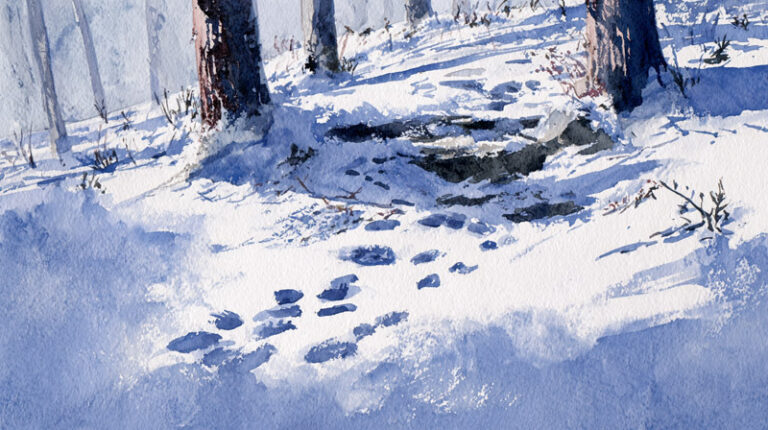
Watercolor Landscape Techniques
Watercolor is probably the most demanding medium for landscapes. There is very little room to fix mistakes. The paint is transparent, so every error stays visible through subsequent layers unless you lift or scrub it out. And paper reacts differently depending on humidity, temperature, and how much water you are using.
That said, watercolor produces atmospheric effects that no other medium quite matches. The softness of wet-on-wet technique in watercolor for skies and distant hills is genuinely hard to replicate in oil or acrylic.
Wet-on-Wet for Skies and Soft Backgrounds

Wet the paper first with clean water. Then drop or brush color into it while the surface is still damp. The paint spreads softly and unpredictably, which is the point.
For landscape skies:
- Tilt the board slightly to encourage directional flow
- Use a large mop brush or wash brush for coverage
- Drop in secondary colors while the first wash is wet, not after it dries
- Do not touch it once the paint is drying. Wet brush into a drying wash creates blooms
Actually, some painters intentionally create blooms for textural effects. The blooming technique in watercolor drops clean water or a lighter value into a damp wash to push paint outward, creating irregular organic shapes that read as clouds or foliage masses.
Hard Edges vs. Soft Edges

Edge control is the most underrated skill in watercolor landscape work.
Soft edge: Brush into a still-wet area, or soften a dry edge with a damp brush. Reads as distance, atmosphere, or soft light.
Hard edge: Let the paint dry fully before adding an adjacent shape. Reads as near, defined, or in strong light.
Most watercolor landscapes need both. The standard approach is soft edges everywhere except the focal point, where one or two hard edges anchor the eye. Focal point in art is almost always defined by edge contrast as much as by color or value contrast.
Reserving Whites and Layering Washes
Watercolor has no white paint that works the way white works in oil or acrylic. The white in the painting is the paper itself.
This means planning backwards. Decide early what stays white. Mask those areas with masking fluid or paint around them carefully. Once a white area is covered with a wash, recovering it cleanly is very difficult. The lifting technique in watercolor can recover some light areas while wet, but it never gets back to pure paper white.
Layering washes for depth: Work light to dark. First wash is the lightest value. Each subsequent wash deepens the tone. In watercolor landscape painting, sky typically goes first since it carries the lightest values. Foreground shadows and dark foliage go last.
Heavy paper matters here. At least 300gsm (140lb) is standard. Lighter paper buckles badly under multiple washes, which makes controlled layering almost impossible. For more on paper choices, see types of watercolor paper.
Salt Texture and Granulation for Terrain

Dropping coarse salt into a wet wash pulls pigment outward, creating starburst-shaped textures that read convincingly as rock, sand, or rough ground.
The salt texture technique in watercolor painting works only when the wash is at the right stage of wetness, wet enough to move but past the shiny-wet stage. Too wet and the salt dissolves. Too dry and nothing happens.
Granulating pigments produce similar organic textures without salt. Ultramarine blue, burnt sienna, and raw umber all granulate on cold-press paper, which is useful for painting rocky landscapes or overcast sky.
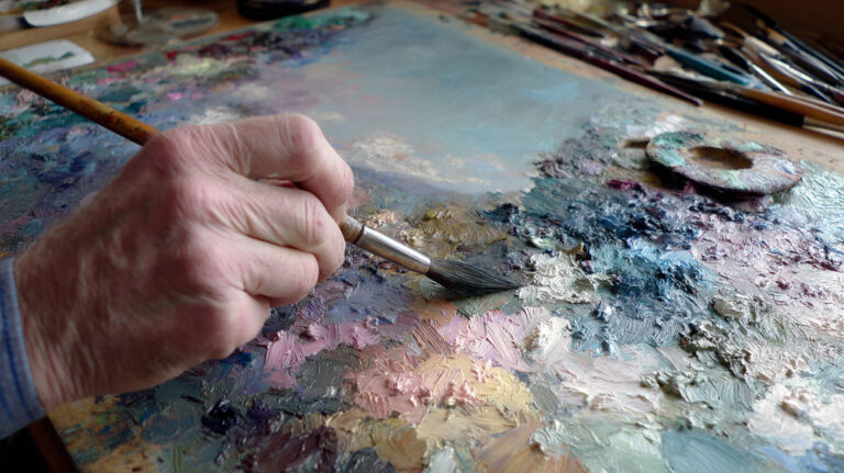
Oil Painting Techniques for Landscapes

Oil paint handles differently from every other medium. It stays wet for hours or days, which is either an advantage or a frustration depending on what you are trying to do.
For landscape work, the long open time is mostly an advantage. You can blend atmospheric edges without rushing. You can correct color decisions. And you can build up complex glazed depth over multiple sessions in a way that watercolor or acrylic cannot easily replicate.
Fat-Over-Lean and Underpainting
The fat-over-lean rule is the structural foundation of multi-session oil painting. Early layers need to be lean (more solvent, less oil). Later layers are fat (more oil, less solvent). If you reverse this, the under-layers dry more slowly than the top layers, which causes cracking over time.
Practical setup for a landscape underpainting:
- Mix burnt sienna or ultramarine blue with odourless mineral spirit, no linseed oil
- Block in the main value structure quickly and loosely
- Let it dry fully before overpainting
- This toned ground eliminates the blinding white of a gesso surface, making value judgments easier from the start
The grisaille technique is a specific type of underpainting done in grey-scale tones only. It maps out the full value range of the landscape before any color is introduced. Glazing over a grisaille base produces colors of unusual depth and luminosity because the grey tones underneath unify the color above them.
Impasto for Foreground Texture
Thick, undiluted paint applied with a palette knife or stiff brush builds physical dimension in the paint surface itself. This is called impasto, and it reads differently from a distance than it does up close.
From three feet away, impasto foreground texture creates a sense of tactile reality. Rough stone, clumped earth, dense scrub, these all benefit from built-up surface. Smooth, flat paint in the same areas looks thin and unconvincing by comparison.
Important: Reserve impasto for the foreground. Heavy texture in the background or middle distance destroys the sense of depth that atmospheric perspective works to build. Background areas need flat, smooth paint with soft edges. Foreground areas can carry all the texture you want.
Plein Air Oil Painting Workflow
Painting outdoors in oil requires a different approach from studio work. The light changes fast. Conditions are unpredictable. You cannot carry everything.
En plein air painting became the technical foundation of the Impressionist movement. John Constable in England developed the practice of making oil sketches on location as early as the 1810s, with his 1816 painting Flatford Mill believed to be one of the first works completed almost entirely outdoors (Barber Institute research). Monet and the French Impressionists then built a movement around this approach.
- Limited palette: Five to seven colors maximum. Too many choices slow decision-making outdoors
- Small panels: 8×10 or 9×12 inch surfaces. Fast to complete, manageable in changing light
- Time blocking: Commit to one light condition for 45-90 minutes. Do not chase the shifting sun
- Pochade box: Compact setup that holds panel, palette, and brushes in one unit
A pochade box mounted on a tripod is how most working plein air painters operate now. It keeps the painting at eye level and the palette directly below it, which reduces errors from looking back and forth between a table palette and an upright surface.
For more on oil painting materials and setup, see oil painting materials and oil painting mediums.
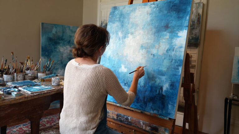
Acrylic Landscape Techniques
Acrylics have one major selling point for landscape work: they are the most forgiving of the three main mediums. Mistakes are easy to paint over. Layers dry fast. Cleanup is simple.
The one real problem is that same fast drying time. It becomes a serious issue during blending, particularly for soft sky gradients and smooth transitions between colour zones.
Working with Fast Dry Time
Retarder medium is the most direct fix. A small amount mixed into paint (generally no more than 15-20% by volume) extends workability without compromising the film.
A stay-wet palette works well alongside this. The palette keeps paint moist between strokes during longer sessions, which reduces waste and stops colours from hardening mid-mix. Golden Artist Colors and Winsor and Newton both produce acrylic retarder mediums that work well for blending in landscape skies.
- Mist the palette surface with water every 15-20 minutes in warm conditions
- Work in smaller sections rather than trying to blend a full sky at once
- A damp brush picks up partially dried paint edges cleanly
Underpainting in Acrylic Landscapes
Burnt umber or raw sienna thinned with water maps out the full tonal structure before any colour goes down. This is the same fat-over-lean principle from oil painting, adapted for acrylic’s faster timeline.
Why it helps: Starting on a toned ground eliminates the visual noise of a white canvas. Value decisions become clearer immediately. The underpainting dries in minutes, not hours.
Artist and teacher Samuel Earp describes blocking in shadow areas first across the whole painting before adding any lit areas, which makes colour saturation decisions much more reliable throughout the painting process.
Gel Mediums for Texture

Acrylic gel mediums mixed with paint build impasto-style surfaces without the weight of pure undiluted paint. This matters for foreground texture in landscape work.
Heavy gel creates pronounced physical marks that catch light. Regular gel gives a subtler raised texture. Both can be applied with a palette knife or a stiff flat brush, and both dry quickly enough to overpaint the same session.
For glazing in acrylic painting, the reverse approach applies. Thin paint with glazing medium or a lot of water, then layer it over a dry surface to build depth without adding texture. This produces the luminous colour depth that acrylics can otherwise struggle to achieve compared to oil glazing.
| Medium Type | Effect | Best Use in Landscapes |
|---|---|---|
| Retarder | Extends the “open” time of the paint by slowing evaporation. | Sky Blending: Achieving soft, seamless transitions in large sky areas without “streaking.” |
| Heavy Gel | Increases body and holds high-relief peaks. | Foreground Texture: Creating 3D effects for craggy rocks, tree bark, or thick foliage. |
| Glazing Medium | Creates a transparent, glass-like film. | Atmospheric Distance: Layering thin veils of color to push mountains into the distance. |
| Pouring Medium | Levels paint into a smooth, glossy, liquid surface. | Water Effects: Creating glass-like lakes or abstract, flowing sky patterns. |
For more on what these products do individually, see acrylic mediums and acrylic painting materials.
Painting Foliage, Trees, and Ground Texture
Trees and foliage are where most landscape painters spend the most time and make the most avoidable mistakes.
The biggest one: painting every leaf. No one paints every leaf. The goal is to paint the impression of foliage, using edges, colour variation, and light direction to make the brain fill in the detail.
Fan Brush and Stippling for Tree Canopy
The fan brush creates foliage texture through tapping motions. Load the brush lightly, then dab rather than drag. Vary the angle with each tap so the marks do not repeat in a mechanical pattern.
- Start with the darkest shadow greens
- Build mid-tones over the shadow layer once dry
- Add the lightest highlights last, sparingly
- Use a filbert brush for individual leaf clusters near the focal zone
Stippling with a round brush handles close-up foliage where more control is needed. The effect is small, irregular dots that suggest leaf texture without defining individual shapes.
Colour Variation Within a Single Tree
Flat green fills kill trees. A single mixed green applied uniformly across a canopy looks like a cutout, not a living plant.
Natural foliage contains cool greens (blue-shifted, in shadow), warm greens (yellow-shifted, in direct light), and neutral mid-tones. All three should appear in a single tree. The cool greens go into the interior and shadow zones. The warm, high-chroma greens sit where direct light hits the outer canopy.
Artists Network research on colour mixing confirms that greens mixed from phthalo blue and cadmium yellow produce the most intense result, while mixes containing any red (such as ultramarine blue plus yellow) produce naturally earthier, more landscape-appropriate greens.
Negative Painting for Branch Detail
Painting branches by going dark-on-light is slow and often produces stiff results.
Negative painting reverses this. Paint the sky colour into the gaps between existing foliage shapes to reveal branch structure. The branches emerge from subtracting light, not adding dark. This keeps edges soft and the result reads more naturally.
It works in any medium. In watercolor, negative painting is particularly useful for birch tree structures where the pale trunks need to emerge from a painted background without hard outlines.
Ground Texture and Foreground Detail
Ground texture anchors the landscape. Without it, the scene floats.
Short upward fan brush strokes in warm yellows and burnt umber suggest dry grass or meadow. Horizontal palette knife marks work for flat ground or stony earth. Stippling with green and brown builds forest floor texture convincingly.
The rule for foreground vs. background applies here too. More detail, more contrast, warmer colour, harder edges in the foreground. As ground recedes into the mid-distance, simplify everything. The most common mistake is giving the mid-ground ground plane the same level of detail as the foreground, which collapses the depth of the whole painting.
For how texture decisions connect to texture in art more broadly, including the difference between visual and tactile texture, see the full guide.
Plein Air Painting Techniques
Painting outdoors is a fundamentally different problem from studio painting. The light moves. The weather changes. You are making decisions in real time with no ability to pause and reconsider.
Most experienced plein air painters work on small panels, 8×10 or 9×12 inches, for exactly this reason. Small surfaces force faster decisions and are completable within a single lighting window.
Limited Palette Selection for Plein Air Efficiency
A five-to-seven colour palette is standard for outdoor landscape painting. More than that and mixing decisions slow down enough to miss the light.
A workable plein air landscape palette:
- Titanium white
- Cadmium yellow light (or yellow ochre for a more muted palette)
- Burnt sienna
- Ultramarine blue
- Phthalo green (or viridian)
- Alizarin crimson
Artists Network research notes that this type of limited palette produces better colour harmony than a large palette because every mix shares the same base pigments, which ties the painting together visually.
Handling Changing Light Conditions
Light changes fastest in the first and last hour of the day. That is also when it is most interesting. Which creates a problem.
Time blocking is the standard fix. Commit to one lighting condition at the start, usually what you see in the first 10-15 minutes outdoors. Make a fast colour note of the key shadow colour and sky colour. Then paint from those notes rather than constantly updating to match the changing scene.
Monet’s plein air practice involved swapping canvases as conditions shifted, returning to each when the original light condition recurred. This is disciplined time-blocking at its most systematic.
Value Sketching Before Colour
A thumbnail value study, three to five minutes with a pencil or a single neutral tone, solves most composition problems before paint gets involved.
The three-value approach is reliable: one tone for lights, one for mid-tones, one for darks. Map these roughly across the scene. If the value structure does not read clearly in the thumbnail, it will not read clearly in the full painting either. Fix it at the sketch stage.
Value in painting and contrast in painting are the two factors that matter most in outdoor work, where colour decisions happen under pressure and often under direct sunlight that makes accurate colour reading difficult.
Pochade Box and Field Setup
A pochade box mounted on a tripod is the standard field setup for oil and acrylic plein air work. The panel sits directly above the palette, keeping both at eye level and eliminating the back-and-forth movement between an easel and a separate table palette.
Setup priorities outdoors:
- Face away from direct sun to avoid glare on the panel surface
- Keep the panel in shade if possible, direct sun distorts colour reading
- Use a viewfinder or frame a composition before committing
For watercolor en plein air work, a lightweight travel palette and a single large mop brush handle most of what you need outdoors. The early plein air tradition actually began in watercolor before oil tube paint made outdoor oil work practical in the 1840s (Invaluable, 2024).
Color Mixing for Landscape Painting

Colour mixing for landscapes is its own skill set. The problems that come up in landscape work, flat greens, muddy shadows, chalky skies, are almost always mixing problems, not technique problems.
Fixing them requires understanding why they happen, not just memorizing which pigments to add.
Mixing Greens Without Going Flat
Tube greens used straight look artificial in landscapes. Permanent green and viridian straight from the tube have no place in natural outdoor scenes (American Watercolor, 2024).
Mixing your own greens from blue and yellow pairs gives you control over hue and chroma simultaneously.
Practical green mixing pairs:
- Vibrant, high-chroma green: Phthalo blue (green shade) and cadmium yellow light
- Natural mid-tone green: Ultramarine blue and yellow ochre
- Earthy, muted green: Ultramarine blue and Indian yellow
- Dark shadow green: Prussian blue and burnt sienna
To mute any green, add the third primary. Red desaturates green toward olive or brown. A small amount of cadmium red or burnt sienna brings any mix from garish to landscape-appropriate. See the dedicated guide on mixing greens for landscape painting for complete pigment combinations.
Creating Neutral Shadow Tones Without Black
Black in shadows produces flat, dead areas that sit against the rest of the painting rather than living within it.
Shadow colour is never simply dark. Shadows contain reflected colour from the sky, usually a cool blue-violet, and complementary warm undertones from nearby surfaces. A useful shadow mix for most outdoor landscape shadows: ultramarine blue and burnt sienna, adjusted warm or cool depending on the light source.
Key rule: If the light is warm (golden hour, direct sun), push shadows cool. If the light is cool (overcast, north light), push shadows slightly warmer. This temperature contrast is what makes shadows read as luminous rather than simply dark.
Understanding warm versus cool colours and colour saturation in art directly supports better shadow decisions across all mediums.
Limited Palette Strategy for Colour Harmony
Colour harmony in landscapes comes from constraint, not variety.
A split primary palette uses one warm and one cool of each primary: warm yellow, cool yellow, warm blue, cool blue, warm red, cool red, plus white. Every colour in the painting is mixed from the same base pigments, which naturally unifies the result.
David Hockney’s Yorkshire landscape series used a similar approach, limiting his palette to force coherence across large-format paintings that otherwise risk losing tonal unity.
For the full framework behind these decisions, see colour theory, complementary colours, and analogous colour schemes.
Common Colour Mixing Mistakes in Sky and Water
Skies painted with a single flat blue look like painted surfaces, not sky.
Sky colour shifts from warm at the horizon (often a pale yellow or peachy-grey) through mid-value blue, to a deeper, cooler blue at the zenith. Adding too much white to a sky mix chalks it out. Adding white to cerulean blue specifically tends to produce a cold, artificial result.
Water colour rules:
- Still water reflects the sky colour directly above it, not a generic blue
- Moving water breaks up reflection into value contrasts rather than colour
- Warm light on water requires a warm sky reflection, not a cool one
The relationship between hue in painting, tone in painting, and value scale in art is worth reading alongside colour mixing, since most mixing errors are actually value errors in disguise.
FAQ on Landscape Painting Techniques
What is the best painting medium for landscape painting?
Oil paint gives the most control over blending and glazing. Watercolor suits atmospheric, loose outdoor scenes. Acrylics work well for beginners due to fast drying and easy correction. The best medium is the one that matches your working pace and subject.
How do you create depth in a landscape painting?
Use aerial perspective: warm, high-contrast colours in the foreground, cooler and softer tones in the background. Harder edges pull elements forward. Soft edges push them back. Varying edge quality across the picture plane builds convincing spatial depth.
What brushes are best for painting foliage and trees?
A fan brush handles broad canopy texture through tapping motions. A filbert brush works for individual leaf clusters. Stippling with a round brush adds detail near the focal zone. Use varied pressure with each to avoid mechanical, repetitive marks.
How do you mix natural-looking greens for landscapes?
Avoid tube greens used straight. Mix ultramarine blue with yellow ochre for earthy, muted greens. Phthalo blue and cadmium yellow produce vivid greens. Add a small amount of red to desaturate any mix toward a more natural, landscape-appropriate tone.
What is plein air painting?
Plein air painting means painting outdoors directly from the scene. Artists work quickly, often on small panels, to capture changing light conditions. The practice shaped the Impressionist movement and remains widely used today for training colour and value observation skills.
How do you paint a realistic sky in a landscape?
Sky colour shifts from warm near the horizon to a cooler, deeper blue at the zenith. Use wet-on-wet blending for smooth gradients. Avoid adding too much white, which chalks out the colour. Soft edges where clouds meet sky read as natural light.
What is atmospheric perspective in landscape painting?
Atmospheric perspective describes how objects lose contrast, colour saturation, and edge definition as they recede into the distance. Background elements shift toward cool blue-grey. Foreground elements carry stronger colour and sharper edges. Turner and Monet both relied heavily on this effect.
How do you paint water reflections in a landscape?
Still water mirrors the sky colour directly above it, not a generic blue. Use horizontal strokes with a flat brush and slightly softened edges. Moving water breaks reflection into value contrasts. Warm light conditions require warm sky tones in the water, not cool ones.
What is the fat-over-lean rule in oil landscape painting?
Early paint layers should use more solvent and less oil (lean). Later layers use more oil (fat). Reversing this causes top layers to dry faster than under-layers, which leads to cracking over time. Always apply lean underlayers first in multi-session oil paintings.
How do you paint landscape shadows without using black?
Mix ultramarine blue and burnt sienna for a natural dark neutral. Adjust the ratio warm or cool depending on the light source. Shadows contain reflected colour from the sky and surrounding surfaces. Black flattens and deadens shadow areas. Chromatic mixes keep them luminous.
Conclusion
This conclusion is for an article presenting landscape painting techniques across oil, watercolor, and acrylic, covering everything from brushwork and color mixing to plein air workflow and foliage handling.
The core takeaway is simple. Technique problems look like subject problems until you know what to look for.
Aerial perspective, limited palette strategies, wet-on-wet blending, and tonal value structure are not advanced concepts reserved for experienced painters. They are the foundations every outdoor scene depends on, regardless of medium.
Artists like Monet, Constable, and Turner built entire bodies of work on a small number of well-understood principles applied consistently.
Start with one section. Apply it to a single painting. The results will tell you where to go next.