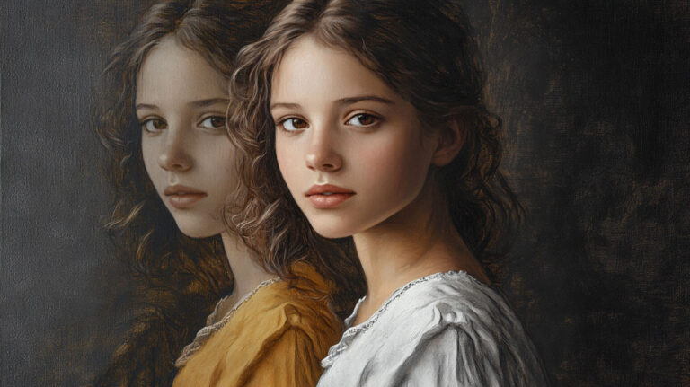
Some of the most powerful paintings ever made contain zero color. That is the grisaille technique at work.
Grisaille is a monochromatic painting method built entirely on shades of gray. From Jan van Eyck’s altarpiece panels to Picasso’s Guernica, painters across six centuries have used it to build form, depth, and volume without a single drop of pigment.
It works as a finished artwork. It works as an oil painting underpainting before color glazing. And it works as one of the most effective training tools in classical art education.
This guide covers what grisaille is, how it works, its history, the materials involved, and how to start practicing it yourself.
What Is Grisaille

Grisaille is a painting technique executed entirely in shades of gray, or near-gray neutral tones. The word comes from the French gris, meaning gray.
The core idea is straightforward: strip away color entirely, and build form, volume, and depth using only value – the relationship between light and dark.
Grisaille can function in two distinct ways. It works as a standalone finished artwork, or as a preparatory underpainting layer beneath transparent color glazes in oil painting.
That second use is where it became truly practical for working painters. If the values are already sorted in gray, adding color on top becomes a much simpler problem to solve.
| Function | Purpose | Typical Medium |
|---|---|---|
| Standalone artwork | Finished monochromatic painting | Oil, watercolor, acrylic |
| Underpainting base | Value foundation before color glazing | Oil on canvas or panel |
| Preparatory study | Model for engravers or printmakers | Watercolor, ink wash |
| Decorative panel | Sculptural illusion on flat surfaces | Fresco, oil on plaster |
The result, when done well, looks less like a painting and more like a carved marble relief. That sculptural quality is the whole point.
How Grisaille Works as a Technique
The process starts with a toned surface. Working on raw white canvas is tricky because the stark contrast throws off your perception of gray values.
A mid-tone gray or warm brown ground gives you something neutral to judge lights and darks against. Most painters use an underpainting wash or a tinted gesso for this.
Building Form Through Value
The sequence matters here: block in your darkest shadows first, work toward mid-tones, then add highlights last. Going the other way causes problems fast.
The key tools in the process:
- Dry brushing – a nearly-dry brush dragged lightly across the surface adds texture without muddying transitions
- Scumbling – a broken, semi-opaque layer dragged over dried paint to soften areas and add atmosphere
- Glazing – thin, transparent layers that deepen shadow areas without losing the luminosity beneath
Most painters keep the grisaille itself relatively thin. If the underpainting is too dark or too thick, the color glazes applied over it will not come through cleanly.
From Gray to Color
Once the grisaille layer is fully dry, transparent oil glazes go on top.
Because the values are already established, the painter only needs to focus on hue. The gray underneath handles all the shadow and highlight work.
Typical drying time between layers: several days for oil, depending on the medium used. Rushing this step ruins the glaze. Painters who use a quick-drying black oil for the underpainting can sometimes cut this to 24-48 hours.
Five to seven distinct gray tones is usually enough. More than that and the composition gets muddy rather than refined.
The History of Grisaille
Grisaille’s use in art traces back to the Middle Ages, with its early appearances in stained glass panels and illuminated manuscripts.
It reached peak prominence during the 15th and 16th centuries in Europe, particularly among Northern European painters working in oil on panel.
Medieval and Early Renaissance Origins

Medieval illuminators like Jean Pucelle (active c. 1320-1350) and Matthew Paris worked extensively in pen and wash with severely limited color ranges. The technique had been especially common in England since Anglo-Saxon times.
Giotto di Bondone used grayscale grisaille techniques in the lower panels of the Scrovegni Chapel frescoes, creating convincing three-dimensional form in a flat painted space. That was the technique’s core appeal: it made paint look like stone.
During the Renaissance, artists like Mantegna and Polidoro da Caravaggio used grisaille to mimic the look of classical sculptural relief. Pigments were scarce and expensive. Working monochromatically was both cheaper and faster than full-color painting.
Flemish and Baroque Applications

Jan van Eyck used grisaille for the exterior shutters of the Ghent Altarpiece, painting stone-gray figures that fool the eye into reading sculpture when the altarpiece is closed.
Peter Paul Rubens and his school used monochrome techniques regularly for compositional sketches made as models for engravers.
In Northern Europe, a continuous tradition of grisaille painting ran from Early Netherlandish work through Pieter Bruegel the Elder, Hendrik Goltzius, and into the circle of Rembrandt. The technique was especially common for the exterior panels of polyptychs and altarpieces, where full color painting would have been wasted on the outside of a closed structure.
By the 18th century, grisaille had become a standard pedagogical tool in academies. Students learned value relationships in gray before they were permitted to work in color. That disciplined sequencing is still considered sound practice today.
Grisaille vs. Underpainting
This is where a lot of people get confused. Not every underpainting is a grisaille, and not every grisaille is an underpainting.
| Type | Tonal Range | Used As |
|---|---|---|
| Grisaille | Black, white, gray | Underpainting or finished work |
| Verdaccio | Green, black, white | Underpainting for flesh tones in tempera and fresco |
| Brunaille | Brown, white | Warm-toned underpainting, popular in oil |
| Ebauche | Muted versions of final colors | Rough color block-in before refining |
When Grisaille Is the Final Work
Pablo Picasso’s Guernica (1937) is the most cited modern example of grisaille as a finished painting. There is no color layer underneath it. The gray is the final statement.
Gerhard Richter made gray a defining feature of his practice for decades. His Abstraktes Bild (Grau) (2002) treats gray not as a limitation but as a conceptual choice. He wrote that gray “has the capacity that no other color has” in the way it holds neutrality without blankness.
When Grisaille Is the Base Layer
In classical oil painting, the grisaille functions as a fully rendered value study that gets glazed over. The key difference from verdaccio: grisaille uses a neutral, achromatic gray, which makes it versatile under any color. Verdaccio’s green undertone was specifically suited to flesh tones in egg tempera.
Many oil painters prefer grisaille over brunaille because the neutral gray reads truer under bright or cool color glazes. A warm brown underpainting can push the final colors warmer than intended.
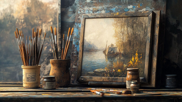
Materials and Surfaces Used in Grisaille
The material choice changes the experience significantly. Grisaille in oil handles nothing like grisaille in watercolor.
Oil Paint
The classic combination: ivory black and titanium white. Mix them in varying ratios for your value scale. Some painters add a touch of raw umber to warm the gray slightly and prevent a cold, lifeless look.
Ivory black is preferred over lamp black for grisaille because it dries faster and blends more smoothly. Titanium white gives strong opacity for building highlights. Zinc white is more transparent and sometimes used for softer mid-tones.
For glazing over the grisaille, a medium of linseed oil or stand oil mixed with a small amount of solvent keeps the paint mobile without becoming too fluid. Many painters follow a 4:1:1 ratio of solvent, linseed, and stand oil for upper layers.
Watercolor and Gouache
Watercolor grisaille relies entirely on dilution for value control. No white paint is needed. Lighter values come from more water; darker values from more concentrated pigment.
Gouache grisaille works the opposite way: opaque and matte, built from dark to light with actual white mixed in. By the 19th century, illustrators commonly produced grisaille works in watercolor for book and magazine reproduction.
Acrylic and Other Media

Acrylic dries faster, which makes layering quicker but blending harder. Layering in acrylic for grisaille benefits from a retarder medium to extend working time.
Suitable surfaces include canvas, wood panel, paper, and glass (for stained glass grisaille). The surface texture affects the final result noticeably, especially when dry brushing is part of the process.
Grisaille in Stained Glass
Grisaille glass is its own distinct category within the broader technique. It refers specifically to stained glass panels decorated with geometric or floral painted patterns in gray vitreous paint on clear or lightly tinted glass.
The effect is very different from colored stained glass. Where colored windows saturate a space with hue, grisaille windows filter light softly, filling interiors with a cooler, more diffuse quality. Many Gothic churches used grisaille panels deliberately for this reason, particularly during periods when austere aesthetics were favored over ornamentation.
The Medieval Tradition
The Five Sisters window at York Minster (c. 1260) is one of the most well-known surviving examples of pure grisaille glass. Five tall lancet windows, each filled with interlocking geometric grisaille patterns. No color. Just gray paint on clear glass interacting with natural light.
Chartres Cathedral contains grisaille panels alongside its famous colored windows. The combination creates deliberate visual contrast between sections of the building.
The Technical Process
Grisaille glass paint is made from powdered metal oxides mixed with a binder, then painted directly onto the glass surface.
Once applied and dried, the glass is fired in a kiln at high temperatures. The firing fuses the paint permanently to the glass surface. Without this step, the paint remains fragile and will eventually flake.
Silver stain (silver sulfide) became common from around the early 14th century, adding golden-yellow tones to grisaille panels without introducing separate colored glass pieces. The Metropolitan Museum of Art holds a grisaille panel from c. 1320-1330 made in Rouen, France, combining colorless glass, silver stain, and vitreous paint.
Grisaille in Contemporary Art and Illustration
Grisaille never really went away. It just stopped being labeled as such.
Today, the tonal grayscale approach shows up across concept art, digital illustration, tattoo studios, and fine art studios with no historical attachment to the Old Masters at all. The method works the same way it always did. Remove color, solve form first.
Digital Grisaille in Concept Art and Illustration

Value-first workflow: Most professional concept artists and character designers block out their compositions in grayscale before adding color. The logic is identical to the classical grisaille underpainting approach.
In software like Procreate, Photoshop, and Clip Studio Paint, this means painting on a locked grayscale layer, then adding color on separate layers above it using blend modes like Multiply or Color.
The result: color decisions and value decisions stay separate problems. Artists working this way report spending less time correcting muddy color and more time refining form.
ArtStation, the portfolio platform used widely by games and film industry professionals, features this workflow extensively. Studios like Ubisoft and Blizzard have concept art pipelines where initial passes are done monochromatically before receiving a color pass from a different artist entirely.
Tattoo Art and Black-and-Gray Technique
Black and gray tattoo work is grisaille applied to skin.
The technique uses diluted black ink in varying concentrations to build tonal gradations across the body’s curved surface. No color pigment is used. The value contrast alone creates depth, volume, and photographic realism in the finished work.
Key distinction from colored tattooing: black and gray requires precise tonal control from the start, with no ability to rework layers once ink is set. The margin for error is smaller than in painting, which is why many tattoo artists practice tonal rendering separately in pencil or charcoal before working on clients.
Gerhard Richter and the Conceptual Use of Gray
Gerhard Richter is the most prominent living example of an artist who made gray a conceptual position, not a limitation.
His gray paintings, produced across several decades, treat the achromatic palette as a statement about neutrality and ambiguity. His 2002 work Abstraktes Bild (Grau) (Abstract Painting, Gray) is now held in private collections and has sold at auction for significant sums.
Richter’s approach influenced a wider movement of artists using monochromatic painting as a deliberate conceptual strategy. Rudolf Stingel and Hugo Bastidas are both cited by the National Galleries of Scotland as contemporary artists working in deliberately grayscale palettes. Bastidas in particular creates large-scale paintings that are often mistaken for black-and-white photographs.
René Magritte also worked in grisaille. His 1935 paper work La Gacheuse (The Bungler) used a reduced palette on tinted paper, putting the monochrome approach to surrealist ends rather than classical ones.
How to Practice Grisaille as a Beginner
The learning curve is real but manageable. The hardest part is not the technique. It is training your eye to convert colors into accurate gray values.
Bright red and deep green can look identical in terms of value, even though they read as completely different colors. Until your eye can consistently distinguish value independent of hue, your grisaille work will look flat. Practicing on grayscale photo references helps fix this faster than any other method.
Starting Point: The Still Life
Best subjects to start with:
- A single sphere under a single light source (the classic academy exercise)
- A draped cloth with moderate folds
- Two or three objects of different sizes and textures grouped together
Avoid complex subjects with many small details. The goal at the start is to practice the dark-to-light layering sequence and get comfortable mixing a usable value scale.
Pre-mix five to seven distinct gray tones with a palette knife before you pick up a brush. Do not mix on the canvas. That leads to muddy transitions and makes it hard to control where each value sits in the composition.
Common Mistakes and How to Fix Them
Most beginners make the same three errors. Worth knowing them before you start.
Too timid with the darks: The shadows come out medium gray instead of genuinely dark. The result looks flat. Push the dark areas to a 7 or 8 on a 10-point value scale before moving to mid-tones.
Over-blending: Every transition gets smoothed out until the surface looks like airbrushed gray. Some edge variation, dry brushing, and visible texture keep the surface alive. Not everything needs to be perfectly smooth.
Starting on white canvas: White throws off your perception of gray values badly. Tone the canvas first with a mid-gray or warm brown wash. This gives you a middle point to judge both shadows and highlights against.
Recommended Exercises by Medium
| Medium | Starter Exercise | Key Practice Focus |
|---|---|---|
| Oil Paint | Sphere on toned canvas with a single light source. | Smooth transitions: Mastering mid-tone gradients and dry-brushing highlights. |
| Acrylic | Still life of two simple objects in natural daylight. | Speed & Layering: Learning to build form rapidly before the paint “sets.” |
| Watercolor | Simple draped fabric study. | Dilution Control: Building dark values through successive transparent washes. |
| Digital | Portrait study from a grayscale photo reference. | Value Isolation: Locking hue sliders to focus strictly on light and shadow. |
Convert your color photo reference to grayscale before starting. Most phones can do this in the native photo editor. Working from a grayscale reference removes the temptation to guess at values by looking at color.
Tonal rendering is a skill that transfers across every medium and every subject. Painters who practice chiaroscuro and value contrast in grisaille consistently produce stronger color work afterward. The two problems, value and hue, are genuinely easier to solve when you have already solved one of them.
Portrait painter Scott Bartner, featured in The Artist’s Magazine, recommends building the grisaille so the gray areas are never too prominent before glazing. His rule: it is easier to go darker later than to recover from a grisaille that is already too dark and dense when color glazes go over it.
FAQ on What Is The Grisaille Technique
What does grisaille mean?
Grisaille comes from the French word gris, meaning gray. It refers to any painting executed entirely in neutral gray tones, without color, to create the illusion of form, volume, and depth on a flat surface.
How is grisaille pronounced?
It is pronounced “griz-EYE.” The word is French, and the final syllable carries the emphasis. Most English speakers default to “griz-AY,” which is also widely accepted in art contexts.
What is grisaille used for in oil painting?
In oil painting, grisaille serves as an underpainting. The painter builds the full tonal value structure in gray first, then applies transparent color glazes over the dried layer to complete the work.
What paints do you use for grisaille?
The standard combination is ivory black and titanium white, mixed in varying ratios to produce a value scale. Some painters add a touch of raw umber to warm the gray slightly and prevent a flat, lifeless result.
Is grisaille only done in gray?
No. Technically, grisaille means monochromatic tonal painting. Brunaille uses brown tones. Verdaccio uses green. All three follow the same logic: build form using a single-color value scale before introducing full color.
Who used grisaille in art history?
Jan van Eyck used it on the exterior panels of the Ghent Altarpiece. Peter Paul Rubens used it for engraver studies. Pablo Picasso’s Guernica (1937) is the most recognized modern example.
What is the difference between grisaille and chiaroscuro?
Chiaroscuro describes the dramatic use of light and shadow contrast across any painting, including full-color work. Grisaille is a specific monochromatic technique. Grisaille often uses chiaroscuro principles, but the two are not the same thing.
Can beginners learn grisaille?
Yes, and it is actually one of the best starting points in painting. Working without color removes one major variable. Beginners can focus entirely on tonal values, light source, and form before taking on the added complexity of color mixing.
Is grisaille still used today?
Regularly. Contemporary painters use it for portrait underpaintings. Concept artists use a digital grayscale-first workflow in Photoshop and Procreate. Gerhard Richter made gray a defining feature of his entire practice across several decades.
What is grisaille in stained glass?
In stained glass, grisaille refers to panels painted with geometric or floral patterns in gray vitreous paint on clear glass. The paint is fired in a kiln to make it permanent. York Minster’s Five Sisters window is the most cited example.
Conclusion
This conclusion is for an article presenting the grisaille technique as one of the most durable methods in the history of painting.
From medieval stained glass to Baroque altarpieces, from academic value studies to digital concept art workflows, the tonal rendering approach has proven its usefulness across every era and medium.
The core principle has not changed. Strip away color. Solve light and shadow first. Build form through value contrast alone.
Whether you are working in classical oil technique or blocking out a grayscale layer in Procreate, the same discipline applies.
Grisaille teaches you to see. And that skill, once developed, improves every piece of monochromatic painting you attempt after it.