Every color you mix on a palette starts with one decision: which hue. Understanding what hue is in painting changes how you see pigment, mix paint, and build color relationships across a canvas.
Hue gets confused with color, value, and saturation all the time. They’re not the same thing. And that confusion leads to muddy mixes, flat shadows, and palettes that fight against each other instead of working together.
This guide breaks down hue as a core property of color theory, how it sits on the color wheel, why warm and cool hues behave differently, and how painters from Vermeer to Rothko used hue to control mood and composition. You’ll also learn practical mixing strategies and the most common hue mistakes that hold beginners back.
What Is Hue in Painting
Hue is the pure, identifiable name of a color on the spectrum. Red, blue, yellow, green, violet. That’s it.
When painters talk about hue, they’re pointing at the most basic property of what they see. Not how light or dark something is. Not how vivid or dull. Just the color family itself.
Most people use “hue” and “color” like they mean the same thing. They don’t. Color theory breaks color into three separate dimensions: hue, value, and saturation. Hue is just one piece of that system.
Think of it this way. Two paint swatches can both be “blue” (same hue) but look completely different because one is pale and washed out while the other is deep and rich. The hue stayed the same. The value and saturation changed.
The American Academy of Ophthalmology estimates that humans can distinguish up to 10 million colors. But there are only about 150 distinguishable hues across the visible spectrum, according to color science research. Everything else comes from changes in brightness and purity.
For painters, this distinction matters on a practical level. When you’re mixing pigments on a palette, knowing whether you need to shift the hue or just adjust the value saves time and prevents muddy results. Took me a while to internalize that, honestly. But once it clicks, mixing paint stops feeling like guesswork.
Hue vs. Color, Tint, Shade, and Tone
People throw these words around interchangeably. They shouldn’t.
Color is the big umbrella. It includes hue, value, and saturation all bundled together. When someone says “I love that color,” they’re reacting to the full package. Hue is just the starting ingredient.
How Tint, Shade, and Tone Relate to Hue
Each of these terms describes what happens when you modify a pure hue:
- Tint: hue mixed with white, making it lighter (pink is a tint of red)
- Shade: hue mixed with black, making it darker (navy is a shade of blue)
- Tone: hue mixed with gray, reducing its intensity
The hue itself doesn’t change through any of this. A tint of red is still red. A shade of blue is still blue. You’re just pushing it lighter, darker, or more muted.
Why This Matters at the Palette
Beginners run into trouble when they confuse value shifts with hue shifts. They’ll grab a different tube of paint when all they needed was a touch of white.
According to Allied Market Research, the global art supplies market was valued at $12.2 billion in 2023, projected to reach $20 billion by 2035. With that many people buying paint, understanding the difference between hue and its modifications is pretty basic knowledge that gets overlooked far too often.
| Term | What It Does | Technical Logic | Example |
| Hue | Pure Color Identity | The base pigment at its highest intensity. | Red, Blue, Yellow |
| Tint | Hue + White | Increases Value and softens the color’s “aggression.” | Baby blue, Pastel pink |
| Shade | Hue + Black | Decreases Value to create depth and weight. | Maroon, Navy blue |
| Tone | Hue + Gray | Decreases Intensity (Saturation) for a more sophisticated look. | Dusty rose, Slate blue |
Getting this straight early prevents a lot of wasted paint. And wasted time.
The Color Wheel and How Hues Are Organized
Isaac Newton built the first color wheel in 1666 after splitting white light through a glass prism. He identified seven distinct spectral colors and arranged them in a circle, connecting red to violet at the ends of the visible spectrum.
That was the foundation. Every color wheel since then builds on Newton’s original insight.
The modern version most painters use contains 12 hues: three primaries, three secondaries, and six tertiaries. Johannes Itten, who taught at the Bauhaus school in the early 20th century, formalized this 12-step wheel. It’s the one you’ll find in practically every color theory textbook and art classroom.
Albert Munsell took a different approach. His system, introduced in 1905, organizes hues into 10 major families (Red, Yellow-Red, Yellow, Green-Yellow, Green, Blue-Green, Blue, Purple-Blue, Purple, and Red-Purple), each subdivided further into 10 steps. That gives you 100 measurable hue positions around the wheel. The Munsell system is still used today for scientific color specification, and the USDA adopted it for soil classification back in the 1930s.
Primary, Secondary, and Tertiary Hues
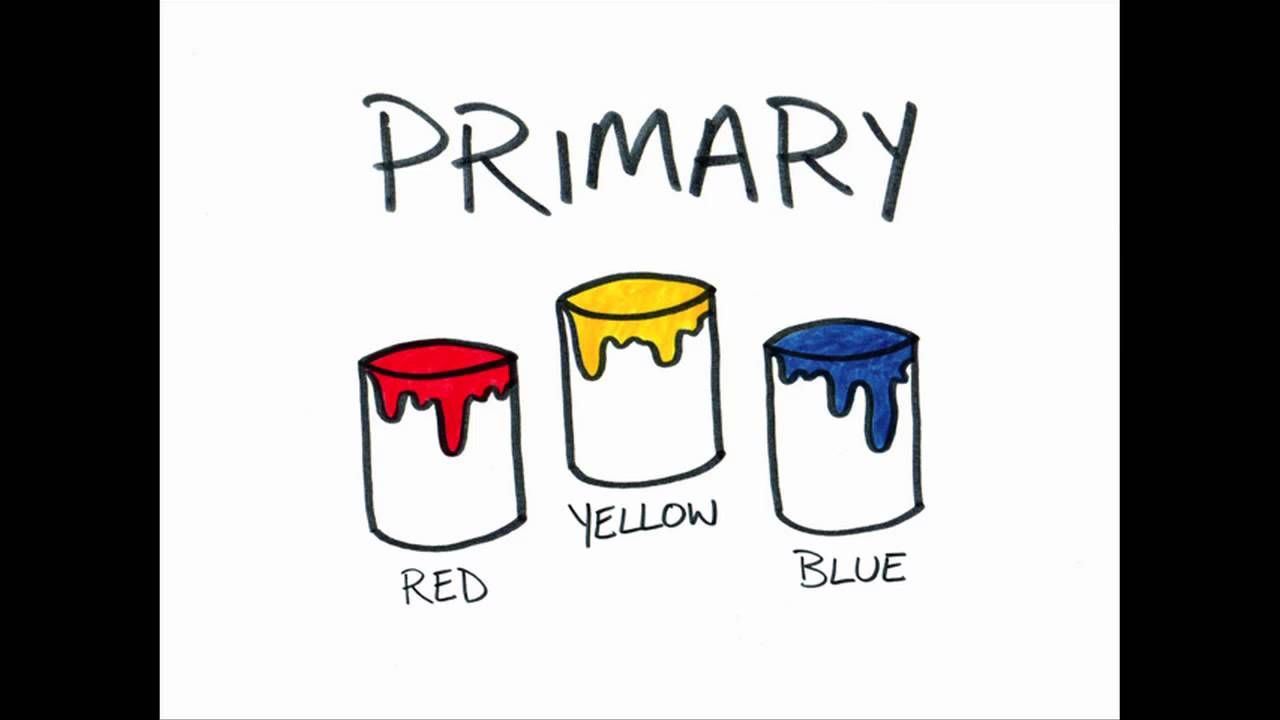
Primary hues sit at the foundation. In traditional painting, these are red, yellow, and blue. You can’t mix them from other pigments. (Well, actually, modern pigment chemistry has complicated this a bit. But for practical painting purposes, the red-yellow-blue model still holds up.)
Secondary hues come from mixing two primaries:
- Red + yellow = orange
- Yellow + blue = green
- Blue + red = violet
Tertiary hues fill the gaps between primaries and secondaries. These carry hyphenated names: yellow-orange, red-orange, red-violet, blue-violet, blue-green, yellow-green. They round out the 12-hue wheel and give painters much more precision when describing what they’re looking at.
Warm Hues and Cool Hues in Painting

The color wheel splits roughly in half. Reds, oranges, and yellows sit on the warm side. Blues, greens, and violets fall on the cool side.
But here’s what trips people up. Temperature is relative.
A “warm blue” like ultramarine leans slightly toward violet (and therefore red), while a “cool blue” like cerulean tilts toward green. Both are blue. Both are technically on the cool side of the wheel. But place them next to each other, and the temperature difference is obvious.
How Temperature Creates Depth
Warm hues tend to advance visually. Cool hues tend to recede. Painters have used this trick for centuries to create the illusion of atmospheric perspective and spatial depth in a painting.
Claude Monet painted shadows using cool blue and violet hues rather than just darkening the local color with black. This was a defining characteristic of Impressionist painting and it changed how artists thought about light and color in outdoor scenes.
EnChroma research found that nearly 50% of color blind students report being less interested in painting and drawing. That’s a reminder that hue temperature perception isn’t uniform across all viewers. About 8% of men and 0.5% of women worldwide experience some form of color vision deficiency, according to the Colour Blind Awareness organization.
Warm and Cool Hues in Practice

A quick reference for how painters typically categorize hue temperature:
| Warm Hues | Cool Hues | Technical Logic |
| Cadmium Red | Alizarin Crimson | Cadmium Red leans toward yellow (fiery); Alizarin leans toward blue (berry). |
| Cadmium Yellow | Lemon Yellow | Cadmium is “sunny” (leaning red); Lemon is “acidic” (leaning green). |
| Yellow Ochre | Cerulean Blue | Ochre is an earth tone with golden bias; Cerulean is a “sky” blue (leaning green). |
| Burnt Sienna | Ultramarine Blue | Sienna is a reddish-brown; Ultramarine is a deep, purplish-blue. |
| Orange | Viridian Green | Orange is the hottest hue; Viridian is a sharp, icy green. |
Your mileage may vary on some of these. Alizarin crimson is technically red, but it leans cool because of its blue undertone. Context matters more than rigid categories.
How Hue Affects Mood and Composition

Hue carries psychological weight. Every painter knows this on some level, even if they can’t articulate it.
Red hues pull attention and trigger urgency. Blue hues calm things down. Yellow hues suggest warmth and energy. These aren’t just personal preferences. Color psychology research has documented these associations across cultures for decades.
Dominant Hue Sets the Emotional Baseline
The dominant hue in a painting establishes its overall feeling before the viewer even registers the subject matter. Mark Rothko understood this deeply. His large canvases used close-value hues, often in reds, oranges, or deep blues, to create emotional responses that had nothing to do with recognizable imagery.
Rothko’s work is a perfect case study for how hue alone can carry an entire painting. No figures. No landscape. Just hue, scale, and value doing all the heavy lifting.
Hue as a Compositional Tool
Color contrast through opposing hues is one of the fastest ways to direct a viewer’s eye. Place a spot of warm orange against a cool blue-green background, and the viewer’s gaze goes straight to it.
This is emphasis through hue contrast, and it works regardless of painting style.
Painters generally work with two broad palette strategies when building mood:
- Analogous hue palettes: neighboring hues on the wheel create harmony and visual calm
- Complementary hue palettes: opposing hues generate energy and visual tension
Neither approach is better. It depends entirely on what the painting needs to say.
Hue Relationships: Complementary, Analogous, and Triadic

Hue relationships are the backbone of palette building. Three systems show up most often in painting practice.
Complementary Hues
Two hues sitting directly opposite each other on the color wheel. Red and green. Blue and orange. Yellow and violet.
When placed side by side, complementary hues intensify each other. The red looks more red. The green looks more green. This optical vibration effect is called simultaneous contrast, and painters like Vincent van Gogh used it constantly. Look at his night cafe paintings. The clash between red walls and green ceiling was intentional, meant to produce what he called “terrible passions.”
When you mix complementary hues together on the palette, though, they neutralize each other. This produces grays and browns. Useful for toning down a color without reaching for black.
Analogous Hues
These are neighbors on the wheel. Blue, blue-green, and green, for example. Or red, red-orange, and orange.
Analogous schemes feel unified because the hues share an underlying pigment connection. They lack the visual pop of complementaries, but they create a sense of cohesion. Monet’s water lily series often relied on analogous blues, greens, and violets to build soft, immersive atmospheres.
Triadic Hues
Three hues equally spaced on the wheel. Red, yellow, and blue is the most familiar triadic set. Orange, green, and violet is another.
Triadic palettes offer more variety than analogous schemes while staying more balanced than pure complementary setups. They can feel playful. Henri Matisse and the Fauvists pushed triadic hue combinations hard, using non-naturalistic colors to create paintings that prioritized emotional impact over realistic representation.
There’s also the split-complementary approach, where you take one hue and pair it with the two hues adjacent to its complement. It gives you the energy of complementary contrast with a little more flexibility. Less confrontational. Easier to control.
| Hue Scheme | Structure | Technical Logic | Visual Effect |
| Complementary | Opposite Hues | Uses maximum wavelength contrast (e.g., Red/Green). | High Contrast: Creates vibrant tension and focal points. |
| Analogous | Neighboring Hues | Uses a narrow slice of the spectrum (e.g., Blue/Teal/Green). | Harmony: Mimics natural gradients found in plants and sky. |
| Triadic | Equally Spaced | Forms an equilateral triangle (e.g., Red/Yellow/Blue). | Balanced Variety: Vibrant but stable; feels “complete.” |
| Split-Complementary | Base + Neighbors of Opposite | Uses a “Y” shape instead of a straight line across the wheel. | Controlled Contrast: Less “vibrating” than pure complementary. |
Knowing these relationships doesn’t mean you have to follow them rigidly. Plenty of great paintings break the rules. But understanding them gives you a starting point. And honestly, that’s worth more than most people realize when they’re staring at a blank canvas.
Hue Mixing with Paint Pigments

Mixing hues with physical paint doesn’t work the same way as mixing light on a screen. Paint uses subtractive color mixing, where combining pigments absorbs more wavelengths and produces darker, less saturated results.
Screens add light together (additive mixing). Paint takes it away. That single difference explains why so many beginners end up with muddy browns when they expected bright purples.
Every tube of paint carries a hidden bias. Cadmium red leans warm, toward orange. Alizarin crimson leans cool, toward violet. Both are “red,” but they produce completely different results when mixed with blue. This pigment bias is the single biggest factor in whether a color mixture turns out clean or dull.
Why Pigment Bias Matters When Mixing Hues
The split-primary palette is the practical fix for pigment bias. Instead of one red, one yellow, and one blue, you keep a warm and cool version of each primary.
- Warm red (cadmium red) + warm yellow (cadmium yellow) = clean, bright orange
- Cool red (alizarin crimson) + cool blue (ultramarine) = clean, rich violet
- Cool yellow (lemon yellow) + cool blue (cerulean) = clean, vivid green
Mixing across temperature bias (warm red + cool blue, for instance) pulls all three primaries into the mixture. That’s how you accidentally create gray or brown. You’ve introduced a trace of the third primary without meaning to.
Golden Artist Colors and Gamblin both publish pigment property guides that list each tube paint’s chemical composition, value, and color saturation data. These are genuinely useful for understanding which pigments lean warm or cool before you start mixing.
Limited Palette Strategies and Hue Control

The Zorn palette is four tubes: yellow ochre, vermilion (or cadmium red), ivory black, and white. That’s it. Anders Zorn painted portraits and figures with just those four, and the results are remarkably rich.
According to Jackson’s Art Blog, the Zorn palette can be traced back to the 4th century BC painter Apelles of Kos, who used a tetrachromatic palette of red, yellow, black, and white.
The key insight: fewer tubes means every mixed hue shares parent pigments, which creates automatic unity across the painting. Limited palettes teach you to control hue through proportion rather than reaching for a new tube every time something looks off.
Hue in Different Painting Mediums

Hue doesn’t behave the same way across all painting mediums. The binder, drying process, and opacity of each medium change how a hue looks on the surface.
| Medium | Hue Behavior | Technical Logic | Key Consideration |
| Oil | Stable & Rich | Pigments are suspended in oil, which doesn’t evaporate, maintaining refractive index. | Slow Drying: Allows for “wet-on-wet” blending and precise hue matching over days. |
| Acrylic | Drying Shift | The acrylic polymer emulsion (milky white when wet) becomes clear when dry, darkening the value. | Value Compensation: You must mix colors roughly one step lighter than the target. |
| Watercolor | Transparent | Light passes through pigment, hits the white paper, and reflects back through the paint. | Luminosity: The white of the paper is your “light”; once covered, it cannot be reclaimed. |
| Gouache | Opaque & Matte | High pigment load with a chalky binder creates a velvety, non-reflective finish. | Value Reversal: Darks often dry lighter and lights often dry darker due to the matte finish. |
Oil Paint and Hue Stability
Oil painting offers the most predictable hue behavior. The slow drying time (sometimes days) gives painters extended working windows to adjust hue relationships while the paint is still wet.
Oil pigments stay close to their wet appearance once dry. That consistency made oils the dominant fine art medium for centuries, from the Renaissance through the modern era.
Johannes Vermeer relied on this stability when building his carefully controlled hue palettes. His use of ultramarine blue and lead-tin yellow produced hue combinations that still look vivid over 350 years later.
Acrylic Paint and Hue Shift
According to Golden Artist Colors (via their Just Paint publication), the acrylic binder appears milky white when wet and dries completely clear. This causes colors to darken as the white opacity disappears during drying.
The standard advice from acrylic painting instructors: mix your colors a step lighter than what you want in the final piece. The hue shift is most noticeable in darker colors like ultramarine blue and less obvious in lighter pigments.
Winsor & Newton developed a professional acrylic line with a translucent-when-wet binder specifically to reduce this problem. But most acrylic brands on the market still exhibit some degree of value shift during drying.
Watercolor and Paper Influence on Hue
No white paint exists in traditional watercolor painting. The white of the paper serves as your lightest value.
Because watercolor pigments are transparent, the paper’s tone directly affects how each hue reads. A warm-toned paper will shift cool hues slightly warm. Cold-pressed paper with more texture creates pooling that adds variety within a single wash of hue.
How Master Painters Used Hue

Studying how specific painters handled hue is one of the fastest ways to develop your own color sense. Theory only gets you so far. Seeing decisions in finished work makes the principles stick.
Vermeer’s Restrained Hue Palette
Vermeer worked with a remarkably narrow range of hues. Ultramarine blue, yellow ochre, lead-tin yellow, and vermilion formed the core of most of his paintings.
By limiting the number of hues, he could focus on subtle temperature shifts and gradation within each one. The result is paintings that feel quiet and precise without ever looking monotonous. His Dutch paintings remain some of the most studied works in art history for this reason.
Matisse and the Fauvists
Henri Matisse went the opposite direction. He pushed hue to its most extreme, non-naturalistic application.
In Fauvist paintings, a face could be green. A shadow could be orange. The hue choices had nothing to do with what colors were “actually there” and everything to do with emotional impact. Matisse used hue as an expressive force, independent of observation.
His work proved that hue doesn’t have to match reality to create a convincing painting. It just has to create internal logic within the picture.
Rothko and Close-Value Hue Fields
Mark Rothko’s abstract canvases reduced painting to the interaction between large fields of hue at similar values.
Two rectangles of red, stacked. Or deep maroon hovering over black. The contrast wasn’t in value. It was in hue temperature and saturation. Rothko’s paintings prove that even tiny differences in hue can produce strong emotional responses when presented at monumental scale.
Van Gogh’s Complementary Hue Strategy

Vincent van Gogh studied color theory obsessively through books and letter exchanges with his brother Theo and fellow painters.
He consistently paired complementary hues for maximum visual energy. Blue skies against orange wheat. Red cafe walls opposite green ceilings. His letters specifically describe choosing hues to create what he called “clashes” and “harmonies” simultaneously.
Common Hue Mistakes Beginners Make

Hue problems are some of the first (and most persistent) issues painters face. The good news: they’re all fixable once you see what’s going wrong.
Using Too Many Hues at Once
More hues don’t make a better painting. They usually create visual chaos.
Beginners often reach for every tube on the shelf, thinking variety equals richness. The opposite tends to happen. With 10+ hues competing for attention, nothing dominates and the composition falls apart.
Start with three to five hues maximum. Build from there only if the painting genuinely needs it.
Confusing Value Changes with Hue Changes
This is the most common mistake, and experienced painters still catch themselves doing it.
When a shadow looks “wrong,” the instinct is to change the hue. Grab a different tube. But most of the time, the hue is fine. The value is just too light or too dark. Learning to see value separately from hue takes practice, but it fixes more problems than any other single skill.
Over-Relying on Black to Darken a Hue
Squeezing out ivory black and dumping it into a hue to make it darker is technically a shade. But it often kills the life in the color. Black deadens many hues, especially yellows and oranges, turning them chalky or muddy.
The alternative: darken hues with their complement instead. Add a touch of blue-violet to yellow-orange. Add green to red. The color gets darker, but it stays alive because the darkening agent is itself a chromatic hue, not a colorless neutral.
Ignoring Hue Temperature in Light and Shadow

Light and shadow almost always have different hue temperatures. If the light source is warm (sunlight, incandescent), shadows lean cool. If the light is cool (overcast sky, fluorescent), shadows lean warm.
Beginners tend to paint light and shadow as the same hue at different values. That produces flat, lifeless form. Once you start shifting hue temperature between light and shadow, even simple subjects suddenly look three-dimensional.
According to PS Market Research, the U.S. art supplies market reached $3.7 billion in 2024. With roughly 40% of U.S. adults engaging in creative activities like painting (per Global Growth Insights data), understanding these basic hue mistakes saves a lot of paint and frustration for a very large group of people.
If you want to test your hue perception, try painting a simple still life using only three tubes plus white. Limiting options forces you to actually see the hues you’re working with instead of grabbing whatever looks close enough.
FAQ on What Is Hue In Painting
What is hue in simple terms?
Hue is the pure name of a color on the spectrum. Red, blue, yellow, green. It refers only to the color family itself, not how light, dark, or vivid that color appears. Hue is one of three properties that define any color.
What is the difference between hue and color?
Color includes hue, value, and saturation combined. Hue is just one part of that equation. Two blues can share the same hue but look completely different because their lightness or intensity differs. Color is the full picture. Hue is the starting point.
How many hues are on the color wheel?
The standard color wheel used in painting contains 12 hues: three primary, three secondary, and six tertiary. The Munsell color system expands this to 100 measurable hue positions for more precise classification.
What are warm and cool hues?
Warm hues include reds, oranges, and yellows. Cool hues include blues, greens, and violets. Temperature is relative, though. A blue can lean warm or cool depending on its undertone and what sits next to it on the canvas.
Why do my paint mixes turn muddy?
Muddy mixes happen when you accidentally combine all three primary hues. Every pigment carries a bias toward a neighboring hue. Mixing a warm red with a cool blue introduces a hidden third primary, which dulls the result into gray or brown.
What is a tint of a hue?
A tint is any hue mixed with white. Pink is a tint of red. Baby blue is a tint of blue. The hue itself doesn’t change. You’re just pushing it lighter in value while keeping the same color identity.
Do acrylics change hue when they dry?
Acrylic paints don’t change hue, but they shift darker in value as the white binder clears during drying. The hue stays the same. The apparent darkening is a value shift, not a hue shift. Mix a step lighter to compensate.
What is a complementary hue?
Complementary hues sit directly opposite each other on the color wheel. Red and green. Blue and orange. Yellow and violet. Placed side by side, they intensify each other. Mixed together on the palette, they neutralize into grays and browns.
Can you paint with only three hues?
Yes. A primary triad of red, yellow, and blue (plus white) can produce a wide range of mixed hues. Limited palettes like the Zorn palette use as few as four tubes. Fewer hues create automatic harmony across the painting.
How did master painters choose their hues?
Van Gogh used complementary hue pairs for visual energy. Matisse chose non-naturalistic hues for emotional impact. Vermeer limited his hue range for quiet precision. Each approach demonstrates a different strategy for controlling mood through hue selection.
Conclusion
Knowing what is hue in painting gives you a clearer way to think about every color decision you make. It’s the foundation that supports everything else, from mixing skin tones to choosing a palette for a landscape.
Hue isn’t complicated once you separate it from value and chroma. The real skill is learning to see those three properties independently.
Start with a limited palette. Pay attention to pigment bias. Study how warm and cool hues create spatial depth and shift the mood of a painting.
Whether you’re working in oils, acrylics, or watercolors, hue control is what separates flat color from convincing light. Practice mixing with intention, and the rest follows.