The Netherlands produced more masterpieces per square mile than any other country in art history. That’s not an exaggeration.
From Rembrandt’s dramatic group portraits to Vermeer’s quiet interiors glowing with light, famous Dutch paintings span centuries of creative output that still shapes how we think about art today. The Dutch Golden Age alone generated tens of thousands of works, and the tradition kept going through Van Gogh, Mondrian, and beyond.
This guide covers 10 of the most important Dutch paintings ever created. You’ll find the story behind each work, where to see it, the techniques that made it special, and the details most people miss. Whether you’re planning a trip to the Rijksmuseum or just want to understand why a small painting of a girl in a turban became one of the most recognized images on the planet, this is where to start.
Famous Dutch Paintings
The Night Watch (1642)

Artist and Origin
Rembrandt van Rijn painted this in Amsterdam at the peak of his career. He was 36 years old. The militia company of Captain Frans Banninck Cocq commissioned it for the great hall of their headquarters, the Kloveniersdoelen.
Medium and Dimensions
Oil on canvas, 363 x 437 cm (about 12 by 14.5 feet). It is the largest painting Rembrandt ever made. So large, in fact, that he likely painted it in a lean-to in his garden because it couldn’t fit in his studio.
Where to See It
Rijksmuseum, Amsterdam. It has its own dedicated room, the Night Watch Gallery, and draws over 2.2 million visitors per year.
What the Painting Shows
A civic guard company stepping into action. Captain Cocq, dressed in black with a red sash, tells his lieutenant Willem van Ruytenburch to start the march. There are 34 figures total, but only 18 are real people who paid to be included. The rest are symbolic, including a mysterious girl in a pale yellow gown who serves as the company mascot.
The title is actually misleading. It doesn’t show a night scene at all. Dark varnish accumulated over centuries fooled people into thinking it was a nocturnal painting. The name stuck anyway.
Why It Matters
Before Rembrandt, group portraits were stiff and boring. Everyone sat in neat rows. He threw that out and created something with real movement, with energy, with drama. The use of chiaroscuro to guide the viewer’s eye through the composition was unlike anything done before in Dutch Golden Age painting.
It basically redefined what a group portrait could be.
Techniques Used
Rembrandt’s signature tenebrism is on full display here. Strong contrast between light and dark creates depth and focuses attention on key figures. He calculated every detail, from the direction of light to the gestures, glances, and banners that build a sense of theatricality and movement.
Interesting Facts
- In 1715, the painting was trimmed on all four sides to fit between columns at Amsterdam’s Town Hall. Two figures and architectural details were permanently lost.
- It survived two vandalism attacks: a butter knife attack in 1975 left zigzag marks, and an acid spray in 1990.
- In 2021, AI was used to reconstruct the missing sections based on a 17th-century copy by Gerrit Lundens.
- Operation Night Watch, launched in 2019, is the largest restoration project ever carried out on the painting.
Girl with a Pearl Earring (c. 1665)

Artist and Origin
Johannes Vermeer created this in Delft during the Dutch Golden Age. It’s not dated, but art historians place it around 1665 based on its pearl motif and the style of other paintings from that period.
Medium and Dimensions
Oil on canvas, 44.5 x 39 cm (about 17.5 x 15 inches). Surprisingly small for such a famous painting.
Where to See It
Mauritshuis, The Hague. The museum announced in 2014 that it would no longer lend the painting out. It did make one exception, for the 2023 Vermeer exhibition at the Rijksmuseum.
What the Painting Shows
A young woman in a blue and gold turban looks over her shoulder at the viewer, lips slightly parted. She wears an improbably large pearl earring. The dark background pushes her face forward, creating an intimate, almost startling directness.
This isn’t a portrait. It’s a tronie, a Dutch 17th-century type of painting showing an imaginary figure or character type. Her identity remains unknown. Some guess she was Vermeer’s eldest daughter Maria. Others say she was purely invented.
Why It Matters
Often called the “Mona Lisa of the North.” Like Leonardo’s work, the subject’s ambiguous expression drives endless fascination. But while the Mona Lisa is a portrait, this is something different. A type study. A mood piece.
Vermeer only produced 36 known works in his lifetime. This one nearly vanished from history before being rediscovered at auction in 1881, badly neglected and caked in dirt.
Techniques Used
Vermeer was the master of light. The soft modeling of the face uses value shifts rather than hard lines to create form. The reflections on her lips and pearl demonstrate his obsession with how light behaves on different surfaces.
The pearl itself? Just two strokes of white paint. One dab at the top, one gleam at the bottom to reflect the collar. No hook. No detail. Just light.
The background originally wasn’t black. It was a deep enamel-like green, created by a transparent glaze of indigo and weld over black. Those pigments faded over centuries.
Interesting Facts
- The pearl is too large to be real. It was likely an imitation glass bead, or possibly entirely imagined.
- Tracy Chevalier’s 1999 novel and the 2003 film starring Scarlett Johansson made this painting a global icon.
- The painting was originally called “Girl with a Turban.” The current title only caught on in the late 20th century.
- A 2018 research project (“The Girl in the Spotlight”) used advanced imaging to reveal hidden details beneath the surface.
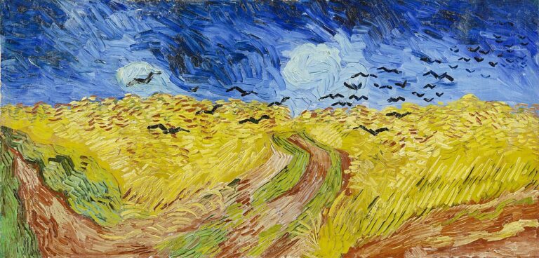
The Starry Night (1889)

Artist and Origin
Vincent van Gogh painted this in mid-June 1889 while staying at the Saint-Paul-de-Mausole asylum in Saint-Remy-de-Provence, France. He had voluntarily admitted himself following a mental breakdown the previous December.
Medium and Dimensions
Oil on canvas, 73.7 x 92.1 cm (about 29 x 36 inches). Van Gogh applied paint directly from the tube onto the canvas, creating thick impasto layers that give the work its signature texture.
Where to See It
Museum of Modern Art (MoMA), New York City. Acquired in 1941 through the Lillie P. Bliss Bequest. MoMA actually traded two Cezannes and a Toulouse-Lautrec for it.
What the Painting Shows
A swirling night sky over a village, with cypress trees surging upward in the foreground. The crescent moon and bright stars (Venus included) glow with halos of yellow light. Rolling hills and a church steeple anchor the scene below.
Here’s the thing. The village is imaginary. Van Gogh painted this from the east-facing window of his asylum room, but added a village from his imagination. He painted over 20 variations of this view during his year-long stay.
Why It Matters
It’s one of the most recognized paintings on Earth. A touchstone of modern art. Van Gogh’s post-impressionist style broke from what the Dutch Masters had done before him, abandoning careful realism for emotional intensity and bold color.
During his lifetime, almost nobody knew who he was. He sold very few paintings. Now this one alone pulls millions of visitors to MoMA every year.
Techniques Used
Thick, swirling brushstrokes build the sky into a living, turbulent surface. The color palette relies on ultramarine blue, cobalt blue, Indian yellow, and zinc yellow. Van Gogh’s expressive use of hue and color contrast creates a painting that feels more emotional than realistic.
Interesting Facts
- Van Gogh actually didn’t think much of this painting. He called it a “study” in a letter to his brother Theo.
- The cypress trees are massively exaggerated compared to reality, brought closer to the viewer for dramatic effect.
- Astronomers have confirmed that Venus was indeed visible in the sky from that location in June 1889.
- Van Gogh created over 2,100 artworks during a career that lasted just one decade.
The Milkmaid (c. 1658)

Artist and Origin
Johannes Vermeer painted this in Delft around 1657-1658. It was likely commissioned by his patron Pieter van Ruijven, one of the wealthiest men in the city.
Medium and Dimensions
Oil on canvas, 45.5 x 41 cm (about 18 x 16 inches). Another small Vermeer that hits way above its weight in terms of impact.
Where to See It
Rijksmuseum, Amsterdam. It’s one of their most prized possessions alongside The Night Watch.
What the Painting Shows
A sturdy kitchen maid pouring milk from an earthenware jug into a pot. Bread sits on the table. Light pours in from a window on the left. A foot warmer rests on the floor near Delft tiles depicting Cupid.
She’s actually not a “milkmaid” in the strict sense. She’s a kitchen maid preparing bread porridge, a simple dish made from stale bread and milk. But the name has stuck for centuries.
Why It Matters
This is arguably the greatest genre painting ever created. While other Dutch painters depicted servants and kitchen scenes, nobody matched Vermeer’s ability to give a mundane moment this kind of quiet grandeur.
Look at the lower vantage point. It makes her monumental. Almost heroic. A simple kitchen maid painted with the dignity of a saint.
Techniques Used
Vermeer’s handling of light here is extraordinarily precise. Points of paint sit on the bread like jewels, creating an almost jewel-like surface. He used natural ultramarine (more expensive than gold at the time) for the blue tones, plus lead white, yellow ochre, vermillion, and ivory black.
X-ray analysis revealed he originally painted a laundry basket where the foot warmer now sits. He simplified the pictorial space to focus all attention on the maid’s action.
Interesting Facts
- At the 1696 Dissius auction, it was described as “exceptionally good” and fetched 175 guilders.
- The Cupid tile near the foot warmer hints at hidden romantic symbolism. “Melken” (milk) was Dutch slang for sexual attraction.
- A white contour line along the maid’s right side makes her shimmer slightly against the wall.
- In 2009, the painting traveled to the Met in New York for the 400th anniversary of Henry Hudson’s voyage.
The Garden of Earthly Delights (c. 1490-1510)

Artist and Origin
Hieronymus Bosch created this massive triptych in ‘s-Hertogenbosch, in the southern Netherlands. It was commissioned by Engelbert II, Count of Nassau-Breda, and originally hung in his palace.
Medium and Dimensions
Oil on oak wood panels. The full triptych measures 205.5 x 384.9 cm (about 6.7 x 12.6 feet) when open. Each wing panel is 76.5 cm wide. Almost 4 meters across total.
Where to See It
Museo del Prado, Madrid, Spain. It has been there since 1939.
What the Painting Shows
Three panels tell a story from creation to damnation:
- Left panel: Paradise. God presents Eve to Adam in an idyllic garden.
- Center panel: Hundreds of nude figures engage in strange, fantastical activities with oversized fruit, bizarre creatures, and mysterious structures.
- Right panel: Hell. Grotesque punishments for sinners, musical instruments turned into torture devices, darkness and chaos.
When closed, the exterior panels show a grisaille painting of Earth during creation, rendered in monochrome grey tones.
Why It Matters
Nothing like it existed before, and honestly, nothing quite like it has existed since. Bosch created something closer to surrealism 400 years before the movement had a name. The imagery has fueled debate among art historians for over five centuries.
Some call it a moral warning. Others see a celebration of earthly pleasure. The truth is probably somewhere in between, and that ambiguity is part of what keeps people coming back.
Techniques Used
Oil on oak wood with transparent glazes. Bosch commonly used grisaille on his exteriors, with highlights of pale pink and creamy white. His loose, painterly brushstrokes create shimmering energy. The shift from the vast scale of the exterior to the miniaturized figures inside creates a transition from macrocosm to microcosm.
Interesting Facts
- The triptych contains hundreds of individual figures, each one uniquely rendered.
- Bosch grew up in Hertogenbosch, a religiously progressive town that likely influenced his complex theological imagery.
- In the hell panel, a pair of ears pierced by a knife and a bird-headed creature on a throne are among art history’s most analyzed details.
- It’s the largest surviving triptych by Bosch.
The Laughing Cavalier (1624)

Artist and Origin
Frans Hals painted this in Haarlem during the Dutch Golden Age. Hals was known for revolutionizing portraiture with his radically loose brushwork and ability to capture spontaneous expressions.
Medium and Dimensions
Oil on canvas, 83 x 67.3 cm (about 33 x 26.5 inches).
Where to See It
The Wallace Collection, London, England.
What the Painting Shows
A young man in lavish clothing, standing confidently with one hand on his hip. His upturned mustache and slight smirk give the impression of a knowing smile, though technically, he isn’t really laughing. The title came later.
His elaborate embroidered sleeve features symbols including bees, arrows, and flames, which have been interpreted as references to love and courtship.
Why It Matters
It’s been called one of the most brilliant Baroque portraits ever made. Hals captured something that most painters of his time couldn’t: a personality frozen mid-expression. That feeling of spontaneity, of catching someone in a genuine moment.
His technique directly influenced later Impressionist painters including Claude Monet and Van Gogh, who studied Hals’ loose brushwork closely.
Techniques Used
Hals’ trademark free brushstrokes are everywhere here. Close up, the paint looks almost unfinished, rough and energetic. Step back and it snaps into photographic clarity. The embroidered details on the sleeve combine precise detail with looser handling in the face and hat.
Interesting Facts
- The sitter’s identity has never been confirmed. The painting is undated in its official title.
- The “laughing” label was added in the 19th century. He’s more smirking than laughing.
- The fourth Marquess of Hertford bought it in 1865 for 51,000 francs, a record price at the time.
- Hals completed many of his portraits in a single sitting, working quickly to capture expression.
The Goldfinch (1654)

Artist and Origin
Carel Fabritius painted this in Delft. A student of Rembrandt, Fabritius developed his own distinct style focused on light, color, and atmospheric effects. He died the same year at age 32 when a gunpowder warehouse exploded in Delft.
Medium and Dimensions
Oil on panel, 33.5 x 22.8 cm (about 13 x 9 inches). Tiny. You could hold it in one hand.
Where to See It
Mauritshuis, The Hague.
What the Painting Shows
A European goldfinch chained by its foot to a feeding box, perched against a worn white wall. That’s it. Just a small bird, two semicircular bars, and a plaster wall.
Goldfinches were popular pets in 17th-century Holland. They could be trained to draw water from a bowl using a miniature bucket. The bird here sits quietly, its bright yellow and red feathers rendered with just a few precise strokes.
Why It Matters
The painting is a masterpiece of trompe-l’oeil illusion. It may have originally functioned as part of a wall niche cover or even a birdcage decoration, designed to trick the eye into seeing a real bird.
Fabritius left behind only 12 known paintings. This is arguably his best. He’s often called the bridge between Rembrandt and Vermeer, who also lived in Delft and was influenced by his handling of light.
Techniques Used
Quick, visible brushstrokes with minimal blending. The yellow wing feathers were painted in thick strokes, then scratched with the handle of the brush to reveal black paint underneath. A technique Fabritius learned directly from Rembrandt.
The low vantage point tells you the painting was meant to be viewed from below, suggesting it was mounted at eye level or above.
Interesting Facts
- The painting was lost for over 200 years before being rediscovered in Brussels in 1859.
- Donna Tartt’s 2013 Pulitzer Prize-winning novel “The Goldfinch” made this painting a household name.
- Fabritius was killed in the 1654 Delft explosion that destroyed much of the city and likely many of his other works.
- It appeared on a set of Dutch postage stamps in 2014 to celebrate the Mauritshuis reopening.
Hunters in the Snow (1565)

Artist and Origin
Pieter Bruegel the Elder painted this in Antwerp. It was part of a series of six seasonal paintings commissioned by the wealthy banker Niclaes Jongelinck.
Medium and Dimensions
Oil on oak wood, 117 x 162 cm (about 46 x 64 inches).
Where to See It
Kunsthistorisches Museum, Vienna, Austria.
What the Painting Shows
Three hunters trudge back through deep snow toward their village, a pack of dogs trailing behind them. Their catch is pathetic. One man carries a single scrawny fox on his spear.
Below them, villagers ice-skate on frozen ponds and play games on the ice. The scene stretches from a foreground hillside down into a vast landscape with jagged Alpine peaks in the distance. A frozen watermill sits to the right. Crows perch in bare trees overhead.
Why It Matters
It’s probably the most recognizable winter painting ever created. Before Bruegel, the idea of painting seasonal cycles existed only in small manuscript illustrations. He brought it to a monumental panoramic scale for the first time.
The way the composition pulls your eye from the hunters in the foreground, along the diagonal line of trees, and down into the valley is something I’ve always found incredibly effective. It creates both depth and narrative at the same time.
Techniques Used
Bruegel used a restricted color palette of whites, blue-greens, and browns to create a consistent impression of cold. Distant figures are reduced to silhouettes, and the bare tree branches act as a framing device. The “balcony motif,” an elevated foreground looking down, appears across all paintings in the series.
Interesting Facts
- Five of the original six seasonal paintings survive. “Spring” was lost.
- The landscape combines Alpine mountains with Flemish architecture. It’s entirely invented. No real place.
- Director Andrei Tarkovsky featured the painting in his 1972 film “Solaris” during the zero-gravity scene.
- An inn sign in the painting reads “To the Deer,” a sly joke given the hunters’ obvious failure.
View of Delft (c. 1660-1661)

Artist and Origin
Johannes Vermeer painted his only cityscape while living in Delft, depicting his hometown from the south across the Schie canal.
Medium and Dimensions
Oil on canvas, 96.5 x 117.5 cm (about 38 x 46 inches). This is one of the largest paintings Vermeer ever created.
Where to See It
Mauritshuis, The Hague. It’s been there since 1822 when the Dutch government purchased it for 2,900 guilders.
What the Painting Shows
The city of Delft on a still morning, reflected in calm water. Buildings, church towers, boats, and a handful of figures on the quay. The sunlit spire of the Nieuwe Kerk (New Church) is the brightest point in the painting. Vermeer deliberately shifted it toward the center to make it more prominent than it actually was.
The sky takes up nearly half the canvas. Patches of cloud and sunlight create a constantly shifting sense of atmosphere.
Why It Matters
French writer Marcel Proust called it “the most beautiful painting in the world.” It became the work that helped 19th-century critic Theophile Thore-Burger rediscover Vermeer after centuries of near-total obscurity.
There’s something almost photographic about it, which has fueled centuries of debate about whether Vermeer used a camera obscura to compose it.
Techniques Used
Vermeer mixed sand into some of his paint to create textured surfaces on the roof tiles. He applied tiny dots of paint on the hull of a boat to simulate water reflections, a proto-pointillist technique centuries ahead of Georges Seurat.
The pigment analysis shows a careful but limited palette: lead white, yellow ochre, natural ultramarine, calcite, and madder lake.
Interesting Facts
- No bells appear in the Nieuwe Kerk tower because they weren’t installed until after the painting was completed.
- Vermeer painted his initials “VM” on the red interior of a barge at lower left.
- X-ray analysis shows he originally included a third person on the quay but later painted them out.
- In Proust’s novel “In Search of Lost Time,” the writer character Bergotte dies while gazing at this painting.
Composition with Red, Blue, and Yellow (1930)

Artist and Origin
Piet Mondrian created this in Paris. Born in Amersfoort in the Netherlands, Mondrian had by this point fully developed his signature style of abstract geometric painting through the De Stijl movement he co-founded.
Medium and Dimensions
Oil on canvas, 46 x 46 cm (about 18 x 18 inches). A perfectly square format.
Where to See It
Kunsthaus Zurich, Switzerland.
What the Painting Shows
A grid of black lines on a white background, with blocks of primary colors: red, blue, and yellow. That’s it. No curves, no gradients, no representation of anything from the natural world.
The rectangles are deliberately asymmetrical. The red block dominates the upper right. Blue sits in the lower left corner. A thin yellow strip occupies the bottom right. The imbalance is the point.
Why It Matters
This painting helped define minimalism and geometric abstraction for the 20th century. Mondrian believed that reducing art to its most basic elements, straight lines, primary colors, and right angles, could express universal truths about harmony and balance.
In 1965, Yves Saint Laurent created his famous “Mondrian Collection” of dresses based directly on these paintings. That crossover between fine art and fashion solidified Mondrian’s place in popular culture permanently.
Techniques Used
Flat application of saturated primary colors within a strict grid structure. Mondrian worked with deliberate precision, adjusting the width of black lines and the proportions of colored blocks until he achieved the right sense of dynamic equilibrium.
Close up, the paint application shows subtle variations in thickness and brush direction, proving these “simple” compositions required careful, considered execution.
Interesting Facts
- Mondrian started as a traditional landscape painter before gradually abstracting his subjects into pure geometry.
- He couldn’t stand the color green and reportedly turned his chair to avoid seeing trees through his Paris studio window.
- The De Stijl movement he co-founded in Leiden in 1917 influenced architecture, furniture design, and graphic design worldwide.
- Willem de Kooning, another Dutch-born artist, would later rebel against everything Mondrian stood for through expressionism.
FAQ on Famous Dutch Paintings
What is the most famous Dutch painting?
Rembrandt’s The Night Watch (1642) is widely considered the most famous. It hangs in the Rijksmuseum in Amsterdam and redefined group portraiture during the Dutch Golden Age with its dramatic use of light and shadow.
Where can I see famous Dutch paintings?
The Rijksmuseum and Van Gogh Museum in Amsterdam hold major collections. The Mauritshuis in The Hague houses Vermeer’s Girl with a Pearl Earring. The Museo del Prado in Madrid has Bosch’s Garden of Earthly Delights.
What made Dutch Golden Age painting different?
Dutch 17th-century painters focused on everyday life, landscapes, still lifes, and portraits rather than religious subjects. A booming merchant class drove demand for art, making the Netherlands the most art-saturated country in Europe.
Who are the most famous Dutch painters?
Rembrandt van Rijn, Johannes Vermeer, and Vincent van Gogh top most lists. Frans Hals, Hieronymus Bosch, Pieter Bruegel the Elder, and Piet Mondrian are also among the most recognized Dutch Masters in art history.
Why is Girl with a Pearl Earring so famous?
Vermeer’s intimate tronie captures an enigmatic expression that invites endless interpretation. Tracy Chevalier’s 1999 novel and the 2003 film starring Scarlett Johansson turned it into a global cultural icon beyond the art world.
What techniques did Dutch Masters use?
Oil painting on canvas and wood panels was standard. Rembrandt mastered chiaroscuro and tenebrism. Vermeer used camera obscura techniques and pointillist-like dots. Many Dutch painters excelled at capturing realistic light and texture.
How many Vermeer paintings exist?
Only 36 paintings are attributed to Johannes Vermeer. He worked slowly and carefully in Delft, producing far fewer works than contemporaries like Rembrandt. Each one is considered exceptionally rare and valuable today.
What is the Dutch Golden Age in art?
A period roughly from 1620 to 1680 when the Dutch Republic experienced massive economic growth. Wealthy merchants bought art in huge quantities. Haarlem alone produced nearly 100,000 paintings between 1605 and 1635.
Are Dutch paintings expensive at auction?
Yes. Rembrandt’s portraits regularly sell for tens of millions. A Van Gogh self-portrait sold for over $71 million. Dutch Old Master paintings remain among the most expensive paintings in the world at major auction houses.
What is a tronie in Dutch painting?
A tronie is a character study, not a portrait of a specific person. Vermeer’s Girl with a Pearl Earring and several works by Frans Hals are tronies. They depict types or expressions, often featuring exotic costumes or exaggerated features.
Conclusion
These famous Dutch paintings represent more than just oil on canvas or wood. They document a culture that valued observation, craft, and honest depiction of the world around them.
Rembrandt’s mastery of portrait painting changed what group compositions could be. Vermeer turned domestic genre scenes into something close to sacred. Bosch imagined worlds nobody had seen before. Van Gogh threw out the rules entirely.
What connects them all is a commitment to seeing clearly and painting with conviction.
If you get the chance, visit these works in person. The Rijksmuseum, Mauritshuis, and MoMA each offer something that no reproduction can match. Standing in front of The Night Watch at full scale or catching the light on that tiny pearl earring hits differently than any screen ever will.