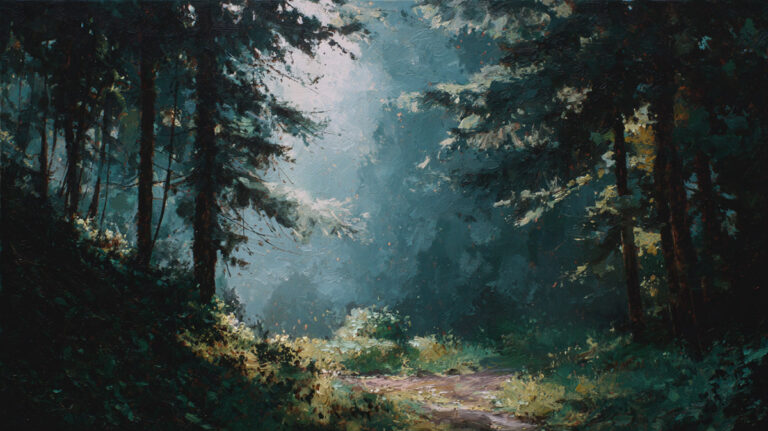
Every color you mix gets darker the moment black touches it. But understanding what shade is in painting goes beyond just “add black and hope for the best.” Shade is a precise color mixing term with real implications for how your darks look, how your shadows behave, and whether your painting reads as flat or three-dimensional.
Most painters confuse shade with tint and tone. That confusion leads to muddy palettes and lifeless shadow areas. Getting shade right means understanding value, saturation, and how different pigments respond when darkened.
This guide covers what shade actually means, how to mix shades properly across different mediums, the mistakes that trip up beginners, and how artists from Caravaggio to Ad Reinhardt used shade to define entire movements.
What Is Shade in Painting

Shade is a color mixed with black. That’s the full definition. When you add black pigment to any hue, the result is a shade of that hue.
Most people use the word “shade” casually. They’ll say “a nice shade of blue” when they really just mean a variation of blue. But in painting and color theory, shade has a specific technical meaning that separates it from related concepts like tint and tone.
Adding black to a pure hue does two things at once. It lowers the value (making the color darker) and it reduces the intensity, which a lot of beginners don’t expect.
The Munsell color system, developed by Albert H. Munsell in 1905, maps every color along three dimensions: hue, value, and chroma. Shades occupy the lower end of the value scale, sitting closer to black on the vertical axis of the Munsell color solid. The system rates value from 1 (darkest) to 10 (lightest), so shades tend to cluster between 1 and 4 depending on how much black has been mixed in.
According to the Art Basel and UBS Global Art Market Report 2025, paintings remained the most purchased medium and the largest by value across global art sales in 2024. Understanding how to manipulate color through shading is one of those foundational skills that separates a finished painting from a flat one.
A shade is not just “dark color.” It’s the specific result of black being introduced into a hue. Burnt umber straight from the tube is dark, sure, but it isn’t a shade of anything. A shade of cadmium red, though, is cadmium red plus black. The distinction matters when you’re mixing on a palette and trying to control exactly where your darks come from.
Shade vs. Tint vs. Tone

These three terms get thrown around interchangeably, and that’s a problem. They describe completely different color modifications.
| Modification | What You Add | Technical Logic | Effect on Color |
| Shade | Black | Decreases Value by absorbing more light wavelengths. | Weight & Depth: Creates a darker, “heavier” version of the hue. |
| Tint | White | Increases Value by reflecting more light; increases opacity. | Softness & Light: Creates a lighter, “airy” version of the hue. |
| Tone | Gray | Decreases Intensity (Chroma) without drastically shifting value. | Muted Sophistication: Neutralizes “visual noise” for a natural look. |
That’s the quick version. But the differences go deeper than just what you squeeze out of a tube.
Why Painters Confuse These Terms
Everyday language doesn’t help. Someone says “a lighter shade of green” when they technically mean a tint. Or “that tone is too dark” when they’re actually looking at a shade.
Even art supply labels can be misleading. Take cadmium red. Mix it with white and you get a tint, a lighter, chalky pink-red. Mix it with gray and you get a tone, a more subdued, muted red. Mix it with black and you get a shade, a deep, heavy crimson that leans almost toward maroon.
The confusion usually starts in casual conversation and just… carries over. Took me forever to break the habit of calling everything a “shade” when I first started painting.
How Each Modification Changes Color Behavior
Shades feel heavier in a composition. They pull the eye downward and tend to recede, making them useful for shadow areas and backgrounds. Adding black also shifts the color temperature. A warm yellow shaded with black can suddenly appear greenish, which catches people off guard.
Tints do the opposite. They lighten and soften, and they’re what you reach for when painting highlights on skin or the bright side of an object. Claude Monet used tints extensively in his water lily paintings to capture reflected light on the pond surface.
Tones sit in the middle. They’re quieter than pure hues but don’t carry the visual weight of shades. A toned-down color reads as more natural, which is why portrait painters rely on tones when mixing skin tones.
Getting these distinctions right isn’t just academic. It changes how you approach every single color mixing decision on the palette.
How Shade Affects Value and Saturation

When you create a shade, two properties shift simultaneously. Value drops and color saturation decreases.
The value part is obvious. Black darkens things. But the saturation loss surprises a lot of painters, especially beginners who expect their shaded color to just be “the same color, but darker.” It’s not. It’s duller, too.
Value Shift in Practice
On a value scale running from white (10) to black (1), a pure hue like cadmium yellow sits high, around 8. Add a small amount of black, and it might drop to 6. Add more, and you’re at 3 or 4. The steps aren’t always linear, which makes careful mixing necessary.
According to Gamblin Artists Colors, the Munsell value scale rates lightness from 1 (darkest) to 10 (lightest), with chroma measured separately as distance from neutral gray. When you shade a color, it moves down on value and inward on chroma at the same time.
This dual shift is why shades can feel flat if you’re not careful. The color loses its punch.
Why Saturation Drops
Black pigment isn’t neutral. Most black paints lean toward blue or brown. Ivory black has a slight warm undertone. Mars black pulls cooler. Lamp black is relatively neutral but still mutes whatever it touches.
So when you’re mixing a shade, you’re not just darkening. You’re introducing a secondary hue influence and pulling chroma down toward gray. This is the main reason many experienced painters avoid using straight black altogether. They prefer to darken colors by mixing complementary colors instead.
A 2024 study from Psychological Research confirmed that art students perceive brightness and saturation shifts differently from non-art students, with trained artists showing greater sensitivity to changes in chroma, exactly the kind of awareness needed to manage shades effectively.
How to Mix Shades with Paint

Mixing shades is straightforward in theory but tricky in practice. The amount of black required is almost always less than you think.
Start with your base hue on the palette. Add black in tiny increments. A dab the size of a pin head can shift a color dramatically. If you dump in too much black too fast, you’ll kill the color entirely and have to start over.
Mixing Shades Without Using Black
Here’s the thing most experienced painters eventually figure out: you don’t actually need black to make a shade.
Mixing a color with its complement darkens it while keeping more life in the result. A few common pairings:
- Burnt umber + ultramarine blue produces a rich, deep dark that works as a substitute for black in most situations
- Alizarin crimson + phthalo green gives you a near-black that’s warmer and more complex than tube black
- Cadmium orange + ultramarine creates a nuanced dark that retains color character
Rembrandt van Rijn rarely used pure black pigment in his paintings. His deep, luminous darks came from layered mixtures of complementary colors and earth tones, which gave his shadow areas that famous inner glow.
Shade Mixing Across Different Mediums

The medium you work with changes how shades behave.
Oil paint: Slow drying time lets you blend shades gradually. Oils also allow glazing, where thin, transparent dark layers build up shade depth without the flatness of direct mixing. This was Caravaggio‘s preferred approach.
Acrylic paint: Dries fast, which means you have less time to blend shades on the canvas. Acrylics also tend to dry slightly darker than they appear when wet. You’ll need to account for this shift when judging your shade mixtures.
Watercolor: Black pigment in watercolor can look harsh and chalky. Many watercolorists prefer to use Payne’s gray or indigo instead, building shades through layered washes rather than direct black mixing.
The digital painting market was valued at $5.85 billion in 2024 and is projected to reach $18.48 billion by 2032, according to Verified Market Research. Digital painters face entirely different shade mixing behaviors since software handles color mathematically rather than through pigment chemistry.
The Role of Shade in Creating Depth and Volume

Shades aren’t decorative. They’re structural.
Every object you paint has a lit side and a shadow side. The shadow side is where shades do their work, defining the form of an object and telling the viewer where the light source is coming from.
How Shades Define Three-Dimensional Form
Look at a sphere. The area facing the light is bright (that’s where tints live). The area curving away from the light gets progressively darker. Those transitional areas are where you mix shades of the object’s base color to create gradation.
Form shadow is the shade on the object itself, the part that curves away from direct light. Cast shadow is the darker area projected onto another surface. Both require careful shade mixing, but they behave differently. Cast shadows tend to have harder edges and are often darker than form shadows.
The chiaroscuro technique, which translates from Italian as “light-dark,” relies almost entirely on controlled shade placement. Artists like Leonardo da Vinci used it to give figures a vivid three-dimensional quality, while Caravaggio pushed it further into tenebrism, where dramatic darkness dominates the composition.
Shade and Atmospheric Perspective
Atmospheric perspective uses shade (among other tools) to push elements into the background. Objects farther from the viewer appear less saturated, lower in contrast, and lighter in value.
But here’s where it gets tricky. Distant darks are actually lighter than nearby darks. So the shade you use on a mountain range five miles away should be softer and more muted than the shade on a tree trunk in the foreground.
J.M.W. Turner understood this intuitively. His landscape paintings show how shade diminishes with distance, creating vast spatial depth through increasingly subtle dark-to-light transitions. If you’re interested in applying this to your own work, learning to create depth in a painting starts with mastering these shade relationships.
Shade in Color Theory and the Color Wheel

On a standard color wheel, every hue can produce a range of shades by adding incremental amounts of black. These shades don’t appear on most printed color wheels, which is part of the reason beginners struggle to understand them.
The color wheel shows hues at their full saturation. Shades exist below that level, deeper and darker, occupying a dimension the flat wheel can’t represent.
Where Shades Sit on a Value Scale
Think of each hue as having a vertical column. At the top sits the pure hue at full brightness. Moving downward, each step adds more black, producing progressively deeper shades until you reach near-black at the bottom.
This is essentially what the Munsell color system visualizes in three dimensions. Albert Munsell, an American painter and art educator, designed the system around 1898 specifically because flat color wheels couldn’t capture how value and chroma interact. His system uses five primary hues (red, yellow, green, blue, purple) instead of three, distributing color temperature more evenly across the model.
Johannes Itten, who taught at the Bauhaus school, developed a different but related color system that influenced how painters learn color mixing today. His 12-part color contrast framework includes light-dark contrast as one of the seven types of color interaction, directly linking shade usage to compositional strategy.
Shade Charts and Paint Manufacturer Data
Gamblin Artists Colors publishes Munsell notation data for each paint in its line, breaking colors down into hue, value, chroma, and temperature. This lets painters predict how a specific pigment will behave when shaded.
Some paint brands include shade charts on their websites or packaging. These show what a color looks like at various darkening stages, from a small addition of black all the way to deep shade. It’s a useful reference, but nothing replaces actually mixing the shades yourself on the palette.
The global art market recorded $57.5 billion in sales in 2024 according to Art Basel and UBS, with paintings accounting for 36% of all lots sold at auction. Whether you work in traditional or digital painting mediums, understanding shade behavior within color theory remains a core skill that directly affects the quality of your work.
Common Mistakes When Using Shades

Shading mistakes ruin more paintings than bad drawing does. And most of them come down to one thing: reaching for the black tube without thinking first.
Over-Reliance on Black Straight from the Tube
This is the number one shade mixing mistake. Beginners squeeze out ivory black or Mars black and dump it directly into their color mixtures. The result looks flat, lifeless, and muddy.
The problem isn’t black itself. It’s the large pigment particle size in most black paints. Gamblin Artists Colors notes that ivory black and Mars black both have relatively large particles that overpower the base hue, making mixtures look dirty rather than richly darkened.
Their solution was Chromatic Black, made from smaller, transparent modern pigments. But you can also mix your own dark from burnt umber and ultramarine blue, which keeps the shade alive.
Ignoring How Black Shifts the Hue
Yellow plus black doesn’t just give you “dark yellow.” It gives you something closer to olive green. That greenish shift catches beginners completely off guard.
This happens because most black pigments carry a blue or cool undertone. When that blue mixes with yellow, green appears. Similar hue shifts occur across the spectrum:
- Cadmium yellow + black turns greenish
- Cadmium red + black can lean toward brownish-purple
- Phthalo blue + black barely changes, since both are already cool
Knowing your pigments’ undertones before shading saves hours of frustration on the palette.
Using One Shade Value for the Entire Shadow
Shadows aren’t one flat block of dark. They contain variation. There’s the core shadow (the darkest part), the half-tone (the transition between light and shadow), and reflected light bouncing back into the shadow area.
Flat shadows = flat paintings. Johannes Vermeer painted some of the most subtle shadow transitions in art history. His use of color harmony within shaded areas is a big part of why The Milkmaid still looks three-dimensional centuries later.
Shade in Digital Painting vs. Traditional Painting

Digital and traditional shade mixing share the same goal but get there in completely different ways. One works with pigment chemistry. The other works with math.
| Factor | Traditional Painting | Digital Painting | Technical Logic |
| Shade Creation | Physical Mixing: Pigment + Black/Complement. | HSB/L Manipulation: Lowering the “Brightness” slider. | Digital is purely mathematical; Traditional is a chemical reaction. |
| Hue Shift Risk | High: Black pigments (like Ivory Black) have cool/blue undertones. | Low: Software maintains the hue’s “degree” while changing value. | Physical pigments have “Bias” that can accidentally shift temperature. |
| Undo Capability | Destructive: Scrape, sand, or opaque over-painting. | Non-Destructive: Ctrl+Z or Layer Masking. | Digital allows for risk-free experimentation with value. |
| Texture Behavior | Organic: Varies by medium (Oil/Acrylic) and substrate. | Algorithmic: Dependent on brush engine and “noise” settings. | Physical texture is a 3D byproduct; Digital texture is a 2D simulation. |
How Digital Tools Handle Shade
In Photoshop, Procreate, or Krita, creating a shade is as simple as dragging the brightness slider down in the HSB (hue, saturation, brightness) color model. The software doesn’t introduce unexpected hue shifts because it calculates color numerically.
Polaris Market Research valued the global digital artwork market at $5.57 billion in 2024, with digital paintings projected to grow at the highest rate among all segments.
Blending modes add another layer. Multiply mode, commonly used for shadows, darkens whatever sits beneath it while preserving the underlying hue. This mimics the effect of a transparent glaze in traditional oil-based work without the drying time.
Translating Between Mediums
A Celsys survey of 6,000 European creators found that 69.6% draw digitally, with many starting before age 15. But shade skills learned in traditional painting transfer directly to digital work, and vice versa.
The core principle stays the same: adding darkness reduces both value and intensity. Whether you’re pulling a brightness slider or mixing burnt umber into cadmium orange, the visual effect on the viewer is identical.
Artists who work across both mediums, like those who sketch digitally in Procreate then execute final pieces in acrylics, often find that understanding traditional shade behavior makes their digital color choices more intentional. The shortcuts in software are useful, but they can hide the “why” behind the color change if you don’t already understand pigment interaction.
Examples of Shade in Famous Paintings

Shade isn’t an abstract concept. It shows up in specific, identifiable ways across centuries of painting. Looking at how individual artists controlled their darks tells you more than any color chart.
Caravaggio and Extreme Shade Contrast
Caravaggio’s most recognized paintings depend almost entirely on shade. In The Calling of Saint Matthew (1600), a shaft of light cuts across the scene while deep, near-black shades dominate the rest of the canvas.
He painted directly in color without preliminary drawings, according to research from art historian Manfredi Faldi. His dark, reddish-brown ground preparation was sometimes left visible through the paint layers, adding depth to his shaded areas.
Between 1953 and 1967, his artistic opposite, abstract painter Ad Reinhardt, produced 25 black-on-black paintings that pushed shade to its absolute limit. What initially appears as solid black reveals, on sustained viewing, subtle rectilinear divisions in value and hue. The Whitney Museum describes these variations as “almost imperceptible,” proving that shade can carry an entire composition alone.
Rembrandt’s Layered Shade Approach
Rembrandt’s famous works show a different philosophy. His shades glow from within because he built them in layers rather than mixing dark colors on the palette.
Key technique: Thin, transparent dark glazes applied over lighter underlayers created luminous shadows that still feel warm and alive. His self-portraits from the 1650s and 1660s are textbook examples. The shadow side of the face carries visible color, not just darkness.
Shade Across Movements
Different painting styles handle shade in radically different ways.
Realism painters matched observed shade values precisely, measuring the darkness of a shadow against the light with careful value studies. Impressionism broke that approach apart. Monet and Renoir replaced black shadows with colored ones, arguing that pure black doesn’t exist in nature under sunlight.
The Art Basel and UBS report notes that the Impressionist sector at auction has remained stable despite broader market declines, with supply dropping 38% in value compared to 2014. These paintings, with their revolutionary approach to shade and light, continue to hold collectors’ attention.
Expressionism took yet another path. Artists like Wassily Kandinsky used shade emotionally rather than observationally, darkening areas to create mood rather than to describe physical reality.
How to Practice Shade Mixing and Application

Reading about shade is one thing. Actually getting it right on the palette is another. These exercises build the specific muscle memory you need.
Value Scale Exercise
Start with a single hue. Mix 5 to 7 steps from the pure color down to near-black.
Paint each step as a small square on your canvas or paper, lined up left to right. The transitions between steps should be gradual, not abrupt. If you can see a harsh jump between two steps, add an intermediate mix.
This exercise trains your eye to see small value differences, which is what separates accurate shading from guesswork. Try it with at least three different hues (one warm, one cool, one earth tone) to see how each pigment responds differently to black.
Monochromatic Shade Study
Pick one color and paint an entire subject using only that hue plus black and white.
Set up a simple still life (a single fruit or cup works fine) under a strong directional light. Mix every value you need from tints through mid-tones down to deep shades, all from the same base color.
This strips away color complexity so you can focus purely on getting the value relationships right. Artists who studied at traditional ateliers often spend weeks on grisaille (gray-scale) painting before introducing color, precisely because shade control is that foundational.
Shade Mapping on a Still Life
Before painting, sketch your subject and map out exactly where each shade level falls.
- Mark the lightest areas (where light hits directly)
- Mark the mid-tones (transitional areas)
- Mark the core shadow (darkest shade on the object)
- Mark the cast shadow (shade projected onto the surface below)
This forces you to plan your shade placement instead of guessing as you go. Sketching before painting like this takes ten minutes but saves you from making corrections later.
Recommended Beginner Palette for Shade Practice
A limited palette keeps things manageable when learning shade mixing.
| Color | Role | Technical Logic | Key Interaction |
| Titanium White | Tints & Highlights | High opacity and refractive index; reflects maximum light. | Cools down warm colors significantly when mixing tints. |
| Ivory Black | Shade Mixing | A carbon-based pigment; has a low tinting strength compared to synthetics. | Cool Leaning: Despite being “warm-based,” it often shifts yellows toward olive green. |
| Burnt Umber | Earth Base | A fast-drying calcined clay; provides a neutral, warm “dark.” | Essential for “Chromatic Darks” when paired with blues. |
| Ultramarine Blue | Cool Shading | A semi-transparent mineral pigment with a violet bias. | Combines with Umber to create a near-black that feels “alive.” |
| Cadmium Red | Temp Control | A heavy metal pigment (opaque) with high “body.” | Used to “warm up” a shade so it doesn’t look bruised or dead. |
| Cadmium Yellow | Hue Mastery | Bright, opaque yellow; highly sensitive to value shifts. | Demonstrates the most dramatic shift when shaded (often turning green). |
This gives you enough range to practice shade mixing across warm and cool hues without overwhelming yourself with options. As your confidence grows, expand the palette from there. If you’re new to painting entirely, picking the right painting medium for beginners matters just as much as the palette you choose.
FAQ on What Is Shade In Painting
What is the definition of shade in painting?
A shade is any color mixed with black. Adding black to a pure hue darkens its value and reduces its intensity. It’s a specific color theory term, not just a casual way of describing a color variation.
What is the difference between shade, tint, and tone?
A shade adds black to a color. A tint adds white. A tone adds gray. Each modification changes how the color behaves in a composition, affecting visual weight, warmth, and saturation differently.
Why do painters avoid using black to create shades?
Black pigments like ivory black and Mars black can make color mixtures look muddy. Many painters prefer mixing complementary colors (like burnt umber and ultramarine blue) to darken hues while keeping the shade vibrant.
How does shade create depth in a painting?
Shades define the shadow side of objects, telling viewers where the light source is. Controlled shade placement builds three-dimensional form through value transitions, which is the basis of techniques like chiaroscuro.
Does adding black change the hue of a color?
Yes. Most black pigments carry a cool undertone. Mixing black into yellow often produces a greenish shift. Reds can lean toward brown or purple. Knowing your pigment undertones prevents unexpected hue shifts.
What is the role of shade on the color wheel?
Shades exist below the pure hue on a value scale, occupying a dimension the flat color wheel can’t show. The Munsell color system maps shades in three dimensions using hue, value, and chroma coordinates.
How do you mix shades in watercolor?
Black pigment in watercolor looks harsh. Most watercolorists use Payne’s gray or indigo instead, building darker values through layered washes. This produces softer, more transparent shades than direct black mixing.
Is shade the same thing in digital and traditional painting?
The concept is identical, but the process differs. Digital painters lower the brightness slider in HSB mode. Traditional painters physically mix black pigment into a hue. Digital shade mixing avoids the hue shifts caused by pigment chemistry.
Which famous painters used shade most effectively?
Caravaggio used extreme shade contrast through tenebrism. Rembrandt built luminous layered darks. Ad Reinhardt painted 25 near-black canvases exploring shade at its absolute limit. Each approached shade from a different artistic philosophy.
What is the best exercise for learning shade mixing?
Paint a value scale using one hue. Mix 5 to 7 steps from pure color to near-black, placing each as a square. This trains your eye to see small value differences and control shade transitions accurately.
Conclusion
Understanding what shade is in painting comes down to one core action: mixing black into a hue to lower its value and reduce its color saturation. Simple concept. Tricky execution.
The difference between a shade that glows and one that looks dead sits in pigment choice, mixing method, and knowing when to skip the black tube entirely. Complementary color darkening, layered glazes, and careful value control all produce richer results than straight black ever will.
From Rembrandt’s luminous shadow layers to the HSB sliders in Procreate, shade mixing connects every painting medium and every era. Traditional or digital, the principle doesn’t change.
Practice your value scales. Study how warm and cool darks behave differently. Pay attention to hue shifts when darkening yellows and reds. These small adjustments turn flat, lifeless shadows into convincing three-dimensional form.
Shade isn’t decorative. It’s structural. Master it, and your entire color mixing approach changes.