

A circle is just a circle until light and shadow turn it into a sphere. That shift from flat shape to three-dimensional volume is exactly what form in two-dimensional art is all about.
Form is one of the core elements of art, and it’s the reason a painted face looks solid instead of like a paper cutout. Every artist working on a flat surface, whether canvas, paper, or screen, has to solve the same problem: how to make something flat look like it occupies real space.
This guide breaks down how form works across different mediums and periods. You’ll learn the visual techniques behind it, the difference between shape and form, how masters like Leonardo da Vinci and Caravaggio approached it, and how to practice rendering form yourself.
What Is Form in Two-Dimensional Art

Form in two-dimensional art is the illusion of three-dimensional volume on a flat surface. It’s what makes a painted sphere look round instead of like a flat circle. It’s what gives a portrait depth instead of looking like a paper cutout.
Unlike actual three-dimensional form found in sculpture or architecture, form in 2D art relies entirely on visual tricks. Artists use value, color, and line to make flat images appear to occupy space.
There are two broad categories here. Geometric forms are based on mathematical structures: spheres, cubes, cones, cylinders. Organic forms follow irregular, natural patterns: the human body, clouds, tree trunks, rock formations.
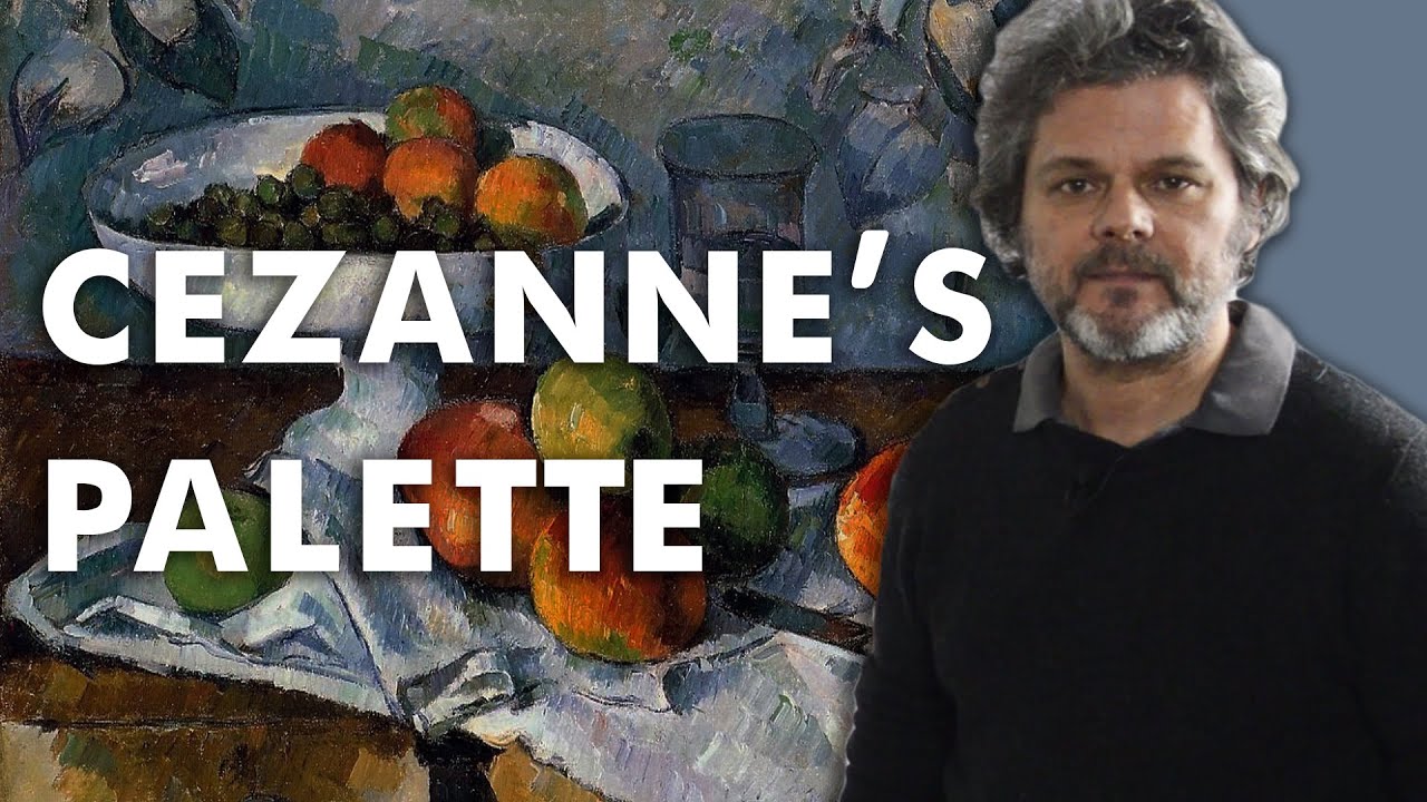
Both types show up constantly across every painting style and period. Paul Cezanne famously reduced natural subjects to their underlying geometric forms. Meanwhile, Baroque painters leaned heavily on organic forms to depict dramatic human figures emerging from shadow.
The U.S. Bureau of Economic Analysis reported that arts and cultural production contributed $1.2 trillion to the U.S. economy in 2023, representing 4.2% of GDP. The visual arts sit at the center of that ecosystem, and understanding form is one of the most basic building blocks.
A 2024 NCES School Pulse Panel Survey found that 82% of U.S. public schools offer visual arts classes. Form, along with shape, texture, and tone, is one of the core concepts taught in those programs.
How Form Differs from Shape
This is where most beginners get stuck. And honestly, even some intermediate artists blur the line.
Shape is flat. It has height and width but no depth. A circle, a square, a triangle. All two-dimensional.
Form implies a third dimension. A circle becomes a sphere. A square becomes a cube. A triangle becomes a cone. The object looks like you could reach in and grab it, even though it exists on a flat picture plane.
| Shape (2D) | Form (3D Illusion) | Technical Bridge | Key Difference |
| Circle | Sphere | Chiaroscuro: Using a 5-point value scale (highlight to cast shadow). | Shading creates a continuous, rounded surface. |
| Square | Cube | Perspective: Adding converging lines to reveal top/side planes. | Perspective reveals depth and multiple “faces.” |
| Triangle | Cone or Pyramid | Value Planes: Sharp or gradual shifts in light across edges. | Value shifts indicate which side is facing the light. |
| Freeform Blob | Organic Mass | Ambient Occlusion: Adding “weight” through contact shadows. | Light and shadow turn an outline into a weighted object. |
The distinction matters because it changes how viewers read an image. Flat shapes sit on the surface. Forms push forward and recede. They create space in visual art that pulls you into the picture.
Pablo Picasso and Cubism played with this relationship directly, fragmenting recognizable forms back into flat geometric shapes, then reassembling them at odd angles. It was a deliberate attack on the centuries-old tradition of making 2D surfaces mimic 3D reality.
The Art Basel and UBS Global Art Market Report found that paintings remained the most purchased medium by high-net-worth collectors in 2024. Whether those paintings use realistic form or flatten it on purpose, the artist’s relationship with form is always part of the conversation.
Visual Techniques That Create the Illusion of Form

Making something flat look solid requires specific methods. Artists have been refining these for centuries, and they generally fall into a few categories.
Shading and Value
Value does the heaviest lifting when creating form. Without shifts from light to dark, objects look flat. Period.
A smooth transition from highlight to midtone to core shadow to reflected light is what makes a drawn apple look three-dimensional. The gradation between those zones is where the magic happens.
Monochromatic value studies, where you paint using only one color plus white and black, are still one of the best training exercises. Took me a while to appreciate that, but stripping away color forces you to see form clearly.
Josef Albers, through his color interaction studies at the Bauhaus, showed how even subtle value shifts between colors could suggest depth and volume on a completely flat surface.
Light, Shadow, and Highlights

According to EBSCO Research, the chiaroscuro technique originated during the Renaissance as a method of using strong contrast between light and dark to simulate volume.
Light source placement determines everything about how form reads. A single directional light source creates predictable patterns:
- Highlight where light hits directly
- Midtone in the transition zone
- Core shadow on the far side from light
- Reflected light bouncing back from surrounding surfaces
- Cast shadow projected onto nearby objects or the ground
Caravaggio pushed this further with tenebrism, plunging backgrounds into near-total darkness while spotlighting figures with intense brightness. His forms practically leap off the canvas.
Line-Based Methods for Suggesting Depth
Contour lines and cross-hatching can build form without any tonal blending at all.
Cross-hatching layers lines at different angles, and the density of those layers suggests darker values. Albrecht Durer was a master of this in his engravings, creating deeply convincing volume using nothing but ink lines on paper.
Contour drawing traces the edges of a form, but also the internal surface changes. Think of the lines on a topographic map. They describe the terrain. Same principle works in drawing to describe how a surface turns away from the viewer.
The Role of Perspective in Depicting Form

Form doesn’t exist in isolation. It sits inside a spatial system. And perspective is the framework that holds everything together.
Linear Perspective and Volume
Linear perspective uses converging lines and vanishing points to create the appearance of depth on a 2D surface. Filippo Brunelleschi formalized this system in early 15th-century Florence, and it changed painting forever.
One-point perspective works well for simple scenes. All parallel lines converge to a single point on the horizon.
Two-point perspective adds a second vanishing point, which lets you show forms at an angle. Buildings, furniture, any object with visible corners benefits from this.
Leonardo da Vinci combined linear perspective with his sfumato shading technique to create some of the most convincing depictions of form in art history. The Mona Lisa is a textbook example. Soft tonal shifts across her face build form, while the landscape behind her recedes through careful perspective construction.
Atmospheric Perspective and Perceived Depth
Atmospheric perspective works differently. Instead of geometry, it uses color and value changes to suggest distance.
Objects far away appear lighter, bluer, and less detailed. Objects close to the viewer are sharper, darker, and more saturated. This is actually how human vision works. Particles in the air scatter light, and our brains interpret that scattering as distance.
Claude Monet and the Impressionists used atmospheric effects extensively, sometimes prioritizing the feeling of light and air over solid form. But even when form gets soft and dissolved in their work, it’s still there. You still read the haystacks as solid objects sitting in a field.
Foreshortening and the Human Figure

Foreshortening compresses form along the axis pointing toward or away from the viewer. An arm reaching straight out at you looks shorter than it actually is. The hand appears much larger than the shoulder.
This is tricky to pull off. Getting it wrong makes figures look distorted in a bad way. Michelangelo handled foreshortening with remarkable skill on the Sistine Chapel ceiling, where figures needed to read correctly from far below.
Geometric Form vs. Organic Form in Two-Dimensional Art
Not all forms are created equal, and the type of form an artist chooses says a lot about their intent.
Geometric Forms on Flat Surfaces
Cubes, spheres, cones, cylinders. These are the foundational building blocks you learn in a first-year drawing class, and there’s a reason for that.
Nearly every complex object can be broken down into these basic geometric volumes. A human torso is roughly a cylinder. A head is close to a sphere. A nose approximates a triangular prism. Learning to see the world this way is what makes accurate rendering possible.
Cezanne stated that painters should treat nature through the cylinder, the sphere, and the cone. That idea became a stepping stone to Cubism, where Picasso and Georges Braque shattered objects into angular geometric planes and reassembled them across the canvas.
The Art Basel and UBS report found that global art market sales reached $57.5 billion in 2024, with abstract and geometric works continuing to perform strongly in lower price segments. Abstract art that manipulates geometric form has a dedicated collector base.
Organic Forms in Nature and Figure Work
Organic forms resist straight edges and mathematical precision. They curve, bulge, taper, and flow.
The human body is the classic example. It’s all organic form, and depicting it convincingly on a flat surface has been one of art’s central challenges for thousands of years. Gesture drawing captures the movement and flow of organic forms before locking in precise details.
Rembrandt van Rijn excelled at rendering organic forms with a combination of loose brushwork and precise value control. His portraits feel alive because the forms breathe. Skin stretches, fabric drapes, hands grip. Nothing looks stiff.
| Aspect | Geometric Form | Organic Form | Technical Impact |
| Edges | Straight & Angular: Defined by mathematical constants. | Curved & Irregular: Lacks a single focal center or radius. | Geometric is “Predictable”; Organic is “Evolving.” |
| Found In | Man-made: Architecture, tech, and engineering. | Biological: The human body, plants, and terrain. | One suggests “Design”; the other suggests “Growth.” |
| Feel | Structured & Mechanical: Implies stability and logic. | Natural & Dynamic: Implies movement, soft edges, and life. | Geometric is “Static”; Organic is “Fluid.” |
| Art Movements | Cubism, De Stijl: Focus on the “essential” building blocks. | Baroque, Realism: Focus on the complexity of nature and flesh. | One simplifies; the other elaborates. |
Realism painters blend both types constantly. A still life might feature geometric bottles alongside organic fruit. The tension between those two kinds of form creates visual interest.
Form in Different Two-Dimensional Art Mediums

Form shows up differently depending on what tools you’re holding. Each medium has its own strengths and limitations when it comes to creating the illusion of volume.
Drawing: Charcoal and Graphite
Charcoal gives you the widest tonal range of any dry drawing medium. You can go from near-white to deep black in a single stroke if you press hard enough. That range makes it ideal for building form through value.
Graphite is more precise but has a narrower value range. You’ll never get charcoal-level darks from a pencil. But for detailed rendering of small forms, graphite wins.
Both mediums let you build form through subtractive methods too. Lay down a field of tone, then lift highlights with an eraser. That’s essentially how grisaille underpaintings work in classical approaches.
Painting: Oil, Acrylic, and Watercolor
Oil painting has been the go-to medium for rendering form since the Renaissance. Its slow drying time lets you blend edges and build glazing layers that create luminous depth. Sfumato technique was only possible because of oil’s workability.
Acrylic paint dries fast, which means you have to work differently. But you can still achieve strong form by layering acrylic paint from dark to light, building volume in stages.
Watercolor painting is the trickiest for form because you work from light to dark (the opposite of charcoal or oil). Your highlights are the white paper, and you build shadows by layering transparent washes. Losing a highlight means losing the form.
The Art of Education’s 2023 survey found that 90% of art teachers were most comfortable with two-dimensional mediums like painting and drawing. Each of those painting mediums handles form differently, and understanding those differences is part of what makes an artist versatile.
Photography and Digital Art
Photography defines form through lighting. A photographer controls how form reads by positioning lights, adjusting intensity, and choosing direction. Studio portrait photographers basically recreate the same highlight-to-shadow progression that painters have used for centuries.
Digital illustration tools like Photoshop and Procreate offer brushes that simulate traditional media. You can paint with virtual oils, sketch with digital charcoal, even apply custom blending modes. The form-building process is the same, just on a screen instead of a canvas.
What’s changed is speed. Undo buttons and layer systems mean you can experiment with light, shadow, and color temperature shifts faster than ever. But the underlying principles of form haven’t changed since the Renaissance.
How Color and Value Build Form

Value is the single most powerful tool for creating the illusion of form. Strip away color entirely, and a well-executed value study still reads as three-dimensional. Strip away value and keep only flat color? Everything goes flat.
A Frontiers in Human Neuroscience study found that within the first 20 seconds of viewing an image, color accounts for nearly 80% of the perceptual attributes identified among visual features like shape and texture. That’s how quickly the brain processes these cues.
Value as the Foundation of Form
Value controls volume. A sphere looks round because its surface shifts smoothly from a bright highlight to a dark core shadow, with reflected light softening the transition on the shadow side.
The value scale from white to black is the framework. Most artists work with at least five distinct steps: highlight, light, midtone, shadow, and dark accent.
Monochromatic studies are the best training exercise for understanding form through value alone. Paint an object using just one hue plus white and black, and you’ll see exactly how value creates dimension.
Warm and Cool Color Shifts
A BMC Psychology study (2025) showed that art-trained students perceive emotional differences in color saturation and brightness more acutely than untrained individuals. That sensitivity to color temperature is directly related to how painters build form.
General principle: Light areas shift warm. Shadow areas shift cool. Or the reverse, depending on the light source color.
- Warm light (sunlight, incandescent): warm highlights, cool shadows
- Cool light (overcast sky, fluorescent): cool highlights, warm shadows
Vincent van Gogh used exaggerated warm-cool shifts to build form with visible brushstrokes. His portraits use thick strokes of green and blue in the shadows, orange and yellow in the light, and the form holds together despite the aggressive color choices.
How Josef Albers Connected Color to Depth Perception
Albers’ Interaction of Color (1963) demonstrated that identical colors look different depending on what surrounds them. Two shades of the same tint can appear to advance or recede based on their neighbors.
Practical takeaway: warm, saturated colors push forward. Cool, desaturated colors pull back. This principle works alongside value to build convincing form on a flat surface, and it’s why understanding color relationships matters for anyone trying to render volume.
Historical Examples of Form in Two-Dimensional Art
Form has been a driving concern for artists across every major period. But each era had its own approach, its own priorities, and its own techniques for handling it.
Renaissance Masters and the Birth of Convincing Form
Leonardo da Vinci pioneered sfumato, a technique of applying ultra-thin glazes to create soft, smoky transitions between light and shadow. The Mona Lisa’s face has no visible brush marks or hard edges. The form just… emerges.
Raphael developed what art historian Marcia B. Hall called “unione,” blending bright color palettes with sfumato-inspired soft shadows. His Alba Madonna (c. 1510) is a textbook example of form built through gentle color shifts rather than dramatic contrast.
The Art Basel and UBS Global Art Market Report showed the global art market hit $57.5 billion in 2024, and Renaissance paintings continue to command record-breaking prices at auction. The technical mastery of form in those works is a big reason why.
Baroque Drama and Extreme Light
Caravaggio took a completely different path. Where Leonardo used subtlety, Caravaggio used shock.
| Artist | Approach to Form | Technical Logic | Signature Technique |
| Leonardo da Vinci | Soft, Gradual Transitions | Eliminating harsh outlines to mimic how the eye perceives depth. | Sfumato: (Italian for “smoky”) Blending colors so subtly they melt together. |
| Caravaggio | Extreme Contrast | Using “The Spotlight Effect” to create a sense of theater and weight. | Tenebrism: A heightened form of Chiaroscuro where darkness dominates. |
| Rembrandt | Warm, Focused Illumination | Using thick paint (impasto) on highlights to create physical form. | Rembrandt Lighting: A specific triangle of light on the shadowed cheek. |
| Vermeer | Quiet, Diffused Daylight | Focusing on the “glow” of light as it bounces off interiors. | Optical Precision: Possibly using a Camera Obscura for photographic accuracy. |
Rembrandt made form feel alive through thick impasto in the lights and thin, transparent darks. His self-portraits practically glow. Johannes Vermeer took the opposite approach, using delicate, even lighting to build quiet, precise forms in domestic interiors.
Impressionism: Dissolving and Rebuilding Form
Claude Monet and the Impressionists loosened their grip on tight, rendered form. They broke color into individual brushstrokes and let the viewer’s eye blend them together.
Form didn’t disappear. It just got softer, more atmospheric. Monet’s haystacks still read as solid objects sitting in a field, even though up close they’re just patches of color.
Paul Cezanne pulled form back toward structure. He treated every subject as a collection of geometric planes, bridging Impressionism and what came next.
Cubism and the Fracturing of Form
Picasso and Georges Braque shattered traditional form entirely. Cubism showed multiple viewpoints at once, flattening and fragmenting objects across the canvas. A face might show a profile and a frontal view simultaneously.
The question was no longer “how do I make this look 3D?” It became “what happens when I break the rules of form on purpose?” Cubist paintings challenged centuries of convention and opened the door for every abstract movement that followed.
Common Mistakes When Rendering Form on a Flat Surface

Some errors show up over and over, regardless of skill level. Knowing what to watch for saves a lot of frustration.
Relying Too Heavily on Outlines
Outlines flatten form. In real life, there are no outlines around objects. There are edges where one value meets another, where one color shifts into the next.
A 2023 Frontiers in Education study found that 71% of higher education art teachers reported students struggling with perspective drawing. A related weakness: students draw outlines first and then try to shade inside them, which locks the form into a flat, cartoon-like appearance before any volume gets built.
The fix is simple but hard to internalize. Build form from the inside out, using value changes, not by tracing edges.
Ignoring Light Source Consistency
Every object in a composition needs to respond to the same light source. When one object has shadows on the left and another has shadows on the right, the illusion collapses.
This sounds obvious. But look at student work (or honestly, some published illustration) and you’ll spot it constantly. Especially in complex scenes with multiple objects, it’s easy to lose track.
Flattening Form with Uniform Color
Using a single flat color with no value shift is probably the most common form-killer. A red apple painted in one shade of red is just a red circle. Add value variation, highlights, and shadows, and it becomes a red apple.
- Flat color = shape
- Color + value variation = form
The Art of Education’s 2024 State of Art Education data showed only 24% of art teachers felt confident teaching digital art, where this particular mistake shows up frequently because digital tools make it too easy to fill areas with uniform color.
Over-Blending
Blending is good. Over-blending removes the structure of light and shadow, turning crisp plane changes into a mushy, undefined surface. You lose the form.
Realist painters know this well. The secret is keeping firm transitions where planes change direction while softening edges where surfaces turn gradually. Not everything should be blended to the same degree.
How to Practice Creating Form in Two-Dimensional Art

Theory only gets you so far. At some point you need to pick up a pencil, a brush, or a stylus and put in the hours.
Still Life Drawing with Directional Light
Set up a single lamp next to a few simple objects. Eggs, cups, fruit, boxes. Turn off all other lights in the room.
This forces you to see how light wraps around form. Where the highlight sits. Where the core shadow lives. Where reflected light bounces back from the table surface. Every principle of form becomes visible in one setup.
A 2024 NCES survey found that 93% of U.S. public schools offer at least one standalone arts class. Still life drawing remains one of the most common exercises in those programs because it teaches form better than almost anything else.
Sphere and Cube Shading Exercises
Boring? Sure. Effective? Absolutely.
Shade a sphere using five values: highlight, light, midtone, core shadow, reflected light. Then shade a cube, paying attention to how each face receives a different amount of light. These two exercises train your eye to see the same patterns on every object you’ll ever draw or paint.
| Exercise | What It Teaches | Technical Logic | Best Medium |
| Sphere Shading | Gradual Transitions | Mastering the “Five Elements of Light” on a continuous curve. | Graphite or Charcoal |
| Cube Shading | Plane Changes | Understanding how light hits flat surfaces at different angles. | Graphite (for precision) |
| Cylinder Shading | Hybrid Geometry | Managing a flat “top” plane vs. a curved “side” plane. | Charcoal or Digital |
| Egg Study | Organic Nuance | Seeing “lost and found” edges on non-perfect, natural forms. | Any (Graphite is best) |
Master Copy Studies
Pick a painting by Rembrandt, Caravaggio, or Vermeer. Copy it. Not for the composition or the subject, but for the value structure.
Focus on how they handled light, shadow, and form. Where did they use hard edges? Where did they soften? How many distinct values can you count from the lightest light to the darkest dark?
This kind of targeted study teaches more about rendering form than reading ten books on the subject. Your hands learn what your brain already understands.
Digital Tools and Traditional Media
Procreate and Photoshop both offer brushes that simulate charcoal, oils, and graphite. The advantage of digital: undo buttons. You can experiment with light direction, value range, and color contrast without wasting materials.
But don’t skip traditional media entirely. There’s a tactile feedback loop with real charcoal on real paper that digital can’t fully replicate. The resistance, the smudging, the physical pressure of your hand on the surface, all of that trains your sense of how depth gets created on a flat plane.
Most working artists use both. Start with traditional to build fundamentals, then move to digital for speed and flexibility. Or go back and forth. There’s no wrong order as long as you’re actually drawing and painting regularly.
FAQ on What Is Form In Two-Dimensional Art
What is the difference between shape and form in art?
Shape is flat, having only height and width. Form adds the illusion of a third dimension through value, shading, and light. A circle is a shape. A sphere rendered with highlights and shadows is a form.
How do artists create form on a flat surface?
Artists use shading, value changes, color temperature shifts, and perspective to simulate three-dimensional volume. Techniques like chiaroscuro and cross-hatching are among the most common methods for building convincing form.
What is an example of form in two-dimensional art?
The Mona Lisa by Leonardo da Vinci is a classic example. The face shows smooth value transitions from light to shadow using sfumato, making the flat painted surface appear to have real depth and volume.
Is form one of the elements of art?
Yes. Form is one of the seven core elements of art, alongside line, shape, color, value, texture, and space. It specifically refers to the appearance of three-dimensional volume in artwork.
What are geometric and organic forms?
Geometric forms include cubes, spheres, and cylinders, based on mathematical shapes. Organic forms are irregular and natural, like the human body or tree trunks. Most representational art combines both types.
What role does value play in creating form?
Value is the most critical tool. Without shifts from light to dark across a surface, objects look flat. The gradation from highlight to core shadow is what makes a drawn object appear solid and three-dimensional.
How does chiaroscuro relate to form?
Chiaroscuro uses strong contrast between light and dark to build volume. It originated during the Renaissance and was pushed to extremes by Caravaggio through tenebrism, where figures seem to emerge from deep darkness.
Can form exist in abstract art?
Yes. Abstract artists often suggest form through color shifts, overlapping planes, and value changes without depicting recognizable objects. The viewer perceives depth and volume even when the subject is non-representational.
What is the best exercise for learning to render form?
Drawing a sphere with a single directional light source. This simple exercise teaches highlight placement, core shadow, reflected light, and cast shadow, all the fundamentals of rendering form on paper.
How did Cubism change the way artists used form?
Cubism broke traditional form apart deliberately. Picasso and Braque showed objects from multiple angles at once, fragmenting volume into flat geometric planes. It challenged centuries of pictorial space conventions.
Conclusion
Understanding what is form in two-dimensional art comes down to one skill: making flat surfaces look like they have volume. Every technique covered here, from shading and value control to perspective systems and color temperature shifts, serves that single goal.
The principles haven’t changed much since the Renaissance. What has changed is the range of tools available. Charcoal, oil paint, acrylics, digital brushes in Procreate. The medium is different. The problem is the same.
Start with simple objects under a single light source. Practice seeing where highlights sit, where shadows fall, where reflected light softens an edge. Build from there.
Form separates flat shapes from convincing pictorial space. Once you train your eye to see it, you’ll notice it in every painting, photograph, and illustration you encounter. And your own work will be stronger for it.


