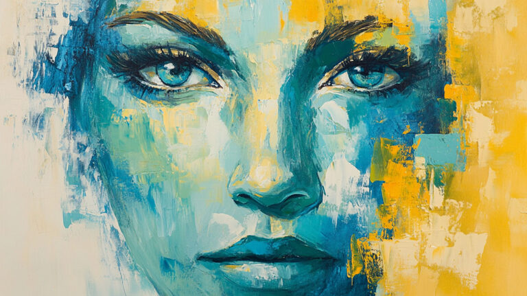
Nothing kills a painting faster than muddy, lifeless colors that flatten your work into gray soup. Learning how to layer acrylic paint properly separates amateur work from professional results.
Most painters struggle with muddy colors because they treat layering like mixing paint on a palette. But layering is actually about building luminous, complex colors through strategic applications.
Professional acrylic painters use specific techniques to maintain clean color mixing through multiple layers. These methods prevent the color contamination that creates muddy results.
This guide covers everything from paint quality and brush selection to advanced glazing techniques. You’ll learn to build rich, vibrant layers that enhance rather than diminish your colors.
By the end, you’ll understand color temperature relationships, proper drying times, and the transparency properties that make certain pigments perfect for layering. No more muddy disasters.
Paint Quality and Consistency Fundamentals
Professional Grade versus Student Grade Paints

Professional acrylics contain higher pigment loads and better binders. Student grade paints use fillers and less expensive pigments.
The difference shows up immediately when layering. Professional paints maintain their color intensity through multiple applications.
Pigment Concentration Differences
Heavy body acrylics from Golden or Liquitex pack more pure pigment per tube. This means cleaner mixing and brighter layers.
Student paints often look chalky or dull after the second layer. The extra fillers dilute the pigment strength.
How Binder Quality Affects Layering
Quality acrylic polymer binders hold pigment particles better. They create stronger adhesion between layers without lifting previous applications.
Cheap binders can cause lower layers to reactivate when you add new paint. This leads to unwanted mixing and muddy results.
When to Invest in Higher Quality Colors
Start with professional grade primary colors – cadmium red, ultramarine blue, and cadmium yellow. These three colors mix cleaner secondaries than any student grade set.
Buy professional white and black too. These get used most often and affect every mixture.
Paint Consistency and Viscosity Control
Straight from Tube versus Thinned Applications
Tube consistency works best for opaque layers and impasto techniques. The thick paint covers completely without showing through previous layers.
Thinned paint creates glazes and transparent effects. Mix with water or acrylic medium, never more than 30% liquid to paint ratio.
Medium Additives for Better Flow
Painting mediums change how paint behaves. Slow-dri extends working time for blending.
Flow aid reduces surface tension. Paint spreads smoother and levels out brush marks.
Glazing medium increases transparency while maintaining proper consistency. Perfect for building up color saturation gradually.
Achieving Proper Paint-to-Medium Ratios
Start with 90% paint, 10% medium for slight consistency changes. Go up to 70% paint, 30% medium for glazing effects.
Too much medium breaks down the binder. Paint becomes weak and may not adhere properly.
Test ratios on practice canvas first. Every brand behaves differently with medium additions.
Opacity and Transparency Properties
Identifying Opaque versus Transparent Pigments
Paint tubes usually mark opacity with symbols. Solid squares mean opaque, empty squares show transparent pigments.
Cadmium colors, titanium white, and Mars black are naturally opaque. They cover underlying layers completely.
Strategic Use of Semi-Transparent Colors
Semi-transparent pigments like quinacridone violet or dioxazine purple work perfectly for glazing. They modify colors underneath without completely hiding them.
Raw umber and burnt sienna make excellent glazing colors. They warm up or cool down areas without losing underlying details.
How Opacity Affects Underlying Layers
Opaque colors stop light from reaching lower layers. Use these for solid coverage and color corrections.
Transparent colors allow light to bounce off lower layers and back through. This creates luminous, glowing effects impossible with opaque paint alone.
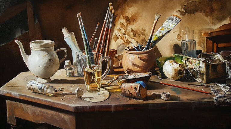
Essential Tools and Materials for Clean Layering

Brush Selection and Maintenance
Synthetic versus Natural Bristle Choices
Synthetic brushes work best for acrylics. They don’t absorb water like natural hair and maintain their shape longer.
Taklon and nylon bristles resist the alkaline nature of acrylic paint. Natural brushes can get damaged by acrylic’s pH level.
Princeton Art Brush makes excellent synthetic brushes specifically for acrylic work. Their snap and spring return brush marks to clean edges.
Flat, Round, and Specialty Brush Applications
Flat brushes lay down smooth, even layers. Perfect for blocking in large areas and creating sharp edges.
Round brushes excel at detail work and organic shapes. Use them for blending and soft transitions between colors.
Fan brushes create texture effects and blend harsh edges. Filbert brushes combine the benefits of flats and rounds.
Proper Cleaning Between Color Changes
Rinse brushes thoroughly in clean water before switching colors. Squeeze bristles gently to remove paint from the ferrule.
Keep two water jars – one for initial rinse, one for final cleaning. Change water frequently to prevent color contamination.
Soap works better than water alone for stubborn pigments. Work soap into bristles, then rinse completely.
Palette Organization and Color Mixing
Setting Up Colors to Prevent Contamination
Arrange colors around your palette edge in color wheel order. Keep warm and cool colors separated.
Place white in the center where it’s easy to reach. White gets mixed with almost every color, so central placement saves time.
Leave mixing areas between each color. Don’t squeeze colors too close together.
Using Separate Mixing Areas for Different Hues
Dedicate palette sections to specific color families. Keep all warm mixtures in one area, cool mixtures in another.
This prevents accidental contamination. A tiny bit of orange in your blue mixture creates instant mud.
Clean your palette knife between different color families. Even microscopic amounts of complementary colors cause problems.
Palette Paper versus Glass Surface Choices
Disposable palette paper works well for quick studies and color sketches. Tear off dirty sheets and start fresh for each layer.
Glass palettes stay wet longer and clean up easily. The smooth surface doesn’t absorb moisture from your paint.
Stay-wet palettes keep acrylics workable for hours. Perfect for complex pieces requiring extended work sessions.
Canvas Preparation and Priming

Ground Color Effects on Subsequent Layers
Toned grounds affect every color you apply. Warm gray grounds make colors appear cooler, cool grays make them warmer.
White grounds reflect maximum light back through transparent layers. Colored grounds create unified color harmony throughout the painting.
Mid-tone gray grounds help judge both light and dark values accurately. Neither color family dominates your perception.
Texture Considerations for Paint Adhesion
Canvas texture affects how layers interact. Smooth surfaces show brush marks clearly and create even coverage.
Rough canvas breaks up brushstrokes naturally. This helps with color mixing and prevents overworked areas.
Prime canvas properly for consistent texture. Unprimed areas absorb paint differently and create uneven layers.
Sealing Techniques Between Major Color Changes
Isolation coats seal finished layers from subsequent applications. Use acrylic medium thinned with water for transparent protection.
Let isolation coats dry completely before adding new layers. Rush this step and you’ll lift previous work.
Varnish provides permanent protection but prevents further painting. Only varnish completely finished pieces.
Layering Techniques and Application Methods
Wet-on-Dry Technique Mastery

Allowing Proper Drying Time Between Layers
Acrylic paint dries from outside in. Surface may feel dry while deeper layers remain wet.
Wait at least 30 minutes between thin layers, several hours for thick applications. Humid weather extends drying times significantly.
Touch test edges where paint is thinnest. If any tackiness remains, wait longer before proceeding.
Testing Dryness Before Applying New Colors
Gently touch an inconspicuous area with your finger. Properly dried paint feels completely smooth and cool.
Slightly warm or sticky paint isn’t ready for new layers. Adding wet paint over semi-dry layers causes lifting and mixing.
Hair dryers speed surface drying but can cause cracking in thick applications. Let paint dry naturally when possible.
Building Up Colors Gradually
Start with thin washes to establish basic color relationships. Each layer should be slightly thicker than the previous one.
Thin to thick prevents cracking and adhesion problems. Thick underlayers can pull apart as they cure.
Build color saturation gradually through multiple thin applications. This creates more luminous results than single thick layers.
Wet-on-Wet Blending Approaches
Working Within Acrylic’s Open Time
Standard acrylics stay workable for 10-15 minutes in normal conditions. Plan your blending accordingly.
Work in small sections you can complete before paint sets up. Large areas require retarding medium or faster brushwork.
Golden Open Acrylics stay wet for hours. Perfect for extended blending sessions and complex color transitions.
Using Retarding Mediums for Extended Blending
Add 10-20% retarding medium to extend working time. Too much medium can prevent proper curing.
Mist areas lightly with water to keep paint workable longer. Don’t oversaturate or paint becomes weak.
Work in cooler conditions when possible. Heat and low humidity shorten working time dramatically.
Strategic Color Placement for Clean Mixing
Place colors next to each other, don’t overlap initially. Blend where colors meet using clean, damp brush.
Keep mixtures simple – two colors maximum for cleanest results. Three or more colors often turn muddy.
Clean your brush frequently during blending. Contaminated brushes spread unwanted colors throughout your work.
Glazing and Scumbling Methods

Transparent Layer Applications
Glazing uses transparent colors over dry underlayers. Mix paint with glazing medium for proper consistency.
Apply glazes in thin, even coats using soft brushes. Multiple thin glazes work better than single thick applications.
Each glaze layer modifies colors underneath. Build up effects gradually through successive applications.
Broken Color Techniques for Visual Mixing
Scumbling drags dry paint lightly over textured surfaces. This creates broken color effects and optical mixing.
Use stiff brushes or palette knives for scumbling. Don’t press too hard or you’ll fill in all the texture.
Broken color appears more vibrant than physically mixed equivalents. The eye blends colors at viewing distance.
Building Depth Without Muddying
Layer warm colors over cool undertones for advancing effects. Cool colors over warm tones create recession.
Maintain color temperature consistency within each layer. Don’t mix warm and cool versions of the same hue.
Use glazing for depth, scumbling for surface interest. Combine techniques strategically for complex effects.
Color Mixing Strategies for Multiple Layers

Limited Palette Approaches
Working with three colors prevents muddy mixtures better than any other method. Choose one warm and one cool version of each primary color.
Cadmium red and alizarin crimson give you warm and cool reds. Ultramarine blue and cerulean blue cover the blue spectrum.
Mixing Secondaries from Primaries
Mix your own secondary colors instead of buying them. This creates cleaner, more harmonious results across all layers.
Cadmium red plus cadmium yellow makes vibrant oranges. Cool primaries create muted, sophisticated secondaries perfect for backgrounds.
Your mixed colors will always relate better to each other. Pre-mixed tube colors often clash because they’re formulated separately.
Maintaining Color Harmony Throughout Layers
Limited palettes automatically create color harmony. Every mixture contains the same parent colors.
Vincent van Gogh used limited palettes in many paintings. His color relationships stayed consistent because he mixed everything from the same base colors.
Add one accent color maximum for focal points. More colors break the harmony you’ve built.
Optical Mixing versus Physical Mixing
Letting Colors Blend Visually Rather Than Physically
Place pure colors next to each other instead of mixing them on the palette. The eye blends them at normal viewing distance.
Broken color techniques keep pigments cleaner than physical mixing. No muddy compromises between pure colors.
Georges Seurat mastered this approach in his pointillism paintings. Pure color dots created vibrant optical mixtures.
Broken Color Application Techniques
Apply colors in separate brushstrokes that don’t completely blend. Let individual color notes show through.
Drag dry paint over textured surfaces for scumbling effects. The raised areas catch new color while valleys keep the underpainting.
Cross-hatching with paint creates optical mixing too. Layer diagonal strokes in different directions and colors.
Distance and Viewing Effects on Color Perception
Step back frequently to check your optical mixtures. Colors that look separate up close blend smoothly from across the room.
What works at arm’s length might be too busy at wall distance. Plan your viewing distance before starting.
Painting size affects optical mixing success. Larger paintings can handle more broken color than small works.
Temperature Consistency Across Layers
Keeping Warm Colors Together
Warm color families stay clean when layered together. Cadmium yellow over cadmium orange maintains temperature consistency.
Cool colors muddy warm underlayers if applied too heavily. Keep cool glazes thin when working over warm bases.
Burnt sienna and raw sienna blend beautifully because they share warm undertones. Mix these for natural earth tones.
Cool Color Family Applications
Ultramarine blue, cerulean blue, and dioxazine purple work together perfectly. All share cool undertones that support each other.
Cool color layering creates receding effects in landscapes. Use these combinations for distant mountains and sky areas.
Mixing warm into cool colors kills their temperature. Keep cool mixtures pure for best atmospheric effects.
Strategic Temperature Shifts for Focal Points
Plan temperature changes carefully for emphasis. Warm notes advance against cool backgrounds.
Place your warmest colors where you want maximum attention. Cool everything else down to support the focal area.
Temperature contrast works better than value contrast in many situations.
Common Mistakes and Prevention Strategies
Overworking Paint Applications
Recognizing When to Stop Blending
Acrylic paint sets up quickly once you start blending. Watch for the telltale drag that signals setting time.
Stop blending immediately when paint starts pulling or lifting. Continued work creates muddy, overworked areas.
Fresh paint blends smoothly. Once it gets tacky, leave it alone until the next layer.
Working in Sections to Maintain Freshness
Break large areas into manageable sections. Complete each section fully before moving to the next.
Section blending prevents rushing and overworking. You can focus on quality in smaller areas.
Plan section boundaries along natural break lines. Edges where sections meet should fall at logical places.
Using Quick, Confident Brushstrokes
Decisive brushwork prevents overworking better than any other technique. Make your stroke and move on.
Practice brushwork on scrap canvas first. Confident strokes come from muscle memory, not hesitation.
Second-guessing leads to muddy paint. Trust your color choices and apply them boldly.
Color Contamination Issues
Dirty Brush Problems and Solutions
Contaminated brushes spread unwanted colors throughout your painting. This is the number one cause of muddy layers.
Rinse brushes completely between each color change. Check the ferrule area where paint hides most often.
Keep separate brushes for light and dark colors. Never use the same brush for yellow and purple without thorough cleaning.
Palette Knife Usage for Clean Color Transfer
Palette knives transfer paint without brush contamination. Use them to move pure colors from tube to mixing area.
Clean palette knives between each color. Wipe on paper towels or scrape clean on palette edge.
Mix colors with palette knives when possible. They don’t hold residual paint like brush bristles do.
Water Jar Maintenance During Painting Sessions
Change water frequently throughout long painting sessions. Dirty water recontaminates clean brushes instantly.
Use distilled water if your tap water has mineral content. Hard water affects paint behavior and can cause color shifts.
Multiple water containers work better than single jars. Reserve one for final rinse only.
Layer Thickness and Build-up Problems

Avoiding Paint Buildup That Affects Color Clarity
Thick paint layers create physical texture that interferes with smooth color application. Keep early layers relatively thin.
Heavy impasto should come in final stages only. Thick underlayers make it impossible to add fine details later.
Sand down problem areas with fine grit paper once completely dry. This levels the surface for new applications.
Strategic Impasto versus Thin Wash Applications
Save impasto techniques for focal points and foreground elements. Background areas should stay relatively flat.
Thin washes build up color saturation without physical thickness. Perfect for atmospheric effects and glazing.
Combine techniques strategically. Thin backgrounds support thick foregrounds without competing for attention.
Sanding or Scraping Correction Techniques
Dry acrylic paint sands easily with fine sandpaper. Remove unwanted texture or completely failed areas.
Scraping wet paint works for immediate corrections. Palette knives remove paint cleanly without damaging canvas.
Reapply gesso over sanded areas before continuing. This ensures proper adhesion for new layers.
Advanced Layering Techniques

Underpainting Methods
Monochromatic Foundation Approaches
Grisaille underpainting establishes values using only black, white, and gray mixtures. Add color glazes over the dried value study.
Raw umber and white create warm monochromatic foundations. This approach works particularly well for portrait paintings.
Burnt sienna underpainting adds warmth to landscape work. The orange undertone shows through subsequent layers beautifully.
Complementary Underpainting for Color Vibrancy
Paint shadows in complements of your final colors. Orange shadows under blue skies create luminous atmospheric effects.
Complementary underpainting makes final colors appear more intense. The contrast pushes both colors toward maximum saturation.
This technique comes from traditional oil painting but works perfectly with acrylics. Many impressionism masters used this approach.
Value-Based Preliminary Layers
Establish correct values first, then add color through glazing. This separates value problems from color problems.
Value studies solve composition issues before color complications arise. Much easier to fix values in monochrome.
Use a limited value range – light, medium, and dark tones only. Complex value structures come in later refinement stages.
Color Temperature Layering
Warm Underpainting with Cool Overpainting
Warm foundations create glowing effects under cool glazes. This mimics how natural light behaves in outdoor scenes.
Raw sienna or burnt sienna underpainting warms up any subsequent cool colors. The warm undertone shows through and creates luminosity.
Cool glazes over warm grounds create complex color effects impossible with direct mixing. The temperature contrast adds visual interest.
Temperature Reversal Techniques
Cool underpainting with warm glazes creates different effects. Cool foundations make warm colors appear more intense and advancing.
Cerulean blue underpainting makes orange glazes incredibly vibrant. The temperature contrast pushes both colors toward maximum intensity.
Plan temperature relationships carefully. Random temperature changes create chaotic, muddy results.
Creating Luminous Color Effects
Transparent warm colors over light grounds create inner glow effects. Quinacridone gold over white creates luminous yellows impossible with opaque paint.
Cool transparent colors over warm grounds create complex atmospheric effects. Perfect for sunset skies and distant landscape elements.
Layer transparent colors in temperature families. Warm transparents work together, cool transparents support each other.
Selective Layering and Focal Points
Where to Add Multiple Layers for Emphasis
Focal areas benefit from complex layering and rich color development. Background areas should stay simple to avoid competition.
Build up paint thickness and color complexity where you want maximum attention. Keep supporting areas flatter and simpler.
Visual hierarchy depends on layering complexity as much as color and value relationships.
Keeping Background Areas Simple
Background simplicity supports foreground complexity. Don’t layer extensively in areas meant to recede.
One or two paint layers usually suffice for background elements. More layers bring these areas forward visually.
Save your best color relationships for focal points. Background areas can use more neutral, less saturated colors.
Building Complexity in Key Areas Only
Plan where complexity serves your painting goals. Random complexity creates visual chaos instead of controlled focus.
Foreground elements typically handle more layering than middle or background areas. This supports natural atmospheric perspective effects.
Every additional layer should serve a specific purpose. Ask yourself why each layer is necessary before applying it.
Troubleshooting Muddy Color Problems

Identifying Muddy Color Causes
Color Wheel Analysis of Problem Areas
Muddy colors happen when complementary colors mix accidentally. Red and green create brown mud, blue and orange make gray sludge.
Check your problem areas against a color wheel. If opposite colors are present, you’ve found your culprit.
Most muddy mixtures contain all three primaries. This automatically creates neutral grays and browns instead of clean colors.
Too Many Colors in One Mixture
Three or more colors almost always produce mud. Stick to two-color mixtures for clean results.
Even professional artists struggle with complex color mixing. Simplicity beats complexity every time for clean layering.
Winsor Newton and Golden Artist Colors publish mixing charts showing clean two-color combinations. Study these before attempting complex mixtures.
Complementary Color Contamination
Dirty brushes spread tiny amounts of complementary colors everywhere. A speck of red in your green mixture kills the purity instantly.
Palette contamination happens gradually during long painting sessions. Clean your mixing areas frequently to prevent buildup.
Check your water jars regularly. Murky water recontaminates clean brushes with every rinse.
Correction Techniques for Existing Work
Selective Repainting of Problem Areas
Spot corrections work better than repainting entire sections. Identify the specific muddy areas and address them individually.
Let problem areas dry completely before attempting corrections. Wet paint lifts and spreads the mud further.
Paint over dried muddy areas with clean, pure colors. Don’t try to mix into existing wet mud.
Glazing to Adjust Color Temperature
Transparent glazes can shift color temperature without completely covering underlayers. Warm glazes heat up cool muddy areas.
Mix transparent colors with glazing medium for proper consistency. Pure pigment glazes often appear too intense.
Cool glazes can neutralize overly warm muddy passages. Use ultramarine blue or dioxazine purple thinned with medium.
Adding Pure Color Accents to Restore Vibrancy
Place pure color notes near muddy areas to create contrast. The eye perceives muddy colors as cleaner when pure colors sit nearby.
Bright accents draw attention away from problem areas. Strategic placement redirects focus to successful passages.
Small touches of pure hue work better than large corrections. Less is more with accent colors.
Prevention Through Better Planning
Color Sketches and Studies Before Main Painting
Color studies solve mixing problems before you commit to the final painting. Test your palette on small practice pieces.
Try different color combinations on scrap canvas. This prevents expensive mistakes on good painting surfaces.
Martha Stewart Crafts and Apple Barrel paints work fine for color studies. Save professional paints for final work.
Testing Color Combinations on Practice Surfaces
Practice mixing every color relationship you plan to use. Know how your colors behave together before starting.
Test glazing effects on the same ground color as your main painting. Different priming affects how glazes appear.
Keep a color mixing journal with successful combinations. Note paint brands and ratios for future reference.
Limiting Color Choices from the Start
Fewer colors mean fewer opportunities for mud. Choose your palette deliberately and stick to it.
Professional painters often use only four or five colors total. More options create decision paralysis and mixing confusion.
List your planned colors before starting:
- One warm and one cool primary for each color family
- Titanium white for mixing and highlights
- Raw umber or burnt umber for neutrals
- One accent color maximum for focal points
Smart Palette Organization
Arrange colors by temperature families on your palette. Keep warm colors on one side, cool colors on the other.
Leave space between color families to prevent accidental mixing. Physical separation prevents mental confusion too.
Clean mixing areas between different color temperature families. Even tiny contamination amounts cause problems.
Brush Management Systems
Dedicated brushes for specific color families prevent cross-contamination. Use separate brushes for warm and cool colors.
Label brush handles if necessary. Color-coded tape helps identify which brush belongs to which color family.
Never use the same brush for yellow and purple without thorough cleaning. These complementary colors create the muddiest mixtures.
Recognition and Early Intervention
Muddy warning signs appear before complete color failure. Watch for graying or dulling in your mixtures.
Stop immediately when colors start looking chalky or lifeless. Adding more paint to muddy mixtures makes them worse.
Scrape off muddy paint while still wet. Clean the area and start over with fresh color mixtures.
Professional Color Mixing Wisdom
Study how master painters handled color relationships. Claude Monet kept his colors incredibly clean through systematic palette organization.
Pierre-Auguste Renoir used limited palettes to maintain color harmony throughout his paintings. His layering techniques prevent mud through careful planning.
Modern acrylic painters can learn from oil painting traditions. The principles of clean color mixing remain the same across painting mediums.
FAQ on How To Layer Acrylic Paint
How long should I wait between acrylic paint layers?
Wait 30 minutes minimum between thin layers, several hours for thick applications. Touch test edges where paint is thinnest – properly dried acrylic feels completely smooth and cool.
Humid weather extends drying times significantly. Hair dryers speed surface drying but can crack thick paint.
What causes muddy colors when layering acrylics?
Complementary colors mixing accidentally creates mud. Red and green make brown, blue and orange create gray sludge.
Dirty brushes spread contamination. Too many colors in one mixture automatically produces neutral grays instead of clean hues.
Can I use water to thin acrylic paint for layering?
Use maximum 30% water to paint ratio. More water breaks down the binder and weakens adhesion.
Acrylic mediums work better than water for thinning. They maintain paint integrity while improving flow and workability.
Which acrylic paints work best for clean layering?
Professional grade acrylics contain higher pigment loads and better binders. Golden Heavy Body and Liquitex Professional maintain color intensity through multiple layers.
Student paints often look chalky after the second layer due to fillers diluting pigment strength.
How do I prevent lifting previous layers when adding new paint?
Ensure lower layers are completely dry before applying new paint. Semi-dry paint reactivates and lifts when touched with wet brushes.
Use gentle brushwork and avoid scrubbing motions. Let paint flow off the brush rather than pressing hard.
What’s the difference between glazing and regular layering?
Glazing uses transparent colors mixed with glazing medium over dry underlayers. Regular layering can use opaque or semi-transparent paint at normal consistency.
Glazes modify colors underneath without hiding them. Multiple thin glazes build up luminous effects impossible with opaque paint.
Should I use synthetic or natural brushes for acrylic layering?
Synthetic brushes work best for acrylics. They resist the alkaline pH and don’t absorb water like natural hair.
Taklon and nylon bristles maintain their shape longer. Natural brushes can get damaged by acrylic’s chemical composition.
How many layers can I apply before problems occur?
No specific limit exists, but thin layers work better than thick ones. Build up gradually using the fat-over-lean principle.
Problems occur from thick underlayers pulling apart as they cure. Keep early layers relatively thin, save impasto for final stages.
What’s the best way to organize my palette for clean layering?
Arrange colors by temperature families – warm colors on one side, cool on the other. Leave mixing spaces between different color groups.
Keep white in the center for easy access. Use separate palette areas for different hue families to prevent contamination.
Can I fix muddy colors after they’ve dried?
Selective repainting works better than trying to fix wet mud. Let problem areas dry completely, then paint over with clean, pure colors.
Transparent glazes can shift color temperature. Add pure color accents nearby to make muddy areas appear cleaner by contrast.
Conclusion
Mastering how to layer acrylic paint transforms amateur work into professional results. Clean layering depends on understanding paint consistency, proper drying times, and strategic color theory application.
The key principles remain consistent across all techniques. Use quality pigments from brands like Liquitex Professional or Golden Artist Colors.
Patience beats speed every time with acrylic layering. Wait for complete drying between applications to prevent lifting and muddy mixtures.
Practice your palette organization and brush cleaning habits. These fundamentals prevent more problems than any advanced technique can fix.
Temperature consistency within each layer creates harmony throughout your painting. Warm colors work with warm colors, cool colors support cool applications.
Remember that less is often more. Limited palettes produce cleaner results than complex color schemes across multiple layers.
Start with simple two-color mixtures and build complexity gradually. Your paintings will show immediate improvement once you apply these systematic approaches to acrylic layering.