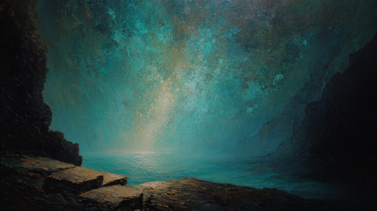
Every convincing painting starts with one decision that shapes everything else: how space is constructed.
Perspective in painting is the system that makes a flat surface read as a three-dimensional world. From Brunelleschi’s geometric experiments in 15th-century Florence to Picasso’s deliberate dismantling of the picture plane, it sits at the core of how painters represent depth, scale, and pictorial space.
This guide covers the full picture: the history, the types of perspective, the key elements, common mistakes, and how different painting styles apply, bend, or reject the rules entirely.
By the end, you will understand not just what perspective is, but how to use it with intention.
What is Perspective in Painting

Perspective in painting is the system artists use to represent three-dimensional space on a flat, two-dimensional surface. It controls how depth, scale, and space in visual art are organized so that a painted scene reads as believable to the human eye.
This isn’t just a stylistic choice. It’s a structural one.
Without a consistent perspective system, objects in a painting have no spatial logic. Figures float. Buildings collapse. The viewer’s brain rejects the scene before even processing what’s in it.
There are two broad categories painters work with:
- Geometric (linear) perspective: Depth created through converging lines, vanishing points, and mathematically calculated scale reduction
- Atmospheric (aerial) perspective: Depth suggested through shifts in color, value, and edge clarity as objects recede
Most paintings use both. A landscape, for instance, might rely on converging orthogonal lines for architecture in the foreground and then shift to atmospheric perspective for the hills behind it.
Perspective also determines the viewer’s relationship to the scene. Where the horizon line sits controls whether the viewer feels above, below, or level with the subject. That decision shapes the emotional read of the entire composition long before color or light enter the picture.
It’s worth separating two things people often conflate: perspective as a mathematical system and perspective as a perceptual experience. Geometric perspective follows rules. Perceptual perspective follows the eye. The best painters understand both and know when to break from the math to serve the visual truth.
Pictorial space is the term used for the total sense of depth a painting creates. Perspective is the primary tool for building it.
The History of Perspective in Art

Perspective didn’t arrive fully formed. It developed over centuries, with long gaps, dead ends, and at least one dramatic reinvention.
The short version: ancient painters had spatial instincts but no geometric system. Medieval painters largely abandoned even those instincts. Then, in 15th-century Florence, someone figured it out properly.
Pre-Renaissance Approaches to Depth
Egyptian art used size to signal importance, not distance. A pharaoh appeared larger than a servant not because he was closer to the viewer, but because he mattered more. Spatial position was symbolic, not spatial.
Greek and Roman painters moved closer to naturalism. Second-style Roman wall paintings from the first century BC, like those found in the Villa of Publius Fannius Synistor near Pompeii, show early experiments with convergent projection. But the system was inconsistent, applying different projection types in different parts of the same composition.
Gothic painting (roughly 12th to 16th centuries) occasionally overlapped figures or angled furniture to hint at depth. But the flat gold backgrounds common in religious work actively worked against any sense of three-dimensional space.
Giotto di Bondone (c. 1267-1337) pushed further. His spatial representations used lines that converge toward a center, though without a proper vanishing point. In works like Christ Before the Caif (1305), the ceiling rafters show too much organization to be accidental, even if they don’t converge precisely. Giotto was working on instinct. The math came later.
Brunelleschi’s Experiment and the Birth of Linear Perspective
Around 1415, architect Filippo Brunelleschi conducted what became one of the most significant experiments in art history. Standing just inside the main doors of Florence Cathedral, he painted the Baptistery opposite using a grid and mirror system, then created a small hole in the painting so viewers could compare his painted version directly against the real building reflected in a mirror.
The match was near-perfect. Linear perspective as a mathematical system had been demonstrated.
Brunelleschi observed that with a fixed viewpoint, parallel lines converge toward a single point in the distance. He developed a method to calculate depth mathematically, applying a single vanishing point to a surface so that objects diminish in size as they recede. This governed pictorial representation of space until the late 19th century (Britannica, 2024).
He never published his findings. That job fell to Leon Battista Alberti, who codified the system in De Pictura (1435), dedicating it to Brunelleschi. Piero della Francesca extended this further in De Prospectiva Pingendi (1474), treating perspective as a branch of applied mathematics.
The first known painting to fully apply the new system is Masaccio’s The Holy Trinity (1425-1427) in Santa Maria Novella, Florence. It created a convincing illusion of an architectural recess in a flat wall. Artists working after 1420 adopted the method quickly.
Leonardo da Vinci expanded on Brunelleschi’s foundations, exploring artificial, natural, and compound perspective and examining how the viewer’s observation point changes the spatial read of a scene entirely.
After the Renaissance: Perspective Challenged
For roughly 400 years, geometric perspective was called the “science of art.” That consensus cracked in the 20th century.
Impressionism loosened spatial cues, prioritizing light and atmosphere over precise geometric construction. Cubism, developed by Pablo Picasso and Georges Braque around 1907-1914, dismantled single-point perspective entirely. Multiple viewpoints in the same image meant no single coherent spatial position for the viewer. The picture plane became a battleground, not a window.
These weren’t failures of perspective. They were deliberate rejections of it, each for different reasons.
| Period | Technical Logic | Key Feature | Philosophical Shift |
| Egyptian & Medieval | Hierarchical Scaling: Logic based on social/spiritual value, not optics. | Size = Importance: Gods/Kings are large; servants are small. | Symbolic: The world as it is known, not seen. |
| Early Renaissance | Empirical / Intuitive: Lines “lean” toward each other without a shared grid. | Focal Points: Approximated depth without a unified math. | Observation: A growing curiosity about the physical world. |
| High Renaissance | Euclidean Geometry: Space is a measurable, mathematical container. | Single Vanishing Point: Everything converges on one horizon. | The Individual: The viewer becomes the center of the universe. |
| Impressionism | Optical Vibration: Light and air (Rayleigh Scattering) replace rigid lines. | Color Recession: Depth via temperature (cools recede). | Atmospheric: Capturing the “momentary” over the permanent. |
| Cubism & Modern | Simultaneous Perspective: Shattering the “Single Lens” of the Renaissance. | Multi-Viewpoint: Top, side, and front views shown at once. | Relativity: Space is fluid, subjective, and non-linear. |
Types of Perspective Used in Painting

Painters don’t apply a single universal system. The type of perspective they use depends on the subject, the viewpoint, and what the composition needs to communicate.
Linear Perspective
The foundation. All parallel lines (orthogonals) converge toward one or more vanishing points on the horizon line. Objects scale down as they recede. Using vanishing points correctly is what separates a spatially convincing painting from one that feels “off” in ways viewers can’t always articulate but always notice.
Three main configurations:
- One-point perspective: Single vanishing point. Best for frontal views, corridors, streets. Raphael’s School of Athens is the textbook example.
- Two-point perspective: Two vanishing points, one on each side of the horizon. Works well for corner views and most architectural subjects.
- Three-point perspective: Adds a vertical vanishing point above or below the scene. Used for dramatic high or low viewpoints, looking up at buildings or down from above.
Atmospheric Perspective
Also called aerial perspective. No converging lines. Depth is built through color and value shifts.
Objects in the foreground: high contrast, warm or saturated color, sharp edges. Objects in the distance: lower contrast, cooler and less saturated color, softer edges. The effect mimics how atmosphere actually scatters light.
Leonardo da Vinci developed this systematically. His sfumato technique used atmospheric haze to dissolve edges and push forms back in space without a single converging line. The backgrounds in The Virgin of the Rocks and the Mona Lisa are built almost entirely on atmospheric perspective.
This technique is especially important in landscape painting. Painters doing en plein air painting often rely on it more than on geometry because the natural world rarely offers the clean orthogonal lines that architectural subjects do.
| Perspective Type | Technical Logic | Primary Mechanism | Strategic Application |
| One-Point Linear | Frontal Parallelism: All depth lines (orthogonals) converge on a single center point. | Single VP on the horizon line. | Stability: Interior corridors, tunnels, and “Stage-like” frontal views. |
| Two-Point Linear | Angular Intersection: Objects are viewed at an angle; no face is parallel to the viewer. | Two VPs at opposite ends of the horizon. | Structural Realism: Standard architectural exteriors and street corners. |
| Three-Point Linear | Vertical Convergence: Accounts for the “shrinking” of objects toward the sky or ground. | Two horizon VPs + one vertical VP (Zenith or Nadir). | Drama: Extreme worm’s-eye or bird’s-eye views; skyscrapers. |
| Atmospheric | Optical Physics: Light scattering (Rayleigh effect) makes distant objects bluer and lighter. | Shifts in color temperature, value, and edge softness. | Scale: Landscapes, vistas, and background “Subordination.” |
| Curvilinear | Spherical Mapping: Mimics the curvature of the human eye or a fisheye lens. | 4 or 5 VPs creating a curved horizon and bowed lines. | Immersion: Panoramic views and “Wide-Angle” cinematic shots. |
Key Elements That Make Perspective Work

Understanding the components is different from knowing how to apply them. These are the actual structural pieces that build a perspective system.
The Horizon Line and Eye Level
The horizon line is always at the viewer’s eye level. That’s not a convention. It’s a geometric fact.
Place the horizon line high in the picture plane and the viewer looks down at the scene. Place it low and the viewer looks up. Center it and the viewer is level with the subject. This decision alone shapes visual hierarchy and the emotional relationship between viewer and subject before anything else is drawn.
Vanishing Points and Converging Lines

Vanishing points sit on the horizon line (in linear perspective). All parallel lines on the same plane converge toward a single shared vanishing point. Directional lines that deviate from this convergence create spatial inconsistency, which readers perceive as visual discomfort even when they can’t name the cause.
Orthogonal lines move toward the vanishing point. Transversal lines run parallel to the picture plane, connecting orthogonals and establishing the scale of receding forms.
Scale Reduction and Foreshortening
Two distinct mechanisms, often confused:
- Scale reduction: Objects appear smaller as they recede from the viewer. Consistent, predictable, governed by the distance from the picture plane.
- Foreshortening: Objects or figures appear compressed along the line of sight. Affects how limbs, faces, and forms look when angled toward or away from the viewer.
Both are necessary. Scale reduction handles the spatial logic of the whole scene. Foreshortening handles the spatial logic of individual forms within it. Get one right without the other and the painting still won’t hold.
Value, Tone, and Edge Quality
In atmospheric perspective especially, value and tone carry as much spatial weight as line. High contrast reads as close. Low contrast reads as distant.
Edge quality works the same way. Sharp, defined edges advance. Soft, lost edges recede. Painters who understand this can build significant depth without a single converging line.
How Painters Construct Perspective in Practice

The theory is clean. The practice is messier and more interesting.
Setting Up the Picture Plane
Before any subject is placed, a painter establishes two things: the horizon line and the vanishing point(s). These anchor the entire spatial system. Change either and the whole scene has to shift.
Most painters who work traditionally sketch before painting, using this stage to lock in the perspective structure. Getting the spatial scaffolding right at this point saves significant rework later.
Common sequence for a linear setup:
- Establish the horizon line at the intended eye level
- Place vanishing point(s) on that line, inside or outside the canvas
- Draw orthogonal lines from the vanishing point(s) to define planes
- Use transversal lines to set object scale at different distances
- Check proportions before committing to detail
Digital Tools and Traditional Methods
Procreate, Clip Studio Paint, and Adobe Fresco all offer built-in perspective grid overlays. These lock brushstrokes to converging lines automatically, which is genuinely useful for architecture-heavy work.
That said, most experienced painters treat digital perspective guides the same way they treat a mahl stick: as a practical aid, not a creative substitute. The spatial decisions still have to be made. The tool just makes execution faster.
Traditional methods include vanishing point pins (a physical pin on the canvas with a string running to the edge), T-squares for architectural work, and perspective rulers. Scott Robertson’s book How to Draw (2013) remains the most thorough practical guide to constructing complex perspective setups from scratch.
David Hockney is a useful real-world case here. His research into how Old Masters may have used optical devices like the camera obscura to construct accurate perspective grids sparked significant debate about the relationship between observation, tools, and spatial accuracy in painting. Whatever the conclusion, the episode showed how deeply perspective construction sits at the core of painterly practice.
Foreshortening in Painting

Foreshortening is perspective applied to individual forms rather than to the scene as a whole. It’s what happens to an arm pointing directly at the viewer, a figure lying flat, or a horse in mid-gallop viewed from a low angle.
Most painters find it the hardest part of perspective to get right. Including me, honestly.
How Foreshortening Works
The core principle: any form angled along the line of sight appears compressed. The parts closest to the viewer appear disproportionately large. The parts farthest away appear disproportionately small. The brain reads this compression as depth.
This creates a specific problem. The measurements that look correct in a foreshortened figure are often dramatically different from the actual proportions of the subject. A forearm pointing toward the viewer might appear barely longer than it is wide. Painters who draw from memory or prior proportion knowledge consistently get this wrong.
Working from direct observation corrects this. Working from imagination doesn’t, at least not without significant practice.
Mantegna’s Lamentation of Christ
The most cited example of foreshortening in Western painting is Andrea Mantegna’s Lamentation of Christ (c. 1480), housed at the Pinacoteca di Brera in Milan.
The composition places the viewer at Christ’s feet, looking toward his face. The body is radically compressed along the z-axis. His torso and limbs appear drastically shortened. Mantegna even reduced the size of the feet relative to strict mathematical perspective so they wouldn’t obscure the rest of the body.
The result is spatially not quite “correct.” It is, however, emotionally overwhelming. Mantegna prioritized visual and emotional impact over rigid anatomical accuracy, and the painting’s power comes precisely from that decision (Pinacoteca di Brera).
The work remained in Mantegna’s studio for roughly 30 years. It was displayed at the head of his catafalque when he died in 1506, then sold to pay his debts.
Foreshortening vs. Standard Perspective
| Feature | Technical Logic | Linear Perspective | Foreshortening |
| Applies To | Scope: Environmental vs. Object-based. | Whole Scene: The “Stage” or container where objects sit. | Individual Forms: Specifically the distortion of organic or geometric figures. |
| Controlled By | External vs. Internal: The anchor of the illusion. | Vanishing Points: External geometric markers on the horizon. | Line of Sight: The specific angle of the form relative to the eye. |
| Common Error | The “Broken” Illusion: Why the eye rejects the lie. | Inconsistent Points: Multiple objects “vanishing” to different heights. | Iconic Memory: Drawing what you know rather than the distorted shape. |
| Key Skill | Cognitive Approach: The mental tool required. | Geometric Construction: Using a grid to plot spatial depth. | Pure Observation: Trusting the “abstract” shape over the “known” form. |
Gesture drawing practice helps significantly with foreshortening. Repeated quick studies of the figure in various positions train the eye to accept compressed proportions as spatially true rather than correcting them toward “normal.”
Perspective Mistakes Painters Make

Most perspective errors don’t announce themselves. The painting just feels wrong. Viewers can’t name the problem, but they feel the spatial inconsistency before they see it.
These are the mistakes that show up most often, whether you’re a beginner or someone who’s been painting for years.
Inconsistent Vanishing Points
The single most common error. Different objects in the same scene converge toward different vanishing points, when they should share the same one.
What causes it: Drawing objects in isolation without checking their relationship to the horizon line. A table, a window frame, and a bookshelf all parallel in real life must share the same vanishing points on the picture plane. When they don’t, the room looks like it was assembled from separate photographs.
Even some famous painters got this wrong deliberately, or semi-deliberately. Velazquez’s Las Meninas has multiple vanishing points that technically conflict, a fact art historians have debated for decades (Quora, 2024).
Skipping the Horizon Line
Working without a clearly established horizon line first.
This leads to: floating objects with no spatial anchor, inconsistent eye level across the composition, and scale reduction that doesn’t follow any logical rule. Artistic Designers (2025) identifies this as the root cause of most beginner perspective failures, since everything else depends on knowing where the viewer’s eye level sits before any subject is placed.
Ignoring Atmospheric Perspective in Landscapes
The problem: Distant hills and trees painted with the same contrast and edge sharpness as foreground elements.
The result is a flat, stage-set quality where everything reads as the same distance from the viewer. Atmospheric perspective handles this: reduce color saturation, lower contrast, soften edges as forms recede. Not doing this is technically not a linear perspective error, but it destroys depth just as effectively.
Foreshortening From Memory
Drawing or painting foreshortened figures based on known proportions rather than observed ones. The brain overrides what the eye sees and inserts “correct” proportions that are actually wrong for the angle.
A forearm pointing directly at the viewer can appear barely longer than it is wide. Painters who trust memory instead of observation will stretch it to something closer to its “real” length and lose the depth illusion entirely.
Vanishing Points Placed Too Close Together
In two-point perspective, placing both vanishing points close to the center of the canvas creates severe spatial distortion on the objects closest to the edges.
Moving vanishing points well outside the canvas boundaries, sometimes significantly off the edge, produces proportions that look natural. Professional illustrators routinely place them several canvas-widths away (Artistic Designers, 2025).
Perspective Across Different Painting Styles

Perspective isn’t applied the same way across all painting styles. Some movements followed geometric rules precisely. Others bent them on purpose. A few abandoned them completely, and did so knowingly.
Realism and Academic Painting
Strict adherence to geometric perspective. Realism as a movement, beginning in the 19th century, prioritized the accurate representation of everyday life. Convincing spatial depth was non-negotiable.
Academic painters trained under formal systems where correct perspective construction was a measurable standard. Johannes Vermeer pushed this to an extreme: architect Philip Steadman calculated that the distances between key perspective markers in Vermeer’s interiors never differ by more than a few percent from mathematical perfection (EssentialVermeer).
Impressionism
Looser spatial cues. Depth through light and color rather than geometric precision.
Impressionist painters like Claude Monet and Pierre-Auguste Renoir were not abandoning perspective, they were subordinating it. The sensation of light in a scene mattered more than a technically correct vanishing point. Atmospheric perspective does a lot of the spatial work in Impressionist landscapes, even when linear construction is loose.
Paul Cezanne took this further, deliberately using multiple slightly conflicting viewpoints in still-life paintings to create more dynamic spatial relationships. He’s the direct bridge between Impressionist looseness and Cubist fragmentation.
Cubism
Deliberate destruction of single-point perspective. Not an accident. A principle.
Cubism, developed by Pablo Picasso and Georges Braque starting around 1907-08, brought multiple views of the same subject into a single image simultaneously (Southern Adventist University). A face shown in profile and front view at the same time. No fixed viewer position. No single spatial truth.
This wasn’t a failure to understand perspective. Both Picasso and Braque had the technical training to use it correctly. They rejected it as a lie: the pretense that one fixed viewpoint captures everything meaningful about a subject.
Flat Styles and Folk Art
Some painting traditions never adopted Western linear perspective at all. Japanese woodblock prints, Egyptian work, and folk art traditions worldwide use size, overlap, and placement rather than converging lines to organize spatial relationships.
These aren’t “wrong.” They operate under different spatial conventions that communicate depth through different means. The assumption that linear perspective is the only valid system is a Western and historically recent one.
| Style | Technical Logic | Perspective Approach | Strategic Takeaway |
| Realism | Euclidean Space: The canvas is a literal “Window” into a 3D box. | Geometric: Rigid adherence to vanishing points. | Immersive: Creates a “tangible” world the viewer can enter. |
| Impressionism | Chromatic Recession: Depth is created by the “vibration” of light and air. | Atmospheric: Prioritizes Rayleigh scattering over lines. | Fleeting: Captures a specific moment of time/light. |
| Cubism | Relativity: Rejection of the “Fixed Eye”; time and space are compressed. | Simultaneous: Multiple viewpoints shown at once. | Intellectual: Shows the “Object-as-Known” from all sides. |
| Folk / Flat | Symbolic Hierarchy: Overlap and vertical position suggest depth. | Non-Convergent: Lines remain parallel or ignore the horizon. | Narrative: Prioritizes the “Story” or “Pattern” over realism. |
Perspective in Painting vs. Photography

Painters and photographers deal with the same spatial problem: representing a three-dimensional scene on a flat surface. But they solve it very differently, and understanding those differences matters more than most painters realize.
How They Differ Fundamentally
Cameras capture perspective optically. Painters construct it deliberately. A camera has no choice about the perspective it records. Move it, and the spatial relationships change. A painter can decide independently what goes where.
This gives painters a freedom cameras don’t have. Classical painters often used linear perspective to construct architecture as a spatial stage, then moved figures around on it freely without following strict perspective rules for each figure (PMC, 2024). That combination of geometric space and free figure placement simply isn’t possible in a straight photograph.
Where Photographic Reference Misleads Painters
Wide-angle lenses create exaggerated depth expansion close to the camera. Telephoto lenses flatten and compress spatial relationships. Both distort in ways the human eye doesn’t, and neither matches how perspective feels from direct observation.
According to PMC research (2024), painters like J.M.W. Turner consistently depicted distant objects as larger relative to their surroundings than a comparable wide-angle photograph would, because that’s how they appear to direct observation rather than through a lens.
The practical problem for painters: copying photographic reference without adjusting for these distortions imports lens-specific spatial relationships into the painting. Wide-angle reference photos make foreground elements look artificially large. Telephoto reference makes backgrounds feel strangely flat. Neither is wrong as photography, but both can mislead the painter.
What Painters Can Do That Cameras Cannot
- Combine multiple viewpoints in a single composition
- Adjust the relative size of elements regardless of their position
- Selectively apply different spatial conventions to different parts of the image
- Use trompe-l’oeil illusionism that exceeds photographic verisimilitude
David Hockney’s research into optical devices used by Old Masters sparked significant debate about this. His argument was that many Renaissance painters used projected images as perspective guides, effectively turning the painted surface into a hybrid of optical capture and deliberate construction.
Tools and Resources for Learning Perspective

Perspective is learnable. The theory is not complicated. The practice takes time, but it becomes intuitive faster than most painters expect once the foundational concepts click.
Books Worth Owning
Essential reading for serious students:
- Perspective Made Easy by Ernest Norling (1939, still the clearest introduction written)
- How to Draw by Scott Robertson (2013, the most thorough technical treatment available)
- Drawing on the Right Side of the Brain by Betty Edwards, for the observational foundation that makes all perspective work easier
Norling’s book is genuinely hard to improve on for a first read. Robertson’s is what you move to once Norling feels too simple.
Digital Tools
Apps like Procreate, Clip Studio Paint, and Adobe Fresco all offer perspective grid overlays that lock brushstrokes to converging lines in real time.
These speed up execution considerably for architecture-heavy work. The spatial decisions still have to be made by the painter. The tool just prevents the line from drifting off the vanishing point by accident. Used well, they’re genuinely useful. Used as a substitute for understanding, they’re a trap.
Practical Study Methods

The fastest way to internalize perspective is through direct observation drawing, not copying diagrams.
- Sketch architecture from life, checking where parallel lines actually converge
- Copy Old Masters with perspective grids drawn over the original
- Do timed figure studies that force you to commit to foreshortened proportions quickly, before the brain overrides what the eye sees
New Masters Academy and Ctrl+Paint both offer structured perspective courses that move from fundamentals to applied figure and environment work. Proko covers perspective as it applies specifically to figure drawing, which is where most painters eventually need it most.
The gap between knowing perspective rules and applying them automatically closes quickly with consistent sketching from direct observation. Architecture is the best subject to start with because the right answer is verifiable: either the lines converge correctly or they don’t. There’s no room for interpretation to hide mistakes.
Understanding perspective is also deeply connected to other fundamentals. Composition, form, shape, and balance all depend on a stable spatial framework. Get perspective right, and everything else in the painting has a coherent structure to sit within.
FAQ on Perspective in Painting
What is perspective in painting?
Perspective in painting is the system artists use to represent three-dimensional space on a flat surface. It controls depth, scale, and spatial relationships so a painted scene reads as believable. Without it, objects have no coherent spatial logic.
What is the difference between linear and atmospheric perspective?
Linear perspective uses converging lines and vanishing points to create depth. Atmospheric perspective builds depth through color and value shifts, with distant objects appearing cooler, softer, and less contrasted. Most paintings use both systems together.
Who invented linear perspective?
Filippo Brunelleschi developed it around 1415 in Florence. Leon Battista Alberti codified the system in writing in De Pictura (1435). Masaccio’s The Holy Trinity (1425-1427) is the first known painting to apply it fully.
What is a vanishing point in painting?
A vanishing point is the spot on the horizon line where parallel lines appear to converge. One-point perspective uses one. Two-point uses two. Three-point adds a vertical vanishing point for dramatic high or low viewpoints.
What is foreshortening in painting?
Foreshortening is the compression of a form angled toward or away from the viewer. Parts closest to the viewer appear disproportionately large. Mantegna’s Lamentation of Christ (c. 1480) remains the most cited example in Western painting.
How does perspective differ across painting styles?
Realism follows strict geometric rules. Impressionism prioritizes light over precise construction. Cubism deliberately fragments single-point perspective to show multiple viewpoints simultaneously. Folk and flat traditions use size and overlap instead of converging lines.
What are the most common perspective mistakes painters make?
Inconsistent vanishing points, no established horizon line, and ignoring aerial perspective in landscapes. Drawing foreshortened figures from memory rather than observation is another frequent problem. One stray line can break the entire spatial illusion.
How is perspective in painting different from perspective in photography?
Cameras capture perspective optically. Painters construct it deliberately. Wide-angle lenses distort depth differently than the human eye. Photographers cannot combine multiple viewpoints in one shot. Painters can, and historically often did.
What tools help painters construct perspective accurately?
Traditional tools include vanishing point pins, T-squares, and perspective rulers. Digitally, Procreate, Clip Studio Paint, and Adobe Fresco offer built-in perspective grid overlays. Scott Robertson’s How to Draw (2013) is the most thorough practical reference available.
Do all painting styles use perspective?
No. Abstract and flat styles often reject it entirely. Egyptian, medieval, and many folk traditions used symbolic size rather than spatial depth. Knowing the rules first makes breaking them a conscious choice rather than an accidental one.
Conclusion
This conclusion is for an article presenting perspective in painting as both a technical system and a creative decision, one that shapes every spatial relationship in a composition.
From one-point linear construction to sfumato technique and atmospheric depth, the tools available to painters are wide-ranging.
Understanding foreshortening, horizon lines, vanishing points, and gradation gives you control over how viewers read pictorial space.
Whether you follow the geometry precisely or break from it like Cezanne and the Cubists, that choice should be intentional.
Observational drawing remains the fastest route to internalizing these principles. Study architecture, copy the Old Masters, and sketch from life regularly.
Perspective is not a rule to obey. It is a tool to command.