Flat paintings frustrate artists more than any other technical problem. Learning how to create depth in a painting transforms lifeless canvases into dimensional artwork that draws viewers into convincing pictorial space.
Atmospheric perspective and strategic layering separate amateur work from professional results.
Masters like Leonardo da Vinci and Claude Monet built their reputations on dimensional painting techniques that create believable depth illusions.
This guide covers essential depth creation methods through paint layering techniques, color theory applications, and spatial relationships.
You’ll master foreground background composition, overlapping shapes technique, and brushstroke texture variation.
By the end, you’ll understand:
• Material selection for effective layering • Color temperature and value relationships
• Linear and atmospheric perspective integration • Advanced glazing and impasto applications • Common depth mistakes and their solutions
Essential Materials and Tools for Layered Painting
Paint Types That Work Best for Layering
Acrylic Paints and Their Quick-Drying Advantages
Acrylic painting offers the biggest advantage for depth creation. These water-based mediums dry fast, letting you build multiple layers without waiting around.
You can apply thin glazes over dried paint within minutes. This speed helps maintain your artistic momentum while building atmospheric perspective effects.
Oil Paints for Blendable Layers

Oil painting gives you extended working time for smooth transitions. The slow drying allows wet-on-wet blending that creates natural depth gradations.
Professional artists like those working in realism rely on oils for their ability to create seamless color mixing. You can work back into areas hours later without harsh edges.
Watercolor Techniques for Transparent Depth
Watercolor painting excels at creating atmospheric effects through transparency. Each layer maintains luminosity while building color intensity.
The transparent quality mimics natural atmospheric perspective. Distant mountains appear hazier because you’re essentially looking through multiple layers of air.
Mixed Media Combinations
Smart artists combine different painting mediums for maximum depth effects. Start with watercolor underpainting, then add acrylic details.
Oil pastels over acrylic create interesting textural contrasts. This approach gives you the benefits of each medium’s strengths.
Brushes and Application Tools

Flat Brushes for Base Layers
Flat brushes cover large areas efficiently when establishing your foundation layers. They create smooth, even coverage for background atmospheric effects.
Use wide flats for sky gradations and distant landscape elements. The straight edge helps maintain clean horizon lines.
Round Brushes for Detail Work
Round brushes give you versatility for both broad strokes and fine details. They’re perfect for creating organic shapes and varied brushstroke textures.
Small rounds work well for foreground details that need to pop forward. The pointed tip lets you add sharp accents that advance toward the viewer.
Palette Knives for Texture
Palette knives create thick, impasto textures that physically project from the canvas surface. This raised paint naturally advances in the picture plane.
Use knives for foreground elements like rocks, bark, or architectural details. The physical thickness helps establish clear spatial relationships.
Sponges and Unconventional Tools
Natural sponges create realistic textures for foliage and clouds. They produce random patterns that look more organic than brush marks.
Credit cards, combs, and fingers all create unique textural effects. Experimentation with tools helps you develop a personal depth-creation vocabulary.
Canvas and Surface Preparation
Priming Techniques That Support Multiple Layers
Proper gesso application creates the foundation for successful layering. Apply thin, even coats with crosshatch strokes for maximum adhesion.
Canvas texture affects how paint sits and reflects light. Smooth surfaces work better for detailed foreground elements, while rougher textures enhance background atmospheric effects.
Texture Considerations for Your Base
The tooth of your surface influences paint application and final appearance. Fine-grained surfaces suit precise detail work in foreground areas.
Coarser surfaces naturally break up brushstrokes, creating softer effects perfect for distant elements. Match your surface to your intended depth effects.
Size Selection Based on Your Depth Goals
Larger canvases allow for more dramatic depth effects through scale relationships. You can include tiny distant elements that really emphasize spatial recession.
Small paintings work well for intimate depth studies. Focus on simple foreground-background relationships rather than complex multi-layered scenes.
Color Theory for Creating Depth

Warm and Cool Color Relationships
Advancing Warm Colors for Foreground Elements
Warm colors naturally advance toward the viewer due to how our eyes process different wavelengths. Reds, oranges, and yellows demand attention and push forward in pictorial space.
Use warm yellows and reds in foreground objects to make them pop. This biological response to color temperature creates automatic depth cues.
Receding Cool Colors for Background Areas
Cool blues and purples recede naturally, making them perfect for distant elements. This happens because cool colors have shorter wavelengths that our eyes process as farther away.
Paint distant mountains in cool blues and violets. Add warm colors sparingly in backgrounds, only where you want to bring elements forward.
Temperature Shifts Across Your Composition
Gradual temperature changes from warm foreground to cool background create smooth depth transitions. Avoid sudden temperature jumps that flatten spatial relationships.
Mix temperatures thoughtfully in middle-ground areas. Slightly cooler than foreground but warmer than background creates believable atmospheric progression.
Value Relationships and Contrast
Light and Dark Patterns That Create Dimension
Value relationships matter more than color for creating convincing depth. High contrast in foreground areas draws attention and advances those elements.
Squint at your reference to see value patterns clearly. The strongest light-dark contrasts should typically occur in your focal areas.
Gradual Value Changes for Smooth Transitions
Smooth gradation between light and shadow creates form that appears three-dimensional. Harsh value jumps flatten forms and reduce depth illusions.
Practice creating smooth value transitions with your brush. This skill applies whether you’re painting clouds, faces, or still life objects.
High Contrast for Dramatic Depth Effects
Strategic high contrast creates dramatic depth effects, especially when combined with atmospheric perspective. Use your strongest contrasts in foreground focal areas.
Reserve your purest whites and deepest darks for areas you want to emphasize. Distant areas should have compressed value ranges.
Atmospheric Perspective Through Color
How Colors Change with Distance
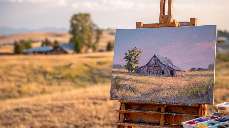
Atmospheric perspective describes how colors shift as they recede through atmosphere. Distant colors become cooler, lighter, and less saturated.
This happens because air particles scatter light, especially warmer wavelengths. Distant red barns appear more purple-gray than bright red.
Desaturation Techniques for Far Objects
Color saturation decreases with distance due to atmospheric interference. Mix grays into distant colors to reduce their intensity.
Add tiny amounts of the sky color to distant objects. This creates color harmony while mimicking natural atmospheric effects.
Color Mixing for Realistic Depth
Learn to mix atmospheric colors rather than using them straight from the tube. Optical mixing through layered glazes creates more convincing depth than flat color applications.
Build distant colors through multiple thin layers. Each glaze adds depth while maintaining luminosity that solid color mixing can’t achieve.
Fundamental Layering Techniques

Building Your Foundation Layer
Establishing Your Composition’s Basic Structure
Start with a thin underpainting that establishes major shapes and value relationships. This foundation layer guides all subsequent work and prevents composition problems later.
Block in major masses without details. Think of this stage as creating a roadmap for your depth effects.
Blocking in Major Shapes and Forms
Use simplified shapes to establish pictorial space relationships early. Don’t worry about details; focus on how shapes overlap and interact spatially.
Establish your focal point areas during this stage. Plan where your strongest depth cues will occur.
Creating a Solid Base for Additional Layers
Your foundation must be completely dry before adding subsequent layers. Proper adhesion between layers prevents cracking and separation over time.
Test paint consistency on a separate surface first. Each layer should bond well with the previous one while maintaining workability.
Transparent and Semi-Transparent Layers
Glazing Techniques with Thin Paint
Glazing involves applying transparent layers over dried paint to modify color and create luminous depth effects. Mix paint with medium to achieve proper transparency.
Each glaze subtly shifts the underlying color while maintaining its luminosity. This technique creates depth that opaque mixing cannot achieve.
Building Color Depth Gradually
Layer thin glazes to build complex colors gradually. This approach creates richer, more vibrant results than mixing everything on your palette.
Patient layering rewards you with colors that seem to glow from within. Each transparent layer adds to the overall depth illusion.
Maintaining Luminosity Through Transparency
Transparent layers allow light to penetrate and reflect back, creating natural luminosity. This mimics how light behaves in the real world.
Avoid making glazes too thick or they’ll become muddy rather than luminous. Think of each layer as colored glass rather than opaque paint.
Opaque Layer Applications
When to Use Thick, Covering Paint
Opaque applications work best for foreground elements that need to advance strongly. Thick paint physically projects from the surface, creating actual three-dimensional effects.
Use opaque techniques for final highlights and sharp details. These areas should contrast with the softer, more transparent distant areas.
Impasto Techniques for Texture and Depth
Texture created through thick paint application adds another dimension to depth creation. Impasto brushstrokes catch light differently than smooth areas.
Apply paint thickly in foreground areas where you want maximum advancement. The physical texture helps separate these areas from flatter background regions.
Balancing Transparent and Opaque Areas
Smart paintings combine both transparent and opaque techniques strategically. Thin backgrounds with thick foregrounds create maximum depth contrast.
Plan your opacity levels during your initial composition phase. Don’t randomly mix techniques without considering their spatial effects.
Linear Perspective in Layered Compositions
One-Point Perspective Foundations
Establishing Your Horizon Line

The horizon line determines your viewer’s eye level and controls the entire spatial framework. Place it carefully because everything else depends on this initial decision.
Linear perspective creates mathematical depth that your brain recognizes instantly. Unlike atmospheric perspective effects, this technique uses geometric rules.
Creating Vanishing Points That Work
Your vanishing points must align logically with your horizon line for believable depth illusions. Place them where parallel lines would naturally converge.
Single-point perspective works perfectly for roads, hallways, or any scene viewed straight-on. The dramatic convergence pulls the eye deep into your pictorial space.
Drawing Guidelines for Accurate Depth
Lightly sketch perspective guidelines before adding paint layers. These construction lines prevent proportion errors that destroy depth illusions.
Use a ruler for accuracy during planning stages. You can paint over guidelines once your basic structure is established.
Two-Point and Multi-Point Perspective
Corner Views and Complex Angles
Two-point perspective handles corner views and angular compositions more naturally than single-point systems. Each surface has its own vanishing point on the horizon line.
Buildings, furniture, and geometric objects benefit from two-point construction. The dual convergence creates more dynamic spatial relationships.
Multiple Vanishing Points in One Composition
Complex scenes often require three or more vanishing points for complete accuracy. Aerial views need additional points above or below the horizon line.
Don’t overcomplicate simple scenes with unnecessary vanishing points. Use only what your specific composition requires.
Avoiding Common Perspective Mistakes
Inconsistent eye levels destroy depth illusions faster than any other mistake. Every element must follow the same perspective system.
Check that similar objects get smaller at consistent rates as they recede. Furniture legs, fence posts, and architectural elements should follow mathematical progression.
Atmospheric vs Linear Perspective
When to Use Each Technique
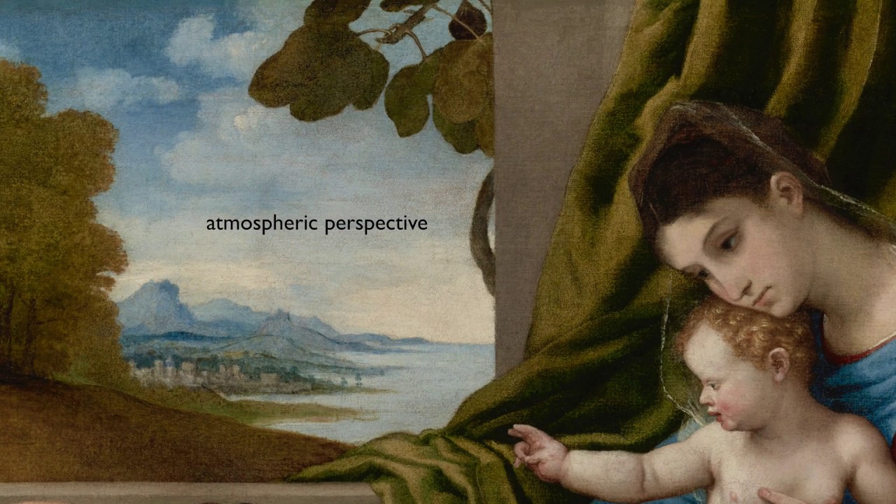
Linear perspective handles geometric subjects and architectural elements. Atmospheric perspective works better for organic subjects and landscape elements.
Combine both techniques in single compositions for maximum depth impact. Use linear rules for buildings, atmospheric effects for trees and mountains.
Combining Both Methods Effectively
Start with linear perspective to establish accurate spatial framework. Layer atmospheric effects over this geometric foundation.
The combination creates believable depth because it mimics how we actually see the world. Our brains process both geometric and atmospheric depth cues simultaneously.
Creating Natural-Looking Depth
Natural depth results from subtle application of multiple depth techniques. Heavy-handed perspective drawing looks mechanical rather than artistic.
Suggest geometric relationships rather than outlining them obviously. The best perspective work supports the overall composition without dominating it.
Overlapping and Layering Objects
Strategic Object Placement

Arranging Elements for Maximum Depth Impact
Overlapping shapes create instant depth cues that your brain processes automatically. Place objects so they partially hide elements behind them.
Plan your overlaps during initial composition stages. Random placement rarely creates effective spatial relationships.
Partial Hiding for Dimensional Effects
Objects that appear behind others automatically read as more distant. This simple depth cue works regardless of size or color relationships.
Strategic concealment makes viewers mentally complete hidden portions of objects. This psychological involvement increases the depth illusion’s effectiveness.
Creating Natural Sight Lines Through Your Painting
Arrange overlapping elements to guide the eye through different spatial layers. Create visual paths that move from foreground to background smoothly.
Eye movement patterns should feel natural and unforced. Avoid creating visual barriers that stop the eye from exploring your pictorial space.
Edge Quality and Definition
Sharp Edges for Close Objects
Crisp edges make objects advance in the picture plane because our eyes focus most sharply on nearby objects. Use clean, defined edges for foreground elements.
Paint foreground objects with confident, decisive brushstrokes. Hesitant edges make objects appear uncertain about their spatial position.
Soft Edges for Distant Elements
Distant objects appear softer due to atmospheric interference. Blurred edges suggest distance more effectively than size or color changes alone.
Blend edges of background elements into their surroundings. This mimics how distant objects lose definition through atmospheric haze.
Lost and Found Edges for Realistic Depth
Varied edge quality creates more interesting and realistic spatial relationships. Some edges disappear completely where objects merge with shadows or similar values.
Study how Rembrandt van Rijn handled edges in his portraits. He masterfully varied edge sharpness to control focus and depth.
Scale Relationships Between Layers

Size Progression from Front to Back
Objects must get smaller as they recede to maintain believable spatial relationships. Consistent scale reduction follows mathematical rules based on distance.
Measure similar objects at different distances to maintain proper proportional relationships. Trees, people, and buildings should follow predictable size changes.
Proportional Relationships That Make Sense
Relative sizing between different object types must remain logical throughout your composition. A distant person cannot be larger than a foreground flower.
Study how Renaissance masters handled complex scenes with multiple figures at various distances. Their mathematical approach created convincing spatial depth.
Avoiding Scale Mistakes That Flatten Your Work
Inconsistent scaling destroys depth illusions immediately. Every object must follow the same perspective rules to maintain spatial credibility.
Check your work by covering foreground elements and examining background proportions independently. Each spatial layer should make sense on its own.
Texture and Surface Variation
Foreground Texture Techniques
Heavy Impasto for Close Objects
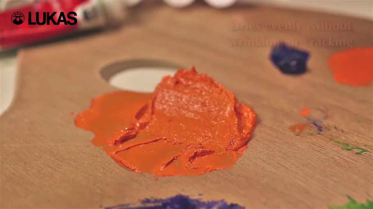
Thick paint application creates actual three-dimensional surface texture that advances physically from the canvas. This technique works especially well for foreground rocks, bark, or fabric textures.
Build up paint gradually rather than applying one thick layer. Multiple applications create more interesting surface variations than single heavy applications.
Detailed Brushwork in Front Areas
Visible brushstrokes add energy and advance elements toward the viewer. Paint foreground areas with confident, directional strokes that describe form and surface quality.
Study how Vincent van Gogh used directional brushwork to create advancing surfaces. His stroke patterns enhanced both texture and spatial depth.
Sharp, Defined Textures That Advance
Crisp textural details make objects appear closer because our eyes focus most clearly on nearby surfaces. Paint foreground textures with precision and clarity.
Use small brushes for detailed texture work in advance areas. Save broader, softer applications for more distant elements.
Middle Ground Texture Balance
Moderate Texture Application
Middle-ground elements need balanced texture treatment that bridges foreground and background areas. Avoid extremes of either heavy texture or complete smoothness.
This transitional area often determines whether your depth effects look natural or forced. Take time to get these relationships right.
Transitional Surface Qualities
Gradual texture changes from rough foreground to smooth background create believable atmospheric progression. Sudden texture jumps look artificial and destroy spatial illusions.
Blend texture qualities where objects meet. Hard texture transitions create unwanted visual stops that flatten depth effects.
Bridging Foreground and Background Elements
Middle-ground objects should share characteristics with both foreground and background elements. This creates visual continuity across spatial layers.
Use moderate detail levels and medium-thick paint applications. These elements help the eye transition smoothly between spatial zones.
Background Texture Simplification
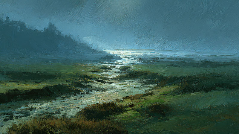
Smooth, Simplified Distant Surfaces
Background textures should appear minimal due to atmospheric softening. Distance reduces our ability to see fine surface details clearly.
Paint distant elements with smooth, flowing brushwork. Avoid heavy texture that would contradict natural atmospheric effects.
Soft Texture Applications
Gentle brush handling in background areas creates appropriate atmospheric effects. Use soft brushes and flowing strokes that suggest rather than define textures.
Blend background textures into their surroundings. Sharp textural contrasts in distant areas fight against atmospheric perspective effects.
Avoiding Detail That Fights for Attention
Excessive background detail competes with foreground focal areas and flattens overall depth effects. Keep distant areas simple and understated.
Remember that less detail reads as more distance. Your background should support rather than compete with your main compositional elements.
Light and Shadow Across Layers

Consistent Light Sources
Establishing Your Main Light Direction
Pick one dominant light source and stick with it throughout your entire painting. Inconsistent lighting destroys depth faster than any other compositional error.
Sketch light direction arrows on your canvas edges as reminders. This simple step prevents lighting mistakes that flatten three-dimensional illusions.
Secondary Light Considerations
Reflected light bounces off surfaces and fills shadow areas with subtle illumination. This secondary lighting adds realism without competing with your main light source.
Keep reflected light cooler and less intense than direct light. Warm reflected light can work in specific situations but use it sparingly.
Maintaining Lighting Logic Throughout Layers
Every painted layer must respect your established lighting scheme. Lighting consistency across all elements creates believable spatial relationships.
Test new elements against your established light pattern before committing to them. Quick value sketches help verify lighting logic.
Cast Shadows Between Objects
Shadows That Connect Different Layers
Cast shadows link foreground, middle ground, and background elements into unified spatial relationships. These shadows prove that objects exist in the same light environment.
Paint shadows that fall across multiple spatial layers. A foreground tree shadow falling on distant ground connects those depth layers convincingly.
Shadow Shapes That Add Depth
Shadow patterns create secondary compositional elements that support your main depth structure. Well-designed shadows guide eye movement through pictorial space.
Study how Caravaggio used dramatic shadows to create spatial depth. His chiaroscuro technique pushed forms forward and backward simultaneously.
Color Temperature in Shadow Areas
Cool shadows typically recede while warm shadows advance slightly. This temperature difference adds another layer to your depth-creation toolkit.
Mix shadow colors rather than adding black to local colors. Pure black shadows look flat and destroy the luminosity you’ve built through layering.
Form Shadows and Modeling

Shadows That Describe Three-Dimensional Form
Form shadows wrap around curved surfaces and create the illusion of volume and mass. These shadows differ from cast shadows because they describe the object’s actual three-dimensional structure.
Practice painting simple spheres and cylinders to understand form shadow behavior. Master these basic forms before attempting complex subjects.
Gradual Transitions in Rounded Objects
Smooth gradations from light to shadow create convincing rounded forms that project from the picture plane. Harsh transitions flatten forms and reduce dimensional effects.
Use soft brushes and patient blending for curved surfaces. The gradual transition zone between light and shadow often determines the success of your form modeling.
Hard Shadows on Angular Surfaces
Sharp shadow edges work well for angular objects with distinct planes facing toward or away from your light source. These crisp transitions emphasize geometric form.
Architectural subjects and still life objects with flat surfaces need clean shadow edges. Soft shadows on hard edges look unconvincing and muddy.
Advanced Layering Strategies
Broken Color Techniques

Optical Mixing Through Layered Strokes
Broken color involves placing pure color strokes next to each other rather than mixing them on your palette. The viewer’s eye blends these colors optically, creating vibrant results.
This technique maintains color intensity while building complex depth relationships. Each stroke retains its purity while contributing to the overall color harmony.
Pointillist Approaches to Depth
Pointillism uses small dots of pure color to build form and space through optical mixing. Color dots of varying sizes can suggest different spatial positions.
Larger dots advance while smaller dots recede, creating another depth variable beyond color temperature and value relationships.
Scumbling for Atmospheric Effects
Scumbling involves dragging dry paint lightly over dried layers, allowing underlying colors to show through. This technique creates atmospheric effects perfect for distant elements.
Use this method for sky effects, distant foliage, and weathered surfaces. The broken color application suggests atmospheric interference naturally.
Selective Focus Methods
Sharp Focus in Key Areas
Selective focus mimics how our eyes work, focusing sharply on specific areas while letting others remain soft. This photographic principle creates convincing depth in paintings.
Paint your focal areas with crisp details and sharp edges. These areas should contrast with softer, less defined surrounding elements.
Soft Focus for Less Important Elements
Peripheral areas should remain softer and less detailed to support your main focal points. This hierarchy guides viewer attention through your spatial layers.
Use broader brushes and simplified details in non-focal areas. Think of these regions as supporting actors rather than stars.
Creating Hierarchy Through Clarity
Visual hierarchy develops naturally when you vary clarity levels across different spatial layers. Sharp foreground elements dominate soft background areas automatically.
Plan your focus levels during initial composition stages. Don’t randomly apply sharp details without considering their impact on overall depth relationships.
Compositional Flow Through Layers

Leading the Eye Through Your Painting
Visual pathways should move smoothly between different depth layers without creating jarring stops or confusing directions. Plan eye movement as carefully as spatial relationships.
Use overlapping shapes, directional lines, and value contrasts to create clear paths through your composition.
Creating Visual Paths Between Layers
Connecting elements link foreground, middle ground, and background into unified spatial experiences. Color echoes, repeated shapes, and value connections work well for this purpose.
A red flower in the foreground might echo in distant red rooftops. These connections create depth while maintaining compositional unity.
Balancing Activity Across Different Depths
Activity distribution across spatial layers prevents any single area from overwhelming your composition. Busy foregrounds need simpler backgrounds for proper balance.
Conversely, simple foregrounds can support more complex background activity. Maintain overall balance while respecting spatial depth principles.
Common Mistakes and How to Fix Them
Flat, Lifeless Compositions
Identifying When Your Painting Lacks Depth
Flat paintings typically result from consistent edge quality, uniform detail levels, or absence of overlapping elements. Step back frequently to assess spatial relationships.
Your painting should have clear foreground, middle ground, and background areas. If everything appears at the same distance, you need stronger depth cues.
Quick Fixes for Flat-Looking Work
Add overlapping shapes immediately. Strategic overlaps create instant depth even in otherwise flat compositions.
Soften background edges and sharpen foreground details. This simple edge variation can rescue flat-looking paintings quickly.
Prevention Strategies During the Painting Process
Plan depth relationships before starting to paint. Sketch value studies that show clear spatial separation between different layers.
Check depth effects regularly by viewing your work from different distances. Problems become obvious when you step back from your easel.
Muddy Color from Over-Layering
Recognizing When You’ve Gone Too Far
Muddy colors develop when you’ve applied too many layers or mixed complementary colors through overworking. Fresh color becomes gray and lifeless.
Stop layering when colors start losing their intensity. Sometimes fewer layers create more convincing depth than complex build-ups.
Cleaning Up Muddy Areas
Scrape back to previous clean layers using palette knives or razors. Fresh paint over cleaned areas often looks better than attempting to fix muddy passages.
Let areas dry completely before attempting corrections. Working into wet, muddy paint typically makes problems worse.
Planning Your Layers to Avoid Problems
Color planning prevents muddy results before they occur. Test layer combinations on separate surfaces before applying them to your painting.
- Plan your layer sequence from dark to light
- Use complementary colors sparingly in layered applications
- Allow adequate drying time between applications
- Test transparency levels before full application
Inconsistent Perspective and Lighting
Spotting Perspective Errors
Perspective mistakes show up as objects that don’t follow consistent vanishing point rules. Similar objects should get smaller at matching rates as they recede.
Use measuring tools to check proportional relationships. Pencils held at arm’s length help compare sizes and angles accurately.
Correcting Lighting Inconsistencies
Mixed lighting directions destroy spatial credibility instantly. Every shadow and highlight must follow your established light source direction.
Photograph your setup if working from life. Reference photos help maintain consistent lighting throughout long painting sessions.
Making Adjustments Without Starting Over
Strategic corrections can salvage paintings with perspective or lighting problems. Focus on the most obvious errors first rather than attempting to fix everything.
Adjust one element at a time and assess the impact before making additional changes. Sometimes small corrections solve bigger compositional problems.
Finishing Techniques for Maximum Depth
Final Detail Work

Adding Finishing Touches That Pop
Final details make the difference between amateur and professional-looking depth effects. Add these details only after all major layers are complete and dry.
Small highlights and sharp accents in foreground areas create maximum advancement. Use your smallest brushes for these critical final touches.
Balancing Detail Across Your Composition
Detail distribution must follow spatial logic throughout your painting. Foreground areas deserve the most detailed attention, while distant areas should remain simplified.
Avoid adding equal detail everywhere. This common mistake flattens compositions and destroys carefully built depth illusions.
Knowing When to Stop
Overworking destroys the fresh quality that makes paintings compelling. Stop when you’ve achieved convincing depth without overcomplicating the surface.
Step away periodically to assess your progress objectively. Fresh eyes reveal when you’ve reached completion better than continuous work sessions.
Unifying Your Layers
Glazes That Tie Everything Together
Unifying glazes harmonize disparate elements while maintaining depth relationships. A thin, transparent layer over the entire painting can pull everything together visually.
Mix glazing medium with small amounts of paint for subtle color shifts. This final glaze should enhance rather than overpower your existing depth effects.
Color Harmony Across All Layers
Color relationships between layers create visual coherence that supports rather than fights your depth illusions. Plan color echoes that connect different spatial areas.
Repeat key colors in modified forms throughout your spatial layers. A warm orange in the foreground might echo as a cooler, grayed orange in distant areas.
Final Adjustments for Cohesion
Critical assessment at completion stage reveals areas that need minor adjustments for maximum depth impact. Look for elements that jump out inappropriately or sink back too much.
Make small value adjustments rather than major changes at this stage. Sometimes darkening a background edge or lightening a foreground area solves spatial problems immediately.
Varnishing and Protection

Varnishes That Maintain Depth
Protective varnishes should enhance rather than diminish your depth effects. Matte varnishes reduce reflective glare that can flatten dimensional illusions.
Gloss varnishes work well for paintings with strong contrast relationships. The enhanced darks and lights can actually increase depth perception.
Protecting Layered Artwork
Multiple paint layers require extra protection because they represent significant time investments. Proper varnishing prevents dust accumulation and color shifts over time.
Wait at least six months before varnishing oil paintings. Acrylic works can be varnished within weeks of completion.
Long-Term Care for Complex Paintings
Layered paintings need careful handling because thick paint areas are more vulnerable to damage than thin applications. Frame them properly to prevent surface contact.
Avoid extreme temperature changes that can cause paint layers to expand and contract at different rates. Stable environments preserve layered paintings best.
FAQ on How To Create Depth In A Painting
What’s the easiest way to create depth in painting for beginners?
Overlapping shapes creates instant depth without complex techniques. Place objects in front of others to establish spatial relationships immediately.
Use warm colors for foreground elements and cool colors for backgrounds. This temperature shift mimics natural atmospheric perspective effects.
How do you use color temperature to create depth?
Warm colors advance while cool colors recede due to how our eyes process different wavelengths. Paint foreground objects with reds and oranges.
Background areas should use blues, purples, and grayed colors. This color theory principle works automatically.
What’s the difference between atmospheric and linear perspective?
Linear perspective uses geometric rules and vanishing points for architectural subjects. Atmospheric perspective relies on color and value changes for organic elements.
Combine both methods in single paintings for maximum depth impact and natural-looking spatial relationships.
Which painting medium works best for creating depth through layers?
Oil painting allows extended blending time for smooth atmospheric transitions. Acrylic painting dries quickly for rapid layer building.
Glazing techniques work well with both mediums when mixed with appropriate mediums for transparency.
How do you avoid muddy colors when layering paint?
Plan your layer sequence before painting and test combinations on separate surfaces. Complementary colors mixed through layering create gray, lifeless results.
Allow complete drying between layers and use glazing mediums to maintain color purity and luminosity.
What role does texture play in creating depth?
Heavy impasto in foreground areas advances physically from the canvas surface. Smooth, simplified textures in backgrounds suggest atmospheric softening.
Vary brushstroke quality from detailed foreground work to soft background applications for natural depth progression.
How important are edges in depth creation?
Sharp edges make objects advance while soft edges suggest distance through atmospheric interference. Vary edge quality strategically across spatial layers.
Lost and found edges create realistic depth because they mimic how we actually see spatial relationships.
What’s the biggest mistake beginners make with depth?
Uniform detail levels across all spatial areas destroys depth illusions. Beginners often add equal detail everywhere instead of simplifying backgrounds.
Keep distant areas simple and understated while concentrating detail work in foreground focal areas.
How do you fix a painting that looks flat?
Add overlapping elements immediately for instant depth cues. Soften background edges while sharpening foreground details creates spatial separation.
Cool down distant colors and warm up close elements. Increase contrast in focal areas while reducing it in backgrounds.
Should depth be planned or can it develop naturally?
Intentional planning creates more effective depth than accidental results. Sketch composition studies showing clear foreground, middle ground, and background relationships.
Map out your depth strategy before applying paint to avoid structural problems that require major corrections.
Conclusion
Mastering how to create depth in a painting requires patience and systematic practice with layered painting approaches. These dimensional painting methods separate amateur work from professional results.
Spatial relationships develop through careful attention to overlapping shapes, value gradation, and brushstroke texture variation.
Temperature shifts from warm foreground colors to cool background elements create automatic depth cues.
Professional artists like Pablo Picasso and Paul Cézanne built careers on understanding these dimensional art creation principles.
Their work demonstrates how systematic depth techniques transform flat surfaces into convincing three-dimensional illusions.
Practice these layering paint methods regularly on small studies before attempting complex compositions. Start with simple foreground-background relationships, then progress to multi-layered scenes.
Remember that form modeling, atmospheric perspective effects, and strategic paint application work together to create convincing pictorial space. Master these fundamentals and watch your paintings transform from flat exercises into compelling dimensional artwork.