Most painting styles ask you to hide the process. Pop art asks you to make it the entire point.
The pop art painting techniques developed by Andy Warhol, Roy Lichtenstein, and their contemporaries in the 1950s and 1960s were not accidents. They were deliberate borrowings from commercial printing, comic book illustration, and mass media, applied to fine art canvases with specific, repeatable methods.
This guide covers those methods directly: Ben-Day dots, flat color blocking, bold outline, silkscreen and stencil work, photorealistic source imagery, text integration, serial composition, and surface preparation.
By the end, you will have a clear technical foundation for creating your own acrylic pop art on canvas, from the first coat of gesso to the final black outline.
What is Pop Art Painting

Pop art painting is the practice of applying commercial and mass-media visual language directly to fine art canvases. It is not just a style. It is a deliberate set of repeatable, teachable techniques.
The movement began in Britain in the mid-1950s and reached peak visibility in 1960s America. Andy Warhol, Roy Lichtenstein, and Richard Hamilton each developed distinct technical approaches, but shared a core principle: fine art could borrow everything from advertising, comic strips, product packaging, and celebrity culture.
Pop art painting is often set against its predecessor. Where abstract art prioritized the artist’s gesture and inner expression, pop art stripped that away entirely. The goal was a flat, printed, machine-like surface that removed the visible hand of the painter.
According to Art Basel and UBS, the global art market recorded approximately $57.5 billion in sales in 2024. Pop art, particularly blue-chip works by Warhol, remained one of the most stable segments throughout.
Core visual characteristics of pop art painting:
- Flat, unblended fields of color with no visible brushstroke
- Bold black outlines borrowed from comic book illustration
- High contrast between primary colors and white backgrounds
- Repeated imagery drawn from consumer culture or mass media
- Graphic clarity that reads quickly, like an advertisement
These are not just aesthetic choices. Each one is a technical decision. Understanding why they exist makes them easier to replicate.
Pop Art vs. the Movements That Came Before

Pop art did not emerge from nowhere. Lawrence Alloway, the British curator who coined the term “Pop Art” in 1955, defined it specifically around imagery from consumerism, mass manufacturing, and new media.
That’s a meaningful distinction from movements that preceded it. Impressionism chased fleeting light effects with loose, visible strokes. Expressionism leaned into distortion and emotion. Pop art rejected both in favor of something deliberately impersonal.
Surrealism is worth mentioning here too. Eduardo Paolozzi, often credited as a precursor to pop art, actually started by fusing early Surrealist ideas with popular culture and technology. The leap from Surrealism to pop is shorter than people assume.
But the clearest break was from Abstract Expressionism. Warhol’s famous quote, “the reason I’m painting this way is that I want to be a machine,” was a direct rejection of the emotional, gestural work of painters like Jackson Pollock and Mark Rothko.
| Movement | Surface Quality | Color Approach | Key Distinction from Pop Art |
|---|---|---|---|
| Abstract Expressionism | Gestural, often heavy texture (impasto) or drips. | Expressive, mixed, and highly personal. | The Artist’s Hand: Focuses on the physical act of painting and inner emotion rather than external consumer goods. |
| Impressionism | Broken, visible strokes; “flickering” quality. | Optical mixing; focus on light and atmosphere. | Nature vs. Culture: Seeks to capture the fleeting beauty of the natural world rather than mass-produced media. |
| Surrealism | Often realistic, “smooth” rendering to ground the weirdness. | Symbolic, dreamlike, and often high-contrast. | The Subconscious: Explores the dream world and the “id,” whereas Pop Art looks at the “ego” of society. |
| Pop Art | Flat, graphic, and mimicking a printed or industrial feel. | Bold primaries and high-contrast commercial colors. | Mass Culture: Rejects the “high art” exclusivity by using advertisements and celebrity as fine art. |
Ben-Day Dots

The Ben-Day process was patented in 1879 by illustrator and printer Benjamin Henry Day Jr. as a cost-saving method for commercial printing. By mid-century it was everywhere in comic books, newspapers, and advertisements, used to create shading and secondary colors through patterns of cyan, magenta, yellow, and black dots.
Roy Lichtenstein started using Ben-Day dots in 1961 with Look Mickey. That painting changed what the technique meant. What had been an invisible printing device became the entire point.
How Lichtenstein Actually Applied the Dots

The process was entirely hand-made, despite the mechanical appearance. Lichtenstein used perforated metal stencils and an aluminum mesh to maintain consistency, pushing paint through the holes with a small brush or toothbrush. Each dot was painted individually.
His three-stage workflow: sketch the image, trace it onto canvas using an opaque projector, then paint with flat Magna acrylic paint, black outlines, and Ben-Day dots. He said in a 1967 Artforum interview, “I want to hide the record of my hand.”
Dot behavior changed across his career:
- Early works: same-size dots, uniform coverage across large areas
- Later Nudes series: varying dot sizes to create changing light and shadow
- Whaam! (1963): aluminum mesh template, toothbrush application
- Drowning Girl (1963): dots used heavily in background and water for texture
This is worth understanding clearly. Lichtenstein’s dots are not a shortcut. They are a labor-intensive simulation of a mechanical process, which is exactly what made them interesting conceptually.
Ben-Day Dots vs. Pointillism

Different intent, different execution.
Pointillism, developed by Georges Seurat, applied pure unmixed pigments to the canvas so they would optically blend in the viewer’s eye. The dots exist to create color. Lichtenstein’s dots exist to reference a printing process. They are about mechanical reproduction, not optical mixing.
In practice, Ben-Day dots use a fixed dot-to-dot spacing that reads as a pattern, while Pointillist dots vary in density to model form. One looks industrial. The other looks like a shimmering field of color. Both use dots. That’s roughly where the similarity ends.
Replicating Ben-Day Dots in Your Own Work
Nine approaches exist for creating Ben-Day dots, from sponge dabbing to mesh stencils. The closest to Lichtenstein’s actual method: hole-punch a strip of cardstock, place it over the canvas, dab paint through the holes, reposition and repeat.
Common issues:
- Inconsistent dot spacing breaks the printed illusion
- Too much paint bleeds under the stencil
- Wrong color pairing (dots that read as mud instead of a secondary color)
For color choices, Lichtenstein primarily used bright primaries on white backgrounds. The contrast between, say, red dots and white space reading at a distance as pink was deliberate. Distance matters with this technique. Always step back.
Flat Color Blocking

Flat color blocking is exactly what it sounds like: large areas of a single, solid, unblended color applied to the canvas with no visible texture or stroke variation. No shading. No gradients. Nothing that looks like a human hand moved a brush across it.
Traditional pop art was made with flat bright colors that had no shading. That was not a limitation of the medium. It was a technical and conceptual choice that echoed the look of screen-printed advertisements and mass-produced graphics.
Why Acrylic Paint is the Default Medium

Acrylic dries fast and sits flat. That is most of the reason.
Acrylic was introduced to the mainstream art world just before the mid-20th century, which made it a contemporary and technically appropriate choice for pop artists. The fast drying time allowed pop artists to work at the speed of commercial production. Oil paint, by comparison, dries slowly and has a natural tendency to blend and soften at the edges, which works against the graphic look pop art demands.
Warhol’s technique combined hand-painted acrylic backgrounds with photographic silkscreen. The acrylic provided the saturated, flat color fields. The silkscreen added the photographic image on top. Neither element blended into the other.
Getting a Truly Flat Surface
Most beginners underestimate how much surface preparation matters here. Visible canvas texture shows through flat paint, and that texture immediately softens the graphic quality.
The standard approach:
- Apply two to three coats of gesso, sanding lightly between each coat
- Use a wide, soft flat brush or foam roller for even coverage
- Apply acrylic paint in multiple thin coats rather than one thick pass
- Keep the surface misted while working to extend drying time and prevent streaking
- Never add more than 30% water to acrylic, or the paint bond weakens
Masking tape creates the hard, clean edges between color areas. Remove the tape while paint is still slightly damp. If you wait until it is fully dry, the paint can lift.
Color Palette Choices
Pop art color is not random. Most canonical works lean heavily on primary colors: red, yellow, and blue, often paired with black outlines and white backgrounds. This combination maximizes visual contrast and reads instantly from a distance.
Color contrast is the structural engine of flat color blocking in pop art. When every shape within a composition is a distinct, clean block of color with no blending at the boundaries, contrast in painting does all the heavy lifting that shading and tone normally handle. The shapes become legible purely through the difference between adjacent hues.
Warhol varied color between repeated panels of the same image, making the color scheme itself the variable rather than the image. That’s a different use of flat color blocking from Lichtenstein’s, but both rely on the same foundational technique.
Bold Outline and Contour Drawing
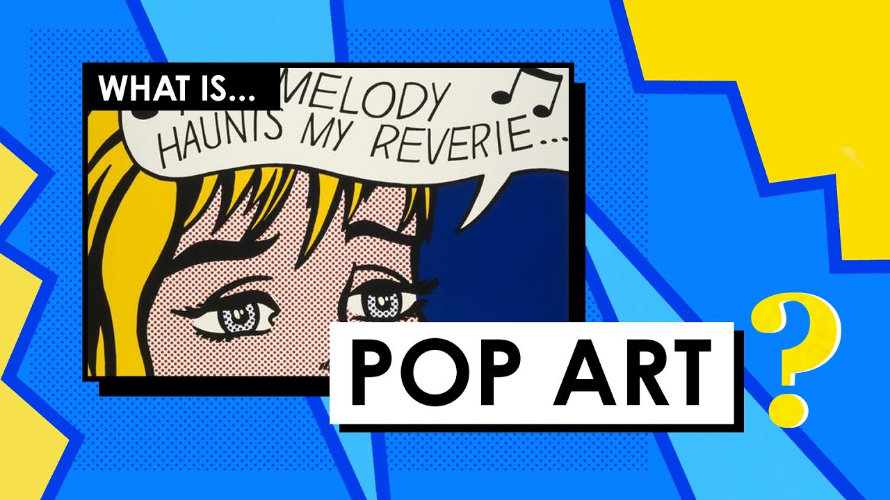
The thick black outline is one of the most recognizable elements of pop art painting. It is not decorative. It is structural. And getting it right is harder than it looks.
Before the 1960s, text and outlines were associated with commercial design, not fine art. Lichtenstein and his contemporaries were the ones who dragged that visual language into gallery spaces.
Where the Outline Comes From
Comic book illustration is the direct source. Commercial artists used bold outlines to separate shapes clearly when printed at small sizes and low resolution. The outline solved a legibility problem. Pop artists borrowed that solution and applied it at monumental scale.
This connects to how contour drawing functions more broadly in visual art: the line that defines the edge of a shape. In pop art, that contour is exaggerated, thickened, made deliberate. Nothing is suggested. Everything is declared.
Lichtenstein’s approach vs. Warhol’s:
- Lichtenstein: heavy, consistent black outlines on every shape, drawn in India ink or black Magna acrylic
- Warhol: often dropped outlines entirely, letting flat color areas meet directly
- Contemporary pop artists like Keith Haring: outline as the primary expressive element, color as secondary fill
Tools and Application Methods
India ink gives the cleanest, most uniform line weight. Applied with a ruling pen or technical pen, it dries flat and matte, which is consistent with the overall look of pop art painting. Paint markers work well for thicker outlines and are easier to control on large surfaces.
Black acrylic paint applied with a fine round brush is the most flexible option. It allows for variable line weight, which matters when outlining complex shapes. The tricky part is consistency: an outline that changes thickness unexpectedly reads as uncertain rather than graphic.
Lichtenstein sometimes traced his pencil sketches onto canvas using an opaque projector before inking. That projection step is worth considering. Freehanding a large outline from memory over a flat-colored canvas, without being able to correct, is stressful in a way that working from a projected guide is not.
Line Weight and Visual Hierarchy
Not all outlines need to be the same thickness. Varying line weight creates visual hierarchy within a composition: heavier outlines for dominant shapes, lighter lines for secondary detail.
Key rule: the outline should be thick enough to read clearly from a viewing distance of at least three feet. Pop art was designed to communicate fast, at the pace of a billboard or an advertisement. If the outline only reads at close range, it has not done its job.
Silkscreen and Stencil Techniques on Canvas

Warhol turned to photographic silkscreen printing in 1962 after finding his earlier rubber-stamp method “too homemade.” His words: he wanted “something stronger that gave more of an assembly-line effect.” That shift defined his career and, frankly, pop art painting as a whole.
MyArtBroker data shows Roy Lichtenstein achieved a record-breaking L9 million in sales in 2024, a 14% increase from the previous year, with print and silkscreen works driving much of that activity.
How Warhol’s Silkscreen Process Worked
Step by step:
- Select a photograph (celebrity, product, news image)
- Blow it up and transfer it in glue onto a silk mesh screen
- Apply an acrylic background color to the canvas by hand first (underpainting)
- Pass an ink-laden squeegee over the mesh so ink transfers through open areas onto the canvas
- Repeat with different color passes for each element
The “imperfections” mattered to Warhol. Misaligned registration, uneven ink density, faint areas in the print. He was not after a clean commercial result. He wanted, as his biographers described it, “the trashy immediacy of a tabloid news photo.”
Warhol began combining silkscreen with hand-painted backgrounds from the start. The acrylic layer came first, the silkscreened photographic image on top. Many of the most famous works, including the Marilyn series and the Liz portraits, are acrylic and silkscreen ink on canvas.
DIY Silkscreen Setup for Pop Art
A basic home silkscreen setup does not require a professional press. The core components:
Screen: a wood frame with polyester mesh stretched tightly across it. The mesh count determines detail level. Lower mesh count for bold, flat shapes. Higher mesh for finer detail.
Photo emulsion: applied to the mesh, then exposed to UV light through a film positive of your image. The UV hardens the emulsion everywhere except where the image blocked the light, leaving those areas open for ink to pass through.
Ink: water-based screen printing inks work on canvas. Pull a squeegee across the screen at a consistent angle and pressure.
Registration is the main challenge when working with multiple color passes. One loose alignment and the layers shift, which can look intentionally pop art or just sloppy, depending on how far off it is.
Stencil Materials That Work on Canvas
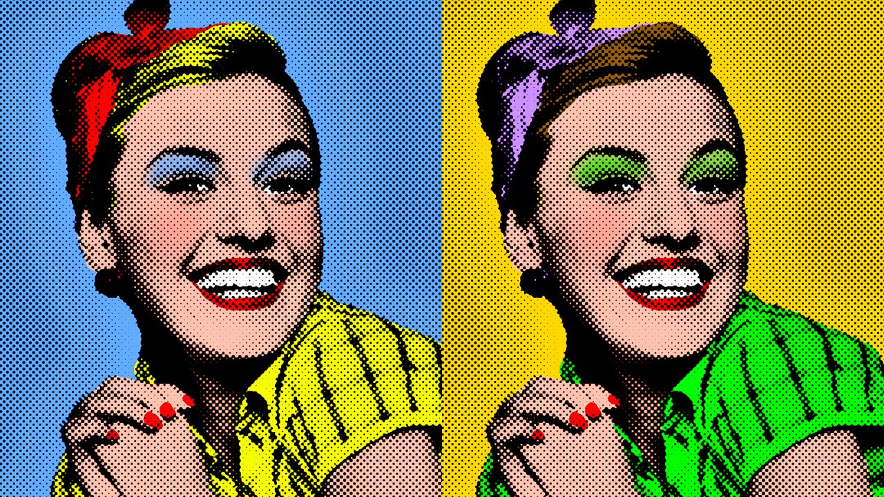
Stencils are a faster, lower-commitment alternative to silkscreen for repeated motifs. Mylar plastic is the standard material: durable enough for multiple uses, thin enough to cut cleanly with a craft knife, and flat enough to sit tight against a canvas surface without lifting.
Materials compared:
| Material | Durability | Cut Quality | Best For |
|---|---|---|---|
| Mylar (4-7 mil) | High; solvent-resistant and washable for repeated use. | Excellent for clean, intricate curves and complex shapes. | Repeated Motifs: Logos, textile patterns, or recurring street art elements. |
| Cardstock | Low; absorbs moisture and tends to warp or tear after one use. | Good for straight edges and simple geometric shapes. | Templates: One-off Ben-Day dot patterns or large blocking shapes. |
| Acetate | Medium; rigid but can crack if handled roughly. | Very clean; allows for extremely fine, sharp detail. | Fine Detail: Technical illustrations or overlays where transparency helps placement. |
| Masking Tape | Single use; must be removed while paint is still slightly tacky. | Perfectly sharp straight lines; leaves no residue if used correctly. | Hard Edges: Geographic abstraction, horizon lines, or clean color blocking. |
One thing worth knowing: registration errors in stencil work read differently from silkscreen registration errors. With silkscreen, a slight misalignment has historical precedent in Warhol’s work. With a hand-cut stencil, a misalignment usually just looks like a mistake. Tape the stencil down before applying any paint.
Photorealistic Source Imagery and Cropping
Pop art paintings do not invent their subject matter. They find it, crop it, and translate it. The source image is not the art. What the artist does with it is.
Lichtenstein’s process started with comic book panels and advertisement photographs, which he would sketch first, making his own changes to the composition, before tracing the result onto canvas using an opaque projector. He described his sources as starting points, not blueprints.
Choosing and Adapting Source Material
The best source images for pop art painting share a few qualities:
- Strong, readable silhouette that simplifies cleanly into flat shapes
- High contrast between subject and background
- Cultural recognition: celebrities, products, logos, news images
- A degree of kitsch or disposability in the original context
Warhol’s 32 Campbell’s Soup Cans (1962) are the obvious example. The source was a soup can label, about as disposable as commercial art gets. By enlarging and isolating it, Warhol forced viewers to look at something they had always looked past.
James Rosenquist, who worked as a billboard painter before becoming a pop artist, brought that same sensibility to enormous canvas scale. His works combine fragments of advertisements in ways that only make sense at close viewing, then become something else entirely from across the room.
The Grid Transfer Method
The grid method is the simplest way to scale a source image accurately onto canvas without a projector. Divide the source image into equal squares, draw a proportionally larger grid on the canvas, and transfer each square one at a time.
This is a technique with deep roots in painting history. Renaissance artists used similar grid systems for scaling preparatory drawings to large wall surfaces. Pop art borrowed it and made it practical for working from photographs.
Process flow:
- Print the reference image at a workable size
- Draw a grid over it (or use a clear acetate grid overlay)
- Draw the corresponding larger grid on the canvas in light pencil
- Transfer one square at a time, focusing on where lines cross the grid
- Erase grid lines before painting
An opaque projector is faster and produces the same result, which is why Lichtenstein used one. But not everyone has access to one, and the grid method requires nothing beyond a pencil and a ruler.
Simplifying Photographic Detail into Flat Shapes
The translation from photo to pop art painting is not a copy. It is an edit. Photographs contain gradients, reflections, half-tones, and thousands of subtle value shifts. Pop art painting reduces all of that to flat, bounded areas of solid color.
The practical approach: squint at the source image until detail blurs and only the major shapes remain. Those shapes become your flat color areas. Everything else gets absorbed into the nearest adjacent color. If two adjacent shapes in the photo are similar in tone but slightly different, make them the same in the painting. Simplification is the technique.
Understanding value in painting helps here. Value is the lightness or darkness of a color. In pop art, value decisions get made at the source-image editing stage, not during painting. By the time you are putting paint on canvas, those decisions should already be made.
Text Integration in Pop Art Paintings
Before the 1960s, text on a canvas was considered a commercial act. Fine art did not do that. Lichtenstein, Ed Ruscha, and Barbara Kruger changed that assumption permanently.
Text in pop art painting is not decoration. It carries narrative weight, creates dramatic tension, and often delivers the conceptual punch of the entire piece. Lichtenstein’s Whaam! (1963) would be a completely different painting without the onomatopoeic explosion text across the right panel.
Speech Bubbles and Onomatopoeia
Lichtenstein used text in three distinct ways: to create dramatic events (“WHAAM!”), to provide contextual narrative (“I Can See the Whole Room and There’s Nobody in It!”), and to add emotional mystery (“Oh, Jeff… I love you, too… but…”). By 1970, he had stopped using text entirely in his later series.
The speech bubble functions as a compositional shape, not just a text container. It has a defined outline, a fill color (usually white), and a tail that points to the speaker. All of these are painted, not drawn. The bubble competes for visual space with the image and needs to be planned as part of the overall composition from the start.
Onomatopoeic words like POW, WHAM, and VAROOM get special treatment:
- Letters are outlined in thick black, same weight as the image outlines
- Color fills match the painting’s primary palette
- Ben-Day dot shading is sometimes applied inside the letterforms
- Action lines radiate from impact words to suggest movement
Lettering Approaches: Hand vs. Stencil

Most pop art painters hand-letter their text, then outline it in black. The lettering style borrowed directly from mid-century comic book fonts: bold, blocky capital letters with minimal stroke variation.
Font choice carries meaning. Lichtenstein used thick, commercial letterforms because they evoked mass media. Ed Ruscha used a different approach, setting words in dramatic typefaces against flat atmospheric backgrounds. Same movement, completely different typographic sensibility.
Stencil lettering gives cleaner, more consistent results. It is worth using for any text that repeats across panels, since hand-lettered text varies in subtle ways that become noticeable at scale.
The balance between text weight and image is the main challenge. If the speech bubble is too large, it dominates. Too small, and it reads as an afterthought. A useful starting rule: the text area should occupy no more than 20-25% of the total canvas, unless text is the primary subject.
Typography as the Whole Point
Ed Ruscha took text further than anyone else in the pop art context. Works like Hollywood (1968) and Standard place single words or short phrases in dramatic compositions where the word itself is the subject.
This is a technically different challenge from speech bubbles. The letterforms need to hold up as visual objects, not just as readable text. Scale, color, surface quality, and the relationship between letterform and background all need deliberate decisions.
For painters working in this mode, understanding shape in art helps. Each letter is a shape. The negative space between letters is a shape. The composition depends on managing both.
Surface Preparation and Ground Choices
Pop art painting fails at the surface level more often than anywhere else. Visible canvas texture, uneven gesso, absorbent grounds that drink up acrylic color: all of these work against the flat, graphic look the technique requires.
Smooth surfaces are not optional here. They are the whole foundation. The printed, machine-made look of pop art painting depends entirely on clean, hard edges and uniform color fields, and those are only achievable on a properly prepared surface.
Canvas vs. Board: Which Works Better
Honestly? Board usually wins for pop art.
Canvas: even fine-weave cotton canvas has a texture that shows through flat acrylic paint, especially in large, solid color areas. You can minimize this with multiple gesso coats and sanding, but you are fighting the material.
Board (MDF or Masonite): starts flat, stays flat, accepts gesso smoothly, and sands down to an almost glass-like surface. The tradeoff is weight and the risk of warping in humid conditions. Seal the back with gesso or medium to balance moisture absorption.
| Support | Surface Quality | Best For | Main Drawback |
|---|---|---|---|
| Stretched Cotton Canvas | Moderate, natural texture. | Larger works and ease of transport due to light weight. | The fabric weave often shows through flat areas of color. |
| Linen Canvas | Fine, consistent, and durable. | Professional-grade work: Exceptional longevity and a luxurious feel. | Significantly more expensive and requires careful preparation. |
| MDF / Masonite Board | Very smooth and rigid. | Small to medium works where a steady hand is required. | Heavy to transport; prone to warping if not sealed properly on all sides. |
| Gessobord | Excellent, non-porous smooth surface. | Detail Work & Stenciling: Allows for crisp lines and fine glazing. | Limited sizes available and can be more costly than raw board. |
Gesso Application for Pop Art
The goal is to eliminate all texture. That requires more gesso coats than most beginners apply.
Standard process for a flat surface:
- First coat: thin gesso slightly with water, apply horizontally with a wide flat brush
- Sand lightly with 220-grit sandpaper once dry, wipe clean
- Second coat: apply vertically (perpendicular to first coat) at full strength
- Sand again, wipe clean
- Third coat if needed: use undiluted gesso, applied with a palette knife or drywall taping knife for the flattest possible result
Between each coat, direction changes. Horizontal first coat, vertical second. This cross-hatching fills any remaining texture from the previous layer. Sanding between each coat removes ridges left by the brush bristles.
Priming with White vs. Colored Grounds
White ground is the default for pop art, and there is a good reason. The high-contrast, primary color palette relies on a white base to maintain color accuracy and saturation. A tinted or grey ground shifts every color mixed on top of it.
Some pop artists do use a colored ground deliberately. A mid-value warm ground can work under a painting that uses mainly warm colors, saving one background paint layer. But for beginners working with flat color blocking, white is the safer starting point.
The canvas priming process matters more in pop art than in most other styles precisely because surface imperfection is so visible when it occurs under flat, unblended color. In Impressionist painting, a rough surface just adds texture to an already textured style. In pop art, it reads as a mistake.
Repetition and Serial Composition
Warhol’s grid compositions are the most recognized structural format in pop art painting. Fifty images of Marilyn Monroe in the Marilyn Diptych (1962). Thirty-two Campbell’s Soup Cans, each a different variety, lined up in rows. The grid is not just a layout choice. It is the argument.
By repeating the same image systematically, Warhol mirrored the manufacturing logic of consumer culture. As Tate Modern noted, he “allowed his screen to be over and under inked,” so each repeated unit showed slight variation. The repetition was deliberate. The imperfection was also deliberate.
Planning a Repeat Grid Composition
Color variation is the main variable. The image stays the same. The color scheme changes per panel. That structure is what gives Warhol’s grids their visual rhythm.
Practical planning steps:
- Decide the number of panels: 4, 9, 16, or 25 work well (perfect squares)
- Determine panel size first, then the overall canvas dimension
- Map out color combinations for each panel before starting
- Keep the same image position in every panel for consistency
- Vary only one or two color elements per panel (not everything at once)
Repetition in art functions differently from pattern. Pattern implies identical or near-identical units. Repetition in pop art involves the same image with controlled variation, where each unit holds meaning individually and contributes to the overall grid as a whole.
Color Variation Across Repeated Panels
The Marilyn Diptych splits across two halves: vivid color on the left, stark black-and-white on the right. That contrast is the entire point of the composition. The color half represents life and celebrity. The fading black-and-white half suggests death and erasure.
Most painters working with repeat grids do not need that level of conceptual loading. But the principle holds: color variation should follow a plan, not just change randomly from panel to panel. Organize panels by temperature (warm colors in one group, cool in another), by saturation level, or by value. All three approaches give the grid a visual logic that random color changes do not.
Complementary colors work well for adjacent panels. The contrast between, say, a red-background panel and a green-background panel of the same image creates visual energy without changing the composition at all. Color contrast in art becomes the primary design tool in serial pop art compositions.
Scaling Repeat Compositions to Large Canvases
Start with small studies. Seriously. Paint the full grid composition at 5×7 inches per panel before committing to anything large.
Why this matters: color combinations that look good at small scale sometimes lose their impact at large scale, and vice versa. The spacing between panels also needs testing. Too much gap and the grid reads as separate paintings. Too little and the units compete with each other.
Space and balance in art are the compositional factors at work here. The space between repeated units is as designed as the units themselves. It is not neutral. It activates or suppresses the overall rhythm of the composition.
Combining Techniques in a Single Work
Most finished pop art paintings use several techniques at once. The surface preparation enables the flat color. The flat color creates the base for the outline. The outline defines the shapes that the Ben-Day dots then texture. Text and speech bubbles sit on top. Each technique depends on the one before it.
Getting the sequence wrong creates problems. Adding Ben-Day dots before the flat color areas are fully dry, for instance, causes bleeding. Outlining before the color is finished means re-doing the outline every time you correct a color edge. Sequence matters as much as technique.
Typical Workflow Sequence
Layer order for a Lichtenstein-style comic panel painting:
- Surface preparation: gesso, sand, repeat until flat
- Source image transfer: grid method or projector tracing in light pencil
- Flat color blocking: largest areas first, working light to dark
- Ben-Day dots: applied over dry flat color using stencil
- Bold black outlines: applied last over everything
- Text and speech bubbles: final layer, after outlines are dry
Robert Rauschenberg’s approach was different. His “Combine” series (1954-1964) mixed painting, collage, and three-dimensional found objects in the same work, and the layering sequence was deliberately non-hierarchical. He would paint over collaged elements, then collage over painted areas. That is an option too, but it is harder to control and produces a different look entirely from the clean, graphic pop art style.
When Techniques Compete Visually
Not every technique combination works. Some create visual noise instead of visual clarity.
Common conflicts:
Ben-Day dots plus heavy text: both are pattern-heavy elements. If they occupy the same visual zone, they compete. Separate them spatially: dots in the image area, text in the speech bubble area.
Silkscreen registration errors plus hand-painted outlines: one looks industrial, the other looks handmade. The contrast can work, but only if it feels intentional. If it looks like the silkscreen slipped accidentally, it undermines the painting.
Flat color plus texture: any visible brushwork in an area meant to be flat color kills the graphic quality. Sand between gesso coats, use a foam roller for background areas, and check from an angle before the paint dries.
Contemporary Pop Artists Combining Methods

Takashi Murakami‘s superflat paintings combine the graphic flatness of pop art with Japanese anime and manga aesthetics. His workflow integrates digital design tools for precision layouts before any paint touches a surface, then translates those designs to canvas with assistants. The technique is industrialized in a way Warhol would have recognized.
Yayoi Kusama built an entire career around one repeated element: the polka dot. Her approach applies the pop art repetition principle at the scale of obsessive pattern across all surfaces. The dot, used at scale across an entire canvas (or room), functions very differently from Lichtenstein’s controlled Ben-Day dot grid.
Both demonstrate the same point: pop art technique is not a fixed recipe. It is a set of principles, flat color, graphic clarity, bold outline, mass culture imagery, repetition, that can be combined in different proportions depending on what the work needs.
For painters starting out, the safest approach is to master each technique separately before combining them. Paint a pure flat-color piece first. Then a Ben-Day dot piece. Then an outline-focused piece. Once those are solid independently, combining them becomes easier to control.
Understanding the full range of painting styles and how pop art sits within that history makes the technical choices clearer. Pop art did not invent flat color, bold outline, or pattern. It borrowed them from commercial design and made them the point of the painting. That is still the most useful way to think about the techniques: they are tools borrowed from a specific visual culture, applied deliberately to create a specific effect.
FAQ on Pop Art Painting Techniques
What paint is used in pop art?
Acrylic paint is the standard choice. It dries fast, sits flat, and produces the bold, unblended color fields the style requires. Warhol also combined acrylic backgrounds with silkscreen ink. Lichtenstein used Magna, a fast-drying acrylic popular in the 1960s.
What are Ben-Day dots and how do you make them?
Ben-Day dots are small, evenly spaced colored dots borrowed from commercial printing. To replicate them, use a perforated stencil and dab paint through the holes with a small brush or sponge. Lichtenstein applied each dot entirely by hand.
What is the best surface for pop art painting?
Smooth surfaces work best. MDF or Masonite board, properly gessoed and sanded, gives the cleanest result for flat color blocking. Stretched canvas works too, but visible weave texture fights against the graphic, printed look pop art demands.
How do you get clean, flat color in pop art?
Apply multiple thin coats of acrylic rather than one thick pass. Use masking tape for hard edges and remove it while paint is still damp. Mist the surface while working to slow drying and prevent streaking.
How did Andy Warhol use silkscreen in his paintings?
Warhol transferred a photograph onto a silk mesh screen, applied flat acrylic color to the canvas first, then pulled ink through the screen on top. He welcomed misalignments and uneven ink as part of the finished result.
What colors are typical in pop art painting?
Primary colors dominate: red, yellow, and blue, usually paired with black outlines and white backgrounds. High color contrast does the structural work that shading would handle in other styles. Warhol varied the color scheme across repeated panels of the same image.
How do you paint bold outlines in pop art?
Apply black outlines last, after flat color areas are fully dry. India ink with a ruling pen gives the most consistent line weight. Black acrylic with a fine round brush is more flexible for complex shapes and curves.
How does pop art differ from pointillism?
Pointillism uses dots to mix color optically in the viewer’s eye. Pop art dots, specifically Ben-Day dots, reference a commercial printing process. The intent is entirely different: one is about light and color theory, the other is about mechanical reproduction.
Can you do pop art without silkscreen equipment?
Yes. Most pop art techniques require nothing beyond acrylic paint, masking tape, a stencil, and brushes. Grid transfer or an opaque projector handles image scaling. Hand-painted Ben-Day dots using cardstock stencils replicate the printed look without any press equipment.
What subjects work best for pop art painting?
Consumer products, celebrity portraits, comic book panels, and advertising imagery are the traditional sources. Strong silhouettes and high-contrast subjects simplify cleanly into flat shapes. The more recognizable the source, the more effectively the pop art treatment reframes it.
Conclusion
This conclusion is for an article presenting pop art painting techniques as a practical, learnable craft rooted in specific decisions about surface, color, line, and source imagery.
Ben-Day dot application, flat color blocking, bold contour drawing, silkscreen and stencil work, serial grid composition: none of these are mysterious.
Each one has a clear method behind it, drawn directly from commercial printing and comic book illustration.
Artists like David Hockney and Keith Haring extended these ideas in different directions, proving the techniques are flexible enough to carry a distinct personal voice.
Start with one technique. Get it solid. Then combine.
The acrylic pop art process rewards methodical work far more than creative improvisation.