Most painting traditions ask you to show what something looks like. Expressionism asks something harder: show what it feels like.
The expressionism painting techniques developed by Die Brucke and Der Blaue Reiter between 1905 and 1925 built a complete visual language around psychological painting, non-naturalistic color, gestural brushwork, and deliberate distortion of form.
Understanding these methods matters whether you paint, study art history, or simply want to read a canvas more honestly.
This article covers the core techniques behind German Expressionism and their evolution into Abstract Expressionism, from impasto paint application and contour distortion to spontaneous process and spatial compression.
What is Expressionism in Painting

Expressionism in painting is a method of representing the world as it feels rather than as it looks. The goal is not accuracy. It is emotional truth.
Artists distort form, use color symbolically, and apply paint with visible physical energy. Every technical choice pushes feeling over realism.
The movement formally emerged around 1905 in Germany, reaching its peak between roughly 1910 and 1925. Two collectives defined its core direction: Die Brucke, founded in Dresden in 1905 by Ernst Ludwig Kirchner and three others, and Der Blaue Reiter, formed in Munich in 1911 by Wassily Kandinsky and Franz Marc.
Both groups rejected academic painting conventions. Both insisted that inner psychological states, not the external world, were the real subject of art.
Understanding expressionism as a painting approach matters because its techniques carry a specific logic. Distorted anatomy, non-naturalistic color, and raw paint application are not mistakes or shortcuts. They are deliberate expressive tools.
To understand what expressionism means as an art form is to understand why each technique works the way it does.
How Expressionism Differs from Impressionism
The distinction is not subtle. Impressionism captures how light falls on surfaces at a given moment. Expressionism captures how an experience lands inside the person who lived it.
| Aspect | Impressionism | Expressionism |
|---|---|---|
| Color | Observed: Colors are captured as they appear in natural light (optical mixing). | Symbolic: Colors are chosen for their emotional or psychological impact (e.g., a green face to show envy). |
| Brushwork | Soft & Atmospheric: Short, thin “flicks” of paint used to capture a fleeting moment. | Harsh & Gestural: Violent, thick, or swirling strokes that reveal the artist’s physical energy. |
| Form | Light-Based: Objects are defined by how light hits them; edges are often soft or blurred. | Distorted: Forms are twisted, exaggerated, or simplified to convey a specific feeling or “scream.” |
| Subject Focus | External Scene: The objective beauty of the world (landscapes, leisure, city life). | Inner State: The subjective experience of the artist (anxiety, passion, isolation). |
Impressionists like Claude Monet worked from careful observation of light. Expressionists deliberately broke that relationship between observation and depiction.
Edvard Munch described the psychological state behind “The Scream” (1893) long before he painted it. The technique followed the emotion, not the other way around.
Key Expressionist Groups and Their Approach

Die Brucke (The Bridge): Formed by architecture students with no formal painting training, which shaped everything. Their lack of academic conditioning made rule-breaking feel natural, not rebellious.
They shared techniques communally, worked from unposed models, and treated woodcut printmaking as central to their painting practice. The boldness and flatness of the woodcut block directly shaped how they applied paint to canvas.
Der Blaue Reiter (The Blue Rider): More spiritually focused. Kandinsky believed color carried inherent emotional and spiritual meaning, which pushed the group toward abstraction faster than Die Brucke ever did.
Franz Marc assigned specific emotional values to individual colors. Blue represented spirituality. Yellow represented feminine gentleness. Red carried material, brutal energy.
These were not decorative choices. They were the foundation of a whole system of color use in painting built around psychological communication.
Color Use in Expressionist Painting
Color in expressionism is not descriptive. It does not tell you what something looks like. It tells you how something feels.
This is the central thing to understand before looking at any specific technique. Every other color decision flows from this premise.
Wassily Kandinsky, whose 1911 treatise “Concerning the Spiritual in Art” remains one of the most direct accounts of this thinking, described red as “assertive and forceful.” The National Gallery of Art notes that Der Blaue Reiter artists built their entire color psychology around these kinds of symbolic assignments.
Non-Naturalistic Color Application

Expressionists did not paint grass green because grass is green. They painted it whatever color conveyed the emotional weight of the scene. Munch’s sky in “The Scream” bleeds red and orange, not because of a sunset but because of dread.
Some practical patterns that show up repeatedly across expressionist works:
- Clashing complementary colors placed directly next to each other without blending
- Blue used for sorrow, isolation, and spiritual longing
- Red carrying rage, passion, or physical threat
- Yellow suggesting unease or fever rather than warmth
- Black used as a structural element, borrowed from woodcut outlines
Emil Nolde pushed this further than most. His saturated palette in works like “Tropical Sun” (1914) uses hues so intense they approach violence. There is no attempt at harmony. The color contrast is the point.
Symbolic Color vs. Fauvist Color
Worth knowing because the confusion comes up often. Fauvist artists like Matisse also used intense, non-naturalistic color. But the emotional register is different.
Key difference: Fauvism used bold color for joy, freedom, and visual pleasure. Expressionism used bold color for anxiety, alienation, and psychological pressure. Same technical approach, opposite emotional direction.
The Brucke artists and the Fauves were roughly contemporary and aware of each other. Britannica notes that while both movements shared interest in high-keyed non-naturalistic color, “manifestations of angst appear in varying degrees in the works of Die Brucke painters and generally distinguish their art from Fauvist art.”
That distinction matters when you are applying these techniques. A bright color in an expressionist painting is not there to delight. It is there to unsettle.
Color and Ground Preparation
Toned grounds played a bigger role in expressionist color work than they are usually given credit for. A dark or mid-value ground changes how color reads completely.
Placing a vivid yellow or orange on top of a dark ground makes it read as electric rather than pleasant. Nolde frequently worked on dark grounds for exactly this reason. The saturated colors appear to glow rather than sit flat.
This is part of why expressionist color saturation feels so different from Impressionist color saturation. It is not just the hue intensity. It is the relationship between the color and what sits beneath it.
Brushwork and Paint Application
How paint gets onto the canvas is not a neutral decision. In expressionist work, the physical act of painting is visible. The viewer is meant to sense the speed, pressure, and intent behind every stroke.
This is fundamentally different from painting traditions that treat the finished surface as something that should conceal its own making.
Impasto Technique in Expressionism

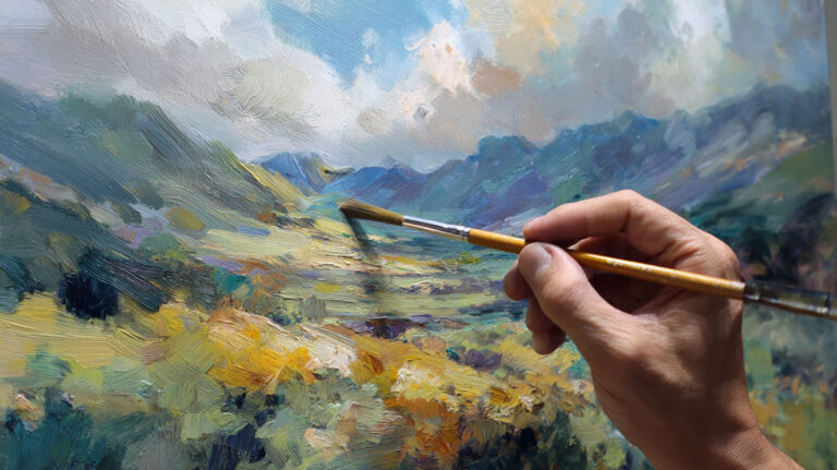
The impasto technique involves applying paint thickly enough that the surface builds real physical texture. Brush or palette knife marks stay visible. The paint appears to come out of the canvas rather than lie on it.
Wikipedia’s entry on impasto notes that Abstract Expressionists like Willem de Kooning used it heavily “motivated in part by a desire to create paintings which dramatically record the action of painting itself.” That impulse runs directly back to German Expressionism.
Chaim Soutine is probably the most extreme example. His impasto surfaces in portraits and still lifes from the 1920s are almost sculptural. The paint is applied so thickly and so urgently that it reads as a record of psychological state, not just a pictorial choice.
Practically, impasto in expressionism differs from Renaissance impasto in purpose. Earlier painters used thick paint to represent cloth folds or jewels catching light. Expressionists used it to show emotional force and process.
Gestural Mark-Making
Speed matters. A slow, careful stroke and a fast, arm-driven stroke produce completely different marks even with the same brush and paint.
Expressionist gestural painting techniques favor the latter. Working from the shoulder rather than the wrist produces longer, more physically committed marks. Holding the brush near the end rather than the ferrule reduces control and increases movement.
Die Brucke artists worked quickly by design. The Art Story notes that their studio practices “emphasized spontaneity over planning” and that “artists worked quickly, often completing paintings in single sessions to maintain emotional intensity.” That speed shows in the marks.
Van Gogh’s influence on this approach is direct. His swirling, directional strokes in “Starry Night” (1889) gave the Expressionists both a model and a permission structure for visible, emotionally charged gestural mark-making.
Palette Knife Application
The palette knife versus brush choice produces meaningfully different surfaces. A knife scrapes, smears, and compresses paint in ways a brush cannot.
For aggressive, raw surfaces, the knife is hard to beat. It creates sharp ridges, compressed areas, and a certain violence of surface that reads as emotionally honest in expressionist work.
Soutine used both heavily. The combination of thick impasto brushwork and palette knife passages in his animal carcass paintings produces surfaces that feel genuinely unstable, like the paint itself is in distress.
| Tool | Surface Quality | Emotional Register | Common Use |
|---|---|---|---|
| Wide Flat Brush | Bold, rhythmic, and directional strokes. | Energy & Urgency: Conveys a sense of rapid movement or sweeping environmental force. | Broad backgrounds, blocking in large shapes, or skies. |
| Palette Knife | Ridged, thick, and compressed “peaks.” | Aggression & Raw Force: The physical scraping and piling of paint feels visceral and heavy. | Impasto passages, sharp highlights, or rocky textures. |
| Stiff Bristle Brush | Broken, scratchy, and highly textured marks. | Tension & Disturbance: The “struggle” of the bristles against the canvas suggests unease. | Focal areas, expressive figure work, or rough surfaces. |
| End of Brush Handle | Linear, incised “scars” through wet paint. | Urgency & Rawness: A primitive, direct way to “draw” within the color. | Sgraffito details, signatures, or frantic hair/grass lines. |
Line and Contour Distortion
Line in expressionism does not describe edges. It carries psychological weight.
This shift from descriptive to expressive line is one of the clearest ways to identify expressionist technique across different artists and periods.
The Woodcut Influence on Painted Line
The most important thing to understand about expressionist line quality is where it came from. Die Brucke artists worked obsessively with woodcut printing, and that medium shaped their painting fundamentally.
MoMA notes that “printmaking, especially woodcut, proved crucial for the development of the Brucke artists’ distinctive Expressionist idiom.” The graphic techniques they developed in woodcuts “helped them clarify their reductive style in painting.”
Woodcut forces decisions. You cannot carve a gradual transition. You work in bold blocks of light and dark, with firm outlines separating them. That logic transferred directly to canvas.
Kirchner created over 2,000 woodcuts between 1905 and 1937. That volume of printmaking practice is not separate from his painting development. It built his visual vocabulary.
Contour as Emotional Signal
In academic figure drawing, a contour line describes where the body ends and space begins. In expressionist work, that function shifts. The contour line becomes a record of psychological state.
Egon Schiele’s figures demonstrate this clearly. The outlines around his figures are angular, interrupted, and often seem to pull against the forms they describe. They read as agitation rather than definition.
Practical patterns across expressionist figure work:
- Heavy, uneven outlines with varying pressure
- Angular rather than curved transitions, especially at joints
- Lines that do not close cleanly, leaving visual tension
- Deliberately simplified contours that lose anatomical detail in favor of emotional clarity
Ernst Ludwig Kirchner’s Berlin street scenes use elongated, angular figures with mask-like faces and compressed spatial depth. The distortion is not incidental. MoMA’s analysis of his “Street, Berlin” (1913) describes how he expressed the destabilizing experience of city life “through compressed space, tilting planes, and acidic colors.” The line quality is one component of a complete distortion system.
Distorted Anatomy as Expressive Tool
Elongation typically signals spiritual yearning or social exposure.
Compression suggests claustrophobia, threat, or psychological pressure.
Angular fragmentation carries urban anxiety, borrowed partly from the cubist experiments happening simultaneously in Paris, though used for different emotional ends.
Oskar Kokoschka’s portrait work shows how anatomy distortion works differently from Schiele’s. Where Schiele’s figures feel exposed and tense, Kokoschka’s subjects appear psychologically probed. The distortion reads as revelation rather than anxiety.
Both are expressionist approaches. The technique is similar. The emotional direction differs because the artist’s relationship to the subject differs.
Composition and Spatial Distortion
Expressionist composition is not about balance or harmony. It is about pressure. Every compositional decision should make the viewer feel something, usually discomfort, claustrophobia, or unease.
This runs directly against classical composition principles, which is exactly the point.
Flattened Picture Planes and Collapsed Depth
Traditional Western painting since the Renaissance used linear perspective to create the illusion of depth. Expressionists largely abandoned this. The picture plane flattens. Depth collapses. Objects and figures pile up against the surface rather than receding into it.
This creates visual pressure. Figures cannot escape into the background. There is nowhere to go.
Munch uses this deliberately. In “The Scream,” the figure is pushed to the front of the picture plane with no real depth available. The swirling background closes in rather than receding. Atmospheric perspective is replaced by atmospheric threat.
Die Brucke’s woodcut practice again shaped this. The woodcut medium naturally produces flat, compressed spatial arrangements. Translating that into oil painting meant accepting and building on flatness rather than fighting it.
Tilted Horizons and Unstable Space
A level horizon signals stability. Tilt it and the viewer’s sense of ground shifts.
Kirchner used tilted picture planes constantly in his Berlin street scenes. The street itself tips toward the viewer. Figures lean at angles that suggest instability rather than movement. Conventional perspective gets replaced by a subjective spatial logic that mirrors psychological disorientation.
Practical indicators of this approach in expressionist works:
- Horizon lines that tilt 5-15 degrees from horizontal
- Buildings that lean inward rather than standing vertical
- Figures placed at angles that suggest falling rather than standing
- Floor planes that tip upward, eliminating the sense of stable ground
This technique connects directly to how pictorial space works as an emotional tool. Stable space feels safe. Unstable space creates anxiety without depicting anything explicitly threatening.
Crowded, Claustrophobic Compositions
Expressionist compositions typically push figures toward the edges and fill the center with tension rather than air. Negative space shrinks. Figures crowd each other. No room to breathe.
This was especially true in urban subject paintings. Kirchner’s city scenes pack figures so tightly that individual identity dissolves. The crowd becomes a mass. The individual is threatened by it.
Compare this to how balance in composition typically functions. Classical balance distributes visual weight to create stability. Expressionist composition distributes it to create weight and pressure. The goal is the opposite of comfort.
Subject Matter and Figure Treatment
What expressionists chose to paint was inseparable from how they painted it. Subject and technique reinforce each other.
The figures in expressionist work are almost never neutral. They carry psychological weight as part of their design.
The Human Figure as Emotional Vehicle
The body in expressionist painting is not a physical specimen. It is a psychological document.
Egon Schiele’s nudes demonstrate this most directly. The bodies are angular, exposed, and often appear to be in states of psychological extremity rather than physical rest. The National Gallery of Art notes that Schiele “explored this in his prints” showing figures that “embody a state of mind or an emotion” rather than a physical position.
Schiele’s contorted anatomy is not anatomical error. It is deliberate. The distortion communicates internal states that a correctly rendered body could not.
Kokoschka took a different angle. His portrait subjects appear to have been painted from the inside out. What you see is less a physical likeness than a psychological reading of the sitter. The visible brushwork, the color choices around the face, and the handling of the hands all suggest what the person carries internally.
Urban Subjects and Social Commentary
Kirchner’s Berlin street scenes used the city crowd as subject matter with a specific purpose. The figures are not observed neutrally. They are distorted to communicate social anxiety, alienation, and the dehumanizing effects of modern urban life.
The prostitutes in his street paintings, angular and mask-faced against crowds of anonymous men, are painted this way deliberately. The distortion is social criticism rendered through technique. George Grosz pushed this further with more explicit political content, using expressionist figure distortion for direct satirical attack.
These choices connect to the broader painting style decisions that define expressionism. Subject matter and formal technique work together. You cannot separate what they painted from how they chose to paint it.
Masks, Faces, and Psychological Reduction
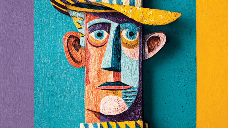
Faces in expressionist painting frequently approach the mask. Features are simplified to their most emotionally legible form. Eyes widen or hollow out. Mouths set into fixed expressions. The individual face approaches a symbol for a state of mind.
Why masks? Die Brucke artists studied African and Pacific Island art extensively at Dresden’s ethnographic museum. The directness and emotional clarity of non-Western masks gave them both technical and philosophical permission to reduce the face to its expressive core.
This mask tendency shows up across the movement. Kirchner’s angular, flattened faces. Nolde’s simplified, almost grotesque features in his religious paintings. The mask is not dehumanization. It is emotional concentration.
The result is figures that read immediately as psychological states rather than as individuals. Which is, of course, the point. Expressionism was never interested in portraiture in the traditional sense. It was interested in the inner life that the outer form might reveal.
Surface and Ground Preparation

The surface an expressionist works on is not neutral. It shapes color, texture, and energy before a single mark is made.
Most expressionist painters chose surfaces and grounds that pushed back against their paint rather than absorbing it quietly. That resistance is part of the result.
Toned Grounds and Their Effect on Color
Dark or mid-value grounds change how paint reads completely. Place the same yellow on a white ground versus a dark brown ground and you get two different yellows: one passive, one electric.
A research project on Nolde’s materials and technique, conducted between 2018 and 2022 by the Doerner Institut and the Foundation Seebüll Ada und Emil Nolde, found that Nolde used colored grounds extensively, with complex multi-level pictorial composition and a varied range of oil painting techniques across his career. His thirty-year preference for specific oil and resin-based paints was tied to the luminosity those grounds produced beneath saturated hues.
For practical purposes, a mid-toned ground (warm gray, ochre, or raw umber diluted) does two things:
- Eliminates the stark white ground that makes dark marks look heavy
- Makes bright colors read as luminous rather than flat
Wikipedia’s article on grounds in art notes that 19th-century artists like Impressionists preferred white grounds, while artists like Rembrandt used brownish tones. Expressionists, drawing on both the Rembrandt tradition and their own emotional goals, typically preferred darker grounds.
Raw and Rough Surfaces
Not every expressionist worked on smooth, fully primed canvas. Rough surface texture creates broken brushstrokes by default.
Key surface choices and their effects:
- Rough linen: Natural texture resists paint, creates irregular marks
- Board or wood panel: Firm, absorbent, holds impasto well without flexing
- Dampened watercolor paper: Nolde’s standard for his wet-on-wet work, pigments spread and bleed organically
- Partially unprimed canvas: Paint soaks into fibers in some areas, sits on top in others
Nolde’s wet-on-wet watercolor technique, documented by the University of Michigan Museum of Art, involved applying watercolor directly to dampened paper so pigments spread naturally. The result was not known until the work dried, which suited his philosophy of “collaboration with nature.”
Mixed Media and Embedded Materials
Neo-Expressionists in the 1970s and 1980s pushed surface preparation further. Georg Baselitz and Anselm Kiefer regularly embedded straw, sand, lead, and found materials into their paint layers.
This continued an impulse already present in early German Expressionism: the texture in art should carry meaning. A rough, built-up surface reads as raw and urgent. A smooth surface reads as controlled and finished.
For expressionist work, finished is usually the wrong direction.
The Role of Spontaneity and Process
In most painting traditions, process is invisible. The finished work is the thing. In expressionism, the process is part of the work.
How the paint got there, and at what speed, is a meaningful part of what the viewer experiences.
Speed as Expressive Choice
Die Brucke artists completed paintings in single sessions by design. TheArtStory documents that their studio practice “emphasized spontaneity over planning” and that artists “worked quickly, often completing paintings in single sessions to maintain emotional intensity.”
Working fast does specific things to paint:
- Wet paint mixes and bleeds at edges
- Brushwork stays loose, marks stay visible
- There is no time to second-guess or correct
The urgency shows. A painting completed in two hours looks different from a painting completed over two weeks. Both are valid. But for expressionist goals, the two-hour version usually tells the truth faster.
Minimal Underdrawing
Academic tradition: careful underdrawing, transferred sketch, planned underpainting, then color layers.
Expressionist tradition: minimal or no underdrawing, direct paint application, working from emotional state rather than a planned image.
This is not sloppiness. It is a philosophical position about where authentic mark-making comes from. A drawing planned in advance becomes a painting planned in advance. The spontaneous brushstroke carries information a planned one does not.
Some artists, including Kirchner, did use quick charcoal sketches before painting. But the sketch was a rough anchor, not a blueprint.
Visible Reworking as Part of the Surface
Expressionist paintings frequently show evidence of reworking. Paint scraped back, passages repainted, layers visible through later brushwork. This is not failure. It is part of the record.
The Doerner Institut research on Nolde’s technique found he reworked paintings “sometimes even decades after they had been finished,” with discarded sections, cuts, and overpainting all contributing to final surface qualities.
Chaim Soutine’s heavily worked surfaces operate the same way. The layering history is visible and the viewer senses time, labor, and psychological pressure embedded in the paint.
This connects directly to what alla prima wet-on-wet painting offers versus layered reworking. Each approach produces a different kind of surface honesty.
Printmaking Techniques That Influenced Expressionist Painting
How Woodcut Shaped Painted Line Quality
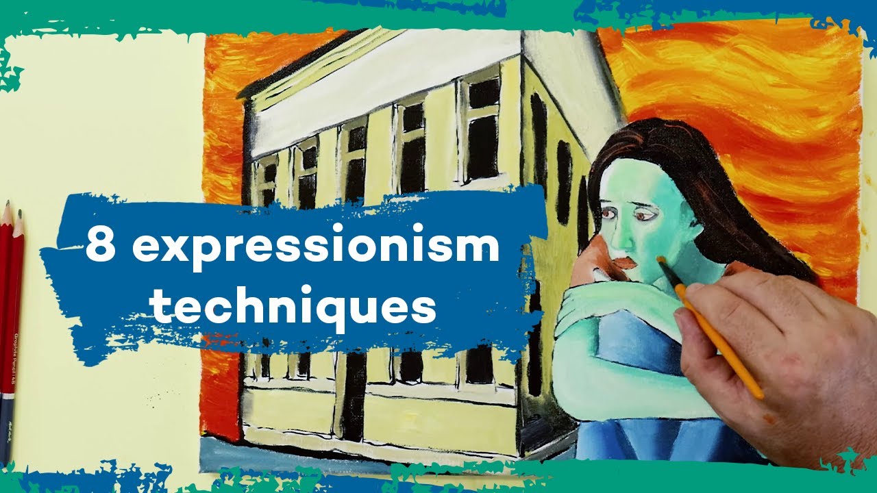
Kirchner created over 2,000 woodcuts between 1905 and 1937, according to Russell Collection’s documentation of his career. That is not a hobby. It is a primary creative practice running alongside his painting for over three decades.
MoMA’s documentation on the Brucke group states directly that woodcut “proved crucial for the development of the Brucke artists’ distinctive Expressionist idiom” and that graphic techniques “helped them clarify their reductive style in painting.” The boldness they developed in prints transferred directly to canvas.
What woodcut teaches:
- Bold, unblended contrasts of light and dark
- Heavy outlines separating areas rather than gradual transitions
- Reduction: cutting away to leave only what is necessary
- Flatness: no depth illusion, compressed picture planes
Britannica notes that Die Brucke art was “deeply influenced by the expressive simplifications of late German Gothic woodcuts and by the prints of Edvard Munch,” and that the movement “contributed to the revival of the woodcut, making it a powerful means” of artistic expression.
Reduction as a Painting Method
The woodcut logic applied to oil: instead of adding detail and complexity, take things away.
Simplify the background until it becomes a flat color plane. Reduce the face until only the most emotionally charged features remain. Eliminate gradual transitions between light and shadow in favor of hard, dark outlines.
This is the direct opposite of the glazing and layering tradition in academic oil painting, where complexity accumulates through many transparent layers. Expressionist painting strips back rather than builds up.
It connects to a broader set of choices around value in painting. High-contrast, simplified value structures read faster and hit harder than subtle tonal gradations. Woodcut teaches you this through the resistance of the medium itself.
Transfer Between Printmaking and Painting
Kirchner did not keep print and paint separate. His Berlin street scene lithographs and his Berlin street paintings from the same period share spatial logic, color structure, and figure treatment.
| Medium | Key Technique | What It Gave to Painting |
|---|---|---|
| Woodcut | Carved wood block; only the raised surface holds ink. | Graphic Power: Heavy black contours and flat, bold color planes that reject traditional shading. |
| Lithography | Drawn directly onto stone with greasy crayons. | Spontaneity: Allowed for an immediate, gestural line quality that mimics charcoal or chalk drawings. |
| Drypoint | Scratched directly into a metal plate with a needle. | Psychological Tension: The “burr” (rough edge) creates velvety, bleeding lines that suggest urgency and raw energy. |
This cross-pollination was not accidental. Die Brucke published annual print portfolios precisely to work through ideas that then appeared in their paintings. The print was a laboratory, not just a product.
Abstract Expressionism as a Technical Evolution

Abstract Expressionism did not appear from nowhere in 1940s New York. It grew directly from German Expressionist technique, filtered through surrealist automatism and American scale.
What changed technically was significant. What carried over was equally significant.
What Carried Over from German Expressionism

The core technical commitments transferred intact:
- Gestural mark-making as emotional record
- Spontaneous process valued over planned execution
- Visible brushwork treated as part of the meaning
- Psychological state driving formal decisions
Wikipedia documents that the term “abstract expressionism” was first used in Germany in 1919 in the magazine Der Sturm, in reference to German Expressionism. Alfred Barr then used it in 1929 to describe Kandinsky’s paintings. The connection is not retrospective. It was acknowledged from the start.
Willem de Kooning and Jackson Pollock both arrived at their mature styles after direct exposure to European Expressionist and Surrealist work. The Hirshhorn Museum’s materials research confirms Pollock’s shift from traditional brushwork toward his drip technique developed progressively from 1943 onward, with synthetic resin-based commercial paints becoming central to his process by 1949.
New Techniques: Action Painting and Drip
Pollock’s drip method was described by art critic Harold Rosenberg in 1952, who coined the term “action painting” to describe it. The canvas, laid flat on the floor, became what Pollock called an “arena” for physical action rather than a vertical surface for image-making.
Technically, the method involved:
- Liquid house paint poured, dripped, and flung from sticks and hardened brushes
- The artist moving around all four sides of the unstretched canvas
- Full body engagement, not just hand and wrist
Britannica notes that Pollock first used the drip process in 1947, “often alternating weeks of painting with weeks of contemplating before he finished a canvas.” The spontaneity was real but not uncontrolled. He described maintaining control even while acknowledging chance effects.
For a deeper look at how this physical process worked, the Jackson Pollock page covers his method and materials in detail.
Key Technical Differences: German vs American Expressionism

| Aspect | German Expressionism | Abstract Expressionism |
|---|---|---|
| Subject Matter | Representation: Distorted figures, jagged urban scenes, and recognizable landscapes. | Non-Objective: Subject matter is eliminated entirely; the painting is only about color, line, and form. |
| Scale | Easel-Sized: Intended for intimate viewing in homes or galleries. | Monumental: Massive, room-scale canvases designed to envelop the viewer’s entire field of vision. |
| Paint Application | Traditional Tools: Heavy use of brushes, palette knives, and thick impasto. | Action Painting: Radical methods like dripping, pouring, and staining (often with the canvas on the floor). |
| Color Intent | Symbolic: Colors are coded to represent specific emotions (e.g., yellow for the “feminine,” blue for the “spiritual”). | Direct Sensation: Focus on “Color Fields” and atmospheric effects to create a raw, immediate sensory experience. |
Mark Rothko’s color field paintings took the emotional weight of color, which Kandinsky had theorized and the German Expressionists had applied to figures, and stripped away the figure entirely. Rothko made color itself carry the full emotional load, at a scale that surrounded the viewer rather than being viewed from across a room.
Willem de Kooning kept the figure. His Women series of the 1950s retained the distorted figure and aggressive gestural brushwork of German Expressionism but pushed the paint handling into physical extremity that had no clear precedent in earlier expressionist work.
Neo-Expressionism and the Return of the Figure
By the late 1970s, both the figure and the emotional directness of early expressionism came back hard. Neo-Expressionism emerged simultaneously in Germany and the United States, rejecting Minimalism and Conceptual art in favor of raw, gestural, emotionally charged painting.
Georg Baselitz, Anselm Kiefer, and Julian Schnabel in the 1980s revived impasto surfaces, visible process, and large-scale figure work. The rough handling of materials, including embedded straw and lead in Kiefer’s case, extended the expressionist logic of surface-as-meaning into new territory.
Jean-Michel Basquiat brought the same energy into a different context. Gallery 1066 Fine Art documents that Basquiat’s 2021 auction totals reached $439.6 million, with a 2023 Christie’s sale of a 1983 work reaching $58 million. The market continued to validate work built on expressionist technique, combining gestural brushwork, symbolic imagery, and psychological urgency in a contemporary urban frame.
The techniques that defined Die Brucke in 1905, non-naturalistic color, gestural mark-making, distorted form, raw paint surface, are still producing significant work and significant market values more than a century later. That is not coincidence. It is the durability of a method built on something that does not go away: the need to show how things feel rather than how they look. And in that gap between appearance and feeling, expressionist painting technique still works.
FAQ on Expressionism Painting Techniques
What techniques did Expressionist painters use?
Expressionists used impasto paint application, gestural brushwork, non-naturalistic color, contour distortion, and flattened picture planes. Every technical choice prioritized emotional communication over accurate representation. Die Brucke artists also drew heavily from woodcut printmaking, which shaped their bold, reductive painting style.
What is the most defining characteristic of Expressionist painting?
Psychological distortion. Expressionists deliberately warped anatomy, color, and space to show inner emotional states rather than external reality. Color symbolism was central: blue signaled sorrow, red carried aggression, and clashing hues created psychological unease rather than visual harmony.
How did Expressionists use color differently from other movements?
Color was symbolic, not descriptive. Expressionists chose hues for emotional impact, rejecting naturalistic color entirely. Wassily Kandinsky theorized that specific colors carry inherent psychological weight. Non-naturalistic color applied to dark grounds produced luminous, emotionally charged surfaces unlike anything in Impressionism.
What is impasto and why did Expressionists use it?
Impasto is thick paint application that leaves visible texture on the surface. Expressionists used it to make the physical act of painting visible. The viewer senses the speed and pressure behind each stroke, which adds urgency and emotional weight to the finished work.
How did woodcut printmaking influence Expressionist painting?
Die Brucke artists worked extensively in woodcut, which taught them bold outlines, flat color planes, and compositional reduction. MoMA documents that printmaking “proved crucial” for their Expressionist style. That graphic boldness transferred directly into their oil painting, producing the heavy contours and compressed depth typical of German Expressionism.
What is the difference between German Expressionism and Abstract Expressionism?
German Expressionism distorted figures and used symbolic color. Abstract Expressionism eliminated the figure entirely. Scale expanded dramatically. Techniques shifted from brushwork to drip, pour, and action painting. The emotional intent carried over; the subject matter and physical method changed significantly.
How did Expressionists distort the human figure?
Through elongation, angular fragmentation, and mask-like facial reduction. Egon Schiele used contorted anatomy to communicate psychological tension. Oskar Kokoschka distorted portraits to reveal inner character. Distorted figures were not anatomical errors. They were deliberate emotional tools, borrowing visual logic from African and Pacific Island art.
What role did spontaneity play in Expressionist technique?
A central one. Die Brucke artists completed paintings in single sessions deliberately, maintaining emotional intensity through speed. Minimal underdrawing kept marks honest. Spontaneous paint application produced brushwork that records psychological state directly, which careful, planned execution cannot replicate.
How did Expressionists approach composition?
They rejected classical balance entirely. Flattened picture planes, tilted horizons, and crowded figures created visual pressure and claustrophobia. Spatial distortion replaced linear perspective. Kirchner’s Berlin street scenes deliberately compressed space and tipped the ground plane to mirror urban anxiety and psychological disorientation.
Which artists best demonstrate Expressionist painting techniques?
Ernst Ludwig Kirchner for gestural line and urban distortion. Emil Nolde for color symbolism and wet-on-wet watercolor. Egon Schiele for contour distortion. Chaim Soutine for raw impasto. Jackson Pollock and Willem de Kooning for the Abstract Expressionist evolution of these same core technical principles.
Conclusion
This conclusion is for an article presenting expressionism painting techniques as a complete system, not a collection of stylistic accidents.
From Kirchner’s woodcut-driven contour lines to Soutine’s raw impasto surfaces, every method connects back to the same premise: inner psychological states are a legitimate subject for visual art.
The spontaneous paint application, spatial distortion, and non-naturalistic color that defined Die Brucke in 1905 still run through Neo-Expressionism, Abstract Expressionism, and contemporary gestural painting today.
Technique and emotion are not separate here. They are the same thing.
Whether you are studying Schiele’s distorted figures, Nolde’s symbolic color, or Pollock’s action painting, the underlying logic holds. Show how it feels. Let the marks prove it.