Every painting you have ever loved got space and balance right. Maybe you did not notice it consciously, but your brain did. Understanding what is space and balance in art changes how you see composition, because these two forces control where the viewer looks, how long they stay, and whether the whole piece feels resolved or restless.
Space covers the areas within, around, and between subjects. Balance is the distribution of visual weight across the picture plane. Together, they form the foundation of every strong composition.
This guide breaks down both concepts, from positive and negative space to symmetrical and asymmetrical balance, with real examples from artists like Leonardo da Vinci, Edgar Degas, and Jackson Pollock. You will also learn practical methods for improving spatial awareness in your own work.
What Is Space in Art
Space is the area within, around, and between subjects in an artwork. It is one of the seven core elements of composition, and it controls how a viewer reads every part of a piece.
Think of it this way. Every mark on a canvas occupies space, and every unmarked area occupies space too. Both matter equally. The problem most beginners run into is treating empty areas like leftovers, something that just happened because they ran out of things to paint. That is backwards.
Space in visual art splits into two categories, and understanding both is where things actually start to click.
Positive and Negative Space
Positive space is the area taken up by the main subject or objects. Negative space is everything else, the open or empty area surrounding and between those subjects.
Neither one is more important than the other. A well-handled negative shape can carry just as much visual information as the subject itself.
Rubin’s Vase is the classic example here. Look at the black areas, you see two faces in profile. Look at the white area, you see a vase. The figure-ground relationship flips depending on which space your brain treats as the subject. That single optical illusion captures why negative space is not “nothing.” It is an active part of the image.
Henry Moore built his entire sculptural practice around this idea. His bronze figures have holes and voids running through them. Those openings are not missing material. They are designed space in visual art that carries meaning and directs the viewer’s eye through the sculpture.
The Japanese concept of ma takes this further. Ma treats the interval between objects as a presence, not an absence. It shaped centuries of ink painting, garden design, and architecture across East Asia.
How Artists Create Depth Through Space
On a flat surface, space has to be faked. Artists use specific techniques to create the illusion of three-dimensional depth on a two-dimensional picture plane.
| Technique | How It Works | Psychological Effect | Common Example |
| Overlapping | Objects in front partially block those behind. | Immediate sense of Order & Layering | Still life arrangements |
| Size Variation | Smaller objects are perceived as being farther away. | Sense of Scale & Distance | Landscape foregrounds vs. backgrounds |
| Linear Perspective | Parallel lines converge at a Vanishing Point. | Mathematical, “Infinite” depth | Architectural drawings, street scenes |
| Atmospheric Perspective | Distant objects lose color, contrast, and detail. | Sense of Air & Environment | Mountain ranges in Impressionist paintings |
| Vertical Placement | Objects higher on the page appear farther away. | Symbolic or “Aerial” depth | Classical Chinese landscape scrolls |
These are not just tricks. They are how painters from Leonardo da Vinci to Claude Monet gave their flat canvases a third dimension.
A 2024 eye-tracking study published in the Journal of Eye Movement Research found that compositional techniques like leading lines significantly influence where viewers fixate their attention and for how long, confirming that spatial arrangement directly controls the viewing experience.
What Is Balance in Art

Balance is the distribution of visual weight across a composition. It determines whether a piece feels stable, unsettled, or somewhere between.
Visual weight is not actual weight. It is the sense that certain elements demand more attention than others based on their size, color, texture, position, or level of detail. A small, bright red circle on one side of a painting can visually “weigh” as much as a large grey rectangle on the other.
Rudolf Arnheim explored this in depth in Art and Visual Perception (1954), applying Gestalt psychology to artistic composition. His argument was that visual elements produce real perceptual forces, tensions that the viewer’s brain processes almost like physical weight on a scale. That book has been translated into fourteen languages and remains a foundational text in art psychology.
Balance is one of the core principles of design, sitting alongside unity, variety, emphasis, and rhythm. But balance is the one you feel first. Before you notice color choices or brushwork, your brain already knows whether a composition feels right or off.
Types of Balance in Composition

Not all balance looks the same. Artists choose between several distinct types depending on the mood, message, and structure they are building. Each one creates a completely different experience for the viewer.
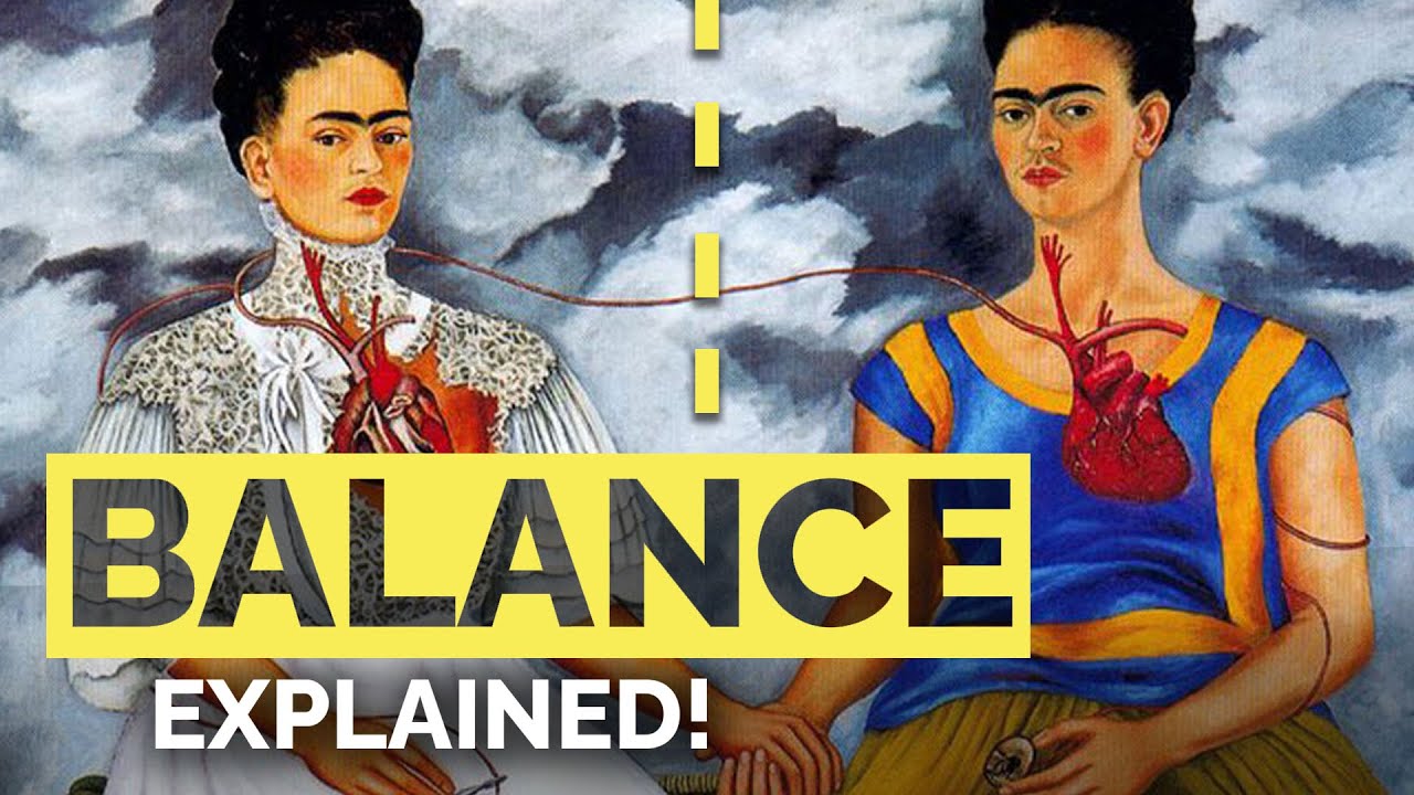
Symmetrical Balance
Also called formal balance. Both sides of a central axis mirror each other in visual weight.
This is the oldest and most psychologically grounding form of compositional balance. It shows up in architecture, religious art, and official portraiture because it communicates order, authority, and permanence.
Leonardo da Vinci’s “The Last Supper” is the textbook case. Christ sits at the center, and the apostles fan out on either side in roughly equal groupings. The symmetry reinforces the gravity and stillness of the scene. Renaissance painters used this approach constantly for altarpieces and frescos.
The downside? Symmetry can feel static. Predictable, even. That is exactly why many artists deliberately break it.
Asymmetrical Balance
A 2024 eye-tracking study by Trawinski et al., published in Scientific Reports, showed that social context and compositional factors both shape where viewers look and how they judge aesthetic quality in figurative paintings. Asymmetrical balance is one of the strongest tools for directing that gaze.
How it works: unequal elements on each side of the composition still achieve equilibrium through careful contrast. A large, light-colored area might balance against a small, dark, highly detailed element.
Why artists prefer it: it feels more natural, more alive. Real life is not symmetrical, and asymmetrical compositions mirror that lived experience.
Edgar Degas was a master of this. His ballet dancers are almost never centered. Figures get cropped at the edge. Empty floor space takes up half the canvas while a cluster of dancers fills the other half. It looks casual, almost accidental, but the visual weight balances out perfectly.
Radial and Crystallographic Balance
Radial balance: elements radiate outward from a central point. Think of rose windows in Gothic cathedrals, mandalas, or the circular compositions of certain Islamic tile patterns. The eye is pulled toward the center, then follows the radiating forms outward.
Crystallographic balance (also called allover balance): visual weight is spread evenly across the entire surface with no single focal point. Jackson Pollock’s drip paintings are the go-to example. Paint covers the canvas edge to edge with roughly equal density. Your eye does not land on one spot. It wanders.
Yayoi Kusama’s infinity dot patterns use crystallographic balance too. Thousands of polka dots of similar size distributed across a surface. No hierarchy, no center, just an even field of visual activity.
| Balance Type | Visual Effect | Psychological Effect | Classic Example |
| Symmetrical | Stable, formal, grounded | Order & Divinity | Da Vinci’s “The Last Supper” |
| Asymmetrical | Dynamic, natural, engaging | Movement & Realism | Degas’ ballet compositions |
| Radial | Focused, expanding, meditative | Unity & Infinity | Gothic rose windows, Mandalas |
| Crystallographic | Even, immersive, no hierarchy | Overload & Texture | Pollock’s drip paintings |
How Space and Balance Work Together

Space and balance are not separate tools. They are two sides of the same coin, and you cannot adjust one without affecting the other.
Negative space acts as a counterweight. A large empty area on one side of a painting can balance a dense cluster of objects on the other. The “emptiness” has visual weight precisely because your brain recognizes it as intentional.
Piet Mondrian understood this better than most. His grid compositions split the canvas into rectangles of primary color separated by black lines and white space. Move one red block, and the entire balance shifts. Make a white rectangle larger, and it suddenly “weighs” more because it dominates the visual field. Every element exists in constant tension with every other element.
Here is what a lot of tutorials skip. The relationship between space and balance is not just about arranging shapes. It directly shapes how much time a viewer spends with a piece and where their attention goes.
Xerox ran an interesting experiment in a completely different context (web design, not painting) that proves this point. By replacing cluttered content around key buttons with white space, they saw a 20% improvement in engagement and a 33% improvement in follow-through actions, according to UXPin. The lesson applies directly to pictorial composition. Give the eye room to breathe, and the viewer stays longer and sees more.
GPremier Solutions research found that increasing white space around focal elements by 50% improved click-through rates by 42% across 15 tested sites. Transfer that principle to a painting, and you understand why Minimalist artists like Mark Rothko could hold a viewer’s attention with nothing but two or three color blocks floating in space.
Space and Balance in Two-Dimensional vs. Three-Dimensional Art
The rules change based on whether you are working on a flat surface or in physical space. Both dimensions use space and balance, but the mechanics are different.
Two-Dimensional Space
In painting, drawing, and photography, space is always implied. There is no actual depth on a canvas. Everything is an illusion built through perspective, overlapping, value shifts, and color contrast.
Balance in 2D art depends entirely on the arrangement of elements within the picture plane. Artists working in oil painting or watercolor manage this through careful placement, using thumbnail sketches and compositional grids before committing paint to surface.
Katsushika Hokusai’s “The Great Wave off Kanagawa” is a masterclass in 2D spatial balance. The massive wave fills two-thirds of the composition, but Mount Fuji, tiny and distant, balances the entire image through its placement and the negative space surrounding it. The pictorial space funnels your eye from the towering wave to the small mountain, and it works because both elements have roughly equal visual pull despite wildly different sizes.
Three-Dimensional Space
Sculpture and installation art operate differently. Space is literal. You walk around it. Gravity matters. An unbalanced sculpture literally falls over.
Alexander Calder’s mobiles are pure three-dimensional balance made visible. Metal shapes of different sizes hang from wire arms, and the entire structure stays level because Calder calculated the physical weight distribution with precision. But the visual balance matters just as much. Larger shapes hang closer to the fulcrum while smaller shapes extend further out, creating a visual rhythm that shifts as the mobile moves in air currents.
Frank Lloyd Wright’s Fallingwater demonstrates spatial balance in architecture. The cantilevered terraces project outward over a waterfall, creating a tension between the horizontal concrete slabs and the vertical stone chimney. The building balances mass against open air.
The Art Basel and UBS Global Art Market Report 2025 noted that global art sales reached an estimated $57.5 billion in 2024, with the number of transactions growing by 3% to 40.5 million. Paintings remained the most purchased medium across all price segments. That includes both two-dimensional and three-dimensional work, but flat painting continues to dominate, which means most artists are working within the constraints (and freedoms) of implied space rather than actual space.
Visual Weight and What Controls It
Visual weight is the thing that makes balance possible. Without it, you are just placing objects at random and hoping for the best.
But visual weight is tricky because it is not one thing. It is the combined result of multiple properties interacting at once. A small element can outweigh a large one if the right factors line up.
Color and Value
Dark elements feel heavier than light ones. A black shape on a white background immediately draws the eye and “weighs” more than a grey shape of the same size. Arnheim noted in Art and Visual Perception that a black area must be physically larger than a white one to achieve visual equilibrium.
Saturated, warm colors (reds, oranges) also carry more visual weight than desaturated, cool colors (pale blues, greys). Color theory is not just about aesthetics. It is a balancing tool.
Henri Matisse used this constantly. In his Fauvist work, a patch of vivid red or orange could anchor an entire composition even when it occupied a small fraction of the canvas. The intensity of the color gave it disproportionate visual pull.
Size, Texture, and Isolation
Bigger objects carry more weight. Obviously. But here is where it gets interesting.
A single isolated object in a field of open space draws far more attention than the same object surrounded by other elements. Isolation amplifies visual weight. This is why a lone figure in a landscape painting often feels more powerful than a crowded street scene, even though the crowded scene contains more visual information.
Texture density matters too. A rough, detailed surface reads as heavier than a smooth, flat one. Impasto brushwork (thick, raised paint) creates a physical texture that increases visual weight. Vincent van Gogh’s swirling, textured skies carry enormous visual mass, which is partly why his compositions hold together even when the subject matter is simple.
Position on the Picture Plane
Where an element sits within the frame changes its weight. Elements placed near the edges or corners of a composition pull the viewer’s eye outward, creating tension. Elements placed at the center feel settled.
There is a reason the rule of thirds works. Placing key elements at the intersection points of a 3×3 grid creates visual movement across the composition rather than letting everything collapse into the center.
According to Nielsen Norman Group research, 80% of user attention goes to the left side of a web page. While that specific stat applies to reading patterns on screens, the broader principle holds in visual art, especially for cultures that read left to right. Compositions that place heavier elements on the left and lighter elements on the right often feel more natural to Western viewers. Visual hierarchy is shaped by culture as much as by design.
Common Mistakes Artists Make with Space and Balance
Most composition problems come down to space or balance being handled carelessly. The tricky part is that these mistakes often feel invisible until someone points them out.
Took me a while to understand why some paintings just “feel wrong” even when the drawing itself is accurate. Nine times out of ten, the issue is spatial.
Overcrowding the Composition
Filling every inch of the canvas is the single most common problem, especially among beginners. There is no breathing room, no rest for the eye, and the viewer’s brain gets overwhelmed trying to process everything at once.
GoodFirm research shows that 84.6% of designers consider cluttered layouts a top error, and while that stat comes from web design, the principle transfers directly to painting and drawing.
The fix is simple but hard to accept. Leave space empty on purpose. That empty area is doing work even when it looks like nothing is there.
Centering Everything
Dead center placement kills energy. When every element sits in the exact middle of the canvas, the composition becomes static and predictable. There is no movement, no tension, no reason for the eye to explore.
Artists Network specifically flags this as a frequent beginner habit. Cropping elements off the edges and allowing unequal negative space around subjects creates far more visual interest than locking everything to the center axis.
Ignoring the Edges
Where objects meet the frame matters more than most people realize.
- Elements that barely touch an edge (called tangencies) create awkward visual tension
- Objects that just graze the border look accidental, not intentional
- Either let objects overlap the edge confidently or keep them clearly away from it
Degas cropped figures aggressively at the canvas edges. It looked bold because it was decisive. A subject that barely clips the frame looks like a mistake.
Treating Negative Space as Leftover
This is the root cause of most space-related issues. If you plan your subjects first and let negative space fill in whatever is left, the composition will feel unintentional.
The better approach: design the negative space at the same time you design the positive space. Sketch both as shapes with their own character. The open areas between objects should form interesting, varied shapes, not awkward slivers or uniform gaps.
How to Practice Space and Balance as a Beginner
Reading about compositional balance only gets you so far. At some point you have to put things on paper and see what happens.
A 2023 Future Market Insights survey found that roughly 32% of artists worldwide now use digital tools for their work. That means most artists are still working traditionally, or splitting time between both. Either way, these practice methods work across painting mediums.
Thumbnail Sketching
Small, fast, disposable. That is the entire point.
A thumbnail sketch is a rough compositional layout, usually no bigger than a few inches. You are not drawing detail. You are testing where masses of dark, light, and empty space go before committing to a full-size piece.
Spend 15 minutes doing five or six different thumbnail arrangements of the same subject. You will see which one has the strongest balance almost immediately. Sketching before painting is the single most reliable way to avoid compositional mistakes.
Squinting and the Rule of Thirds
Squinting at your work (or at a reference) strips away detail and reveals the underlying distribution of visual weight. If one side of the composition looks noticeably heavier than the other when squinted, the balance is off.
| Practice Method | What It Reveals (The Secret) | Time Needed | Immediate Benefit |
| Thumbnail Sketches | Mass distribution and spatial layout | 2–3 min each | “Fails fast” before committing hours. |
| Squinting | Value balance and weight distribution | Instant | Removes detail to see the “Big Shapes.” |
| Rule of Thirds Overlay | Focal point placement and asymmetry | 1 min | Verifies if the “Golden Ratio” is working. |
| Tracing Master Works | How professionals handled space | 15–20 min | Teaches “Muscle Memory” for layout. |
The rule of thirds is a starting framework, not a law. Place key elements at the intersection points of a 3×3 grid. It nudges you toward asymmetrical balance, which is almost always more engaging than dead-center symmetry.
Studying Master Compositions
Pick a painting you admire. Trace just the major shapes, ignoring all the detail. What you will see is the skeleton of the composition, the underlying structure of positive and negative space.
Paul Cezanne’s still life arrangements are excellent for this exercise. He constantly adjusted the spatial relationships between objects, tilting tabletops and shifting perspective to get the balance he wanted.
Digital tools make this even easier. Procreate, which has over 15 million users worldwide according to World Metrics data, includes grid overlays and reference layers that let you diagram compositions directly on your screen.
Space and Balance in Graphic Design and Digital Art

Everything covered so far about traditional art applies directly to screens. The vocabulary is different (designers say “white space” instead of “negative space”), but the underlying principles are identical.
The digital art software market was valued at $3.4 billion in 2024 and is projected to reach $7.1 billion by 2033, according to Verified Market Reports. That growth reflects how many creatives now work across both traditional and digital surfaces. Understanding spatial balance is not optional in either context.
White Space in Web and UI Design
White space is the direct digital equivalent of negative space in painting. Designers use it to separate content blocks, direct attention to key actions, and prevent cognitive overload.
Apple’s product pages are the most cited example. Their layouts feature massive amounts of white space surrounding product images. The emptiness is the design. It forces your eye onto the product and nothing else.
Forrester Research found that a well-designed user interface can boost conversion rates by up to 200%. White space is a huge part of what makes those interfaces work, because it reduces the number of elements competing for attention at any given moment.
Grid Systems as Balance Tools
Josef Muller-Brockmann’s Swiss grid system is the bridge between fine art composition and modern layout design. His 1961 book Grid Systems in Graphic Design codified the idea that structured spatial relationships produce cleaner, more balanced visual communication.
Most modern websites run on a 12-column grid. This structure allows designers to divide layouts into halves, thirds, or fourths while maintaining consistent spacing, the same proportional logic that Renaissance painters used when laying out frescos.
The Constructivist and De Stijl movements influenced this approach. Mondrian’s grid paintings were not just art. They were visual arguments about how structure and open space could coexist, and they directly shaped the International Typographic Style that modern UI design grew out of.
Balance in Typography and Page Layout
Text blocks carry visual weight just like painted shapes do. A dense paragraph “weighs” more than a short one. A bold headline pulls the eye harder than body copy.
- Micro white space: gaps between letters, lines, and paragraphs that affect readability
- Macro white space: margins, gutters, and the space between major content sections
The Interaction Design Foundation notes that marginal white space around paragraphs directly affects reading speed and comprehension. Too little space and readers slow down. Too much and elements feel disconnected.
The Bauhaus school explored these exact issues in the 1920s and 1930s. Wassily Kandinsky taught courses on the relationship between form, color, and spatial arrangement, ideas that fed directly into graphic design as a profession.
Why Space and Balance Affect How People Experience Art
There is actual psychology behind why balanced compositions feel satisfying and imbalanced ones create tension. Your brain does not just passively receive visual information. It actively organizes it.
Gestalt Principles and Spatial Perception
German psychologists Max Wertheimer, Kurt Koffka, and Wolfgang Kohler developed the Gestalt principles in the 1920s. These describe how the brain groups visual elements into coherent patterns.
The core principles that connect directly to space and balance:
- Figure-ground: the brain separates objects (figure) from surrounding space (ground)
- Proximity: elements placed close together are perceived as a group
- Closure: the brain completes incomplete shapes by filling in missing information
The Interaction Design Foundation describes these principles as mental shortcuts that explain how the whole is different from the sum of its parts. When an artist arranges elements with deliberate spacing, the viewer’s brain automatically reads those spatial relationships as meaningful.
Balanced vs. Unbalanced Compositions
A 2024 eye-tracking study published in the Journal of Eye Movement Research (Chuang et al.) found that Gestalt-aligned compositions significantly influenced fixation patterns. Viewers focused more quickly and spent more time on well-organized images, with closed compositions producing longer fixation durations and more concentrated gaze distribution.
Balanced compositions feel resolved and complete. The viewer’s eye can move through the piece without getting stuck or falling off the edge.
Unbalanced compositions create tension, restlessness, or unease. Sometimes that is exactly the point. Expressionist painters like Francisco Goya used deliberately unbalanced compositions to mirror emotional turmoil.
Neither approach is inherently better. The question is always whether the balance (or lack of it) serves the work.
Cultural Differences in Spatial Reading
How viewers scan a composition depends partly on their reading direction. Western audiences (left-to-right readers) tend to enter an image from the left side. Arabic and Hebrew readers scan from right to left.
Nielsen Norman Group data shows that 80% of attention goes to the left side of a web page for Western users. That same bias affects how people experience paintings.
| Reading Direction | Entry Point | Implications for Balance |
| Left to right (English, French) | Left side | Heavier elements on the left feel natural |
| Right to left (Arabic, Hebrew) | Right side | Mirror the above for these audiences |
| Top to bottom (Traditional Chinese) | Upper area | Vertical balance becomes more critical |
Pablo Picasso and other Cubist painters disrupted these conventions by fragmenting the picture plane entirely, forcing viewers to abandon their default scanning patterns and engage with space in new ways.
Different painting styles handle this tension between cultural expectation and compositional balance differently. Abstract work tends to ignore reading direction altogether, while Realism often leans into it to ground the viewer in a recognizable visual flow.
FAQ on What Is Space And Balance In Art
What is space in art?
Space is the area within, around, and between objects in an artwork. It includes both positive space (occupied by subjects) and negative space (the open areas surrounding them). Artists use space to create depth, direct attention, and structure a composition.
What is balance in art?
Balance is the distribution of visual weight across a composition. It determines whether a piece feels stable or unsettled. Visual weight comes from color, size, texture, and position. Balance is one of the core principles of design alongside unity and emphasis.
What are the four types of balance in art?
The four types are symmetrical (formal, mirrored), asymmetrical (informal, unequal but balanced), radial (elements radiating from a center point), and crystallographic (even distribution with no focal point). Each creates a different visual experience and emotional response.
What is the difference between positive and negative space?
Positive space is where the main subject sits. Negative space is everything else, the open or empty areas around and between subjects. Both carry visual weight. Well-designed negative space is intentional, not leftover.
Why is balance important in art composition?
Balance controls whether a viewer feels comfortable or uneasy when looking at a piece. A balanced composition guides the eye smoothly. An unbalanced one creates tension. Artists choose either approach deliberately to match the mood they want.
How do artists create the illusion of space on a flat surface?
Artists use overlapping, size variation, linear perspective, atmospheric perspective, and vertical placement. These techniques trick the eye into seeing three-dimensional depth on a two-dimensional surface. Renaissance painters refined most of these methods.
What is asymmetrical balance and why do artists prefer it?
Asymmetrical balance uses unequal elements that still achieve visual equilibrium through contrast. A small dark shape can balance a large light area. Artists prefer it because it feels more natural and dynamic than symmetrical arrangements.
How does negative space affect a painting?
Negative space gives the viewer’s eye room to rest. It acts as a counterweight to filled areas, controls pacing, and prevents overcrowding. Treating empty areas as designed elements rather than leftovers produces stronger compositions.
What is visual weight in art?
Visual weight is the sense that certain elements demand more attention than others. It depends on color intensity, size, texture, isolation, and position on the picture plane. Dark, saturated, or textured elements typically carry more visual weight.
How do space and balance apply to graphic design?
Graphic designers use white space (negative space) and grid systems to organize layouts. The same spatial balance principles from painting apply directly. Proper spacing improves readability, directs focus, and creates visual hierarchy across digital interfaces.
Conclusion
Understanding what is space and balance in art comes down to one thing. Every element you place on a surface affects every other element. The visual weight of color, size, texture, and position all interact to create equilibrium or tension.
Positive and negative space are not separate concerns. They are two halves of the same compositional decision. Design both at the same time.
Whether you are working in acrylic painting, Surrealism, or digital layout, the spatial principles stay consistent. Symmetrical and asymmetrical balance both work. The choice depends on what you want the viewer to feel.
Start with thumbnail sketches. Study how masters like Georges Seurat and Paul Gauguin handled spatial relationships. Then apply those observations to your own compositions.
Good balance is invisible. Bad balance is the first thing you notice.