A painting where every shape, color, and line looks the same isn’t art. It’s wallpaper. So what is variety in art, and why does it matter so much to how we experience visual work?
Variety is one of the core principles of design that keeps a composition alive. It’s the reason your eye moves through a painting instead of bouncing off it. Without variety, even technically skilled work falls flat.
This article breaks down how variety functions across different visual elements, art movements, and applied design. You’ll see how artists from the Baroque period to Pop Art used it, where it goes wrong, and how to practice it in your own creative process.
What is Variety in Art

Variety in art is the use of different visual elements within a single composition to create interest and keep the viewer engaged.
It is one of the core principles of design, sitting alongside unity, balance, emphasis, and rhythm. Without variety, artwork risks becoming flat and monotonous. Without its counterparts, variety turns into visual chaos.
Think of it this way. A painting where every shape is the same size, every line runs the same direction, and every color sits at the same intensity has no variety. It just… stops being interesting. Your eye hits it and moves on.
A 2021 study from Johns Hopkins University found that people automatically dwell longer on visually complex objects compared to simple ones, even when the task at hand didn’t require it. The researchers called it “perceptual curiosity.” The brain is wired to spend more time with visual complexity.
That’s what variety does in art. It gives the brain something to chew on.
Variety as a Principle of Design
Variety is not random. That’s the part most people get wrong at first.
Controlled diversity is the goal. An artist introduces differences in texture, form, color, and scale to keep the viewer’s attention moving through the piece. But those differences still serve the overall work.
According to the Art of Education University’s 2023 survey, 90% of art teachers reported being most comfortable teaching two-dimensional mediums like painting and drawing. Variety as a principle shows up heavily in these mediums because the artist controls every element on a flat surface.
Juxtaposition is the mechanism. Straight lines placed next to curved ones. Organic shapes among geometric ones. Bright colors beside dull ones. Each contrast creates a small moment of visual surprise that keeps attention alive.
How Variety Differs from Randomness
Here’s where beginners tend to struggle.
Throwing a dozen unrelated elements onto a canvas isn’t variety. It’s just mess. Variety requires intent. Every differing element needs to serve a purpose within the larger compositional structure.
| Feature | Variety (The Tool) | Randomness (The Chaos) |
| Connection | Different elements with a shared purpose | Different elements with no connection |
| Psychological Effect | Creates visual interest and curiosity | Creates visual confusion and fatigue |
| Relationship to Unity | Works with unity to add flavor | Works against unity to break the piece |
| Eye Movement | Guides the viewer’s eye strategically | Scatters the viewer’s eye aimlessly |
The difference is almost always about whether the artist had a reason for each choice. Jackson Pollock‘s drip paintings look chaotic, but they actually contain controlled variation in line weight, density, and color layering. There’s a logic under the surface.
How Variety Works with Unity in Art

Unity and variety are opposites that need each other.
Unity ties everything together. Variety pulls things apart just enough to keep it interesting. Get the balance wrong in either direction and the piece falls apart. Too much unity? Boring. Too much variety? Incoherent.
The Art Basel and UBS Art Market Report 2024 found that global art market transaction volume grew by 3% in 2024, even as total sales value declined 12%. The growth came from lower price segments and emerging artists. Collectors are clearly drawn to diverse artistic styles, but they still want work that holds together as a complete piece.
The Balance Between Unity and Variety

Unity-dominant work: Piet Mondrian‘s grid paintings use strict geometric order. Variety enters through his color choices (red, blue, yellow against white and black) and the different sizes of his rectangular sections. Small moves. Big impact.
Variety-dominant work: Wassily Kandinsky‘s abstract compositions explode with different shapes, colors, and lines. But he holds them together through recurring motifs and a shared sense of movement.
Most successful artwork lives somewhere between these two poles. The sweet spot depends on what the artist is trying to communicate. Took me a while to appreciate that there’s no fixed formula here. It shifts based on subject matter, style, and personal intent.
Why Too Much Unity Fails
A composition that repeats the same element without variation becomes wallpaper.
The human eye is wired to detect differences. When everything is the same, there’s nothing for the brain to latch onto. Research published in Cognitive Science (Sun and Firestone, 2021) showed that visually complex stimuli draw automatic attention and trigger what researchers described as exploratory engagement. Sameness doesn’t trigger that response.
Minimalism is an interesting test case. Artists like Frank Stella deliberately reduced variety, but even his early stripe paintings contained subtle shifts in color value and edge quality. Total uniformity isn’t something the brain naturally wants to sit with.
Visual Elements That Create Variety
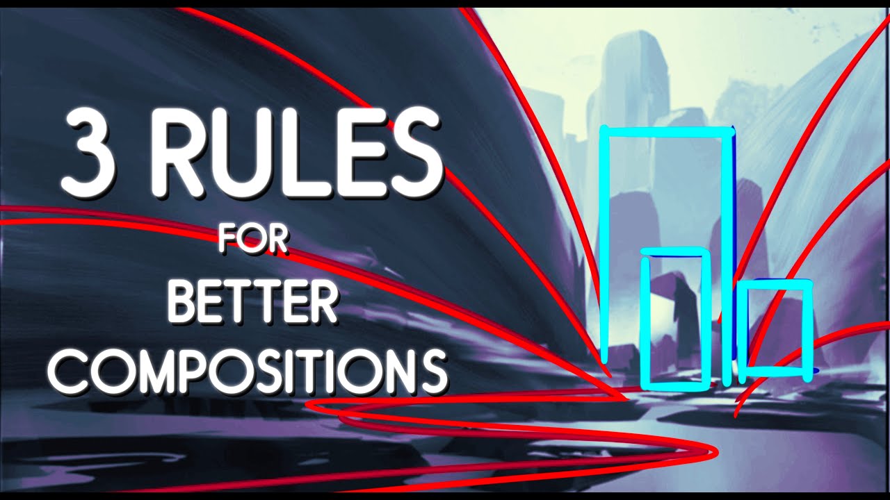
Variety enters a composition through changes in the basic building blocks of visual art. An artist has several elements to play with, and the differences between them drive the visual interest of the piece.
These elements don’t work in isolation. Changing one often affects how others are perceived. A shift in color temperature, for example, can make a textured surface appear closer or farther away.
Color as the Most Common Source of Variety
Color gets the most attention because it’s the first thing most viewers notice.
An artist creates variety through shifts in hue, saturation, and value. Even a painting built on a narrow palette can contain enormous variety if the value range is wide enough. That’s why monochromatic color schemes still work. Different tints and shades of a single hue introduce variety without breaking the overall color harmony.
Complementary colors are the most direct route to color variety. Red against green, blue against orange. These pairings push maximum contrast and visual energy.
Henri Matisse understood this better than most. His Fauvist works use color variety as the primary compositional tool. Shapes are often simplified. Lines are loose. But the color shifts from one area to the next carry all the visual weight.
Texture and Pattern Variation
Texture variety works on two levels in visual art:
- Actual texture: Physical surface differences you can feel. Thick impasto next to smooth glazing. Collage materials against flat paint.
- Implied texture: The illusion of surface quality created through brushwork and technique. Smooth skin rendered next to rough fabric in a portrait.
Pattern variation is closely related. Gustav Klimt’s famous paintings are a masterclass in this. He layered different decorative patterns within the same composition (spirals, triangles, organic spots) and the result is visually dense but organized. Each pattern section reads differently from its neighbor.
Mixed media artists take texture variety the furthest. Combining paint, found objects, fabric, and paper within one piece creates extreme tactile differences that the eye reads as high variety.
Shape, Line, and Form Contrasts
Geometric shapes placed next to organic ones. That single contrast generates immediate variety.
Pablo Picasso‘s Cubist work broke subjects into angular, faceted planes mixed with curved fragments. The variety of shapes within a single figure is what makes the style so visually active. Your eye can’t rest because each adjacent area presents a different kind of form.
| Element | Low Variety (Order) | High Variety (Energy) | Psychological Effect |
| Line | All straight, same width | Curved, angular, thick, thin | Low: Calm, rigid. High: Chaotic, fast. |
| Shape | Repeated circles or squares | Mix of organic and geometric | Low: Reliable, safe. High: Natural, complex. |
| Form | Uniform 3D objects | Varied volumes and scales | Low: Industrial, mass-produced. High: Architectural, grand. |
Form in two-dimensional art relies on value shifts and shading to create the illusion of depth. Varying the types of forms within a painting (rounded vs. angular, large vs. small) builds spatial complexity that pulls the viewer deeper into the pictorial space.
Variety Across Different Art Movements

Different art movements treated variety in completely different ways. Some pushed it to extremes. Others stripped it down to almost nothing. Looking at how movements handle variety tells you a lot about what they valued most.
Baroque Art’s Heavy Use of Variety
Baroque art is variety turned up to full volume.
Light and shadow swing between extremes. Caravaggio‘s chiaroscuro technique placed stark brightness against deep darkness within the same scene. Figures twist through space. Fabrics fold in unpredictable directions. Peter Paul Rubens packed his canvases with different textures (skin, metal, silk, fur) that each demanded different handling.
The result is art that feels alive, almost theatrical. Everything in a Baroque painting competes for attention while still serving the central narrative.
Minimalism’s Intentional Reduction
Then there’s the other end of the spectrum.
Minimalist art deliberately reduced variety to force the viewer to pay attention to what remained. Mark Rothko‘s color field paintings contain just two or three soft-edged rectangles of color. The variety is almost invisible at first glance. Subtle shifts in tone, edge quality, and color intensity emerge the longer you look.
The 2025 Art Basel and UBS Survey of Global Collecting found that nearly three-quarters of current collectors are Millennials or Gen Z, and their tastes are increasingly eclectic. The variety of styles they collect (from digital art to traditional painting) mirrors how broadly the concept of variety itself has been interpreted across art history.
Abstract Expressionism and Unpredictable Variety
Abstract Expressionism treated variety as emotional release.
Pollock‘s drip technique generated variety through physical action. No two marks land the same way. Willem de Kooning mixed aggressive brushstrokes with smoother passages, creating violent textural contrast within single works.
But here’s where it gets interesting. Even within all that apparent chaos, these artists maintained compositional awareness. Pollock’s all-over compositions distribute visual weight evenly. De Kooning returned to recognizable forms (especially the figure) as anchoring devices. The variety is extreme, but it’s not actually directionless.
Pop Art’s Variety Through Repetition
This one seems contradictory, but bear with me.
Andy Warhol‘s screen prints repeated the same image multiple times. Same face. Same product. Same composition. But each print carried different color combinations. That single variable (color variety within repeated form) is what makes pieces like the Marilyn Diptych so visually engaging.
Roy Lichtenstein took a different path. He borrowed from comic strips and advertising, introducing variety through source material and scale. A tiny comic panel blown up to six feet tall introduces variety through context disruption alone.
Variety in Two-Dimensional vs. Three-Dimensional Art

Variety behaves differently depending on whether you’re working on a flat surface or in physical space. A painter controls every visual element from a single viewpoint. A sculptor has to think about variety from every possible angle.
Variety in Painting and Drawing
On a flat surface, variety comes from the artist’s direct control over mark-making, color, and spatial arrangement.
An oil painter can shift from thick palette knife strokes to thin transparent glazes within the same piece. That textural contrast alone creates a huge range of visual variety. Watercolor artists achieve variety differently, through wet-into-wet passages next to sharp dry-brush details.
The 2023 Art of Education survey found that 65% of art teachers are the only art educator in their building. That means variety in painting mediums and techniques is often introduced by a single person covering everything from drawing to mixed media. The scope of variety students encounter depends heavily on that teacher’s range.
Variety in Sculpture and Architecture
Sculpture adds a dimension that flat art can’t match: the viewer moves around it.
A single sculpture can look completely different from two sides. Alexander Calder‘s mobiles are a perfect example. The same piece presents different arrangements of shape and color depending on where you stand and when you look (since the elements actually move). The variety isn’t fixed. It changes in real time.
Architecture uses variety through material contrast, spatial sequence, and facade treatment. Walking through a building, you might pass from a low-ceilinged corridor into a double-height atrium. That spatial variety is experienced physically, not just visually.
Installation Art and Spatial Variety
Yayoi Kusama‘s Infinity Rooms create variety through light, reflection, and the viewer’s own position within the space.
Installation art can combine sound, light, physical objects, and spatial design. The variety is multisensory. It’s probably the art form that pushes variety the hardest because it isn’t limited to a single medium or a fixed viewpoint.
James Turrell‘s light installations achieve variety purely through shifts in color and intensity of projected light. No physical objects. No texture. Just light changing over time. And it’s still visually rich enough to hold your attention for long stretches. Which says something about how little you actually need to vary if you vary the right element.
How Artists Use Variety to Guide the Viewer’s Eye

Variety isn’t decoration. It’s a directional tool.
Artists use differences between elements to control where the viewer looks first, second, and third. The area with the most variety (or the greatest contrast) in a composition naturally pulls focus. The areas with less variety recede.
Variety Creates Focal Points
A focal point is the area in a composition that draws the most attention.
One of the most reliable ways to create one is to break a pattern. If a painting is mostly cool blues and greens with one section of warm red, that red becomes the focal point. The variety (the difference from the surrounding area) is what pulls the eye there.
Rembrandt van Rijn was exceptionally good at this. His portraits often feature detailed, high-variety rendering in the face and hands, while the background and clothing receive much looser, lower-variety treatment. Your eye goes exactly where he wants it to go.
Contrast as Directional Force
Contrast is variety’s sharpest tool.
Value contrast (light vs. dark) is the strongest guide. Value differences read faster than color differences. That’s why a black-and-white photograph can have just as much visual hierarchy as a full-color painting.
Tenebrism (the extreme version of chiaroscuro) uses contrast as an almost violent directional force. Caravaggio’s famous paintings pin figures against near-total darkness. The lighted areas pop forward with such intensity that the viewer has zero choice about where to look first.
What Happens When Variety is Absent
When variety drops below a certain threshold, the eye disengages.
This is actually a known problem in gallery and exhibition design. A wall of identically sized, similarly colored paintings hung at equal intervals becomes background noise. The eye stops looking at individual works because there’s not enough variation between them to trigger focused attention.
The same thing happens within a single piece. If every area of a painting receives the same level of detail, the same type of brushwork, and the same value range, nothing stands out. The composition has no hierarchy. No path. The viewer looks, gets no clear entry point, and moves on.
That’s the functional cost of ignoring variety. It’s not just an aesthetic preference. Your ability to communicate through visual art depends on it.
Variety in Graphic Design and Applied Art

Variety isn’t limited to painting or sculpture. It runs through every form of applied and commercial art, from brand identity systems to web layouts.
The difference? In applied design, variety has to serve function. A poster can be expressive. A checkout page can’t afford to confuse. Controlled visual variety helps users process information quickly and stay engaged without feeling overwhelmed.
According to web design research compiled by Clutch, 94% of first impressions are design-related. Users form opinions about a site within 50 milliseconds based on visual appeal alone. Variety in layout, typography, and color contrast plays a direct role in whether someone stays or bounces.
Typography Variety in Layout Design
Mixing font weights, sizes, and styles within a layout is one of the fastest ways to create visual hierarchy.
Weight: A bold headline paired with a light-weight body font creates instant differentiation.
Size: Varying type scale guides the eye from primary content to secondary details.
Style: Serif headings over sans-serif body text (or vice versa) introduce contrast that keeps the layout from going flat.
Sesame Workshop’s rebrand used a single type family with enough weight and style variation to unify two separate brand identities while giving each its own voice. Variety within constraints.
Web and UI Design
Web design data from Hostinger shows that original graphics drive 20% more engagement than stock photos. That’s variety in visual content producing measurable results.
Effective web design uses variety across several layers at once:
- Content blocks alternate between text, images, and interactive elements
- Spacing shifts between tight and generous to create rhythm
- Color accents break up neutral sections to draw attention to calls to action
Too little variety and the page feels like a wall of sameness. Too much and users can’t find what they need. The balance is the whole job.
Branding and Controlled Variety
Good branding uses variety without losing recognizability. That’s the tricky part.
A brand identity system typically includes a primary color palette, secondary palette, multiple type treatments, and a set of graphic elements. The variety lives in how these pieces get assembled differently across applications (business cards, packaging, digital ads) while still reading as one brand.
| Design Context | Variety Source (The “Spice”) | Unity Source (The “Anchor”) |
| Brand Identity | Changes in color, layout, and photography styles | The Logo, consistent typeface, and core grid |
| Web / UI Design | Different content types, spacing, and accent colors | Navigation menus, page templates, and the palette |
| Editorial Layout | Column widths, image scales, and pull quotes | The Masthead, typography, and page margins |
The psychology behind color choices matters here too. Brands that vary their secondary palettes across product lines (think Google’s distinct colors per service) maintain recognition while giving each product its own visual identity.
Common Mistakes When Using Variety in Art
Variety goes wrong more often than you’d think. The line between “visually interesting” and “visually confusing” is thinner than most people assume, especially when you’re early in the process and excited about all the options in front of you.
Overloading a Composition
The most common mistake. Too many competing elements fighting for attention at the same time.
Every new color, texture, or shape you add increases the visual load on the viewer. Research from the Loopex Digital web design report found that cluttered designs see bounce rates roughly 50% higher than minimal, content-first layouts. The same principle applies to fine art. If everything screams for attention, nothing gets heard.
Jean-Michel Basquiat‘s work might look chaotic at first glance. But look closer and you’ll see he consistently used repetition of crowns, text fragments, and anatomical drawings as anchoring devices. The variety is high, but it’s organized around recurring motifs.
Variety Without a Unifying Thread
No dominant element: when there’s no single visual theme tying things together, variety becomes noise.
No shared palette: five unrelated colors on one canvas rarely work unless the artist is very deliberately playing with discord.
No compositional anchor: even the most varied arrangement needs a dominant area or element that the eye returns to.
Think of it like a band. Five musicians all playing different songs in different keys at the same time is not variety. It’s a mess. Variety means they’re playing the same song but each contributing a different part.
Confusing Randomness with Intentional Variation
This comes up a lot in abstract painting.
Throwing random marks onto a surface and calling it “expressionism” isn’t the same as building a varied composition with intent. The difference is whether the artist can explain (at least to themselves) why each element is there and what it’s doing in relation to everything else.
Adobe’s 2024 Creative Trends Report showed a 30% rise in searches for hand-drawn and imperfect design elements. People are drawn to organic variation, not manufactured randomness. There’s a reason the imperfect stuff resonates. It feels intentional even when it looks loose.
How to Self-Check for Variety Balance
The squint test: squint at your work from a distance. If everything blurs into one even mass, you don’t have enough variety. If it splinters into disconnected chunks, you have too much.
The grayscale check: convert your work to grayscale (digitally or mentally). If the value range is too narrow, you’re missing variety in your lights and darks, which is often the most important kind.
How to Practice Variety in Your Own Art

Understanding variety as a concept is one thing. Actually building it into your work takes focused practice. Here are concrete exercises that train your eye and hand to introduce variety with purpose.
Single-Element Variation Exercises
Pick one visual element and push it as far as it will go.
- Create a composition using only line, but vary the thickness, direction, spacing, and curve of every mark
- Paint a study using a single hue but explore its full range of shades, tints, and tones
- Build a collage from one material type (newspaper, fabric, found paper) but vary the scale, angle, and layering
This forces you to see how much range exists within a single constraint. The limitation is the point.
Studying Master Works for Variety
The 2024 Art Basel and UBS Survey found that 52% of collector spending went toward new and emerging artists, with the rest split between mid-career and established names. Collectors value fresh perspectives, but the established masters still teach the clearest lessons about compositional variety.
What to look for when studying a painting:
- Where does the artist place the most visual variety? (Usually near the focal point)
- Where do they deliberately reduce variety? (Background, edges, supporting areas)
- How many different types of brushwork appear in a single piece?
Vincent van Gogh‘s iconic paintings are perfect study material. His brushstrokes vary in direction, length, and thickness across every square inch of the canvas. But the color harmony holds everything together.
Thumbnail Sketches and Variety Planning
Don’t wait until you’re deep into a painting to think about variety. Plan it.
Small thumbnail sketches (2-3 inches, quick, rough) let you test different arrangements of visual variety before committing to a full piece. You can try five different value distributions in the time it takes to mix one color on a full canvas. The Art of Education survey from 2023 noted that art teachers increasingly emphasize sketching before painting as a foundational skill.
| Practice Method | What It Trains (The Goal) | Time Needed | Best Tool |
| Single-Element Studies | Depth and Variety within one variable (e.g., just lines) | 30–60 mins | Ink, pencil, or digital brush |
| Master Painting Analysis | Recognizing variety and unity in finished work | 15–20 mins | Trace paper or digital layers |
| Thumbnail Sketches | Pre-planning the Distribution of variety | 5–10 mins | Small notepad or sticky notes |
| Grayscale Value Studies | Variety in Light and Dark (Chiaroscuro) | 20–30 mins | Charcoal or gray markers |
Well, the real secret (if there is one) is that practicing variety means practicing attention. You’re training yourself to notice the difference between areas that hold interest and areas that don’t. Once that awareness kicks in, it starts showing up in your work on its own. Your eye just gets better at knowing when something needs more variation, or when you’ve pushed too far and need to pull back.
And look, variety isn’t a box to check. It’s a way of seeing. The artists who use it best aren’t thinking “I need to add variety here.” They’re responding to the work in front of them, making adjustments based on what the composition needs at that moment. That responsiveness is the skill worth building.
FAQ on What Is Variety In Art
What is the definition of variety in art?
Variety is a principle of design where an artist uses different visual elements (color, texture, shape, line) within a single composition to create interest. It prevents monotony and keeps the viewer’s eye moving through the artwork.
Why is variety important in a composition?
Without variety, a composition becomes visually static. The human brain is wired to engage with visual complexity. Variety creates focal points, builds visual hierarchy, and gives the viewer a reason to keep looking at the piece.
What is the difference between variety and unity in art?
Unity ties a composition together through shared elements. Variety introduces differences to create interest. They work as counterparts. Too much unity is boring. Too much variety is chaotic. Balanced compositions need both working together.
What are some examples of variety in art?
Matisse’s Fauvist paintings use extreme color variation. Klimt layers different decorative patterns within one piece. Picasso’s Cubist work mixes angular and curved shapes. Each artist varied specific elements while maintaining overall coherence.
How do artists create variety in a painting?
Artists create variety by changing color, value, texture, line quality, and shape within a single work. Shifting from thick brushstrokes to thin glazes, or mixing geometric and organic forms, introduces visual contrast that holds attention.
What elements of art are used to create variety?
All core elements contribute. Color through hue and saturation shifts. Line through changes in weight and direction. Shape through mixing organic and geometric forms. Texture through surface differences. Value through contrasts between light and dark.
Can a minimalist artwork still have variety?
Yes. Minimalist artists like Rothko used subtle shifts in tone and edge quality within limited palettes. Variety doesn’t require loud contrasts. Even small differences in color temperature or surface finish count as variety within a reduced composition.
What happens when there is too much variety in art?
The composition falls apart. Too many competing elements with no unifying thread creates visual confusion. The viewer’s eye has no clear path through the work. The piece reads as scattered rather than intentionally diverse.
How does variety relate to the other principles of design?
Variety works alongside balance, emphasis, rhythm, and harmony. It creates the contrast that emphasis depends on. It generates the differences that rhythm organizes. Without variety, most other design principles have nothing to act on.
How can beginners practice using variety in their art?
Start by limiting yourself to one element and varying it fully. Paint a study using a single hue across its full value range. Or create a line drawing using only different line weights and directions. Constraints teach variety faster than freedom.
Conclusion
Understanding what is variety in art comes down to one thing. It’s the deliberate use of different visual elements to hold attention and create meaning within a unified composition.
Every art movement from Impressionism to Abstract Expressionism has grappled with how much variety to include and where to pull back. The answer is never fixed. It shifts with intent, medium, and audience.
Color variation, texture contrast, shifts in line quality and form. These are the tools. But the real skill is knowing when enough is enough.
Whether you’re working on a canvas, a digital layout, or a three-dimensional installation, variety is what separates flat work from work that rewards repeated viewing. Train your eye to spot it. Then train your hand to control it.