Color does something to us before we even register what we are looking at.
Artists have known this for centuries. The study of color psychology in art explains why, drawing on neuroscience, perceptual research, and art history to map how chromatic choices shape emotional response, direct visual attention, and carry meaning across cultures.
This article covers how the brain processes color, what research says about specific hues and their psychological effects, how cultural context changes color meaning, and how working artists apply all of this deliberately, from palette selection to composition.
Whether you paint, study art history, or simply want to understand why certain works move you, the connection between color and human emotion is worth knowing.
What is Color Psychology in Art

Color psychology in art is the study of how colors in visual compositions affect human perception, emotion, and behavior. It sits at the intersection of neuroscience, perceptual research, and art history.
This is different from color theory, which focuses on the structural relationships between colors. Color psychology is specifically about how people respond to those colors, what they feel, what they remember, and how their attention shifts.
The distinction matters. An artist who understands color contrast knows which colors clash or harmonize. An artist who understands color psychology knows which of those combinations will make a viewer feel unsettled, focused, or calm.
Johannes Itten and Josef Albers both explored this territory in the 20th century, one through color as spiritual energy, the other through rigorous perceptual experiment. Their work helped shift the conversation from “what colors look good together” to “what colors do to people.”
A 2025 systematic review published in Psychonomic Bulletin & Review, covering 128 years of psychological research, confirmed that color-emotion associations are consistent enough to be measurable, though the diversity of specific associations across individuals and cultures is considerable.
The field also connects directly to color harmony and the color wheel, both of which inform how artists structure emotional response through deliberate chromatic choices.
How the Brain Processes Color in Visual Art

Color perception is not a simple relay from eye to brain. It involves multiple processing stages across different regions of the visual cortex, with emotional weight added at each stage.
A 2023 conference paper from the International Human Systems Integration conference confirmed that color processing is primarily associated with the V4 area of the visual cortex, and that damage to this region causes achromatopsia, a condition where color perception is lost entirely. This positions color not as decorative information but as a core visual signal.
Opponent-Process Theory and Simultaneous Contrast
Opponent-process theory explains how the visual system encodes color as opposing pairs: red versus green, blue versus yellow, black versus white. This is why simultaneous contrast works the way it does in painting.
A gray square placed on a red background looks greenish. The same gray on a blue background looks orange-tinted. The brain is not simply reporting what is there. It is actively constructing a reading based on surrounding context.
Painters like Paul Cezanne and Josef Albers built entire bodies of work around exploiting this phenomenon. Albers spent years demonstrating that the same color reads completely differently depending on what surrounds it, a finding documented in his 1963 book Interaction of Color.
Neuroaesthetics: What Happens When We Look at Color in Art
Neurobiologist Semir Zeki, along with researchers Anjan Chatterjee and Edward Vessel, has shown through fMRI studies that viewing aesthetically engaging artworks activates specific brain regions tied to reward, emotion, and visual processing simultaneously.
This work, reviewed in a 2024 Springer Nature chapter on neuroaesthetics, confirms that looking at art is not a passive act. The brain’s reward system engages. The prefrontal cortex activates. And color, as a primary visual signal, is one of the first triggers.
| Brain Region | Role in Color Response | Art Application |
|---|---|---|
| V4 (visual cortex) | Primary color decoding | How hue and saturation are read |
| Orbitofrontal cortex | Beauty and value judgment | Aesthetic response to color composition |
| Amygdala | Emotional tagging | Why certain colors feel threatening or safe |
| Default Mode Network | Personal meaning-making | Individual response to color symbolism |
Understanding this process helps explain why two people can stand in front of the same painting and have very different emotional responses. The color is constant. The neural processing is not.
Emotional Responses to Color in Art
The 2025 systematic review in Psychonomic Bulletin & Review found that across 128 years of research, color-emotion correspondences were broadly consistent. Red maps to anger and excitement. Blue maps to calm and melancholy. Yellow links to happiness. Black and grey carry negative associations in most studied populations.
But the same review documented 190 different affective terms used to describe color responses across studies, which shows how layered and personal this process really is.
Red, Blue, and Yellow in Art History
Red: High arousal, urgency, aggression. Warm tones like red and yellow can increase heart rate and evoke excitement, according to color psychology research compiled in 2025. Caravaggio used red robes as a focal signal, a way to draw the eye to figures of highest narrative importance.
Blue: Calm, melancholy, introspection. Pablo Picasso’s Blue Period (1901-1904) is one of the clearest documented cases of an artist deploying color temperature as direct emotional communication. The restricted palette of desaturated blues and blue-greens was not a technical limitation. It was a psychological one.
Yellow: Attention, energy, optimism at low saturation. At high saturation it tips toward anxiety. Vincent van Gogh’s use of cadmium yellow in his later work has been extensively analyzed in this context, the intense chromatic pressure in paintings like The Starry Night and his Arles series reading differently from his earlier, more muted palette work.
Achromatic Colors and Psychological Weight
Research confirms that bright and white color categories consistently produce positive emotional responses, while dark and black produce negative ones. Grey sits closer to black than white in terms of emotional valence.
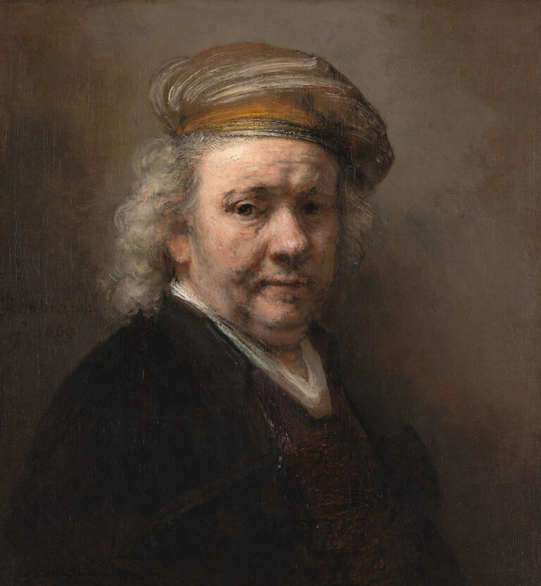
This has direct implications for how chiaroscuro functions psychologically, not just compositionally. The dramatic tonal contrasts in Rembrandt van Rijn’s work create psychological tension before the viewer consciously registers the subject matter.
Cultural Differences in Color Meaning
Color psychology in art does not operate uniformly across cultures. A 2022 study published in Psychological Research (Kawai et al.) confirmed that red carries significantly more positive implicit associations in Chinese populations compared to Western ones, a difference found in both explicit and implicit measurement conditions.
A 2024 cross-cultural comparison published in Scientific Reports found that visual harmony and color variety significantly influenced beauty judgments across Japanese and German participants, but preferences for complexity diverged. Japanese speakers rated simpler artworks as more beautiful; German speakers responded more positively to complexity.
Color Symbolism by Region
| Color | Western Art Context | East Asian Context |
|---|---|---|
| Red | Danger, passion, urgency | Luck, prosperity, celebration |
| White | Purity, innocence, hope | Mourning, death, absence |
| Blue | Melancholy, calm, trust | Immortality, depth, mystery |
| Yellow | Optimism, caution, energy | Imperial power, royalty |
Hokusai’s use of Prussian blue in The Great Wave off Kanagawa is a useful case here. In a Japanese context, the color carried associations of depth and mystery. When European audiences first encountered it, they read it primarily through their own chromatic associations, calm, melancholy, distance.
Neither reading is wrong. That is the point. An understanding of color meanings in different cultures is not optional for artists working across audiences. It directly shapes how work is received.
Frontier psychology research from 2025 on urban color preferences also confirmed that ethnic customs and regional lifestyles shape color symbolism significantly, and that these preferences remain stable even as globalization increases cross-cultural exposure.
Color Temperature and Its Psychological Effects

Color temperature splits broadly into warm colors (reds, oranges, yellows) and cool colors (blues, greens, violets). The psychological effects are distinct and well-documented.
Warm colors advance. They appear closer to the viewer, increase perceived stimulation, and draw attention. Cool colors recede. They feel more distant, quieter, and create a sense of atmospheric space.
Controlling Viewer Attention Through Temperature Contrast
BMC Psychology research from 2025 found that warm colors like orange produced the highest positive emotional evaluations in controlled studies, while blue consistently received the lowest positive ratings across both art-trained and general populations.
This has practical implications. Artists who place a warm focal point against a cool background are not just making a compositional decision. They are directing physiological attention. The eye moves toward warmth instinctively.
- Rembrandt used pools of warm amber light against deep, cool shadows to direct focus in his portraits
- Claude Monet built atmospheric depth by pushing cool blues and mauves into background planes while keeping warm highlights in the foreground
- Henri Matisse in his Fauvist work pushed temperature contrast to psychological extremes, warm and cool colors placed side by side without tonal mediation
The Fauvism movement was largely built around exploiting this tension. Color temperature stopped being descriptive and became the primary emotional carrier in the composition.
Atmospheric Perspective and Psychological Distance
Cool colors are also the foundation of atmospheric perspective. As objects recede in a landscape, they shift toward blue and grey because of how light scatters through air.
Artists use this perceptual reality psychologically. A painting that shifts to cool tones at its edges feels more expansive. One that stays warm throughout feels immediate and close. Value and temperature work together here, and the difference between a background that reads as far away versus one that feels pressingly close often comes down to a few degrees on the color temperature scale.
Color Saturation, Value, and Psychological Weight
Beyond hue and temperature, color saturation and value are independent psychological variables. They change how a color feels regardless of what that color is.
BMC Psychology’s 2025 study found that higher brightness and saturation were rated more positively than lower levels. Non-art students in particular showed stronger emotional responses to saturation shifts than to hue shifts, which is useful information for artists thinking about audience reach.
High Saturation vs. Desaturated Color
High saturation: Intensity, immediacy, visual pressure. Colors at full saturation feel aggressive and urgent. They are hard to ignore.
Low saturation: Calm, nostalgia, psychological distance. Desaturated palettes pull the viewer back. Impressionist painters often worked in partially desaturated light, which is partly why their work reads as atmospheric rather than confrontational.
Mark Rothko understood this precisely. His Color Field paintings use saturation as a dial, some works at near-full intensity to create immersive psychological pressure, others at low saturation to create quiet and contemplative space. The Color Field movement broadly treated saturation as the primary emotional variable in abstract work.
Tonal Value and Psychological Tension
Value contrast, the difference between the lightest and darkest areas of a composition, generates psychological tension directly. High contrast feels dramatic. Low contrast feels unified and calm.
Chiaroscuro in the work of Caravaggio and Vermeer deploys extreme value contrast to create not just visual drama but psychological urgency. The viewer’s eye snaps to the lit area. Everything else competes for attention and loses.
Understanding the value scale is not a technical exercise. It is a psychological one. Where the tonal range sits within a composition directly determines how much emotional weight a painting carries before the viewer even registers the subject.
Color Symbolism Across Art History

Color in art has never been neutral. Every era assigned meaning to specific hues, and those meanings shifted as religion, politics, and commerce changed around them.
The clearest example is ultramarine blue. During the Renaissance, lapis lazuli was the only reliable source for this pigment, mined in Afghanistan and transported by Italian traders. By the 14th century, ultramarine was worth more than five times its weight in gold, according to historical accounts from the National Gallery, London.
That cost directly shaped its symbolism. Wealthy patrons who commissioned works would specify ultramarine in contracts as a mark of prestige and devotion. Artists including Titian and Vermeer reserved it for the most important figures in their compositions.
Renaissance and Baroque Color as Spiritual Signal
Ultramarine: Reserved for the Virgin Mary’s robes, where it signified divinity, purity, and spiritual love. Its cost reinforced its sacred status.
Red: Passion, power, sacrifice. Caravaggio’s dramatic reds in Baroque compositions drew the eye to figures of highest narrative importance.
Gold leaf: Divine light, transcendence. Used in medieval and early Renaissance works to represent the sacred beyond earthly space.
A synthetic ultramarine was invented in 1826, which democratized blue for the first time. Within decades, the color’s symbolic weight in religious painting began to dissolve. It became a tool rather than a statement of devotion.
Symbolism, Expressionism, and the Shift to Psychological Color
By the late 19th century, the Symbolist movement began using color for psychological suggestion rather than established iconography. Artists like Gustave Moreau and Odilon Redon chose hues based on emotional resonance, not visual accuracy.
Expressionism pushed this further. Ernst Ludwig Kirchner and Emil Nolde used color to externalize psychological states directly, distorted, unnatural color combinations that communicated inner tension rather than depicting observed reality.
This shift is significant. Color moved from representing spiritual hierarchy to representing individual psychology, a change that set the stage for abstract art’s full commitment to color as emotional carrier.
Color Psychology in Abstract Art

In representational work, color supports content. A red apple, a grey sky, a pale face. Remove the subject entirely, and color has to carry everything.
That is the challenge and the project of abstract art. Color becomes the sole psychological mechanism available to the artist.
Kandinsky’s System: Color as Spiritual Sound
Wassily Kandinsky experienced synesthesia, a neurological condition where sensory inputs cross, so that colors produced sounds and sounds produced colors for him. The Denver Art Museum documents this as a central driver of his theoretical work.
In Concerning the Spiritual in Art (1911), Kandinsky built a systematic grid associating specific emotions and sounds with ten colors. His influence on later movements was direct. Jackson Pollock, Willem de Kooning, and Mark Rothko all drew on Kandinsky’s foundational argument that color could carry psychological meaning without representational content, according to TheArtStory’s documented analysis of his influence.
| Color (Kandinsky) | Emotional Association | Sound Analogy |
|---|---|---|
| Yellow | Agitation, earthly energy | Trumpet, high pitch |
| Blue | Calm, spiritual depth | Cello, deep organ |
| Red | Strength, passion, maturity | Tuba, percussion |
| White | Silence, infinite possibility | Pause between notes |
Rothko and the Measurable Emotional Effect
Rothko’s stated goal was direct. He wanted his paintings to produce basic human emotions: tragedy, ecstasy, doom. The so-called “Rothko effect,” where viewers are brought to tears, is a documented phenomenon noted by multiple museum sources and widely reported by curators at institutions including the Tate Modern and MoMA.
His technique layered thin washes of color on large canvases. The scale was intentional. Rothko believed viewers needed to be enveloped rather than observe from a distance. Brighter panels in his work produce feelings described as joyous; his later, darker compositions produce what researchers have characterized as somber and brooding emotional tones.
This is color psychology in its purest form. No subject, no narrative. Just chromatic response.
How Artists Apply Color Psychology Deliberately
Knowing the theory is not the same as using it. The gap between understanding color emotion and building it into a finished composition is where most of the actual work happens.
At the 2022 Art Basel Miami Beach, an immersive digital exhibition tracked visitor reactions using biosensors while software altered color palettes in real time. Organizers found that rapid shifts in vibrant synthetic colors triggered excitement but also mild discomfort in some viewers, depending on their sensitivity to sensory input. That result is useful: deliberate color shifts can generate psychological arousal, but they need to be calibrated to audience and context.
Controlling Viewer Attention Through Color Contrast
Color contrast is not a single technique. It operates across at least three variables simultaneously.
- Hue contrast: Complementary colors placed next to each other create maximum chromatic tension
- Value contrast: The difference between light and dark areas directs the eye to focal points before the viewer consciously chooses where to look
- Saturation contrast: A single saturated element in a desaturated composition draws attention with almost no additional compositional work
Georges Seurat’s Pointillist method was partly built on this. By placing analogous color dots in adjacent positions, he produced optical mixing that generated a different chromatic response than physically mixed pigment would have.
Palette Building With Psychological Intent
Starting with a psychological intention and working backward to palette selection is how many working artists approach color.
Step 1: Identify the primary emotional response the work should produce.
Step 2: Select a dominant hue family that carries that response, then limit the palette to 3-5 colors that support it without competition.
Step 3: Use saturation and value to control intensity. A palette that is all high-saturation produces visual pressure. One that mixes high and low saturation gives the eye places to rest.
Tools like Adobe Color and Coolors let artists generate and test palettes against color harmony rules and monochromatic or analogous schemes before applying them to canvas. Most digital concept artists and illustrators working today use these tools as a first step, not an afterthought.
A 2023 study published in Informatics confirmed that color and light choices in digital paintings measurably shifted audience emotional cognition, with color images producing significantly stronger emotional responses than monochromatic or black-and-white versions of the same composition. The study used 225 participants across three experimental conditions.
Practical Color Psychology for Artists Today
Color psychology does not stay in art history classrooms. It shows up in every palette decision a working artist makes, whether they think of it that way or not.
Common Mistakes and How to Avoid Them
Most color errors come from the same places.
Ignoring audience culture: Red reads as danger in Western contexts and luck in East Asian ones. An artist working across multiple markets who does not account for this is making decisions without full information.
Over-relying on warm/cool generalizations: The warm-advances, cool-recedes rule is real, but it has limits. A cool color at high saturation will pull attention just as aggressively as a warm one. Saturation and value interact with temperature in ways that simple rules do not capture.
Treating palette as decoration: Choosing colors because they look nice together is not the same as choosing them for psychological purpose. The composition, focal point, and color palette should all be in service of the same emotional intention.
Working With the Primary, Secondary, and Tertiary Structure
Understanding primary colors, secondary colors, and tertiary colors is the structural foundation, not the ceiling.
Kaya and Epps (2004) found that principal hues like red and yellow evoked higher positive emotions than intermediate or achromatic colors, a finding relevant to any artist making choices about palette dominance. But intermediate hues carry their own psychological character, neither the urgency of pure red nor the calm of pure blue, which makes them useful for compositions that require psychological nuance rather than impact.
The hue, tint, shade, and tone of any color all shift its psychological reading. A tint of red (pink) reads as soft, even gentle. A shade of red (deep crimson) reads as serious, weighted. Same hue family, different psychological territory entirely.
Testing Color Response
Color response testing does not require biosensors. A few practical approaches actually used by artists and illustrators:
- Share early-stage color studies without any context and ask what emotion the viewer registers
- Run the same composition in two different color temperature versions and compare reactions
- Convert the final image to greyscale to check whether value structure alone is doing enough psychological work
If the greyscale version loses all its impact, the color is doing compensating work for weak value structure. That is usually a sign the composition needs restructuring rather than recoloring.
Frida Kahlo and Georgia O’Keeffe both developed highly distinctive chromatic approaches grounded in psychological and personal intention rather than conventional color harmony. Their palettes are immediately recognizable partly because color was never incidental to either of them. It was the argument.
FAQ on Color Psychology in Art
What is color psychology in art?
Color psychology in art is the study of how colors in visual compositions affect human perception, emotion, and behavior.
It differs from color theory, which maps color relationships. Color psychology focuses on the human response to those colors.
How does color affect emotion in art?
Color triggers emotional responses through both neurological and cultural pathways. Warm colors tend to raise arousal; cool colors calm.
A 2025 systematic review covering 128 years of research confirmed consistent color-emotion associations across populations, though individual variation is significant.
What colors evoke the strongest emotional response?
Red produces the strongest physiological arousal, linked to urgency and intensity. Research from BMC Psychology found orange rated highest for positive emotional valence overall.
Black and dark tones consistently produce negative emotional associations across most studied populations.
Did artists historically use color psychology deliberately?
Yes. Caravaggio used red to direct attention. Renaissance painters reserved ultramarine for sacred figures.
Wassily Kandinsky built a formal system linking specific hues to emotions and sounds, documented in Concerning the Spiritual in Art (1911).
Does color meaning change across cultures?
Significantly. Red signals luck in Chinese art and danger in many Western contexts. White means purity in Western traditions and mourning in several East Asian cultures.
A 2022 study in Psychological Research confirmed these differences exist at both explicit and implicit levels.
What is the role of color saturation in emotional response?
High color saturation produces intensity and visual pressure. Low saturation creates calm, nostalgia, or psychological distance.
BMC Psychology (2025) found non-art students respond more strongly to saturation shifts than to hue changes.
How did Expressionism change color psychology in art?
Expressionism broke the link between observed color and painted color. Artists like Kirchner and Nolde used distorted, unnatural hues to externalize psychological states directly.
Color became a record of inner experience rather than a description of the visible world.
What is the Rothko effect?
Mark Rothko designed his large color field canvases to envelop viewers completely. Documented cases of viewers being moved to tears are reported by curators at MoMA and the Tate Modern.
No subject matter. Just chromatic response at scale.
How do warm and cool colors work psychologically?
Warm colors advance visually and raise stimulation. Cool colors recede and reduce arousal. Artists use this contrast to control where attention lands within a composition.
Atmospheric perspective relies on this: distant planes shift cool, foreground stays warm.
How can artists apply color psychology practically?
Start with an emotional intention, then build a limited palette that supports it. Use complementary colors for tension, analogous schemes for harmony.
Test early color studies with viewers before committing. Convert to greyscale to check whether value structure holds without color support.
Conclusion
This article on color psychology in art covers a lot of ground, from how the V4 visual cortex decodes chromatic signals to how Rothko used saturation as a direct emotional tool.
The core finding holds across every section: color is never passive. Every hue, tint, and shade carries psychological weight, and artists from the Renaissance to Abstract Expressionism have used that weight deliberately.
Cultural context matters too. Color symbolism shifts across populations, and chromatic associations that read as universal often are not.
Whether you work in oil, acrylic, or digital media, understanding the relationship between color perception and emotional response gives you more control over how your work lands with a viewer.