The color you see right now is not out there in the world. It exists entirely inside your brain.
Color perception is the process by which your visual system converts light wavelengths into the rich, continuous experience of color. From the cone cells in your retina to the V4 visual cortex, every step reshapes the raw signal.
Understanding how this works matters for painters, designers, scientists, and anyone who has ever disagreed with someone about whether a wall reads as blue or green.
This article covers the full picture: the biology of photoreceptors, neural processing, color vision deficiency, species comparisons, the physics of the visible spectrum, psychological effects, display technology, and how researchers measure color perception today.
What is Color Perception

Color perception is the brain’s interpretation of light wavelengths detected by the eye. It is not a property of objects themselves, but a constructed experience produced by your visual system in response to electromagnetic radiation.
The distinction matters. A red apple doesn’t contain redness. It absorbs most wavelengths and reflects those around 620-700 nanometers. Your visual system does the rest.
Three components make this work together:
- Physical stimulus: light at specific wavelengths entering the eye
- Biological detection: photoreceptor cells converting light into electrical signals
- Neural interpretation: the brain constructing a color experience from those signals
This means two people looking at the same surface can perceive different colors. The experience is subjective. The physics is not.
Color perception connects directly to how artists and designers work with color in painting, how color theory was built, and why concepts like simultaneous contrast and color psychology in art have real perceptual foundations rather than just aesthetic ones.
Objective vs. Subjective Color
Key difference: wavelength is measurable. Perceived color is not.
A spectrophotometer gives you an exact reading of the light reflecting off a surface. Two observers looking at that same surface may disagree on whether it reads as warm or cool, orange or red.
This is partly why colorimetry exists. The CIE 1931 color space, developed by the International Commission on Illumination, was created specifically to map human color perception mathematically. It remains the international standard for color measurement nearly a century later.
Metamerism makes this even trickier. Two surfaces can reflect completely different wavelength combinations and still appear identical under one light source, then look totally different under another. Anyone who has bought paint under store lighting and had it look wrong at home has experienced this firsthand.
How the Human Eye Detects Color
The retina contains two types of photoreceptor cells: rods and cones. Rods handle low-light, non-color vision. Cones handle color.
There are roughly 6 million cone cells in the human eye, concentrated heavily at the fovea centralis, the small central region of the retina responsible for sharp, detailed vision. Frontiers in Neuroscience (2024) research confirms cone density drops from around 15,000 per mm2 at the fovea to fewer than 1,000 per mm2 at just 20 degrees away from the central axis.
Color detection depends entirely on three cone types:
- S-cones (short wavelength): peak sensitivity around 420-440 nm, perceiving violet and blue
- M-cones (medium wavelength): peak sensitivity around 530-540 nm, perceiving green
- L-cones (long wavelength): peak sensitivity around 560-580 nm, perceiving red and yellow
The ratio of L to M cones varies considerably between individuals. Research shows this ratio can range from roughly 1:1 to 1:17 without meaningfully affecting color perception in most everyday tasks.
Trichromatic Theory Explained
Thomas Young proposed in the early 1800s that color vision required only three receptor types. Hermann von Helmholtz later developed this into what became the Young-Helmholtz trichromatic theory, supported by color-matching experiments showing people with normal vision need exactly three wavelengths to reproduce the full visible color range.
This theory explains why RGB works for screens and why mixing primary colors produces other hues. Red, green, and blue correspond (roughly) to the three cone sensitivity peaks.
Well, it explains most of it. Trichromatic theory alone can’t account for why we see yellow as distinct from a mix of red and green, or why certain afterimages appear. That’s where opponent-process theory fills the gap.
Cone Cell Sensitivity Ranges
Cone sensitivity ranges overlap significantly. S-cones don’t respond to red; L-cones respond weakly to blue. But all three overlap in the middle of the spectrum, which is why detecting subtle differences between similar greens or yellows can be tricky.
| Cone Type | Peak Sensitivity | Color Range Covered |
|---|---|---|
| S-cones | ~420-440 nm | Violet, blue |
| M-cones | ~530-540 nm | Green, cyan |
| L-cones | ~560-580 nm | Yellow, red |
Rods contain a single photopigment called rhodopsin, which peaks around 498 nm. They are responsible for scotopic vision (low-light) but contribute nothing to color discrimination. Under moonlight, everything genuinely does appear desaturated.
How the Brain Processes Color Signals
Detecting light at the retina is only the first step. The actual experience of color is constructed in the brain, through a processing chain that runs from the retinal ganglion cells through the lateral geniculate nucleus (LGN) and into the visual cortex.
Signals leave the eye through the optic nerve, pass through the lateral geniculate nucleus in the thalamus, and arrive at the primary visual cortex (V1). From there they move through V2 and V4. Area V4 is where most of the heavy lifting for color perception happens, handling color constancy operations and color recognition tasks.
Opponent-Process Theory
Ewald Hering proposed in the 1870s that color perception is organized around three opponent pairs: red-green, blue-yellow, and black-white. His opponent-process theory was initially dismissed, then later proven correct at the neural level.
Retinal ganglion cells are organized to respond in opposing ways. Some fire more when exposed to red and less when exposed to green. Others do the opposite. This explains a few things trichromatic theory can’t:
- Why we never perceive “reddish-green” as a color
- Why staring at a red object produces a green afterimage
- Why complementary colors sit across from each other on the color wheel
Both theories are correct. Trichromatic theory describes the receptor level. Opponent-process theory describes what happens next in the neural pathway.
Color Constancy
Color constancy is the brain’s ability to perceive an object’s color as stable across different lighting conditions. A white piece of paper still looks white under yellow indoor light and blue outdoor light, even though the wavelengths reaching your eye are completely different.
Area V4 in the visual cortex is strongly associated with this process, according to functional neuroimaging research. V4 cells adjust their responses based on the surrounding light context, not just the direct wavelength input.
This is also why the “the dress” debate went viral in 2015. People’s visual systems made different assumptions about the ambient lighting conditions in the photo, and those assumptions led to genuinely different perceived colors. Neither group was wrong. They were just running different contextual corrections.
Color constancy is relevant to painting too. It’s why atmospheric perspective works, and why value and tone relationships change the perceived color of a surface within a composition.
Factors That Influence Color Perception

Color perception is not consistent across people, situations, or time. Several overlapping factors shift how any given color reads to any given observer.
Scientific Reports (2020) research found that visual function remains relatively stable until around age 50-60, after which decline accelerates. The main mechanism is reduced retinal illuminance and yellowing of the crystalline lens, which increasingly filters short-wavelength (blue) light. This makes yellow-blue discrimination the first to suffer noticeably with age.
Age, Lighting, and Adaptation
Lens yellowing is the most predictable age-related factor. It doesn’t affect red-green discrimination much. Blue-yellow axis perception takes the bigger hit.
Ambient light matters just as much. Metamerism means colors that look identical under one light source can look completely different under another. This is why professional color work uses standardized D65 daylight illumination as a baseline.
Then there’s adaptation. Stare at a saturated color for 30 seconds and then look at a neutral surface. The afterimage you see is the opponent channel recovering. This same mechanism causes subtle shifts in how you perceive colors throughout the day as your visual system adapts to ambient conditions.
Painters working with color saturation and intensity in color theory deal with this constantly, particularly when switching between studio lighting and natural light during a painting session.
Psychological and Cultural Variables
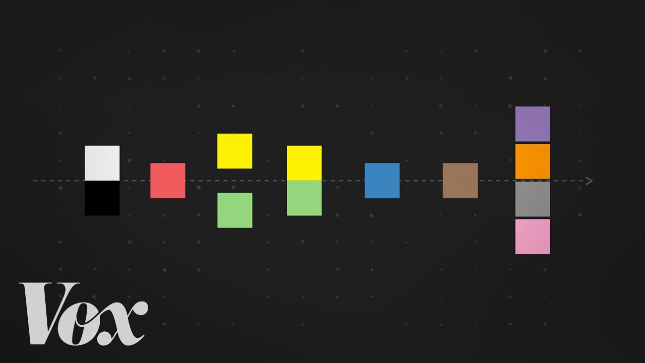
The Sapir-Whorf hypothesis, applied to color, suggests that the number of color terms a language has influences how finely speakers discriminate between similar hues. This has been debated heavily, but there’s reasonable evidence that linguistic categories shape color perception at the boundary between named categories.
A few other well-documented variables:
- Prior expectations and memory shift perceived hue slightly toward the “typical” color of an object
- Surrounding colors alter perceived hue through simultaneous contrast effects
- Fatigue reduces contrast sensitivity across both luminance and chromatic channels (Nature, 2025)
Color perception in this sense is never purely bottom-up. Context, memory, language, and expectation all feed into the final experience.
Color Vision Deficiency
Color vision deficiency (CVD) is an umbrella term for conditions where one or more cone types are missing, non-functional, or shifted in their spectral sensitivity. “Color blindness” is the common name, but it’s somewhat misleading. Most people with CVD see many colors. They just can’t distinguish certain pairs reliably.
Globally, CVD affects around 300 million people (Colour Blind Awareness). Red-green CVD affects roughly 8% of males and 0.5% of females of Northern European descent, with lower rates in Asian and African populations, according to a 2025 review published in Healthcare (MDPI).
Types of Color Vision Deficiency
CVD broadly divides into two categories: dichromacy and anomalous trichromacy.
| Type | Missing/Affected Cone | Practical Effect |
|---|---|---|
| Protanopia | L-cones absent | Red appears dark; red-green confusion |
| Deuteranopia | M-cones absent | Green-red confusion; most common type |
| Tritanopia | S-cones absent | Blue-yellow confusion; rare |
| Anomalous trichromacy | Shifted cone pigment | Partial discrimination loss; milder form |
Deuteranopia and deuteranomaly (the anomalous version) together account for the majority of CVD cases. ARVO research on individual cone cell phenotypes confirmed that deuteranomalous trichromats have M-cones replaced with a second L-cone variant shifted in its spectral peak.
Testing and Diagnosis
The Ishihara Color Test is still the most widely used screening tool. It uses pseudoisochromatic plates designed so that people with normal vision read numerals that someone with red-green CVD cannot distinguish from the background pattern.
For clinical and research purposes, the Cambridge Color Test gives more detailed diagnostic information, measuring discrimination thresholds along all three cone confusion axes.
A 2025 review in Healthcare noted that despite CVD being congenital in most cases, diagnosis is often delayed until school age or later. Many individuals remain unaware of their condition until adolescence or adulthood, particularly where routine screening programs don’t exist.
On the design side, tools like Coblis and Stark simulate CVD in interfaces and visual compositions. This matters when building accessible work using color contrast or working with monochromatic color schemes that still need to communicate clearly to a wide range of viewers.
Color Perception Across Species
Human trichromacy is not the default setting for animal vision. It’s one point on a much wider spectrum, and not always the most capable one.
Most mammals are dichromats. Dogs have only two cone types, roughly equivalent to human S and L cones, making their experience somewhat similar to a person with deuteranopia. They can distinguish blue from yellow reasonably well but struggle with red-green differences.
Tetrachromats and Beyond
Birds, many fish, and reptiles have four cone types, including sensitivity to ultraviolet light. For bees, UV perception is not incidental. Flower petals carry UV-reflective patterns that are invisible to humans but serve as guidance markings for pollinators.
The mantis shrimp holds the record with 16 types of photoreceptors. This sounds like extraordinary color vision. Actually, research suggests they may not be discriminating colors finely at all. Their system appears optimized for rapid identification rather than subtle differentiation. More parallel processing channels, not necessarily richer color experience.
Human tetrachromacy exists too, though rarely. It occurs almost exclusively in women, since the gene for the extra cone type is carried on the X chromosome. Estimates vary, but some studies suggest around 12% of women may carry the genetic variation for a fourth cone type. Functional tetrachromacy, where that fourth cone meaningfully extends discrimination ability, is far rarer.
Artists like Georges Seurat built an entire method around the perceptual limits of human color detection. His pointillism technique relied on the fact that small dots of pure color, placed close enough together, blend in perception rather than on the palette. That only works because of how the cone mosaic and opponent channels integrate spatial information.
Comparing Color Vision Systems
| Species | Cone/Receptor Types | Notable Range |
|---|---|---|
| Dogs | 2 (dichromat) | Blue-yellow; limited red-green |
| Humans | 3 (trichromat) | ~380-700 nm visible spectrum |
| Most birds | 4 (tetrachromat) | Includes UV range |
| Mantis shrimp | 12-16 | UV to far red; rapid channel processing |
Color Perception and Light Wavelengths
The visible spectrum runs from roughly 380 nm to 700 nm, according to NASA Science. Violet sits at the short end, red at the long end.
That range is narrow. It represents a tiny slice of the full electromagnetic spectrum, which extends from radio waves through gamma rays. Everything outside that band exists, but human eyes don’t have the photoreceptors to detect it.
| Color | Approximate Wavelength | Cone Response |
|---|---|---|
| Violet / Blue | 380-450 nm | S-cones primary |
| Green | 490-560 nm | M-cones primary |
| Yellow / Red | 580-700 nm | L-cones primary |
Why the Sky is Blue and Grass is Green
Objects don’t contain color. They selectively absorb and reflect specific wavelengths.
A grass lawn absorbs most of the visible spectrum and reflects wavelengths around 520-560 nm, which activate M-cones and register as green. The sky scatters shorter blue wavelengths more than longer ones (Rayleigh scattering), so blue reaches the eye from all directions.
This is also why aerial perspective works in painting. Distant objects take on a bluish haze because more atmosphere sits between the viewer and the subject, scattering short wavelengths into the line of sight.
Metamerism adds a useful layer to this. Two surfaces can reflect completely different wavelength combinations and still appear the same color to a human observer under one light source, then look completely different under another. This is why painters working in artificial studio lighting sometimes find their color relationships shift when the work moves into natural daylight.
Additive vs. Subtractive Color Mixing
Additive mixing combines light sources. Red, green, and blue light mixed together produce white.
Subtractive mixing removes wavelengths through pigment absorption. Cyan, magenta, and yellow absorb different parts of the spectrum; combined, they theoretically produce black.
This distinction sits at the core of all practical color work. RGB for screens, CMYK for print. Understanding which system you are working in determines how secondary colors, tertiary colors, and color harmony behave. Georges Seurat exploited additive mixing directly on the retina through optical blending in his pointillist technique.
Psychological and Emotional Effects of Color
Color affects emotion. The research is real, but the popular framing of it usually oversimplifies what’s actually going on.
A 2025 systematic review in Psychonomic Bulletin and Review (Jonauskaite and Mohr) analyzed 128 years of color-emotion research. The findings confirmed consistent color-emotion associations across many studies, but found most correspondences were many-to-many, not one-to-one. Lightness and saturation drove many of the effects as much as hue did.
What the Research Actually Shows
Frontiers in Psychology (2025) research found that red hues correlate with higher arousal, increased saturation correlates with heightened arousal, and blue or green hues link to lower arousal. These patterns hold fairly consistently across studies.
The 2025 Jonauskaite and Mohr review identified consistent associations:
- Light and bright colors associated with positive affect
- Dark and black categories associated with negative affect
- Red and black both linked to anger
- White linked to hope; green linked to envy
Worth noting: most of these are associations, not direct emotional inductions. Knowing red is “associated with anger” does not mean looking at red makes you angry.
Where Cultural Variation Shows Up
Consistent patterns exist, but they are not universal. Color meanings shift significantly across cultures, particularly for colors like white, red, and black.
White: mourning in several Asian cultures; purity and weddings in Western contexts.
Red: luck and celebration in China; danger or urgency in much of Western design; love in fashion contexts globally.
Purple: royalty and luxury in Europe; linked to mourning in Brazil and Thailand.
Artists navigating color psychology in art have always worked with this tension. Mark Rothko used large color fields specifically to produce direct emotional responses in viewers, building on the idea that color at scale could bypass intellectual interpretation.
Baker-Miller Pink and Appetite Research
Baker-Miller pink, a specific shade of desaturated pink, became widely cited after Alexander Schauss claimed in the late 1970s that it reduced aggression in confined spaces. Several detention facilities painted holding cells this color.
Subsequent research found the effects temporary and inconsistent. The initial studies lacked proper controls.
Fast food color choices (red, yellow, orange) are more reliably supported. Research suggests warm hues and high saturation increase appetite cues and accelerate eating pace, which aligns with fast food’s turnover model.
Color Perception in Design and Digital Displays

How a display renders color has a direct impact on what a viewer actually perceives. The gap between intended color and displayed color is bigger than most people expect.
sRGB covers approximately 35.9% of the human visible color space, according to ColorFYI. Display P3 is about 25% larger than sRGB, expanding notably into vivid greens and reds. For most web work, sRGB is still the default baseline.
Color Gamut and Display Technology
OLED and LCD panels produce color differently. OLED pixels emit light directly per pixel, producing deeper blacks and more accurate dark colors since pixels switch off completely. LCD panels use a backlight filtered through liquid crystals, which makes true black harder to achieve.
Apple adopted Display P3 for consumer devices starting in 2015. Chrome and Edge added full wide-gamut CSS support in version 111 (March 2023); Firefox followed in version 113 (May 2023), according to ColorFYI. Before that, wide-gamut color on the web was largely a Safari-only experience.
The practical upshot for anyone preparing digital work:
- sRGB is still safe as a universal baseline
- P3 content displays correctly on capable hardware but degrades gracefully on sRGB screens
- Viewing environment matters since ambient light affects perceived color even on calibrated displays
Designing for Color Accessibility
Color contrast failures are the most common accessibility violation on the web. WebAIM’s 2024 Million analysis found 83.6% of websites fail basic color contrast requirements.
WCAG 2.1 sets minimum contrast ratios for readable text. The formula uses relative luminance values on a scale from 0 (black) to 1 (white), then calculates contrast as a ratio up to 21:1.
Two red-green saturated colors can pass a luminance contrast test while still being completely indistinguishable to someone with deuteranopia or protanopia. The WCAG 2.1 formula doesn’t detect that. This is a documented limitation that APCA (Advanced Perceptual Contrast Algorithm) is being developed for WCAG 3.0 to address.
Tools that simulate CVD in design workflows include Coblis and Stark. Analogous color schemes in particular require careful testing since they rely on subtle hue differentiation that disappears for red-green deficient viewers.
Wassily Kandinsky wrote extensively about the psychological and spiritual impact of specific colors on viewers, effectively exploring these accessibility questions from a perceptual art standpoint decades before the digital design era.
Color Perception Research and Measurement
Measuring color objectively is harder than it sounds, because the measurement system has to account for both the physics of the light and the biology of human perception.
The CIE 1931 color space solved this problem by mapping color mathematically based on color-matching experiments with human observers. It remains the international standard for colorimetry, used in industries from textiles to pharmaceuticals, nearly a century after its creation.
Colorimetry and Spectrophotometry
A spectrophotometer measures how much light a surface reflects or transmits at each wavelength across the spectrum. That data produces a reflectance curve, which is then converted into a standardized color value using CIE calculations.
The CIELAB color space (Lab) is the most common output format for this work. It defines color in three dimensions: L for lightness (0 to 100), a for the green-red axis, and b for the blue-yellow axis.
PMC research (2024) confirms CIELAB has been part of the United States Pharmacopeia’s general chapters since 1985. It’s used in textiles for batch color consistency, in food science for freshness assessment, and in automotive manufacturing for cross-batch paint uniformity.
The Munsell System and Perceptual Uniformity
Albert Munsell developed his color system in the early 1900s with a different goal than the CIE: perceptual uniformity. He wanted equal visual steps between adjacent color samples.
The Munsell system organizes color along three dimensions:
- Hue: the color name (red, yellow, green, etc.)
- Value: lightness from 0 (black) to 10 (white)
- Chroma: saturation strength from neutral gray outward
It remains in use for soil science, dental color matching, and as a reference for the hue, tint, shade, and value scale vocabulary that painters use daily.
Current Research Directions
Individual variation in color experience is a growing focus. Research published in IOVS (Frontiers, 2024) confirmed high intersubject variability in color-matching performance even among people classified as color-normal, with matching range values spanning from 5.2 to 32.4 across subjects.
Neural decoding of color is another active area. EEG research shows the brain encodes isoluminant hues within a 100-300 ms window from stimulus onset, with hue and luminance contrast encoded through overlapping neural channels.
The broader implication: even between two people with textbook-normal trichromatic vision, color perception is not identical. The color wheel, color theory frameworks, and perceptual models like Munsell all represent useful approximations of a system that varies considerably from person to person.
FAQ on Color Perception
What is color perception?
Color perception is the brain’s interpretation of light wavelengths detected by cone cells in the retina. It is a constructed experience, not a property of objects. The same surface can appear different colors depending on lighting, context, and the observer’s visual system.
How do cone cells detect color?
The retina contains three cone types: S-cones (blue-violet), M-cones (green), and L-cones (red-yellow). Each responds to a different range of wavelengths. The brain compares signals across all three to produce a full color experience.
Why do people see colors differently?
Individual differences in cone ratios, lens density, age-related yellowing, and neural processing all cause variation. Two people with normal trichromatic vision can still produce measurably different color-matching results in lab conditions.
What causes color blindness?
Most color vision deficiency is genetic. One or more cone types are absent or have shifted spectral sensitivity. Red-green color blindness is the most common form, affecting roughly 8% of males and 0.5% of females of Northern European descent.
What is color constancy?
Color constancy is the brain’s ability to perceive an object’s color as stable across changing lighting conditions. Area V4 in the visual cortex adjusts responses based on surrounding light context, not just the direct wavelength input reaching the eye.
What is the visible spectrum?
The visible spectrum spans roughly 380 nm to 700 nm. Violet sits at the short end, red at the long end. Wavelengths outside this range, such as ultraviolet and infrared, exist but human photoreceptors cannot detect them.
How does simultaneous contrast affect color perception?
Simultaneous contrast occurs when surrounding colors shift the perceived hue or lightness of a central color. A gray square looks lighter on a dark background and darker on a light one. Opponent-process channels in the visual pathway drive this effect.
Do colors affect emotions?
Yes, but not as simply as popular claims suggest. A 2025 systematic review of 128 years of research confirmed consistent color-emotion associations, with lightness and saturation driving many effects alongside hue. Most links are associations rather than direct emotional inductions.
How is color perception measured scientifically?
Spectrophotometers measure surface reflectance across wavelengths. The CIE 1931 color space converts that data into standardized color values based on human observer experiments. The CIELAB system then maps those values into a perceptually uniform three-dimensional space.
How does color perception apply to art and design?
Painters use perceptual principles directly, from color contrast and value relationships to color psychology. Digital designers work with sRGB and Display P3 gamuts. Accessibility standards like WCAG 2.1 apply color perception science to ensure readable contrast for all users.
Conclusion
This conclusion is for an article presenting color perception as a layered process, from photoreceptor response and trichromatic theory to neural processing, spectral sensitivity, and real-world application.
The science is clear on the fundamentals. Opponent-process theory, the CIE 1931 color space, and the Munsell Color System each describe different parts of the same underlying mechanism.
Color vision deficiency affects roughly 300 million people worldwide. Designing with that reality in mind, using proper color harmony and accessible contrast, is not optional.
Whether you work in color theory, painting, or digital design, understanding hue discrimination, metamerism, and color constancy makes every color decision more intentional and more accurate.