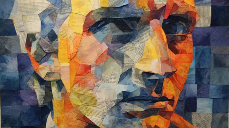
That face staring back from your reference photo holds secrets you’re dying to capture on canvas. Learning how to paint a portrait transforms flat images into living, breathing art that connects with viewers on an emotional level.
Portrait painting combines technical skill with artistic observation in ways that challenge even experienced artists. The human face contains infinite subtleties of color, form, and expression that require careful study.
This guide walks you through the complete portrait painting process, from selecting the right materials to adding final details. You’ll master facial anatomy, color mixing for realistic skin tones, and professional techniques used by masters like Rembrandt van Rijn and John Singer Sargent.
Whether you work in oil painting or acrylic painting, these step-by-step methods will help you create portraits that capture not just likeness, but personality and life itself.
Essential Materials and Tools for Portrait Painting

Paint Selection Basics
Quality matters when choosing your portrait paints. You don’t need to break the bank, but cheap paint will fight you every step of the way.
Start with a basic palette built around key portrait colors. Primary colors form your foundation: Cadmium Red, Ultramarine Blue, and Cadmium Yellow.
Add these essential skin tone colors to your kit:
- Yellow Ochre (warm base tone)
- Raw Sienna (mid-tone warmth)
- Burnt Umber (deep shadows)
- Titanium White (highlights and mixing)
- Alizarin Crimson (lip and cheek tones)
Oil vs. Acrylic for Portraits
Oil painting gives you longer working time. The paint stays wet for hours, letting you blend and adjust colors as you work.
Acrylic painting dries fast but requires quick decisions. You can slow it down with retarders or work in thin layers.
Both mediums produce stunning portraits. Your choice depends on your painting style and patience level.
Understanding Paint Consistency
Thick paint (straight from the tube) works great for final details and texture. Thin paint (mixed with medium) flows smoothly for initial washes and blending.
Different painting mediums change how your paint behaves. Linseed oil makes colors flow. Alkyd mediums speed drying time.
Brush Selection for Face Work
Essential Brush Types
Flat brushes handle large areas like cheeks and foreheads. Sizes 6-12 cover most needs without getting unwieldy.
Round brushes tackle details and curved areas. A size 4 round works perfectly for eyes and lips.
Filbert brushes blend the best of both worlds. Their oval shape follows facial contours naturally.
Brush Quality Considerations
Kolinsky sable holds the most paint and keeps its point longer. But synthetic brushes work fine for beginners and cost much less.
Natural bristles absorb oil and release it slowly. Synthetic bristles work better with acrylics and clean easier.
Buy the best brushes you can afford. Good brushes make painting more enjoyable and last for years with proper care.
Specialty Brushes for Portraits
Fan brushes create soft hair textures and subtle blending effects. Use them sparingly for natural-looking results.
Liner brushes paint individual hairs and fine details. A steady hand and quality liner make all the difference.
Canvas and Surface Preparation
Canvas Selection
Linen canvas costs more but provides superior tooth and longevity. Cotton canvas works fine for practice and smaller works.
Medium-texture canvas suits most portrait work. Too smooth and paint slides around. Too rough and fine details get lost.
Pre-stretched canvases save time but limit size options. Canvas rolls let you stretch custom sizes.
Priming Your Surface
Raw canvas absorbs paint unevenly and will rot over time. Always prime your surface before painting.
Gesso creates a stable, bright foundation. Apply two thin coats rather than one thick coat.
Toned canvases eliminate the white stare. A warm gray or light brown helps judge colors accurately from the start.
Alternative Surfaces
Wood panels provide a smooth, stable surface that won’t flex or sag. Sand lightly and prime well before painting.
Paper works for studies and quick sketches. Watercolor paper handles acrylics well with proper preparation.
Understanding Facial Anatomy and Proportions

Basic Head Proportions
The human head measures roughly five eyes wide. This rule helps position features correctly even when proportions vary between individuals.
Eyes sit halfway down the head from crown to chin. Most beginners place them too high, making faces look childlike.
The Rule of Thirds Applied
Divide the face into three equal sections horizontally. Hairline to eyebrows, eyebrows to nose bottom, nose bottom to chin.
These divisions shift slightly with age and individual differences. But they provide a reliable starting framework.
Children’s faces break these rules. Their eyes sit lower, and their foreheads appear larger proportionally.
Measuring and Checking
Hold your brush at arm’s length to check proportions. Compare the distance between features to other facial measurements.
The space between eyes equals one eye width. The mouth spans roughly the distance between the inner edges of the iris.
Facial Bone Structure
Understanding the Skull
The skull creates the basic face shape. High cheekbones catch light differently than soft, round faces.
Prominent brow ridges cast shadows over the eyes. A strong jaw creates defined edges along the lower face.
Study skulls and anatomical drawings. Understanding what lies beneath the skin improves your portrait accuracy.
Major Facial Planes
The face has five main planes that catch and reflect light differently:
- Forehead plane (usually lightest)
- Side planes (temples and cheeks)
- Nose plane (projects forward)
- Chin plane (catches light from below)
- Eye socket planes (often in shadow)
Individual Variations
Every face differs from the standard proportions. Some people have longer noses, wider-set eyes, or fuller lips.
Train your eye to see these individual characteristics. They make each portrait unique and recognizable.
Don’t force faces to fit ideal proportions. Paint what you see, not what you think should be there.
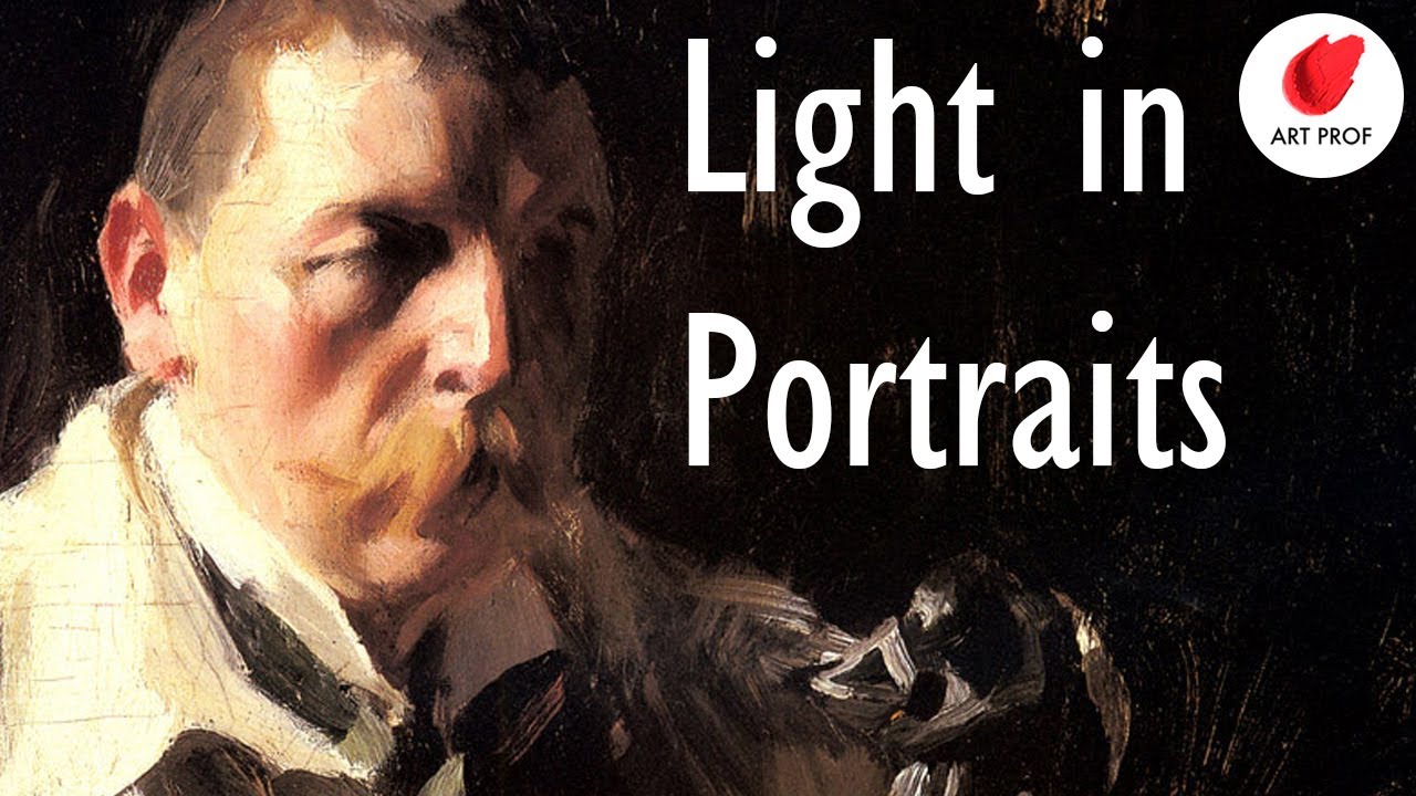
Light’s Effect on Form
Chiaroscuro principles
Chiaroscuro uses strong light-dark contrasts to create dramatic volume. Masters like Caravaggio built entire paintings around this technique.
Light reveals form by creating predictable shadow patterns. The same face looks completely different under various lighting conditions.
Shadow Types and Placement
Core shadows occur on the form itself where light doesn’t reach directly. Cast shadows happen when one part of the face blocks light from reaching another area.
Reflected light bounces back into shadow areas, preventing them from going completely black. This subtle light keeps features readable.
Form Shadows vs. Cast Shadows
Form shadows follow the shape of facial features. They’re usually softer and contain more color variation.
Cast shadows have harder edges and appear cooler in temperature. The shadow under the nose differs from the shadow on the side of the nose.
Color Theory for Portrait Painting

Understanding Skin Tones
Base Color Components
All skin contains the same basic colors in different proportions. Red from blood circulation, yellow from subcutaneous fat, and blue from veins creates the foundation.
Darker skin tones aren’t just lighter colors with brown added. They have different undertone relationships and color intensities.
Warm undertones show more yellow and red influences. Cool undertones lean toward blue and green notes.
Mixing Realistic Flesh Tones
Start with Yellow Ochre as your base for most skin tones. Add small amounts of red and white to adjust warmth and lightness.
Never use pink straight from the tube for Caucasian skin. Mix your own using reds, yellows, and whites for more natural results.
For deeper skin tones, add Burnt Sienna or Raw Umber to your base mixture. Avoid using black, which deadens the color.
Color theory in Practice
Understanding color relationships helps you paint convincing portraits. Complementary colors create vibration and interest when placed next to each other.
The orange-blue relationship works perfectly for skin tone and background combinations. Warm skin against cool backgrounds creates natural separation.
Light and Shadow Color Relationships
Warm Light, Cool Shadows
When light appears warm (yellowish), shadows tend to look cooler (bluish). This color temperature shift happens naturally in most lighting situations.
Reflected light in shadow areas often picks up colors from surrounding objects. A person wearing a red shirt will have warm reflected light on their neck and chin.
Color Temperature Changes
Skin color shifts toward cooler tones in shadow areas. What looks peachy in direct light might appear more grayish or purplish in shadow.
Highlights on skin rarely appear pure white. They usually lean toward the color of the light source, whether warm candlelight or cool window light.
Environmental Color Influence
Outdoor light changes throughout the day. Morning light appears cooler, while afternoon sun creates warmer flesh tones.
Indoor lighting affects skin color dramatically. Fluorescent lights create greenish casts, while incandescent bulbs add yellow warmth.
Advanced Color Mixing
Secondary colors in Portraits
Orange mixed from red and yellow creates vibrant skin tones. Purple from red and blue works well for deeper shadow areas.
Green appears in skin more than you might expect. Subtle green notes in shadow areas prevent them from looking flat or lifeless.
Building Color Depth
Layer transparent colors over opaque base tones. This creates the luminous quality that makes skin look alive rather than painted.
Glazing techniques add color depth without obscuring underlying forms. A thin red glaze over dry paint warms the area without changing its value.
Color Harmony in Portraits
Analogous color schemes use colors next to each other on the color wheel. This creates peaceful, harmonious portraits.
Limit your palette to create color harmony. Too many different colors make portraits look chaotic and unfinished.
The background color affects how skin tones appear. Test your flesh mixtures against your planned background before committing to large areas.
Initial Drawing and Composition

Setting Up Your Portrait
Choosing Your Focal Point
Every strong portrait needs a clear focal point that draws the viewer’s eye. Usually this centers on one or both eyes.
Place your subject off-center using the rule of thirds. Dead center compositions feel static and boring.
Reference Photo Preparation
Good reference photos make painting easier. Poor lighting or blurry details doom your portrait from the start.
High-resolution images show skin texture and fine details clearly. Phone photos often lack the detail needed for realistic work.
Adjust contrast and brightness in your photo editor before painting. This reveals shadow details that might otherwise disappear.
Basic Head Construction
Gesture drawing Approach
Start with loose, confident strokes to capture the overall head shape and neck angle. Don’t worry about details yet.
Gesture drawing captures the essential character and pose in just a few minutes.
Establishing the Basic Shape
Draw the head as a simple oval or egg shape first. Add construction lines to guide feature placement.
The center line runs vertically through the face. It shows which direction the head turns and helps align features.
Horizontal guidelines mark eye level, nose bottom, and mouth placement. These prevent proportion errors later.
Neck and Shoulder Connection
The neck doesn’t attach directly under the chin. It connects further back, creating a natural forward thrust.
Show some shoulder mass to ground your portrait. A floating head looks disconnected and unfinished.
Feature Placement Guidelines
Eye Positioning Rules
Eyes sit halfway down the head from crown to chin. Measure carefully because this relationship affects the entire face.
The space between eyes equals one eye width. Wide-set eyes create a calm expression; close-set eyes appear more intense.
Eye level stays consistent even when the head tilts. The line connecting both eyes remains horizontal to the picture plane.
Nose Construction Basics
The nose bottom lines up with the ear bottom in profile view. This relationship helps with three-quarter views too.
Draw the nose as geometric planes first. Complex nostril shapes come later after the basic structure works.
Nose width at the base roughly matches the distance between the inner corners of the eyes.
Mouth Shape and Placement
The mouth sits about one-third of the way from nose to chin. This varies with individual facial structure.
The mouth width generally aligns with the center of each eye. Wider mouths suggest friendliness; narrower ones appear more serious.
Composition Principles
Using Linear Perspective
Even portrait heads follow perspective rules. Features closer to you appear larger than those farther away.
In three-quarter views, the far eye appears smaller and the far side of the mouth shortens. Fight the urge to make everything symmetrical.
Creating Visual Hierarchy
Lead the viewer’s eye through your portrait using contrast and detail levels. The most important areas get the sharpest focus.
Secondary elements like hair and clothing stay softer to avoid competing with facial features.
Space and Balance Considerations
Leave appropriate breathing room around your subject. Cramped portraits feel uncomfortable and claustrophobic.
Balance detailed areas with simpler passages. Too much detail everywhere creates visual chaos.
Blocking In Base Colors

Establishing Color Foundation
Underpainting Approach
Start with a thin wash of color that establishes the basic light and shadow pattern. This roadmap guides all subsequent color decisions.
Warm browns or cool grays work well for underpainting. Avoid colors that will muddy your final flesh tones.
Transparent layers let you see your drawing underneath while establishing the color foundation.
Background Color Strategy
Paint your background early to judge skin tones accurately. Colors change dramatically depending on their surroundings.
Complementary colors make skin tones appear more vibrant. A cool blue-gray background enhances warm flesh colors.
Keep backgrounds simple during the blocking stage. Complex patterns distract from learning color relationships.
Base Skin Tone Mixing
Primary color Relationships
All skin tones contain the same basic primary colors in different proportions. Red from blood circulation, yellow from fat, and blue from veins.
Start with Yellow Ochre as your base. Add tiny amounts of red and white to create your foundation flesh tone.
Warm vs. Cool Undertones
Warm undertones show more yellow and red influences in the skin. Cool undertones lean toward blue and green notes.
Test your base mixture against both warm and cool backgrounds. This reveals whether your color temperature works.
Most portrait lighting creates warm lights and cool shadows. Establish this relationship early.
Color Mixing Strategy
Mix more paint than you think you need. Running out of a custom color mixture mid-painting creates matching headaches.
Palette organization keeps your colors clean. Group warm and cool mixtures separately to avoid accidental muddy colors.
Keep your mixtures simple during blocking. Complex colors come later after the basic structure works.
Large Shape Color Blocking
Simplifying Complex Areas
Hair masses read as large color shapes first, individual strands later. Block in the overall hair color and value.
Clothing and backgrounds get simplified color treatment. Focus your energy on facial color accuracy.
Light and Shadow Masses
Separate your face into clear light and shadow shapes. Don’t blend these areas yet-maintain the distinction.
Core shadows occur where the form turns away from light. Cast shadows happen when one feature blocks light from reaching another.
The boundary between light and shadow creates the most important edge in your portrait.
Color Temperature Relationships
Light areas usually appear warmer than shadow areas. This warm-cool relationship creates natural color harmony.
Shadow colors often reflect surrounding objects. A red shirt bounces warm light into the neck and chin shadows.
Developing Facial Features Step by Step
Eye Construction Process
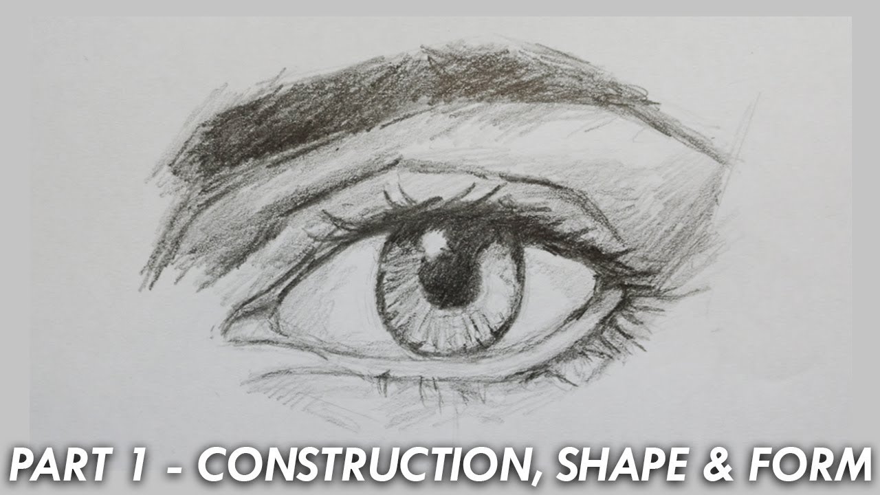
Eye Socket Foundation
The eye sits inside a socket, not on the surface of the face. Paint the socket shadow first to establish proper depth.
Orbital bones create predictable shadow patterns around each eye. Learn these shapes to paint any lighting condition.
The upper eyelid usually appears darker than the lower lid because it faces away from most light sources.
Iris and Pupil Details
The iris appears as a perfect circle only when viewed straight-on. In three-quarter views, it becomes an ellipse.
Pupil placement within the iris shows where the person looks. Center the pupil for direct gaze; offset it for looking sideways.
The top of the iris often disappears under the upper eyelid. Don’t paint the entire circle unless the eyes appear surprised.
Eyelid Structure and Thickness
Eyelids have measurable thickness that shows as a light-catching edge. This detail separates amateur from professional portraits.
Upper eyelashes cast tiny shadows onto the eyeball. Lower lashes appear lighter because they catch more reflected light.
The tear duct area needs careful observation. This small pink triangle adds realism when painted accurately.
Catchlight Placement
Catchlights bring eyes to life, but placement matters enormously. They should reflect your actual light source position.
Multiple catchlights suggest multiple light sources. Keep it simple unless your setup actually uses complex lighting.
The catchlight usually appears in the upper portion of the iris, near the edge closest to your light source.
Nose Construction Steps
Understanding Nose Planes
The nose has five basic planes: top, two sides, and two nostril areas. Light hits each plane differently.
Bridge structure connects the forehead to the nose tip. This area often catches the most light in portrait lighting.
Side planes turn away from frontal light and appear cooler in temperature than the top plane.
Nostril Shape and Shadows
Nostrils aren’t simple holes-they have complex shapes that change with viewing angle and expression.
Cast shadows under the nose vary dramatically with light direction. Side lighting creates different patterns than frontal lighting.
The area between the nostrils (septum) often catches light and appears lighter than the surrounding nostril areas.
Nose Tip Highlights
The nose tip usually receives strong light and appears as a definite highlight area. Don’t make it too bright or small.
Highlight shapes follow the nose structure. Round noses create different highlight patterns than narrow, angular noses.
Mouth and Lip Development
Upper vs. Lower Lip Treatment
The upper lip typically appears darker than the lower lip because it faces downward, away from most light sources.
Lip color isn’t just red-it contains the same warm and cool notes as the surrounding skin, just more saturated.
The center of the lower lip often catches light and appears as a small highlight area.
Mouth Corner Definition
Mouth corners recede into the face and usually appear darker than the lip surfaces. This creates proper depth and form.
The line where lips meet isn’t uniformly dark. It varies in intensity and sometimes disappears entirely in bright light.
Lip Edge Quality
The transition from lips to skin shouldn’t appear as a hard outline. Use soft edges with occasional sharper accents.
Color temperature shifts happen at lip edges. The skin around the mouth often appears cooler than the lip color itself.
Integration and Refinement
Form and Volume
Each feature must appear to exist in three-dimensional space, not as flat shapes pasted onto the face.
Form comes from consistent light logic-the same light source affects all features predictably.
Feature Relationships
Proportional relationships between features matter more than individual feature accuracy. A perfectly painted eye looks wrong if it’s too large for the face.
Check your work frequently by stepping back or looking in a mirror. Fresh perspective reveals problems you stop seeing while working closely.
Light, Shadow, and Form
Understanding Light Sources
Single vs. Multiple Light Sources
Single light sources create dramatic, easy-to-read shadow patterns. Multiple lights flatten forms and confuse shadow relationships.
Window light provides excellent natural illumination for portraits. The large, soft light source minimizes harsh shadows while maintaining form.
Direct vs. Diffused Lighting
Direct sunlight creates sharp, well-defined shadows with hard edges. Diffused light through clouds or curtains softens shadows and reduces contrast.
Studio lighting gives you complete control over shadow placement and intensity. But natural light often looks more convincing.
Natural vs. Artificial Light Qualities
Daylight changes color temperature throughout the day. Morning light appears cool; afternoon sun warms up significantly.
Incandescent bulbs add yellow warmth to skin tones. Fluorescent lights create greenish casts that make portraits look sickly.
LED lights vary wildly in color quality. Invest in high-CRI bulbs for accurate color rendering.
Creating Form with Values
Core Shadow Fundamentals
Core shadows occur where the form turns away from the light source. These shadows define the three-dimensional structure of facial features.
The core shadow edge varies from soft to sharp depending on light quality and surface texture.
Never paint core shadows as flat, dead areas. They contain subtle color variations and reflected light influences.
Cast Shadow Behavior
Cast shadows have harder edges than core shadows. They appear when one part of the face blocks light from reaching another area.
Under-nose shadows change shape dramatically with different light angles. Side lighting creates different patterns than top lighting.
Cast shadows usually appear cooler in temperature than the surfaces that cast them.
Understanding Value Relationships
The lightest light should be lighter than the darkest shadow. Maintaining this value range creates convincing form.
Squinting helps you see major value relationships without getting distracted by color or detail.
Use a value scale to judge your tones accurately. Most portraits need only 5-7 distinct value levels.
Reflected Light Effects
Bounce Light Sources
Reflected light fills shadow areas with subtle illumination. Light bounces off nearby surfaces and softens harsh shadows.
A white shirt reflects light up into the chin and neck shadows. A red wall adds warm color notes to the shadow side of the face.
Color Temperature in Shadows
Shadow areas often appear cooler than lit areas. This warm-cool relationship happens naturally in most lighting situations.
Reflected light colors mix with the base shadow tone. Don’t just add white to lighten shadows-add the color of the reflecting surface.
Atmospheric Effects
Atmospheric perspective affects even close-up portraits. Shadow edges soften slightly as they recede from the viewer.
Dust and humidity in the air scatter light, creating subtle effects that make portraits look more natural.
Adding Details and Refinement

Fine Feature Details
Individual Eyelash Treatment
Paint eyelashes as grouped masses first, then add individual hairs sparingly. Too many individual lashes look artificial.
Upper lashes cast tiny shadows onto the eyeball. These micro-shadows add realism without being obvious.
Lower lashes catch more light and appear lighter in value. They shouldn’t compete with the upper lashes for attention.
Skin Texture Considerations
Young skin appears smooth and reflective. Older skin shows more texture variation and surface irregularities.
Pore structure becomes visible in close-up portraits. Suggest texture without painting every pore individually.
Use broken color rather than smooth blends to suggest skin texture naturally.
Hair Strand Details
Individual hair strands work best when painted selectively. Focus detail where light hits the hair mass most strongly.
Flyaway hairs catch light and create interesting silhouette variations. But don’t overdo these small details.
Surface Texture Variations
Smooth Skin Areas
Forehead and cheek areas often appear smoothest and most reflective. These surfaces catch light cleanly.
Young subjects have more uniform skin texture. Age adds character through surface variation.
Rougher Skin Textures
Men’s skin typically shows more surface texture than women’s skin. Beard stubble creates micro-shadows even when closely shaved.
Weathered skin from sun exposure develops distinctive texture patterns that affect how light reflects.
Fabric and Clothing Textures
Clothing texture affects reflected light color and intensity. Smooth satin reflects differently than rough wool.
Fabric folds create their own shadow patterns that interact with facial lighting.
Keep clothing textures secondary to facial detail. They support but shouldn’t compete with the main subject.
Subtle Color Variations
Color Shifts in Skin
Skin color changes throughout the face. Forehead may appear more yellow while cheeks show more red influence.
Temperature variations happen naturally. The nose tip often appears warmer than the eye socket areas.
Blood circulation affects local skin color. Areas with more blood flow appear warmer and more saturated.
Subsurface Scattering Effects
Light penetrates skin slightly before bouncing back. This subsurface scattering gives skin its characteristic glow.
Thinner skin areas like eyelids and lips show more subsurface scattering effects than thicker areas.
Environmental Color Influences
Outdoor light bounces off grass, creating subtle green influences in shadow areas. Snow reflects blue sky color.
Indoor reflections from walls and furniture affect skin color subtly. A yellow wall warms the entire lighting environment.
Hair Painting Techniques
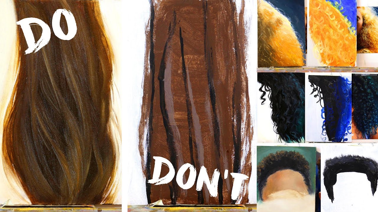
Hair Mass and Shape
Simplifying Complex Hair
Think of hair as large, simple shapes first. Individual strands come later after the basic masses work correctly.
Hair volume depends on underlying skull structure and hair type. Fine hair lies closer to the head than thick, curly hair.
Dark hair appears as one mass against light backgrounds. Light hair shows more internal structure and variation.
Hair Flow and Direction
Hair growth patterns follow predictable directions around the head. Study these patterns to paint convincing hair texture.
Straight hair follows gravity more directly than curly hair. Wavy hair creates S-shaped flow patterns.
Hair parts create strong directional lines that affect the overall composition.
Volume and Weight Considerations
Heavy hair pulls away from the scalp and creates shadows underneath. Fine hair lies closer and shows less volume.
Gravity effects become obvious in longer hair. Show the weight pulling downward for realistic results.
Wind or movement affects hair differently depending on length and texture. Consider these forces when painting dynamic poses.
Hair Color and Light
Highlight Patterns in Hair
Hair highlights follow curved paths around the head form. They’re not random streaks but follow the hair’s three-dimensional structure.
Blonde hair shows more highlight variation than dark hair. The light areas can be quite bright without looking artificial.
Curly hair creates broken highlight patterns. Straight hair shows smoother, more continuous light streaks.
Shadow Areas in Hair Masses
Hair shadows appear much darker than skin shadows because hair absorbs more light. Don’t be afraid of deep, rich darks.
Underneath areas of hair masses stay in shadow and provide important contrast for the highlighted sections.
The deepest hair shadows often appear at the roots where hair separates from the scalp.
Hair Color Temperature Changes
Hair color shifts temperature just like skin color. Light areas appear warmer; shadow areas lean cooler.
Environmental lighting affects hair color dramatically. Indoor tungsten light warms hair tones; outdoor shade cools them.
Gray hair reflects surrounding colors more than pigmented hair. Use this quality to integrate hair with the overall color scheme.
Hair Detail Work
Individual Hair Strands
Paint individual hairs selectively, focusing on areas where light hits the hair mass most strongly. Less is more with hair details.
Hair strand direction should follow the overall hair mass flow. Random strands that ignore the underlying structure look unconvincing.
Use a steady hand and quality liner brush for hair details. Poor brush control makes hair look messy rather than natural.
Hair Texture Variations
Straight hair reflects light more consistently than curly hair. Adjust your highlight patterns accordingly.
Damaged hair appears rougher and less reflective than healthy hair. Show this through broken highlight patterns.
Different hair types require different painting approaches. Fine hair needs delicate treatment; coarse hair can handle bolder strokes.
Flyaway Hair Treatment
Flyaway hairs catch light and create interesting edge variations. Use them sparingly to avoid busy, overworked effects.
These small details work best when painted confidently with single brush strokes. Overworking destroys their natural appearance.
Consider the overall silhouette when adding flyaway details. They should enhance, not distract from, the main hair shape.
Final Touches and Problem Solving

Overall Assessment
Stepping Back to Evaluate
Walk away from your painting for at least 20 minutes before making final judgments. Fresh eyes catch problems you stop seeing while working closely.
Mirror checks reveal drawing errors instantly. Flip your painting’s reflection to spot proportion issues.
Value Relationship Checks
Squint at your painting to see if the major light and shadow patterns read clearly. Details don’t matter if the big shapes fail.
The lightest lights should be lighter than the darkest darks. This value range creates convincing three-dimensional form.
Compare your painting’s values to your reference photo using the squint test. They should match in overall pattern and contrast.
Color Harmony Review
All skin tones should relate to each other harmoniously. Random color notes stick out and destroy unity.
Temperature consistency matters enormously. Warm lights need cool shadows, and vice versa.
Your color choices should support the mood you want to create. Warm palettes feel friendly; cool palettes appear more serious.
Common Issues and Fixes
Muddy Color Solutions
Muddy colors happen when you overmix or use too many different pigments in one area. Start over with cleaner color mixtures.
Gray skin results from using complementary colors in wrong proportions. Add more of the dominant color to fix gray mixtures.
Scrape off muddy areas while paint stays wet. It’s easier than trying to paint over dried mud.
Proportion Adjustment Methods
Major proportion errors need aggressive fixes. Don’t try to nudge a badly placed eye into position with small adjustments.
Scraping and repainting works better than endless small corrections. Be brave about removing problem areas.
Use your brush handle to measure proportions directly from your reference. Hold it at arm’s length for accurate comparisons.
Overworked Area Recovery
Overworked paint loses freshness and vitality. Sometimes you need to scrape back to earlier stages.
Let problem areas dry completely before attempting repairs. Wet-into-wet corrections often make things worse.
Paint fresh details over simplified, dry understructure. Don’t try to fix everything in one painting session.
Adding Final Details
Sharpening Focal Points
Eyes typically serve as the main focal point in portraits. Make sure they’re the sharpest, most detailed area.
Increase contrast around your focal point. Lighten the lights and darken the darks in this critical area.
Use your smallest brushes only for the most important details. Too much fine detail everywhere creates visual chaos.
Softening Non-Essential Areas
Background edges should stay soft to avoid competing with facial features for attention.
Hair details work best when suggested rather than meticulously rendered. Focus sharp details where light hits the hair strongest.
Clothing and jewelry need less detail than faces. Keep them simple enough to support without distracting.
Final Highlight Placement
Catchlights in eyes bring the portrait to life. Place them carefully to reflect your actual light source.
The brightest highlights usually occur on the nose tip and forehead. These areas face the light most directly.
Don’t overdo highlights. Too many bright spots destroy the form you’ve worked to establish.
Finishing and Presentation

Knowing When to Stop
Signs of Completion
Fresh brushwork looks more alive than overworked passages. Stop before you paint the life out of your portrait.
When you start making changes that don’t improve the overall impact, it’s time to step away.
Your painting should read clearly from across the room. Details that only show up close aren’t worth the effort.
Avoiding Overworking
Set a timer for painting sessions. Working too long in one stretch leads to poor decisions.
Take photos of your work in progress. Sometimes you’ll want to go back to an earlier, fresher stage.
Remember that impressionism and other painting styles embrace suggestion over tight rendering. Not everything needs sharp focus.
Preserving Spontaneity
Confident brushstrokes convey more energy than tentative, overworked areas. Trust your instincts about color and value.
Leave some edges soft and lost. Hard edges everywhere make portraits look stiff and lifeless.
The most successful portraits balance finished areas with suggested passages.
Varnishing and Protection
When to Varnish
Oil paintings need 6-12 months drying time before final varnishing. Rushed varnishing can crack as paint continues curing.
Acrylic paintings can be varnished immediately after drying. The paint film stabilizes much faster than oils.
Test varnish on a small, hidden area first. Some paint brands react poorly with certain varnish types.
Varnish Types and Application
Gloss varnish intensifies colors but creates reflections that interfere with viewing. Satin finishes offer good compromise.
Matte varnish reduces color saturation significantly. Use it only when you specifically want a flat, non-reflective surface.
Apply varnish in thin, even coats using soft brushes or lint-free cloths. Multiple thin coats work better than one thick application.
Long-term Preservation
UV protection matters for long-term color stability. Choose varnishes with UV inhibitors for maximum protection.
Keep paintings away from direct sunlight and heat sources. Temperature fluctuations cause paint to expand and contract.
Document your painting with high-quality photos before varnishing. Colors may shift slightly over time.
Photographing Your Work
Proper Lighting for Documentation
Even lighting eliminates hot spots and shadows that distort your painting’s appearance. Use two lights at 45-degree angles.
Avoid camera flash, which creates harsh reflections and color distortion. Continuous lighting works much better.
Daylight-balanced LED panels provide consistent color temperature for accurate documentation.
Avoiding Glare and Reflections
Polarizing filters reduce glare from wet paint or varnished surfaces. They’re essential for professional documentation.
Position lights to avoid direct reflection into the camera lens. Move around until reflections disappear.
Photograph paintings at slight angles if necessary to eliminate stubborn reflections from glossy areas.
Color Accuracy in Photos
White balance settings dramatically affect how colors appear in photos. Use custom white balance for best accuracy.
RAW image files preserve more color information than JPEGs. Shoot RAW when possible for maximum flexibility.
Compare your photos to the actual painting under the same lighting. Adjust color temperature and saturation as needed.
Final Presentation Considerations
Framing Options
Simple frames work best for most portraits. Ornate frames compete with the subject for attention.
Realism and photorealism benefit from clean, minimal framing that doesn’t distract from the illusion.
Consider your painting’s color harmony when choosing frame colors. Neutral tones usually work safest.
Display Environment
Lighting quality affects how viewers see your work. Avoid fluorescent lights that shift color perception.
Hanging height matters for portraits. Eye-level positioning creates the most natural viewing experience.
Give portraits adequate wall space. Crowded arrangements diminish individual impact.
FAQ on How To Paint A Portrait
What materials do I need to start portrait painting?
Essential supplies include quality paints (Titanium White, Yellow Ochre, Cadmium Red, Ultramarine Blue, Burnt Umber), brushes (rounds and flats in sizes 4-12), primed canvas, palette knife, and painting mediums. Start with oil painting or acrylic painting based on your preference for drying time.
How do I get facial proportions correct?
Use the five-eye rule for face width and place eyes halfway down the head from crown to chin. Draw construction lines to guide feature placement. Practice measuring with your brush handle held at arm’s length to check proportional relationships between features.
What’s the best way to mix realistic skin tones?
Start with Yellow Ochre as your base, then add small amounts of Cadmium Red and Titanium White. Never use pink straight from the tube. Adjust warmth and coolness based on your subject’s undertones and lighting conditions for natural results.
Should I work from photos or live models?
High-resolution photos offer convenience and consistent lighting for beginners. Live models provide better color accuracy and three-dimensional understanding. Choose photos with clear details and good contrast if working from reference images rather than life.
How do I paint realistic eyes in portraits?
Paint the eye socket first to establish proper depth, then add the iris as an ellipse (not a circle). Include eyelid thickness, place catchlights to match your light source, and remember upper lids typically appear darker than lower lids.
What’s the proper order for painting portrait features?
Block in large color masses first, establish light and shadow patterns, then develop individual features. Paint eyes, nose, and mouth after the basic structure works. Save finest details and highlights for the very last painting stages.
How do I create depth and dimension in portraits?
Use chiaroscuro principles with strong light-dark contrasts. Establish clear core shadows and cast shadows. Maintain consistent light source direction and use warm lights with cool shadows for natural three-dimensional form.
What are common beginner mistakes to avoid?
Overworking areas destroys freshness. Avoid making everything equally detailed, placing features too high on the head, and using too many colors. Don’t paint what you think should be there-paint what you actually observe.
How long should a portrait painting take?
Alla prima portraits take 2-4 hours for experienced painters. Layered approaches may require multiple sessions over weeks. Beginners should expect 8-15 hours for their first portraits, focusing on learning rather than speed.
When should I consider a portrait finished?
Stop when the painting reads clearly from across the room and captures the subject’s essential character. Avoid adding details that don’t improve the overall impact. Fresh brushwork often looks more alive than overworked passages.
Conclusion
Learning how to paint a portrait requires patience, practice, and careful observation of facial anatomy and color relationships.
Each brushstroke brings you closer to capturing not just likeness, but the essential character that makes each person unique.
Master painters like Leonardo da Vinci and Johannes Vermeer built their reputations through relentless study of human features and light behavior. Their classical painting techniques remain relevant today.
Start with simple composition and focus on major value relationships before adding details. Understanding color theory and skin tone mixing will transform your portrait work dramatically.
Remember that confident brushwork often conveys more life than overworked passages. Trust your observations, keep practicing regularly, and don’t fear making mistakes-they’re part of the learning process that leads to artistic growth.