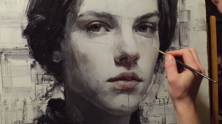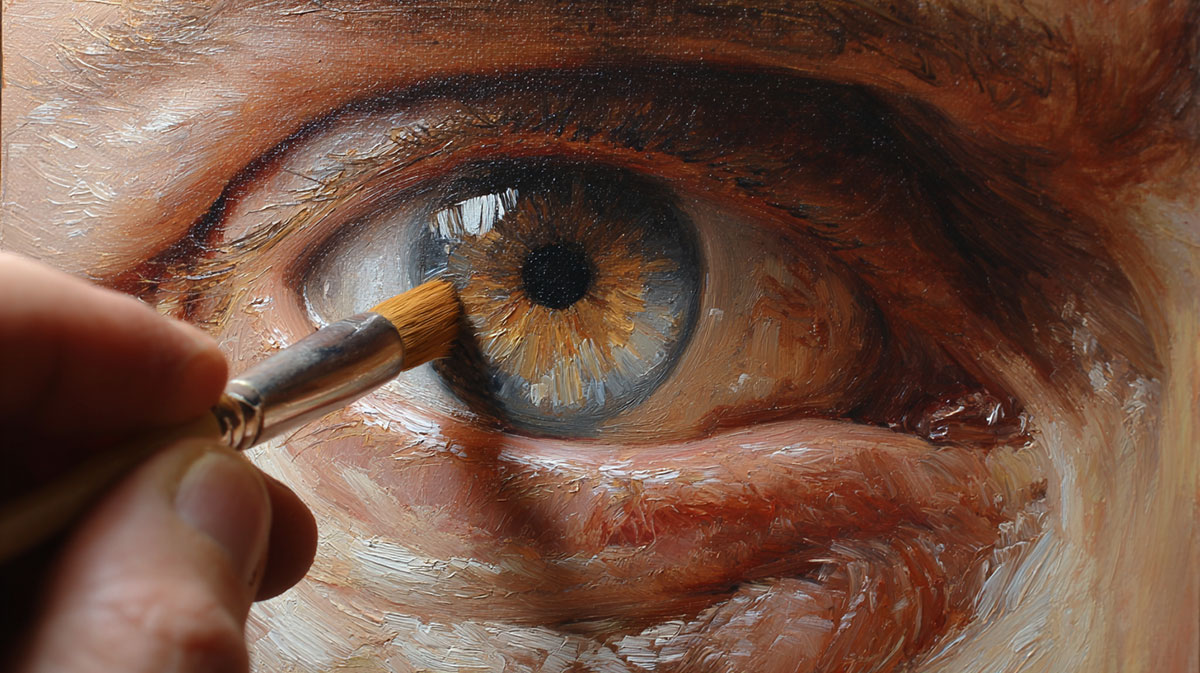

The eyes make or break any portrait. They’re the first thing viewers notice and the last thing they forget.
Learning how to paint realistic eyes separates amateur portrait work from professional results that truly connect with viewers. Johannes Vermeer and Leonardo da Vinci understood this-their painted eyes still captivate audiences centuries later.
Most painters struggle with lifeless, flat eyes that lack the spark of living subjects. The problem isn’t talent-it’s technique.
Iris color mixing, pupil depth, and highlight placement require specific knowledge that art schools rarely teach systematically.
Without understanding eye anatomy and color theory, even skilled painters create artificial-looking results.
This guide breaks down realistic eye painting into manageable steps. You’ll master value relationships, skin tone mixing, and the subtle details that bring painted eyes to life.
From initial eye socket shadows to final eyelash refinements, each technique builds toward eyes that seem to breathe and think. The methods work across all painting mediums–oil painting, watercolor painting, or acrylic painting.
Essential Materials and Setup
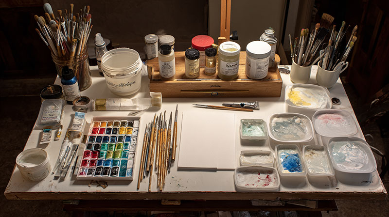
Paint Selection for Eye Work
Primary colors form the backbone of any realistic eye painting. You need cadmium red, ultramarine blue, and cadmium yellow to mix flesh tones accurately.
These three pigments create every skin tone variation you’ll encounter. Add titanium white for mixing lighter values and burnt umber for deeper shadows.
Specific Pigments for Iris Colors
Raw umber mixed with ultramarine blue creates deep brown eyes. For green eyes, mix yellow ochre with viridian and a touch of burnt sienna.
Blue eyes require ultramarine blue mixed with titanium white and a hint of raw umber. Never use pure colors straight from the tube.
Different painting mediums affect how these colors behave on canvas. Oil painting allows longer working time for blending, while acrylic painting dries faster but requires quick color mixing.
White Paint Varieties for Highlights
Zinc white creates softer highlights than titanium white. Titanium white covers more aggressively and works better for sharp catchlights.
Mix zinc white with a tiny amount of warm color for realistic eye moisture. Pure white looks artificial and kills the life in painted eyes.
Brush Requirements

Fine Detail Brushes for Precision Work
Size 2 and 4 round brushes work best for iris details and eyelash painting. Natural sable holds more paint and creates smoother strokes than synthetic bristles.
Keep one brush exclusively for light colors. Paint contamination ruins highlight quality instantly.
A size 0 liner brush handles individual eyelash strokes and tear duct details. The longer bristles hold enough paint for complete lash strokes without reloading.
Blending Brushes for Soft Transitions
Flat brushes in sizes 6 and 8 blend skin tones around the eye socket. Fan brushes create subtle texture in eyebrow areas.
Clean, dry brushes blend colors without muddying. Wipe brushes frequently on clean rags during blending work.
Liner Brushes for Eyelashes and Details
Script liners create flowing eyelash curves. Load the brush fully with thin paint consistency for smooth strokes.
Practice lash strokes on scrap canvas first. Each lash requires confidence and cannot be corrected easily.
Workspace Organization
Lighting Setup for Color Accuracy
Natural north light provides the most accurate color temperature. Avoid direct sunlight which creates harsh shadows and color shifts.
LED daylight bulbs (5000K-6500K) work when natural light isn’t available. Position lights to eliminate shadows on your palette and canvas.
Multiple light sources reduce harsh shadows but can confuse color mixing. One strong, consistent light source works better than several weak ones.
Reference Photo Positioning
Mount reference photos at eye level beside your canvas. Looking up or down at references distorts proportions and angles.
High-resolution photos show iris patterns and skin texture details. Zoom in on eye areas for close study but keep the full face visible for proportion checking.
Print multiple copies at different exposures. Dark prints show shadow details while light prints reveal highlight information.
Palette Arrangement for Efficiency
Arrange colors in consistent order around your palette edge. Keep mixing areas in the center clean for accurate color matching.
Place flesh tone mixtures near eye color mixtures. Color theory connections become obvious when colors sit adjacent to each other.
Mix large amounts of base skin tones before starting. Running out of mixed color mid-painting creates matching problems that waste hours.
Color Theory for Realistic Eyes

Skin Tone Fundamentals
Warm Versus Cool Undertones
Every person has either warm or cool undertones in their skin. Warm undertones contain more yellow and red pigments.
Cool undertones lean toward blue and violet bases. This affects every color choice in eye area painting.
Test undertone temperature by comparing mixed flesh colors to your reference photo under consistent lighting. Wrong undertones make realistic skin impossible.
Shadow Color Relationships
Shadows aren’t just darker versions of skin tones. They contain complementary colors that make them appear deeper and more realistic.
For warm skin tones, add violet or blue to shadow mixtures. Cool skin tones need orange or red in their shadow areas.
The eye socket creates some of the deepest shadows on the face. These shadows require careful color temperature control to avoid muddy results.
Reflected Light Color Choices
Reflected light bounces from nearby surfaces into shadow areas. This light takes on the color of reflecting surfaces.
White clothing reflects cool light into facial shadows. Warm wooden surfaces or yellow walls cast warm reflected light.
Study your lighting setup carefully. Room colors affect skin tone accuracy more than most painters realize.
Iris Color Complexity
Base Color Establishment
No iris contains just one hue. Even brown eyes have multiple color variations within their structure.
Start with the dominant color and mix variations around it. Brown eyes might contain raw umber, burnt sienna, and yellow ochre variations.
Blue eyes need ultramarine blue, cerulean blue, and gray mixtures. Green eyes combine yellow ochre, viridian, and raw umber in different proportions.
Secondary Color Layering
Iris patterns create complex color interactions. Radial lines often differ in color from the base iris tone.
Yellow-green lines appear in many brown eyes. Blue eyes frequently contain gray or darker blue radiating patterns.
Layer these secondary colors while the base remains wet for smooth integration. Dry layering creates harsh, unrealistic transitions.
Rim and Spoke Pattern Colors
The outer iris rim appears darker than the main iris color. Mix your base iris color with raw umber for this rim.
Spoke patterns radiate from the pupil toward the outer rim. These spokes catch light differently and require value variations.
Some eyes have broken or incomplete spoke patterns. Study your reference carefully rather than painting generic iris details.
Environmental Color Effects
Light Source Color Influence
Warm light sources (tungsten bulbs, candles) make all colors appear warmer. Cool light sources (fluorescent, overcast sky) push colors toward blue and gray.
Your mixed skin tones must match the light source tone in your reference photo. Indoor versus outdoor lighting creates completely different color relationships.
Artificial lighting often has color casts that affect iris color appearance. Account for these shifts in your color mixing.
Reflected Colors from Surroundings
Clothing colors reflect into the white areas of eyes. Red clothing casts pink reflections into the sclera.
Blue clothing or sky light creates cool reflections in the eye whites. These subtle color shifts add realism that pure white cannot achieve.
The area under the upper eyelid often reflects warm colors from skin tones above it. This creates natural color harmony between facial features.
Atmospheric Perspective in Portraits
Close portrait work rarely shows atmospheric effects, but they matter in full-figure paintings. Eyes farther from the viewer appear slightly cooler and less contrast.
Moisture in the air softens colors and reduces intensity in color theory. This affects outdoor portrait work significantly.
Distance also reduces detail visibility. Paint fewer iris details in background figures than foreground subjects.
Foundation Techniques

Initial Eye Shape Blocking
Proportion Measurement Methods
The human head is roughly five eye-widths across. Each eye measures one eye-width apart from the other.
Use your brush handle or pencil to measure these proportions from your reference. Hold the measuring tool at arm’s length for accurate comparisons.
The inner eye corners sit slightly lower than the outer corners in most faces. This angle varies dramatically between individuals and affects expression greatly.
Angle and Tilt Accuracy
Eye angles follow the head’s position and viewing angle. A three-quarter view shows different eye shapes than a frontal pose.
The far eye appears narrower and more angled in three-quarter views. Foreshortening affects eye proportions dramatically.
Sketch these basic angles lightly before adding any paint. Correcting proportions after applying color wastes time and materials.
Size Relationship to Facial Features
Eyes occupy roughly one-third of the face height when measured from hairline to chin bottom. This proportion remains consistent across different face shapes.
The eyebrow sits approximately one eye-height above the eye itself. The nose base aligns with the inner eye corners in most faces.
Check these relationships constantly against your reference photo. Proportion errors compound quickly in portrait work.
Value Mapping Strategy
Light Source Identification
Identify your primary light source before mixing any colors. This determines every shadow and highlight placement throughout the painting.
Single light sources create stronger contrast than multiple light sources. Dramatic lighting produces more interesting eye paintings than flat, even lighting.
Mark the light direction with a small arrow on your canvas margin. This prevents confusion during long painting sessions.
Core Shadow Placement
The deepest shadows occur where form turns away from the light source most dramatically. In eye area painting, this usually happens in the upper eye socket.
Core shadows contain the darkest value in your painting. Mix these colors first to establish your darkest reference point.
These shadows often appear cooler than the surrounding skin tones. Add subtle blue or violet to warm skin shadow mixtures.
Reflected Light Areas
Reflected light bounces back into shadow areas from nearby surfaces. This light appears warmer or cooler depending on the reflecting surface color.
The lower eyelid often catches reflected light from the cheek area below it. This creates a subtle warm glow that separates the eyelid from deep socket shadows.
Paint reflected light areas slightly lighter than core shadows but darker than direct light areas. Getting this value scale relationship right creates convincing three-dimensional form.
Base Color Application
Skin Tone Mixing and Application
Start skin tone mixing with titanium white as your base. Add tiny amounts of other colors until you match your reference photo skin tone.
Warm skin tones need cadmium red and yellow ochre additions. Cool skin tones require more blue and violet additions to the white base.
Mix enough skin tone for the entire eye area before starting to paint. Color matching problems destroy painting unity quickly.
Eye Socket Depth Creation
The eye socket creates a recessed area that requires darker tones than the surrounding facial planes. This depth illusion requires careful value control.
Start with your base skin tone and add raw umber to create socket shadow colors. Keep these mixtures slightly warm to maintain skin tone quality.
Apply socket shadows with soft, blended edges. Hard shadow edges make eyes appear cut out rather than naturally recessed into the skull.
Initial Iris Color Establishment
Block in the basic iris shape with your dominant iris color mixture. Keep edges soft at this stage.
The iris appears as a perfect circle, but the upper portion hides behind the upper eyelid. Only paint the visible iris portion.
Leave space for the pupil but don’t paint it yet. Establish iris color relationships first, then add pupil darkness for proper contrast relationships.
Painting the Iris Step-by-Step

Base Layer Construction
Overall Iris Color Mixing
Start with your dominant iris color mixed from primary colors. Brown eyes need raw umber, burnt sienna, and yellow ochre combinations.
Blue eyes require ultramarine blue mixed with titanium white and raw umber. Green eyes combine viridian, yellow ochre, and burnt umber in careful proportions.
Mix enough base color for the entire iris before starting. Color matching mid-painting creates visible inconsistencies that destroy realism.
Circular Form Establishment
The iris appears perfectly round, but perspective and eyelid coverage change its visible shape. Paint only what you actually see in your reference photo.
Use confident, smooth brush strokes to establish the iris edge. Hesitant, choppy strokes create rough, unnatural boundaries.
Keep the iris edge soft where it meets the sclera. Sharp, hard edges make the eye appear artificial and lifeless.
Initial Pupil Placement
Mark the pupil location with a small dot of dark paint. The pupil sits slightly off-center in most eyes due to natural asymmetry.
Pupils appear perfectly circular when viewed straight-on but become elliptical in three-quarter views. Study your reference carefully for accurate pupil form.
Leave the pupil placement loose at this stage. You’ll refine the exact size and position after establishing iris patterns and colors.
Pattern and Texture Development
Radial Line Creation Techniques
Iris patterns radiate from the pupil toward the outer rim like spokes on a wheel. These lines vary in length, width, and intensity.
Load a fine liner brush with slightly darker iris color. Pull strokes from the pupil edge outward with steady, confident movements.
Some radial lines reach the iris rim while others stop partway. This natural variation prevents mechanical, artificial-looking iris patterns.
Color Variation Within Patterns
Real iris patterns contain multiple hues within the same eye. Brown eyes might show golden streaks alongside darker umber lines.
Mix secondary colors that relate to your base iris tone. For brown eyes, try burnt sienna and raw sienna variations.
Apply these color variations while the base layer remains wet. This creates smooth blending that mimics natural iris texture.
Pattern Density Guidelines
- Inner iris: Dense, fine radial lines
- Middle section: Medium density with some broken lines
- Outer rim: Fewer, more defined pattern lines
- Random areas: Some completely smooth sections
Depth Illusion Through Layering
The iris surface isn’t flat-it has subtle depth variations that catch light differently. Chiaroscuro techniques help create this dimensional quality.
Add slightly lighter versions of your iris colors to raised pattern areas. These subtle value shifts suggest three-dimensional iris structure.
Work with thin paint layers to maintain transparency. Heavy paint application flattens the iris surface and kills depth illusion.
Rim Definition and Contrast
Outer Rim Darkening Methods
The iris rim appears darker than the central iris color in most eyes. This contrast helps define iris boundaries and adds realism.
Mix your base iris color with raw umber for rim darkening. Avoid pure black, which looks harsh and unnatural.
Apply rim color with a small flat brush, following the circular iris shape carefully. Blend the inner edge into the iris base color smoothly.
Inner Rim Highlight Placement
The inner iris rim (next to the pupil) often catches light, appearing lighter than surrounding iris areas. This highlight adds sparkle and life to painted eyes.
Mix titanium white with a tiny amount of your iris color. Pure white looks artificial and destroys natural color harmony.
Apply this inner rim highlight sparingly. Too much highlight creates an unnatural, glowing effect that damages realism.
Limbus Creation for Realism
The limbus is the subtle dark ring where the iris meets the sclera. This anatomical detail separates amateur from professional eye painting.
Mix a neutral gray from ultramarine blue and burnt umber. Add this thin line around the entire visible iris circumference.
Keep the limbus soft and subtle. Heavy-handed limbus painting creates artificial-looking eye boundaries that destroy natural appearance.
Creating Convincing Pupils

Shape and Size Accuracy
Perfect Circle Versus Natural Variations
Real pupils appear perfectly round in normal lighting, but they’re rarely geometrically perfect. Subtle irregularities add authenticity to painted eyes.
Use a steady hand but don’t obsess over mathematical perfection. Slight asymmetries make pupils appear more natural and alive.
Leonardo da Vinci studied pupil variations extensively in his anatomical drawings. His observations show pupils as near-circles with minor imperfections.
Size Consistency Between Eyes
Both pupils should match in size unless your reference shows different lighting conditions on each eye. Pupil size differences suggest medical conditions or uneven lighting.
Measure pupil diameters carefully against your reference photo. Use proportional measuring rather than absolute measurements for accuracy.
Emotional states and lighting affect pupil size dramatically. Bright light creates small pupils while dim light causes dilation.
Light Condition Responses
Pupils dilate in low light and constrict in bright conditions. Your painted pupils must match the lighting scenario in your reference photo.
Outdoor daylight photos typically show smaller pupils than indoor portrait lighting. Studio photography often uses controlled lighting that affects pupil size.
Caravaggio mastered dramatic lighting effects that included accurate pupil responses to his light sources. Study his work for pupil size inspiration.
Depth and Darkness Techniques
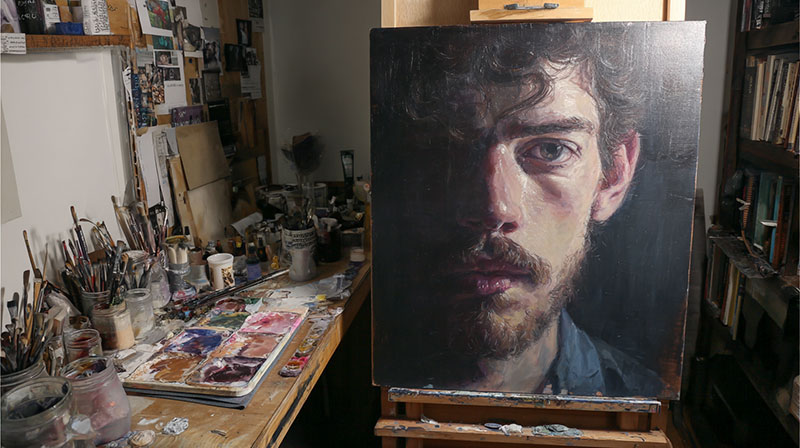
True Black Versus Dark Mixtures
Pure black paint creates flat, lifeless pupils that lack dimensional quality. Mix dark colors instead for more convincing results.
Combine ultramarine blue with burnt umber for rich, dark pupil colors. This mixture appears blacker than pure black but retains color warmth.
Add tiny amounts of complementary colors to darken mixtures further. These subtle color additions prevent muddy, gray appearances.
Avoiding Flat Appearance
Pupils aren’t uniformly black-they contain subtle value variations that suggest depth and dimension. The pupil opening recedes into the eye interior.
Paint pupils slightly lighter around edges where they catch reflected light. This subtle gradation creates depth illusion effectively.
Rembrandt van Rijn understood pupil depth better than most artists. His portraits show pupils with subtle tonal variations that enhance realism.
Subtle Reflection Incorporation
Very bright lighting conditions create tiny reflections even within the dark pupil area. These minute details add sophisticated realism to professional eye paintings.
Use the finest round brush available to add these reflections. Mix titanium white with the smallest possible amount of warm color.
Apply pupil reflections sparingly and only when your reference photo clearly shows them. Overdoing reflections creates artificial, glossy appearances.
Edge Quality Management
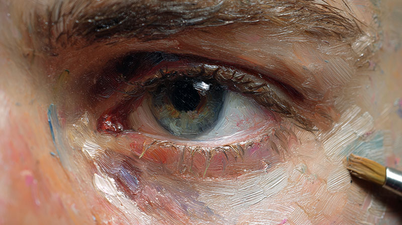
Sharp Versus Soft Pupil Edges
Pupil edges appear sharp in bright lighting but softer in dim conditions. Match your edge quality to the lighting situation in your reference.
Use clean, precise brush work for sharp pupil edges. Load your brush fully and paint confident, smooth curves.
Softer pupil edges require careful blending while paint remains wet. Work quickly before paint starts setting up on your canvas.
Transition to Iris Smoothness
The pupil-to-iris transition should flow smoothly without harsh boundaries. Real eyes show gentle transitions between these adjacent areas.
Blend pupil edges into iris colors while both paints remain workable. This creates natural transitions that enhance overall eye realism.
Johannes Vermeer achieved perfect pupil-to-iris transitions through masterful wet-into-wet painting techniques. Study “Girl with a Pearl Earring” for reference.
Highlight Interaction Points
Catchlight highlights often overlap pupil areas, creating complex interactions between light and dark. These overlaps require careful value management.
Paint pupils first, then add highlights on top. This layering sequence prevents muddy color mixing and maintains clean highlight quality.
Where highlights meet pupil edges, blend transitions carefully to avoid harsh, artificial boundaries that destroy natural eye appearance.
Mastering Eye Highlights

Primary Catchlight Placement
Light Source Angle Reflection
Catchlights reflect your primary light source position directly. Single light sources create one dominant highlight per eye.
Position catchlights according to your lighting setup. Window light from the left creates highlights in the left portion of each eye.
Diego Velázquez demonstrated masterful catchlight placement in his royal portraits. His highlights accurately reflect the palace window lighting he used.
Size and Intensity Variation
Catchlight size relates to light source size and distance. Large, close light sources create bigger highlights than small, distant ones.
Bright light sources produce intense, sharp-edged highlights. Softer lighting creates gentler, more diffused highlight effects.
Studio portraits often show larger catchlights than outdoor natural lighting. Adjust highlight size to match your reference photo lighting conditions.
Shape Characteristics by Light Type
Window light creates rectangular or square highlight shapes that reflect the window frame. Round light sources produce circular highlights.
Multiple light sources create multiple highlights per eye. Balance their relative intensities according to light source strengths.
Artificial lighting shapes (softboxes, umbrellas) leave distinctive highlight patterns. Study photography lighting setups to understand these shapes better.
Secondary Reflection Points
Environmental Light Sources
Secondary highlights come from reflected light bouncing off nearby surfaces. These weaker reflections add subtle realism to painted eyes.
White walls, clothing, or paper reflect additional light into eyes. These secondary colors appear much dimmer than primary catchlights.
Paint secondary reflections with grayed-down colors rather than pure white. Full-strength white competing with primary highlights destroys visual hierarchy.
Cornea Curvature Effects
The curved cornea surface reflects light sources from multiple angles. This curvature creates complex highlight patterns in realistic eyes.
Study close-up eye photography to understand cornea reflection patterns. The curved surface distorts reflected images in characteristic ways.
Paul Cézanne simplified cornea reflections into essential highlight shapes without losing their essential character. His approach works well for painted portraits.
Iris Surface Reflections
The iris surface itself reflects light, creating subtle gleams different from major catchlights. These micro-reflections add sparkle and life.
Use very pale versions of iris colors for surface reflections. Avoid pure white, which creates artificial, plastic-looking eye surfaces.
Apply iris surface reflections sparingly with the finest available brushes. Overdoing these details creates busy, overworked eye surfaces.
Highlight Painting Techniques
Clean White Application Methods
Load your brush with fresh titanium white straight from the tube. Avoid contaminated white from your palette, which appears gray and lifeless.
Clean your brush thoroughly before applying highlights. Any color contamination dulls highlight brilliance immediately.
Apply highlights with confident, single brush strokes when possible. Multiple strokes often create muddy, overworked highlight edges.
Soft Edge Blending
Most highlights need soft edges that blend naturally into surrounding iris colors. Hard-edged highlights appear artificial and destroy natural eye appearance.
Blend highlight edges while paint remains wet using clean, dry brushes. Work gently to avoid lifting paint from underneath layers.
Édouard Manet achieved perfect highlight blending through confident, direct painting methods. His technique avoided overworking highlight areas.
Color Temperature Considerations
Warm light sources create slightly warm-tinted highlights. Cool lighting produces cooler highlight tones that enhance natural color relationships.
Add microscopic amounts of warm or cool colors to highlight mixtures. Pure white highlights often appear too stark and artificial.
Claude Monet understood highlight color temperature better than most artists. His impressionist approach showed how lighting affects highlight colors throughout the day.
Eyelid and Surrounding Area Rendering

Upper Eyelid Form and Shadow
Lid Fold Depth Creation
The upper eyelid creates a natural fold that casts shadows onto itself. This form requires careful value planning to appear three-dimensional.
Mix your base skin tone with raw umber for lid fold shadows. Keep these mixtures warm to maintain natural flesh tone quality.
Peter Paul Rubens mastered eyelid anatomy in his portrait work. His understanding of lid structure shows in every painted eye.
Thickness Variation Along the Lid
Eyelids aren’t uniform in thickness from inner to outer corner. The center portion appears thicker while corners taper thinner.
Paint this thickness variation subtly using gradation techniques. Smooth transitions prevent artificial, mechanical-looking eyelids.
Study your reference photo carefully for individual lid characteristics. Every person’s eyelid structure differs significantly.
Lash Line Shadow Placement
The line where eyelashes emerge creates a subtle shadow that defines the eyelid edge. This detail separates amateur from professional eye painting.
Use a fine brush with dark brown or burnt umber. Avoid pure black, which appears harsh and unnatural.
Follow the natural curve of the eyelid precisely. Straight or poorly curved lash lines destroy eye realism instantly.
Lower Eyelid Subtleties
Waterline Color and Texture
The waterline appears pink or coral-colored in most people. This color requires careful mixing to avoid artificial appearance.
Mix cadmium red with titanium white and add tiny amounts of yellow ochre. Test color matches against your reference photo constantly.
The waterline texture appears smooth and moist. Avoid overpainting this area, which kills the natural wet appearance.
Bag Formation Under Stress
Lower eyelid bags show form through subtle shadow and highlight placement. These bags appear more prominent in older subjects or tired expressions.
Paint bag shadows with cooler skin tones containing subtle violet or blue additions. These complementary colors create convincing depth.
Lucian Freud painted eyelid bags with brutal honesty that enhanced rather than detracted from his portraits’ power.
Cheek Transition Smoothness
The lower eyelid transitions smoothly into cheek areas without harsh boundaries. This space relationship requires careful balance in value and color.
Blend transitions while paint remains wet. Hard edges between eyelid and cheek areas create artificial, cut-out appearances.
Use larger brushes for these transition areas. Small brushes create overworked, tight painting that lacks natural flow.
Tear Duct and Corner Details
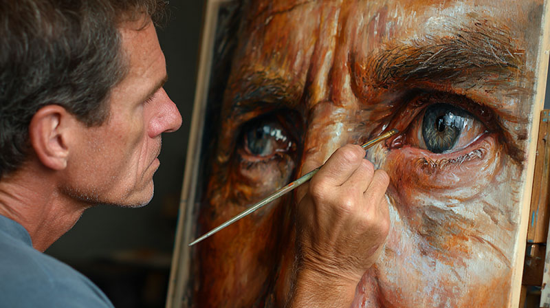
Pink Flesh Tone Mixing
Tear ducts appear pinker than surrounding skin due to visible blood vessels beneath thin tissue. This hue requires specific color mixing knowledge.
Start with titanium white and add cadmium red gradually. Include tiny amounts of yellow ochre to prevent artificial pink appearance.
Jean-Auguste-Dominique Ingres painted tear duct colors with incredible accuracy in his portrait masterpieces.
Moisture Appearance Creation
Tear ducts often appear slightly moist, creating subtle highlight effects. These details add significant realism to painted eyes.
Apply tiny highlights with clean titanium white using your finest brush. Keep these highlights minimal and natural-looking.
Overpainting moisture effects creates artificial, plastic-looking tear ducts that damage overall portrait quality.
Corner Shadow Accuracy
Inner eye corners create small shadow pockets that require careful observation. These shadows anchor the eye convincingly in the skull.
Mix darker flesh tones with burnt umber for corner shadows. Keep edges soft to maintain natural appearance.
Outer corners also cast subtle shadows where upper and lower lids meet. Don’t forget these important structural details.
Eyelash Painting Strategies

Individual Lash Technique
Hair-Like Stroke Creation
Each eyelash requires individual attention to create convincing results. Generic lash painting always looks artificial and unconvincing.
Load your liner brush fully with thin paint consistency. Pull confident strokes that taper naturally from base to tip.
Edgar Degas understood individual lash character better than most artists. Study his pastel portraits for lash painting inspiration.
Length and Thickness Variation
Real eyelashes vary dramatically in length and thickness across the eyelid. This natural variation prevents mechanical, artificial-looking results.
Center lashes appear longest while corner lashes stay shorter. Paint this variation accurately for convincing realism.
Some lashes appear thicker at their base and taper quickly. Others maintain consistent thickness throughout their length.
Lash Length Guidelines
- Inner corner: Short, fine lashes
- Center section: Longest, most prominent lashes
- Outer corner: Medium length, slightly curved
- Lower lid: Consistently shorter than upper lashes
Direction and Curve Realism
Eyelashes don’t grow straight outward-they curve naturally following eyelid shape. This curvature affects every lash stroke direction.
Upper lashes curve upward and outward. Lower lashes curve downward and outward from their attachment points.
Paint lash curves with confident, sweeping motions. Hesitant, choppy strokes create stiff, unnatural-looking lashes.
Lash Group Management
Clumping for Natural Appearance
Real eyelashes often stick together in small groups, especially near the center of the upper lid. This clumping adds natural character.
Paint 2-3 lashes together occasionally to create realistic groupings. Avoid making every lash perfectly separated.
Vincent van Gogh used expressive lash groupings in his self-portraits that enhanced rather than diminished the paintings’ power.
Density Variation Across the Lid
Lash density isn’t uniform across the entire eyelid. Some areas appear fuller while others show gaps or thinner coverage.
Study your reference photo for individual density patterns. Every person’s lash distribution differs significantly.
Paint fewer lashes where natural gaps occur. Filling every available space creates unrealistic, false-eyelash appearances.
Color Shifts from Root to Tip
Many eyelashes appear darker at their roots and lighter toward their tips. This gradation adds sophisticated realism to painted lashes.
Start lash strokes with darker mixtures and gradually lighten paint as you approach lash tips.
Blonde subjects often show dramatic root-to-tip color changes. Brown-haired people typically show more subtle variations.
Lower Lash Considerations
Shorter Length Maintenance
Lower lashes stay consistently shorter than upper lashes in most people. Painting them too long creates artificial, feminine appearances in male subjects.
Keep lower lash length roughly half of upper lash length. This proportion varies slightly between individuals.
Francisco Goya painted lower lashes with remarkable accuracy in his royal portrait commissions.
Lighter Color Application
Lower lashes often appear lighter than upper lashes due to different light exposure and natural pigmentation patterns.
Mix lighter versions of your lash colors for lower lid application. This subtle difference enhances natural appearance significantly.
Some people show blonde or light brown lower lashes even with darker upper lash colors.
Sparse Distribution Patterns
Lower lashes grow more sparsely than upper lashes in most people. Paint them with appropriate spacing and density.
Leave gaps between lower lash groups to maintain natural appearance. Overpopulated lower lash lines look artificial.
Focus lower lash painting on the center and outer portions of the lower lid where they appear most prominent.
Adding Life Through Expression
Eyebrow Integration
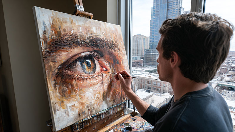
Hair Direction Accuracy
Eyebrow hairs follow specific growth patterns that vary across the brow length. Inner brow hairs grow upward while outer portions angle downward.
Paint individual brow hairs following these natural directions. Random hair directions create messy, unconvincing eyebrow appearances.
Albrecht Dürer studied facial hair patterns extensively in his detailed self-portrait drawings and paintings.
Density Variation for Age
Younger subjects typically show fuller, denser eyebrows than older individuals. This age-related change affects eyebrow painting significantly.
Paint fewer individual hairs for elderly subjects. Sparse, wispy eyebrows suggest advanced age convincingly.
Middle-aged subjects often show uneven density with some areas appearing fuller than others.
Color Relationship to Hair
Eyebrow color usually matches or appears slightly darker than head hair color. This relationship maintains natural harmony in portraits.
Gray-haired subjects often retain darker eyebrows. Study your reference carefully for accurate color relationships.
Paul Gauguin used bold eyebrow colors that enhanced his subjects’ character while maintaining believable color relationships.
Skin Texture and Pores
Subtle Texture Application
Facial skin shows subtle texture that varies by age and individual characteristics. Smooth, poreless skin appears artificial in realistic portraits.
Apply texture effects sparingly using dry brush techniques. Overworked texture destroys smooth skin appearance.
Focus texture work on areas where it naturally occurs most prominently-nose, cheek, and forehead areas.
Age-Appropriate Details
Younger subjects require minimal texture work while older subjects show more pronounced skin characteristics.
Add crow’s feet and expression lines gradually. Heavy-handed aging details can appear caricatured rather than realistic.
Rembrandt van Rijn balanced age-appropriate details with dignified portrait presentation in his later self-portraits.
Makeup Interaction Effects
Many portrait subjects wear makeup that affects natural skin texture and color appearance. Paint what you see, not what you expect.
Foundation creates smoother skin surfaces than natural skin. Adjust your painting technique accordingly.
Eye makeup colors influence surrounding skin tones through reflected color effects.
Moisture and Wetness Effects
Tear Film Simulation
Eyes naturally appear moist due to tear film covering the entire eye surface. This moisture creates subtle reflection effects throughout the eye.
Paint this wetness using very pale, warm-tinted highlights across iris and sclera surfaces.
Johannes Vermeer captured eye moisture effects with incredible subtlety in his intimate portrait work.
Highlight Softening Techniques
Moisture softens highlight edges, preventing harsh, artificial appearance. Real eye highlights blend naturally into surrounding colors.
Blend highlight edges while paint remains workable. Sharp, unblended highlights appear painted-on rather than natural.
Use clean, dry brushes for highlight blending. Contaminated brushes muddy highlight quality immediately.
Reflection Quality Adjustments
Moist eye surfaces reflect light differently than dry surfaces. These reflections appear softer and more diffused than hard, mirror-like reflections.
Adjust reflection intensity to match natural eye moisture levels. Overly bright reflections suggest artificial tears or eye drops.
Claude Monet understood how natural moisture affects eye appearance in his outdoor portrait studies.
Common Mistakes and Corrections

Proportion and Placement Issues
Eye Size Discrepancies
Unmatched eye sizes destroy portrait credibility instantly. Measure both eyes against your reference using proportional comparison methods.
The far eye in three-quarter views appears smaller due to perspective effects. Don’t make both eyes identical sizes in angled portraits.
Pablo Picasso deliberately distorted eye proportions in his cubist works, but realistic portraits demand accurate size relationships.
Angle Alignment Problems
Eyes follow the head’s tilt and position. Misaligned eye angles make subjects appear to have medical conditions or cross-eyed appearances.
Draw light guidelines connecting inner corners to outer corners. These lines should remain parallel in frontal views.
Check angle alignment frequently during painting. Small angle errors compound into major proportion problems quickly.
Distance Measurement Errors
The space between eyes equals one eye-width in most faces. Too much or too little spacing creates alien-like appearances.
Use your brush handle to measure eye spacing against your reference photo. Hold the measuring tool at consistent distances for accuracy.
Leonardo da Vinci documented ideal facial proportions extensively, though individual variations require careful observation over generic rules.
Color and Value Problems
Overly Bright Highlights
Beginner painters often use pure white straight from the tube for eye highlights. This creates artificial, plastic-looking eyes that lack natural quality.
Mix titanium white with tiny amounts of warm color for realistic highlights. The eye’s moisture creates slight color tinting in natural highlights.
Caravaggio used subtle highlight colors that enhanced rather than dominated his dramatic portrait lighting effects.
Muddy Iris Colors
Overmixing colors or using contaminated brushes creates gray, lifeless iris colors that kill eye sparkle and vitality.
Keep iris color mixtures clean and fresh. Mix new batches when colors become muddy or contaminated.
Use separate brushes for different color families. Cross-contamination between warm and cool colors creates muddy mixtures instantly.
Flat Pupil Appearance
Pure black pupils appear flat and lifeless because they contain no value variation or subtle color nuances.
Mix dark browns and blues for richer pupil colors. These mixtures appear blacker than pure black while retaining warmth and depth.
Rembrandt van Rijn painted pupils with subtle gradation that suggested depth and dimension beyond simple flat darkness.
Detail Overworking
Too Many Eyelashes
Painting every possible eyelash creates busy, artificial appearances that destroy natural eye character and realistic texture.
Study your reference for actual lash density. Many areas show gaps or sparse coverage that shouldn’t be filled artificially.
Edgar Degas painted suggested lash groups rather than individual hairs, achieving convincing results with economical brushwork.
Excessive Texture Detail
Overpainting skin texture creates rough, unnatural surfaces that compete with the eye’s natural smoothness and form.
Apply texture effects sparingly and only where they naturally occur most prominently in your reference photo.
Focus detail work on key areas while keeping supporting areas simpler. Not every surface needs maximum detail treatment.
Highlight Placement Errors
Multiple competing highlights confuse the eye and destroy clear light source logic. Too many bright spots eliminate focal point clarity.
Identify your primary light source and paint one dominant highlight per eye. Secondary highlights should appear much dimmer.
Diego Velázquez used single, perfectly placed highlights that enhanced rather than competed with his subjects’ natural character.
Final Refinement and Finishing

Overall Harmony Assessment
Value Relationship Checking
Step back from your painting regularly to assess overall value relationships. Close-up detail work can distort your perception of tonal balance.
Squint at your painting to eliminate detail and focus on major value patterns. Dark, medium, and light areas should read clearly.
Paul Cézanne constantly evaluated value relationships in his portrait work, making adjustments until harmony emerged naturally.
Color Temperature Consistency
All colors in your eye painting should relate to the same lighting conditions. Mixed lighting creates conflicting color temperatures that destroy unity.
Warm light sources affect all colors consistently throughout the painting. Cool lighting pushes everything toward blue and gray ranges.
Check color temperature relationships by comparing different areas of your painting under consistent viewing conditions.
Edge Quality Evaluation
Vary edge quality throughout your eye painting to create visual interest and natural emphasis. Hard edges everywhere create tight, overworked appearances.
Sharp edges draw attention while soft edges recede visually. Use this principle to control where viewers look first.
John Singer Sargent mastered edge variety in his portrait work, guiding viewer attention through skillful edge control.
Selective Detail Addition
Strategic Highlight Placement
Add final highlights only where they enhance the overall painting composition. Random bright spots destroy careful visual hierarchy development.
Primary highlights should support your main focal point. Secondary highlights can add sparkle without competing for attention.
Use your finest brushes with fresh, clean paint for final highlight additions. Contaminated highlights appear gray and lifeless.
Final Eyelash Refinements
Add only the most essential final eyelashes after assessing the overall lash pattern. Too many last-minute additions create overworked appearances.
Focus final lash work on areas that need stronger definition or emphasis. Not every lash needs individual perfection.
Henri Matisse simplified lash details to essential characteristics while maintaining convincing eye structure and character.
Skin Texture Completion
Complete skin texture work with restraint and selectivity. Overworked texture competes with smooth eye surfaces and destroys natural contrast.
Age-appropriate texture should enhance rather than dominate portrait character. Subtle suggestions often work better than detailed rendering.
Georgia O’Keeffe painted minimal skin texture in her portraits, focusing attention on eyes and essential facial structure instead.
Atmospheric Integration
Environmental Color Influence
Room color and lighting affect all painted colors through reflection and atmospheric perspective effects. Isolated eye colors appear disconnected from their environment.
Introduce subtle environmental colors into shadow areas and reflected light zones. This integration creates believable spatial relationships.
Claude Monet understood environmental color influence better than most artists, adjusting all colors to match specific lighting conditions.
Distance and Focus Effects
Not every eye detail requires sharp focus. Selective focus creates depth and draws attention to key areas effectively.
Slightly soften background eye elements while keeping foreground details crisp and clear. This creates natural depth perception.
Vermeer used selective focus effects centuries before photography, creating atmospheric depth through careful detail control.
Overall Painting Unity
Your painted eyes must integrate seamlessly with the rest of your portrait work. Isolated, overworked eyes appear pasted-on rather than natural.
Match painting technique and finish quality between eyes and surrounding facial areas. Consistency in brushwork creates believable unity.
Peter Paul Rubens achieved perfect integration between detailed eye work and broader facial form through consistent painting approaches.
FAQ on How To Paint Realistic Eyes
What colors do I need to paint realistic brown eyes?
Mix raw umber, burnt sienna, and yellow ochre for base iris colors. Add ultramarine blue for deeper shadows and titanium white for highlights.
Caravaggio achieved stunning brown eye realism using similar earth tone combinations in his portrait masterpieces.
How do I make eye highlights look natural instead of artificial?
Never use pure white straight from the tube. Mix titanium white with tiny amounts of warm color matching your light source temperature.
Position highlights according to your primary light direction. Johannes Vermeer perfected this technique in “Girl with a Pearl Earring.”
What’s the biggest mistake beginners make painting eyes?
Making both eyes identical sizes and shapes. The far eye appears smaller in three-quarter views due to perspective effects.
Study your reference photo carefully instead of relying on generic eye formulas that create artificial results.
How do I paint convincing eyelashes without overworking them?
Use confident, tapered strokes with a loaded liner brush. Paint lash groups rather than every individual hair for natural appearance.
Edgar Degas suggested lashes economically in his pastels, achieving believable results without excessive detail work.
What brush sizes work best for eye detail painting?
Size 2 and 4 round brushes handle iris details and pupils. Size 0 liner brushes create individual eyelashes and tear duct work.
Keep separate brushes for light and dark colors to prevent contamination that muddles color quality.
How do I mix realistic skin tones around the eyes?
Start with titanium white and add cadmium red plus yellow ochre gradually. Cool skin needs more blue additions.
Peter Paul Rubens mastered flesh tone mixing through systematic primary color combinations that maintained natural warmth.
Why do my painted pupils look flat and lifeless?
Pure black creates artificial flatness. Mix ultramarine blue with burnt umber for rich, dimensional pupil darkness instead.
Rembrandt van Rijn painted pupils with subtle value variations that suggested depth beyond simple flat surfaces.
How do I paint the eye socket shadows convincingly?
Mix base skin tone with raw umber for socket shadows. Keep edges soft and blend while paint remains wet.
Socket depth requires careful value control to create the illusion that eyes sit naturally within skull structure.
What’s the proper proportion between the two eyes?
One eye-width spacing between eyes works for most faces. Measure proportions from your reference rather than using generic rules.
Leonardo da Vinci documented facial proportions, but individual variations require careful observation over mathematical formulas.
How do I create the wet, moist appearance in realistic eyes?
Apply subtle highlights across iris and sclera surfaces using pale, warm-tinted mixtures. Blend highlight edges softly.
Real eyes have tear film coverage that creates gentle reflections throughout the eye surface, not just sharp catchlights.
Conclusion
Mastering how to paint realistic eyes transforms your portrait work from amateur attempts into professional-quality art that captivates viewers. The techniques covered here work across all mediums and skill levels.
Practice each step methodically rather than rushing toward finished results. Vincent van Gogh spent years studying eye structure before achieving the piercing gazes in his self-portraits.
The key lies in understanding that eyes aren’t just visual features-they’re complex three-dimensional forms requiring careful value relationships and color harmony. Henri Matisse simplified eye details while maintaining essential character and life.
Start with basic eye shape and socket shadows. Build iris patterns gradually using tertiary colors mixed from your palette primaries.
Remember that realistic eye painting demands patience and observation skills more than expensive materials. Francisco Goya created stunning eye portraits using limited color palettes and basic brush techniques.
Focus on one technique at a time until it becomes natural. Soon you’ll paint eyes that seem to breathe and think-the hallmark of truly successful portrait work.