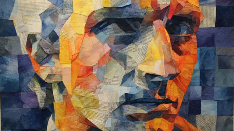
That photo sitting on your desk could become your next masterpiece. Learning how to paint a portrait from a photo transforms static images into living, breathing artwork that captures not just appearance, but personality itself.
Most people think portrait painting requires years of formal training or natural talent. Actually, it’s a learnable skill that combines observation, technique, and patience.
Professional portrait artists from Leonardo da Vinci to contemporary masters all started with photo references. Even John Singer Sargent used photographs to capture details he couldn’t observe during live sittings.
This guide walks you through every step of the portrait painting process. You’ll discover how to analyze facial proportions, mix realistic skin tones, and build paint layers that create dimensional form.
By the end, you’ll understand:
• Essential facial structure and measurement techniques • Color theory principles for accurate skin tones
• Step-by-step painting methods for eyes, nose, and mouth • Common mistakes and practical solutions
Whether you’re working in oil painting, acrylic painting, or watercolor painting, these fundamentals apply across all painting mediums.
Understanding Facial Structure and Proportions

Basic Face Measurements That Actually Work
The human face follows predictable patterns. Eyes sit exactly halfway down the head from crown to chin.
Most people get this wrong. They place eyes too high, making faces look childlike.
The Golden Rules of Facial Proportions
The distance between eyes equals one eye width. No exceptions.
From the bottom of the nose to the chin measures the same as from the eyebrows to the nose base. This linear perspective principle applies to portrait work just like landscape painting.
The mouth sits one-third of the way down from nose to chin. Not halfway.
Individual Facial Features That Make or Break Your Portrait
Eye Shape Variations
Every eye is different. Some droop at the outer corners, others lift upward.
The iris rarely shows completely. The upper eyelid typically covers part of it.
Lower eyelids have thickness. They’re not just lines.
Nose Structure From Multiple Angles
Noses cast complex shadows. The bridge creates one shadow, the tip another.
Nostrils aren’t circles. They’re more like commas or teardrops.
From a three-quarter view, you only see one nostril clearly. The other disappears behind the nose bridge.
Mouth Expressions and Lip Formations
Upper lips create shadows. Lower lips catch light.
The corners of mouths sit deeper than the center. This creates natural shadow areas.
Lips aren’t the same color as surrounding skin. They’re typically cooler in temperature.
Ear Details Most Artists Miss
Ears align with eyes and nose base. This stays consistent across different head angles.
The ear canal creates the darkest shadow in the ear. Don’t skip this detail.
Earlobes either attach or hang free. This affects how light hits them.
Head Shape and Angle Challenges
Different Face Types Need Different Approaches
Oval faces are the easiest to paint. They follow textbook proportions.
Round faces appear wider at the cheeks. Square faces have prominent jaw lines.
Heart-shaped faces narrow at the chin. Each type changes how shadows fall.
Three-Quarter View Problems
This angle shows both eyes but from different perspectives. The far eye appears narrower.
The nose partially hides the far nostril. The mouth curves around the face’s cylinder form.
Understanding foreshortening becomes critical here.
Profile Accuracy Tips
In profile, the eye appears triangular, not almond-shaped. The eyelashes project outward from this triangle.
The ear moves back on the head. It’s not attached to the side of the face like in front view.
Common Proportion Mistakes
Beginning painters often make eyes too large. Real eyes are smaller than you think.
Foreheads get shortened. They actually take up significant space from hairline to eyebrows.
Necks appear too narrow in photos due to perspective distortion. Paint them slightly wider.
Color Theory for Realistic Skin Tones

Understanding Skin Color Basics
Skin isn’t one color. It’s a complex mixture of undertones and surface colors.
Every face contains warm and cool areas. Knowing where these occur makes portraits look alive.
Base Colors for Different Ethnicities
Mixing Accurate Flesh Tones
Caucasian skin often starts with yellow ochre and cadmium red. Add white sparingly.
Darker skin tones need burnt umber and raw sienna as bases. Never use black to darken skin.
Asian skin tones lean toward yellow undertones. African skin often has purple or blue undertones.
The key is observing, not assuming. Every person’s skin differs.
Warm and Cool Undertones in Skin
Where Warm Colors Appear
Cheeks, nose tips, and ears show warm undertones. Blood vessels create these reddish areas.
Forehead centers often appear warm. This is where light source hits directly.
Around the mouth, skin leans warm due to lip proximity.
Cool Areas in Faces
Jaw lines and temples typically appear cooler. These areas recede into shadow.
Under the eyes, skin often looks purplish or bluish. This isn’t a mistake – it’s reality.
The sides of noses can appear quite cool, especially in natural light.
How Lighting Affects Skin Color
Outdoor Light Versus Indoor Light
Natural light reveals true color theory in skin tones. Indoor lights shift everything toward warm or cool.
Fluorescent lights make skin appear greenish. Incandescent bulbs push everything orange.
Window light from the north stays consistent. South-facing windows change throughout the day.
Shadow and Highlight Colors
Shadows aren’t just darker versions of skin tone. They contain complementary colors to the light.
If your light is warm, shadows will be cool. This creates natural color contrast that makes faces dimensional.
Highlights aren’t white. They’re light versions of the skin tone with a touch of the light color.
Reflected Light in Shadow Areas
Shadow areas catch light from surrounding surfaces. A white shirt reflects up onto the jaw.
Bright walls bounce light into shadow sides of faces. Green grass reflects upward in outdoor portraits.
This reflected light prevents shadows from going completely dark.
Transition Colors Between Light and Shadow
The area between light and shadow contains the most complex colors. This is where value changes occur gradually.
These transitions often appear grayer than pure light or shadow areas. They’re neutralized mixtures.
Master painters like Rembrandt van Rijn built entire careers on painting these subtle transitions.
Color Temperature Changes Throughout the Face
Noses appear warmer at the tip, cooler along the bridge. Cheeks are warm in the center, cool at the edges.
Foreheads shift from warm in the center to cool at the temples. This follows the skull’s underlying structure.
Understanding color saturation helps here – areas in direct light appear more saturated.
Drawing and Sketching the Initial Portrait

Getting Started With Your Drawing
Accurate drawing forms the foundation of successful portrait painting. No amount of beautiful color can save poor proportions.
Start with the largest shapes first. Details come later.
Grid Method for Accurate Proportions
Creating Effective Grids
Draw a grid on your reference photo using a ruler. Make squares about half an inch apart.
Create a proportional grid on your canvas. If your painting is twice as large, make two-inch squares.
Number the grid lines. This prevents confusion when transferring information.
Some artists prefer digital grids on tablets or phones. These don’t damage your reference photo.
Transferring Key Points
Mark where major features intersect grid lines. Eyes, nose tip, mouth corners, chin line.
Don’t trace every line of the photo. Use the grid to check proportions as you draw freehand.
The grid helps most with placement. You still need to observe carefully.
When to Use Grids Versus Freehand
Beginners benefit from grids for proportion accuracy. Advanced painters often prefer freehand methods.
Use grids when working from complex photos with multiple people or difficult angles.
Skip grids for loose, expressive portraits where exact accuracy isn’t the goal.
Blocking in Basic Shapes
Head as Simple Geometry
Start with an oval or circle for the head mass. This isn’t the face outline – it’s the entire skull shape.
Add a center line down the face. This line follows the nose and mouth, even when the head turns.
Mark the eye line across the halfway point. This stays consistent regardless of head angle.
Feature Placement With Construction Lines
Draw light guidelines for feature placement. These erase easily once proportions are confirmed.
The nose centerline connects to the center line between the eyebrows. It’s rarely perfectly straight.
Mark the mouth line before drawing lips. This prevents mouths from floating in space.
Connecting Neck and Shoulders
The neck connects to the skull behind the ears, not at the jaw line. This is a common mistake.
Necks are thicker than most people think. They support the head’s weight.
Shoulders start wide and angle upward. They’re not perfectly horizontal.
Refining Your Drawing
Checking Proportions With Measuring
Hold your brush or pencil at arm’s length. Use it to compare measurements between features.
Check eye-to-eye distance against eye width. Verify nose length against other facial measurements.
Look at negative spaces – the shapes between features. These are often easier to see accurately.
Getting Eye Angles Correct
Eyes follow the skull’s curve. They’re not flat stickers on the face.
The far eye in three-quarter view appears narrower due to atmospheric perspective principles.
Inner corners of eyes typically sit lower than outer corners. This varies by individual.
Nose Centerline Alignment
The nose centerline rarely runs straight down. It often curves slightly.
This line connects to the center of the mouth. If they don’t align, something’s wrong.
From three-quarter view, the nose centerline shifts toward the near side of the face.
Mouth Width Relations
Mouth corners typically align with the inner edges of the iris, not the entire eye.
This rule breaks when people smile widely or have unusual mouth proportions.
Check mouth width against other facial measurements for accuracy.
Developing Strong Contour Lines
Vary your line quality. Some edges are sharp, others soft and broken.
Hair edges tend to be softer than facial feature edges. This creates natural visual hierarchy.
The drawing stage determines your painting’s success. Take time to get it right.
Painting Techniques for Different Features

Eyes That Look Alive
Iris and Pupil Relationship
The pupil sits dead center in the iris. This sounds obvious, but many painters get it wrong.
Iris colors contain flecks and variations. Never paint them as solid colors.
The pupil reflects light differently than the iris. It appears deeper, almost like a hole.
Eyelid Thickness and Structure
Upper eyelids have substantial thickness. They cast shadows on the eyeball below.
Lower eyelids catch light on their top edge. This creates a subtle highlight that makes eyes look wet.
The tear duct sits in the inner corner. It’s often pinkish and slightly raised.
Eyebrow Direction and Individual Hairs
Eyebrow hairs grow in specific directions. They angle upward near the nose, then curve over the eye.
Don’t paint every hair. Suggest texture with strategic strokes.
The skin underneath shows through in thin eyebrow areas. This isn’t a painting mistake.
Catchlight Placement for Life
Catchlights make eyes alive. Without them, eyes look dead.
Place catchlights where your light source hits the eye. Usually upper left or right.
Keep catchlights small. Oversized ones look artificial.
Nose Structure and Form
Understanding Nose Planes
The nose has five basic planes: top, two sides, bottom, and tip. Each catches light differently.
Side planes often appear cooler in temperature than the top plane. This follows basic color theory principles.
The bridge highlight rarely runs straight down. It follows the nose’s actual curve.
Nostril Shape and Shadow Patterns
Nostrils aren’t black holes. They contain reflected light from surrounding skin.
The nostril shape changes dramatically with head angle. Study your reference carefully.
Cast shadows from nostrils extend downward toward the upper lip. Don’t make them too dark.
Tip Roundness and Definition
Nose tips catch direct light. They’re often the brightest spot on the nose.
The tip connects to the nostril area with subtle gradation. Avoid hard edges here.
Some noses have a central cleft in the tip. This creates two small highlight areas.
Connection to Cheek Areas
The nose doesn’t end at its outline. It blends into surrounding cheek areas.
This transition area often appears slightly grayer than pure cheek or nose color. It’s a neutralized mixture.
Master painters like Leonardo da Vinci perfected these subtle transitions using sfumato technique.
Mouth Expression and Lips
Upper Lip Shadow Line Importance
The line between upper lip and skin creates crucial definition. This edge is usually quite sharp.
Upper lips typically appear darker than lower lips. They angle away from the light source.
The center groove in the upper lip (philtrum) catches a thin highlight line.
Lower Lip Highlight Placement
Lower lips face upward and catch light. They’re often the brightest part of the mouth.
Don’t paint lower lip highlights as white stripes. Use light versions of the lip color.
The highlight follows the lip’s curve. It’s not a straight line across.
Corner Depth and Smile Lines
Mouth corners sit deeper than the center. They’re in shadow most of the time.
Smile lines (nasolabial folds) extend from nose to mouth corners. These vary greatly between individuals.
The corners connect to surrounding skin gradually. Avoid outlining the entire mouth.
Teeth Visibility and Color
Teeth aren’t white. They’re slightly warm gray or very pale yellow.
Individual teeth have different values. Front teeth are usually brightest.
The gum line creates a subtle shadow along the top of visible teeth.
Hair Texture and Movement
Hair Flow Direction
Hair follows growth patterns from the scalp. Study how it falls naturally.
Part lines create directional changes. Hair flows away from these divisions.
Wind or movement affects hair direction. Static photos can’t show this – you need to imagine it.
Individual Strand Versus Mass Approach
Begin with hair masses, not individual strands. Think of hair as large shapes first.
Add strand details only after establishing the overall hair pattern. Too much detail early kills the natural flow.
Use different brush techniques for different hair types. Fine hair needs delicate strokes; coarse hair needs bolder marks.
Different Hair Types and Textures
Curly hair creates complex shadow patterns. Each curl casts small shadows on surrounding hair.
Straight hair reflects light in predictable bands. These highlights follow the hair’s direction.
Gray or silver hair has cooler undertones than brown or black hair. Adjust your color temperature accordingly.
Highlights That Show Hair Shine
Hair highlights aren’t white. They’re light versions of the hair color plus light source color.
Healthy hair shows sharp highlight edges. Damaged hair has softer, less defined highlights.
The shiniest area usually appears on the crown where light hits most directly.
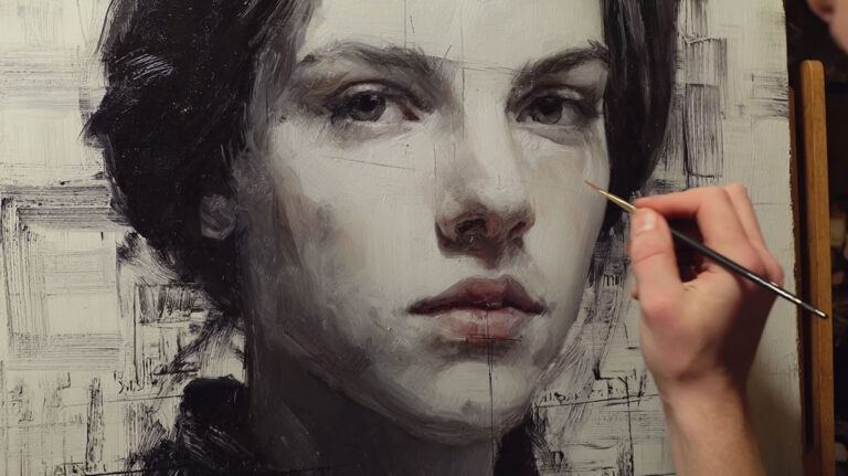
Building Up Paint Layers

Understanding Layer Basics
Successful portraits build gradually from general to specific. Rush this process and you’ll create mud.
Each layer should solve specific problems while maintaining what works from previous layers.
Underpainting Fundamentals
Monochrome Value Studies First
Start with a single color plus white. Raw umber or burnt sienna work well.
Establish all major values before adding color. This prevents color-mixing disasters later.
The underpainting shows through subsequent layers, affecting final colors subtly.
Color Temperature Mapping
Identify warm and cool areas in your reference photo. Map these onto your canvas early.
Warm areas might get a thin wash of cadmium red or yellow ochre. Cool areas get ultramarine blue or purple.
This temperature foundation affects every subsequent layer. Get it right from the start.
Thin Paint Application Techniques
Underpainting should be thin enough to dry quickly. Add medium or turpentine to achieve this.
Thick paint in early layers causes adhesion problems. Subsequent layers may crack or peel.
“Fat over lean” means each layer contains more oil than the previous. This ensures proper drying.
Drying Time Between Layers
Oil painting requires patience. Each layer needs adequate drying time.
Thin layers dry in 1-2 days. Thick layers need weeks or months. Plan your painting sessions accordingly.
Acrylic painting dries faster but still benefits from layer thinking. Let each application set completely.
Adding Details Gradually
Working From General to Specific
Block in large areas first. Eyes, nose, and mouth come after establishing the overall head shape.
Details like eyelashes and individual hairs come last. Add them too early and they look pasted on.
Each layer should improve the whole painting, not just isolated areas.
When to Add Fine Details
Fine details need a solid foundation. Don’t add wrinkles until the basic skin form is established.
Details work best when the painting is nearly finished. They’re the final seasoning, not the main ingredient.
Some details might be too small for your painting size. Leave them out rather than making everything look busy.
Keeping Edges Soft Where Needed
Not every edge should be sharp. Soft edges create atmospheric perspective even in close-up portraits.
Hair edges against background often stay soft. This prevents hair from looking cut out and pasted on.
Use clean, soft brushes for blending edges. Dirty brushes create muddy transitions.
Hard Versus Soft Brush Techniques
Hard brushes create crisp edges and fine details. Use them for eyelashes, eyebrow hairs, and sharp contour lines.
Soft brushes blend colors smoothly. They’re perfect for skin transitions and soft hair areas.
Switch between brush types frequently. Different areas need different approaches.
Final Touches and Refinements
Sharpening Focal Points
The focal point needs the highest contrast and sharpest details. Usually this is the near eye.
Surrounding areas should be slightly softer to support the focal point, not compete with it.
Add the sharpest highlights and darkest darks to focal areas last.
Softening Background Elements
Backgrounds should support, not distract from the subject. Keep them simple and soft.
Even if your photo shows detailed backgrounds, simplify them in your painting. This creates better visual hierarchy.
Use larger brushes for backgrounds. This prevents overworking and maintains looseness.
Color Harmony Adjustments
Step back frequently to assess overall color harmony. Individual areas might look great but clash with the whole.
Glaze thin color over large areas to unify the painting. A thin warm glaze over everything creates golden hour lighting.
Cool glazes can push areas into shadow or create moonlight effects.
Texture Additions for Realism
Skin texture comes last. Use dry brush techniques to suggest pores without painting every one.
Fabric textures need different brushwork than skin. Study how light hits different material types.
Don’t texture everything equally. Focal areas get more texture than supporting areas.
Common Problems and How to Fix Them
Proportion Issues That Kill Portraits

Eyes Too Large or Small
Oversized eyes make subjects look childlike or cartoon-ish. Measure carefully against other features.
Undersized eyes make faces look dead or mask-like. Eyes are the most important feature – get their size right.
Use the “one eye width between eyes” rule to check proportions. This rarely varies between individuals.
Features Not Lining Up Properly
Draw construction lines to check feature alignment. Eyes should sit on the same horizontal line.
The nose centerline must align with the center of the mouth. If they don’t, the face looks crooked.
In three-quarter view, features follow the face’s curve. They’re not arranged on flat planes.
Head Size Versus Shoulders
Beginning painters often make heads too large for bodies. The head is smaller than you think.
Adult heads are about one-eighth of total body height. This stays consistent across different people.
Shoulders extend well beyond the head width. They’re not just neck-width supports.
Asymmetry Problems
Human faces aren’t perfectly symmetrical, but paintings can make asymmetry look like mistakes.
Compare both sides of the face constantly. One eye higher than the other looks wrong quickly.
Some natural asymmetry adds character. Too much looks like poor craftsmanship.
Color Problems That Ruin Realism
Skin Looking Muddy or Gray
Muddy skin usually comes from overmixing colors or using too many pigments in one mixture.
Add clean color in small amounts rather than trying to fix mud with more mud.
Sometimes you need to scrape off muddy areas and start fresh. Don’t try to paint over serious color mistakes.
Colors Too Bright or Dull
Oversaturated skin looks artificial. Real skin contains more gray than you think.
Undersaturated skin looks lifeless. Find the balance between natural and colorful.
Color saturation varies across the face. Cheeks and lips are more saturated than forehead areas.
Inconsistent Lighting Direction
All shadows must come from the same light source. Mixed lighting directions destroy form illusion.
Check shadow directions constantly. If nose shadow goes left but cheek shadow goes right, something’s wrong.
Study master paintings by Diego Velázquez to see consistent lighting handled expertly.
Colors Not Matching Reference
Don’t copy photo colors exactly. Photos distort colors, especially in artificial light.
Observe the color relationships instead. Is the cheek warmer or cooler than the forehead?
Adjust all colors proportionally if the overall painting seems too warm or cool.
Technical Painting Issues
Paint Getting Muddy From Overmixing
Mix colors decisively. Overworking mixtures on the palette creates gray, lifeless colors.
Clean your brush between colors. Dirty brushes contaminate fresh mixtures.
Sometimes partial mixing looks better than complete mixing. Leave some color variation in mixtures.
Edges Too Hard Everywhere
Vary edge quality throughout your painting. Not every edge should be razor-sharp.
Use clean, soft brushes to blur edges while paint is still wet. This is easier than trying to soften dried paint.
Study where edges are naturally soft in your reference. Hair against skin, shadow transitions, background elements.
Lost Details From Overworking
Know when to stop. Overworked areas look labored and lose their freshness.
If you’ve lost important details, let the area dry completely before attempting repairs.
Sometimes it’s better to leave slightly unfinished areas than to overwork them into mud.
Paint Application Problems
Thick paint over thin areas can crack. Follow “fat over lean” principles religiously.
Different painting mediums have different application requirements. Learn your chosen medium’s characteristics thoroughly.
Brush control comes with practice. Don’t expect perfect technique immediately.
Quick Fixes for Common Mistakes
- Scrape don’t paint over major mistakes
- Use clean brushes for each color family
- Step back frequently to see the whole painting
- Compare proportions to your reference constantly
- Mix colors confidently – hesitation creates mud
The key to improvement is recognizing problems early. Fix small issues before they become big ones.
Finishing Your Portrait

Final Detail Work
Eyelash and Eyebrow Refinement
Individual eyelashes grow in clumps, not perfect rows. Paint them in small groups for natural appearance.
Upper lashes curve upward and outward. Lower lashes are shorter and point downward.
Don’t paint every lash. Suggest them with confident strokes that follow natural growth patterns.
Eyebrow Hair Direction
Eyebrow hairs change direction across the brow. They angle upward near the nose, then sweep over the eye socket.
Use a liner brush for individual hair strokes. Keep your hand loose and confident.
The tail of the eyebrow often has sparser hair. Show the skin underneath in these areas.
Refining Eye Details
Tear ducts need careful attention. They’re often pinkish and slightly wet-looking.
The white of the eye isn’t pure white. It has subtle tone variations and often appears slightly blue-gray.
Eye corners create small shadow pockets. These details separate amateur work from professional results.
Skin Texture Suggestions
Creating Realistic Skin Surface
Real skin has subtle texture variations. Smooth areas alternate with slightly rougher zones.
Use dry brush techniques to suggest pores without painting every one individually. Less is more here.
Skin texture varies by age and gender. Young skin appears smoother; older skin shows more character lines.
Age-Appropriate Texture Work
Children’s skin needs minimal texture work. Overdo it and they look artificially aged.
Adult skin benefits from subtle texture suggestions around eyes, mouth, and forehead areas.
Senior subjects often have pronounced texture that adds character when painted sensitively.
Clothing and Background Completion
Simplifying Clothing Details
Clothing should support the face, not compete with it. Simplify complex patterns and textures.
Focus detail work on areas closest to the face. Shoulder and chest areas can remain looser.
Study how Johannes Vermeer handled clothing in his portraits for inspiration.
Background Strategy
Backgrounds establish mood without stealing attention. Keep them simple and unified.
Use larger brushes for background work. This prevents overworking and maintains painterly quality.
The background color should complement skin tones, not clash with them.
Creating Depth Through Simplification
Background elements should appear less detailed than foreground features. This creates natural space in visual art.
Soften background edges to push them back visually. Sharp edges advance toward the viewer.
Consider the principles of aerial perspective even in close-up portraits.
Signature Placement

Where to Sign Your Work
Sign in an area that doesn’t compete with the subject. Lower corners work well for most composition types.
Signature size should be proportional to the painting. Oversized signatures look amateurish.
Use a color that relates to the painting but doesn’t jump out. Avoid bright, contrasting signature colors.
Signature Techniques
Some artists incorporate signatures into shadow areas. This keeps them subtle but visible.
Others prefer small, clean signatures in neutral areas. Choose what fits your personal style.
Traditional masters often signed with dates. This helps track your artistic development over time.
Varnishing and Protection
When Your Painting is Ready
Oil paintings need six months to a year before final varnishing. The paint must cure completely.
Acrylic paintings can be varnished within days of completion. They dry faster than oils.
Test a small area first. Some paint brands react differently to varnishes.
Types of Varnish for Different Effects
Gloss varnish intensifies colors and creates smooth surfaces. It shows brush strokes clearly.
Matte varnish reduces reflections but can dull colors slightly. Semi-gloss splits the difference.
Removable varnishes allow future restoration. Permanent varnishes are easier to apply but can’t be undone.
Application Techniques
Apply varnish in thin, even coats using soft brushes. Work quickly to avoid streaking.
Varnish in dust-free environments. Particles settling on wet varnish become permanent.
Some artists prefer spray varnishes for even coverage. Practice on test pieces first.
Brush Care for Varnishing
Use separate brushes for varnishing. Don’t use your good painting brushes.
Clean varnish brushes immediately after use. Dried varnish ruins brushes permanently.
Store varnish brushes wrapped in plastic between uses if working over multiple days.
Long-term Care Instructions
Proper Storage Methods
Store finished paintings vertically when possible. Horizontal storage can cause sagging over time.
Wrap paintings in acid-free tissue or glassine paper. Regular paper can stain artwork over time.
Avoid extreme temperatures and humidity changes. These cause paint to expand and contract.
Handling and Display
Handle paintings by the frame or stretcher bars, never by the painted surface. Oils from hands damage paint over time.
Display away from direct sunlight. UV rays fade pigments and break down paint films.
Maintain consistent room temperature and humidity. Museums aim for 68-72°F with 45-55% humidity.
Future Restoration Considerations
Document your painting mediums and techniques. Future restorers need this information.
Keep photos of your painting process. These help identify original artist intent during restoration.
Some pigments change over time. Knowing which ones you used helps predict future appearance changes.
Professional Finishing Tips
Take breaks before final assessment. Fresh eyes catch problems you’ve stopped seeing.
Photograph your work in progress. The camera reveals proportion and color issues your eyes miss.
Compare your painting to works by master portraitists like John Singer Sargent or Paul Cézanne.
Ask for honest feedback from other artists. They see things you can’t after staring at the same painting for weeks.
FAQ on How To Paint A Portrait From A Photo
What painting medium works best for portrait painting from photos?
Oil painting offers the most blending time for smooth skin transitions. Acrylics dry faster but require working quickly. Watercolor painting creates luminous effects but demands careful planning. Choose based on your experience level and desired finish.
How do I get accurate facial proportions from a photo?
Use the grid method for precise transfer. Draw equal squares on both photo and canvas. Eyes sit halfway down the head. Measure distances between features using a pencil held at arm’s length. Check proportions constantly during the drawing stage.
What colors do I mix for realistic skin tones?
Start with yellow ochre, cadmium red, and white for lighter skin. Add burnt umber for darker tones. Never use black to darken skin – it creates muddy colors. Observe warm and cool areas in your reference photo. Mix colors based on observation, not assumptions.
How do I paint eyes that look alive?
Paint the iris as a transparent sphere, not a flat circle. Add catchlights where light hits the eye – usually upper left or right. The pupil reflects differently than the iris. Include eyelid thickness and subtle shadows. The tear duct adds crucial realism.
Should I paint every detail I see in the photo?
No. Simplify background elements and clothing details. Focus detail work on the face, especially around the eyes. Photos show more information than paintings need. Select what’s important for your artistic goals rather than copying everything mechanically.
How do I avoid muddy colors when mixing skin tones?
Mix colors decisively without overworking. Clean your brush between different color theory families. Use fewer pigments per mixture – three colors maximum. Add clean color in small amounts rather than trying to fix muddy mixtures with more paint.
What’s the best way to paint hair texture?
Begin with hair masses, not individual strands. Use directional brushstrokes that follow natural growth patterns. Add strand details only after establishing overall hair shape. Different hair types need different brush techniques – fine hair requires delicate strokes.
How long should each paint layer dry?
Oil paintings need 1-2 days between thin layers, weeks for thick applications. Follow “fat over lean” principles. Acrylic layers dry within hours. Test small areas first. Rushing layer drying causes cracking and adhesion problems later.
How do I create depth in portrait paintings?
Use atmospheric perspective – sharper details in foreground, softer in background. Vary edge quality throughout the painting. Warm colors advance, cool colors recede. The strongest contrast should be at your focal point, usually the near eye.
When is my portrait painting actually finished?
Stop when adding more details would harm the overall painting. Overworking kills freshness in portraits. Step back frequently to assess the whole image. Compare your work to master portraits by Rembrandt van Rijn or Diego Velázquez for quality benchmarks.
Conclusion
Mastering how to paint a portrait from a photo transforms both your artistic skills and your understanding of human expression. Every face tells a unique story through subtle variations in form and color.
The journey from photograph to painted portrait requires patience and practice. Start with simple compositions before attempting complex foreshortening or dramatic lighting effects.
Remember that master artists like Vincent van Gogh and Paul Cézanne constantly studied facial structure and color harmony. They understood that technical skill serves emotional expression.
Your first portraits won’t match your vision immediately. Each painting teaches valuable lessons about value, texture, and human anatomy.
Focus on observation over perfection. Study how light creates form across different facial planes and skin types.
The most important tool isn’t your brush – it’s your ability to see accurately. Keep practicing, stay curious, and let each portrait challenge you to grow as an artist.