Most painting movements tell you what to paint. Impressionism told you how to see.
The impressionism painting techniques developed by Monet, Renoir, Degas, and their contemporaries in 1870s Paris broke nearly every rule academic painters had followed for centuries. Visible brushstrokes. Colored shadows. Paint applied thick and fast, outdoors, under changing light.
Those weren’t accidents. They were deliberate choices that changed the course of art history.
This guide covers the core methods behind the style: broken color and optical mixing, impasto application, plein air practice, light and shadow handling, composition, palette, and the techniques that fed directly into Pointillism, Cubism, and Expressionism.
What is Impressionism
Impressionism is a 19th-century painting movement built around one core idea: capture what a moment looks like, not what it actually is. Impressionism as a style rejected smooth, finished surfaces in favor of raw, visible brushwork, unstable light, and the textures of everyday life.
The movement traces back to April 1874, when 30 artists staged an independent exhibition at the Paris studio of photographer Nadar. Among them: Claude Monet, Pierre-Auguste Renoir, Edgar Degas, Camille Pissarro, Alfred Sisley, and Berthe Morisot.
The name “Impressionism” wasn’t chosen by the artists. Critic Louis Leroy coined it as a mockery, pulling from the title of Monet’s painting Impression, Soleil Levant (1872). The group adopted it defiantly.
This was not a minor break from tradition. Academic painting of the era demanded polished surfaces, historical subjects, and invisible brushwork. The Impressionists threw all of that out. They painted cafes, rivers, gardens, railway stations, and ordinary people doing ordinary things.
The auction market still reflects the movement’s staying power. In 2022, sales of Monet’s work alone reached $539 million, second only to Andy Warhol across all artists worldwide (Artnet/Morgan Stanley, 2024).
If you want to understand where painting styles shifted from rigid to expressive, Impressionism is the turning point. Cubism, Fauvism, and Expressionism all trace a direct line back to it.
| Feature | Academic Painting (Pre-1874) | Impressionism |
|---|---|---|
| Brushwork | Hidden and blended smooth to create a “glass-like” finish. | Visible, deliberate, and gestural “broken” strokes. |
| Subject Matter | Grand narratives: historical, mythological, or religious scenes. | Modern life: landscapes, street scenes, and ordinary people. |
| Shadows | Defined by black, brown, and gray tones. | Colored shadows: Using violets, blues, and complementary hues. |
| Setting | Studio-based; controlled, artificial lighting. | En Plein Air: Painted outdoors to capture fleeting light. |
| Color Mixing | Pre-mixed on the palette and blended on the canvas. | Optical Mixing: Side-by-side strokes that mix in the viewer’s eye. |
Broken Color and Optical Mixing

This is the technique most people recognize as “Impressionist,” even if they don’t know the name for it.
Instead of pre-mixing colors on the palette to get, say, a particular green, Impressionist painters placed unmixed dabs of blue and yellow side by side directly on the canvas. At normal viewing distance, the eye combines them. The brain does the mixing.
The result is more luminous than any pre-blended color could achieve. Blended paint absorbs light. Separated strokes of contrasting color vibrate.
The Science Behind It

This wasn’t accidental. Michel Eugene Chevreul published his color theory on simultaneous contrast in 1839, and an English translation appeared in 1872, right as the Impressionist circle was forming. His core finding: when two colors sit side by side, the brain exaggerates their differences to perceive them better. Adjacent complementary colors intensify each other.
Chevreul’s influence on Impressionism was substantial, though the relationship was complicated. Camille Pissarro was among the artists who engaged most directly with his ideas, applying principles of color contrast to his framing and palette choices well before Georges Seurat formalized the approach into Pointillism.
Renoir used this technique primarily on figure paintings, layering small strokes of skin tones, pinks, and warm shadows. Monet applied it to water and atmospheric landscapes. Same principle, very different results.
Optical Mixing vs. Traditional Glazing

Traditional glazing: thin transparent layers of color stacked over each other, producing depth through transmission of light through layers.
Optical mixing: separate strokes of unmixed color placed adjacently, blended by the viewer’s eye at a distance. No transparency required. Faster, more spontaneous, and better suited to outdoor painting sessions where speed was essential.
The role of color in painting changed fundamentally here. Color stopped being a descriptor of form and became its own subject. Understanding complementary colors was no longer optional. It was the whole technique.
Impasto and Visible Brushwork
Pick up a reproduction of a Monet and look at it closely. The surface isn’t flat. There’s physical texture, ridges of paint that catch the light, directional strokes that pull your eye across the canvas.
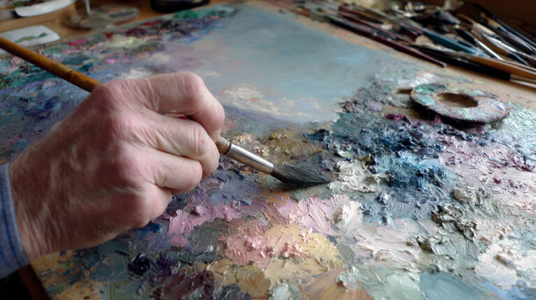
That’s impasto: paint applied thick enough to stand above the canvas surface, building texture you can see and sometimes almost feel.
How Monet Used It
Technical analysis of Monet’s Water Lilies (1906) at the Art Institute of Chicago found that in some areas, he applied at least eight or nine layers of paint (Art Institute of Chicago conservation research). The flowers in the lower third of the painting show thick, paste-like buildups where he used a flat brush to apply quick dabs of pure color with almost no detail.
Lead white was a key material here. Monet incorporated it into most of his paint mixtures as both a tonal adjuster and a physical agent for creating thick impasto on the surface.
He also worked wet-on-wet regularly, applying successive strokes while earlier layers were still wet. The strokes blend at the edges without losing their individual identity. Alla prima painting was a natural fit for outdoor sessions where drying time was limited.
Tools
- Hog-hair bristle brushes – stiff enough to push thick paint around without losing stroke character
- Palette knives – for building heavier texture, scraping back, and mixing directly on canvas
- Flat brushes – used by Monet for the quick dabs of color on lily pad blooms
The visible brushstroke wasn’t a failure of technique. It was a deliberate choice. Academic painters spent enormous effort hiding evidence of their process. Impressionists reversed that logic completely. You were supposed to see how the painting was made.
To understand more about the physical application of paint as a formal tool, texture in art covers how surface qualities function as expressive elements beyond just visual description.
Painting en Plein Air
Before 1841, painting outdoors for more than a sketch session was genuinely impractical. Pigments had to be ground fresh, stored in animal bladder pouches, and transported carefully. Working outside for hours was messy and wasteful.
That changed when American artist John Goffe Rand invented the collapsible tin paint tube in 1841. Pre-mixed colors in portable containers. Suddenly, a painter could carry a full palette into a field, onto a riverbank, or into a train station.
Portable French easels followed, making sustained outdoor sessions possible. The Impressionists didn’t invent plein air painting, but they made it the backbone of an entire movement.
What Outdoor Work Actually Changed
Working outside under changing light meant sessions had to be fast. Natural light shifts significantly within two hours. That constraint directly produced the loose, rapid brushwork that defines the Impressionist style. It wasn’t a stylistic preference so much as a practical necessity that became an aesthetic.
Locations mattered. Argenteuil, Giverny, the Normandy coast, the banks of the Seine near Paris, the beaches of Brittany. These places show up repeatedly because the artists kept returning to the same sites at different times of day and different seasons.
Plein air painting also pushed artists toward subjects they couldn’t find in a studio. You can’t paint steam rising from a locomotive or the specific quality of November light on haystacks from memory alone. Monet’s Gare Saint-Lazare series (1877) required working directly in the station, negotiating access, and painting rapidly as trains arrived and departed.
Renoir’s Own Words
After working outdoors extensively, Renoir wrote to a friend: by spending so much time painting in the open air, he had stopped caring about small details that extinguished sunlight and focused instead on great harmonies. That shift, from detail to atmosphere, is what outdoor painting forced on the Impressionists and what separated their work from anything that came before. (Sotheby’s, En Plein Air: The Legacy of Impressionism)
Light and Shadow Techniques

The single most radical technical decision the Impressionists made wasn’t about brushwork. It was about shadows.
Academic painters painted shadows with black or grey. Darker versions of the object’s color, or neutral tones to indicate where light didn’t reach. The Impressionists looked at actual shadows and saw color: violet, blue, warm orange, sometimes green.
This came directly from observation. Shadows change color depending on the surrounding light. A shadow on snow in morning light looks different from the same shadow at noon or in the blue hour before dusk. Academic painting had ignored this entirely.
The Haystacks and Rouen Cathedral Series
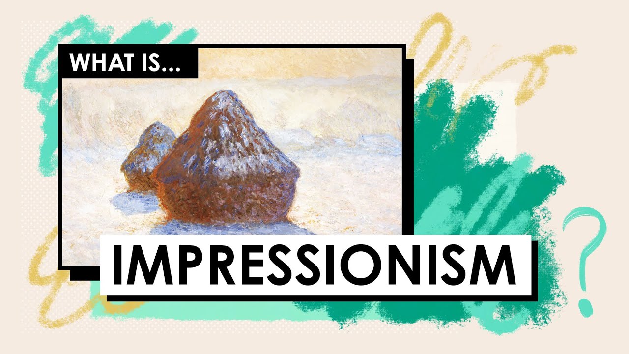
Monet’s series paintings are the clearest proof that light, not subject matter, was the actual topic of his work.
The Haystacks series (1890-1891) shows the same stacks of grain in different seasons and times of day. Morning pink. Midday yellow-white. Late afternoon orange. Winter blue. The subject doesn’t change. The light does. The Rouen Cathedral series (1892-1894) worked the same way: same stone facade, same compositional angle, 30 different paintings capturing the stone’s surface as it absorbed and reflected morning mist, harsh noon sun, and golden afternoon glow.
Japanese influence shaped how the Impressionists thought about flat, non-directional light. Ukiyo-e woodblock prints by Hiroshige and Hokusai used minimal shadows and bold flat color. The Impressionists studied these prints closely. Monet collected Japanese prints throughout his life and displayed them at Giverny. Their approach to light as a surface quality rather than a dramatic effect was exactly what Impressionism needed to break from Western chiaroscuro tradition.
| Approach | Academic / Baroque | Impressionist |
|---|---|---|
| Shadow Color | Black, gray, or simply a darkened version of the local color. | Violet, blue, and complementary tones based on reflected light. |
| Light Source | Single, dramatic, and directional (Chiaroscuro). | Diffuse, changing, and atmospheric; often “all-over” light. |
| Edge Quality | Hard, defined transitions that carve out 3D form. | Soft, blurred, and “dissolved” edges where objects merge. |
| Focus | Form and narrative revealed by the light. | The behavior and quality of light itself as the primary subject. |
Understanding value in painting is essential context here. The Impressionists weren’t abandoning tonal structure. They were replacing neutral grey-scale values with chromatic ones. Same logic, different tools. Their use of contrast in painting shifted from light-dark opposition to color temperature opposition.
For comparison, chiaroscuro is the older system they were working against: the strong contrast of light and shadow used by Caravaggio and Rembrandt to model form dramatically. Impressionism didn’t just modify that system. It replaced it.
Composition and Cropping
Academic paintings centered their subjects. The most important figure sat in the middle, balanced, arranged. Nothing was accidental. Everything was composed to read as a unified, hierachical whole.
Impressionist compositions looked almost careless by comparison. Figures cut off at the canvas edge. High viewpoints. Asymmetrical arrangements. Empty foregrounds with distant subjects. It looked like a snapshot.
That was the point.
Photography and Japanese Prints
Two forces reshaped how the Impressionists thought about framing. Photography, particularly through the work of Nadar (who hosted their first exhibition), showed that compelling images didn’t need centered subjects. A figure cut by the edge of a frame could convey movement and life that a posed composition never would.
Japanese ukiyo-e prints pushed further. Their compositions used:
- High or elevated viewpoints that flatten space
- Strong diagonal lines pulling the eye across the frame
- Subjects cropped at unusual angles without apology
- Negative space used as a compositional force, not just background
Degas absorbed this more visibly than almost anyone. His ballet scenes use viewpoints from above, from the wings, from positions that no formal portrait painter would choose. His horse racing compositions cut horses mid-stride at the edge of the canvas. The viewer’s eye is always moving, never settled.
Gustave Caillebotte’s Street-Level View
Caillebotte’s Paris Street, Rainy Day (1877) is a useful case study. The viewpoint is at street level, the figures are large and close, and the frame cuts through the scene as if a photographer had simply pressed the shutter. There is no central hero. No symbolic arrangement. Just people moving through Paris in the rain.
This approach to composition fundamentally changed what a painting was allowed to show. It didn’t need to mean something allegorically. It could just be a moment. Understanding focal points in art becomes more complex in this context because Impressionist painters often deliberately avoided strong single focal points to mimic how attention actually moves across a real scene.
The influence of asymmetrical balance also became central here. Rather than symmetrical arrangements that convey stability and order, asymmetric compositions convey energy, movement, and the feeling of a captured instant.
Color Palette Used by Impressionists
Roughly half of all pigments on a typical Impressionist palette were synthetic, invented within the previous 50 years (National Gallery, London pigment analysis). The other half were traditional historical pigments, many in use for centuries.
This mattered because the new synthetic pigments were brighter, more saturated, and more stable than anything available before. When cadmium colors arrived in Paris around 1860, they gave painters a range of yellows, oranges, and reds with a luminosity the old chrome yellows simply couldn’t match, according to Artists Network (2023).
Pissarro famously claimed to have removed all dull earth colors from his palette entirely. Monet’s Gare Saint-Lazare (1877), apparently dark and atmospheric, is actually built from cobalt blue, cerulean blue, French ultramarine, emerald green, and viridian (Pigments Through the Ages, WebExhibits).
Core Pigments on the Impressionist Palette
Yellows: cadmium yellow (light, medium, deep), chrome yellow, Naples yellow, yellow ochre. The Impressionists were slow to adopt cadmiums at first because chrome yellows were cheaper, but by the late 1870s cadmiums had largely taken over.
Blues: cobalt blue (in use from 1807), French ultramarine, cerulean blue, Prussian blue. Cobalt was a staple from the start of Monet’s career. French ultramarine was half the price of cobalt by the mid-19th century after synthetic production scaled up.
Greens: viridian (introduced 1838), emerald green, chrome green. Viridian was a key pigment for Monet specifically. He used the toxic emerald green early in his career, then abandoned it due to stability issues.
Whites: lead white (flake white) was dominant and is present in almost every paint mixture in Monet’s analyzed works. Zinc white was available from 1845 but less favored. Lead white is now banned for sale in the EU and UK due to toxicity (Jackson’s Art Blog, 2024).
What Colors Did Monet Actually Use
Pigment analysis of Monet’s works around 1880 identified: cadmium yellow, vermilion, alizarin crimson, cobalt blue, French ultramarine, Prussian blue, emerald green, viridian, raw and burnt sienna, light red, red earth, flake white, zinc white, and ivory black (Eclecticlight.co, pigment research).
Black is on that list. Monet’s color choices are often described as black-free, but the reality is more nuanced. He avoided using black for shadows, but kept it on the palette for specific mixing purposes.
His palette differs notably from Renoir’s, who leaned heavily into pinks, warm reds, and softer flesh tones. Pissarro used more earth colors than either. Same movement, meaningfully different palettes.
| Artist | Palette Character | Signature Colors |
|---|---|---|
| Claude Monet | Cool, atmospheric, and luminous; focused on the “enveloppe” of light. | Cobalt blue, Viridian, Lead white, Chrome yellow. |
| Pierre-Auguste Renoir | Warm, skin-focused, and soft; prioritized the “glow” of the figure. | Rose madder, Cadmium red, Silver white, Naples yellow. |
| Camille Pissarro | Earthy, restrained, and structured; the “peasant” perspective. | Raw sienna, Cobalt violet, Earth pigments, French ultramarine. |
| Paul Cézanne | Geometric, layered, and deliberate; bridging Impressionism and Cubism. | Naples yellow, Madder lake, Cerulean blue, Emerald green. |
Understanding color saturation is directly useful here. The Impressionists pushed saturation higher than any preceding movement, which is exactly why critics at the time described their canvases as assaulting to the eye.
The interplay between warm and cool colors was also central to how they painted light. Warm light meant cool shadows. Cool morning light meant warm contrasts. This wasn’t instinct. It was system, even if applied loosely.
Capturing Movement and Atmosphere
Speed was not optional for Impressionist painters working outdoors.
A painting session under changing outdoor light often lasted no more than two hours before the light shifted enough to make continuing pointless. That constraint forced a specific kind of mark-making: short, directional, decided. No blending, no correction, no second-guessing.
How Brushstrokes Suggested Motion
Degas’s approach to movement is worth looking at separately from the landscape painters.
He rarely worked outdoors. His subjects were ballet dancers, horse races, cafe scenes, and laundresses, mostly observed from unusual angles in controlled settings. But his handling of implied movement through off-balance figures, cropped bodies, and directional marks is among the most sophisticated in the movement.
Key techniques Degas used to imply motion:
- Figures caught mid-gesture rather than in stable poses
- Strong diagonal compositions that pull the eye across the frame
- Smudged pastel and loose oil handling that softened edges of moving forms
- Cropping at canvas edges to suggest a larger scene continuing beyond the frame
His horse racing paintings, like Before the Race (c.1882), show riders and horses massed at the edge of the canvas, never quite centered, always suggesting imminent movement. You feel the race is about to start.
Atmospheric Effects in Monet’s Industrial Series
Monet’s Gare Saint-Lazare series (1877, twelve paintings) remains the most deliberate study of industrial atmosphere in Impressionism.
He negotiated access to the station and set up his easel directly on the platform. What he painted wasn’t the trains. It was the steam. Thick, colored clouds of vapor filling the iron-and-glass roof of the station, catching light differently in each canvas.
The technique: soft, undefined edges throughout. No hard line where steam ends and architecture begins. Short strokes layered wet-on-wet to build the blurring effect of vapor in motion. The entire composition is atmospheric rather than structural.
This approach to atmospheric perspective in Impressionism differs from the Renaissance version. Traditional atmospheric perspective made distant objects lighter and bluer to suggest depth. Monet used it to dissolve the present moment, right in front of you, into something uncertain and alive.
Water, Reflections, and Ripple Technique
Reflections in water were a recurring subject precisely because they tested everything the Impressionist approach was built for: unstable light, constant motion, broken color, and atmospheric distortion all at once.
Monet created water reflections at Giverny by mixing vivid colors directly on the canvas, applying successive strokes while paint was still wet, producing no hard edges (Portland Art Museum conservation research, 2024). The reflections of willow branches in Waterlilies (1914-1915) used long vertical strokes to describe the shimmering vertical shapes, while swirling circular strokes handled sky and lily pad areas.
Different stroke directions in the same canvas. Deliberate, not random.
For anyone studying landscape painting techniques today, this combination of directional stroke variety and wet-on-wet application is probably the most practically teachable element of the Impressionist approach. It produces naturalistic water surfaces faster than any other method.
How Impressionist Techniques Influenced Later Movements
By 1886, the last Impressionist group exhibition had taken place. Within 30 years, the specific techniques those painters developed had become the foundation of nearly every significant modern art movement in Europe.
That’s not gradual influence. That’s a fast technical revolution.
Seurat and the Systematization of Broken Color
Georges Seurat took optical mixing and pushed it to its logical extreme.
Where Monet placed adjacent strokes of broken color intuitively, Seurat systematized it into a precise method: tiny, uniform dots of pure contrasting color placed side by side in a calculated grid. He called it Divisionism. Critics named it Pointillism.
Key difference from Impressionism: where Impressionists worked quickly from sensation, Seurat worked slowly from theory. A Sunday on La Grande Jatte (1884-1886) took over two years. No Impressionist would have spent that long on a single canvas.
Pointillism influenced Henri Matisse directly. Matisse credited both Seurat and Paul Signac as the figures who helped him discover the possibilities of pure color, which fed directly into the development of Fauvism (art historians, multiple sources).
Cezanne’s Structured Brushwork and Cubism
Paul Cezanne had exhibited with the Impressionists but wanted something different. His own description: “to make of Impressionism something solid and durable, like the art of the museums” (Britannica).
He kept the broken brushstroke and the saturated color palette. But instead of using strokes to capture fleeting light, he used them to analyze the geometric structure of objects. Apples became near-spheres. Mountains became interlocking planes. The surface of a painting became a grid of deliberate marks, each contributing to a structural whole.
Pablo Picasso and Georges Braque both described Cezanne as the artist who made Cubism possible. Braque specifically studied his late landscapes before developing the fragmented planes of early Cubism. The broken stroke of Impressionism, filtered through Cezanne’s structural logic, became the fractured forms of Cubism.
Van Gogh, Expressionism, and the Emotional Brushstroke
Van Gogh arrived in Paris in 1886, met the Impressionists, and immediately absorbed their broken color and light palette. His earlier Dutch work had been dark, earthy, and somber. Within two years, his palette transformed completely: cadmium yellows, cobalt blues, viridian greens, the full Impressionist spectrum.
But he did something different with the brushstroke. Where Impressionism used marks to capture visual sensation, Van Gogh used them to express psychological and emotional states. Thick, swirling, intensely directional strokes that read as almost physical energy on the canvas surface.
Van Gogh’s approach fed directly into Expressionism through artists like Ernst Ludwig Kirchner and Edvard Munch, who took the idea of the emotionally charged brushstroke and pushed it further toward distortion and psychological extremity.
| Movement | Impressionist Technique It Built On | How It Changed It |
|---|---|---|
| Pointillism | Optical color mixing. | Systematized the “broken stroke” into uniform dots based on the scientific color theory of Georges Seurat. |
| Fauvism | Non-naturalistic color and visible brushstrokes. | Pushed color beyond observation to pure emotional expression (e.g., Matisse’s “The Green Stripe”). |
| Cubism | Broken brushwork and structural analysis (Cézanne’s legacy). | Fragmented the form entirely into simultaneous viewpoints, destroying traditional perspective. |
| Expressionism | Gestural marks and personal color choices. | Used the stroke and palette to express the inner psyche and “angst” rather than external light. |
The Impressionists didn’t know they were building a foundation. They were trying to paint what they saw. That their methods turned out to be the most generative toolkit in modern art history is, honestly, a useful reminder that technique developed from observation tends to outlast technique developed from theory.
If you want to see how these movements compare side by side, the broader history of painting covers the full arc from academic tradition through the modern movements that Impressionism made possible. And for the specific techniques that carried forward into oil painting practice, oil painting techniques covers the practical lineage from Impressionist methods to contemporary approaches.
FAQ on Impressionism Painting Techniques
What is the main painting technique used in Impressionism?
Broken color is the defining technique. Artists placed unmixed dabs of paint side by side, letting the eye blend them at a distance. This produced more luminous color than traditional pre-mixed paint and became the visual signature of the entire movement.
What is impasto in Impressionist painting?
Impasto means applying paint thickly enough to leave visible texture on the canvas surface. Monet used it extensively, building up multiple layers in his Water Lilies series. The raised strokes catch light differently across the surface, adding physical depth to the painted image.
Why did Impressionists paint outdoors?
Painting en plein air let artists capture natural light as it actually appeared, not from studio memory. The invention of portable paint tubes in 1841 made this practical. Changing outdoor conditions also forced faster, looser brushwork, which became central to the Impressionist style.
How did Impressionists paint shadows?
They replaced black and grey shadows with color. Shadows in Impressionist paintings contain violet, blue, and complementary hues, because observed shadows shift in color depending on surrounding light. This was a direct break from academic painting convention and drew harsh criticism at the time.
What colors did Impressionist painters use?
Around half their pigments were newly developed synthetics: cadmium yellow, cobalt blue, viridian, cerulean, and French ultramarine. Lead white was mixed into almost everything. Pissarro removed all earth tones entirely. Each artist had a distinct palette, though all favored high-chroma, light-key colors.
What is optical color mixing in Impressionism?
Instead of blending colors on the palette, Impressionists placed contrasting strokes next to each other on the canvas. The viewer’s eye combines them at a distance. The result is more vivid than pre-mixed paint and traces back to Michel Eugene Chevreul’s theory of simultaneous contrast.
How did Impressionists show movement in paintings?
Through short, directional brushstrokes and soft, undefined edges. Degas captured implied motion by cropping figures mid-gesture and using strong diagonals. Monet painted steam and water with wet-on-wet strokes that dissolved hard edges, making surfaces feel alive rather than fixed.
What brushes did Impressionist painters use?
Primarily stiff hog-hair bristle brushes, which push thick paint without losing stroke character. Flat brushes were common for quick dabs of pure color. Palette knives were also used for heavier texture and direct canvas mixing. Tool choice varied by artist and by the effect needed.
How did Impressionism influence later art movements?
Directly. Seurat systematized broken color into Pointillism. Cezanne’s structured brushwork laid the groundwork for Cubism. Van Gogh transformed the gestural stroke into emotional expression, feeding into Expressionism. Matisse credited Seurat and Signac as key influences on Fauvism’s bold color approach.
Can beginners learn Impressionist painting techniques?
Yes. The core methods are accessible: work with visible strokes, avoid over-blending, observe how light changes color, and paint quickly. Starting with simple outdoor subjects and a limited palette of six to eight colors is the most practical entry point into the Impressionist oil painting approach.
Conclusion
This conclusion is for an article presenting impressionism painting techniques as a living, practical system, not just art history.
The gestural brushstroke, the colored shadow, the outdoor palette built around cadmium yellows and cobalt blues: none of these were stylistic quirks. They were solutions to real problems of capturing light, movement, and atmosphere on canvas.
Monet, Degas, Pissarro, and Renoir each applied these methods differently. Same principles, distinct results.
What they built became the direct foundation for Pointillism, Fauvism, Cubism, and Expressionism. That lineage didn’t happen by accident. It happened because optical color mixing, visible impasto, and plein air observation are genuinely generative tools.
Study the technique. The rest follows.