Most painters hit a wall when painting from observation. Objects look flat, surfaces feel generic, and the painting never quite matches what is in front of them.
Still life painting techniques fix that. They give you a structured way to read light, build form, mix color, and control value before the subject even hits the canvas.
This guide covers the full process, from composition and lighting setup to oil, acrylic, and watercolor methods, texture rendering, and the most common mistakes that flatten otherwise solid work.
Whether you are working with oil paint or trying to get clean washes in watercolor, the core principles here apply across every medium.
Good. I have enough research. Now I’ll write sections 1-6.
What Is Still Life Painting

Still life painting is the depiction of inanimate objects arranged deliberately within a composition. The subject matter typically includes fruit, flowers, vessels, food, fabric, books, and everyday objects. Unlike portraiture or landscape work, the artist controls every element of the scene before making a single mark.
The term itself comes from the Dutch word stilleven, first used in the 16th and 17th centuries to describe this type of work. Understanding what painting is as a discipline helps clarify why still life holds such a distinct place within it. The genre sits at the intersection of technical skill and deliberate visual decision-making.
Still life is one of the principal genres in Western art. It gained serious recognition as an independent category in the late 17th century, when the French Academy formally classified it, though it ranked last in the hierarchy of genres at the time. That ranking did not stop artists from mastering it.
Why Still Life Matters for Technical Development
Controlled conditions for learning: The objects do not move. Light can be fixed. This makes still life the most repeatable training environment in painting.
Traditional academies have long used still life as a bridge between basic exercises and advanced subjects like portraiture. The Florence Classical Arts Academy, for example, structures its curriculum from geometric shapes to still life studies before progressing to casts and live models.
Skills practiced in still life transfer directly to all other painting subjects. Shading an apple teaches the same form-reading you use on a face. Arranging bottles on cloth teaches composition in art principles that apply to abstract work, landscape, and everything in between.
Common Subject Categories
Still life subjects generally fall into four categories: flowers, breakfast or banquet arrangements, animal subjects, and symbolic compositions. Within symbolic work, vanitas paintings became particularly widespread, using objects like skulls, hourglasses, and wilting flowers to reference mortality.
- Florals: Among the most common, especially in Dutch Golden Age work
- Ontbijtjes (breakfast pieces): Simple food arrangements on a table, popularized in Haarlem
- Pronkstilleven: Elaborate displays of luxury objects showing wealth and status
- Vanitas: Symbolic compositions referencing the transience of life
Still life paintings by Paul Cezanne, Vincent van Gogh, and Pablo Picasso have each sold for over $40 million at auction, a figure that reflects just how seriously collectors and institutions regard this genre.
How to Set Up a Still Life Composition
Every technique decision you make is downstream of the setup. A weak arrangement produces a weak painting regardless of how well you apply paint. Composition decisions made before you touch the canvas determine the final result more than almost anything else.
Learning how types of composition in painting function helps here. Still life gives you the rare opportunity to physically rearrange your subject until the composition works, which no other genre offers.
Object Arrangement

Start with odd numbers. Three or five objects almost always read better than two or four. Even visual weight on both sides creates static symmetry. A slight imbalance creates tension and movement.
Overlap objects to build depth. Objects sitting side by side with gaps between them flatten the composition immediately. Push them together, let edges intersect, and vary heights by placing items on books or fabric folds.
| Principle | What It Does | Common Mistake |
|---|---|---|
| Rule of Odds | Creates visual interest and prevents “stagnant” symmetry. | Using pairs of objects, which the brain tends to “pair off” and ignore. |
| Overlapping | Establishes a clear foreground, middle ground, and background. | Spacing objects equally apart, making the composition look flat and “arranged.” |
| Negative Space | Provides a “breathing room” for the viewer’s eye. | Filling the entire frame with detail, leading to visual exhaustion. |
| Visual Weight | Balances the canvas through size, color, or contrast. | Centering every object, which can lead to a “static” or boring layout. |
Understanding what negative shape in art means is useful here. The spaces between and around your objects carry as much compositional weight as the objects themselves.
Lighting Setup for Still Life

Single-source directional lighting produces the strongest tonal contrast. It defines form clearly and creates obvious shadow patterns that are easier to read and paint.
Natural north-facing window light is a reliable option. It stays consistent throughout the day without the color shifts you get from direct sunlight. Artificial lighting with a single lamp placed at roughly 45 degrees to the subject gives you full control over the shadow angle.
Key lighting decisions:
- High side light (45 degrees above): strong shadows, clear form
- Low raking light: dramatic texture emphasis on fabrics and rough surfaces
- Diffused light: softer shadows, flatter tones, harder to read form
- Backlight: rim lighting effects, complex and tricky for beginners
The light source in composition affects every color and value decision you make. Decide on your light direction before setting up and do not change it mid-session.
Underpainting Techniques

Underpainting is the foundational layer applied before color. It maps tonal values, establishes the drawing, and gives subsequent layers something to react against. Working out value problems at this stage means they do not become color problems later.
The grisaille technique, a full monochromatic underpainting in gray or neutral tones, is particularly well-suited to still life and portrait work. By solving all light and shadow relationships first, you can focus entirely on color temperature and hue relationships when painting over the top. Grisaille in classical painting was a standard practice among Dutch and Flemish masters for this reason.
Grisaille and Verdaccio

Grisaille uses neutral grays. Verdaccio uses a green-gray mixture. Both build a tonal map. The difference is in how color glazes interact with the dried underpainting beneath them.
Verdaccio works particularly well under warm flesh tones and organic subjects like fruit. The cool green underneath complements warm reds and yellows when glazes are applied over it, producing a sense of depth that a neutral gray underpainting does not always achieve.
Warm-Tone Underpainting
A thin wash of burnt sienna or raw umber is faster and more common than a full grisaille. Artists use it to knock back the white of the canvas and establish a warm mid-tone to work from.
This approach works well with alla prima painting because it integrates into the wet paint above it. With glazing methods, a warm underpainting shifts the overall color temperature toward the warm side, which you then counterbalance with cool glazes in shadows.
According to the National Endowment for the Arts, 41% of U.S. art schools incorporated oil paints in fine arts curricula in 2023. Underpainting is covered in virtually every foundational oil curriculum because it remains one of the most reliable ways to build a structured painting from the ground up.
Oil Painting Techniques for Still Life
Oil paint suits still life particularly well. Long drying times allow you to rework passages, blend smoothly, and build complex layered surfaces over days or weeks. The global art paint market data from 2024 shows oil paints hold roughly 18% of global unit volume, with 38% of professional painters preferring oils over acrylics for gallery and exhibition work (BLS, 2023).
The range of techniques available in oil is wider than any other medium. A painter can apply paint as thin as watercolor or as thick as modeling paste, sometimes within the same canvas.
Alla Prima (Wet-on-Wet)
Alla prima means completing a painting in a single session while the paint remains wet. Paint mixes directly on the canvas surface, producing soft transitions and a unified color harmony that is difficult to fake with layered methods.
Best for: Direct observation paintings, time-limited sessions, loose expressive work
Key challenge: Overworking. Wet paint only tolerates so many passes before it turns muddy. The fat-over-lean rule still applies: thicker, oilier paint goes on top, not underneath.
John Singer Sargent used alla prima wet-on-wet for his society portraits and figure studies. The same directness works for still life, especially when painting from organic subjects like flowers or fruit that may shift or wilt over multiple sessions.
Glazing
Oil painting glazing is the opposite of impasto. Thin, transparent layers of paint applied over dry surfaces build color depth gradually. Each layer allows light to pass through, bounce off the layer beneath, and return to the eye with an internal glow that opaque painting cannot replicate.
Rembrandt used this approach extensively. His deep shadow tones are not a single dark color but many thin glazes of warm and cool hues built over each other. The velvety reds and shadow passages in his work result from glazing over textured impasto, allowing the glaze to settle into the surface recesses.
For still life specifically, oil painting glazing techniques work well on translucent subjects: glass objects, grapes, citrus skin, ceramic glazes. Subjects that have light passing through them or a glowing quality benefit most from this method.
Impasto
Impasto builds physical texture. Paint applied thickly with a brush or palette knife stands off the canvas surface, catching light differently depending on the viewing angle.
Used selectively, impasto creates emphasis. The brightest highlight on a ceramic jug, the texture of a rough linen cloth, the peak of a wave in a fluid subject. It reads as weight and tactile presence in a way smooth paint does not.
The impasto technique in both oil and acrylic involves loading the brush or palette knife with paint directly from the tube or with minimal medium added. Mixing impasto with a medium like cold wax or a dedicated impasto gel increases volume and reduces the paint cost of building heavy texture.
Blending and Edge Control in Oil

Edge quality does more compositional work than most beginners realize. Hard edges pull the eye toward them. Soft edges recede. Lost edges disappear entirely, letting adjacent areas merge.
| Edge Type | Visual Effect | When to Use |
|---|---|---|
| Hard Edge | Creates sharp focus and high definition. | Focal Points: Use for the center of interest, sharp metallic glints, or foreground silhouettes. |
| Soft Edge | Suggests roundness, volume, and atmosphere. | Curved Forms: Essential for human skin, clouds, or the turning edge of a sphere. |
| Lost Edge | Objects merge into the background; increases depth. | Shadow Areas: Use where a dark object meets a dark shadow to let the viewer’s eye “complete” the form. |
A filbert brush is the standard tool for blending in oil. Its rounded edge produces soft strokes that blend easily without over-softening. What a filbert brush does structurally is different from a flat brush: it produces a tapered stroke that integrates well with surrounding wet paint rather than dragging across it.
Fan brushes work for very light surface blending. Avoid using them heavily since they can strip wet paint from the canvas rather than blend it.
Acrylic Painting Techniques for Still Life
Acrylics dry faster than oil. Much faster. That is the defining fact that shapes every technique decision when painting still life in acrylic. What takes days to dry in oil takes minutes to hours in acrylic, which changes how you approach blending, layering, and edge work entirely.
Art paint market data from 2024 puts acrylics at roughly 32% of global unit volume, the largest share of any medium. Among student painters, acrylics dominate at 78% of acrylic volume. They are the default starting medium for many artists, which means getting still life techniques right in acrylic matters.
Managing Drying Time
Fast drying is either an asset or a problem depending on how you use it.
Advantages: Layers can be built quickly, there is no fat-over-lean rule, and corrections can be made without disrupting lower layers.
Challenges: Wet blending windows are short. Paint on your palette dries out. Edges firm up before you can soften them.
A stay-wet palette solves palette drying. Retarder medium extends the open time of paint on canvas, giving you closer to an oil-like blending window. Blending in acrylic painting requires working faster and in smaller sections than oil, or using retarder to slow things down.
Dry Brushing and Glazing in Acrylic
Dry brushing in acrylic catches the top texture of the canvas weave while leaving the lower texture unpainted. This is excellent for fabric simulation, rough wood grain, and bark texture in still life props.
Acrylic glazing works similarly to oil glazing but with water as the dilutant instead of linseed oil. Thin the paint heavily with water or glazing medium and apply in transparent washes over dry layers. Glazing in acrylic painting builds color depth fast because each layer dries in minutes rather than days.
Thin washes layered repeatedly over a dry underpainting in acrylic produce surprisingly rich tonal variation. The technique rewards patience even though each individual step is fast.
Layering and Scumbling
Scumbling in acrylic involves dragging a relatively dry brush loaded with opaque paint over a dry lower layer. The lower layer shows through in a broken, irregular pattern. It is useful for suggesting texture on ceramic surfaces, aged fabric, and rough natural objects.
Layering in acrylic painting is more flexible than in oil because you do not need to follow a lean-to-fat sequence. Any consistency can go over any other, as long as the lower layer is dry. This makes building complex surface effects significantly more forgiving.
Watercolor Techniques for Still Life
Watercolor is a subtractive medium by nature. You cannot paint light over dark the way you can in oil or acrylic. The lightest values are the white of the paper, reserved from the start. This inverts the normal painting process and requires planning composition and value structure before any paint is applied.
Still life in watercolor suits translucent subjects particularly well: glass vessels, flowers, soft fruit, thin fabrics. The transparency of the medium echoes the transparency of the subjects themselves.
Wet-on-Wet vs. Wet-on-Dry
The wet-on-wet technique in watercolor painting produces soft, diffused edges. Paint dropped into a wet wash spreads and blooms unpredictably. The technique suits backgrounds, soft petals, and atmospheric shadow areas where hard edges would look wrong.
Wet-on-dry gives you controlled, defined edges. Paint applied to dry paper stays where you put it. This approach builds the structured passages: glass rims, fabric folds, sharp shadow lines.
Most still life watercolors use both. Start with wet-on-wet for large soft background areas and major shadow shapes, then switch to wet-on-dry for defining edges and building detail in the focal areas.
Negative Painting and Reserving Whites
Negative painting means painting the space around a shape to define the shape itself, rather than painting the shape directly. For light-colored flowers or pale objects against a dark background, you paint the dark background and let the flower emerge from the reserved paper.
Masking fluid protects specific areas from paint while you work freely over them. Once dry, the mask peels off to reveal clean white paper. The masking technique in watercolor painting is useful for fine highlights on glass, specular points on ceramics, or bright flower stamens in a dark composition.
Planning which whites to reserve before starting is a critical step. Once a watercolor area is painted dark, recovering the white requires either lifting (while wet) or using opaque white, which changes the surface quality significantly.
Graduated and Flat Washes for Backgrounds
Background handling separates competent watercolor still life from mediocre work. A flat, dead background kills everything in front of it. A graduated wash or a wet-on-wet texture build gives the objects something to sit against.
A graduated wash in watercolor moves from dark to light or from one color to another across the wash area. Tilt the paper at roughly 30 degrees, load a mop brush with diluted paint, and pull horizontal strokes across the paper, adding more water with each pass to lighten the value.
Rendering Texture and Surface Qualities

Painting convincing material texture is where still life painting gets genuinely interesting. Glass, metal, ceramic, fabric, fruit skin, and wood each respond to light in distinct ways. Treating them all with the same brushwork approach flattens the whole composition.
The foundational observation skill here is looking for what is actually there rather than painting what you expect to see. Most people paint the idea of a glass, not the specific distortions, reflections, and transparency that a particular glass under a particular light actually shows. Understanding what texture in art means technically helps clarify the difference between implied and actual surface variation.
Glass and Reflective Surfaces

Glass is not transparent. It reflects, distorts, and refracts everything around it. The most common mistake is painting it as an outline with a vague interior.
Key observations for glass:
- Strong specular highlights on the rim and nearest curved edge
- Distorted reflections of the objects and background behind it
- A darker tone where the glass curves away from the light source
- A cast light spot on the surface below it where light refracts through
Trompe l’oeil painters like William Harnett built entire reputations on glass and metal surface rendering. His approach involved layering transparent glazes to build depth inside the glass, then adding sharp opaque highlights last.
Fabric and Drapery
Fabric texture depends on the weave. Linen reads differently from velvet, which reads differently from silk. Before painting any cloth, spend time observing how the highlights sit on the surface ridges and how shadow fills the recessed areas between threads.
Dry brushing is the most direct method for simulating coarse fabric weave. Load a stiff brush lightly and drag it across the canvas texture. The paint catches the raised grain of the canvas and skips the recessed areas, mimicking woven cloth naturally.
For smooth silk or satin, the technique reverses. Smooth, blended passages with sharp, clear specular highlights and defined shadow shapes read as high-sheen fabric.
Fruit Skin and Organic Textures
Organic objects have subsurface scatter. Light enters the surface, bounces around beneath it, and exits slightly offset from where it entered. This gives fruit and skin a glow that ceramic or metal objects do not have.
Sfumato in painting addresses this soft, boundary-blurring quality. Leonardo da Vinci used sfumato to describe the edges of forms that do not have a hard boundary. Fruit edges behave this way, particularly where they transition from lit to shadow. Blending that transition softly rather than leaving a hard edge reads more accurately.
Reflected light on the shadow side of rounded fruit is often underestimated by beginners. The table surface, nearby objects, and even the cloth underneath all bounce light back into the shadow area, keeping it luminous rather than dead.
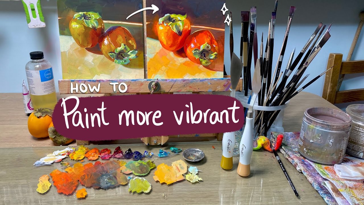
Color Mixing and Palette Selection

A limited palette forces better color decisions than a full spectrum palette. Working with four to six colors requires understanding how to mix a wider range from a narrow base. This builds color theory knowledge faster than having every color available.
Warm vs. cool colors is the most practically useful color concept in still life painting. Every surface has either a warm light and cool shadow, or a cool light and warm shadow. Mixing without attention to temperature produces flat, lifeless color even when the values are correct.
Limited Palette Approach
A standard limited palette for still life in oil or acrylic:
- Titanium white
- Yellow ochre or cadmium yellow
- Cadmium red or alizarin crimson
- Ultramarine blue
- Burnt sienna or raw umber for neutrals
This covers a wide range. Mixing greens from yellow and blue rather than using tube green forces attention to color temperature. Mixing neutrals and grays from complementary pairs rather than using black produces more lively, integrated shadow colors. Avoiding black as a shadow mixer is a preference many representational painters share, including Rembrandt, whose shadows are built from warm and cool color interaction rather than black tints.
Mixing Neutrals Without Black
Black paint mixed into a color produces a dead, cool, often chalky result. There are better options.
Complementary mixing: Adding the complement of a color neutralizes and darkens it while keeping the hue family intact. Red plus green, blue plus orange, purple plus yellow.
Earth color mixing: Raw umber, burnt umber, and burnt sienna are natural neutralizers that add darkness without killing the color temperature. They integrate more naturally into most palettes than lamp black.
Understanding color harmony helps explain why limited palettes work. When all colors in a painting share common mixing pigments, they relate to each other automatically. Chromatic unity is built in rather than forced.
Observed Color vs. Local Color
Local color is what an object “is”: a red apple, a blue cloth, a yellow lemon. Observed color is what you actually see under specific lighting conditions. These two things are rarely the same.
Under warm incandescent light, the shadow side of a red apple shifts toward cool purple-gray, not darker red. The highlight on a blue cloth under warm light picks up orange-yellow from the light source. Painting local color produces flat, illustration-like results. Painting observed color produces believable light.
Color in painting is always relational. No color exists independently from the colors surrounding it. Placing a neutral gray next to warm orange makes the gray look cool blue. The same gray next to cool blue looks warm. This phenomenon, known as simultaneous contrast, affects every color decision in a still life.
Tonal Value and Contrast Control
Value is the single most important element in a painting. Not color. Not composition. Value. A painting with wrong colors but correct values reads as a convincing image. A painting with beautiful colors but wrong values reads as flat and confusing.
Understanding what value in painting means and how to control it deliberately separates painters who struggle with a consistent sense of form from those who do not.
Simplifying Values Before Painting
Squint at your still life setup until the details disappear and only masses of light and dark remain. This eliminates local color distraction and shows you the actual value structure of the scene.
Three-value planning:
- Light: all lit areas grouped together
- Mid: transition areas, often kept small
- Dark: all shadow areas grouped together
Planning the composition in three values before starting, using a small pencil sketch or a simplified underpainting, solves value problems before they become paint problems. Artists who skip this step often reach a half-finished painting and realize the light and shadow relationships make no sense. The value scale in art provides a structured framework for these decisions.
High-Key vs. Low-Key Approaches
High-key paintings work predominantly in the lighter half of the value scale. Think Chardin’s domestic subjects or Morandi’s quiet arrangements: soft light, subtle contrast, contemplative mood.
Low-key paintings work in the darker half. Think Caravaggio’s chiaroscuro in painting or Rembrandt’s candlelit still life work: dramatic contrast, deep shadows, objects emerging from darkness.
Both approaches work. The mistake is a painting that is neither, where contrast is scattered randomly across the canvas without any consistent strategy. High-contrast areas pull the eye first. Place them at your focal point, not distributed evenly across the painting.
Avoiding Scattered Contrast
This is probably the most common value error in still life painting. Scattered light spots and dark spots across the whole canvas compete with each other for attention and create visual noise.
The solution is simple: group your lights and group your darks. All of the lightest values in the painting should sit together in a connected passage. All of the deepest darks should sit together or near each other. Contrast in painting creates emphasis, and emphasis only works when it is focused, not scattered.
Morandi is worth studying here. His arrangements are quiet, limited in contrast, and highly unified in value. The paintings read clearly despite minimal drama because his value groupings are disciplined and his focal point in art is always clear.
Common Mistakes in Still Life Painting
Most recurring problems in still life come from habit rather than ignorance. The painter knows what to do but defaults to a shortcut. Identifying the specific habit is more useful than general advice about “looking more carefully.”
Outlining Objects Instead of Painting Form
Drawing an outline around an object and filling it in produces a flat, graphic result. Objects in real life do not have outlines. They have edges, and those edges vary in hardness, value contrast, and clarity depending on context.
The fix: Work from the inside of each form outward. Build the mass of the object using value and color before worrying about where the edge is. The edge should be the last decision, not the first.
Contour in art has a specific role in drawing that does not translate directly to painting. Contour lines describe edges in a drawing context. In painting, form is described by value and color relationships, not lines.
Painting What You Know Instead of What You See
This is the hardest habit to break. The brain substitutes symbols for observation constantly. You paint a round apple because you know apples are round, not because you are looking at the specific flattened, slightly asymmetric, particular apple in front of you.
Painting from observation means looking more at the subject than at the canvas. Most beginners do the opposite. A useful ratio: two-thirds of your time spent looking at the subject, one-third looking at what you are painting.
The gesture drawing in painting practice of recording the essential character of a subject quickly, without detail, trains the observation habit by forcing you to look at structure before detail.
Losing the Light Source Mid-Painting
This happens when a session extends across multiple days and the light shifts, or when the artist starts correcting areas independently without reference to the overall light logic.
Every shadow, highlight, and reflected light in the painting should be traceable back to a single consistent light source. When they are not, the painting looks inconsistent in a way the viewer feels but cannot always name. Photograph your setup under the same lighting conditions before each session to maintain consistency.
Overworking Passages
Every paint application has a limit. Oil paint that has been worked repeatedly in one session becomes greasy and unresponsive. Acrylic builds up surface ridges that make subsequent layers look patchy. Watercolor lifts and muddies.
The most experienced painters often do less, not more. Knowing when a passage is resolved and moving on rather than fussing with it is a discipline that develops over time. When a passage starts to look worse with each additional stroke, stop. Let it dry and reassess before making changes.
Good techniques for fixing painting mistakes also involve knowing which mistakes to leave alone. Sometimes what looks like an error in isolation reads correctly in the context of the whole painting.
FAQ on Still Life Painting Techniques
What is the best medium for still life painting?
Oil paint gives you the most control. Long drying times allow blending, reworking, and layering. Acrylics work well if you prefer fast drying. Watercolor suits translucent subjects like glass and flowers. Your choice depends on the surface qualities you want to achieve.
How do I set up a still life composition?
Use the rule of odds and overlap objects to build depth. Vary heights, group items close together, and choose a single light source before arranging anything. Negative space matters as much as the objects themselves.
What is underpainting and why does it matter?
Underpainting establishes tonal values before color is added. Grisaille, a monochromatic gray underpainting, lets you solve light and shadow relationships first. It prevents value errors from becoming color errors later in the painting process.
What is the fat-over-lean rule in oil painting?
Each successive oil paint layer must contain more oil than the one beneath it. Lean layers dry faster. Fat layers dry slower. Reversing this causes cracking over time. It applies to alla prima and layered methods alike.
How do I paint glass and reflective surfaces?
Look for distorted reflections, dark tones where the glass curves away from light, and sharp specular highlights on the rim. Apply transparent glazing layers to build interior depth, then add opaque highlights last for realism.
What is alla prima painting?
Alla prima means completing a painting wet-on-wet in a single session. Paint mixes directly on the canvas. It suits direct observation work and loose expressive still life. John Singer Sargent used this method extensively for its spontaneous, unified color results.
How do I control edges in a still life painting?
Hard edges pull the eye forward. Soft edges recede. Lost edges merge areas together, adding depth. Place your hardest edges at the focal point only. Use a filbert brush for blending transitions between light and shadow passages.
How important is value compared to color in still life?
Value is more important. A painting with wrong colors but correct tonal values still reads convincingly. Squint at your setup to simplify the scene into three value groups before applying any paint. Color decisions come after value structure is solved.
What is the best lighting for a still life setup?
A single directional light source at roughly 45 degrees produces clear shadows and strong form. North-facing natural window light stays consistent throughout the day. Avoid multiple light sources early on as they create competing shadows that are difficult to resolve.
How do I avoid overworking a painting?
Stop adding strokes when the passage starts looking worse. Oil and acrylic paint become unresponsive after repeated working. Let areas dry before reassessing. What looks like a mistake in isolation often reads correctly within the pictorial space of the full composition.
Conclusion
This conclusion is for an article presenting still life painting techniques as a complete system, not a collection of isolated tips.
Tonal value, edge control, color temperature, and surface rendering all work together. Get one wrong and the others suffer.
The Dutch Golden Age painters built entire careers on observational discipline and layered paint application. Those fundamentals have not changed.
Whether you build depth through layering and scumbling or work with direct observational methods, the principles of chiaroscuro, limited palette mixing, and deliberate composition apply across every medium.
Pick one technique. Apply it to a simple setup. Observe more than you paint.
That is how the work improves.