Most watercolor painters hit a wall trying to build depth without muddying their colors. The answer is usually glazing.
Watercolor glazing is the technique of applying thin, transparent paint layers over fully dried ones, letting light pass through each layer and reflect off the paper beneath.
It is what separates flat washes from paintings that seem to glow.
This guide covers how glazing works optically, which pigment types actually work for transparent layering, how paper choice affects results, and the mistakes that kill luminosity before it starts.
What is Watercolor Glazing

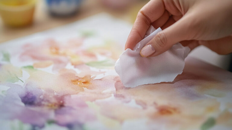
Watercolor glazing is the technique of applying a thin, transparent wash of paint over a layer that has fully dried. Each glaze sits on top of the previous one without physically mixing into it. The result is optical color mixing, not pigment blending on the palette.
This is the core of watercolor painting as a medium. Light passes through each transparent layer, bounces off the white paper underneath, and travels back through the pigment stack. That return trip through the layers is what creates the luminosity glazing is known for.
One rule matters above everything else: the underlayer must be completely dry before the next glaze goes down. Not damp. Not cool to the touch. Fully dry. Skip that, and the glaze drags into the wet layer below, creating blooms and muddiness that cannot be undone.
The fine art watercolor paints market was valued at USD 3,670 million in 2024, projected to reach USD 5,477 million by 2031 at a CAGR of 6.9% (Proficient Market Insights). That growth reflects a real, sustained interest in watercolor painting techniques that produce results mixing paint on a palette simply cannot.
Glazing is not the same as layering in the broader sense. Layering covers any paint-over-paint approach, including opaque passes. Glazing is specifically transparent, always wet-on-dry, and always optical. The distinction matters when choosing pigments.
How Glazing Works Optically

The mechanism is straightforward once you see it. Transparent pigments allow light to pass through to the paper surface. The paper reflects that light back upward through the glaze layers. What the eye sees is that reflected light filtered through each pigment layer in sequence.
Stack two glazes and the reflected light passes through both before reaching the eye. The colors combine optically, not physically. This is fundamentally different from mixing two pigments together on a painting palette and applying the result directly.
The Kubelka-Munk model, one of the most studied frameworks for predicting pigment behavior, describes this using two parameters: the absorption coefficient and the scattering coefficient. These govern how light is absorbed and scattered within each pigment layer. In practical terms, transparent watercolor pigments have low scattering values, which is why they let light pass through rather than blocking it.
Palette-mixed color and glazed color using the same two pigments will look different. The glazed version tends to read as deeper, more saturated, and more luminous. This is why color theory in watercolor puts such emphasis on working light to dark and building color through transparent layers rather than single, opaque applications.
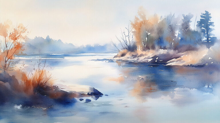
Painters like J.M.W. Turner exploited this property heavily, building atmospheric effects through accumulated transparent washes rather than direct color placement. His skies and water scenes are textbook examples of what optical mixing through transparent layering can produce.
Transparency vs. Opacity in Glazing

Not every watercolor pigment works for glazing. Pigment transparency is the deciding factor, and it determines whether a glaze produces clean color depth or muddy coverage.
| Pigment Type | Glaze Behavior | Mechanical Outcome | Professional Examples |
|---|---|---|---|
| Transparent | Total Light Pass: Acts like a sheet of colored glass. Light travels through the pigment, hits the white paper, and reflects back. | Luminous Depth: Ideal for building rich, glowing shadows and clean optical mixes (e.g., glazing Blue over Yellow to get a vibrant Green). | Quin. Magenta, Phthalo Blue, Aureolin (Cobalt Yellow). |
| Semi-Transparent | Partial Diffusion: Allows some depth but begins to “cloud” the layers beneath as you add more glazes. | Naturalistic Tones: Perfect for earth textures, wood grain, and skin tones where a bit of “body” is needed. | Burnt Sienna, Raw Umber, Sap Green. |
| Opaque | Light Block: Pigment particles are large and dense; they sit on top and “cover” whatever is underneath. | Surface Weight: Best used in the final layer for highlights or “correcting” small areas. Over-glazing with opaques leads to “mud.” | Cadmium Red, Naples Yellow, Cerulean Blue. |
| Granulating | Sedimentary Drift: Particles are heavy and settle into the “valleys” of the paper, creating a speckled appearance. | Textural Interest: Adds an organic “grit” to glazes. Excellent for mimicking stone, sand, or distant foliage. | French Ultramarine, Viridian, Cobalt Violet. |
Paint tube labels and manufacturer charts carry transparency ratings. Daniel Smith, Winsor and Newton, and most professional-grade brands mark each color with a symbol indicating transparency, semi-transparency, semi-opacity, or opacity. Check this before glazing, not after.
Single-pigment paints produce cleaner glazes than mixed-pigment paints. A tube labeled “Sap Green” usually contains multiple pigments combined by the manufacturer. Stacking two multi-pigment glazes introduces four or more pigments into the same passage, which can quickly push toward muddy neutrals.
What happens with opaque pigments
Opaque glazes: They cover rather than filter. An opaque wash applied over a dry layer simply sits on top like a veil of flat color. The underlayer stops contributing to the final appearance, which defeats the purpose of glazing.
Cadmium pigments are the classic example. Beautiful for direct application, completely wrong for glazing. A transparent quinacridone red glazed over a dry yellow wash creates a luminous orange. The same pass with cadmium red creates a dull, chalky result that hides the yellow entirely.
The Drying Requirement and Why It Cannot Be Skipped
This is the one technical rule with no flexibility. The underlayer must be fully dry before the glaze goes on. “Fully dry” means bone dry throughout the paper, not just on the surface.
What goes wrong when layers are still damp:
- The fresh glaze pushes into the wet underlayer, causing blooms and hard edges in unintended places
- Pigment from the lower layer lifts and mixes into the glaze, muddying both
- The paper fiber softens under repeated wet passes before earlier layers are set, causing tearing and pilling
Drying time varies by conditions. A thin wash on hot-press paper in a warm, dry room might be ready in 10 minutes. A heavy, pigment-loaded passage on cold-press paper in humid conditions can take 45 minutes or longer. Humidity is the biggest variable. Many painters use a hairdryer on a low setting to speed this up, held at a distance to avoid pushing wet paint across the surface.
The difference between “dry to the touch” and “fully cured” is real. Some pigments, especially heavy granulating ones, can feel dry on the surface while moisture remains deeper in the paper fibers. A good test is the back of the wrist held close to the surface. If there is any coolness, the paper is still releasing moisture.
Paper weight and its effect on drying
Heavier paper holds more moisture. 300gsm (140lb) paper is the standard recommendation for multi-layer glazing work. Lightweight 190gsm (90lb) paper buckles under repeated wet layers and can trap moisture in the warped valleys, extending dry time unpredictably.
Paper sizing also matters. Heavily sized paper (either internally or surface-sized) is less absorbent, so paint sits on the surface longer before sinking in. This slows drying but also makes it easier to lift the glaze while it is still wet if a correction is needed.
Color Mixing Through Glazing

Glaze order changes the final color. Glazing yellow over a dry blue wash produces a different result from glazing blue over a dry yellow wash. Both combinations create green, but the proportions of each pigment hitting the eye shift based on which sits closer to the paper surface.
The layer closest to the paper contributes more to the shadow and depth of the final color. The top layer controls the surface tone and temperature. This is why painters who work with glazing think about layer sequence before they start, not during.
Common glaze combinations and their practical results:
- Quinacridone Magenta over Phthalo Blue: deep, saturated violet with a cool bias
- Burnt Sienna over French Ultramarine: rich, transparent brown with granulation interest
- Aureolin over Quinacridone Rose: warm, luminous orange that holds transparency through several passes
- Dioxazine Violet as a final glaze over warm mid-tones: pushes areas into deep shadow without opacity
Glazing also works well for color saturation adjustments and temperature shifts. A single cool glaze over a painting that reads too warm can unify the whole surface. Harmony through glazing is something many experienced watercolorists use as a finishing step rather than a structural one.
How many layers is too many? Practically, four to six transparent glazes over the same area is around the upper limit before the paper surface starts to resist the paint and freshness is lost. Some pigments are more forgiving than others. Phthalo pigments, for instance, can stain the paper quickly, making subsequent glazes harder to control.
Glazing for Shadow and Depth

Shadows built through glazing look different from shadows painted in a single opaque pass. They read as transparent, which is how shadows in nature actually behave. A shadow is not a gray coating on a surface. It is less light reaching that surface. Transparent glazes communicate that optically.
Recommended pigments for transparent shadows:
- Prussian Blue: deep, transparent cool dark
- Burnt Sienna: warm, transparent mid-dark, useful for skin tones and earth subjects
- Dioxazine Violet: one of the most transparent darks available, works across cool and warm shadows
- Phthalo Green: high-staining, very transparent, useful for deep foliage shadows
The layering approach to shadow also preserves value relationships more reliably than direct dark application. Building a shadow through two or three transparent passes gives more control over how dark the passage becomes. Stop after the second pass and it reads as a mid-shadow. Add a third focused glaze in the deepest area and the shadow has natural variation.
Winslow Homer’s watercolors are often studied for exactly this quality. His shadow passages in outdoor scenes retain transparency and warmth rather than going flat, because they were built through layered glazes rather than a single dark wash.
Atmospheric depth works the same way. Glazing a cool, pale wash over distant landscape elements pushes them back in space far more convincingly than simply mixing a lighter version of the same color. This overlaps with atmospheric perspective as a principle, and glazing is one of the most direct technical tools for applying it in watercolor specifically.
Paper and Material Considerations
Paper is not just a surface. It actively determines how a glaze behaves, how long each layer takes to dry, and whether the paint lifts when the next pass goes down.
The global fine art watercolor paints market was projected to grow at a CAGR of 6.9% through 2031 (Proficient Market Insights), with professional-grade cotton paper driving a significant share of that spending. Artists who glaze seriously do not use student-grade cellulose sheets for finished work.
| Paper Type | Surface Architecture | Mechanical Glaze Behavior | Professional Best For |
|---|---|---|---|
| Hot Press | Smooth: Passed through hot rollers to create a flat, slick finish with zero “tooth.” | Surface Glide: Pigment sits on top longer. Glazes are incredibly crisp and uniform, allowing for “surgical” control over edges. | Technical Precision: Botanical illustrations, high-end product renders, and fine-line architectural details. |
| Cold Press | Textured: Pressed through cold rollers; the “all-purpose” industry standard with a visible grain. | Structural Grip: Provides a perfect balance of pigment absorption and surface play. Granulating pigments settle naturally into the valleys. | Environmental Context: Landscapes, professional interior mood boards, and multi-layered commercial illustrations. |
| Rough | Heavy Tooth: Air-dried or minimally pressed; features high-amplitude “peaks” and “valleys.” | Textural Break: Glazes “skip” over the surface. Excellent for dry-brushing where pigment only hits the top fibers, leaving “white spark.” | Bold Narratives: High-impact abstracts, rugged stone textures, and “shimmering” water or galaxy effects. |
For multi-layer glazing, 300gsm (140lb) cotton paper is the practical minimum. Watercolor Affair confirms that anything lighter buckles under repeated wet layers, trapping moisture in warped valleys and making dry time unpredictable.
Cotton fiber handles repeated wetting and drying far better than cellulose. Arches, Fabriano Artistico, and Canson Heritage are the brands most watercolorists working with glazing actually reach for. Cellulose sheets pill under multiple passes, especially if the brush catches the surface fiber.
Paper sizing and how it affects glazing
Internal sizing: waterproofing agent added during paper manufacturing, controls how quickly paint absorbs into the fiber.
External (surface) sizing: gelatin applied after the sheet is made, creates a harder surface layer that slows paint absorption and makes lifting slightly easier while a glaze is still wet.
Hot press paper with heavy surface sizing gives the most control for precise, clean glazes. The paint sits on the surface longer, giving time to correct or soften an edge before it sets. Jackson’s Art Blog notes that staining pigments like Phthalo Blue are safer to glaze over on well-sized paper because they sink in less, reducing the risk of lifting the underlayer.
Common Glazing Mistakes and How to Fix Them
Most glazing failures come down to three things: wrong pigment, wrong timing, wrong brush pressure. That is almost every mistake, categorized.
Applying a glaze before the layer is dry
The most common error, by a wide margin.
A glaze applied to a damp underlayer pushes wet pigment around, creates blooms, and produces muddy passages that cannot be cleanly corrected. The fix after the fact is limited. Sometimes a clean damp brush can lift the bloom before it fully dries, but the result is rarely clean.
Prevention: Wait longer than you think is necessary. Test with the back of the wrist held close to the surface. Any coolness means moisture is still present.
Overworking the glaze stroke
Watercolor Affair research confirms that repeatedly brushing the same area grinds pigment particles together and unravels paper fiber, producing dull, lifeless color. One confident pass, then leave it.
Soft, large brushes reduce this risk. A wide flat or mop brush covers more area per stroke, which means fewer passes needed to lay a glaze evenly.
- Use the largest brush that fits the area being glazed
- Load the brush fully so one stroke carries enough paint
- Do not go back over a stroke while it is wet
Too much pigment in the glaze mix
A glaze that is too concentrated loses transparency. The result looks like a layer of paint rather than a filter of light.
The mix should be mostly water with a small amount of transparent pigment. Test on a scrap of the same paper before applying to the painting. If the test swatch covers the underlayer rather than tinting it, the mix needs more water.
Wrong pigment choice
Cadmium colors: opaque, block light, wrong for glazing.
Naples Yellow: semi-opaque, dulls underlying layers when used as a glaze.
Cerulean Blue: granulating and semi-opaque, produces chalky results over most colors.
Check the manufacturer’s transparency rating before mixing. Daniel Smith and Winsor and Newton both mark this clearly on tube labels and their online pigment charts.
Glazing vs. Layering vs. Wet-on-Wet

These three techniques are not interchangeable, and most painters use all three within a single painting. Knowing which to reach for depends on the edge quality, color control, and timing you need at that stage of the work.
| Technique | Surface Condition | Edge Quality | Mechanical Color Behavior |
|---|---|---|---|
| Glazing | Bone Dry: Underlayer must be 100% evaporated. | Hard / Controlled: Allows for precision silhouettes. | Optical Mixing: Light passes through the transparent “glass” layers. Colors mix in the viewer’s eye, not on the paper. |
| Layering (Broad) | Dry: Standard build-up of values. | Hard: Defined boundaries between shapes. | Tonal Saturation: Increases pigment density. Using opaques here will “flatten” the depth but increase coverage. |
| Wet-on-Wet | Saturated: Paper is pre-soaked or paint is “flooded.” | Soft / Diffused: Edges disappear into “blooms” or hazy gradients. | Physical Mixing: Pigments collide and blend within the water film. Results in “spontaneous” organic transitions. |
Glazing is a specific subset of layering. Not all layering is glazing. The distinction is transparency and the optical mixing mechanism. A painter who lays cadmium orange over a dry wash is layering. That is not glazing.
Wet-on-wet produces effects that glazing cannot replicate. Soft, atmospheric backgrounds, blooming skies, diffused light. Wet-on-wet sacrifices control for spontaneity. Glazing does the opposite.
When to use each technique
Use glazing when: you need to modify color or deepen value in a specific area without disturbing what is already there. Also when building shadow depth gradually, or unifying a painting’s temperature with a single transparent pass.
Use wet-on-wet when: soft edges are needed, especially in early passes. Skies, backgrounds, loose washes where the paint can move.
Use direct layering when: an opaque accent or covering pass is the right tool, or when precise detail needs to sit on top of an existing passage.
Most finished famous watercolor paintings combine all three. The background may be wet-on-wet, the mid-tones built with transparent glazes, and fine detail placed last with direct wet-on-dry strokes. Understanding watercolor painting techniques as a set of complementary tools, rather than competing methods, is what separates competent work from genuinely skilled work.
John Singer Sargent’s watercolors are a useful study here. His large-scale outdoor work layers all three approaches within a single sheet. Loose wet passages in the light areas, controlled glazes in the shadows, and crisp direct marks for structural edges. The glazing technique in watercolor is only one tool in that sequence, but it is consistently the one that creates the depth and shadow quality that makes his work read as three-dimensional.
FAQ on What Is Watercolor Glazing
What is watercolor glazing?
Watercolor glazing is applying a thin, transparent wash over a fully dried paint layer. Light passes through each layer, reflects off the paper, and travels back through the pigment stack. The result is optical color mixing and luminosity that palette-mixed color cannot replicate.
How is glazing different from regular layering?
All glazing is layering, but not all layering is glazing. Glazing requires transparent pigments and relies on optical mixing. Regular layering can use opaque paint, which covers rather than filters the layer beneath.
Which pigments work best for glazing?
Transparent single-pigment paints work best. Quinacridone Magenta, Phthalo Blue, Dioxazine Violet, and Burnt Sienna are reliable choices. Opaque pigments like Cadmium Yellow or Naples Yellow block light and dull the underlayer instead of filtering it.
Does each layer need to be fully dry before glazing?
Yes, completely. Applying a glaze over a damp layer causes blooms, lifts pigment, and creates muddy passages. Bone dry is the standard. Test with the back of the wrist held near the surface. Any coolness means moisture remains.
How many glaze layers can you apply?
Practically, four to six transparent passes over the same area before the paper surface starts resisting paint and freshness drops. Three to four layers is usually enough. Knowing when to stop is part of the technique, not an afterthought.
What paper is best for watercolor glazing?
300gsm cotton paper is the standard. Hot press works well for smooth, even glazes. Cold press suits looser work where granulation is welcome. Lightweight cellulose paper pills under repeated wet layers and is not suited for serious glazing work.
Can glazing fix a watercolor painting that went wrong?
Sometimes. A thin glaze of a complementary color can tone down an area that reads too bright. A cool transparent wash can unify a painting that feels too warm. It will not rescue overworked or muddy passages.
What is the difference between glazing and wet-on-wet?
Glazing is wet paint on a dry surface, giving controlled edges and predictable color shifts. Wet-on-wet is paint applied into a wet layer, producing soft, diffused edges and less predictable results. They serve different purposes within the same painting.
Why do my glazes look muddy instead of luminous?
Usually one of three causes: the underlayer was not fully dry, the glaze mix contained too much pigment, or an opaque paint was used. Check pigment transparency ratings on the tube. More water in the mix and more patience between layers solves most cases.
Did historical artists use watercolor glazing?
J.M.W. Turner built his atmospheric skies and water scenes through accumulated transparent washes rather than direct color. Winslow Homer’s shadow passages retain transparency for the same reason. Glazing has been central to watercolor practice for centuries.
Conclusion
This article on what is watercolor glazing covers the full picture, from optical color mixing and pigment transparency to paper choice and shadow depth.
The technique is not complicated. It requires the right transparent pigments, fully dry layers, and enough patience to let the process work.
Get those three things right and the glazing technique builds luminosity that direct paint application simply cannot produce.
Whether you are working on creating depth in a landscape or refining color temperature across a portrait, glazing gives you control after the fact.
That is the real value. You can adjust, deepen, and unify a painting without starting over.